Florecer

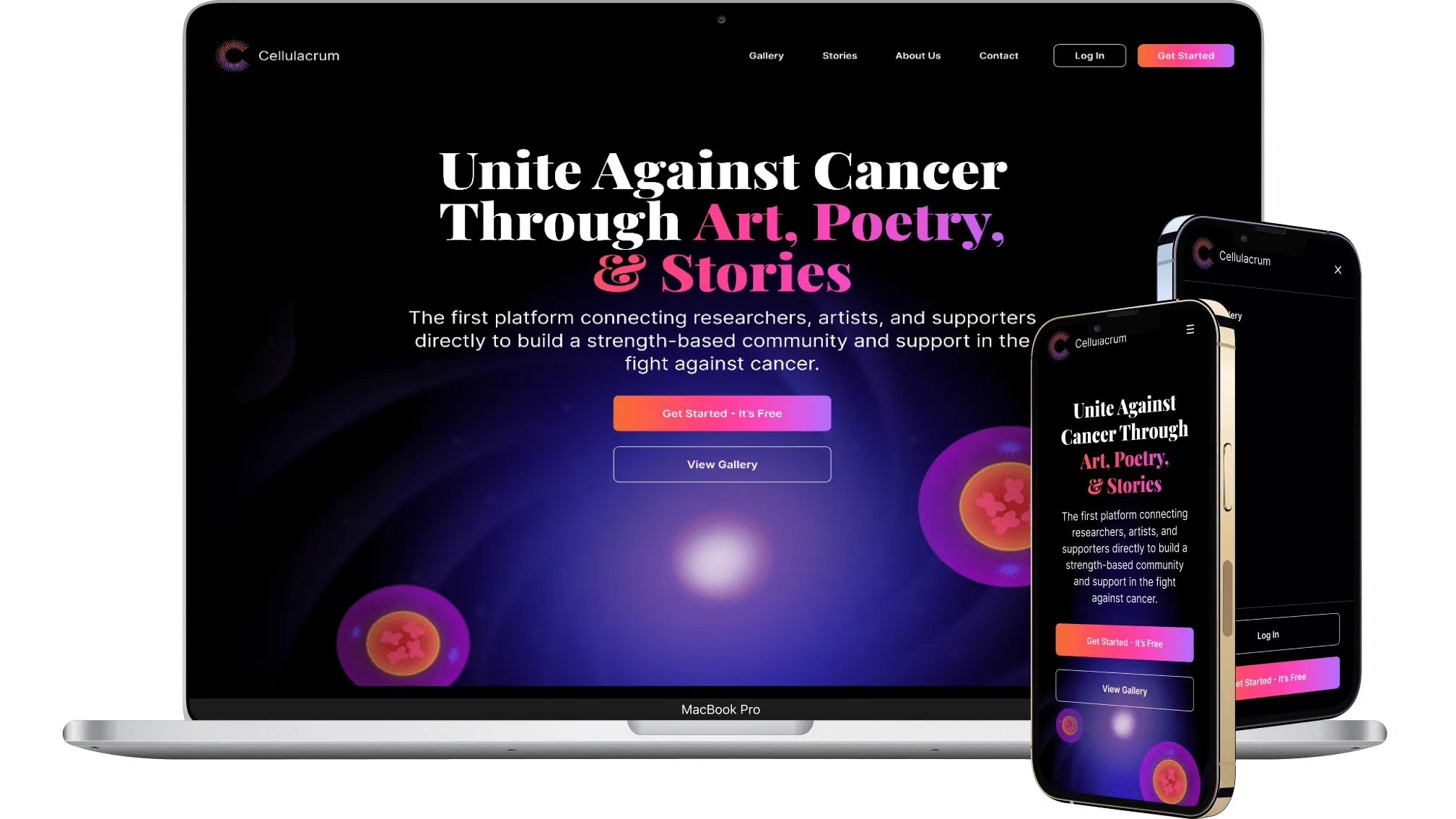
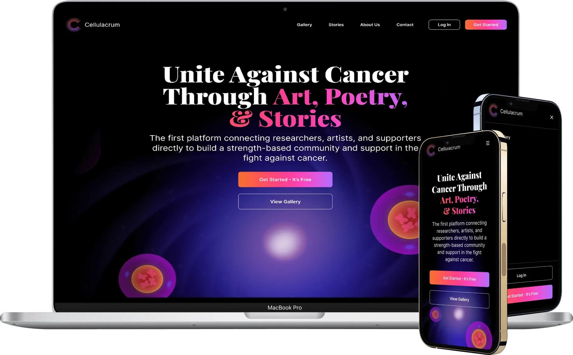
A mobile app that lets plant lovers connect and swap plants anywhere in their local area
Hero image featuring four iPhone mockups with Florecer app screens on the case study page
Hero image featuring four iPhone mockups with Florecer app screens on the case study pageTry Interactive Prototype
100%
80%
60%
3

Background Info

How it all started

Growing up in the Dominican Republic, my mother cultivated a love for plants in her backyard, an experience she brought with her to NYC.

Rehoming plants

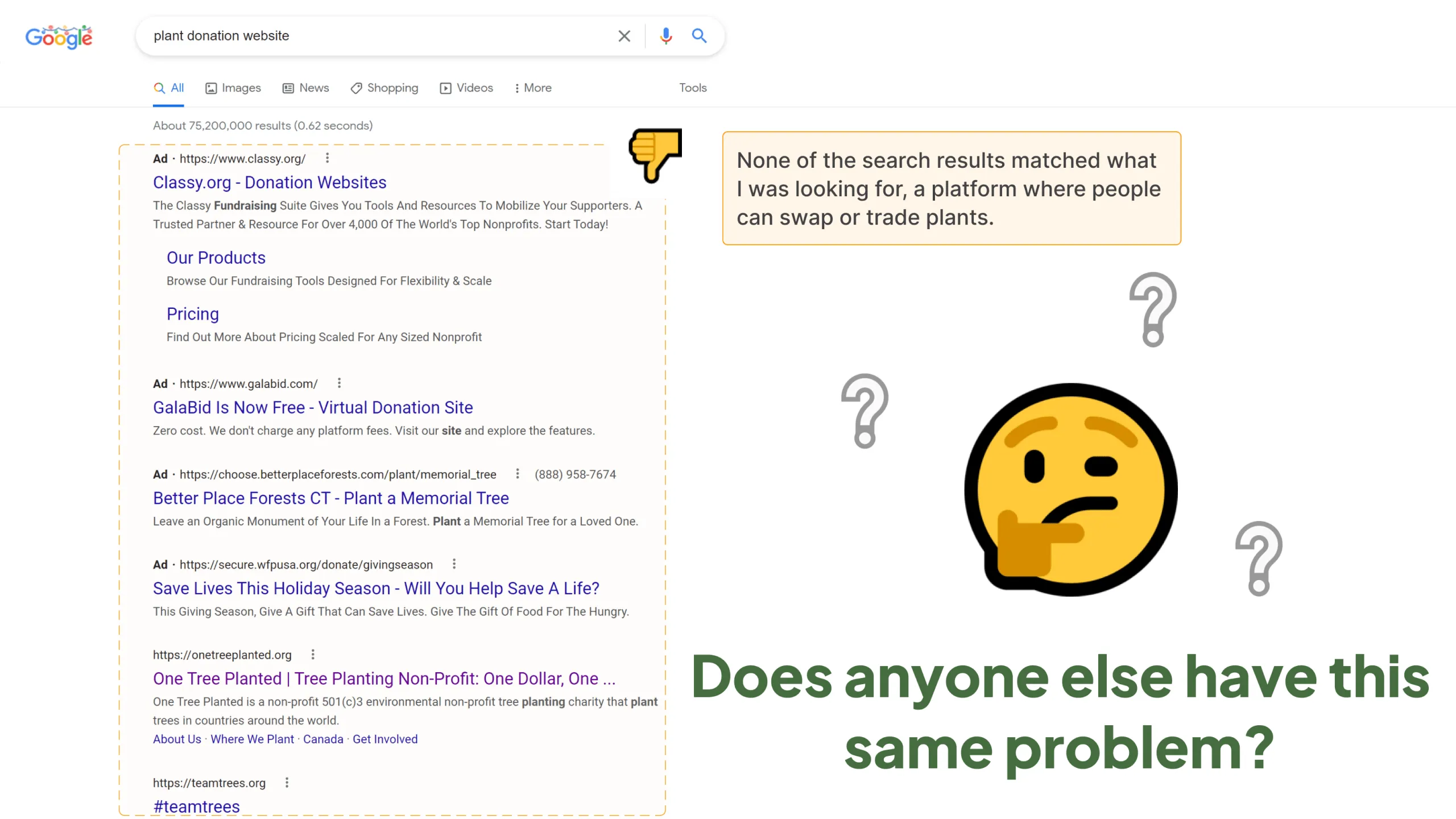
Every fall and winter, she faced the same problem: some plants wouldn’t survive the season, and she wished she could gift them to someone who’d care for them. But there was no simple way to do this online.

This sparked the following questions:

  • Are other plant lovers facing the same challenge?
  • How do plant owners connect with others to share their plants, and is there a better way?

The Problem

Nowhere to share

There’s no dedicated, easy-to-use platform where plant owners can connect with others nearby to swap or donate plants, especially during seasonal transitions.

Design Planning & Research

Researching the root

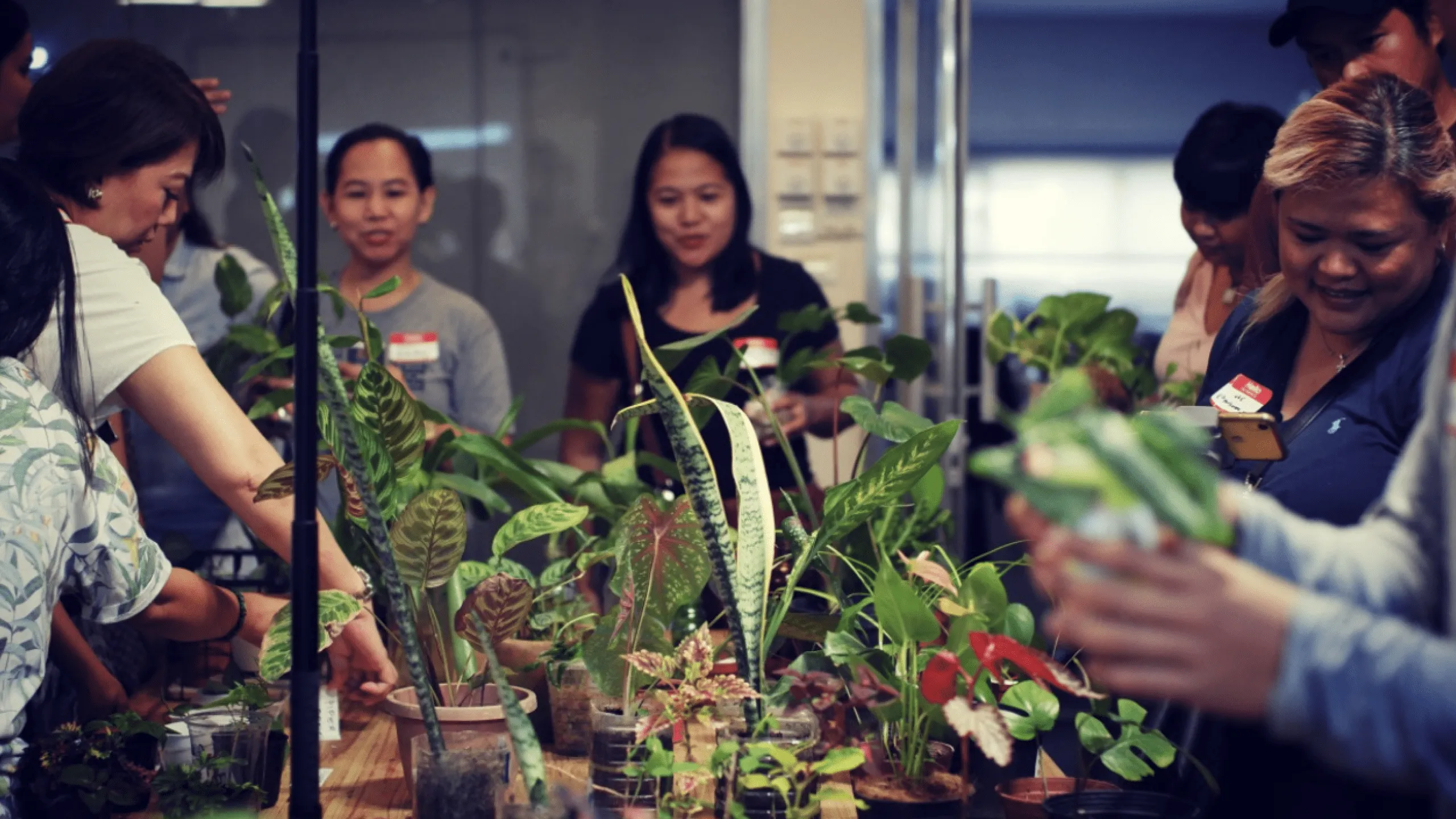
To design a solution that truly meets the needs of plant lovers, I started by understanding their current behaviors, challenges, and motivations around plant swapping and giving.

Goals

  • Understand how people currently trade, donate, or sell plants
  • Validate demand for a platform dedicated to plant swapping
  • Identify current frustrations and pain points
  • Explore what features would truly serve the community

Methods

  • Screener survey
  • One-on-one interviews
  • Recruit between 3-5 participants (ideally located in NYC)

Key Takeaways

Seeds of insight

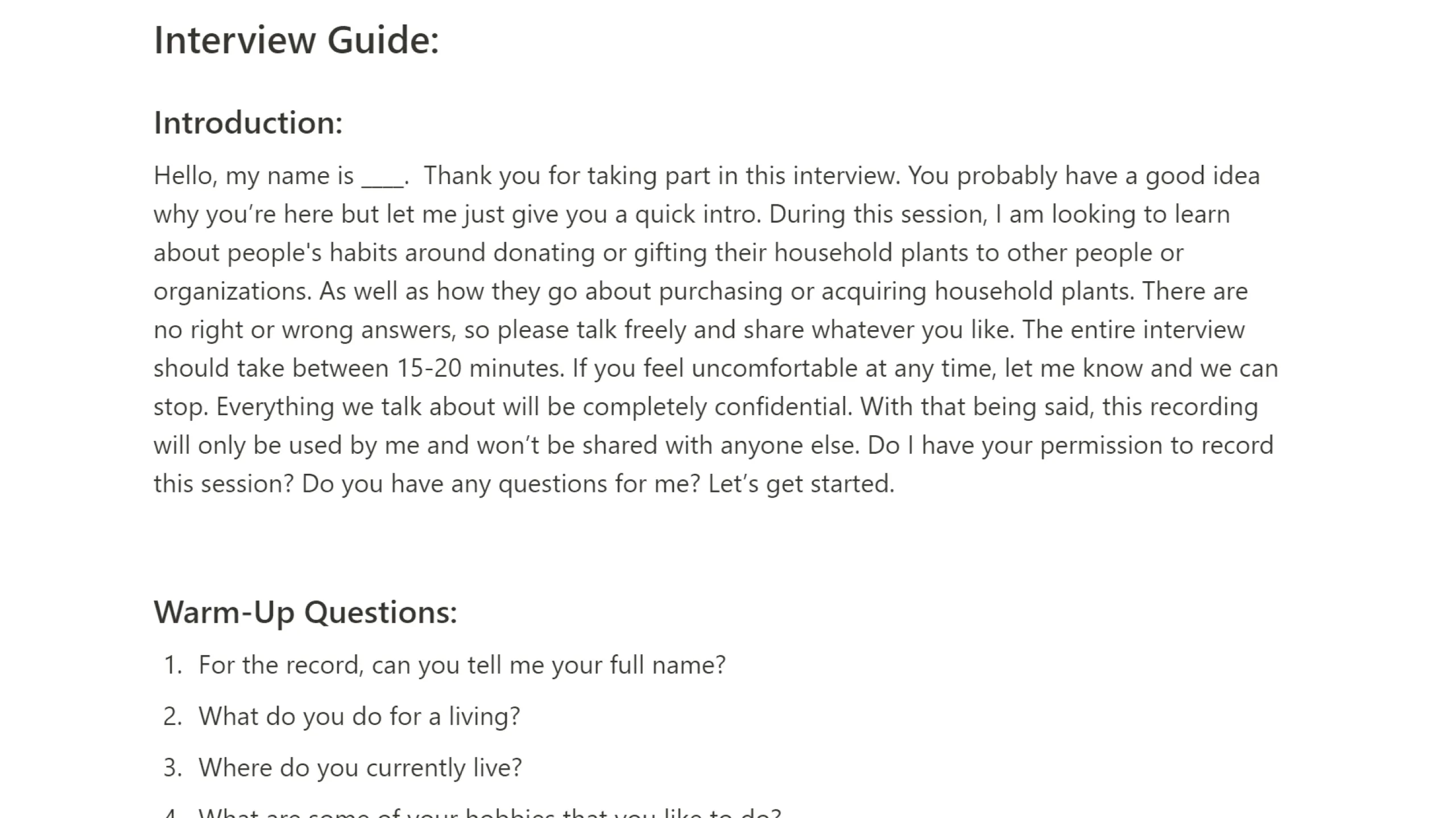
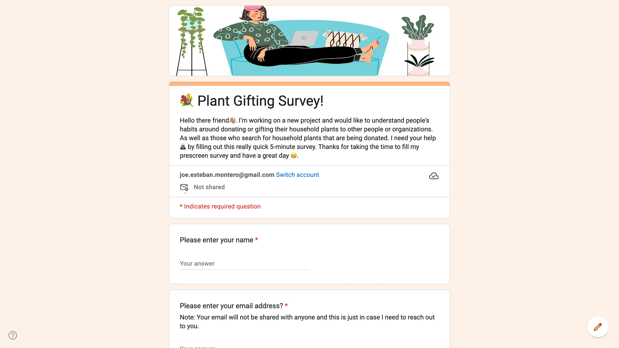
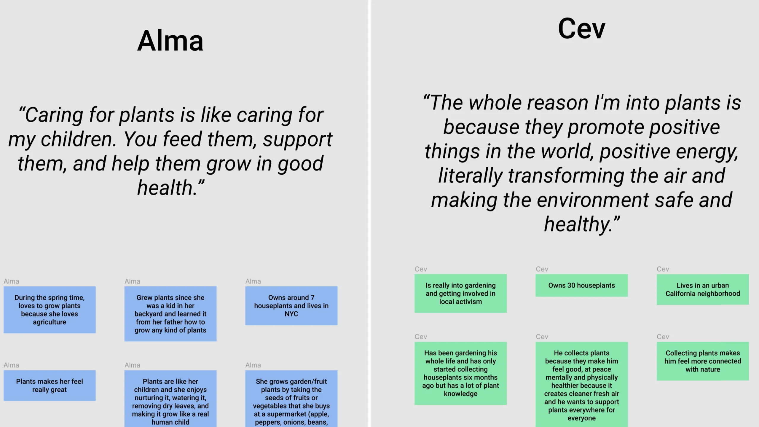
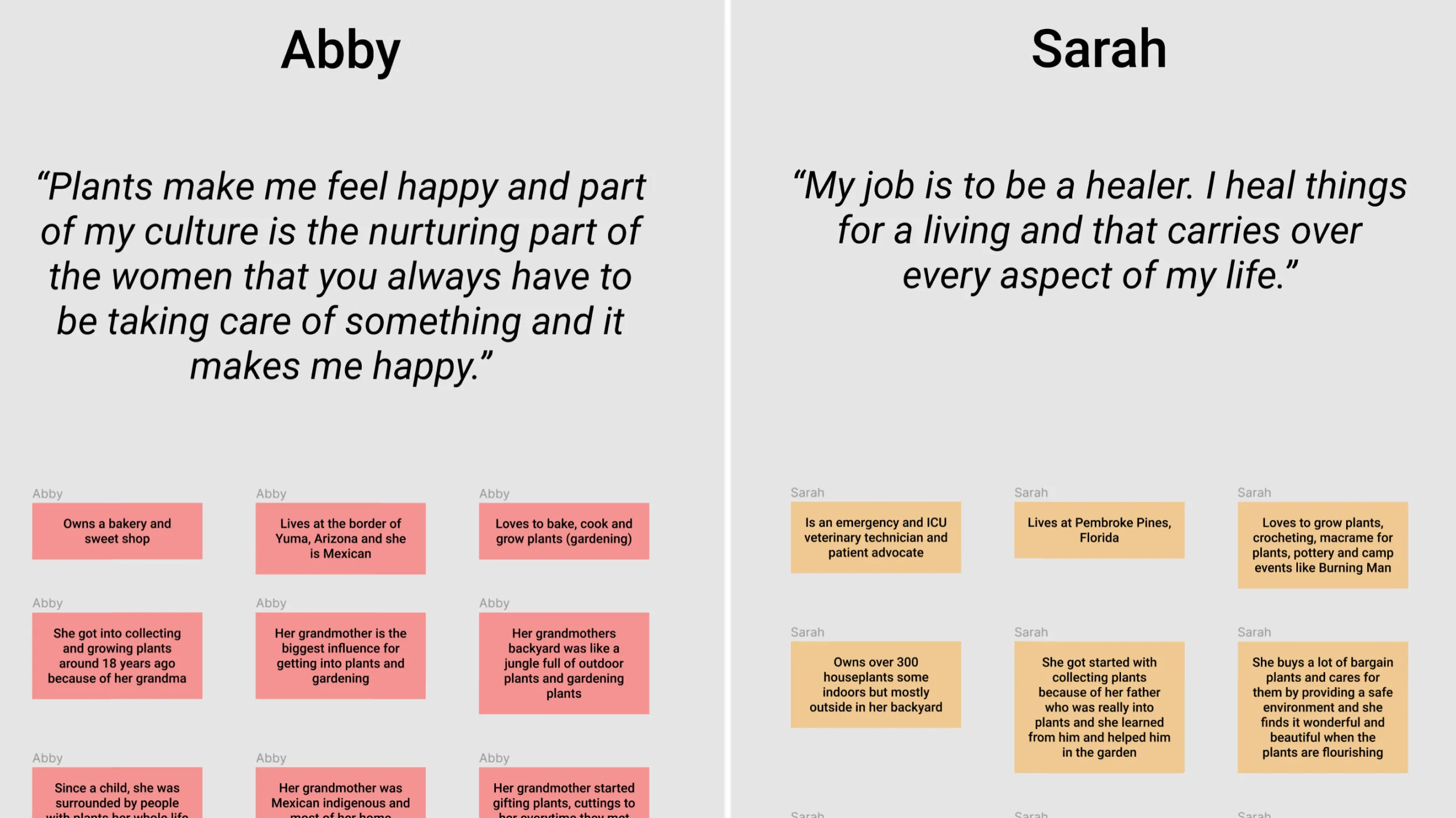
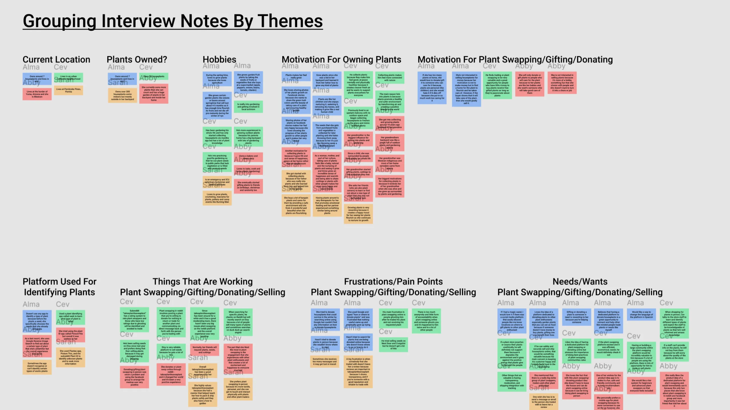
After recruiting and conducting user interviews, I created an Affinity Map with some interesting key takeaways. These insights helped shape my design decisions and confirmed a real need for a product like Florecer.

Motivations

  • Many users developed a love for plants in childhood, often influenced by a parent or grandparent
  • Caring for plants helps users feel calm, fulfilled, and connected
  • Several users want to join a supportive, knowledgeable community
  • Some trade plants to help others, share rare cuttings, or earn a little extra money

Current behaviors

  • Most use Reddit communities like r/TakeAPlantLeaveAPlant, local nurseries, or Facebook groups
  • Some sell cuttings on Etsy
  • Positive feedback about Reddit’s rating system and community guides

Pain Points

  • Hard for non-tech-savvy users to participate
  • Forgotten reviews lead to trust issues
  • Occasionally, trades fall through, or items never arrive
  • Communication is scattered and disorganized

User Needs

  • A simple, modern mobile app for listing plants to trade, donate, or sell
  • A way to share plant photos and personal stories
  • Safe, friendly, well-moderated community
  • Messaging tools, review system, and beginner guides
  • Language support and a matching feature to pair compatible users

User Persona

Who we’re designing for?

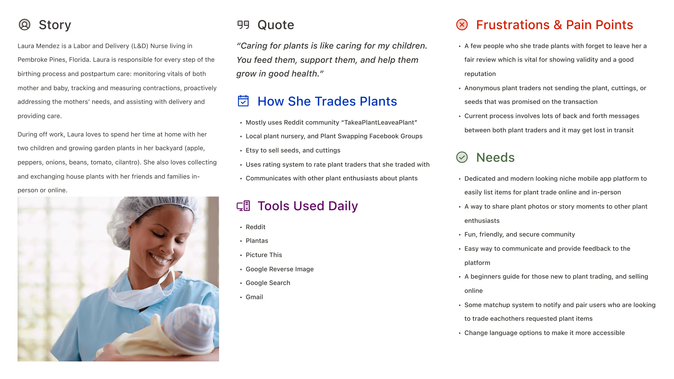
To bring my research together and guide my design decisions, I created a user persona representing Florecer’s target audience. The primary user persona is based on interview themes, focusing on users who are plant enthusiasts seeking a social and reliable way to trade and share plants locally.

Competitive Landscape

Where we fit

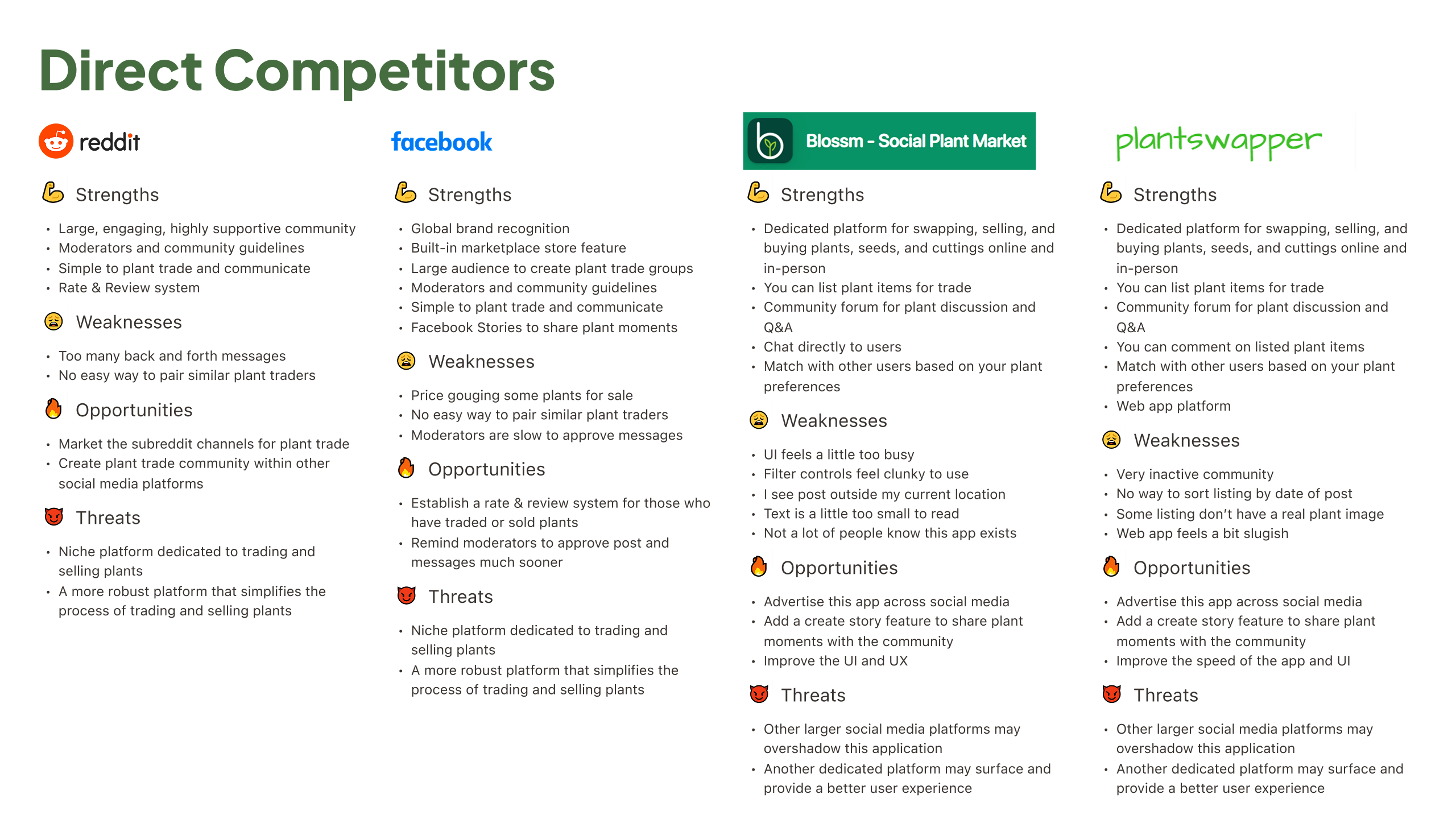
To find gaps and opportunities in the market, I looked at the tools people currently use for swapping, donating, or selling plants. This included plant-focused platforms as well as broader community and marketplace tools. I ran a SWOT analysis on platforms like Reddit, Facebook, Etsy, and local nurseries to see where Florecer could stand out.

Defining The Product

Solving what matters

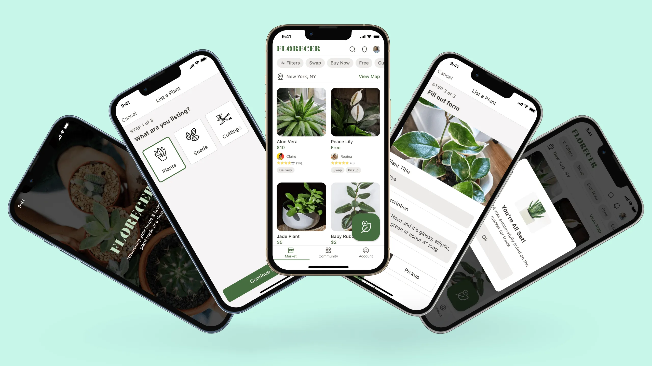
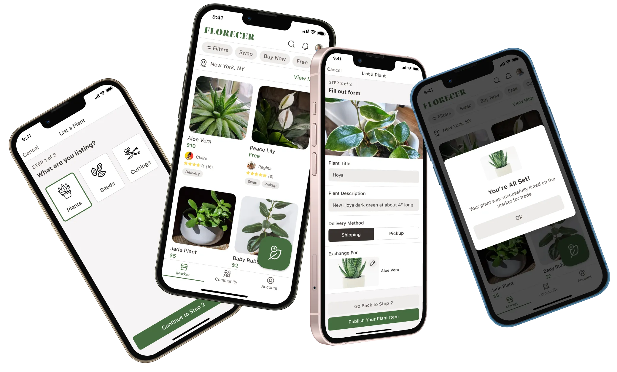
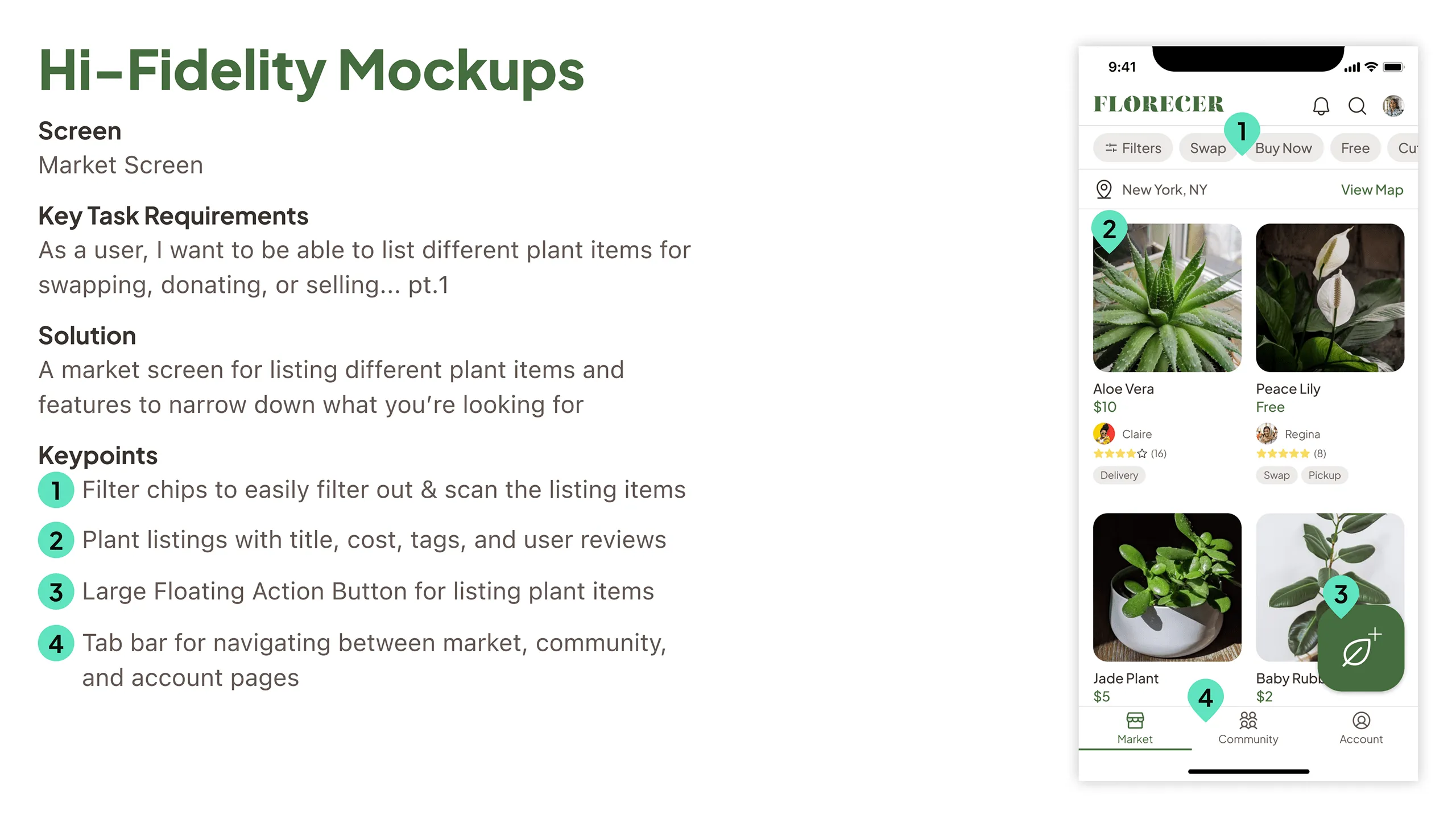
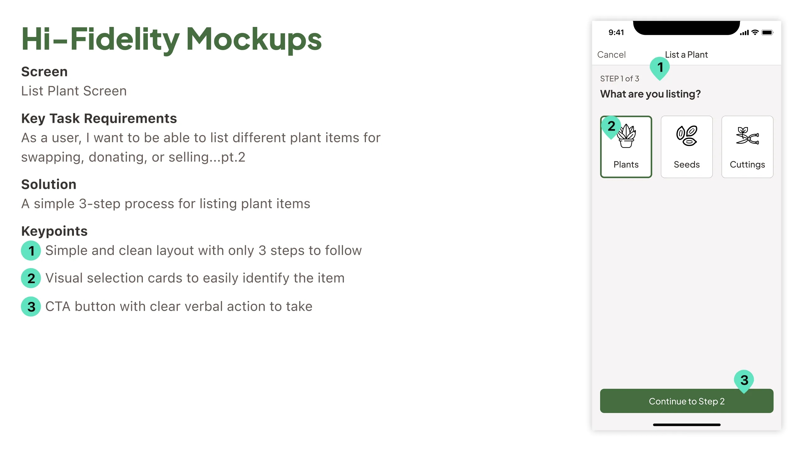
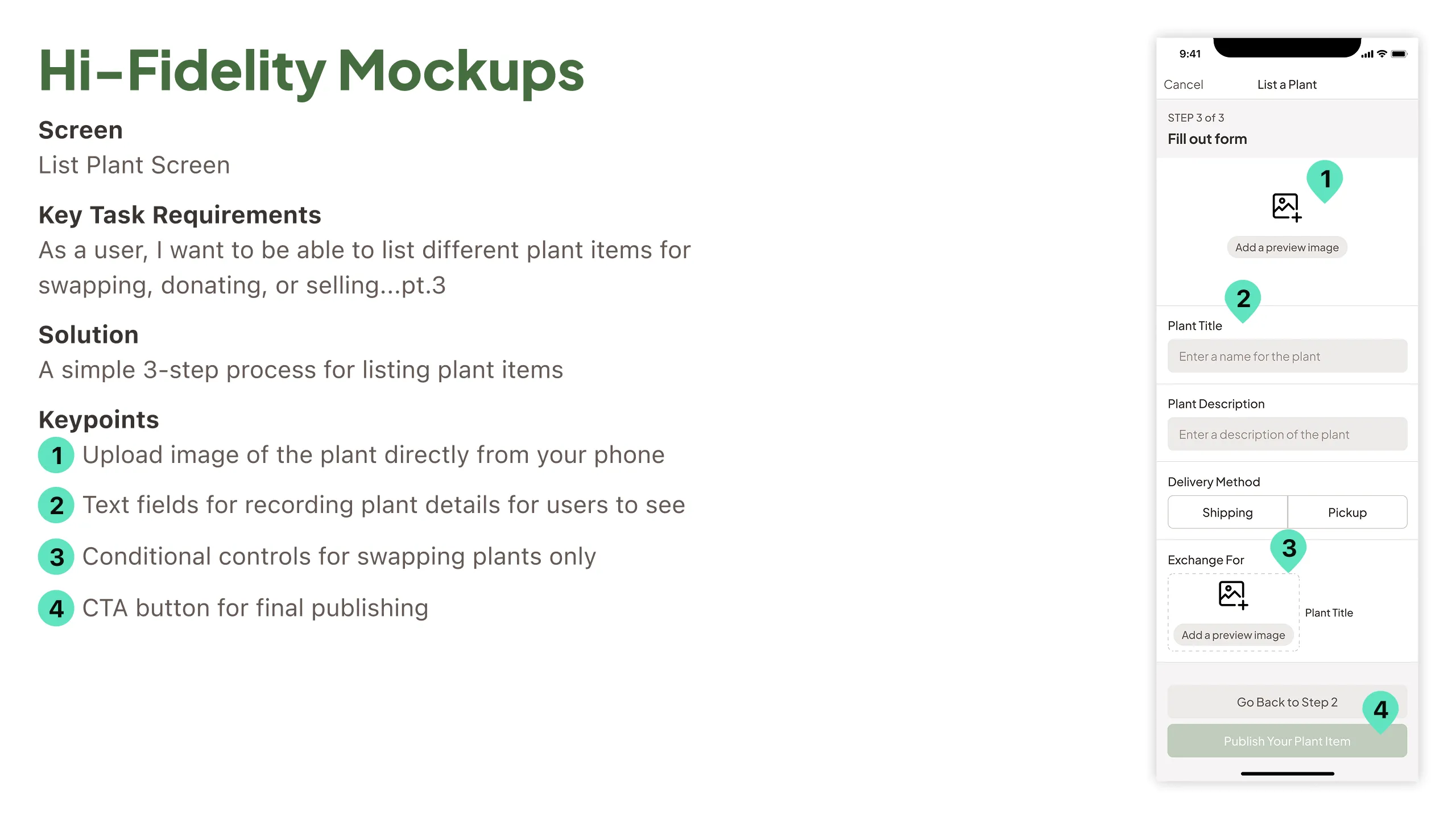
With a clearer understanding of the user needs, I defined Florecer’s core features and value. Each core feature addressed an important user need.

Core Features

  • List plants for swapping, donating, or selling
  • Browse plants nearby
  • Post plant stories or updates (like Instagram Stories)
  • Share local plant swap events
  • Submit feedback easily
  • Community posting and discovery

Prioritized Task Flow

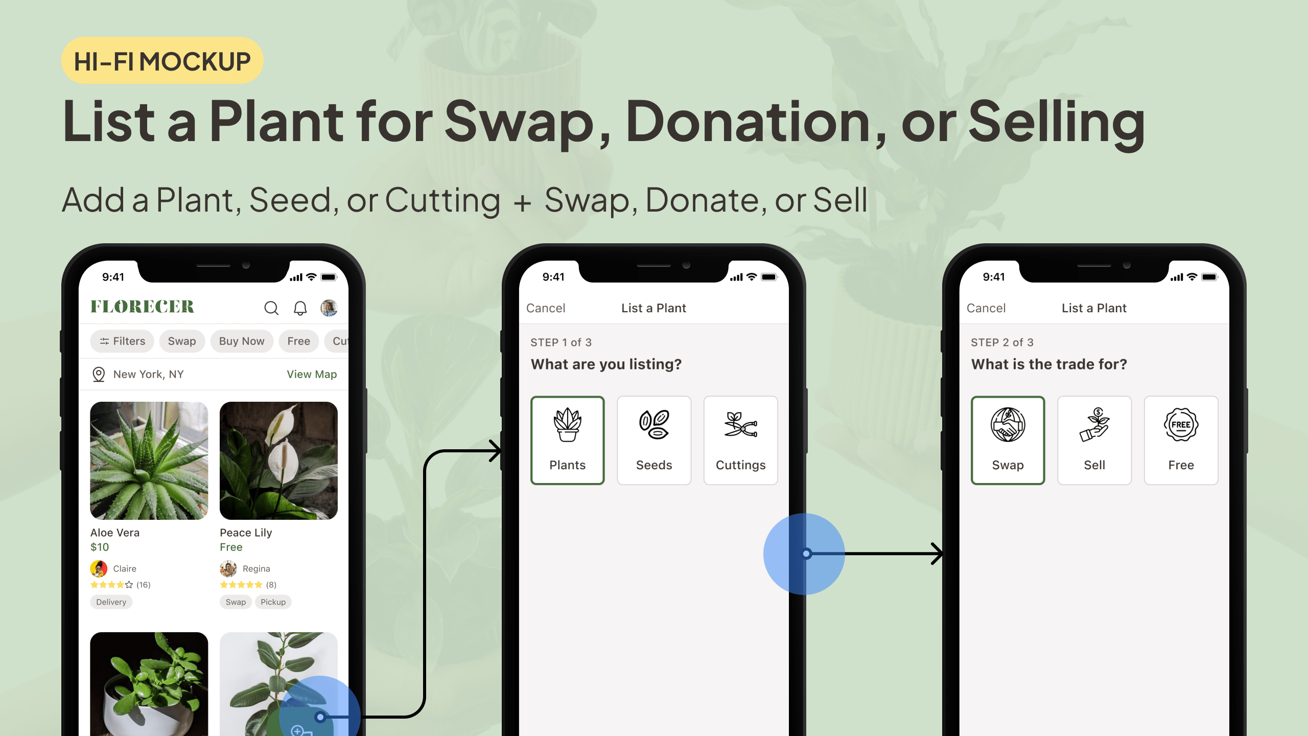
While all the core features mattered to users, I prioritized the most important one, which is letting people list plants to swap, donate, or sell.

"As a user, I want to list plants for swapping, donating, or selling."

Design Process

From vision to interface

Now that I really understood what users were looking for and what the product needed to do, I kicked off the design phase by defining the brand vibe, brainstorming ideas, and mapping out user flows.

Moodboard

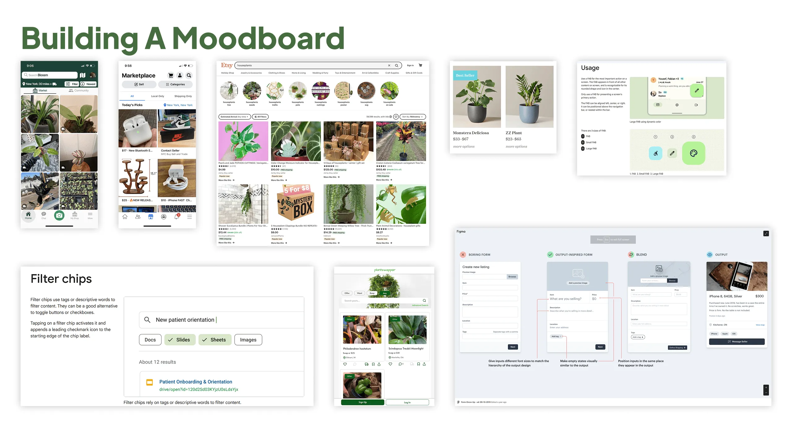
I began collecting visual inspiration such as colors, UI components, design systems, and competing app screenshots to define the look and feel.

Sketches

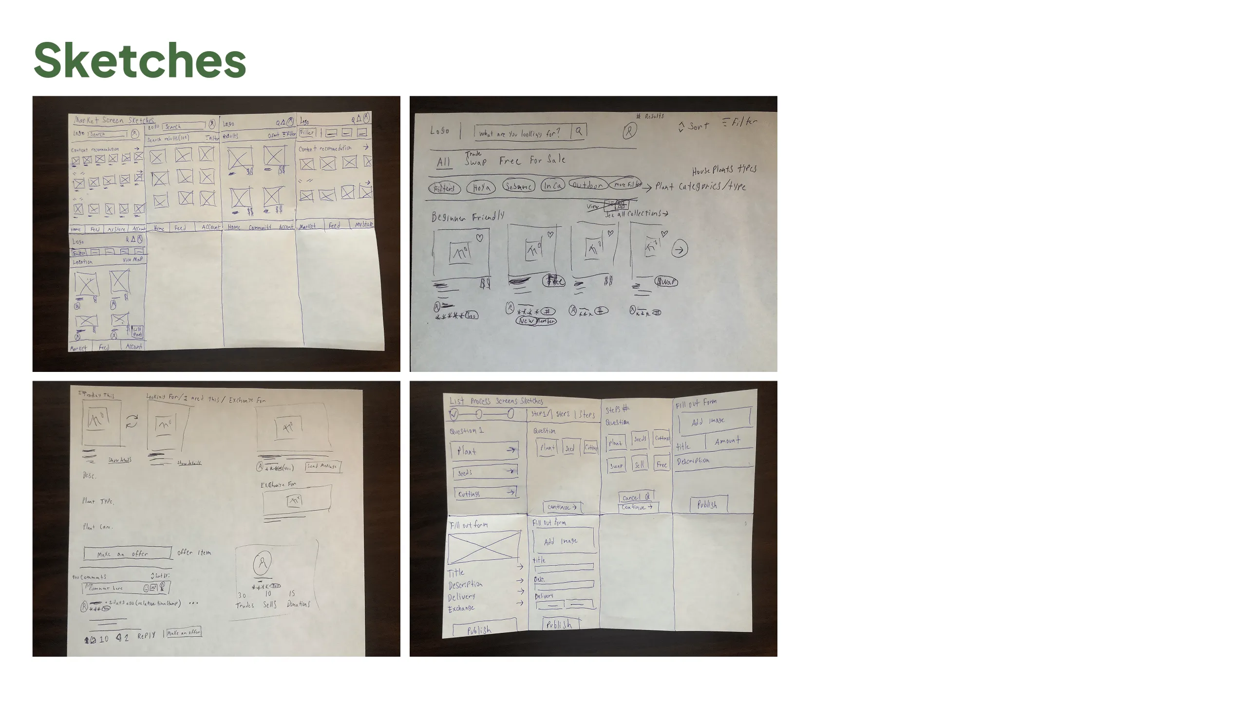
Next, I created low-fidelity sketches of the primary user flow, focusing on ease-of-use and clarity.

Brand Identity

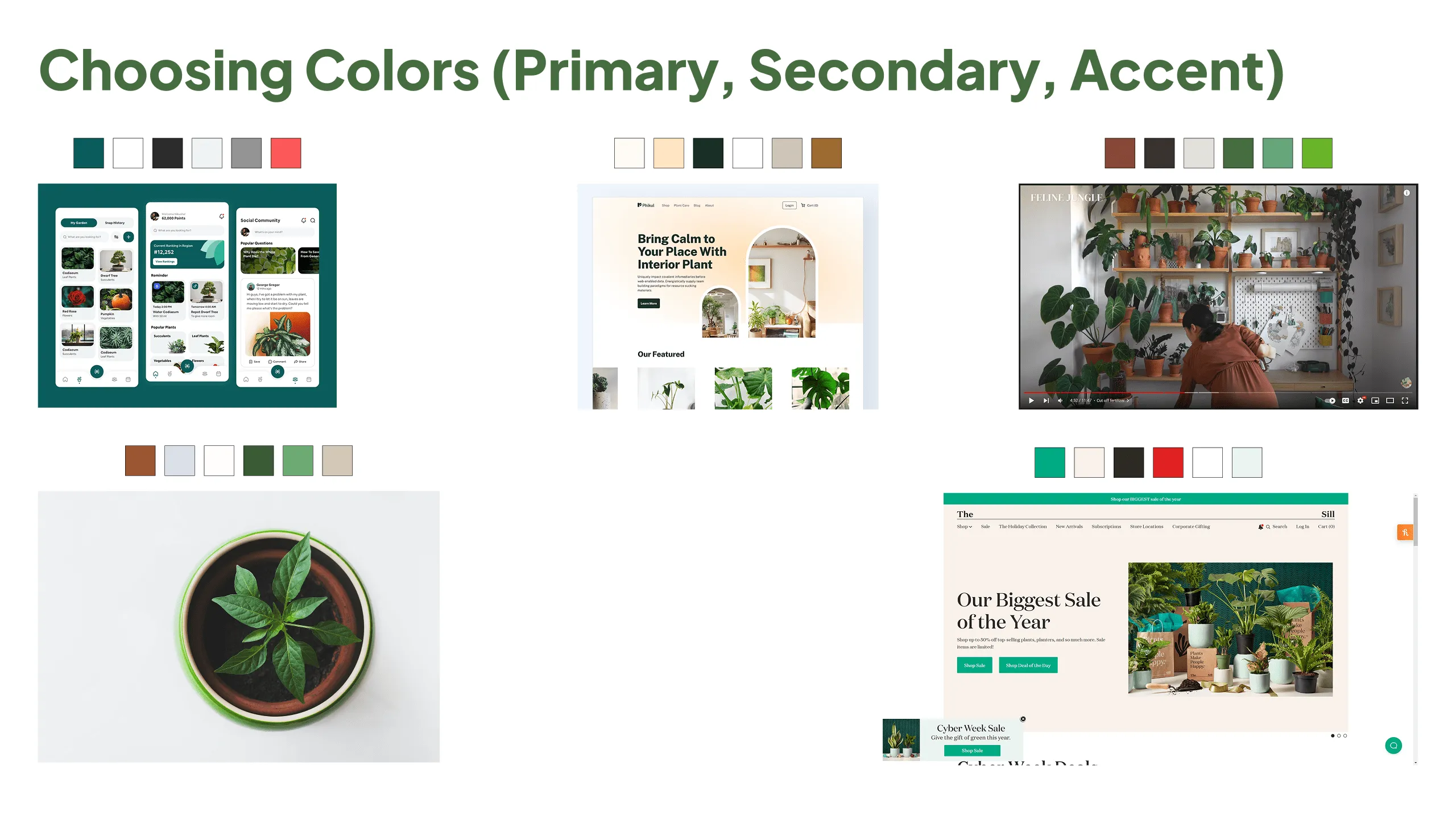
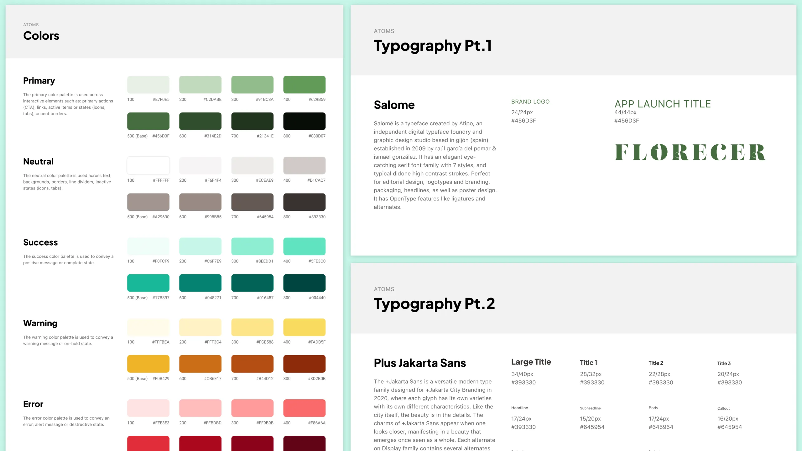
Finally, I shaped Florecer’s visual identity to reflect both the users’ personality and the product’s goals, helping to bring the brand’s character to life.

  • Earthy & Elegant
  • Nourishing & Informative
  • Modern & Minimal

Final Designs

Building the core experience

With the sketches, moodboard, and brand direction in place, I was ready to start building out the key screens and task flows.

Hi-Fi mockups

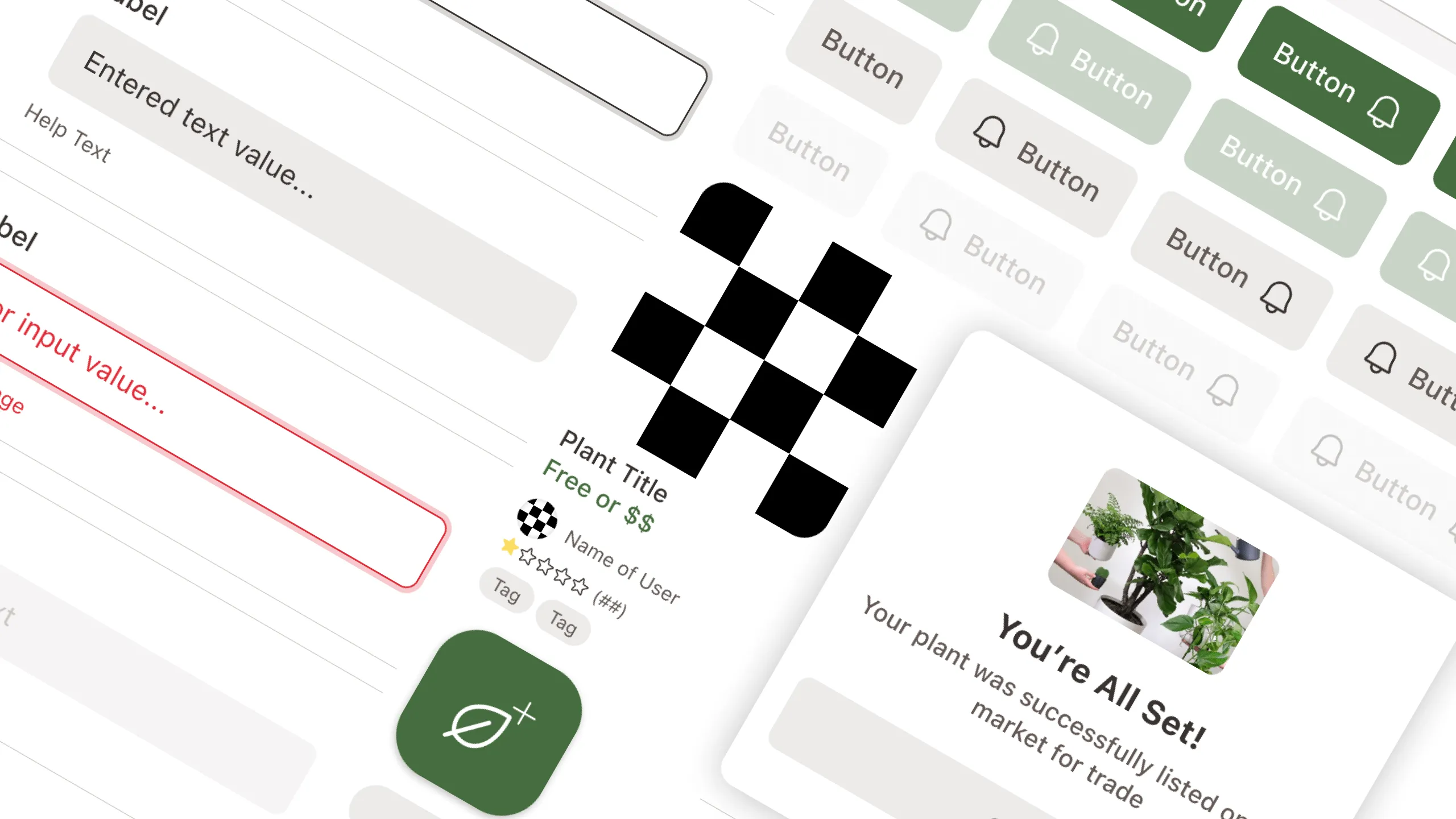
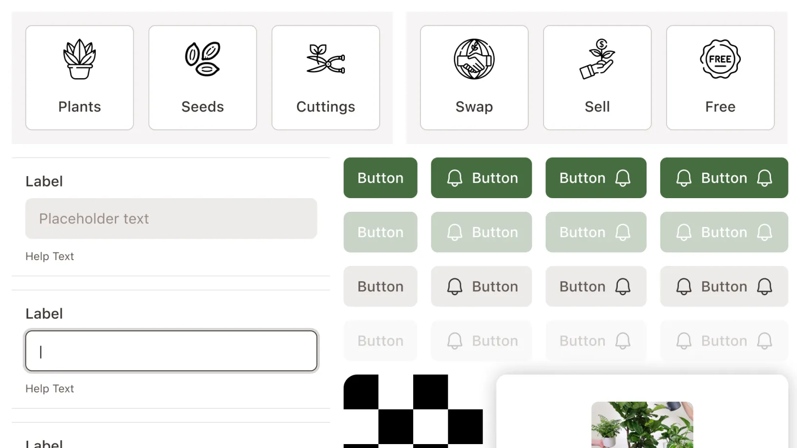
Since I had a lot of visual inspirations, I jumped straight into high-fidelity mockups in Figma, designing the look while building out the design systems at the same time.

Hi-fidelity mockup of Florecer market screen showing key UI benefits

Prototype & Usability Testing

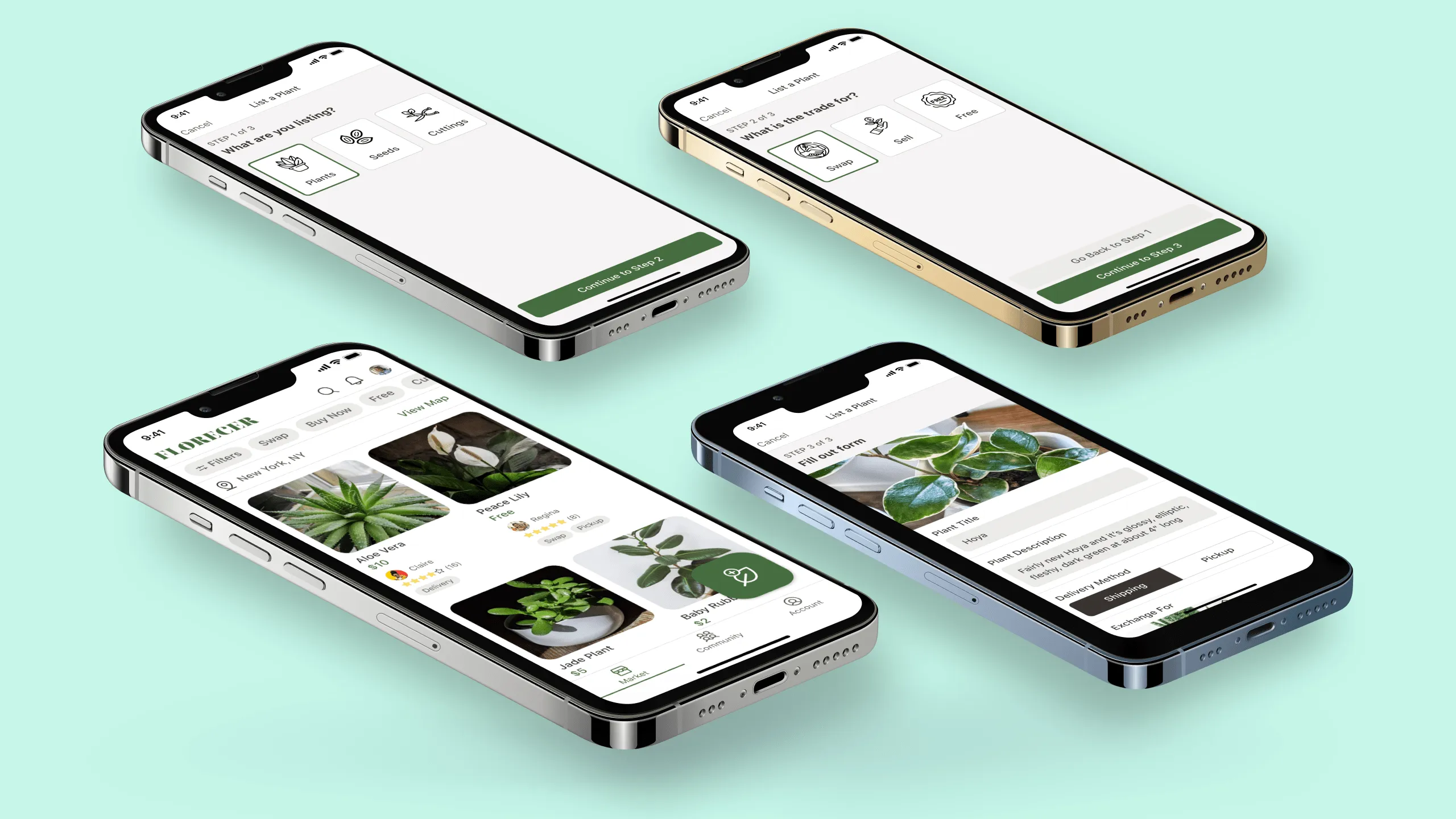
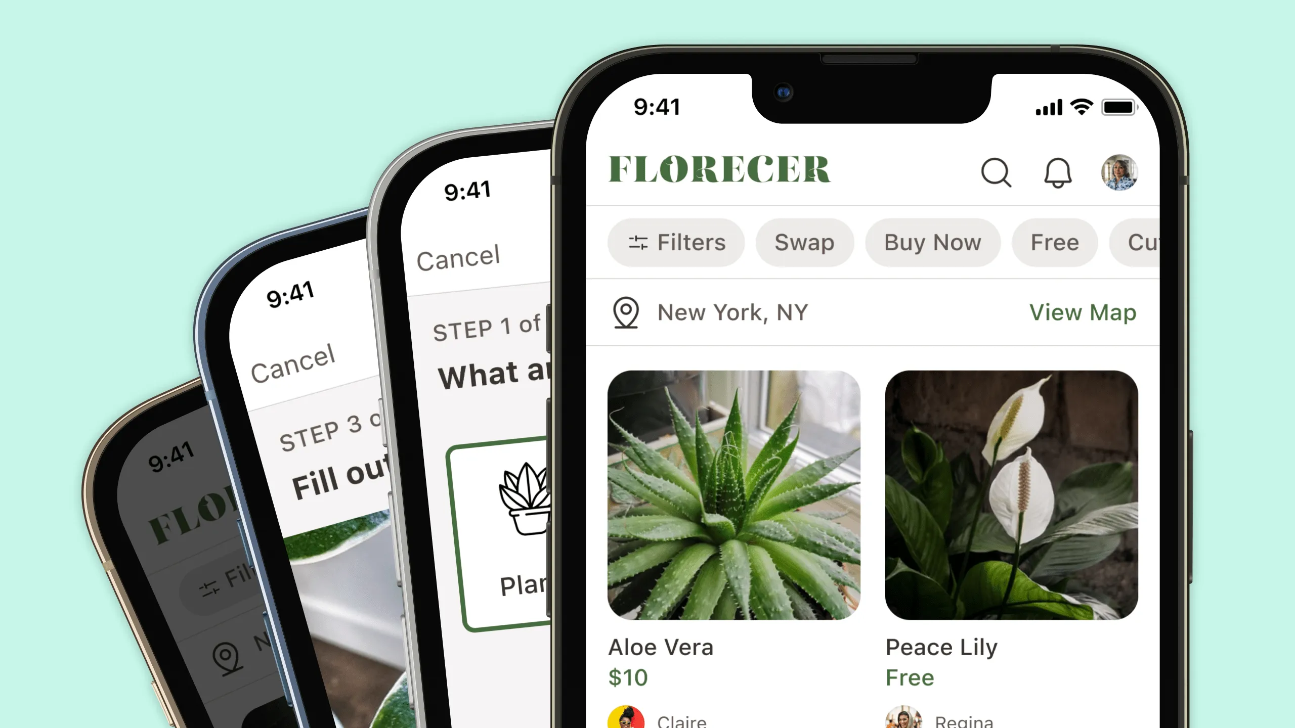
Next, I connected all the screens into an interactive prototype that shows the full flow of listing a plant for trade, donation, or sale.

To validate the design, I tested the prototype with 5 users. This helped identify what worked and where improvements were needed. 

Results & Impact

What we found

The overall result was pretty positive, with some interesting key metrics:

  • All 5 users completed the core flow of listing a plant during usability testing.
  • 4 out of 5 users said the app was easy to use and navigate.
  • 3 out of 5 users said they would use Florecer if it were publicly available.
  • Research uncovered key issues such as trust, disorganized communication, and accessibility that Florecer directly addresses.

Next Steps

Room to grow

While the first version of Florecer was a success, there's still room to improve and explore other key areas.

  • Follow up with additional testers
  • Continue refining based on user feedback
  • Design and user test the rest of the core features with users
  • Explore building a working MVP and releasing it to the public

Final Thoughts

Toward what’s possible

This project started as a personal story and turned into a promising product concept. Florecer addresses a real need in the plant community and offers a thoughtful, simple way for people to connect and grow together. I’m excited to keep developing it and hopefully bring it to life as an iOS mobile app.

Other Projects

See more of my work

Hero image for the Noonan case study, showing two device mockups featuring the app's golf course search screen and in-game play screenHero image for the Noonan case study, showing two device mockups featuring the app's golf course search screen and in-game play screen
Chip component tag labeled “UX Cabin Work” used to categorize case study projects.

Noonan

A redesigned AI-powered golf app with a fresh brand and a smoother, smarter playing experience
responsibilities
Check icon
UX Audit & Improvements
Check icon
Mobile App Redesign
Check icon
New Brand Guideline
Check icon
Design System
View Case Study
Hero image for the YellowHat case study, showcasing an AI-powered web app that helps construction subcontractors evaluate bid documentsHero image for the YellowHat case study, showcasing an AI-powered web app that helps construction subcontractors evaluate bid documents
Chip component tag labeled “UX Cabin Work” used to categorize case study projects.

YellowHat AI

A web app that uses AI to support subcontractors in analyzing and responding to bid opportunities
responsibilities
Check icon
UX/UI Design
Check icon
Design System
Check icon
Prototyping
Check icon
Design QA
View Case Study
Screenshot showing both desktop and mobile views of the Cellulacrum platform, which connects researchers, artists, and supporters to build a strength-based community against cancerScreenshot showing both desktop and mobile views of the Cellulacrum platform, which connects researchers, artists, and supporters to build a strength-based community against cancer
Chip component tag labeled “UX Cabin Work” used to categorize case study projects.

Cellulacrum

A hub connecting researchers, artists, and supporters in a strength-based cancer community
responsibilities
Check icon
Research
Check icon
UX/UI Design
Check icon
Low-Fi Wireframe
Check icon
Responsive Design
View Case Study
Screenshot of the Quadax desktop software, a complex payment remittance and medical billing platformScreenshot of the Quadax desktop software, a complex payment remittance and medical billing platform
Chip component tag labeled “UX Cabin Work” used to categorize case study projects.

Quadax

A platform for managing complex medical billing and payment remittance
responsibilities
Check icon
Research
Check icon
UX/UI Design
Check icon
Prototyping
Check icon
Design System
View Case Study
Hero image for the Moen case study card, featuring the app's home screen and sump pump monitor interface from the redesigned smart irrigation apHero image for the Moen case study card, featuring the app's home screen and sump pump monitor interface from the redesigned smart irrigation ap
Chip component tag labeled “UX Cabin Work” used to categorize case study projects.

Moen

A smart mobile irrigation app redesigned to unify features and support scalable design and testing
responsibilities
Check icon
UI Design
Check icon
Prototyping
Check icon
Component Redesign
Check icon
DS Documentation
View Case Study
Desktop view of the Qi Tissue platform, showing tools that help doctors analyze cancer images and create personalized treatmentsDesktop view of the Qi Tissue platform, showing tools that help doctors analyze cancer images and create personalized treatments
Chip component tag labeled “UX Cabin Work” used to categorize case study projects.

Qi Tissue

A tool that helps doctors analyze cancer images and create personalized treatments
responsibilities
Check icon
Research
Check icon
UX/UI Design
Check icon
Prototyping
Check icon
Design System
View Case Study
Two iPhone X mockups showing the Open Peeps Stickers collection tab and a custom sticker creation screen.Two iPhone X mockups showing the Open Peeps Stickers collection tab and a custom sticker creation screen.
Chip component tag labeled “Personal Work” used to categorize case study projects.

Open Peeps Stickers

A fun concept iMessage stickers app inspired by Pablo Stanley - Open Peeps illustration
responsibilities
Check icon
Research
Check icon
UX/UI Design
Check icon
Prototyping
Check icon
Design System
View Case Study
Two iPhone 5s mockups showing the Latin Bites food menu tab and a tacos product listing page.Two iPhone 5s mockups showing the Latin Bites food menu tab and a tacos product listing page.
Chip component tag labeled “Personal Work” used to categorize case study projects.

Latin Bites

An iOS concept app born out of the need for a better food ordering experience
responsibilities
Check icon
Research
Check icon
UX/UI Design
Check icon
Prototyping
Check icon
Design System
View Case Study
Chevron up icon