Latin Bites

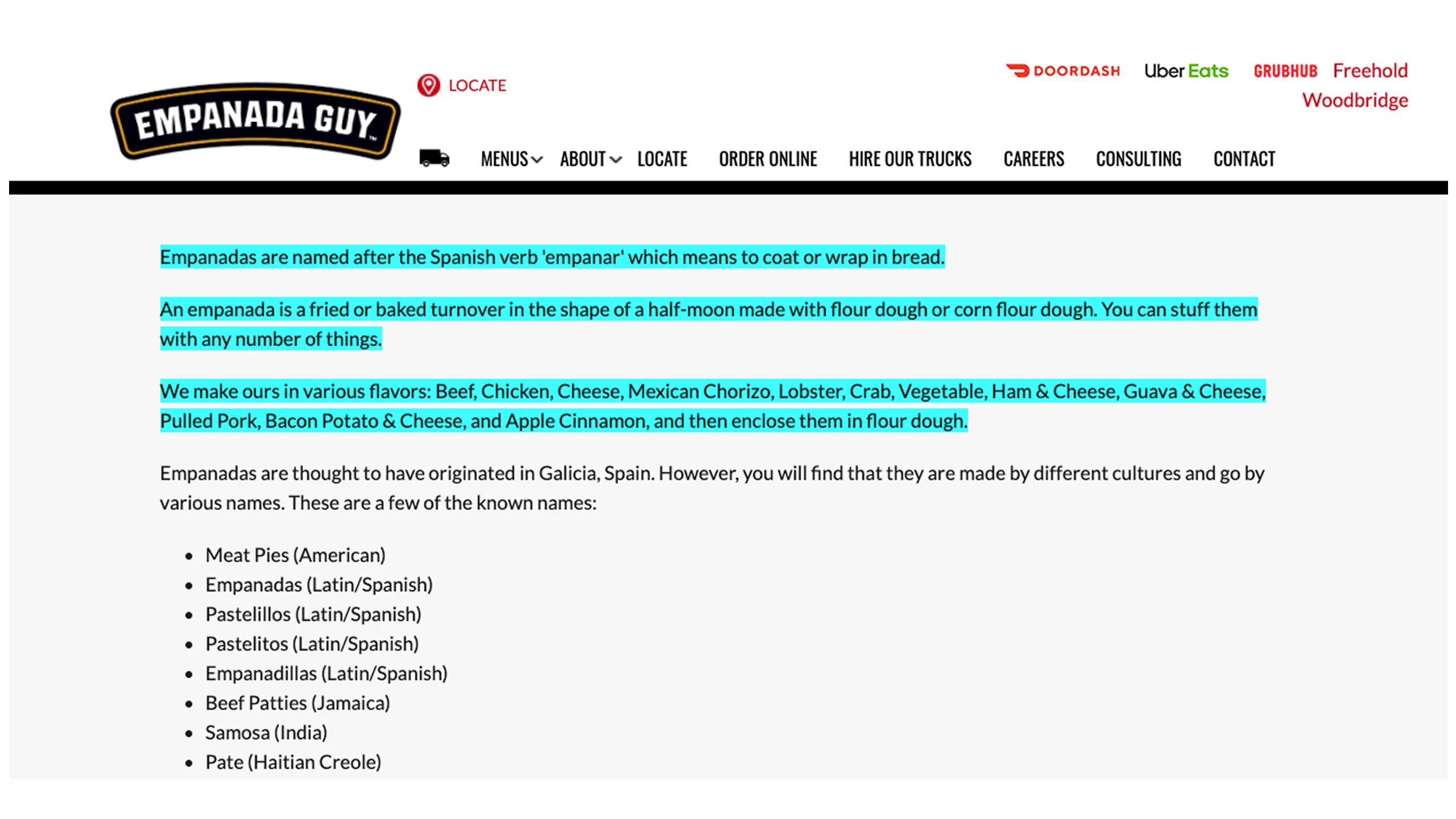
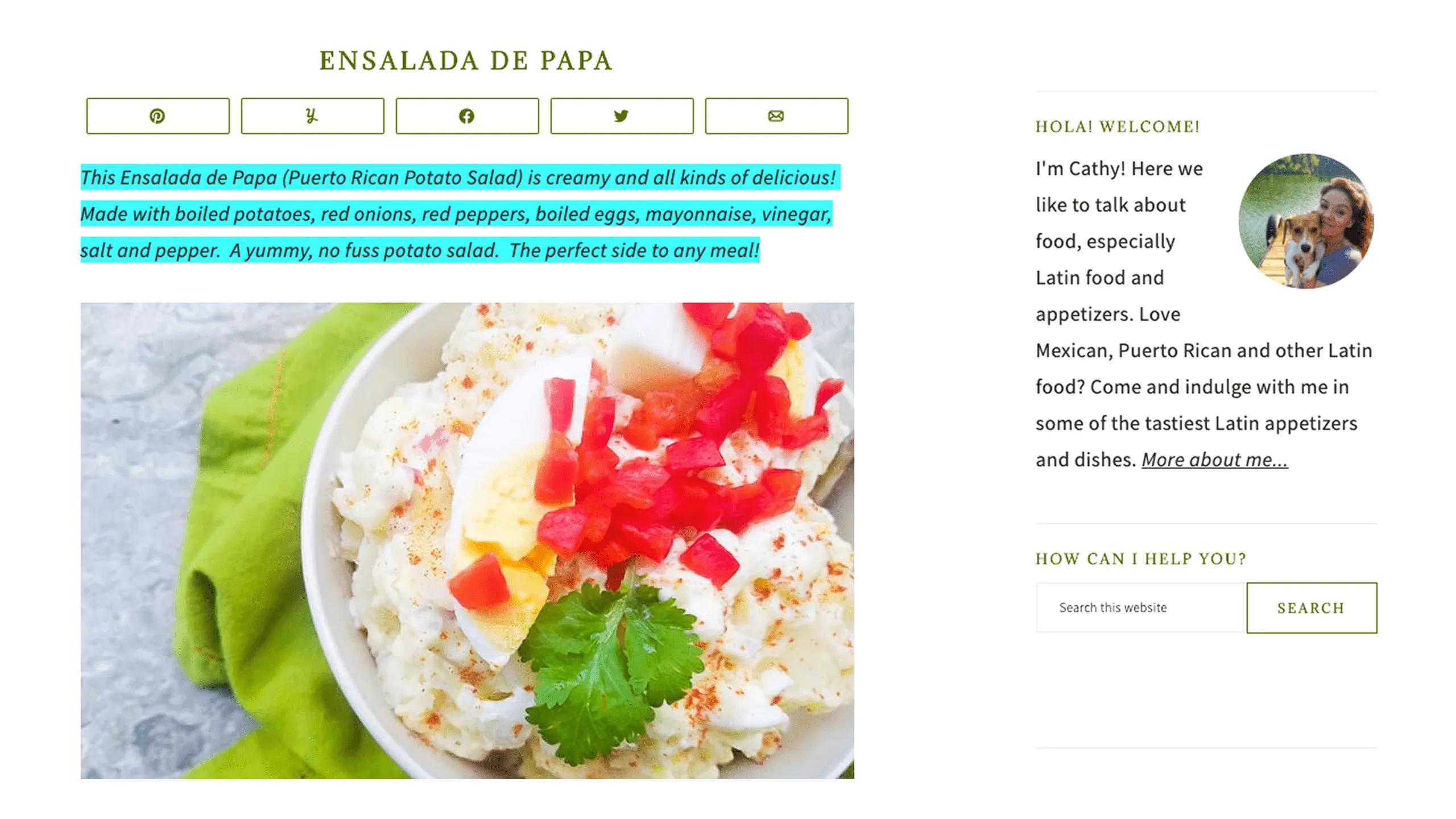
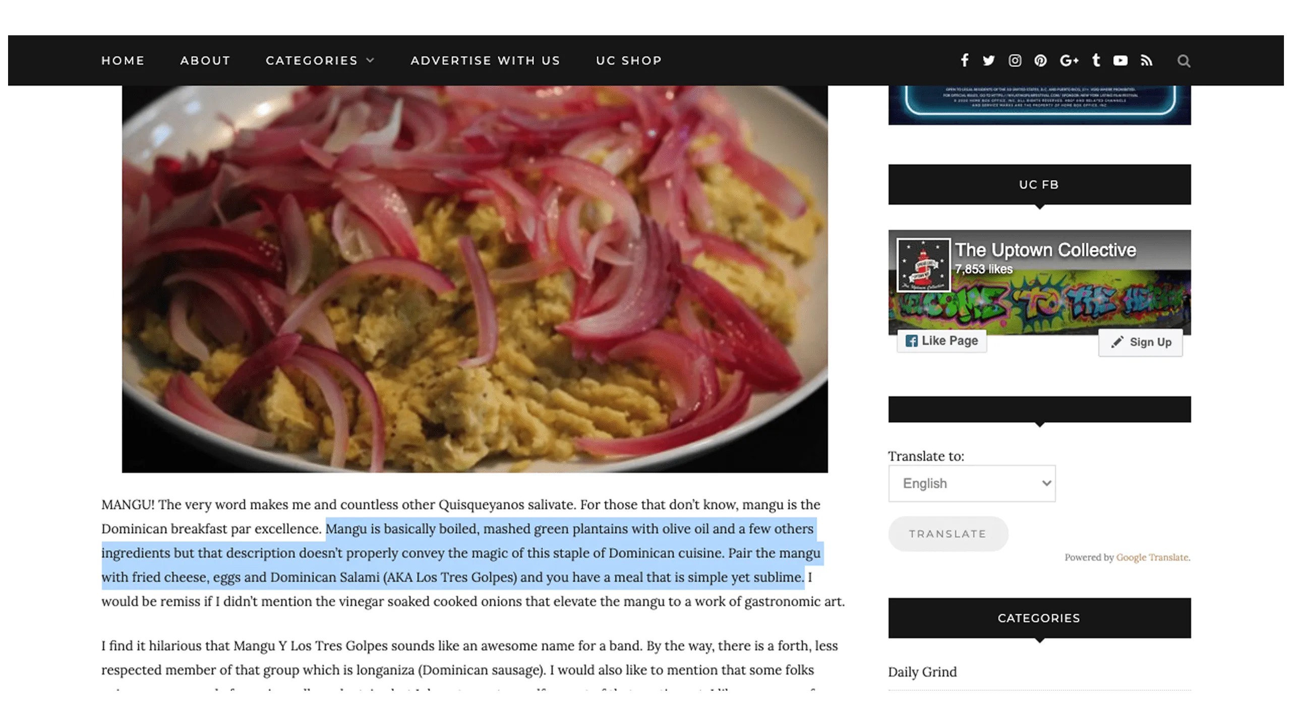
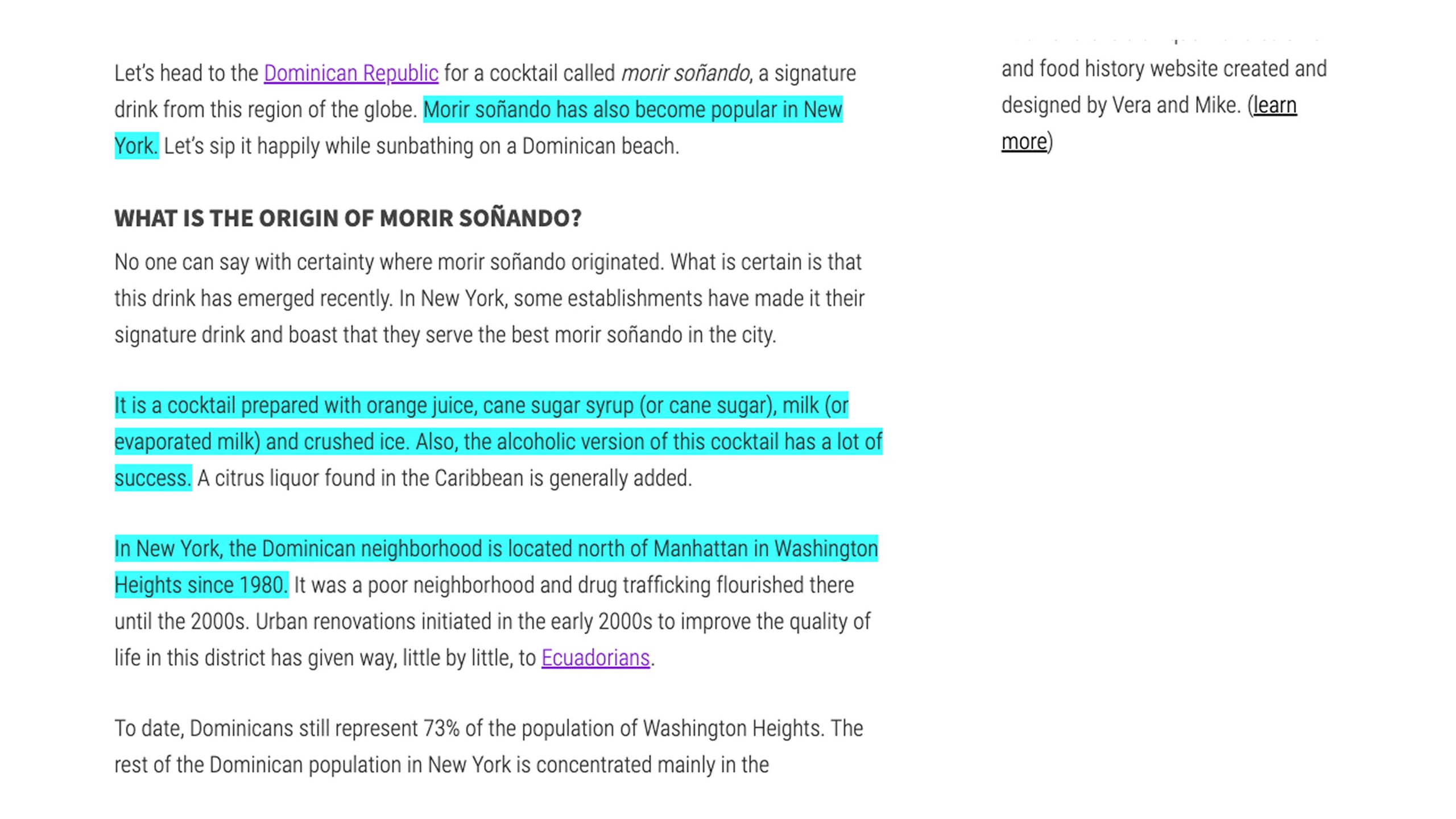
An iOS concept app born out of the need for a better food ordering experience
Latin Bites - Hero Image
100%
100%
100%
4/5

Info and Backstory

What home tasted like

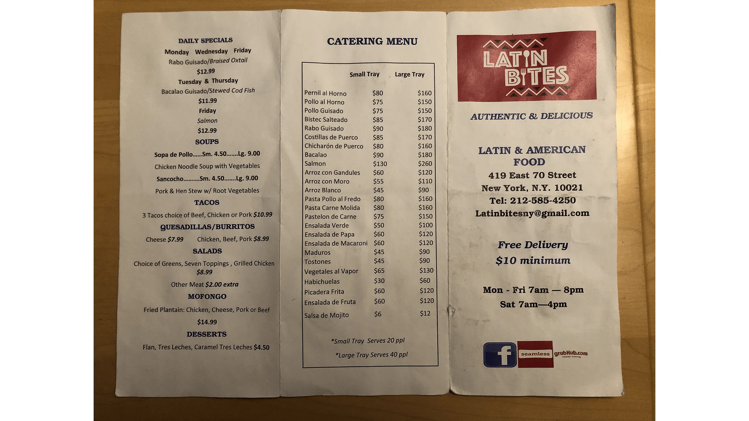
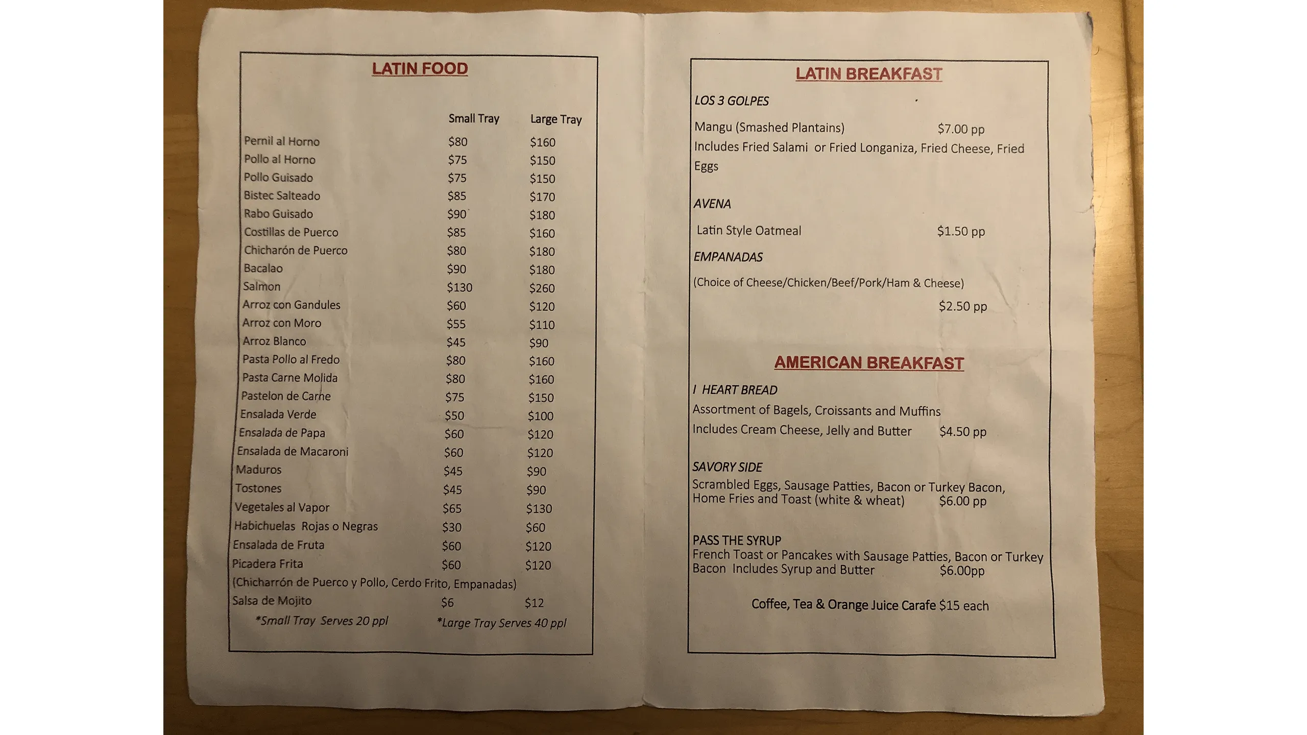
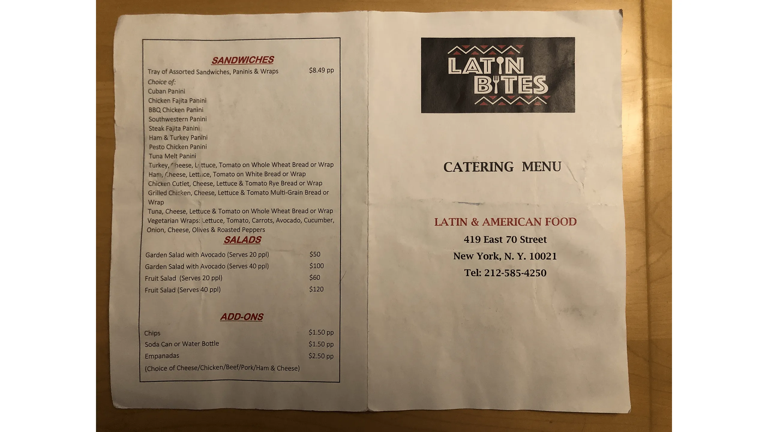
I grew up in a Dominican household where home-cooked meals were a daily ritual. My mother’s cooking such as rice and beans, stewed meats, braised chicken, plantains was more than just food. It was connection, culture, and comfort.

Screenshot of tres golpes with salami, fried cheese, avocado, red onions, and eggs served with mangú

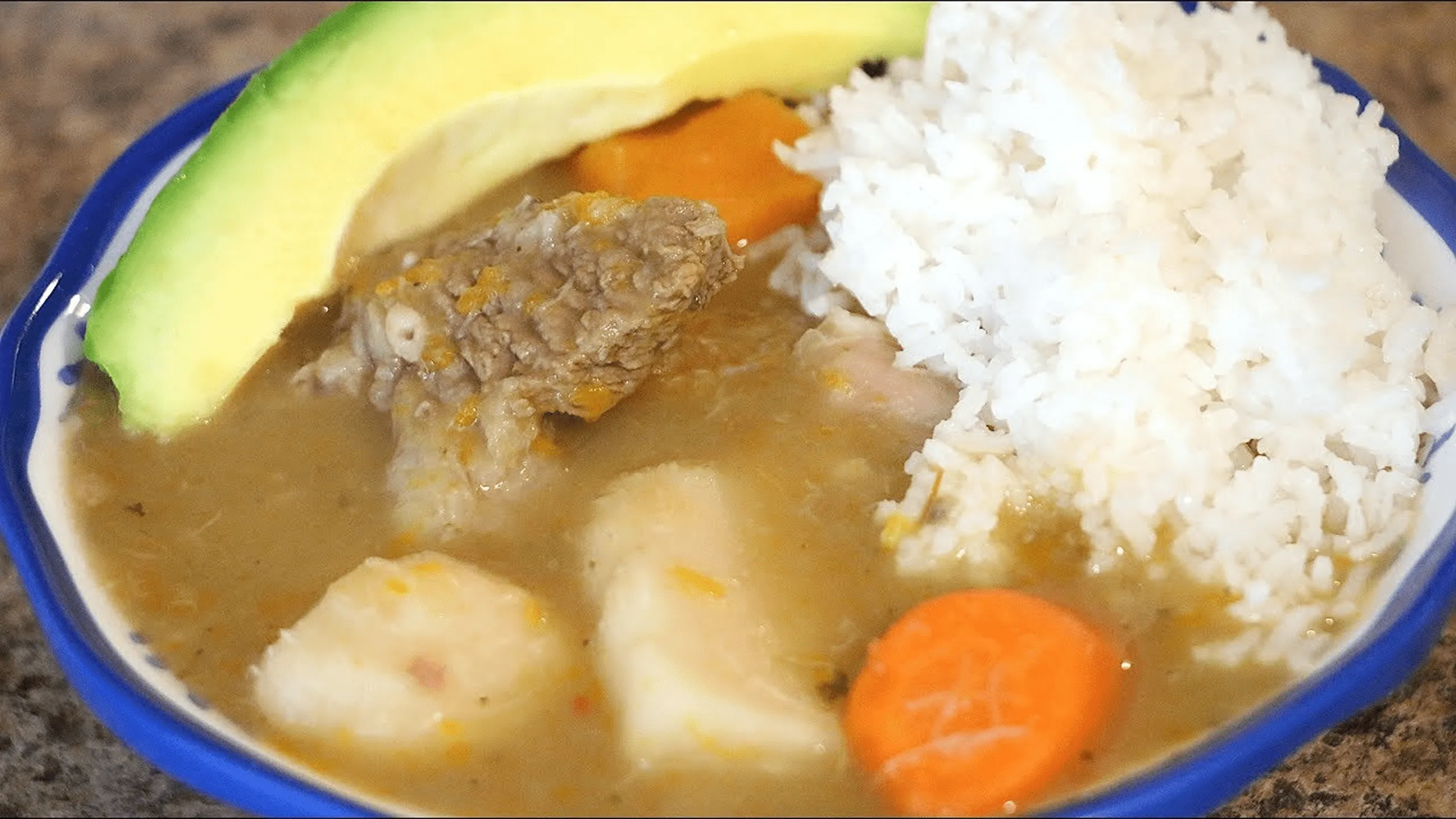
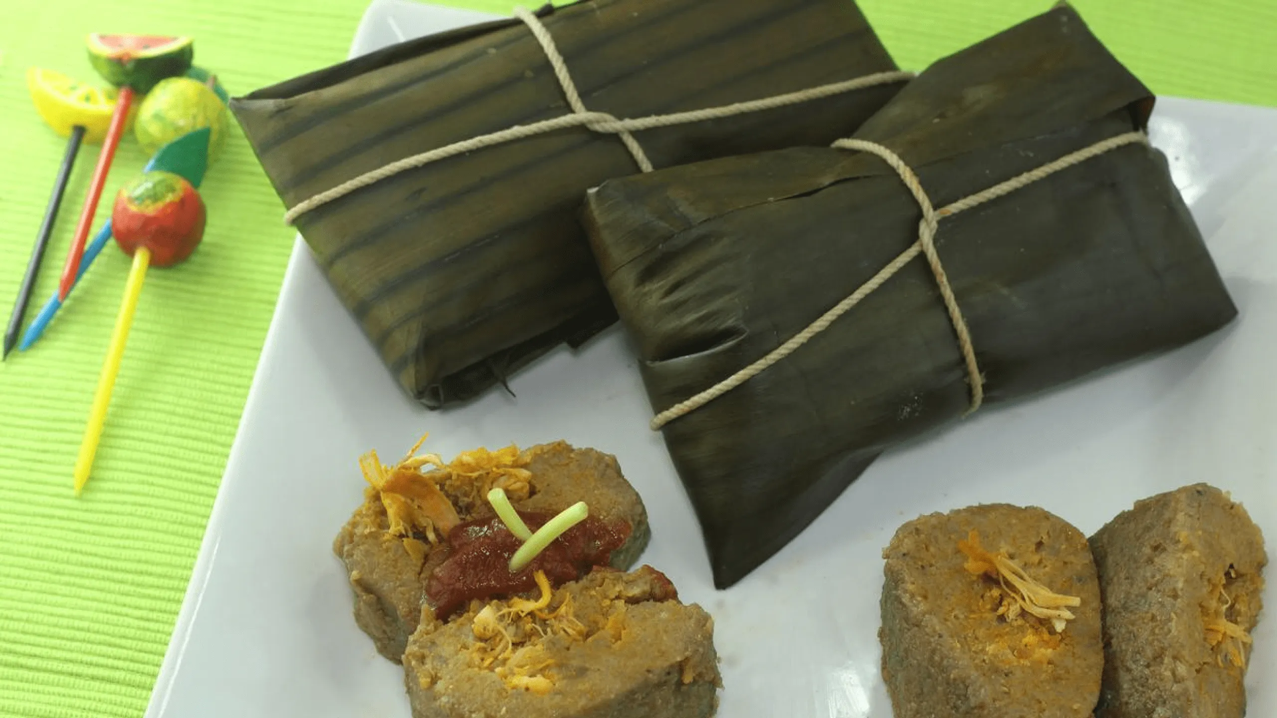
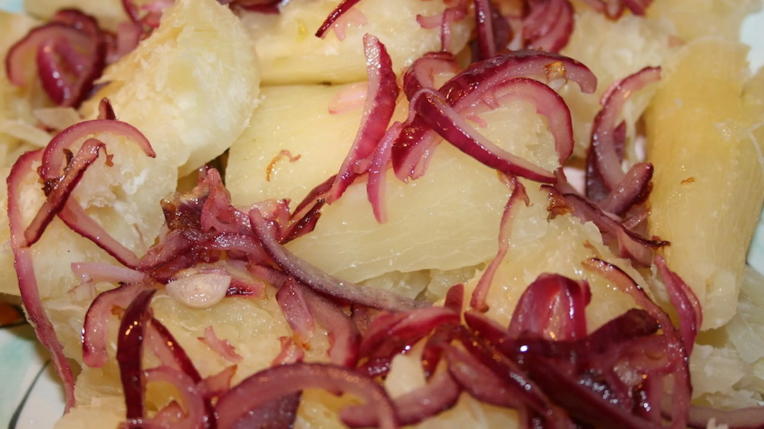
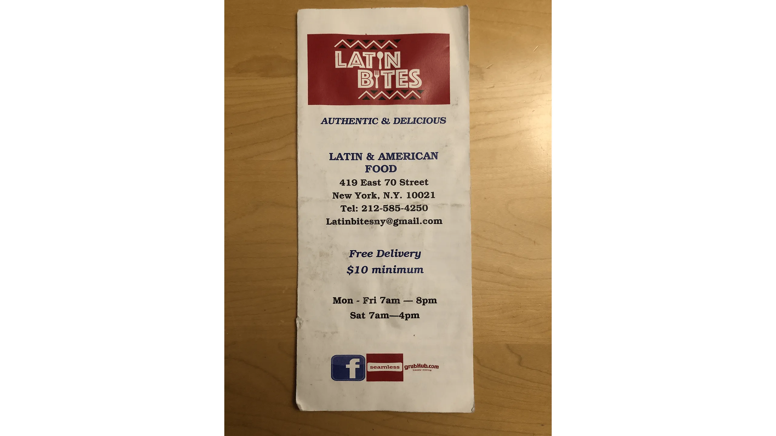
One day, I discovered Latin Bites, a local Latin American restaurant that instantly reminded me of those homemade meals. The flavor was authentic, the price was right, and the staff was warm and welcoming.

Screenshot of Latin Bites restaurant exterior.

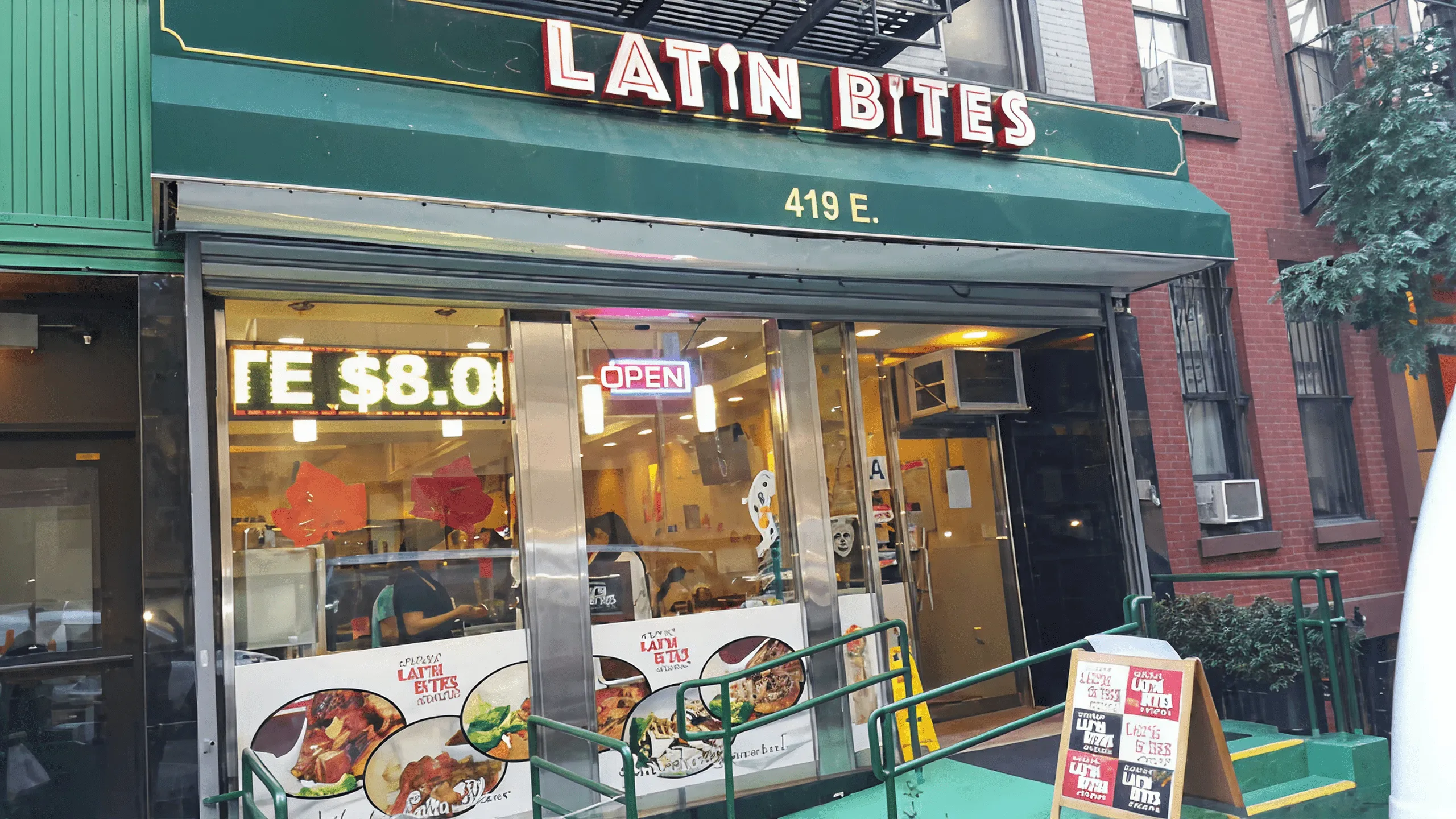
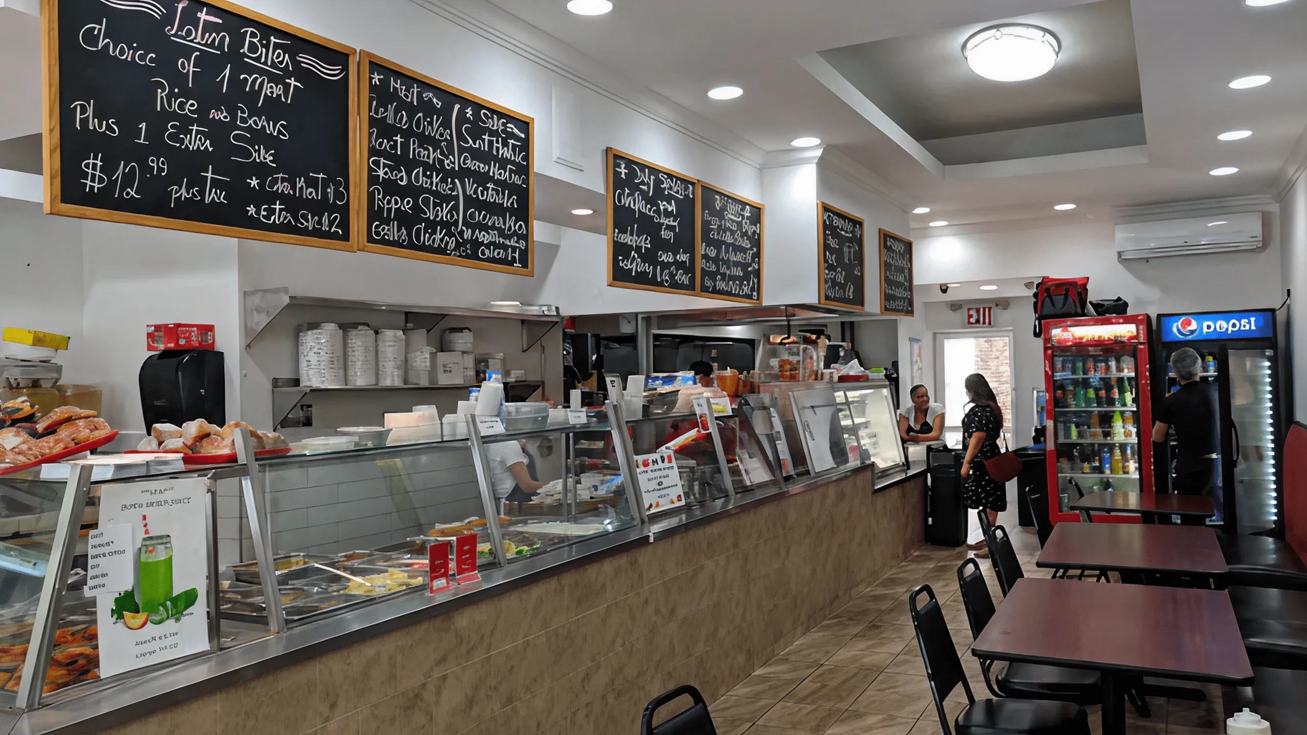
But despite loving the food, the experience of ordering from them was not so great. Clunky phone calls, long lines, and third-party apps like Yelp and Grubhub didn’t do the menu justice and was inconsistent and inconvenient.

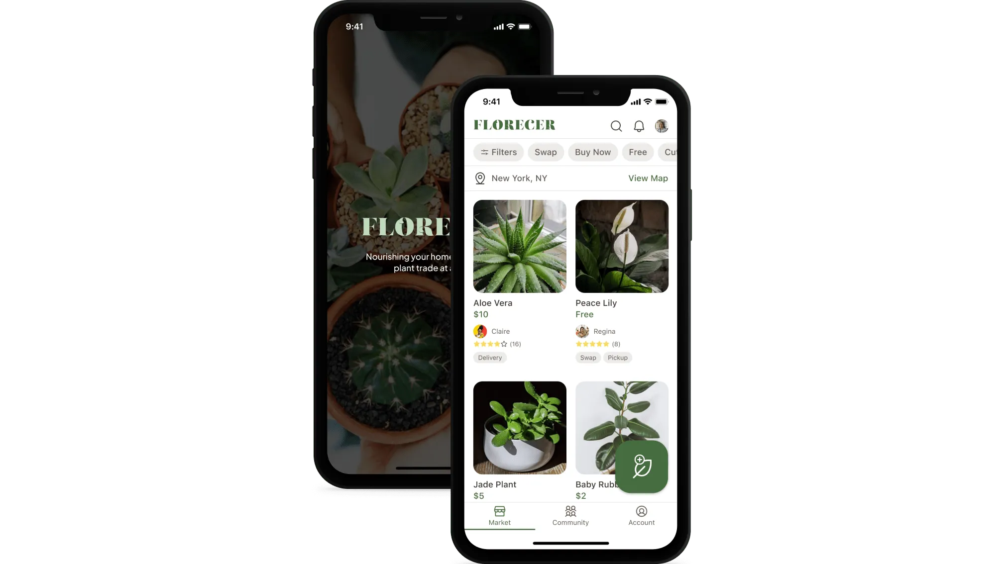
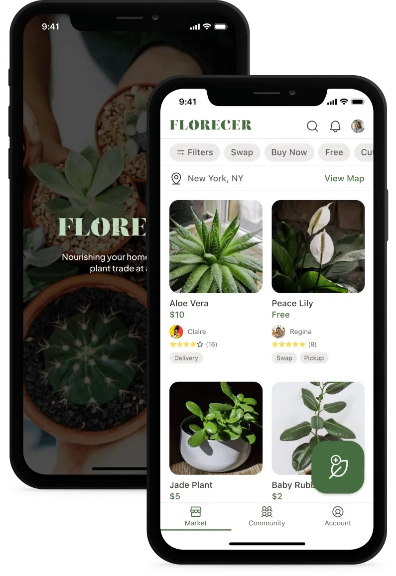
That disconnect inspired me to design a concept mobile app that reimagines the Latin Bites experience by making it more intuitive, visual, and joyful for people like me who love the food but want a better way to order it.

The Problem

Great food, frustrating experience

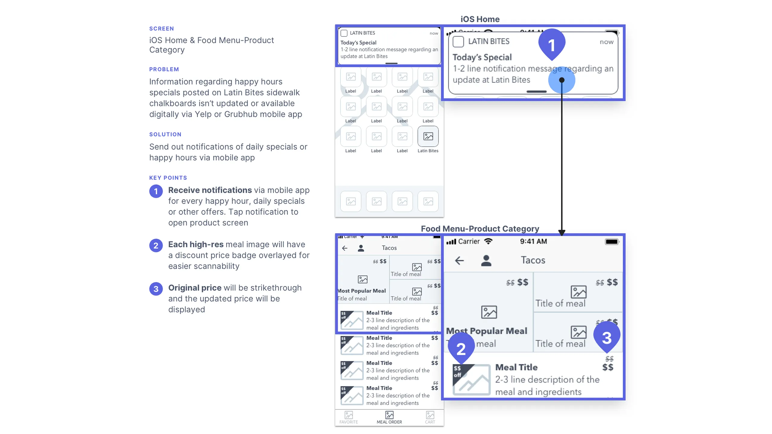
As I mentioned before, the current food ordering experience at Latin Bites feels bland and impersonal, often causing frustration and missing chances to connect with customers in a more engaging way.

Phone and in-person ordering

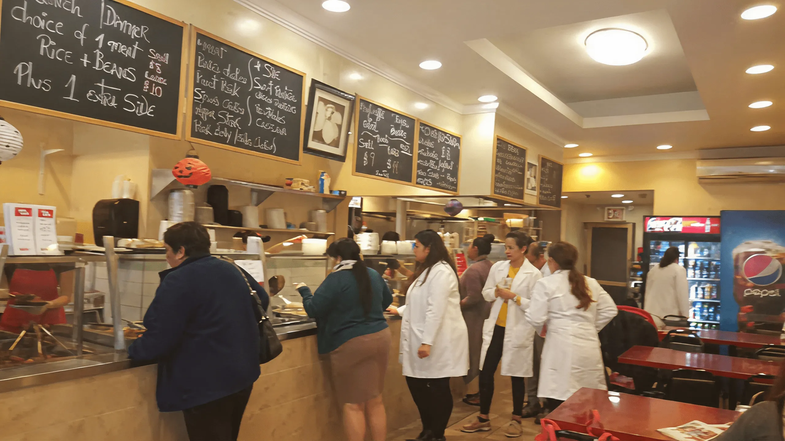
Ordering the traditional way was time-consuming and prone to miscommunication. Whether it was digging up the phone number, getting stuck on hold, or repeating customizations over the phone, the process was inefficient. Ordering in person was often even slower, with long lines and 10–15 minute waits during busy hours.

Yelp & Grubhub issues

Third-party apps were slightly more convenient, but not ideal:

  • Latin Bites didn’t always show up in search
  • Past orders were sometimes canceled
  • Menus lacked images, organization, and filtering
  • Custom meals and catering options weren’t available
  • Daily specials and happy hour offerings were missing
Screenshot of three Yelp app screens showing Latin Bites menu with annotated UI issues.
Screenshot of two Grubhub app screens showing Latin Bites menu with annotations.Screenshot of two Yelp app screens showing Latin Bites menu with scrolling issue highlighted.Screenshot of three Yelp app screens showing salad bar menu with usability issues annotated.Screenshot of two Yelp app screens showing beverage menu with no sizing options.Screenshot of a happy hour chalkboard and Yelp app screen with annotations.

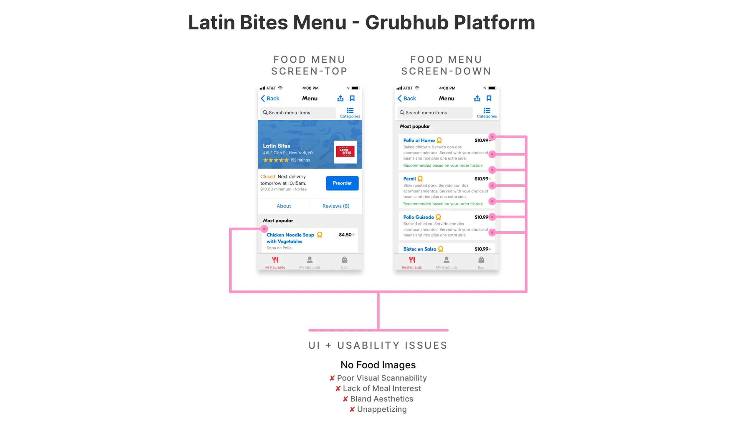
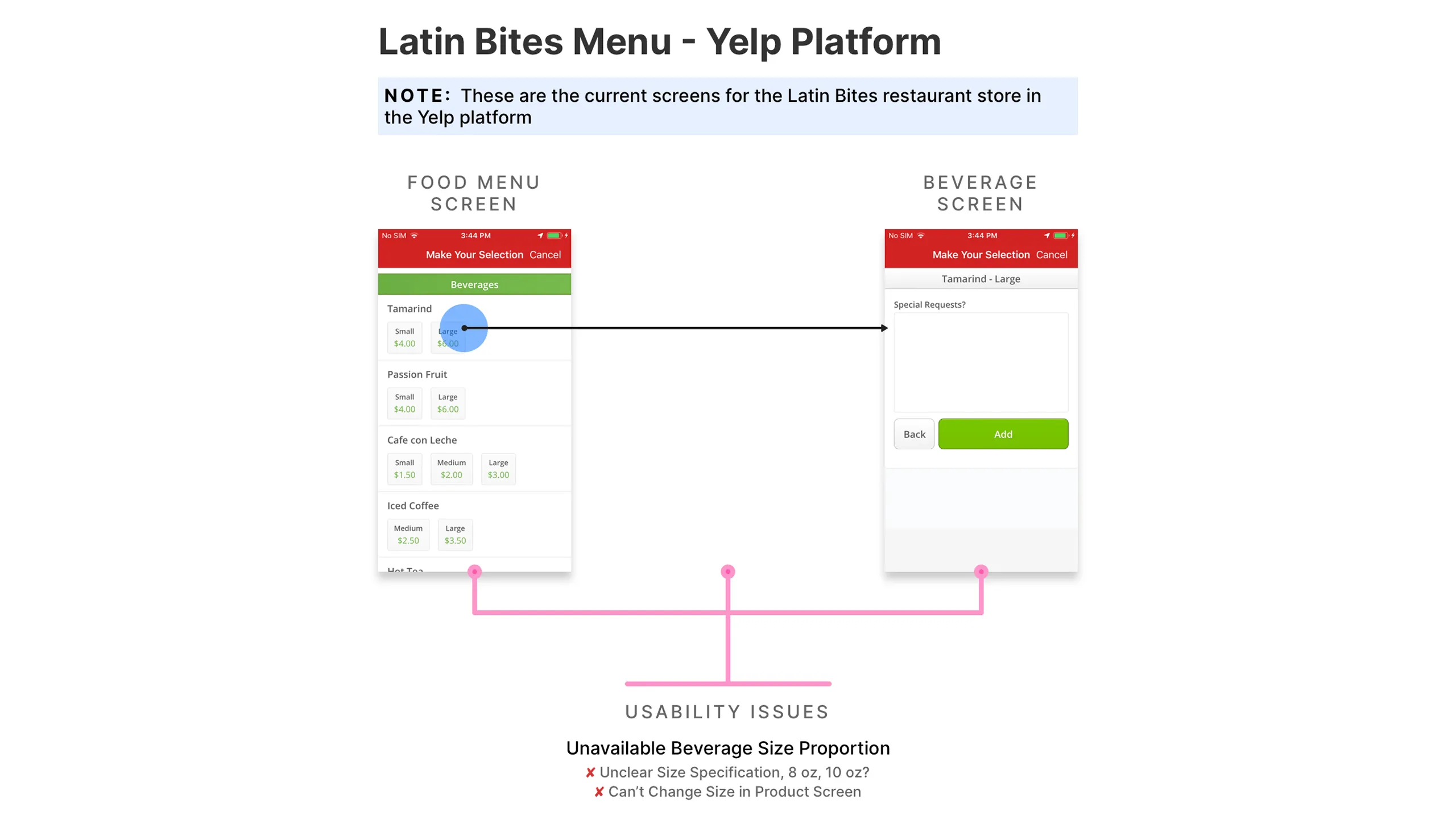
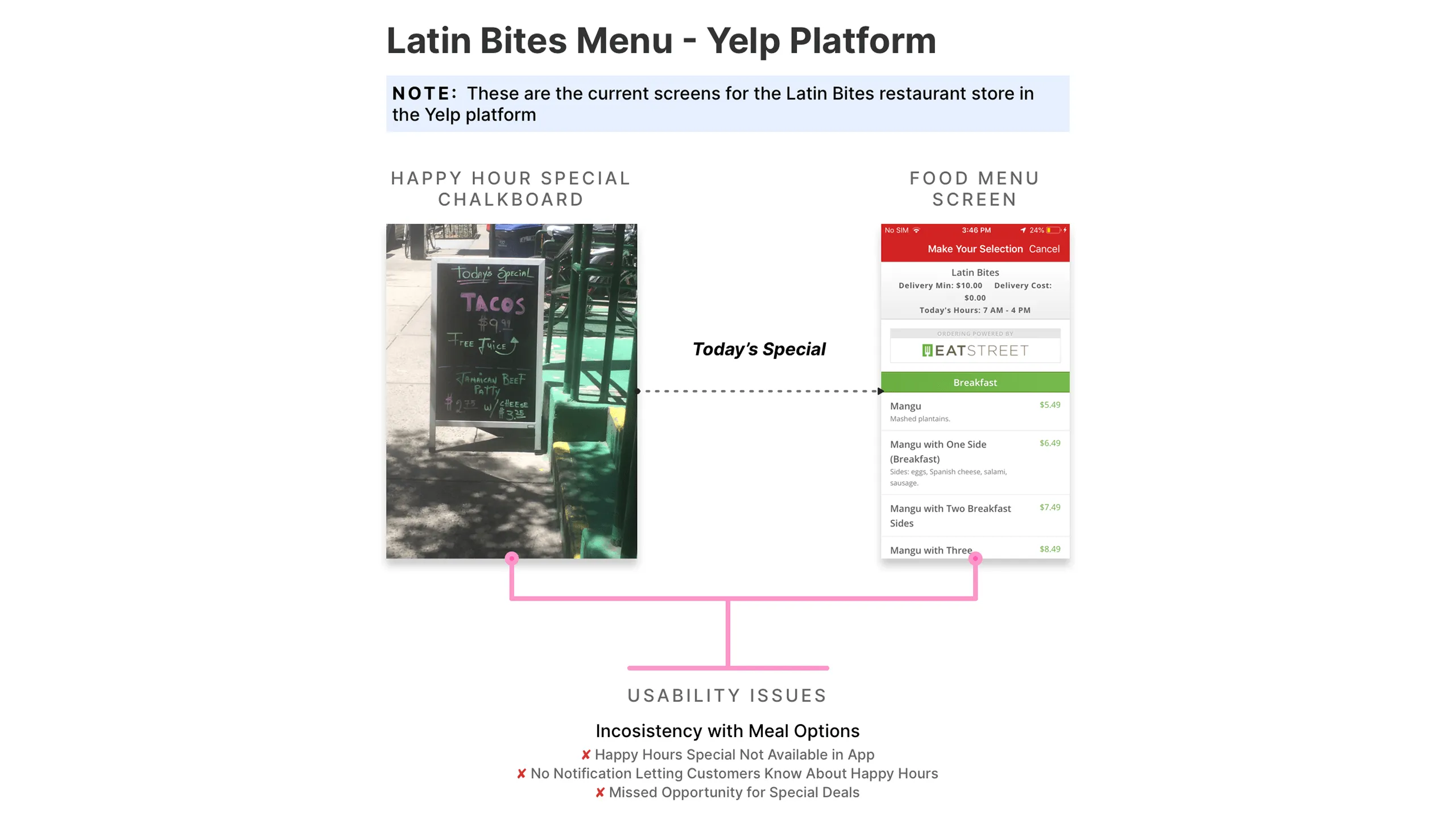
The apps weren’t tailored to the restaurant’s strengths or the needs of its customers.

Social features were lacking

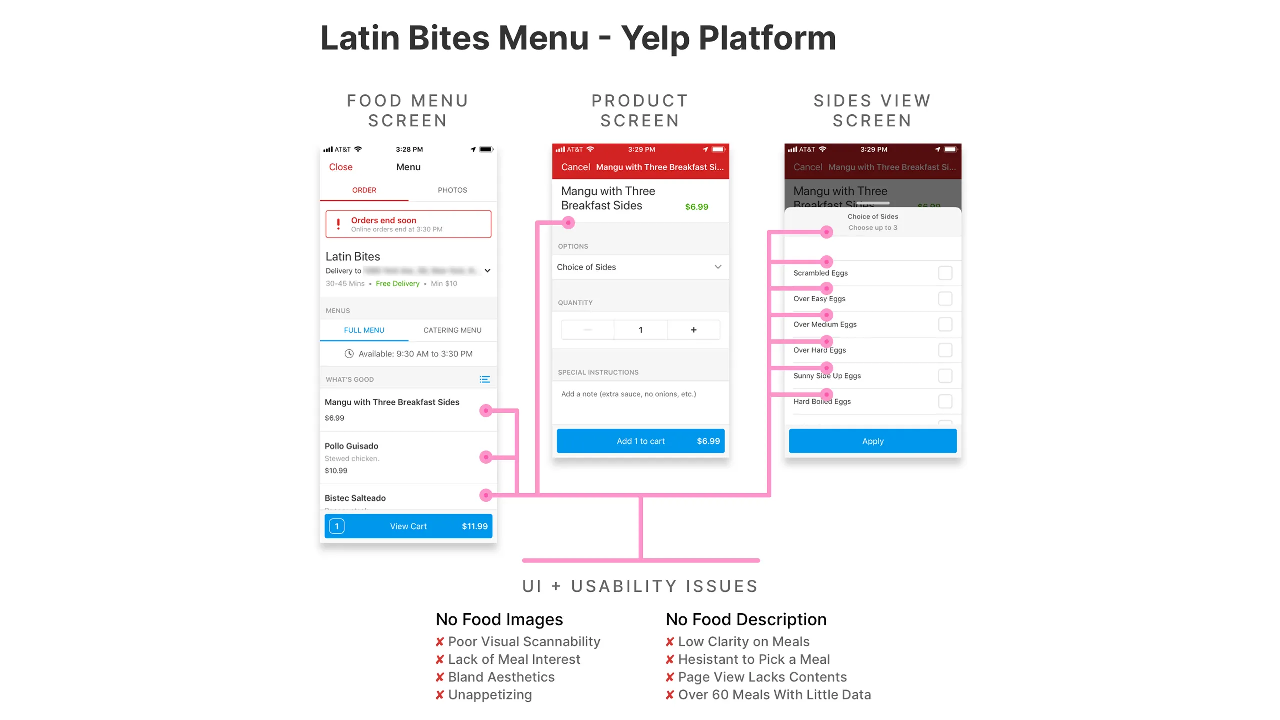
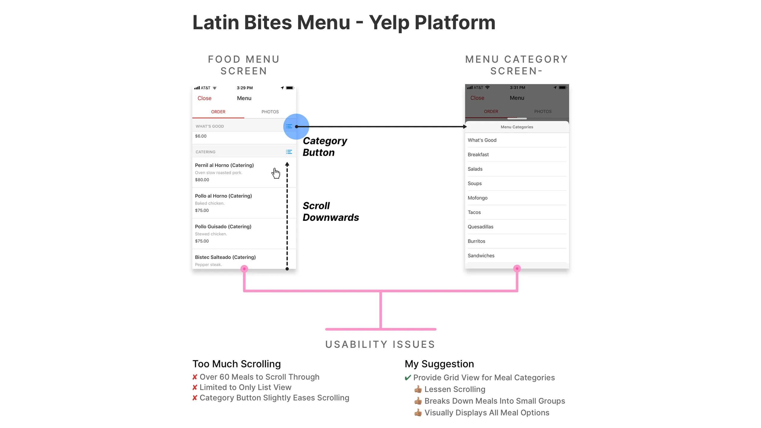
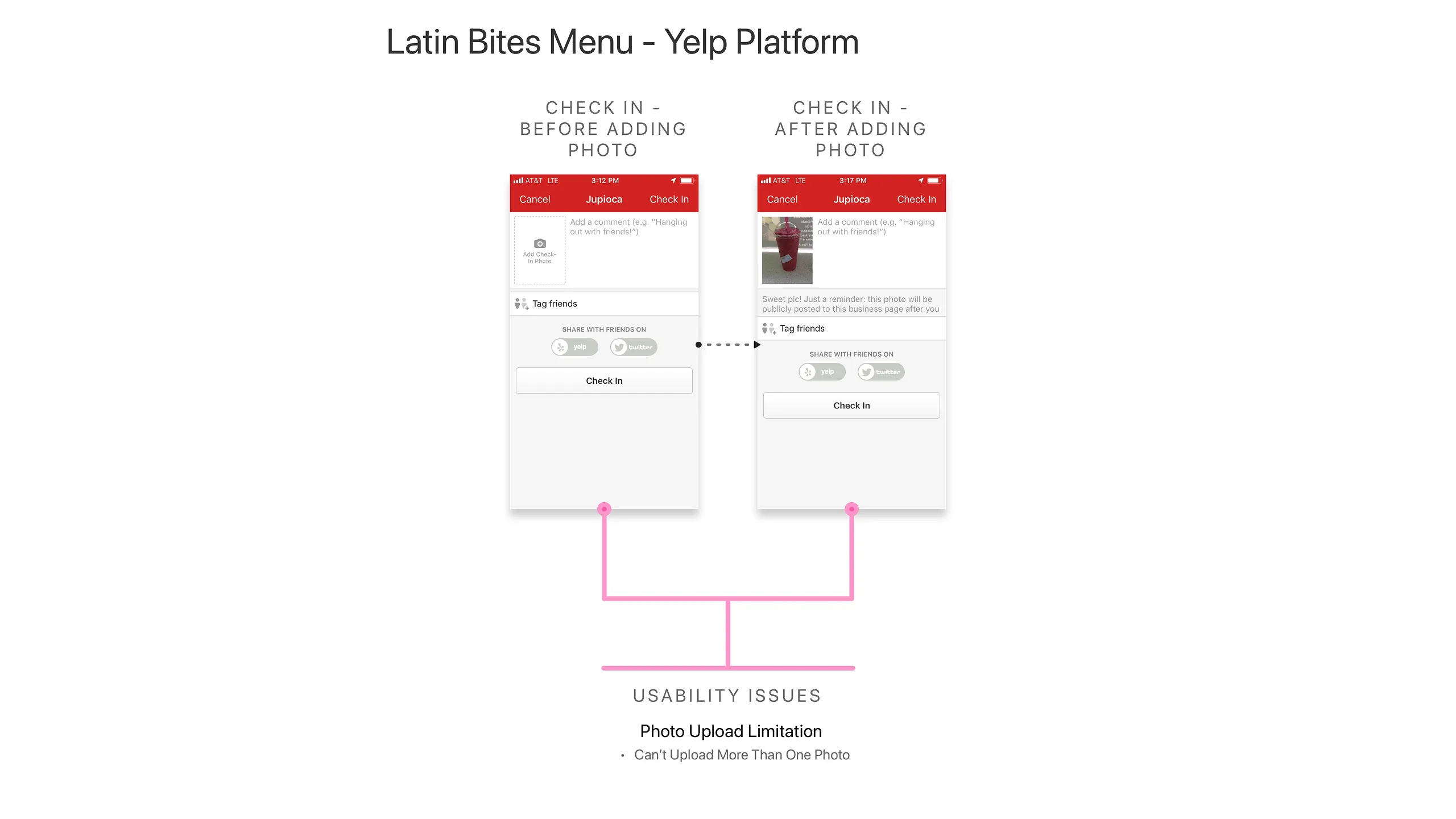
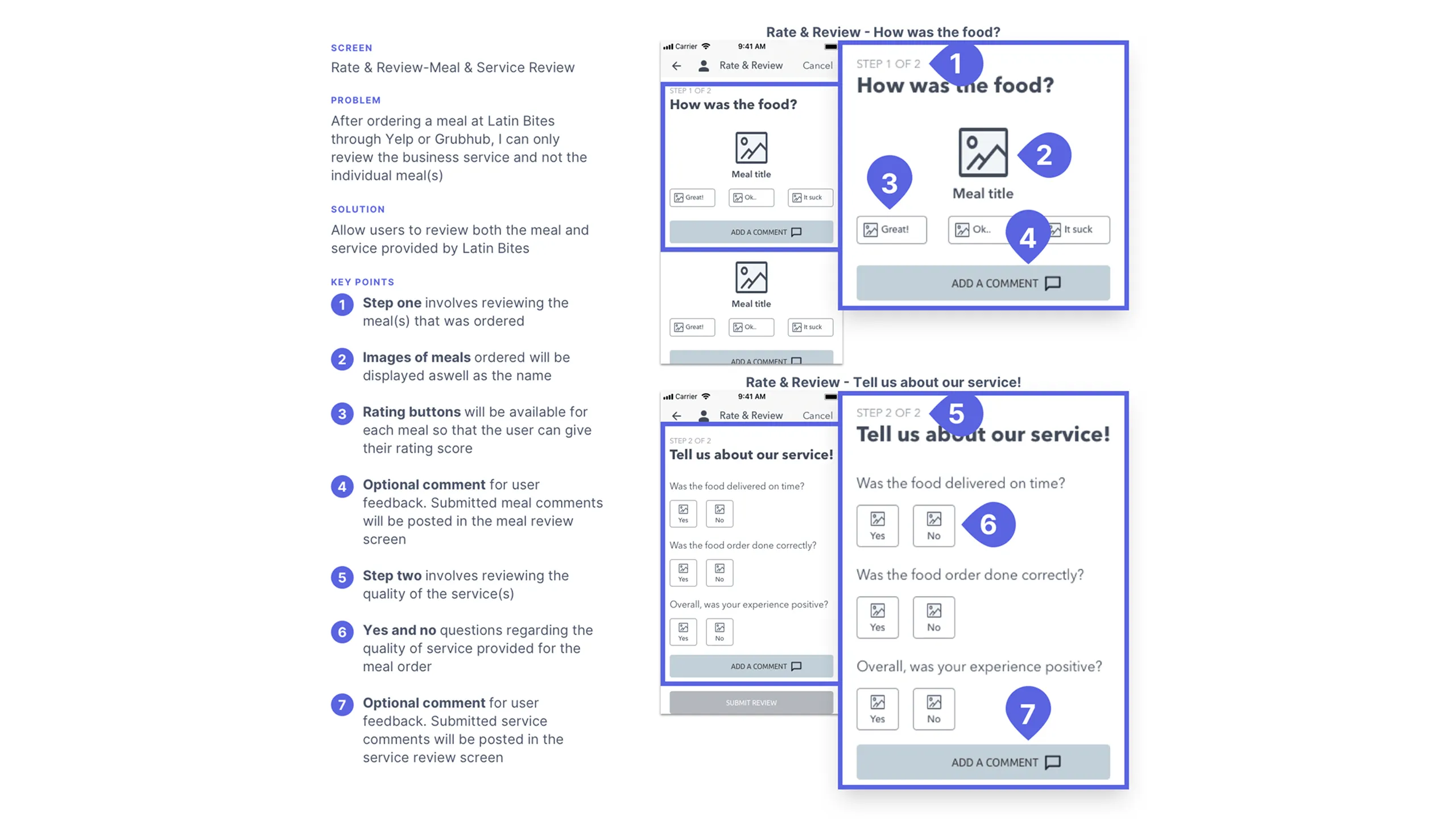
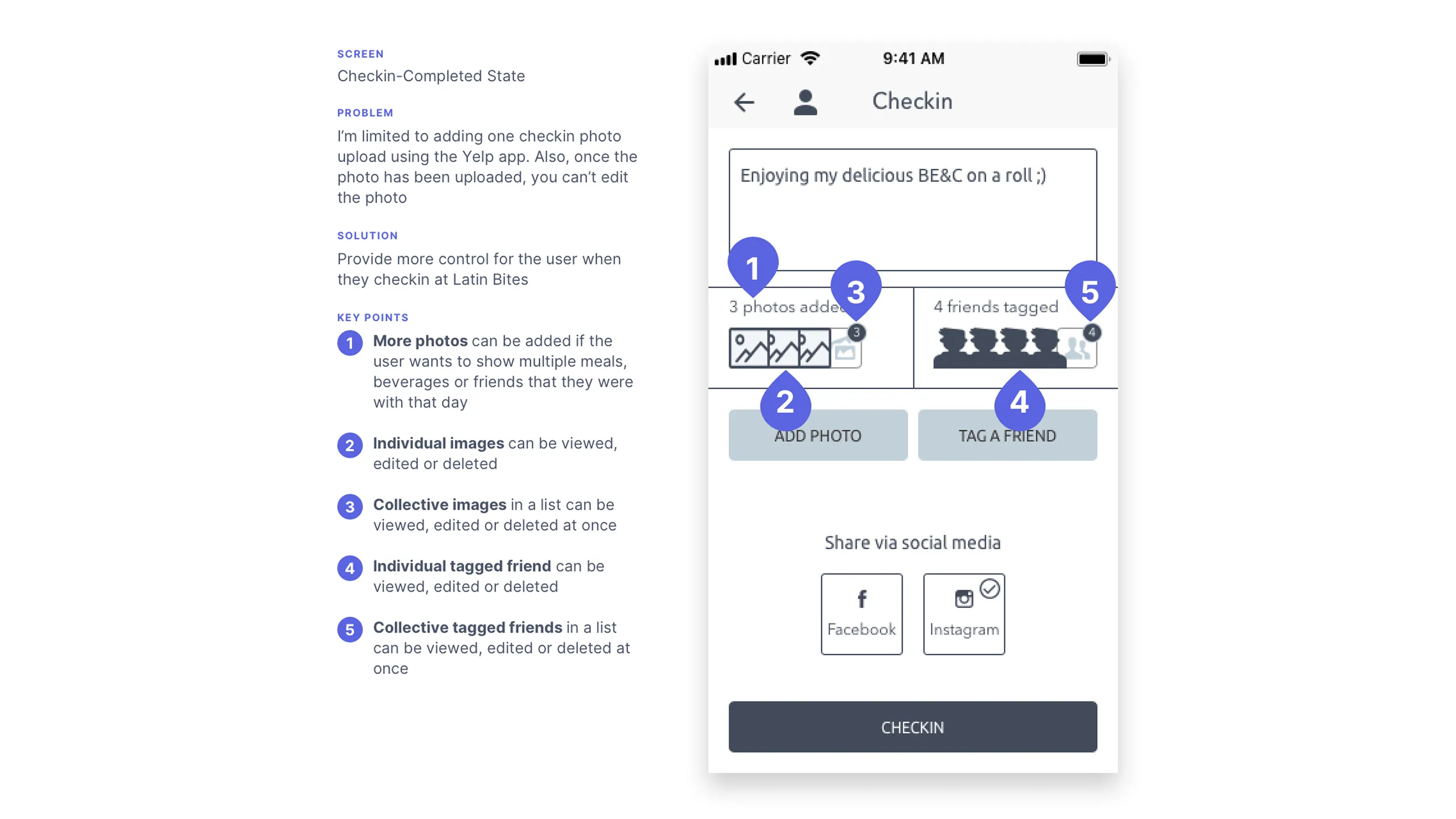
Yelp’s check-ins and reviews didn’t go far enough. You could only upload one photo, and the reviews weren’t tied to specific meals. It was hard to know which dishes were favorites or worth skipping.

Limited plant-based options

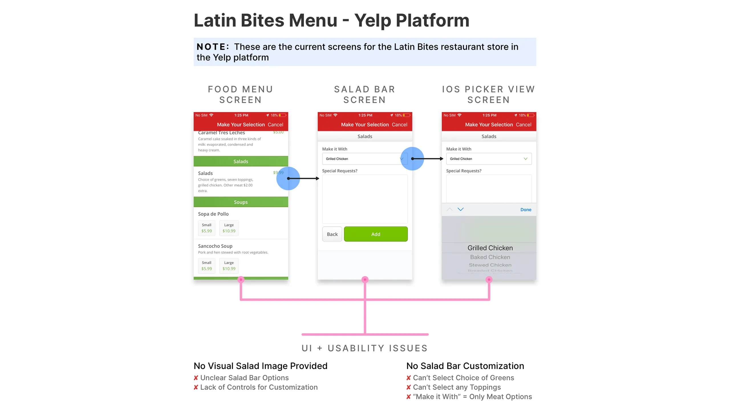
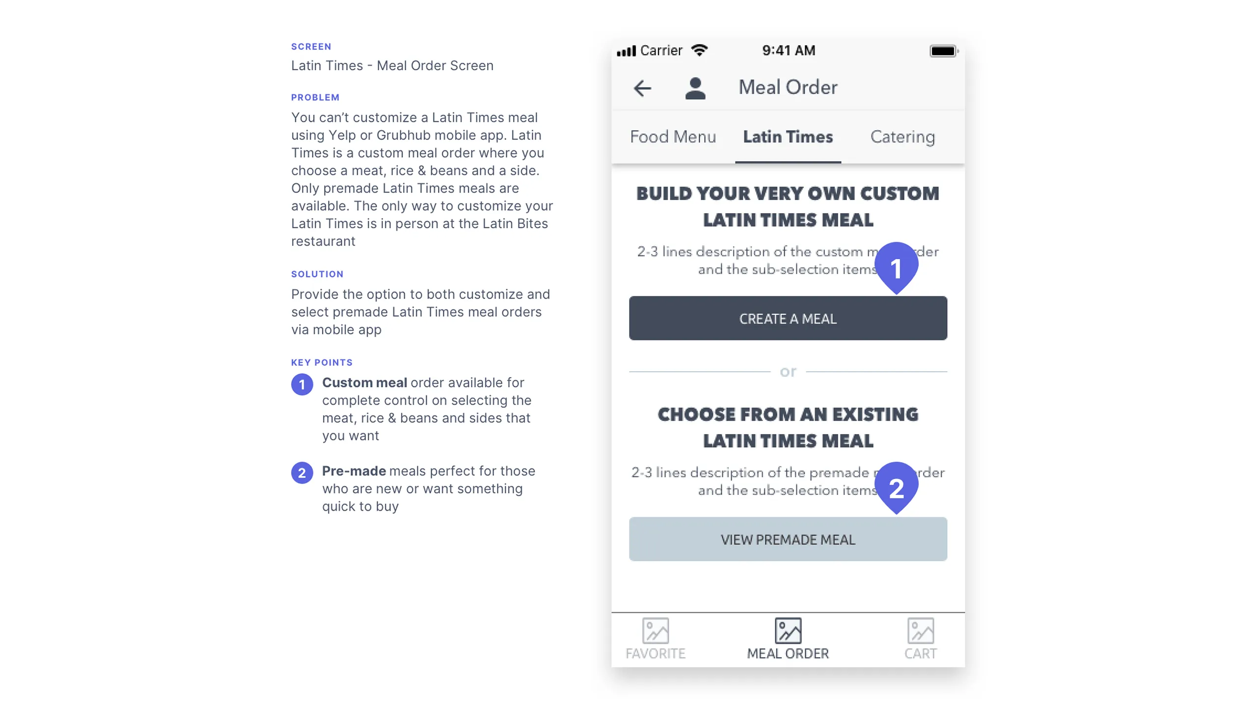
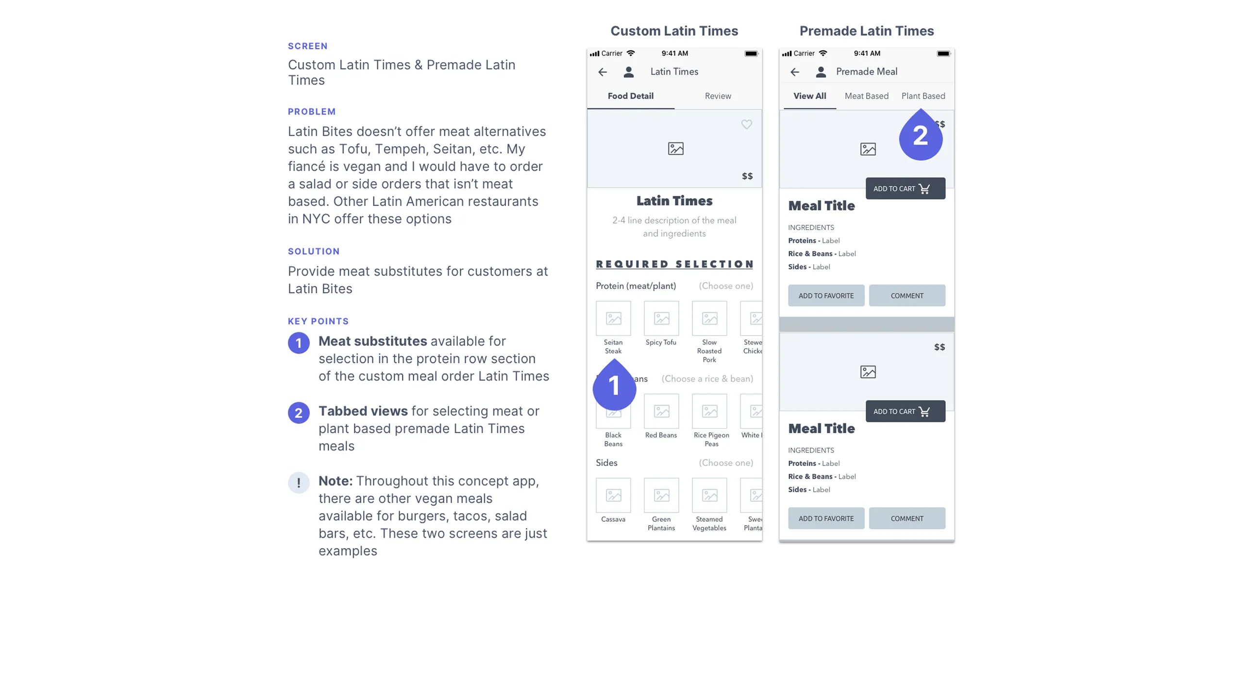
My fiancée at the time was vegan, and Latin Bites, like many traditional spots, didn’t offer many satisfying plant-based options. Other Latin restaurants in NYC have added tofu, lentils, or veggie protein substitutes. Latin Bites could easily expand here, especially with their proximity to hospitals and schools where plant-based eating is on the rise.

Screenshot of NYP blog page featuring the Meatless Monday Initiative article.

The Solution

Design a better mobile user experience

The goal was simple: Create a visually engaging mobile app that makes ordering from Latin Bites easier and more enjoyable.

The concept app would allow users to do the following actions:

  • Visually browse meals with rich imagery and helpful descriptions
  • Create and customize meals, including meat, vegetarian, and vegan options
  • Place orders for takeout or delivery
  • Access exclusive features like meal reviews, loyalty rewards, catering, and daily deals

In short, the app elevates the ordering experience while staying true to what makes Latin Bites special.

Key Task Requirements

As a user, I should be able to...

To translate the solution into actionable product features, I outlined the core user tasks and needs:

  • Browse and scan the full menu visually
  • Filter and jump between food categories
  • See images and descriptions for each item
  • Place orders for food and drinks
  • Select drink and side sizes
  • Choose multiple payment options at checkout
  • Choose takeout or delivery
  • Reorder from previous meals
  • Create custom meals (e.g., “Latin Time” and salad bar)
  • Select vegetarian or vegan options
  • Place catering orders
  • Track current orders in real time
  • Favorite meals for quick access
  • Get notifications for daily specials and happy hours
  • Create a user profile
  • Rate and review meals and service
  • View community meal reviews and ratings
  • Leave detailed feedback
  • Check in and view order history
  • Earn and track loyalty rewards

With a robust set of user goals defined, I began the next stage: research and planning.

Design Planning & Research

Good design starts with clear vision

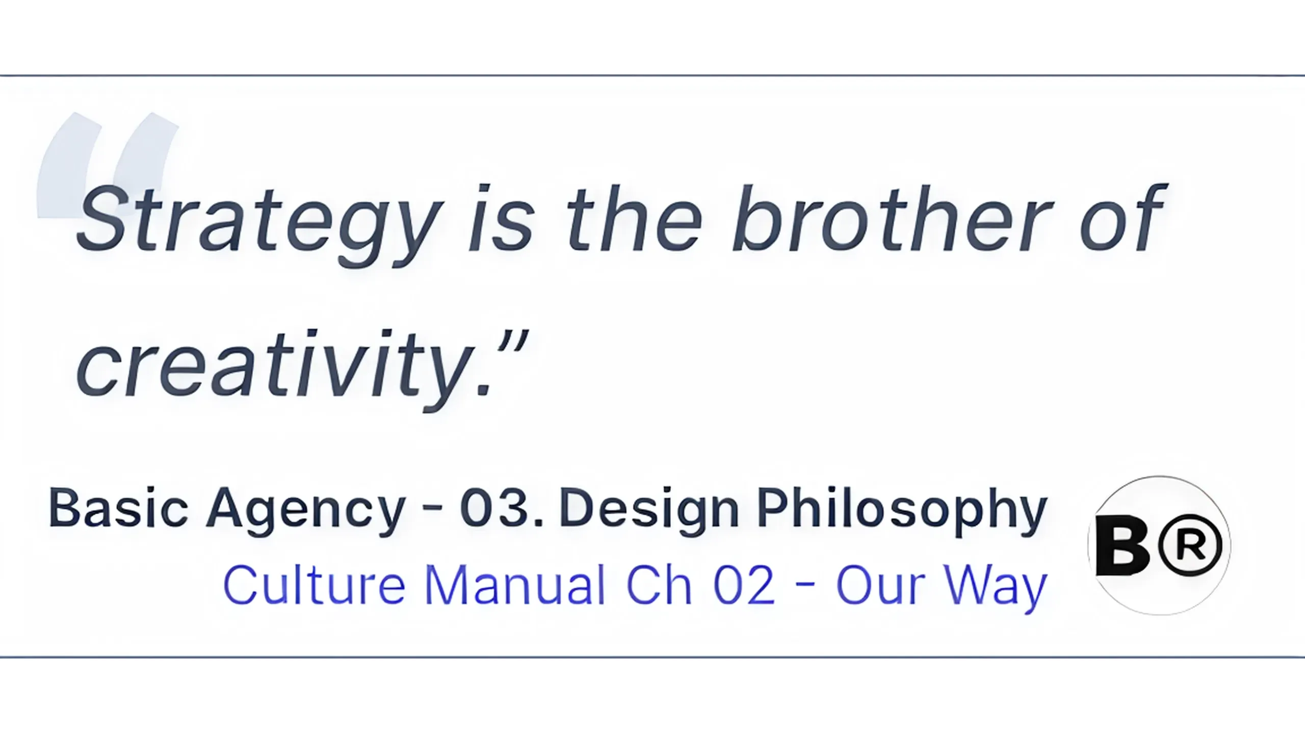
Before diving into visuals, I built a solid design strategy rooted in inspiration, structure, and user flow clarity. I was inspired by a quote from a design agency called BASIC and they said that Strategy is the brother of creativity.

Never start with a blank canvas

One of the biggest lessons from early in my design career: don’t design in isolation. Starting from scratch wastes time and stalls creativity. Instead, I compiled a digital moodboard in Sketch that included the following:

  • UI inspiration and visual themes
  • Competitor task flows
  • Color palettes and food imagery
  • Typography references
  • Flat icon sets and UI components
  • Best practices and UX patterns
Screenshot of Latin Bites logo in various formats including banners, menu, and store signage.
Screenshot of colorful food icons in linear-color style from Flaticon.Screenshot of eBay filters screen and iOS Health app UI.Screenshot of Font Awesome icons for UI elements.Screenshot of three UI screens with food menu grid layouts.Screenshot of two screens with trending specials UI designs.Screenshot of food images and descriptions in engaging UI layouts.Screenshot of three UI screens with navigation tabs.Screenshot of nested tab navigation UI examples.Screenshot of McDonald’s and Chipotle card-style UIs.Screenshot of product detail pages from Starbucks and a food UI design.Screenshot of delivery/takeout order placement UIs.Screenshot of ingredient customization UI with sliders and icons.Screenshot of onboarding UI designs with hero images and sliders.Screenshot of rewards point system UIs.Screenshot of secondary navigation UI with hamburger menu examples.Screenshot of profile and comments UI with user photos and CTAs.

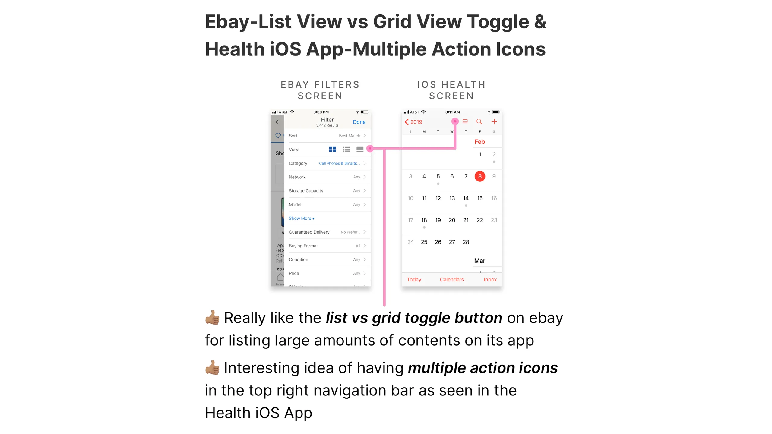
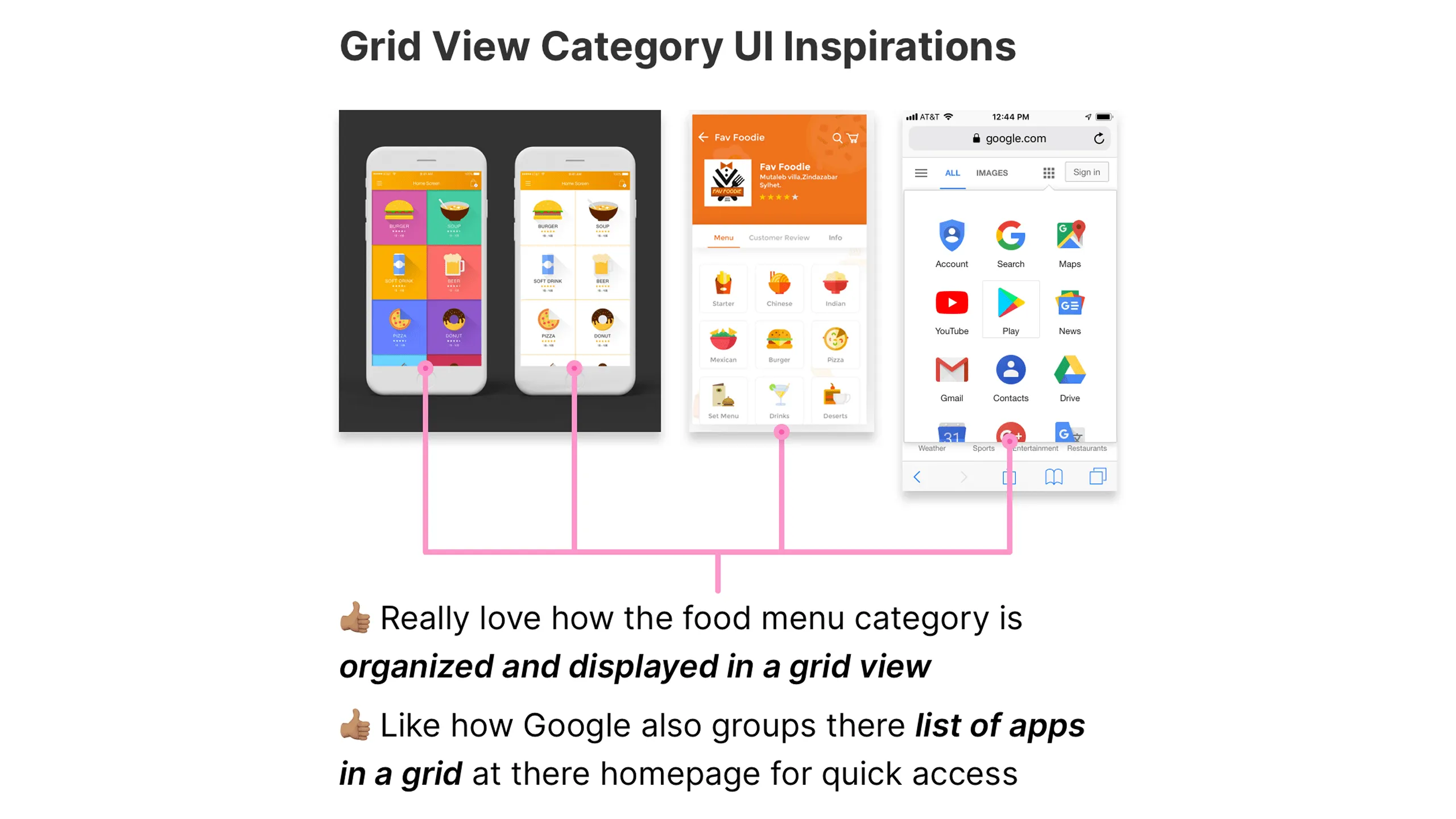
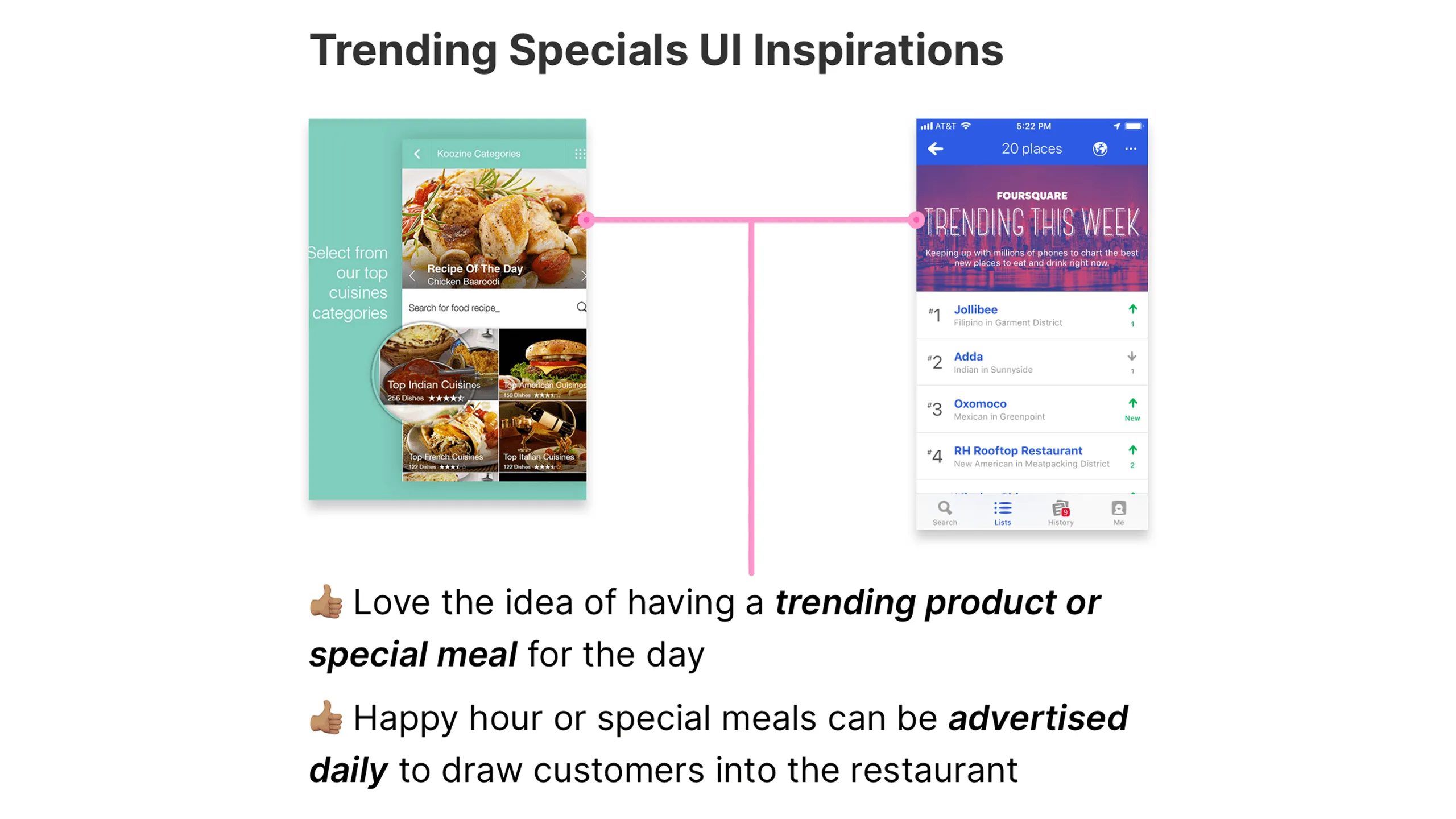
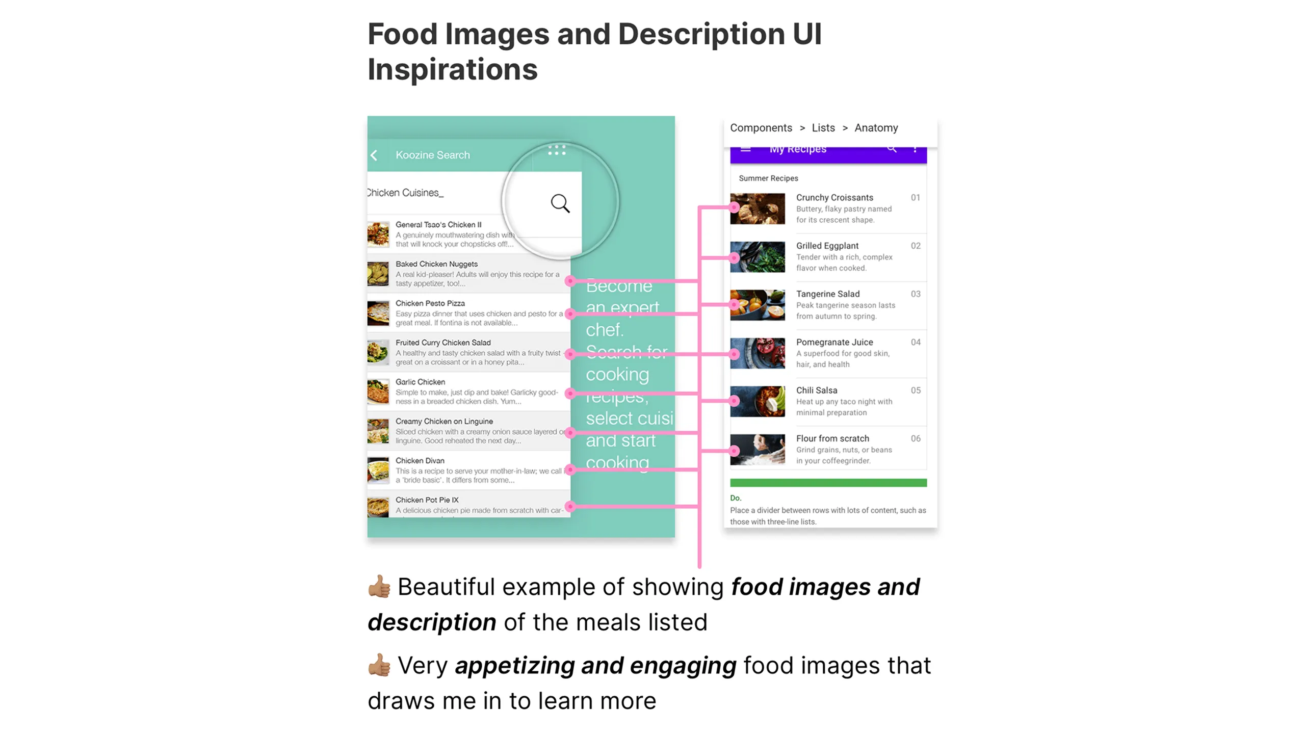
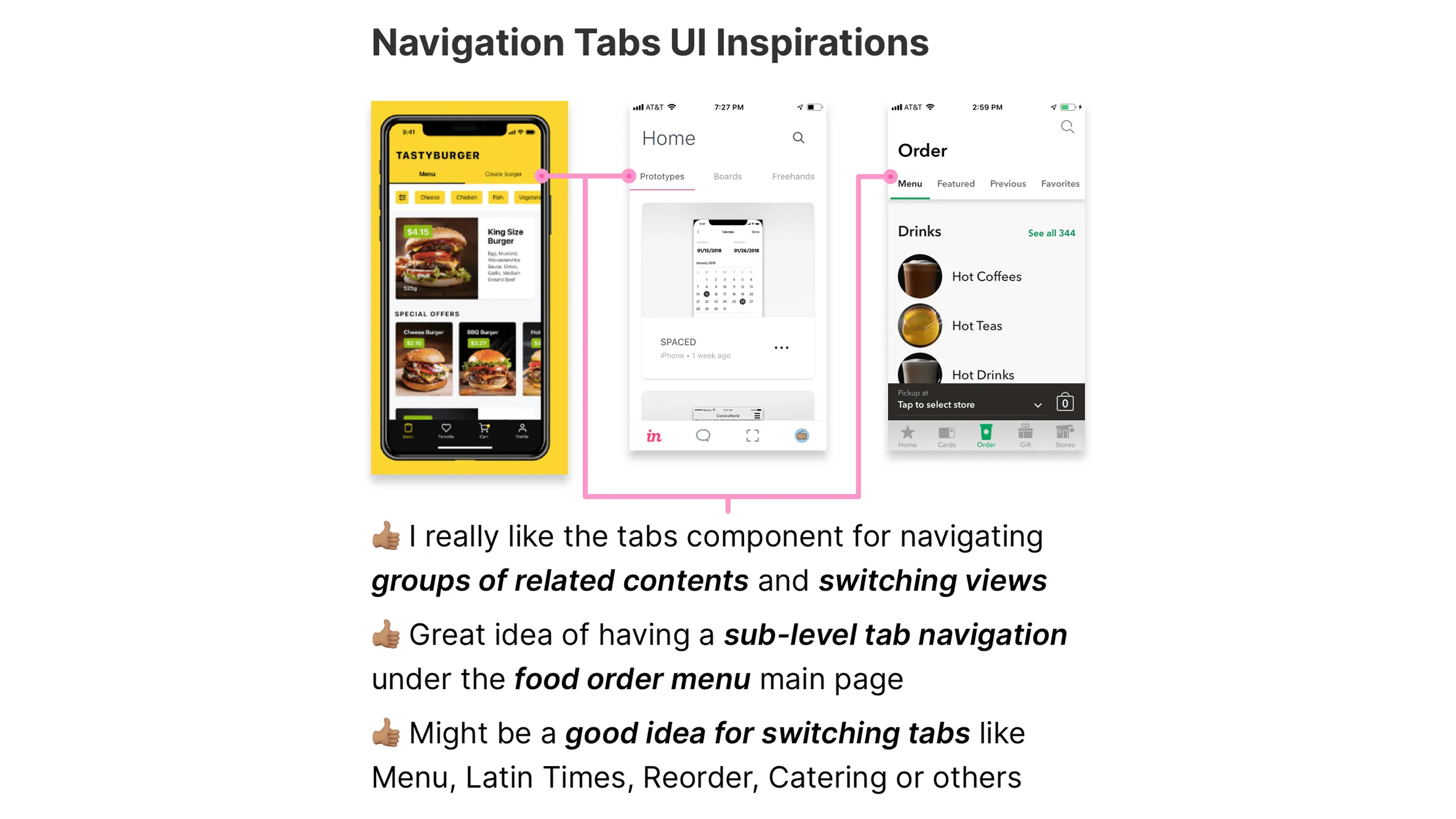
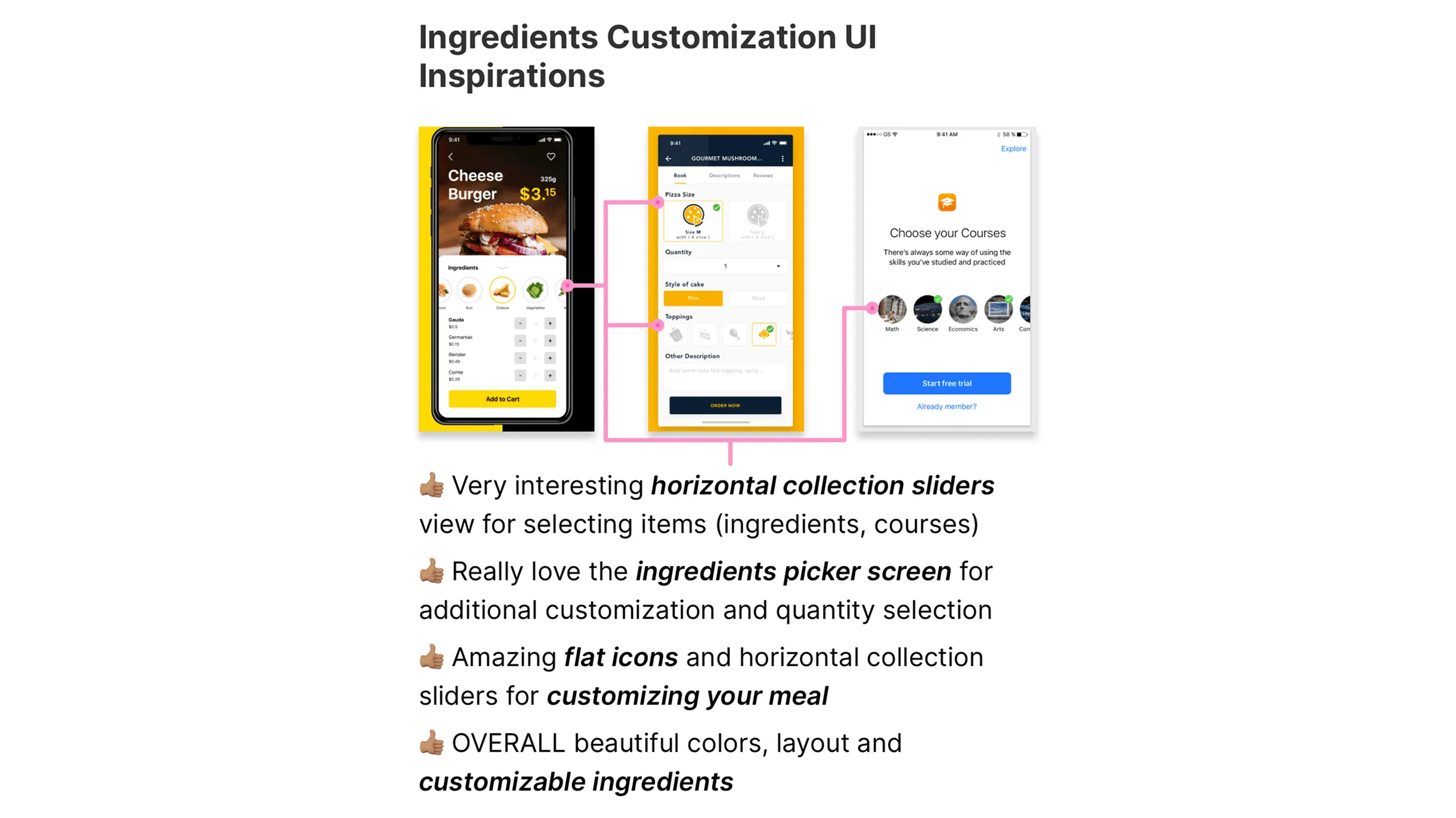
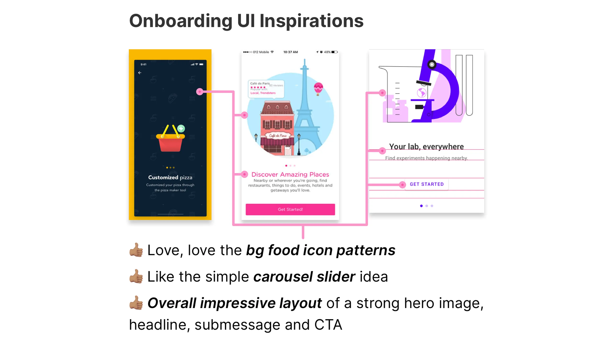
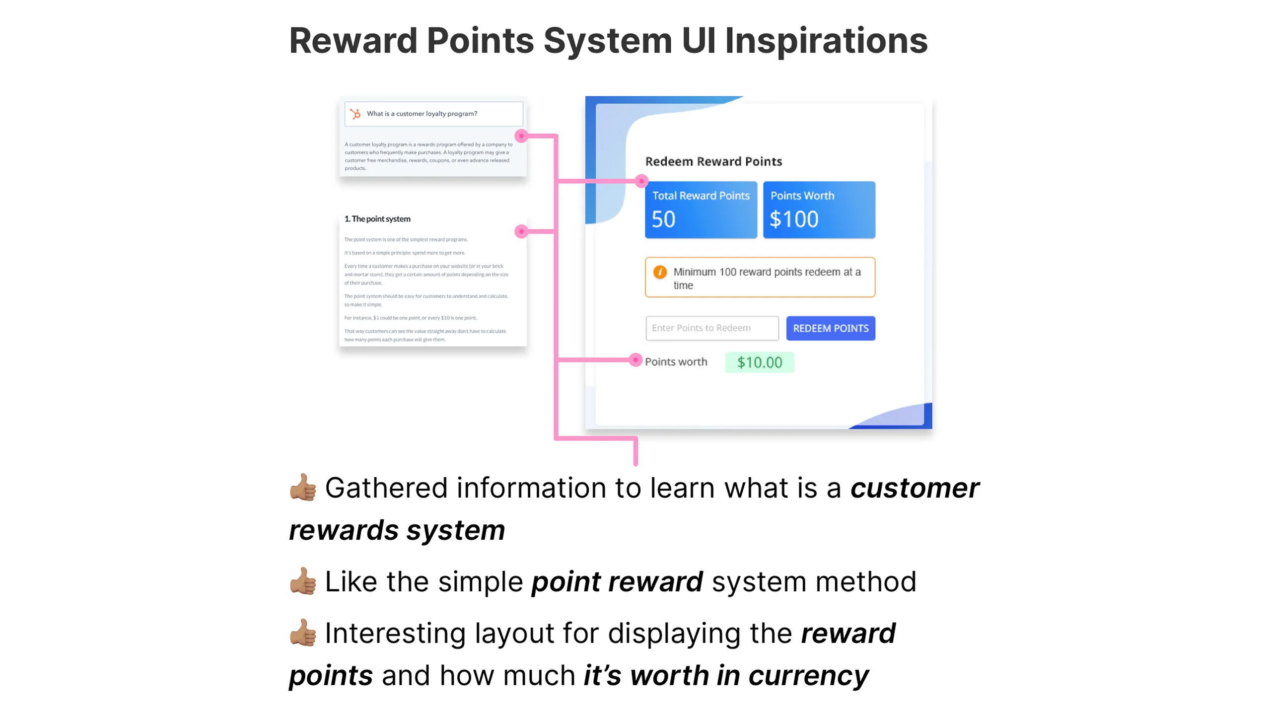
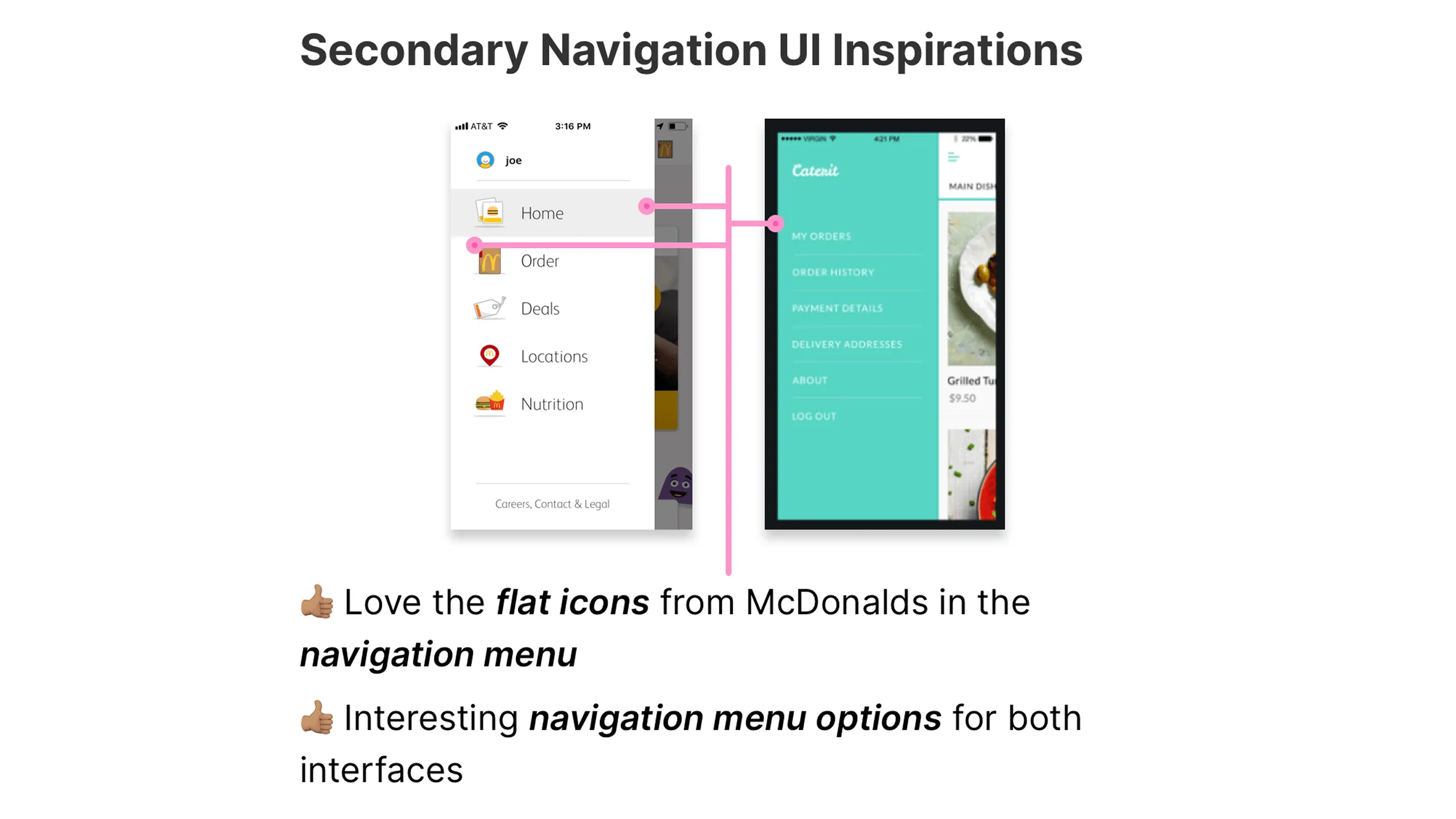
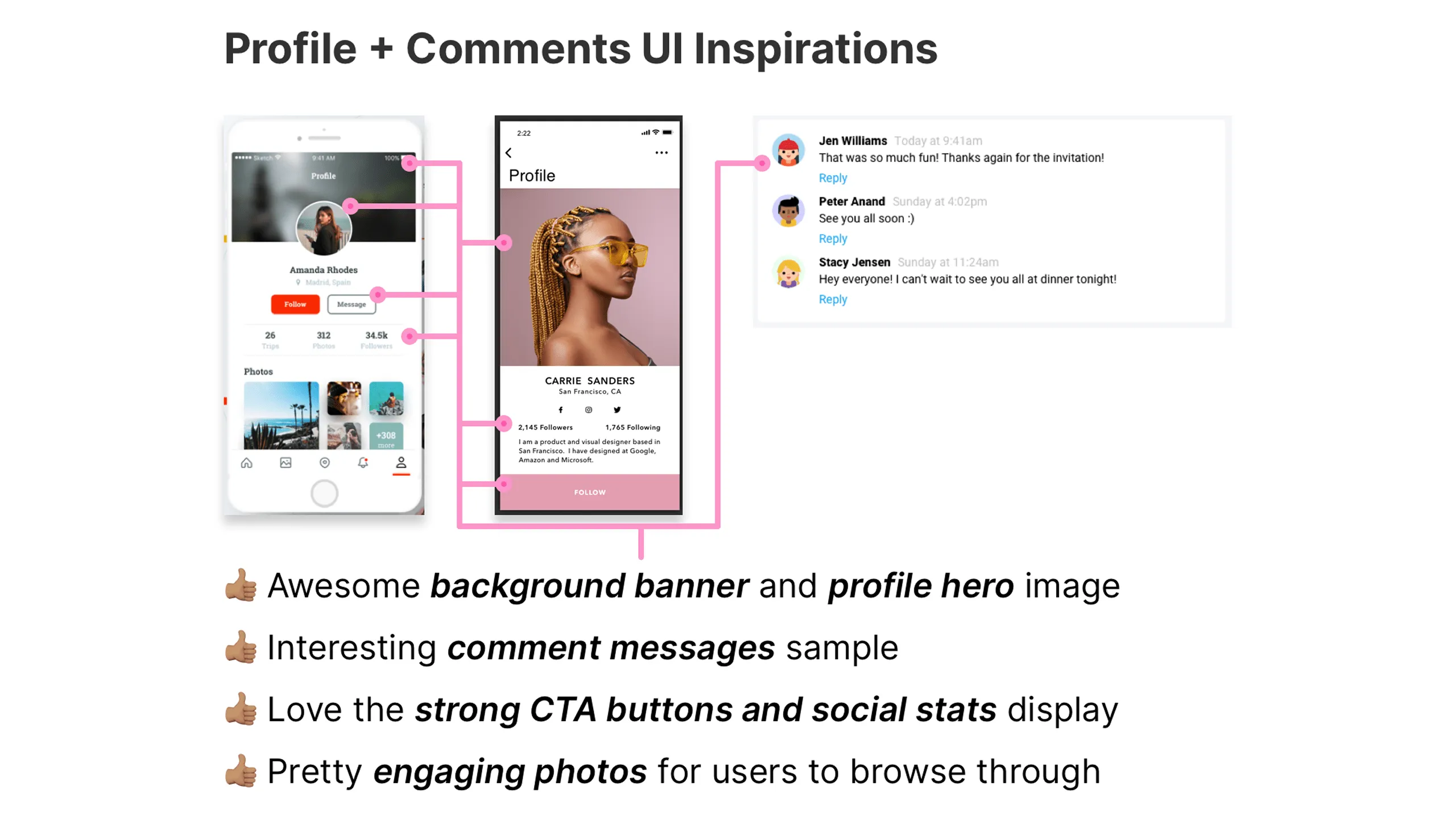
This gave me a solid foundation to build from and defined the personality of the Latin Bites app.

Early Ideation

Sketching ideas on paper

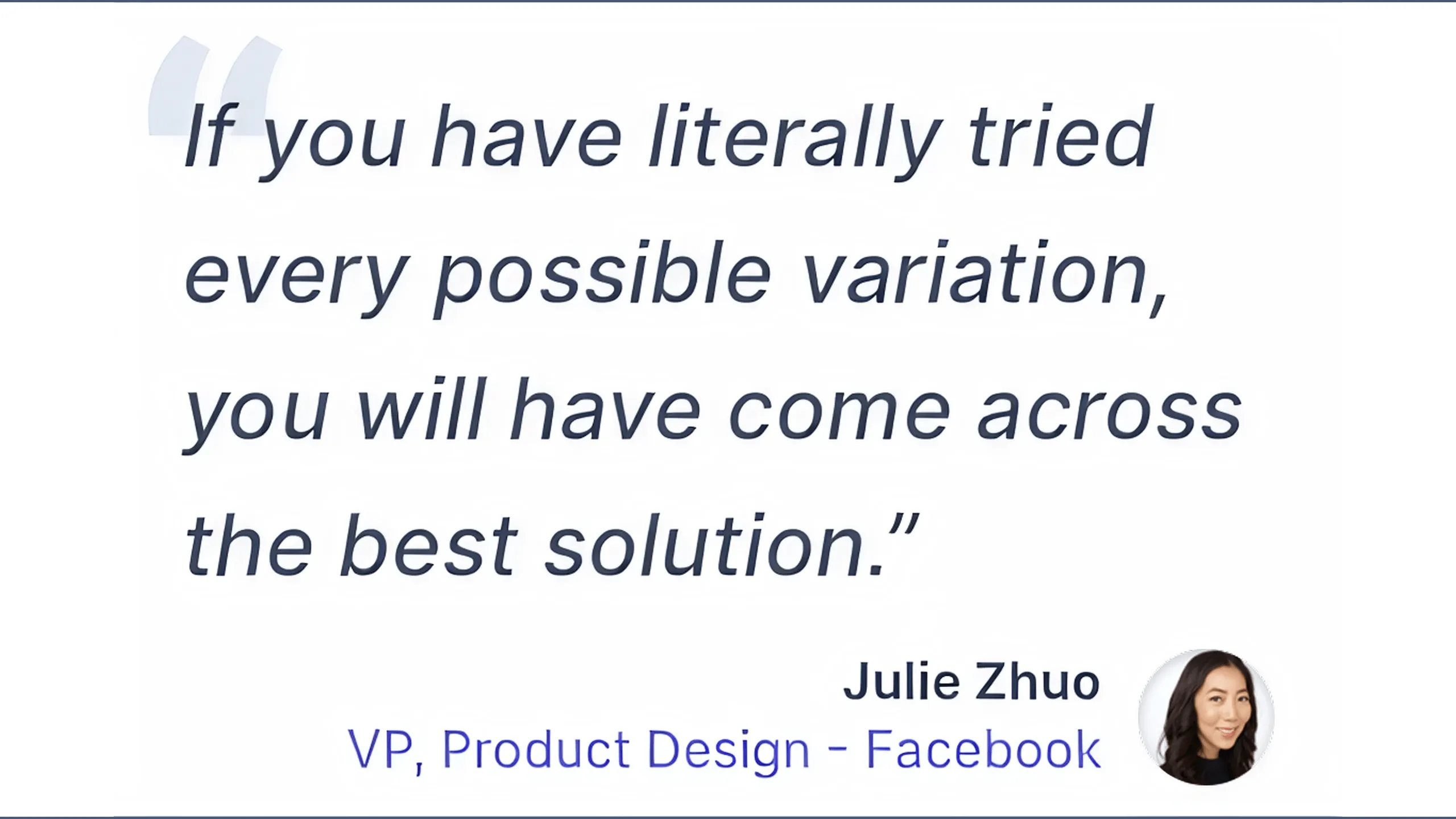
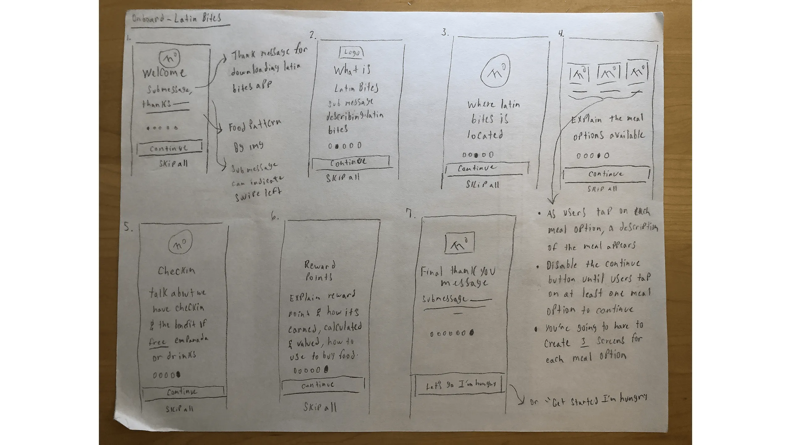
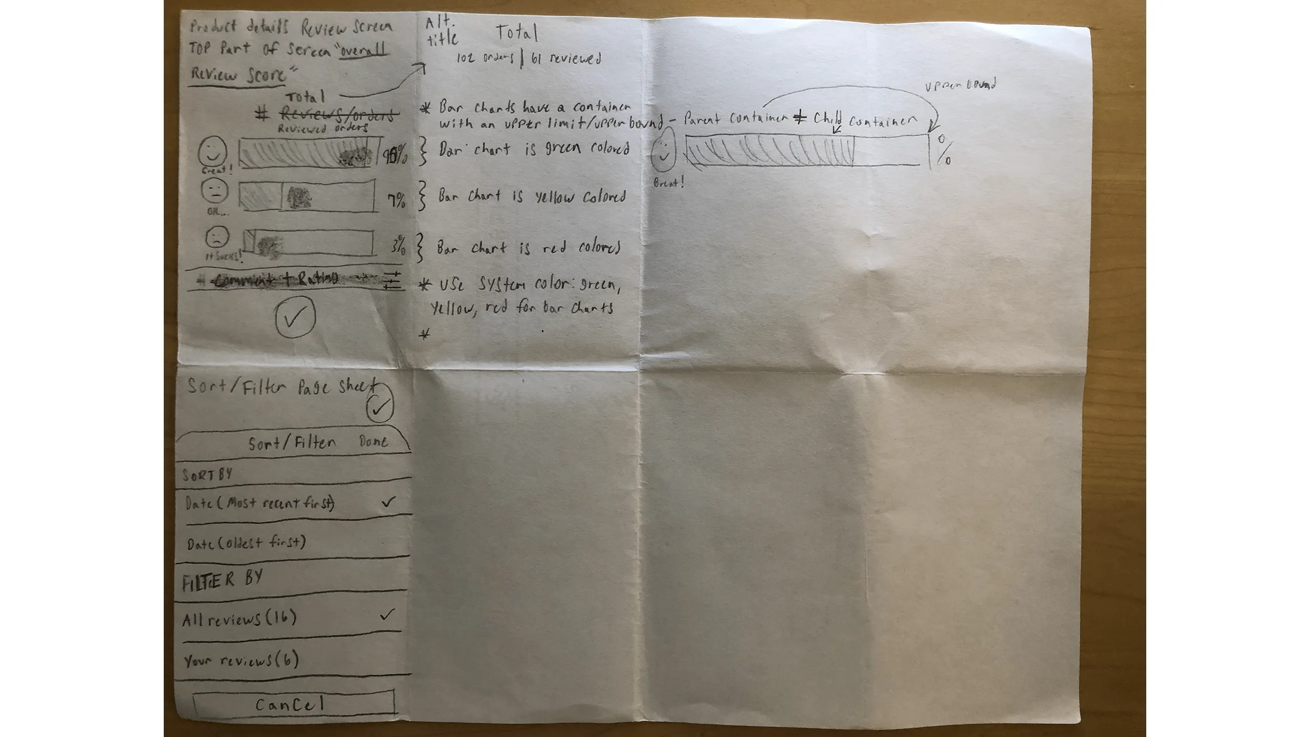
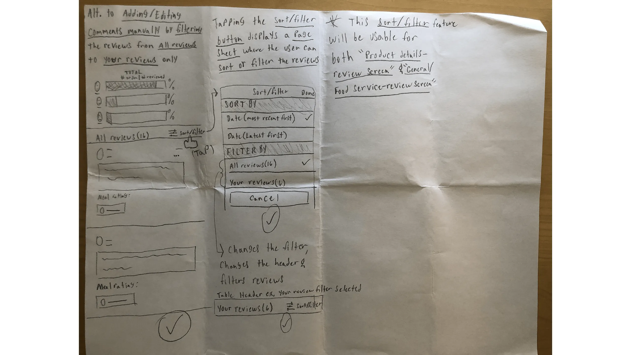
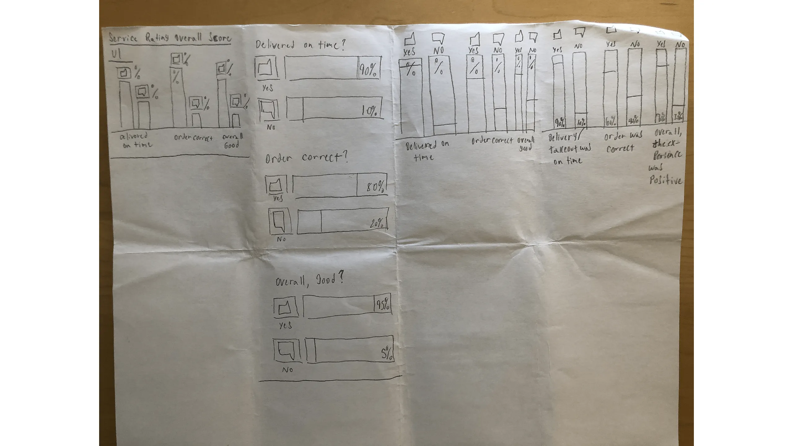
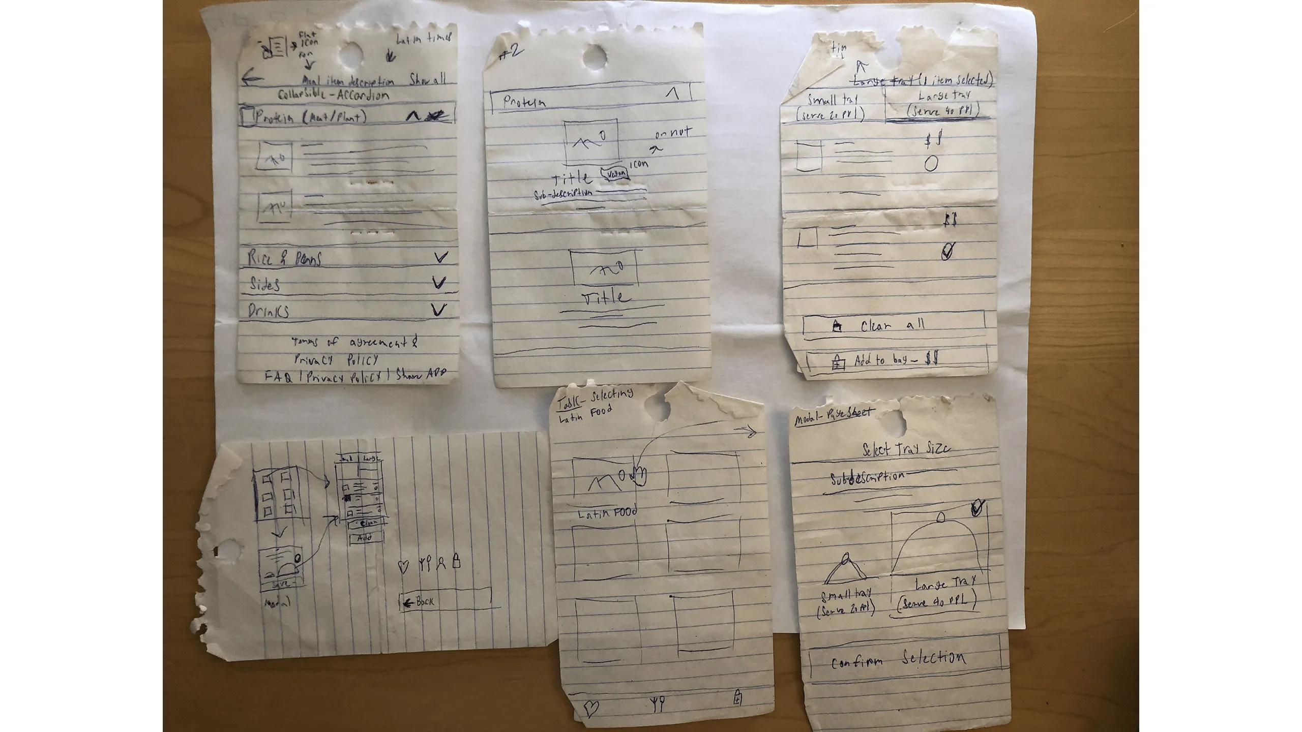
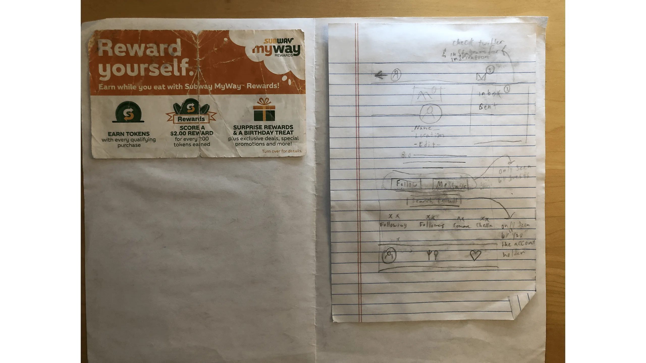
With my moodboard and task requirements in hand, I began ideating with hand-drawn sketches. I mapped out early versions of each user flow, iterating rapidly with the goal of exploring every possibility. Julie Zhuo, former VP of Product Design at Facebook, once said, "If you have literally tried every possible variation, you will have come across the best solution."

To support this mindset, I used the Crazy 8s technique, sketching eight ideas in eight minutes for each screen. I repeated this process across different features like food browsing, custom meal creation, and checkout.

Screenshot of early onboarding flow sketches for Latin Bites.
Screenshot of Latin Bites home screen sketches showing icon-based navigation.Screenshot of delivery option screen sketches showing UI states for address entry.Screenshot of takeout option screen sketches with map and location pin.Screenshot of food menu screen sketches in a grid view with top carousel.Screenshot of food menu screen sketches in list view with food images and descriptions.Screenshot of food product detail screen sketches with customization options.Screenshot of food checkout screen sketches with delivery and payment fields.Screenshot of rewards screen sketches showing points-to-dollars conversion.Screenshot of check-in history screen sketches with various UI layouts.Screenshot of rate and review flow sketches for past orders.Screenshot of manual review/comment flow sketches for past meals.Screenshot of brainstorming sketches for meal review flow.Screenshot of meal review screen sketches with editable ratings and comments.Screenshot of product review screen sketches using emojis and sort/filter controls.Screenshot of filtered review flow sketches for viewing/editing user comments.Screenshot of meal service review screen with charts for delivery and accuracy.Screenshot of Latin Times and Catering menu flow sketches.Screenshot of various customer journey and task flow sketches.Screenshot of social profile sketch and photo of a Subway Rewards paper.Screenshot of sticky note listing UI components for Latin Bites app.

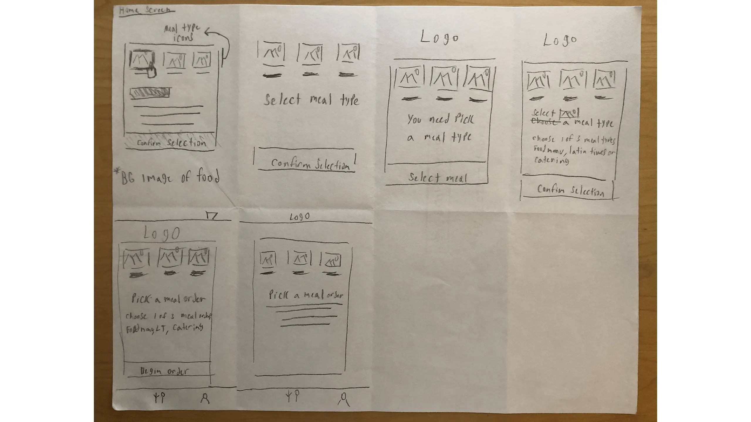
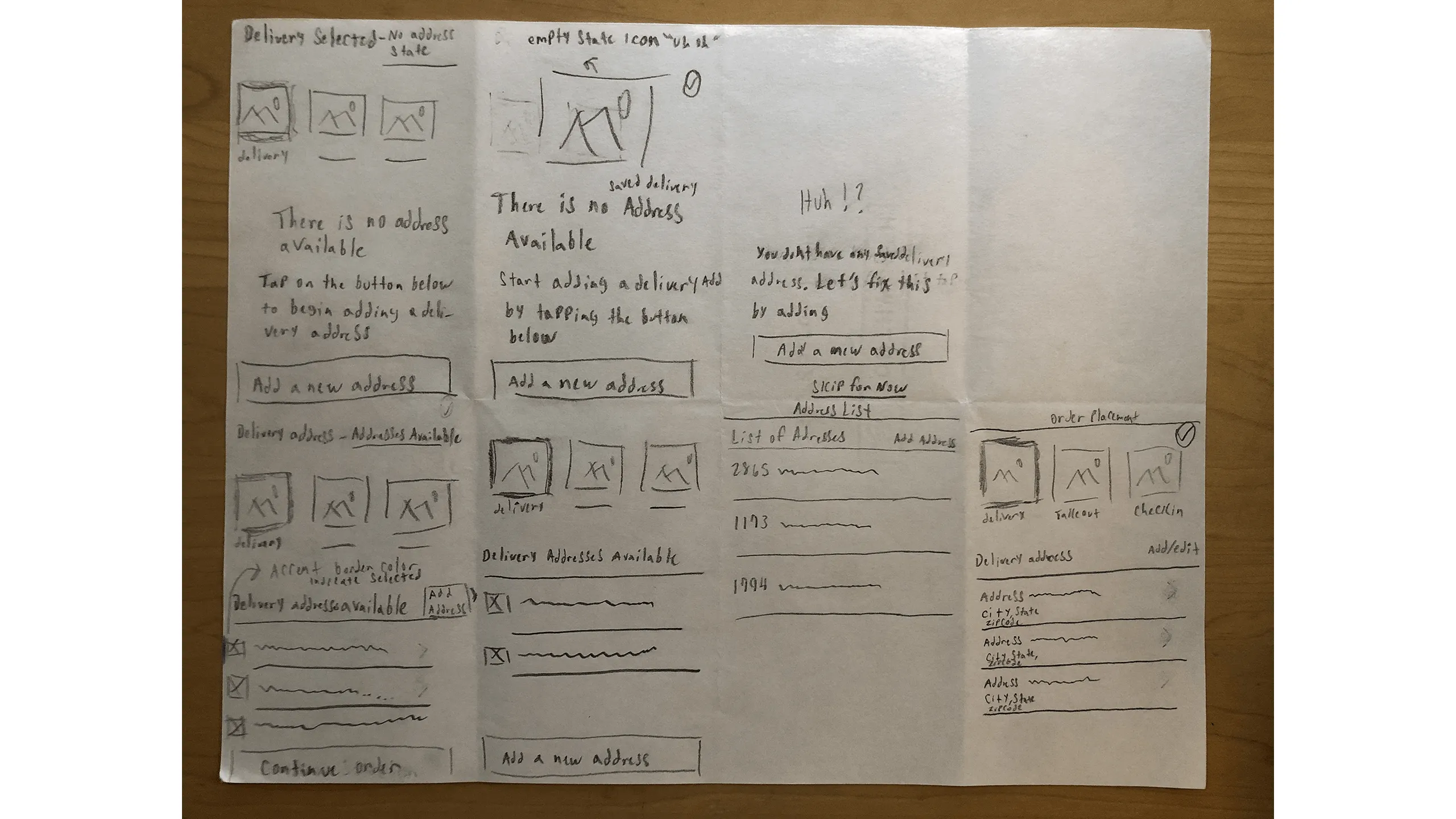
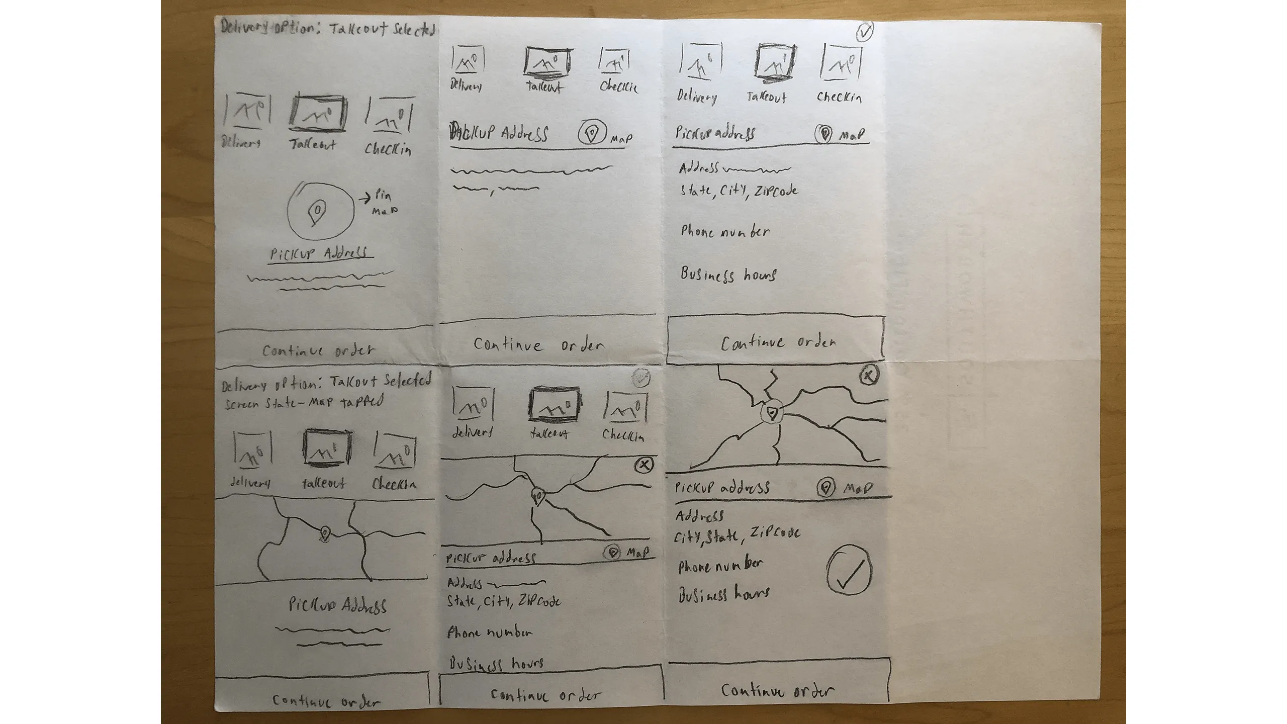
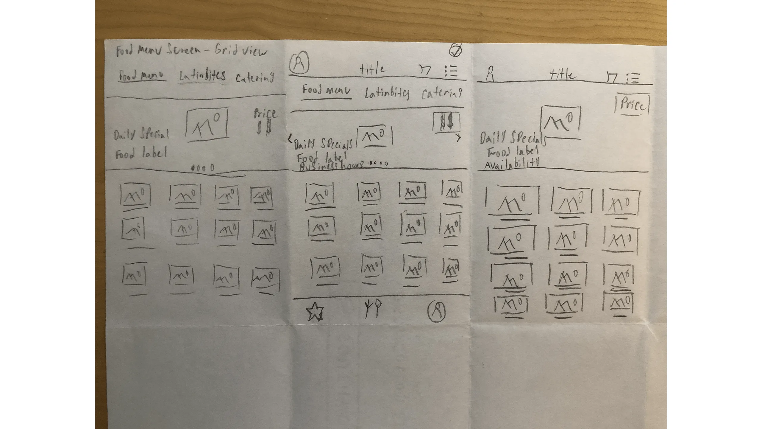
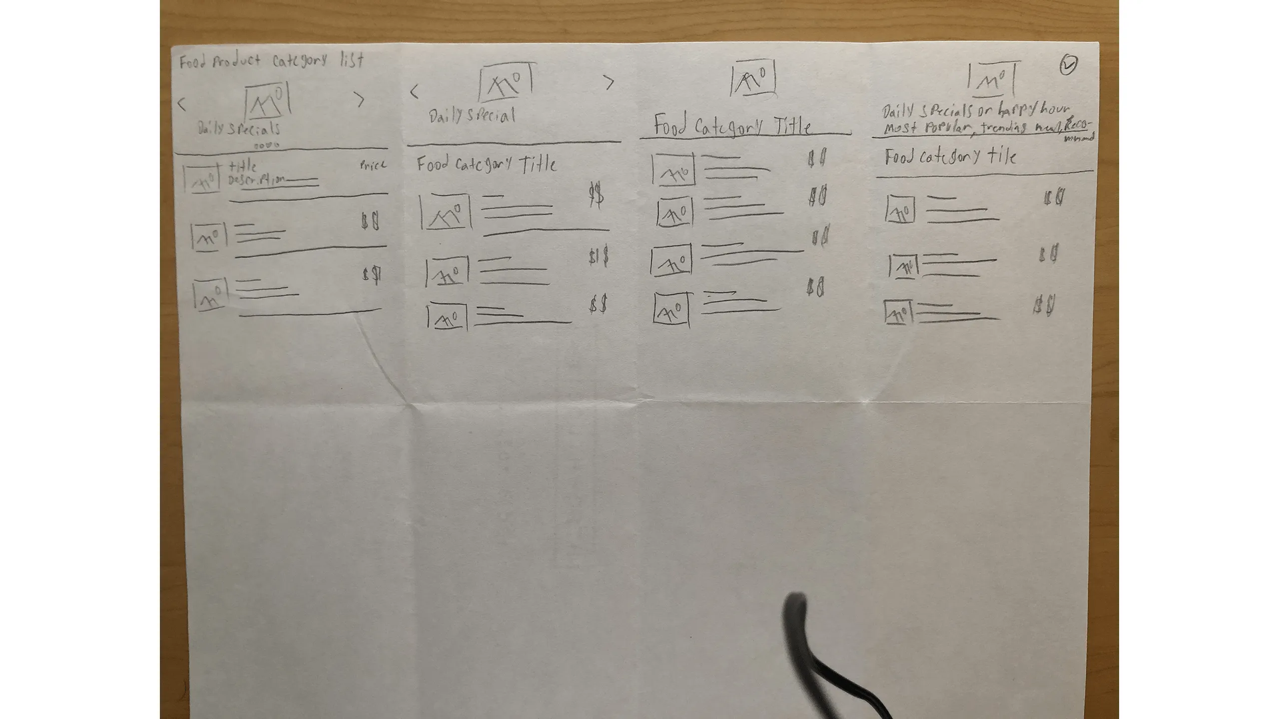
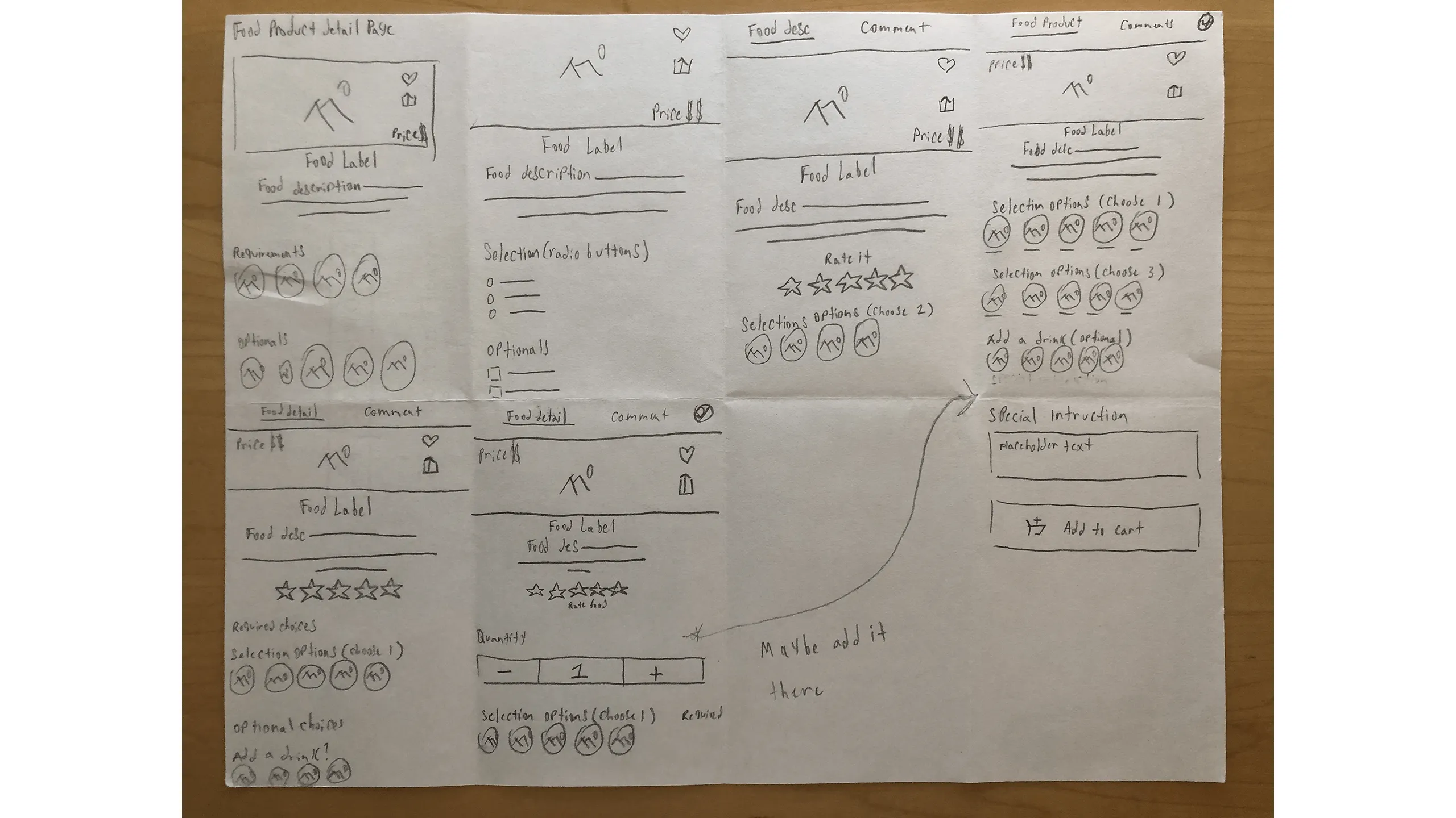
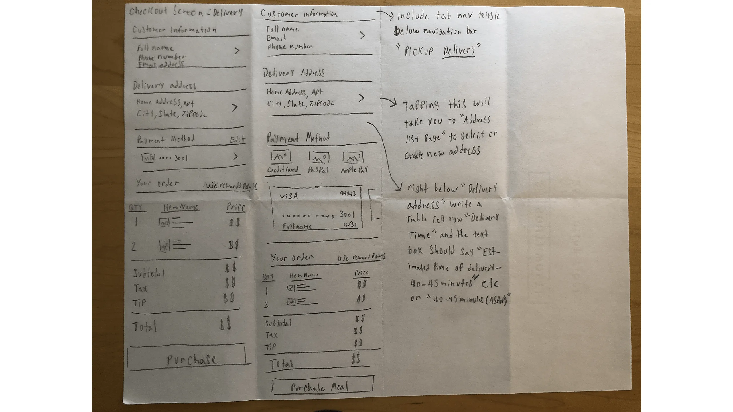
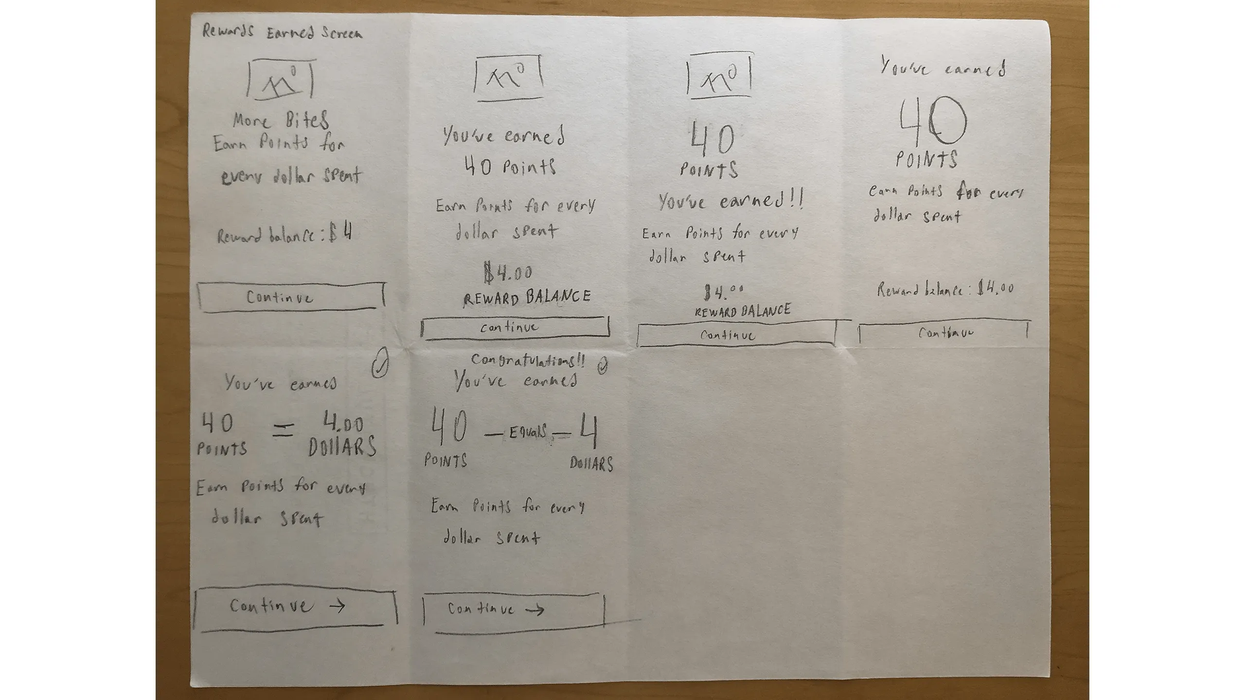
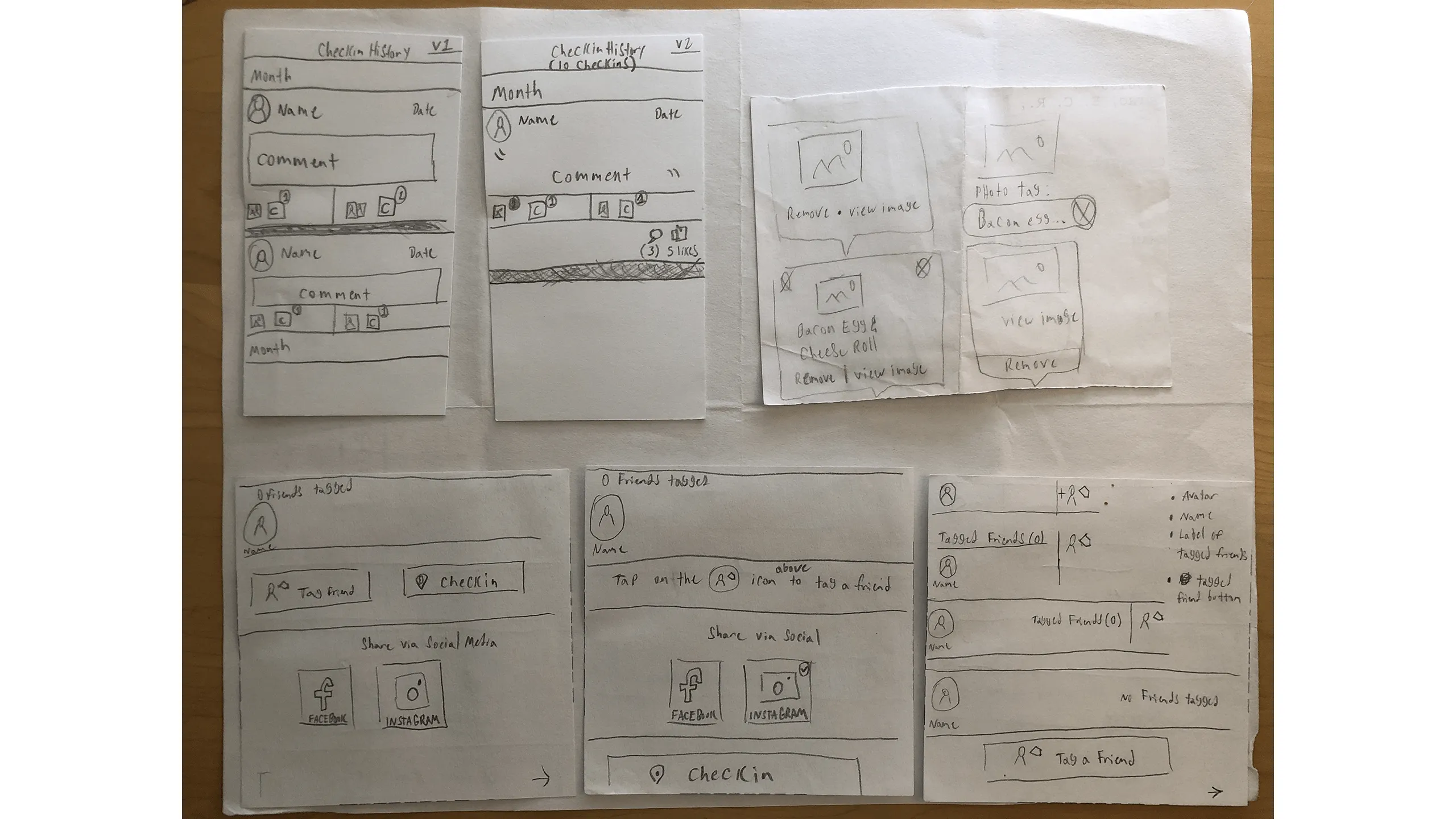
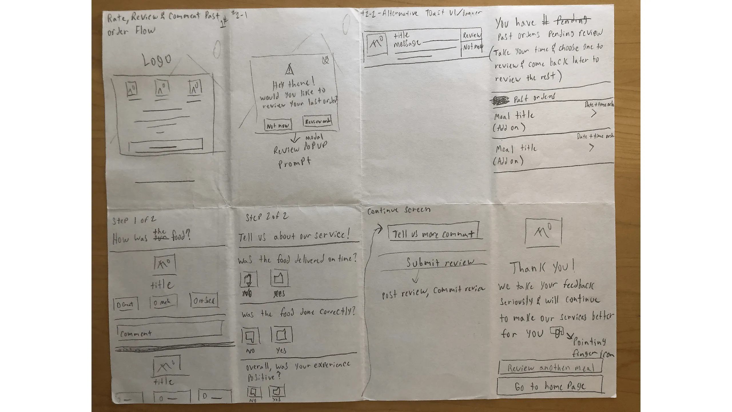
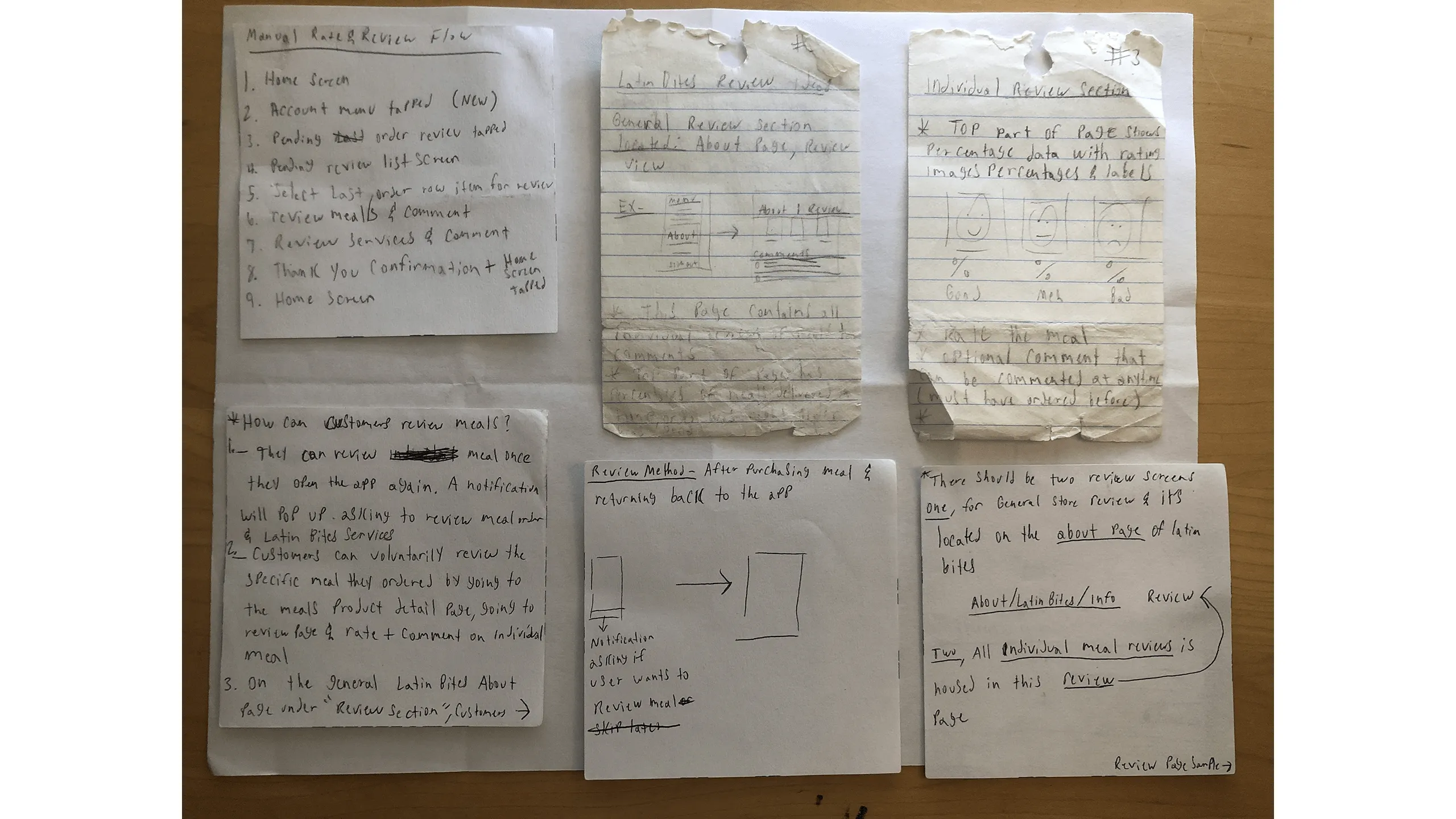
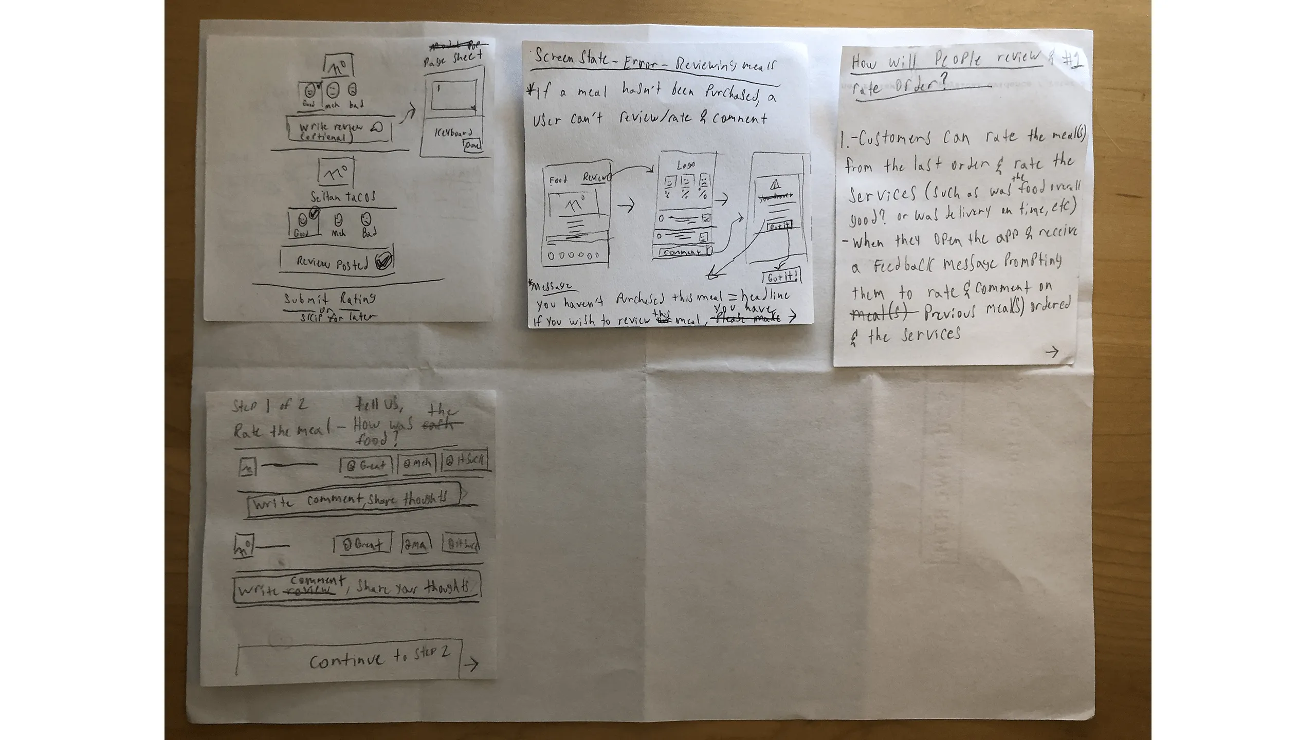
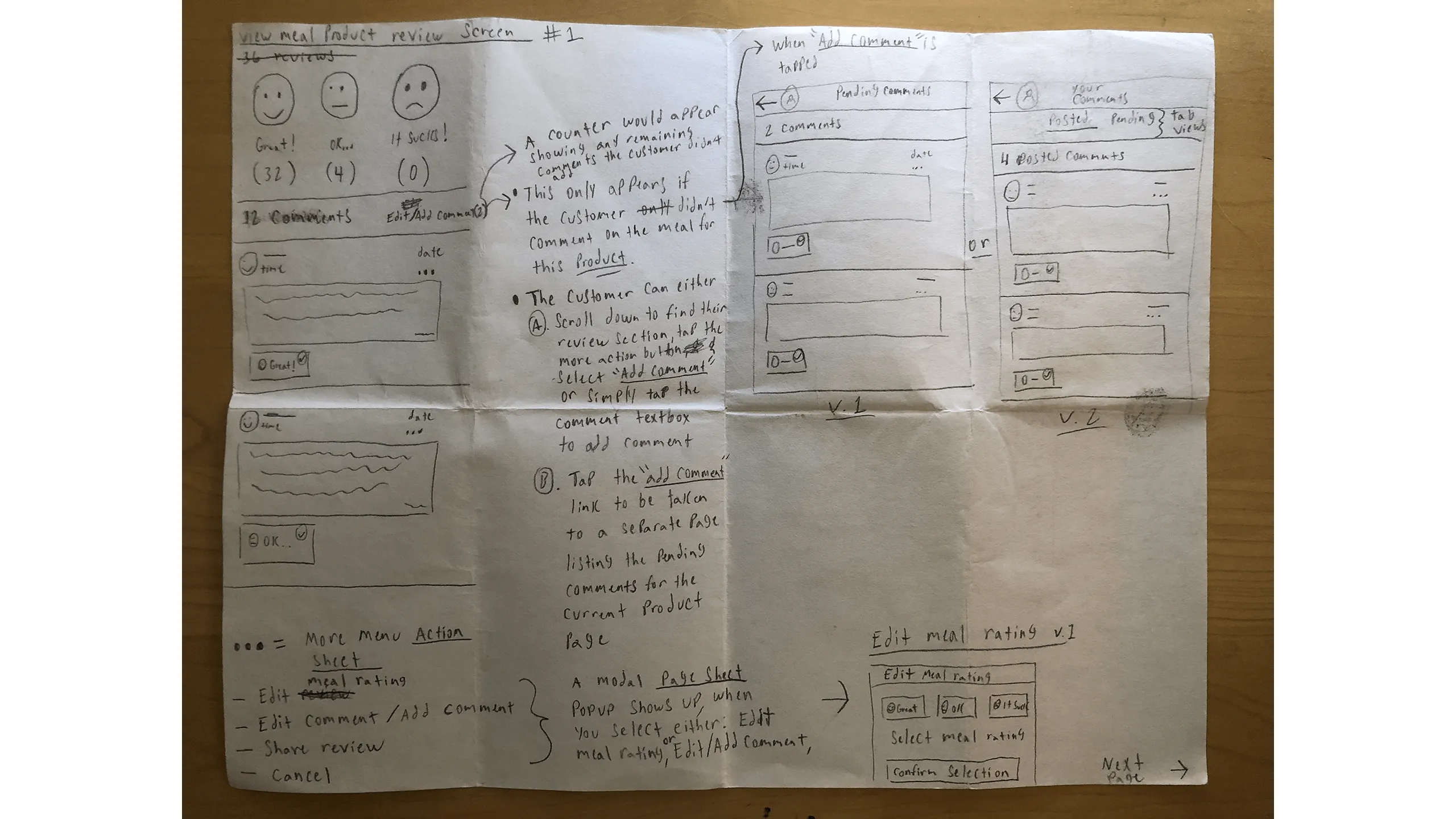
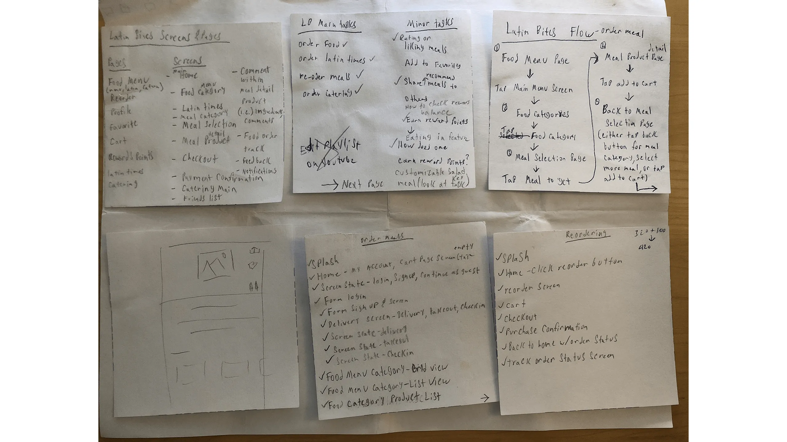
Once I refined the most promising flows, it was time to digitize.

Taskflow Wireframes & Prototyping

Design with detail, test with intention

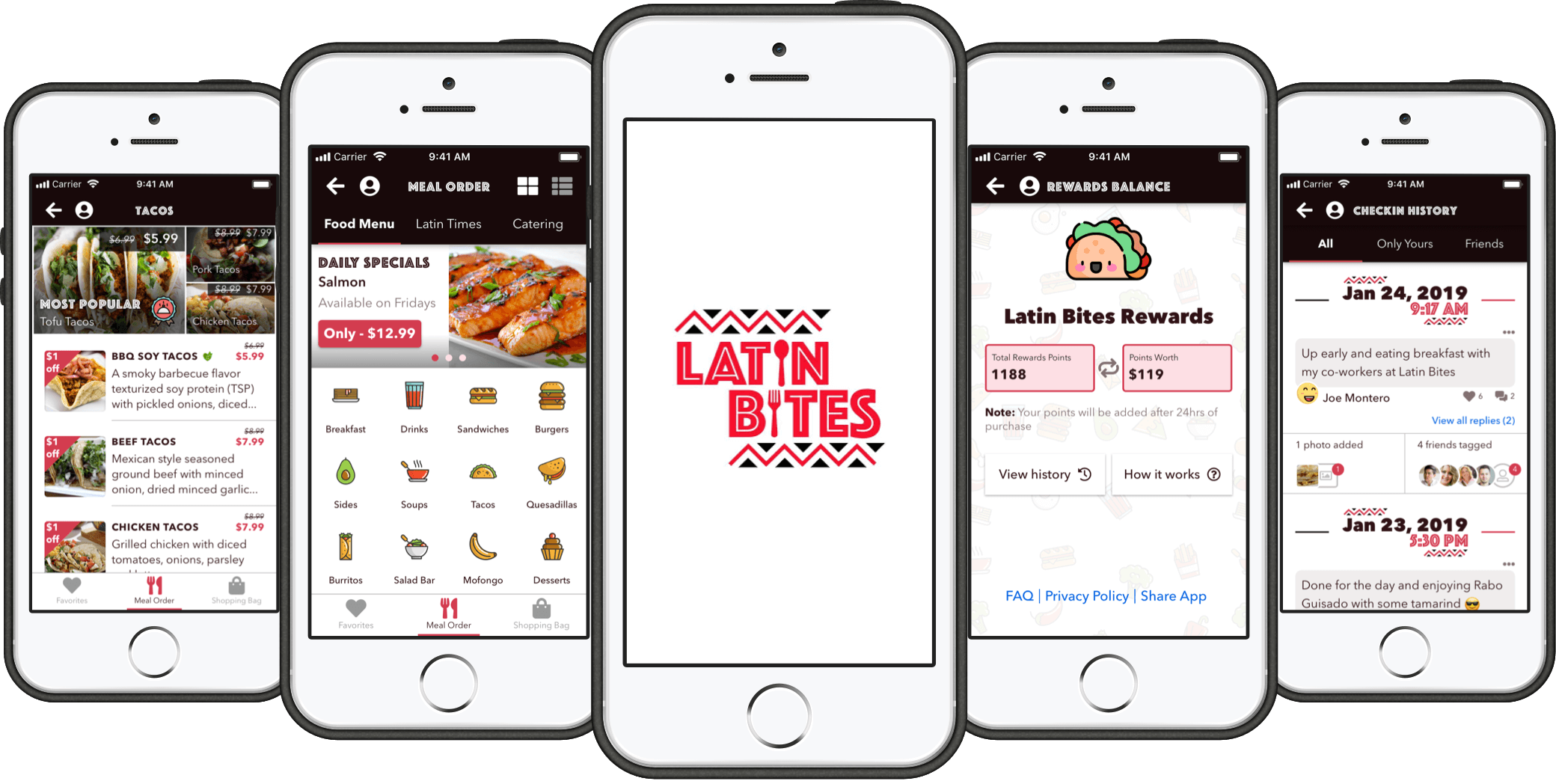
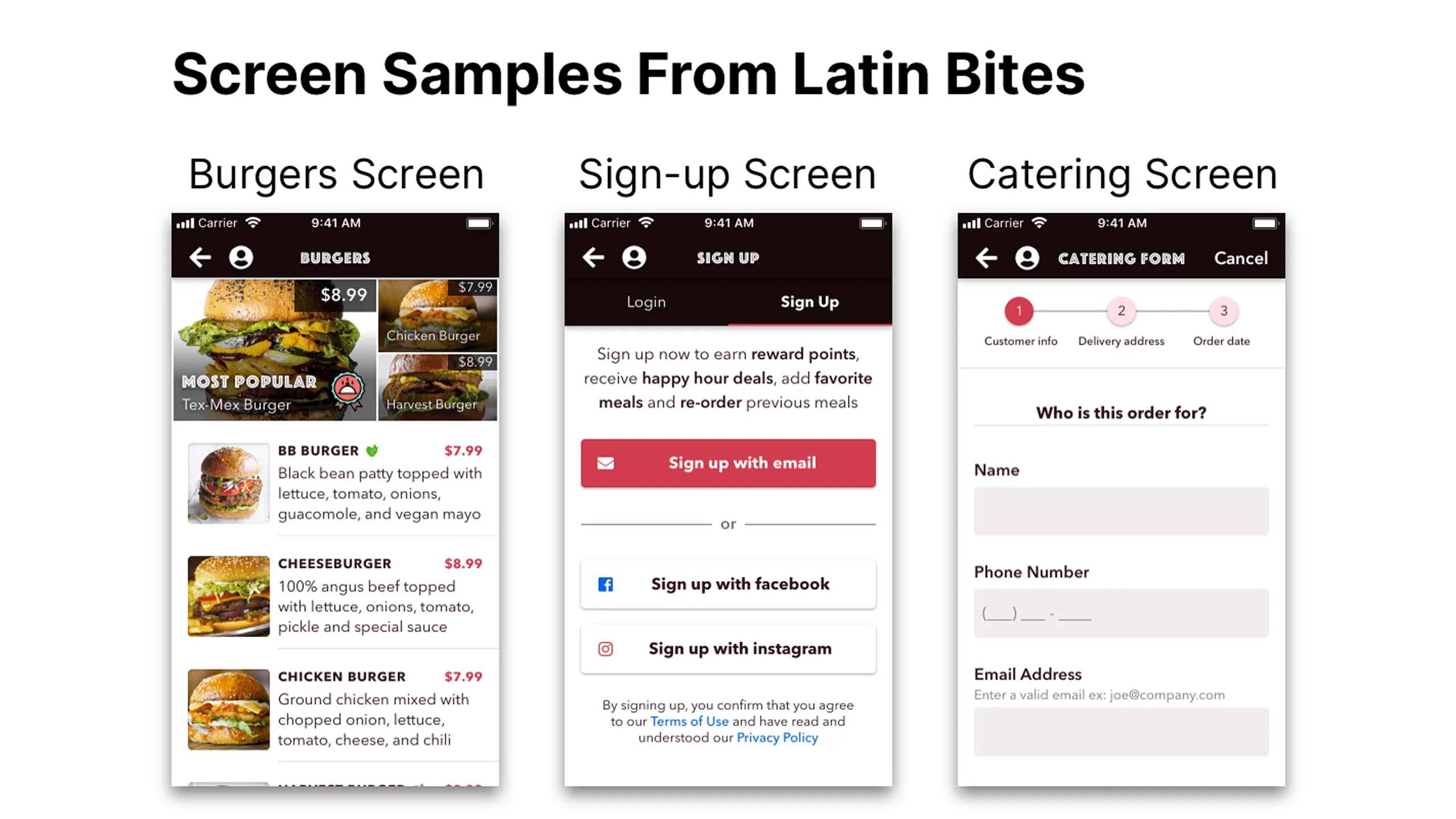
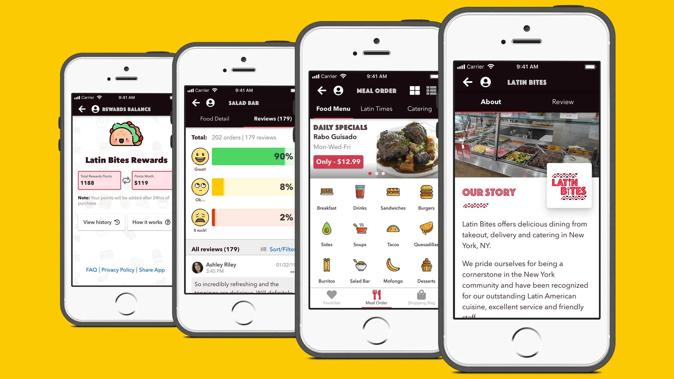
I used Sketch to bring the paper sketches to life as mid-fidelity wireframes. Since I owned an iPhone 5s at the time, I designed specifically for iOS 5s screen dimensions to simulate real use.

Throughout this phase, I followed Apple’s official guidelines and used these references:

  • Apple Human Interface Guidelines
  • iOS Design Guidelines
  • Learn iOS 11 Design
  • iOS Font Size Guide

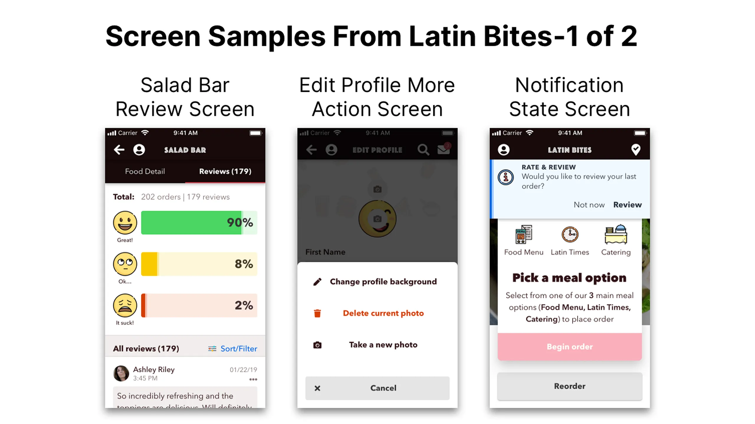
Each wireframe was grounded in task requirements and aimed at solving real friction points I experienced as a user. From food discovery to checkout, I focused on ease of use, clarity, and delight.

Screenshot of Latin Bites home and menu wireframe with special offers and discounted prices.
Screenshot of Latin Bites food category wireframe with quilted image layout and meal descriptions.Screenshot of Salad Bar detail wireframe with card selection and add-on options.Screenshot of Seitan Tacos product detail wireframe with action sheet and quantity selectors.Screenshot of Latin Times meal order wireframe with full custom and premade options.Screenshot of Latin Times meal options wireframe with tabs for vegan and meat dishes.Screenshot of Latin Bites catering order wireframe with form and menu options.Screenshot of Salad Bar review wireframe with charts and filterable comments.Screenshot of Latin Bites service review wireframe with charts and comments.Screenshot of rate & review flow wireframe with step-by-step rating process.Screenshot of Latin Bites check-in wireframe with multi-photo and tagging features.

After wireframes were complete, I created interactive prototypes using Sketch’s native tools and tested them directly on my iPhone 5s. This helped validate screen flow, interaction logic, and overall UX fidelity.

Hi-Fi User Interface Mockups

Visual eye candy to the rescue

When I started the hi-fi UI mockup phase, I went through several key stages to bring the Latin Bites app to life:

  • First, I defined the personality of my concept app design.
  • Next, I referenced my moodboard for UI inspiration to create a visual style
  • Finally, I began designing the hi-fi prototype mockups while documenting and creating a cohesive design system

#1. Choosing a design personality

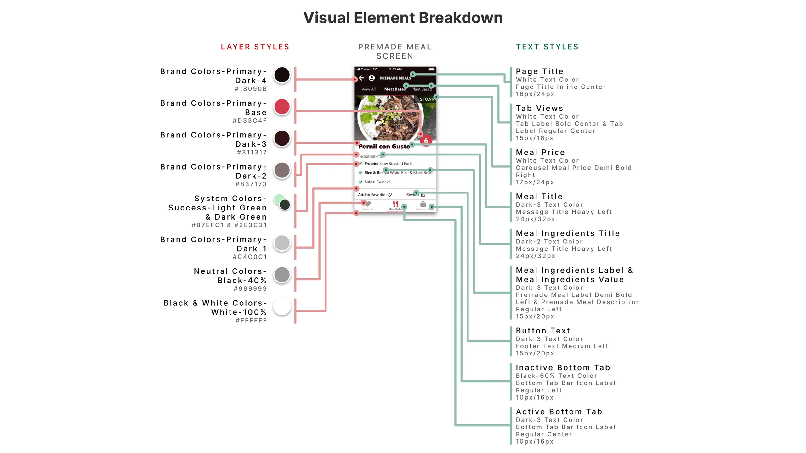
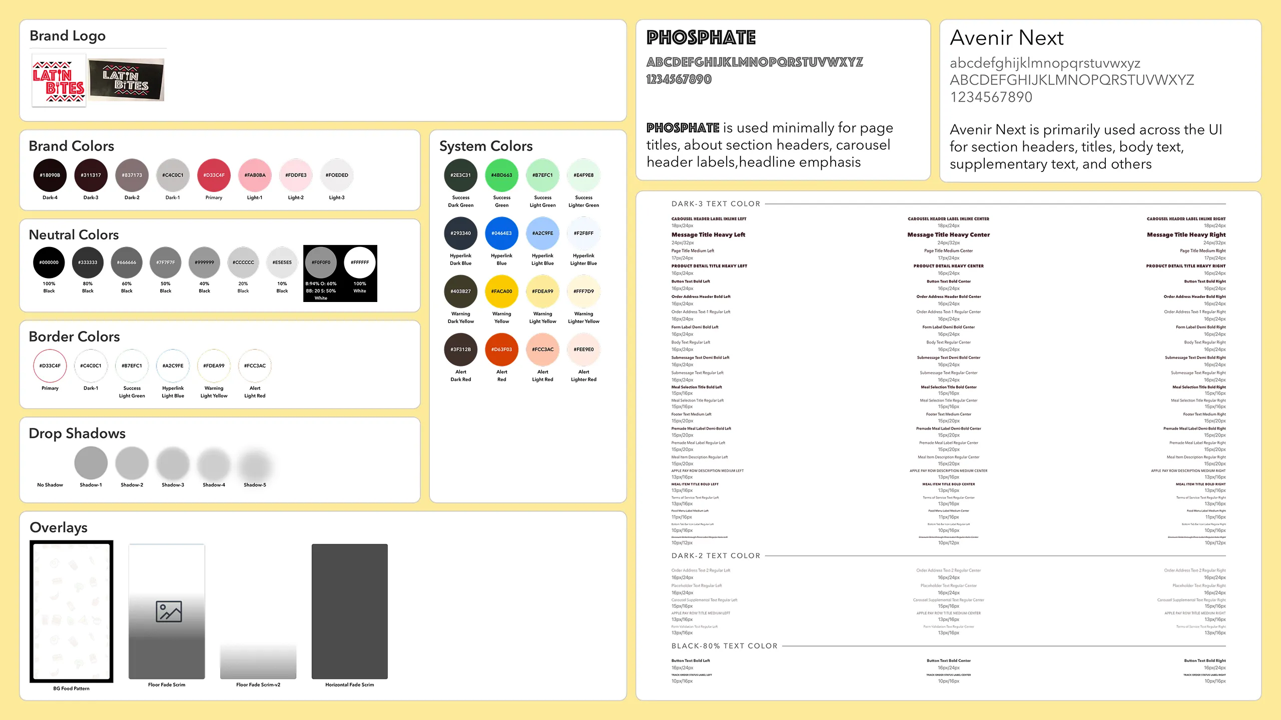
To define the app’s personality, I picked five words: casual, friendly, appetizing, cultural, and fun. Though this step might seem abstract to some, defining the brand personality simplified identifying the visual style language and made design decisions clearer.

#2. Aligning brand personality with ideas and visual style

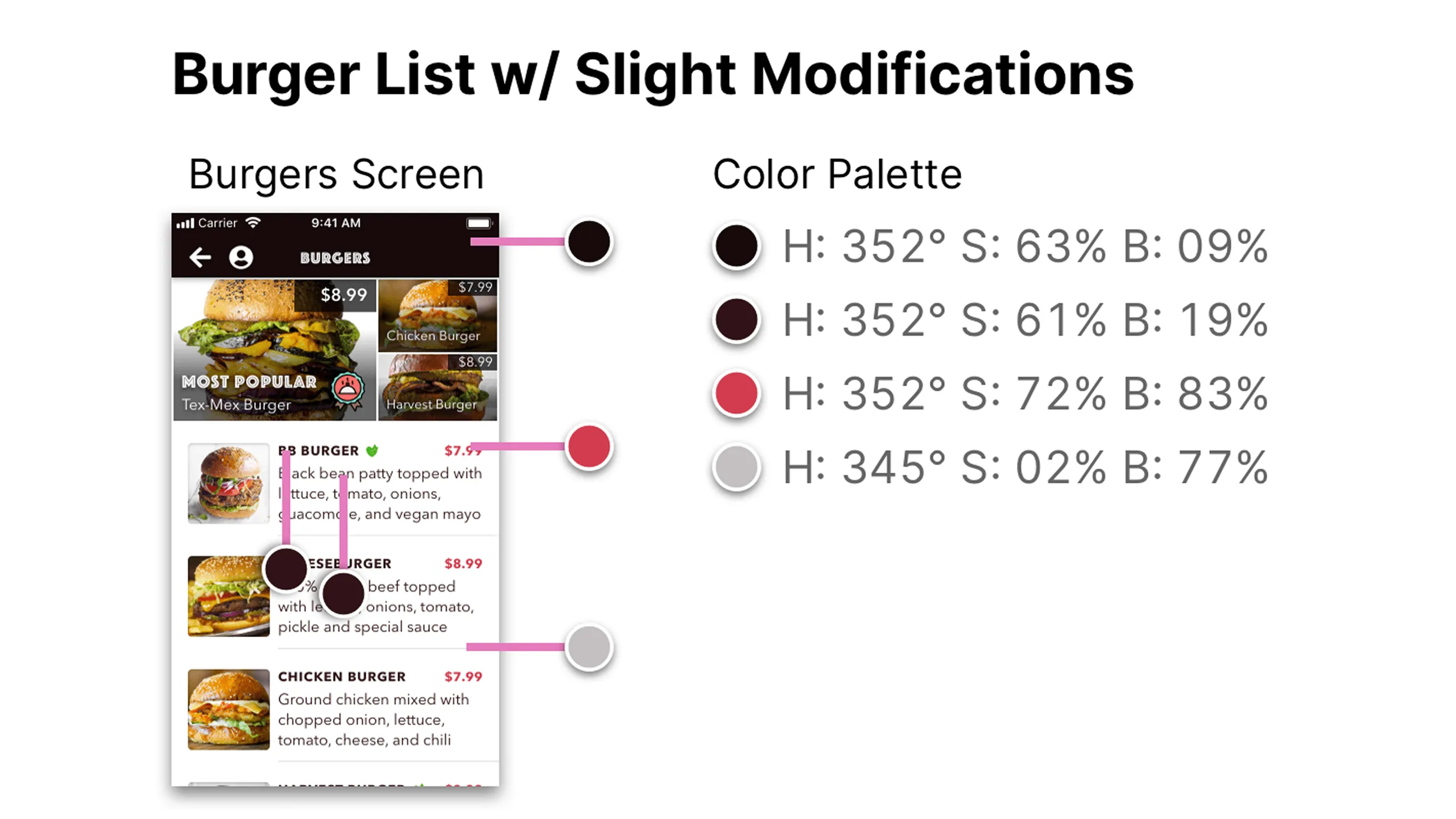
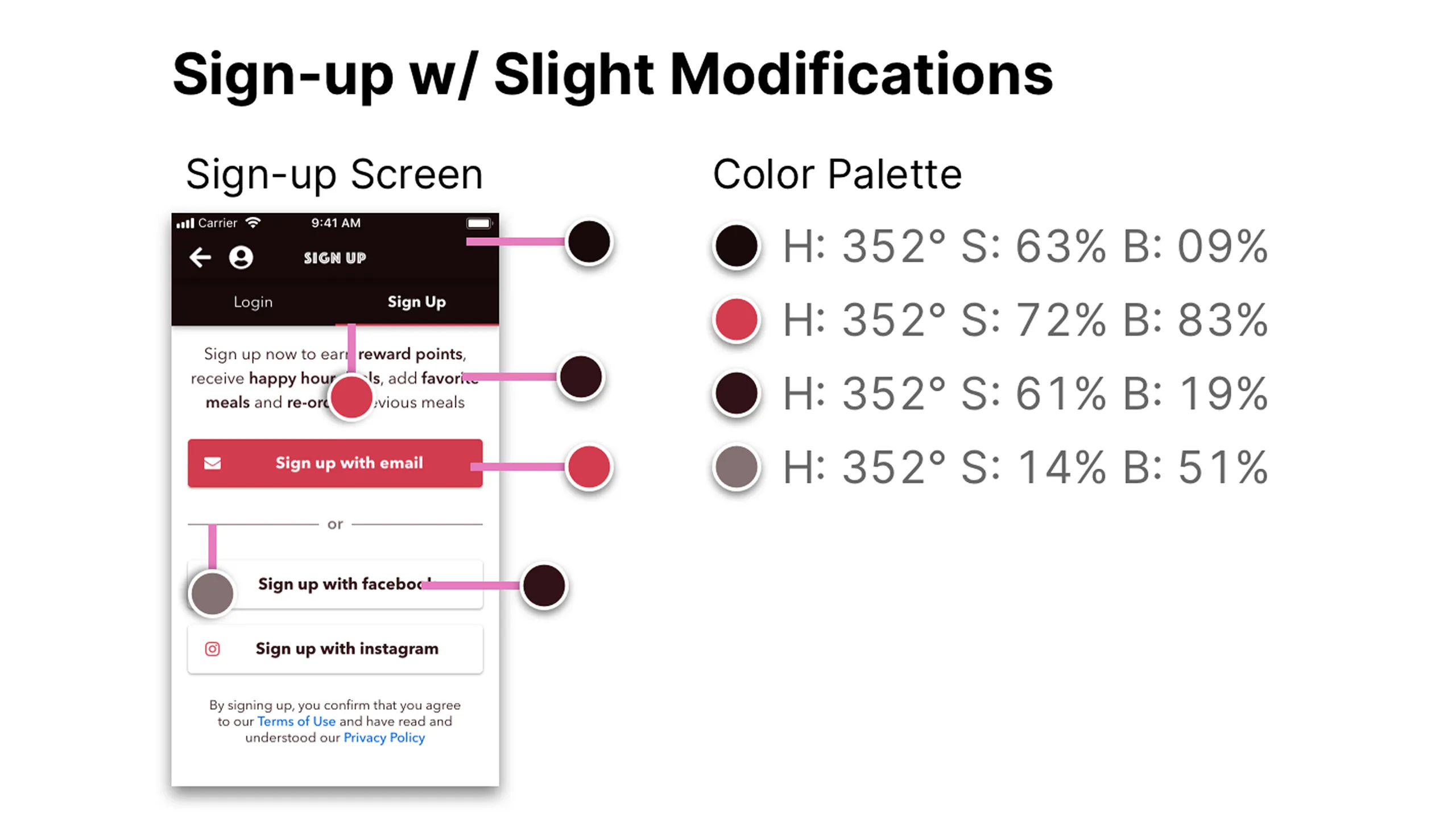
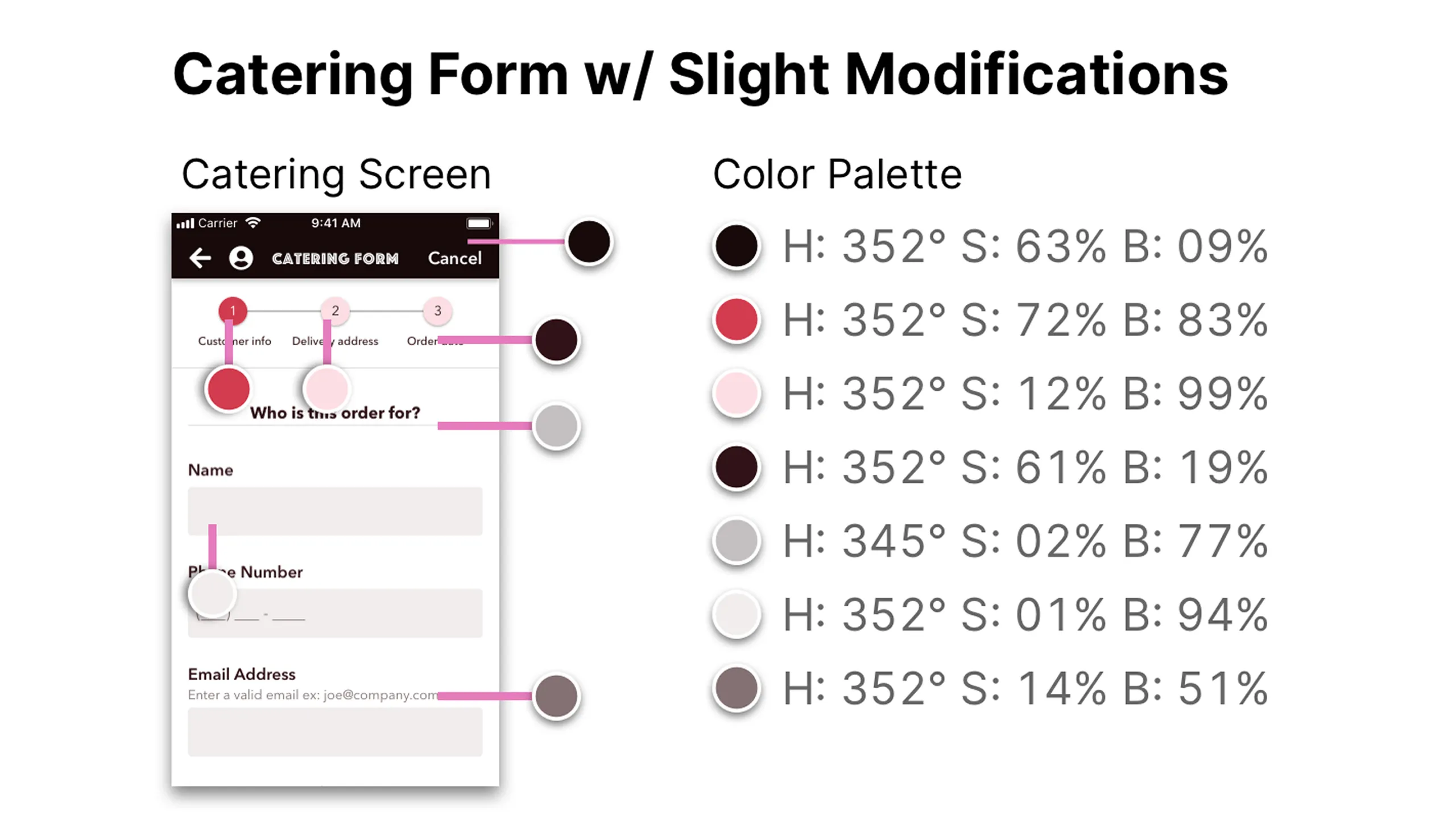
Writing down the adjectives helped me analyze the moodboard and select visual elements that best aligned with the brand. This foundation was critical for identifying the colors, shadows, border colors, overlays, typefaces, icons, and images.

Color choices

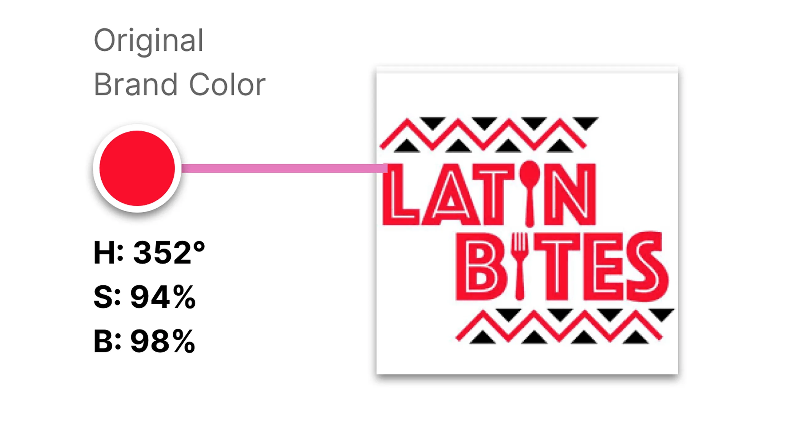
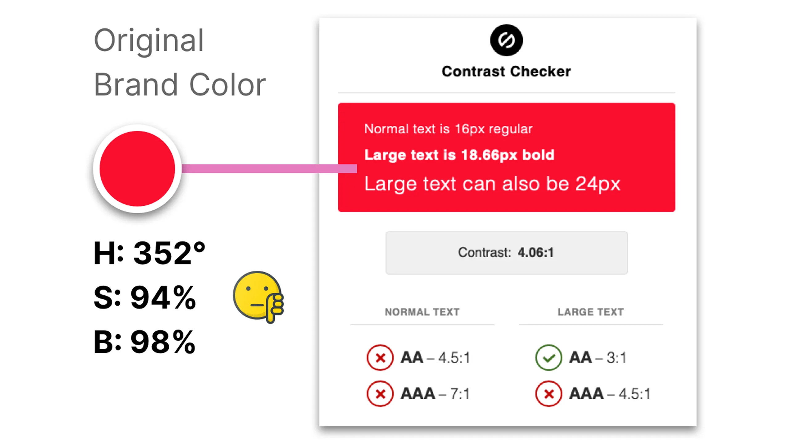
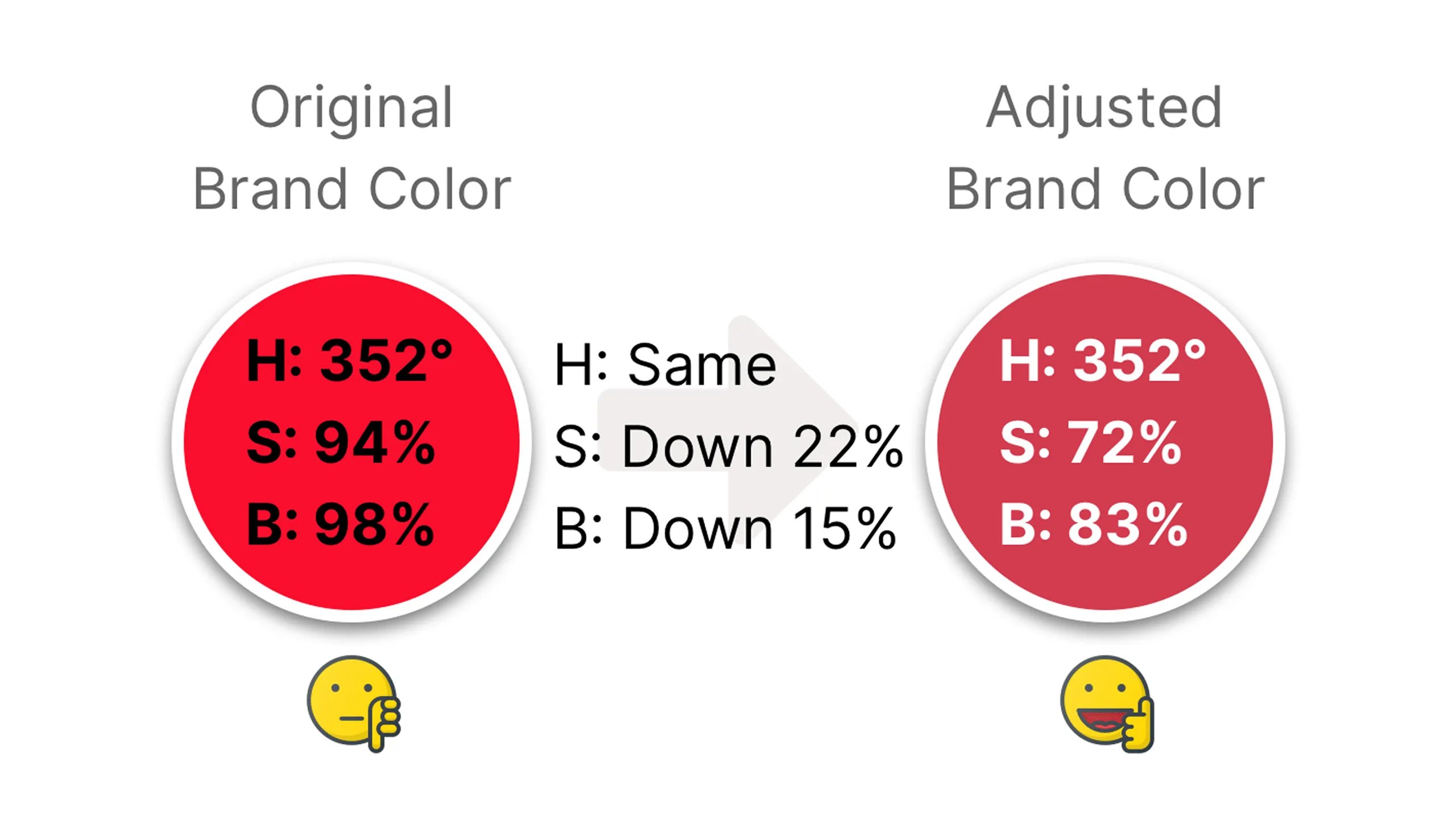
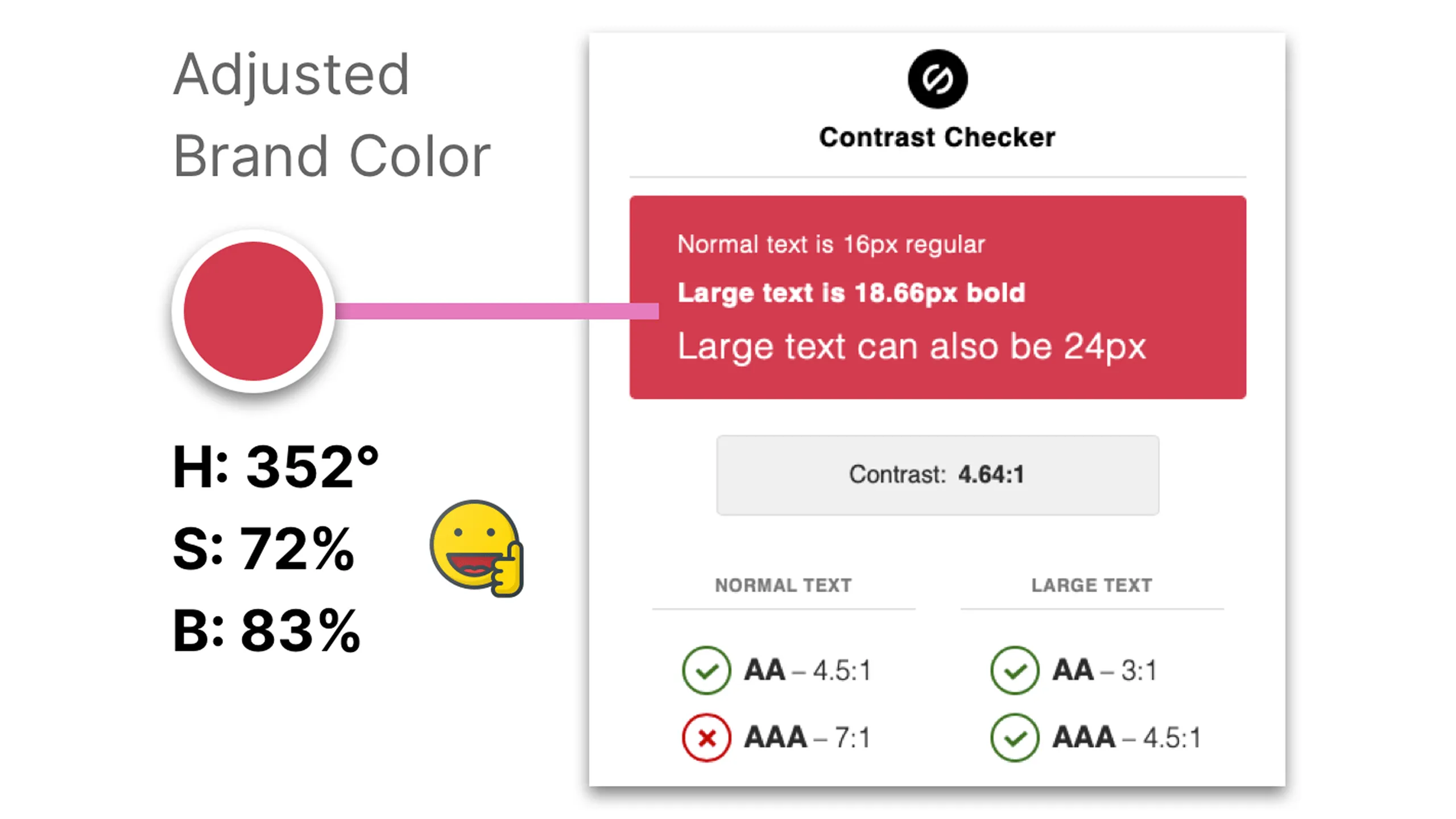
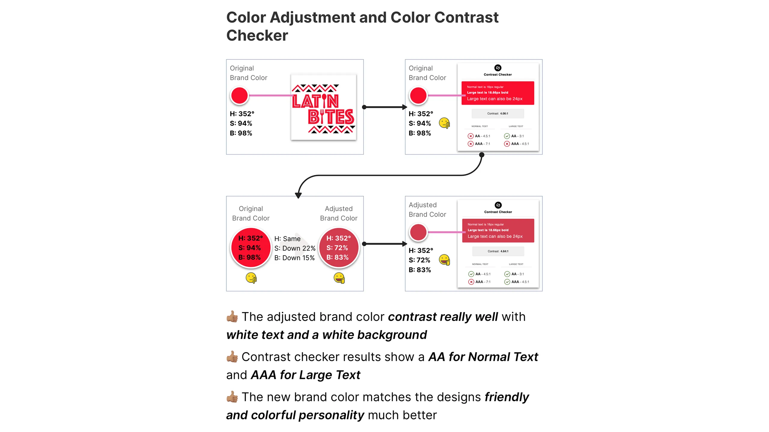
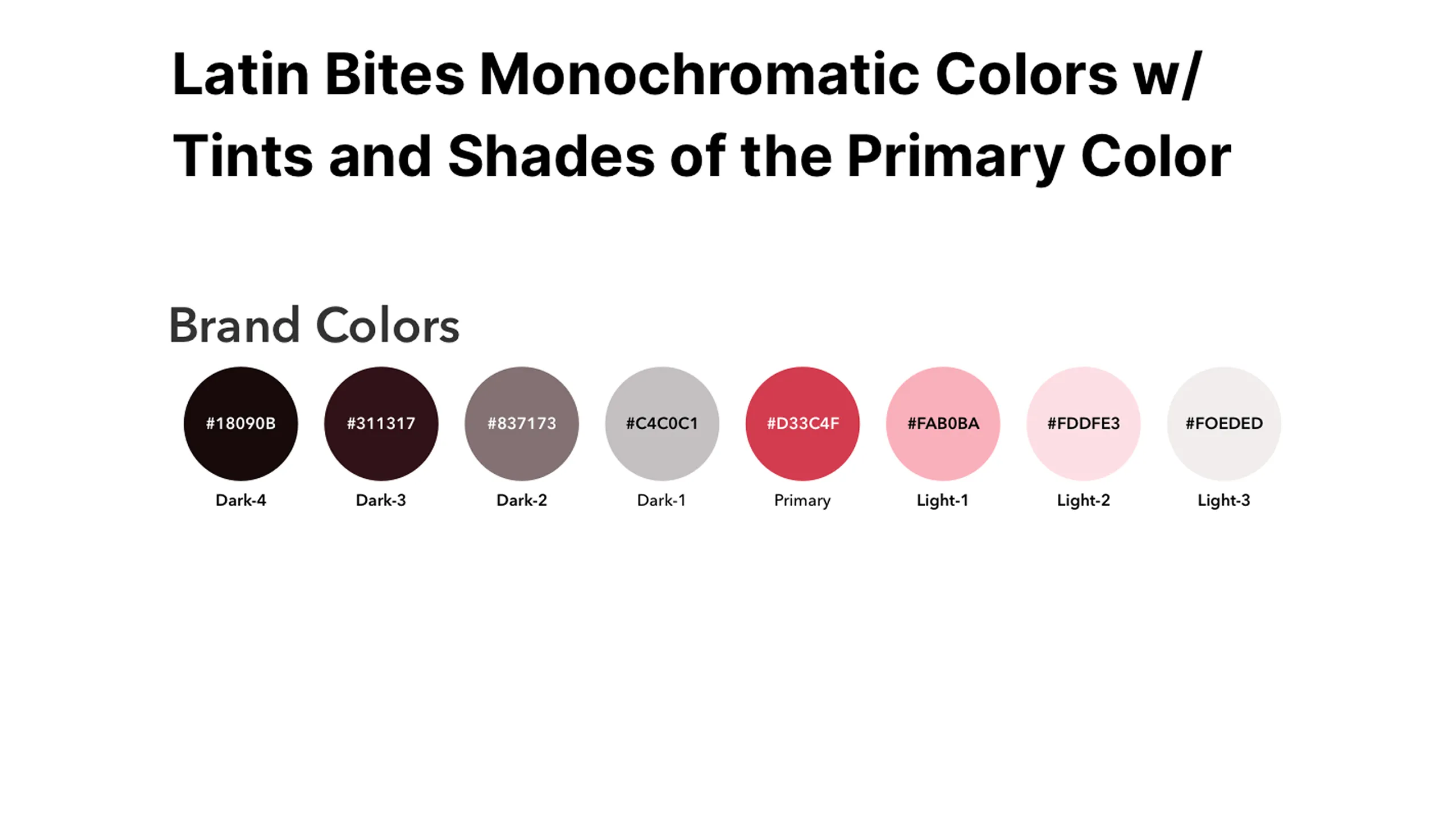
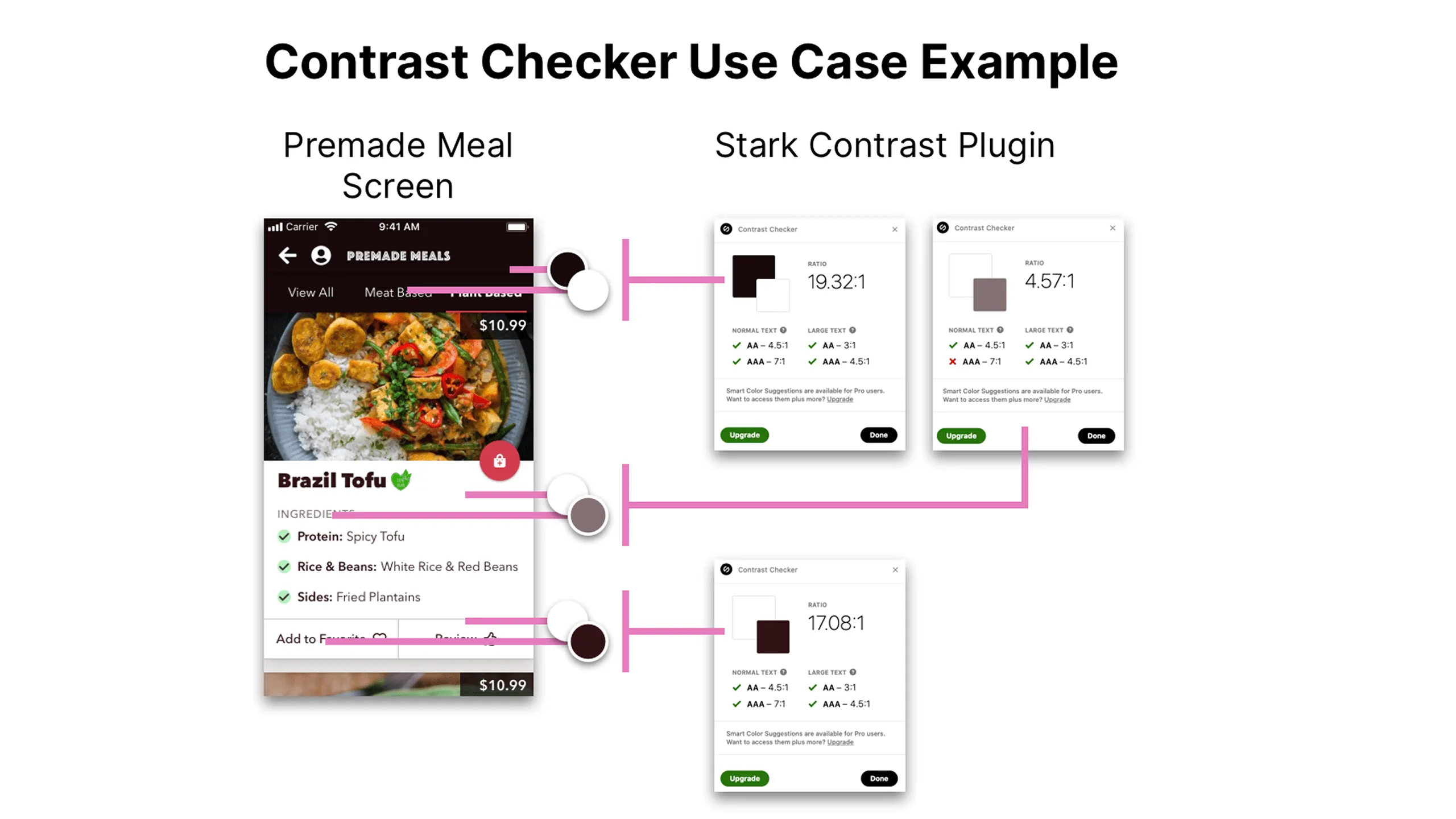
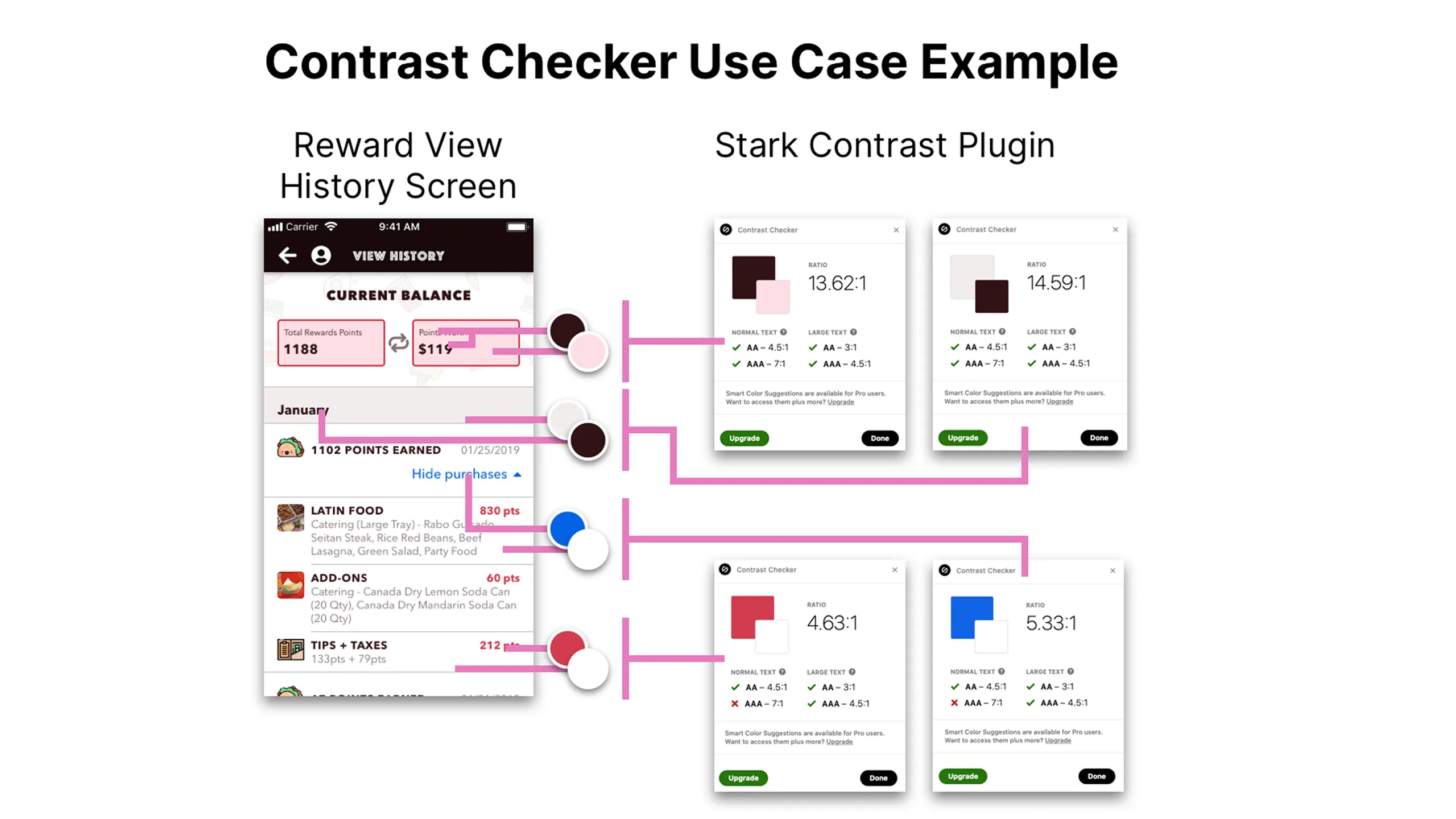
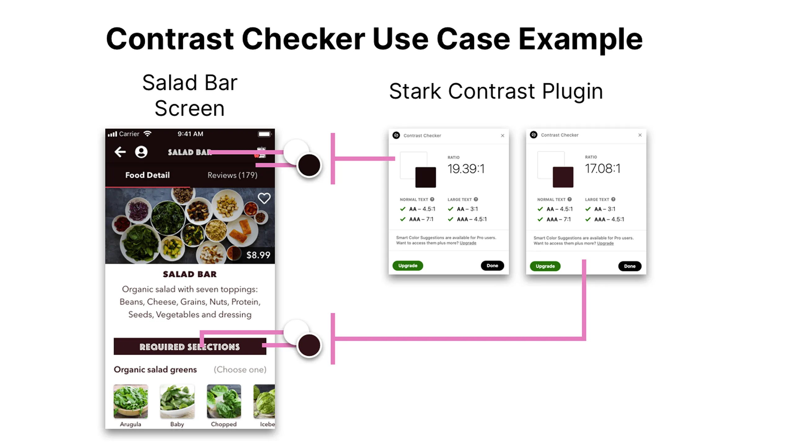
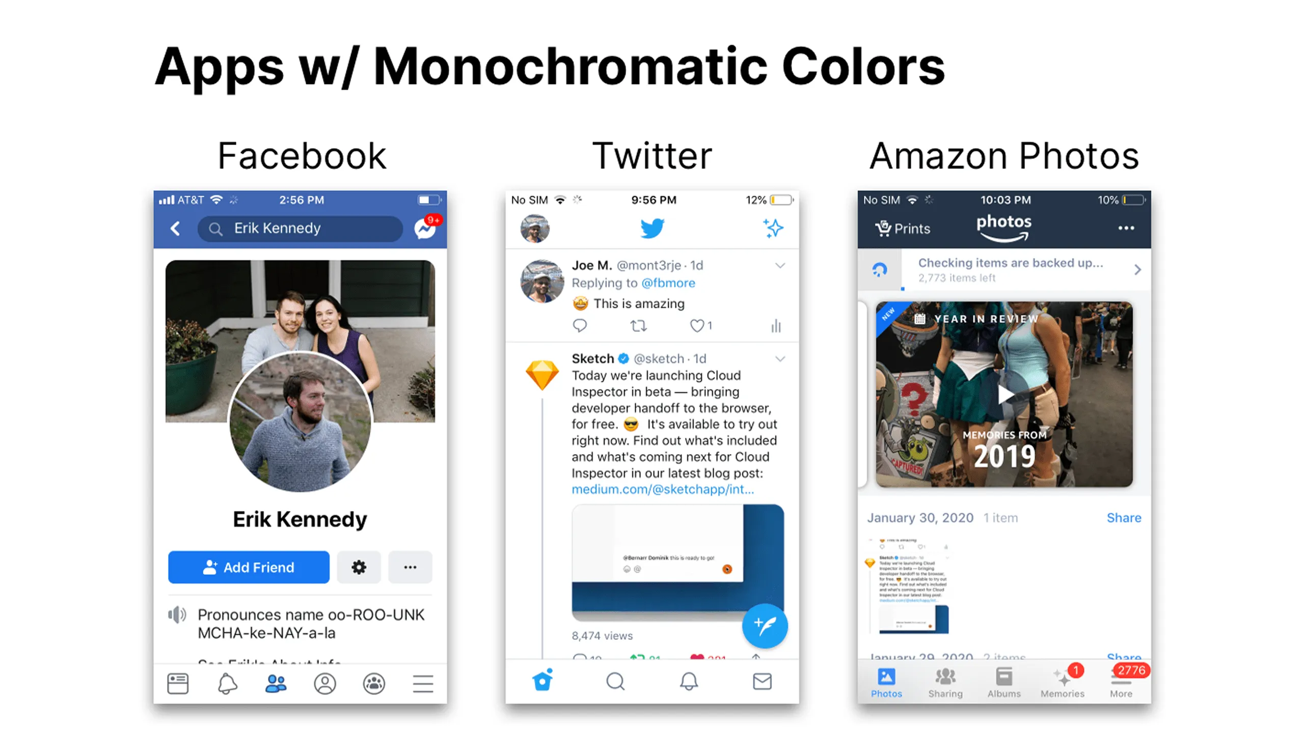
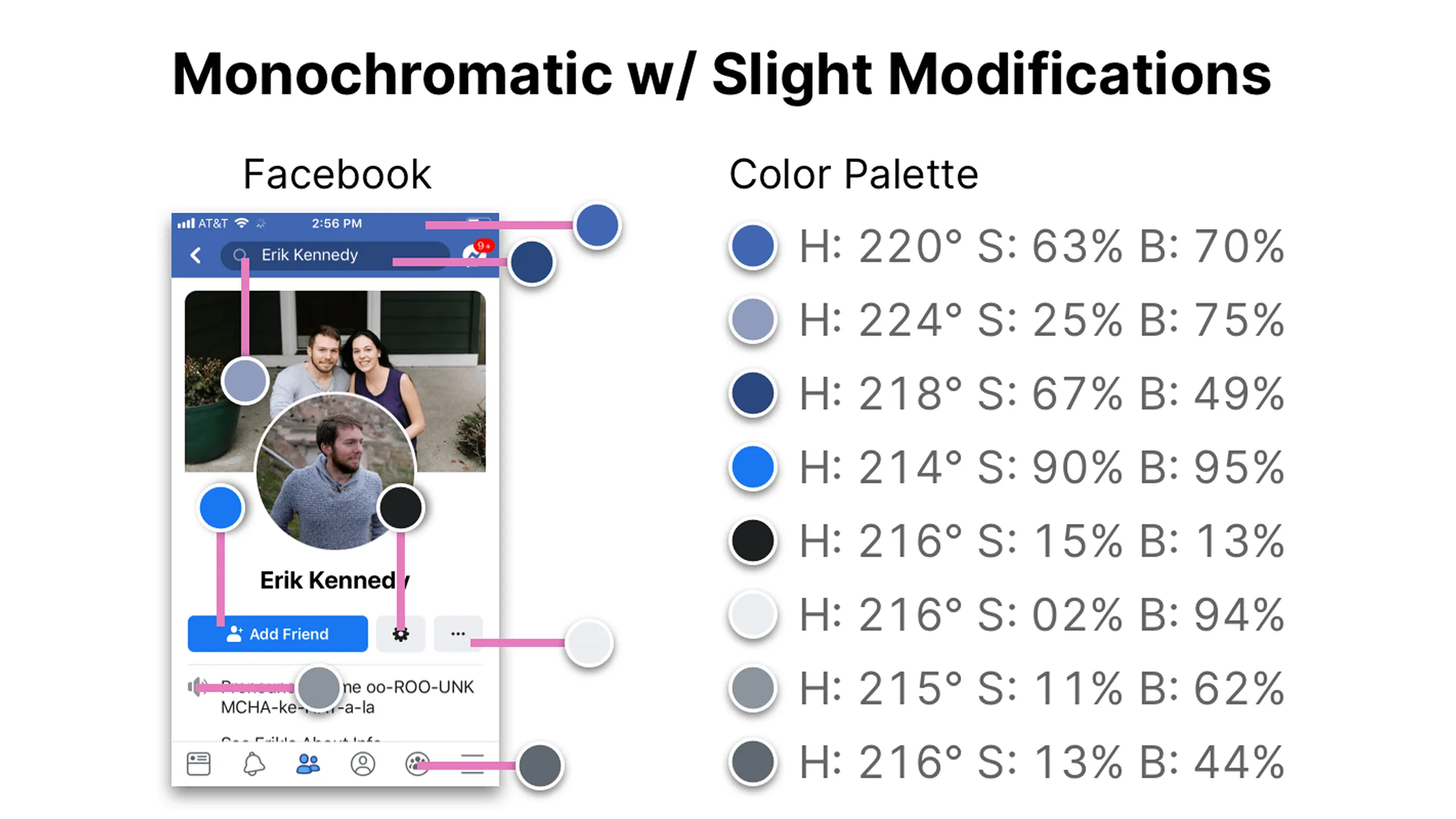
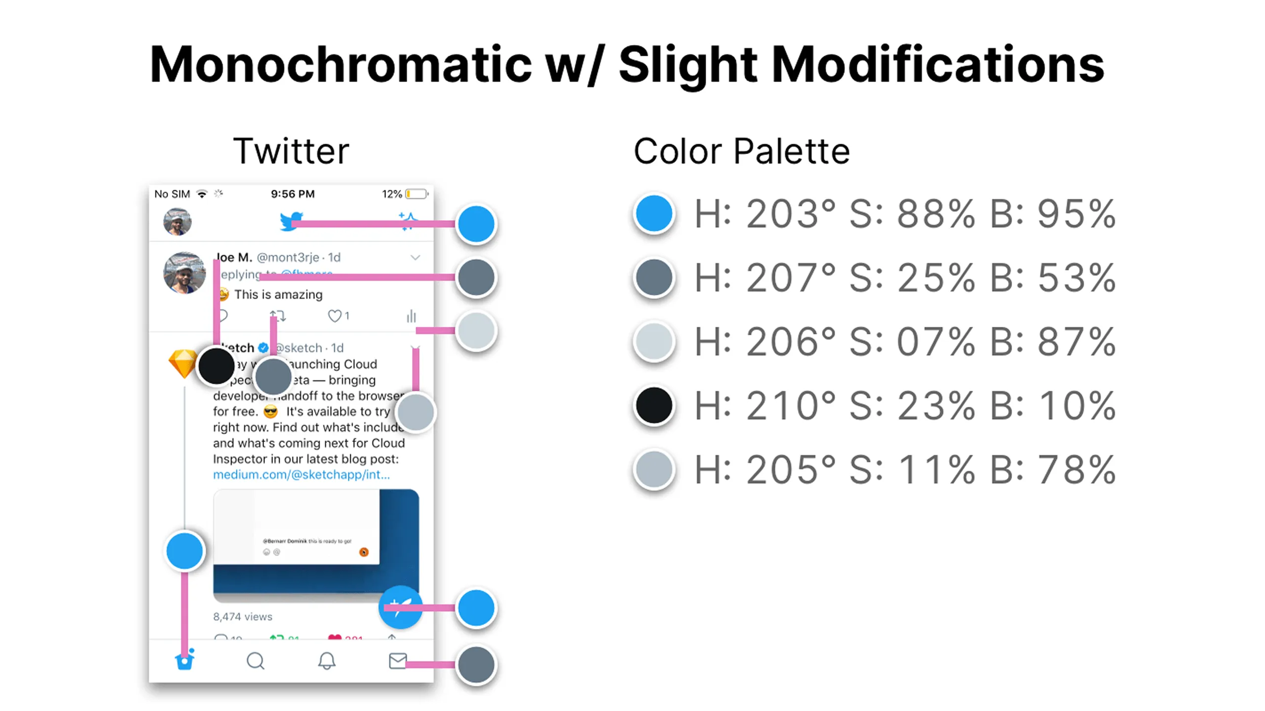
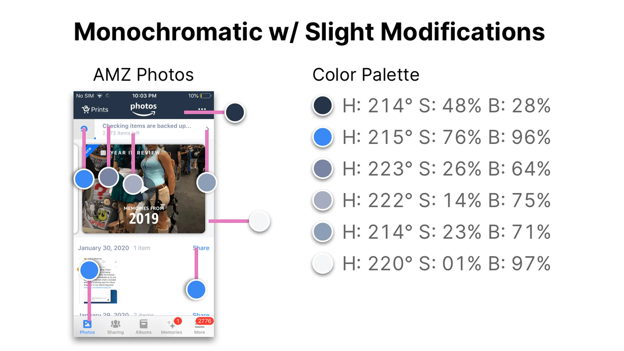
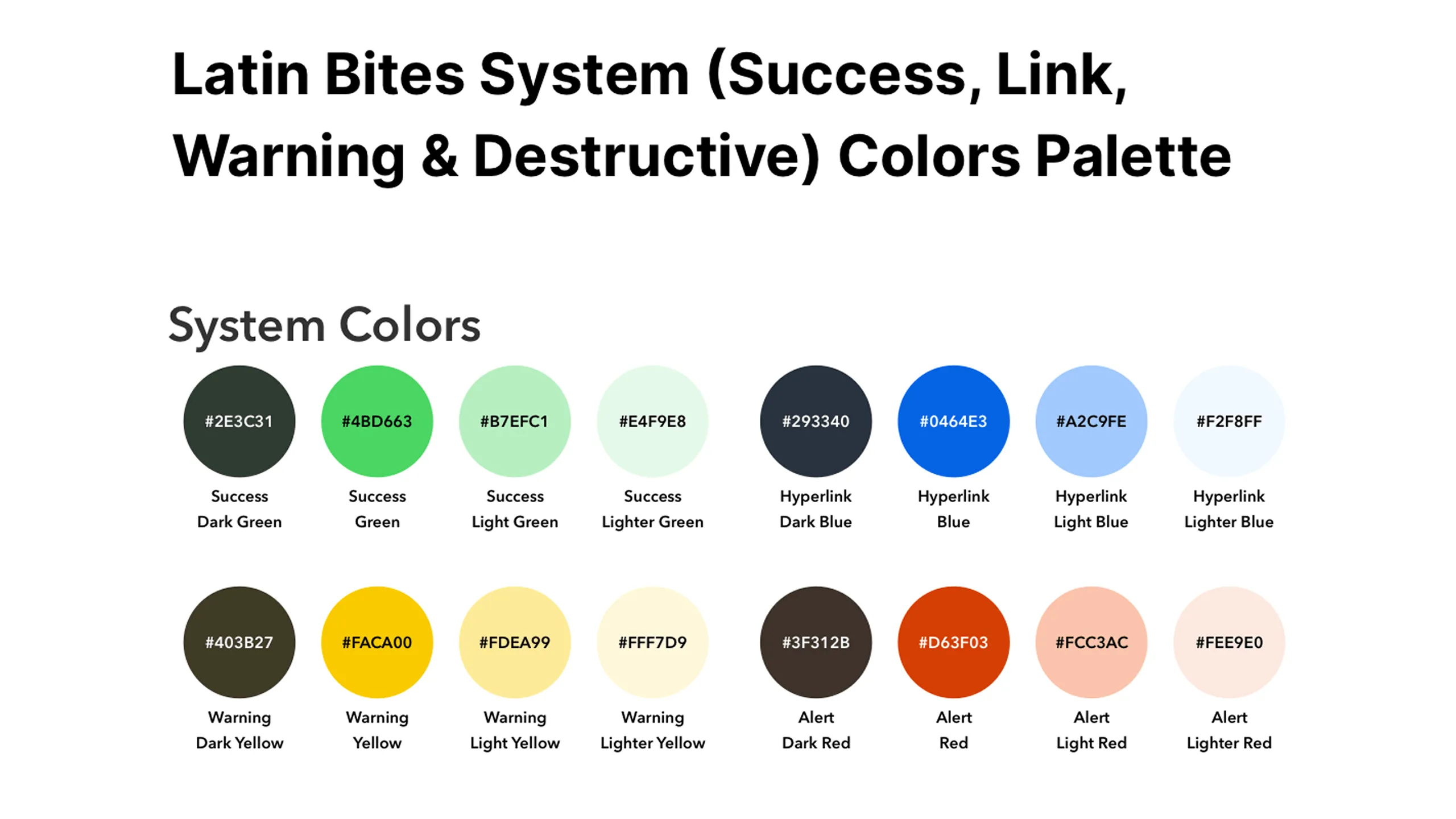
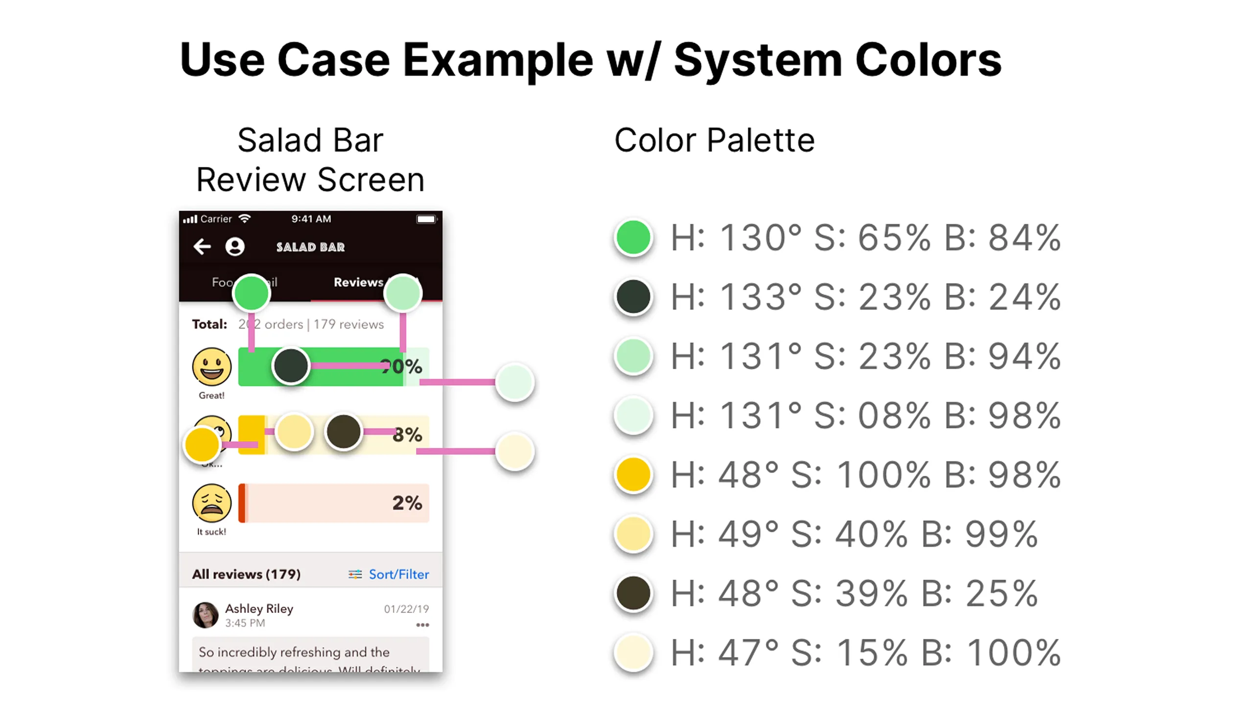
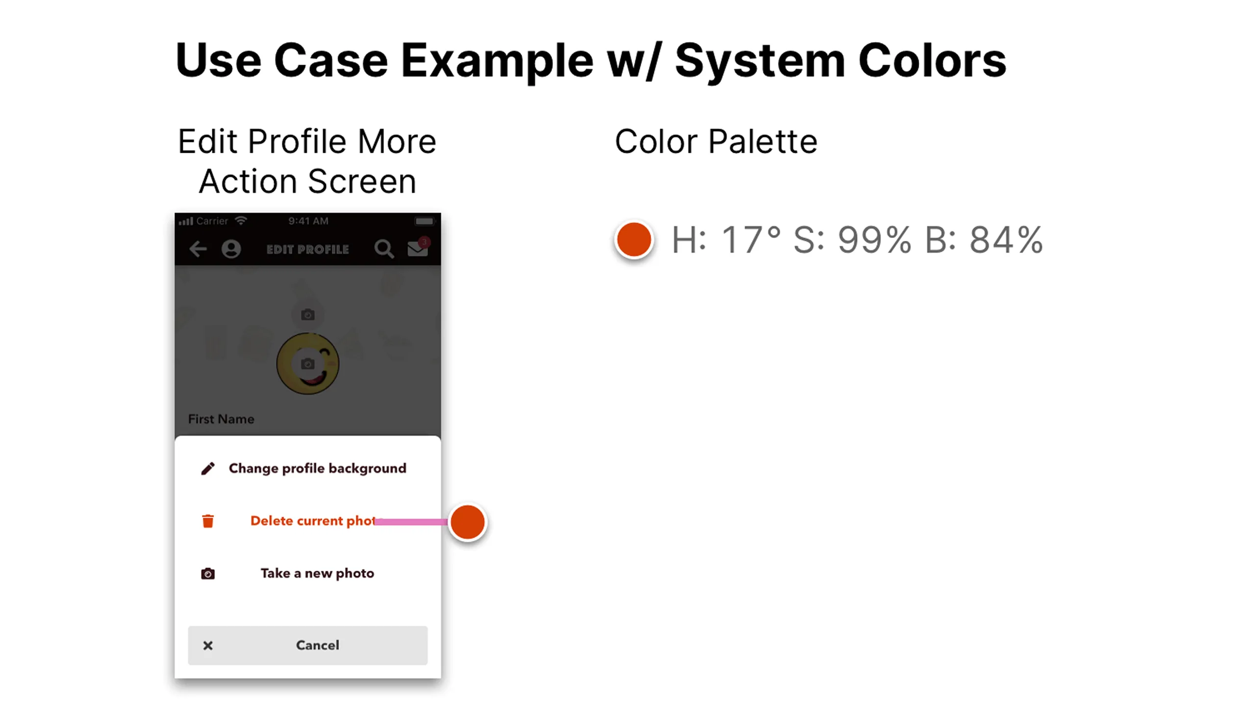
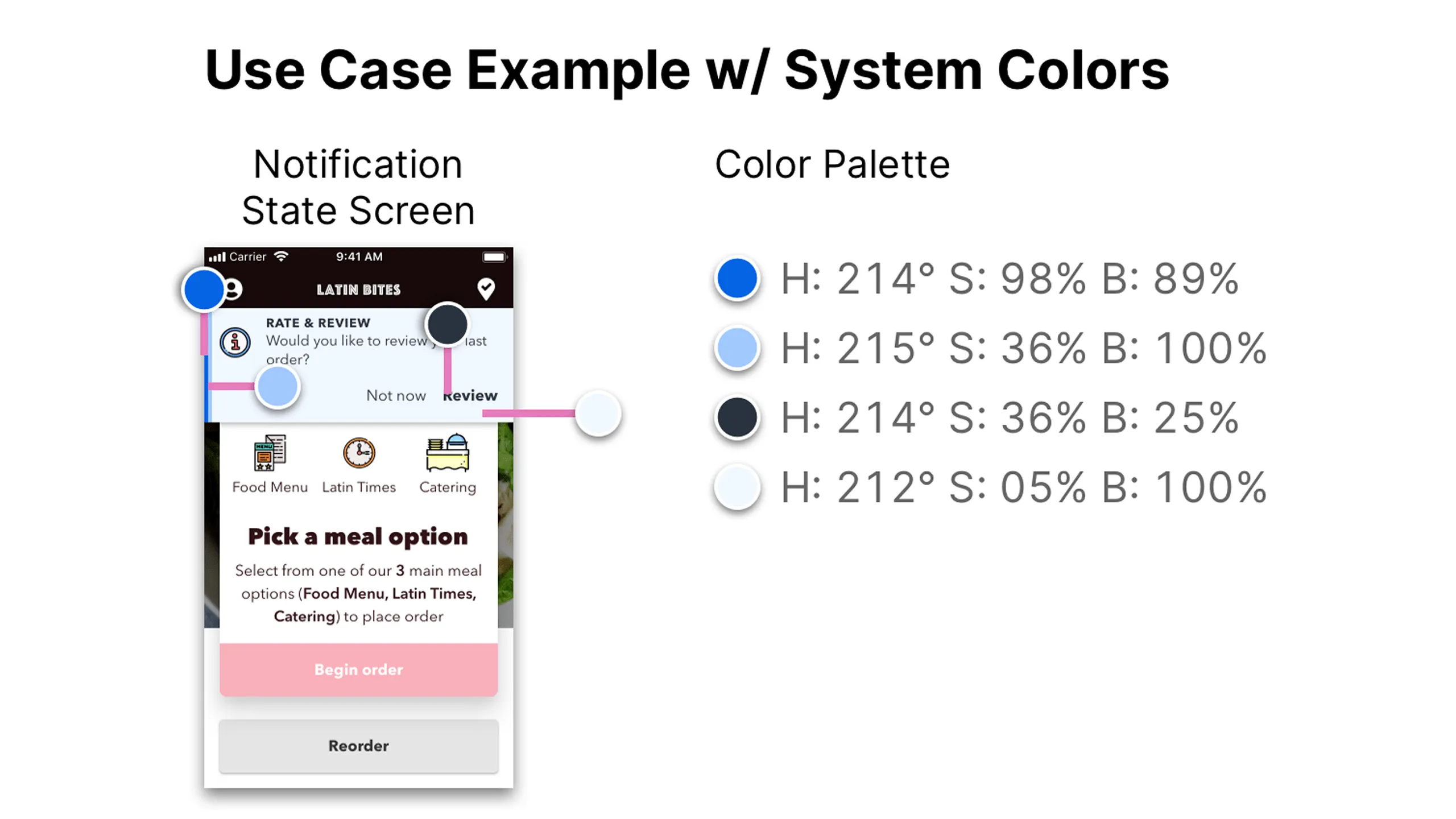
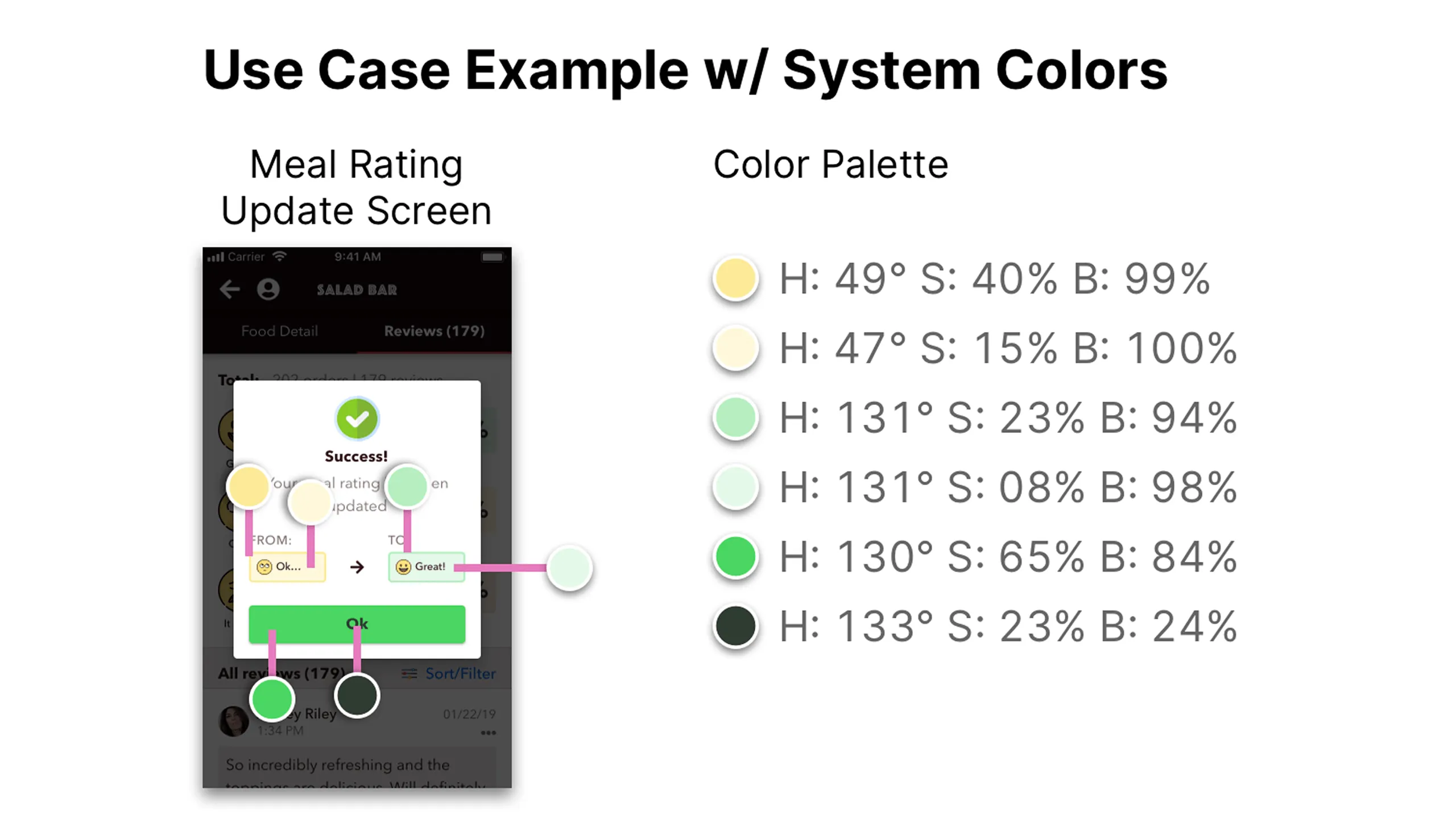
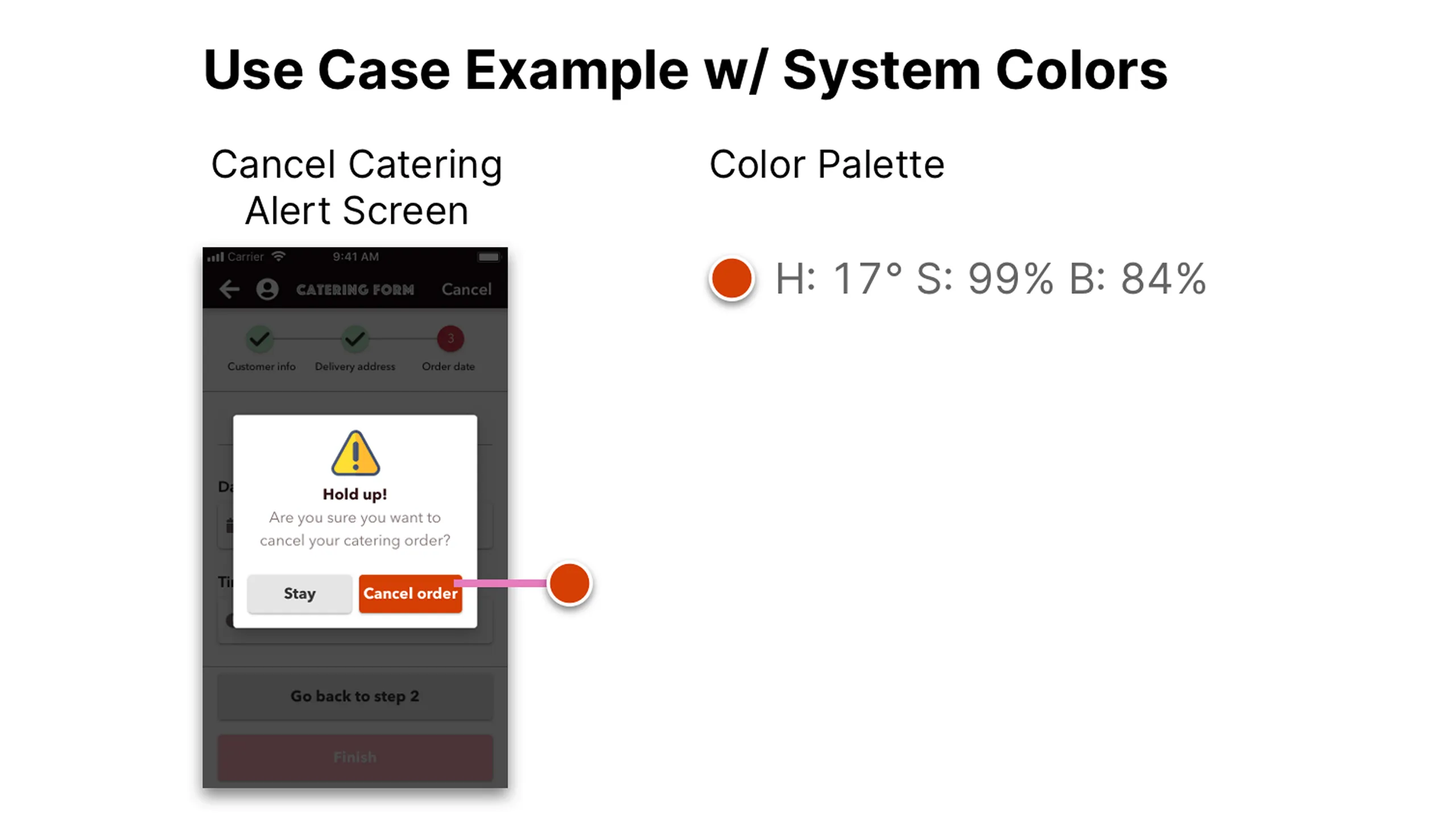
The original red in the Latin Bites logo felt a bit too harsh, so I softened it to make it feel more warm and inviting but without losing the contrast needed for accessibility. From there, I built out a full monochromatic color palette, including primary colors, neutrals, and system colors like red for errors and green for success. I took inspiration from apps that use tints and shades of a single base color and it really helped the UI look clean and consistent.

Screenshot of Latin Bites logo with original brand colors and HSB values.
Screenshot of original Latin Bites colors with contrast ratio score of 4.06:1.Screenshot comparing original and adjusted Latin Bites brand colors.Screenshot of adjusted Latin Bites logo colors with 4.64:1 contrast ratio.Screenshot showing Latin Bites color adjustments and passing contrast scores.
Screenshot of Latin Bites monochromatic color palette showing tints and shades.
Screenshot of three Latin Bites screens (burger, sign-up, catering) using the monochromatic palette.Screenshot of burger screen annotated with HSB values for each UI color.Screenshot of sign-up screen annotated with HSB values for UI elements.Screenshot of catering form screen with color annotations and HSB values.Screenshot of three screens (premade meal, rewards, salad bar) using monochromatic color palette.Screenshot of premade meal screen with contrast checker results.Screenshot of reward view history screen with contrast checker results.Screenshot of salad bar screen with contrast checker score displayed.
Screenshot showing mobile screens from Facebook, Twitter, and Amazon Photos apps using their own monochromatic palettes.
Screenshot of Facebook app screen annotated with monochromatic color usage and HSB values.Screenshot of Twitter app screen annotated with monochromatic color usage and HSB values.Screenshot of Amazon Photos app screen annotated with monochromatic color usage and HSB values.
Screenshot of Latin Bites grayscale monochromatic color palette showing tints and shades.
Screenshot of three Latin Bites screens (Food Menu, Your Order, Social Profile) using grayscale palette.Screenshot of Food Menu screen annotated with grayscale palette and HSB values.Screenshot of Your Order screen annotated with grayscale palette and HSB values.Screenshot of Social Profile screen annotated with grayscale palette and HSB values.
Screenshot of Latin Bites semantic monochromatic UI color palette showing tints and shades.
Screenshot of three Latin Bites screens (Salad Bar, Edit Profile, Notification) using semantic color palette.Screenshot of Salad Bar Review screen with HSB annotations for semantic colors.Screenshot of Edit Profile More Action screen with HSB annotations.Screenshot of Notification State screen with HSB values annotated.Screenshot of Meal Rating Update and Cancel Catering Alert screens using semantic color palette.Screenshot of Meal Rating Update screen with HSB annotations for semantic colors.Screenshot of Cancel Catering Alert screen with HSB annotations.

Shadows with depth

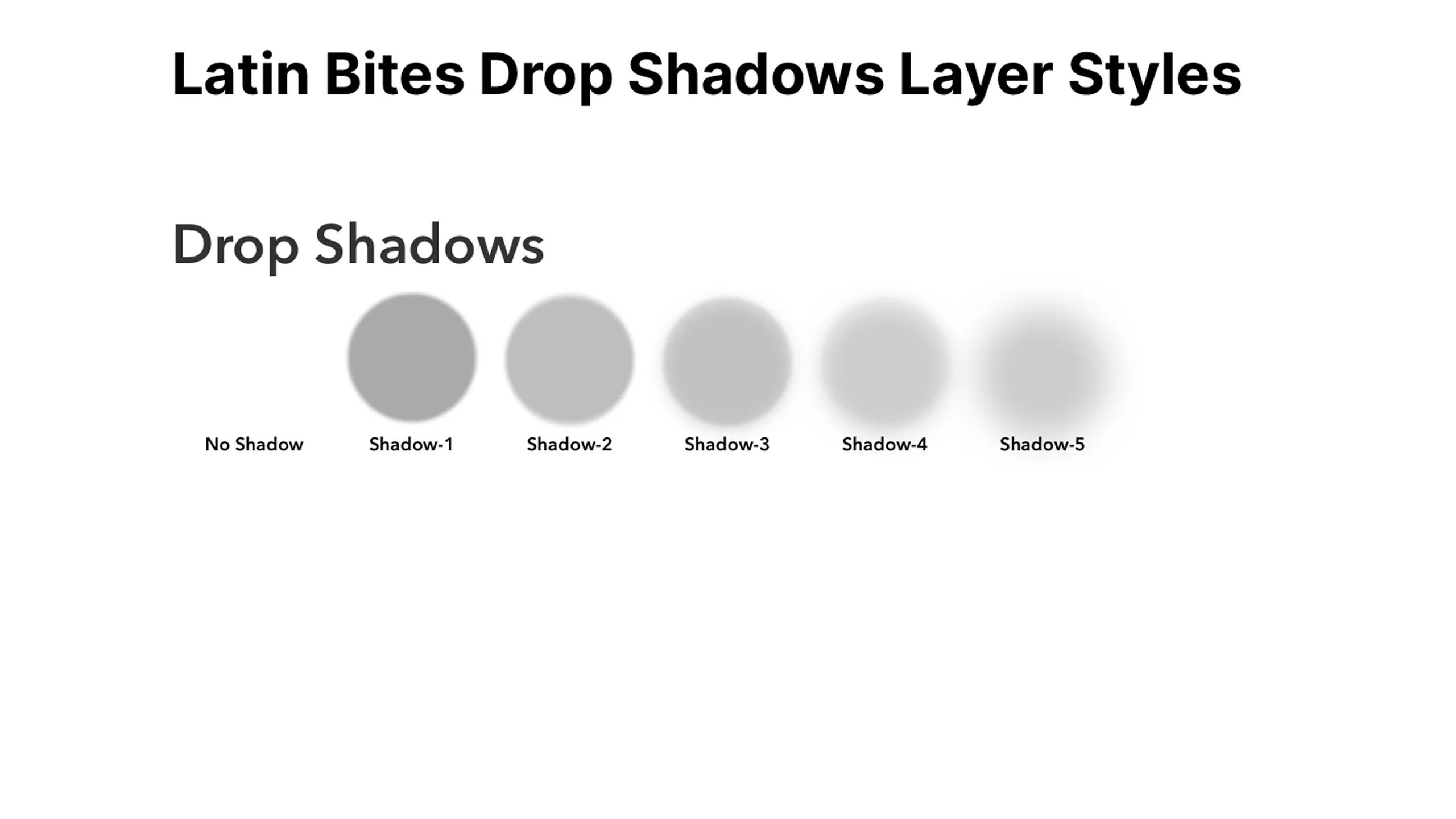
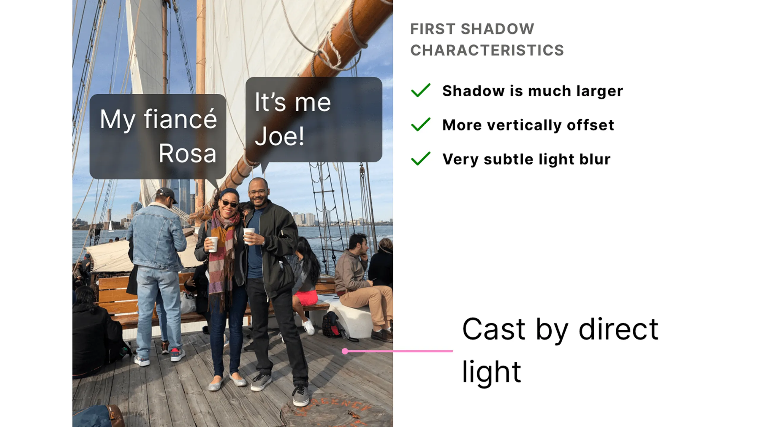
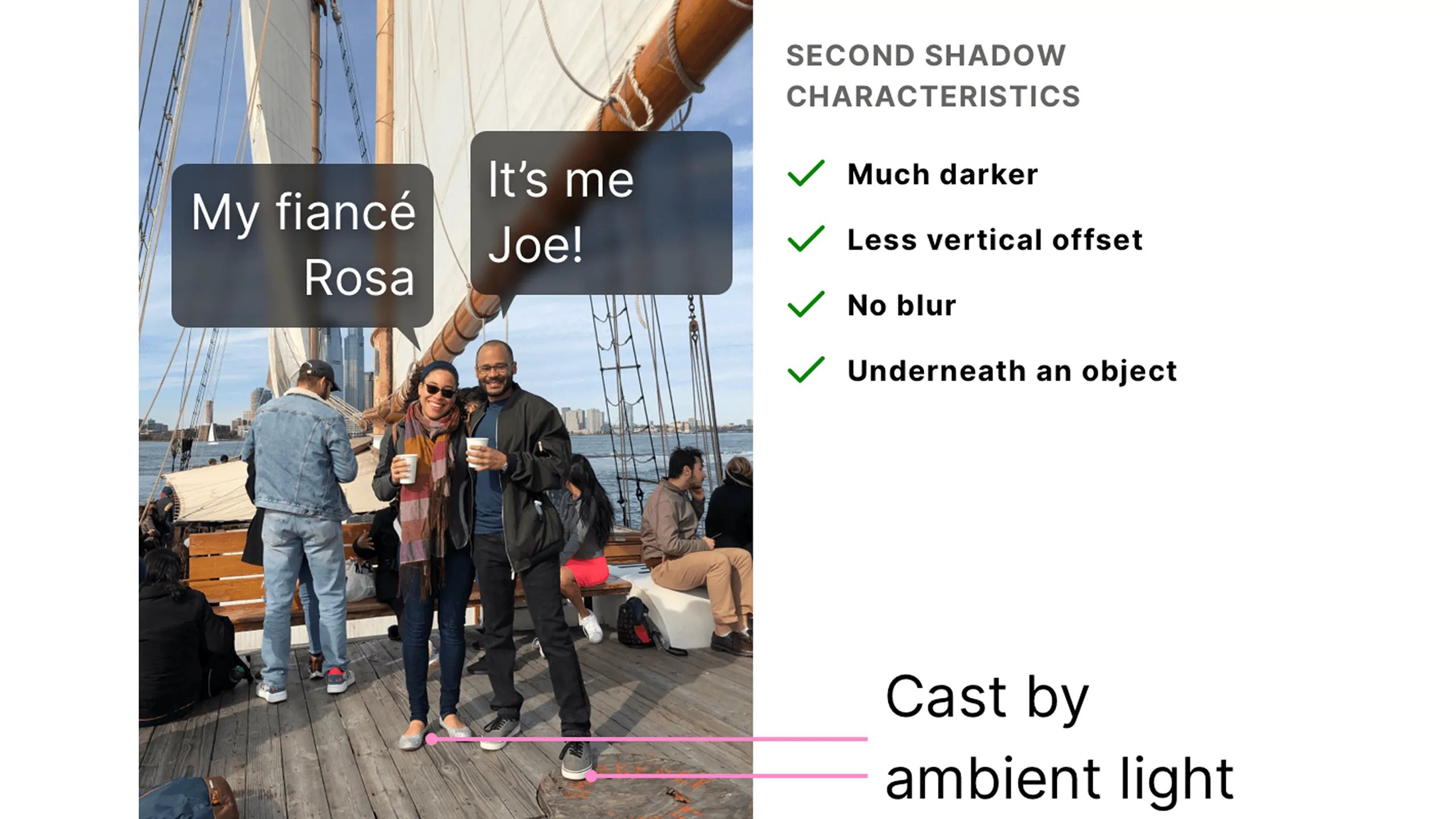
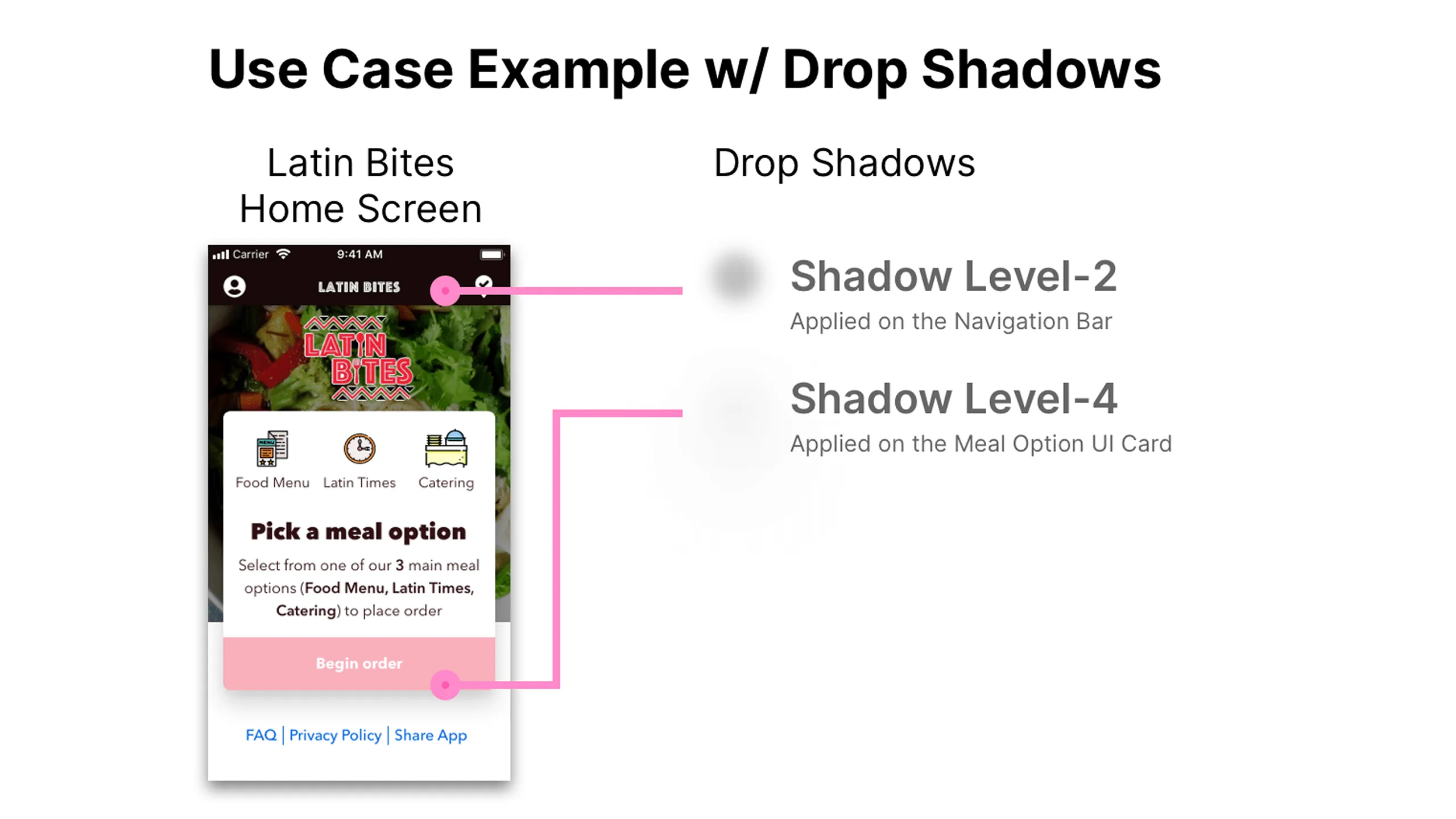
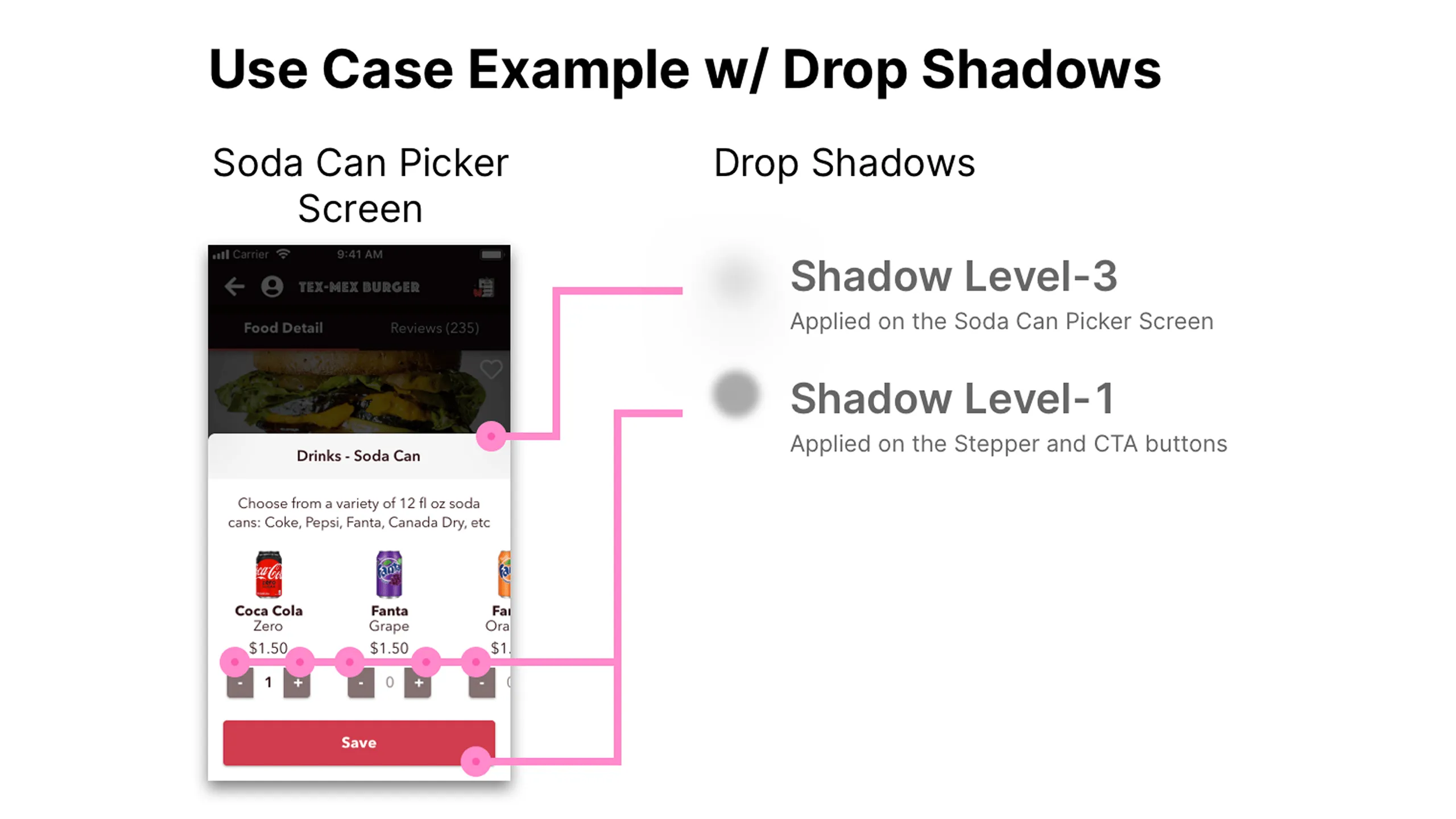
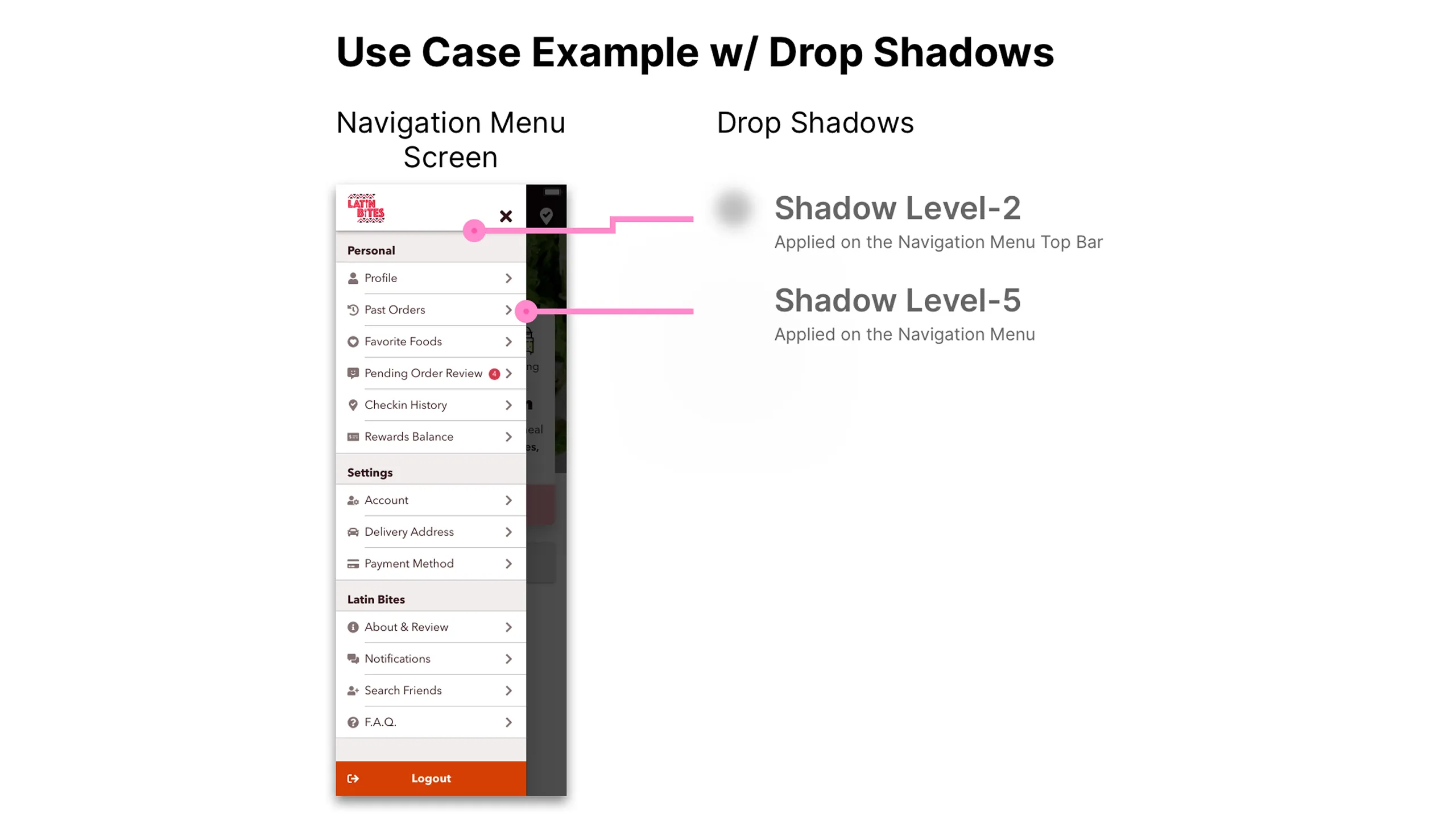
Once the color selection was completed, I began building a light-based shadows to create realistic elevation and contrast for both cards and input controls.

Screenshot of Latin Bites drop shadow layer styles with various elevation levels.
Real-life photo of you and your fiancée illustrating soft blur shadows from direct light.Real-life photo of you and your fiancée showing darker ambient shadows.Screenshot of three Latin Bites screens (Home, Soda Can Picker, Navigation Menu) using varied drop shadows.Screenshot of Latin Bites Home screen annotated with shadow layer styles.Screenshot of Soda Can Picker screen annotated with shadow usage.Screenshot of Navigation Menu screen annotated with shadow layers.

Borders, overlays & texture

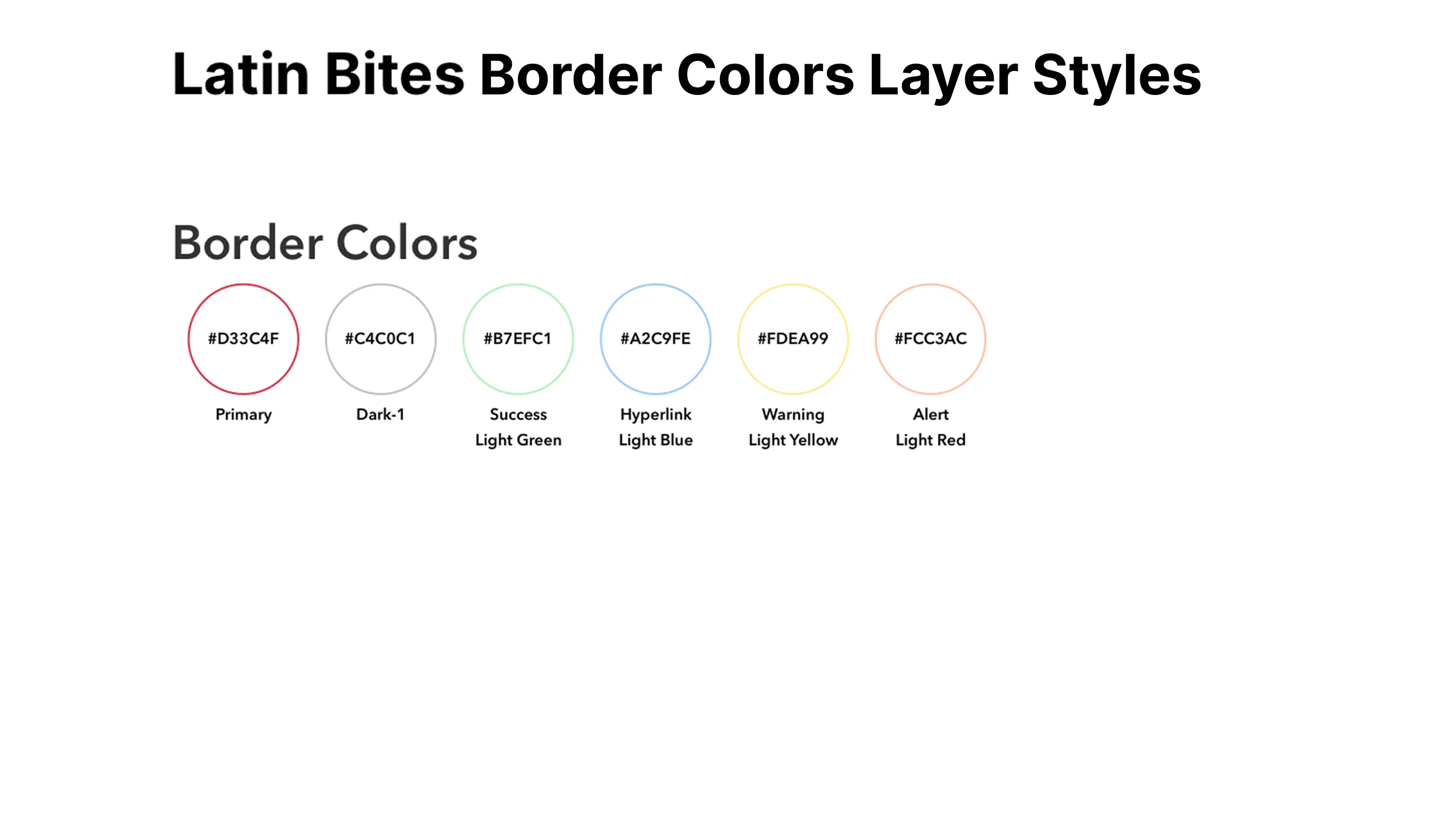
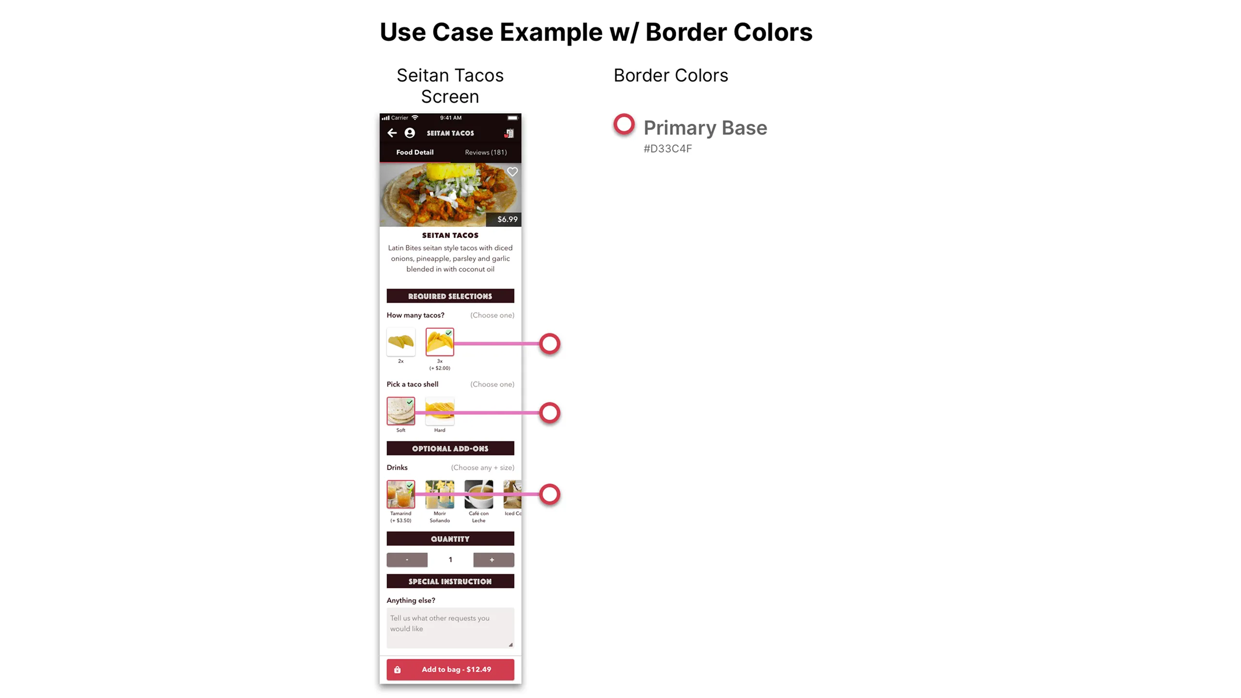
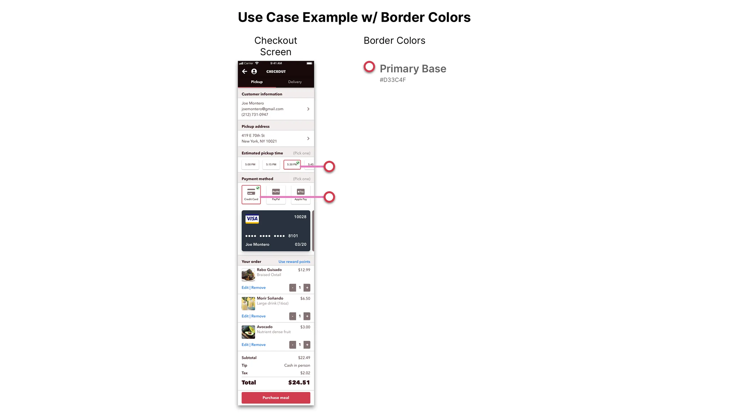
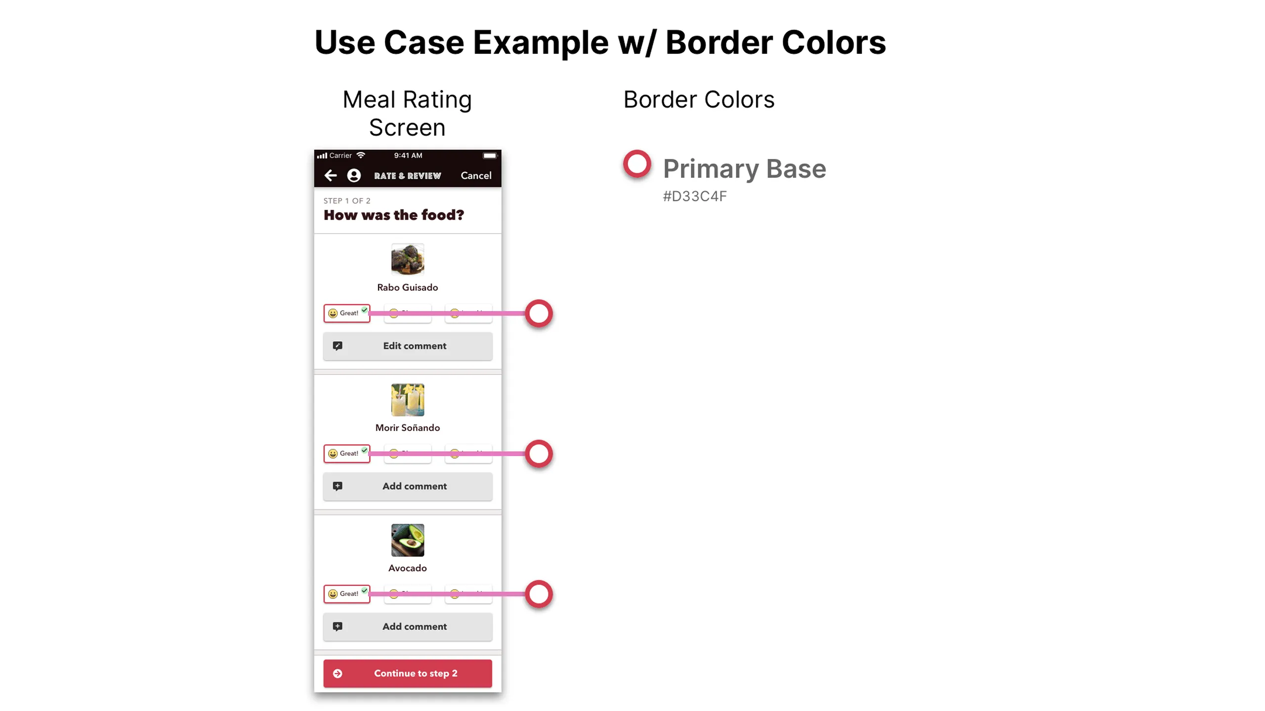
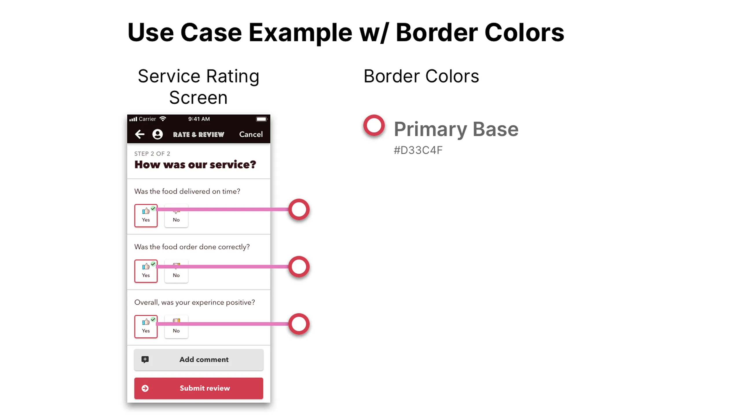
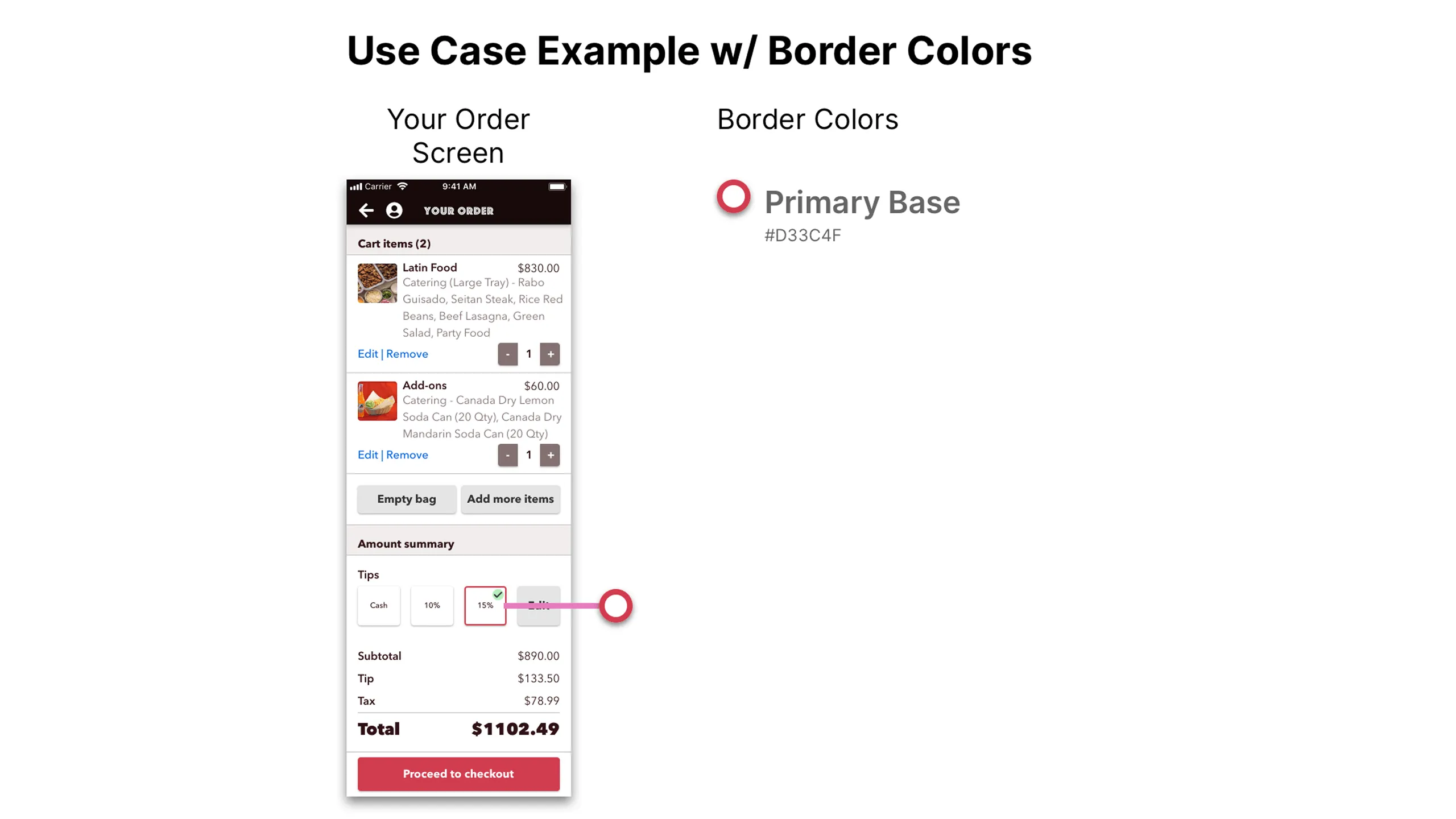
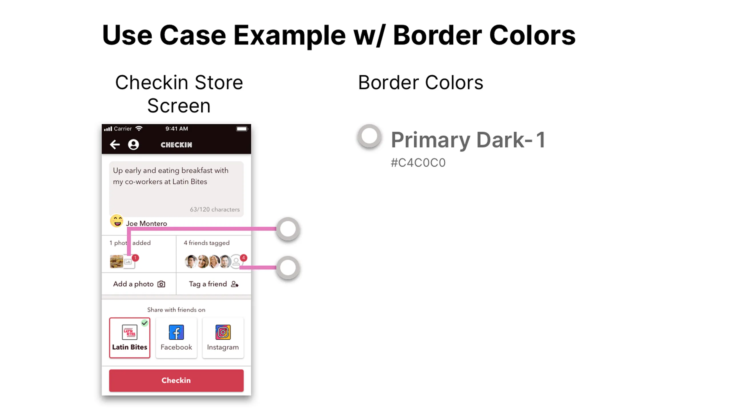
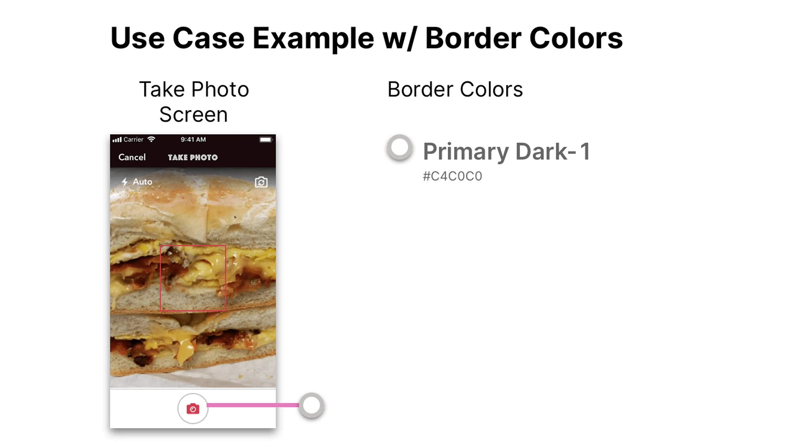
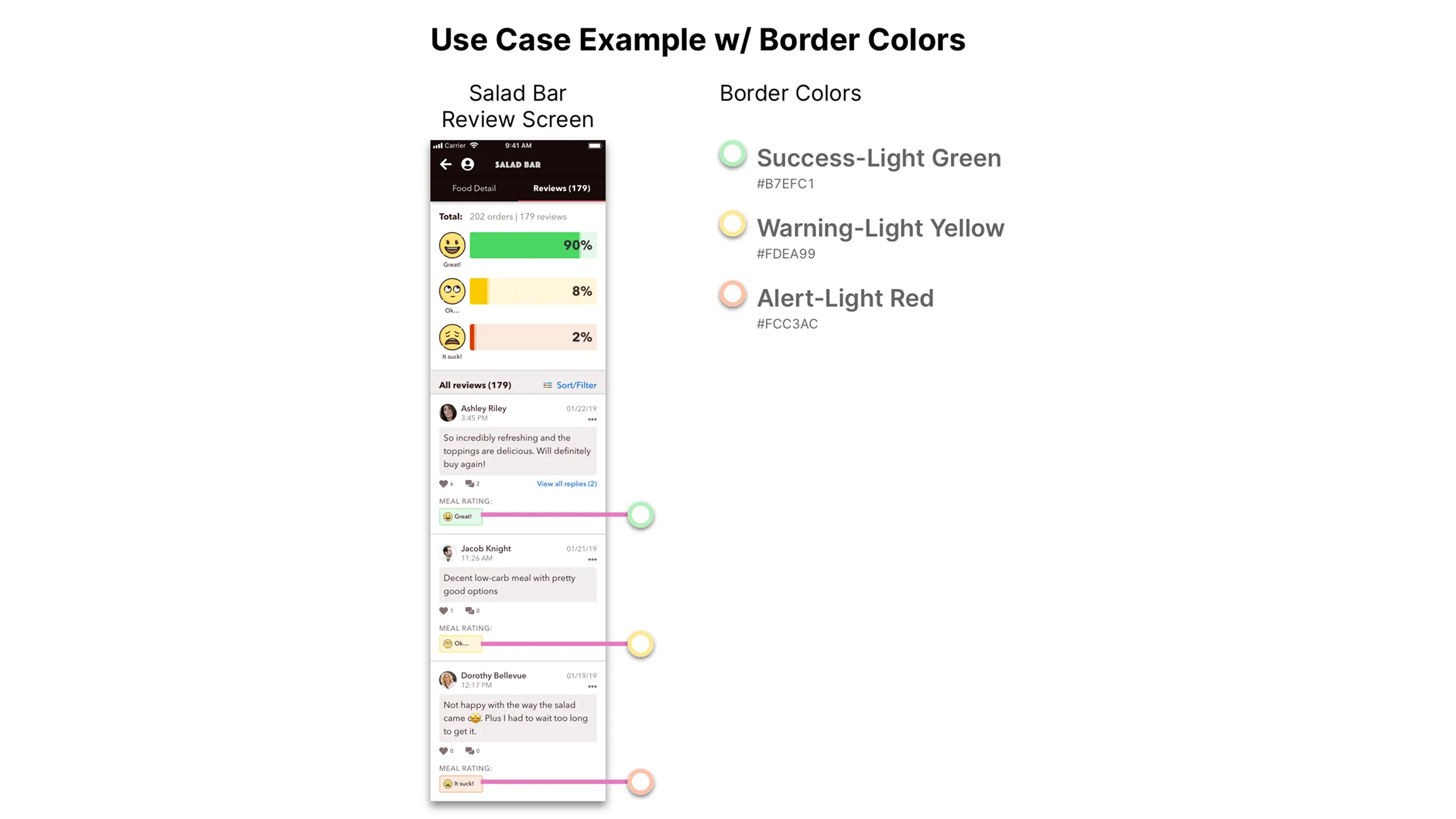
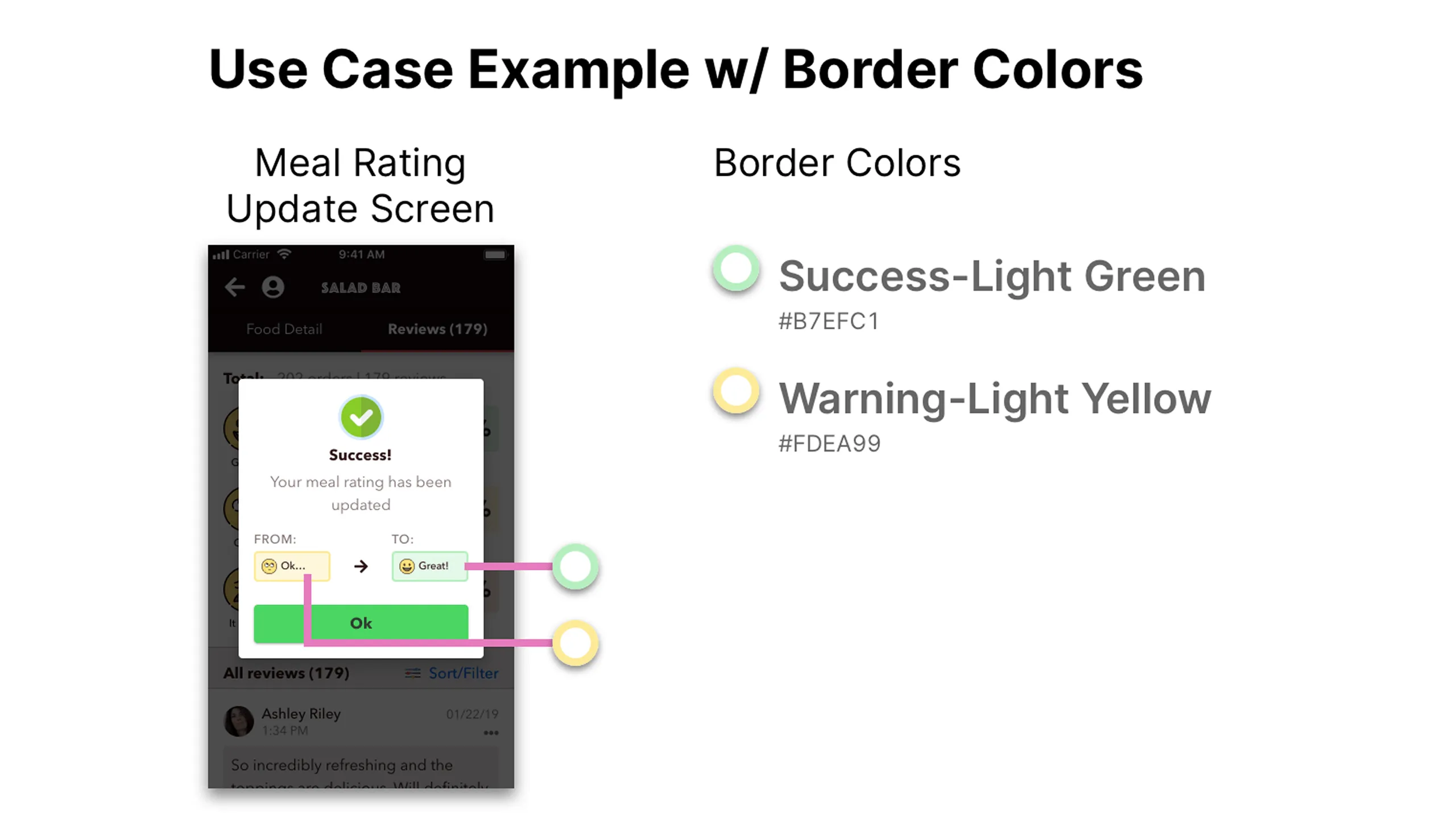
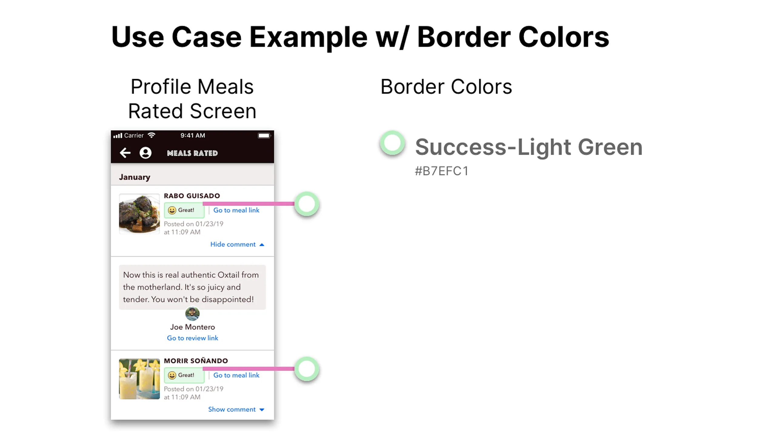
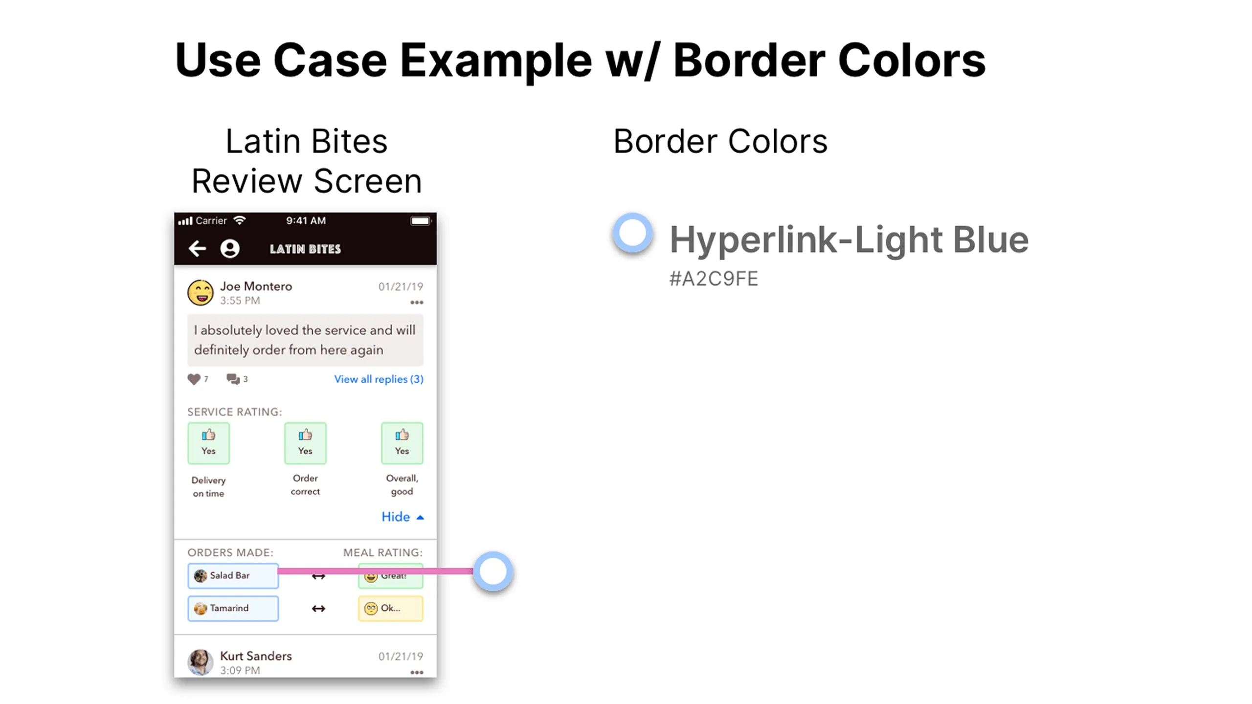
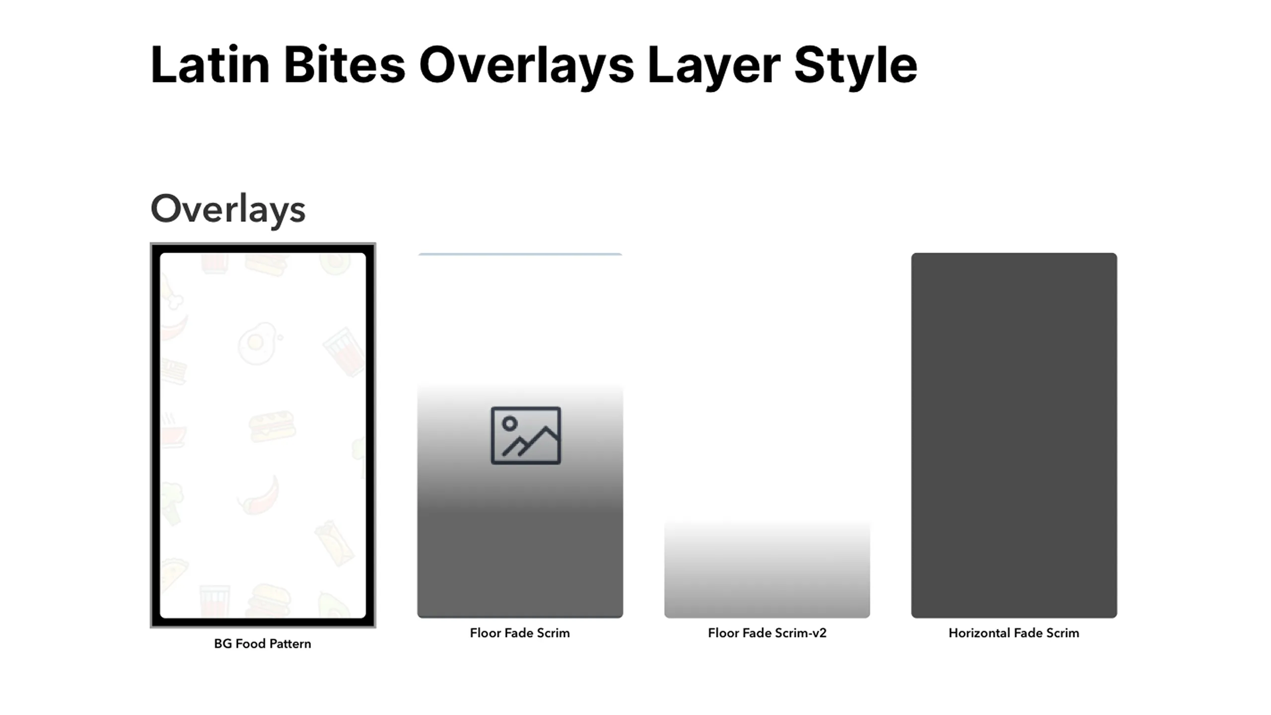
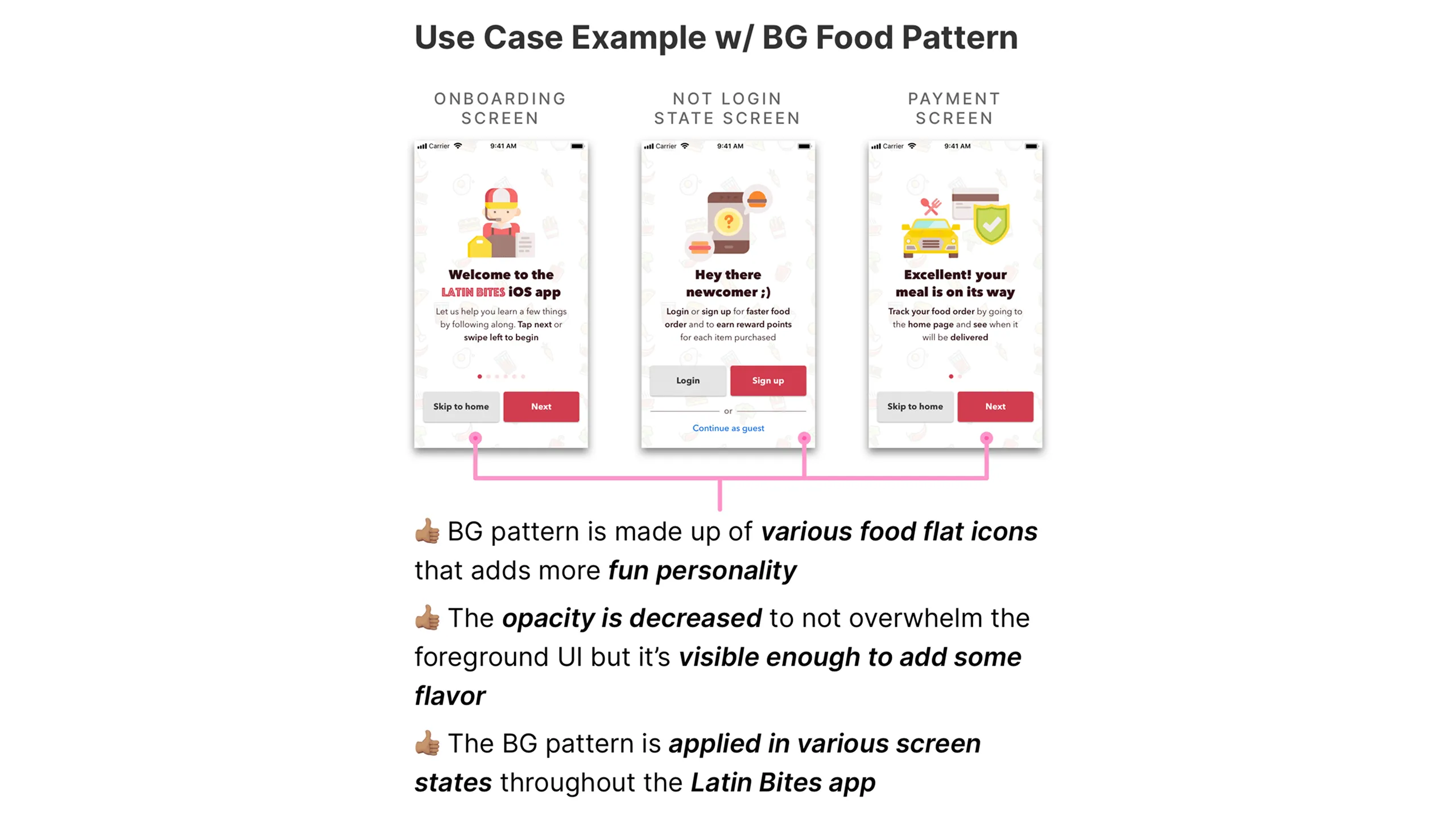
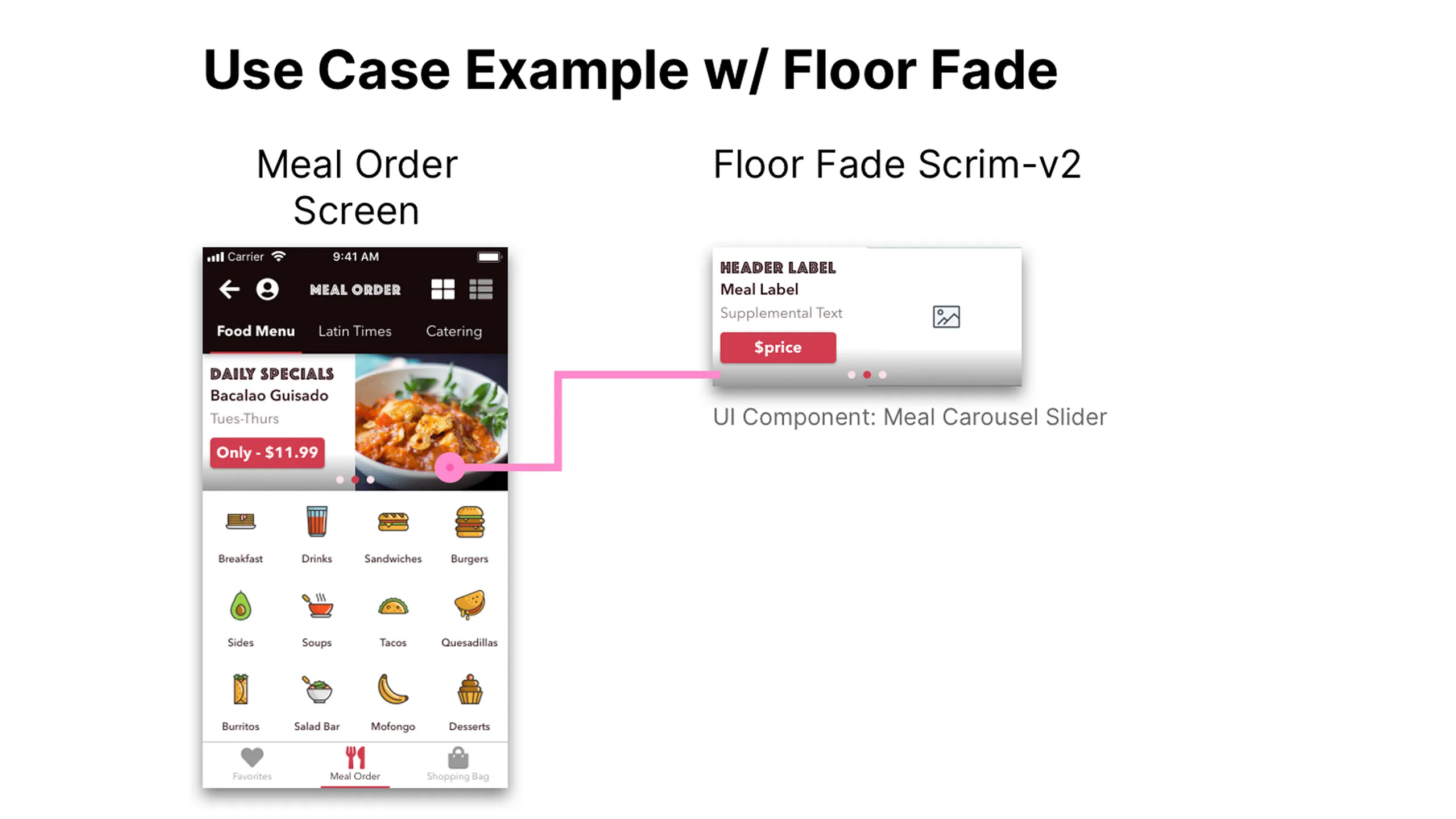
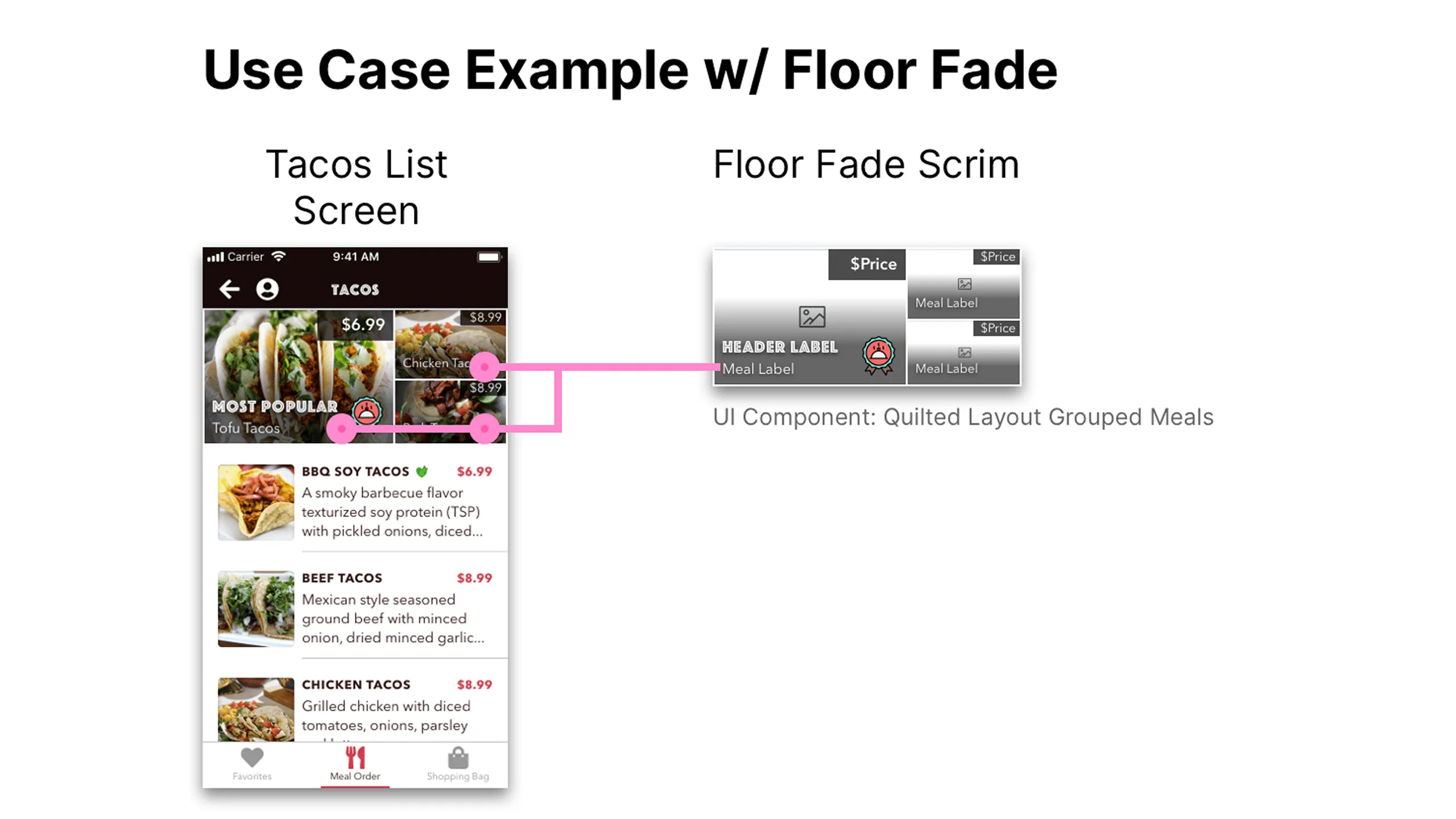
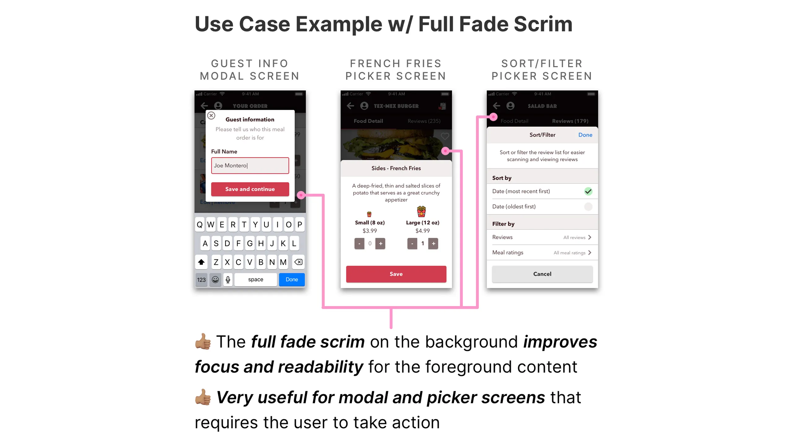
I created a handful of border styles for different use cases such as focused inputs, action buttons, ratings, and links. For overlays, I added scrims for readability and even custom background patterns using food-themed icons to keep it playful.

Screenshot of Latin Bites border color styles showing various color variations.
Screenshot of Seitan Tacos, Checkout, and Catering Form screens using different border colors.Screenshot of Meal Rating, Service Rating, and Your Order screens using border styles.Screenshot of Seitan Tacos screen with border color annotations and hex values.Screenshot of Checkout screen with annotated border colors and hex codes.Screenshot of Meal Rating screen with annotated border colors and hex values.Screenshot of Service Rating screen with annotated border color hex codes.Screenshot of Your Order screen with border color annotations and hex values.Screenshot of Checkin Store and Take Photo screens using border colors.Screenshot of Checkin Store screen with annotated border colors and hex values.Screenshot of Take Photo screen with border hex annotations.Screenshot of Salad Bar Review, Meal Rating Update, and Profile Meals Rated screens with border styles.Screenshot of Salad Bar Review screen with border annotations and hex values.Screenshot of Meal Rating Update screen with annotated borders.Screenshot of Profile Meals Rated screen with border color annotations.Screenshot of Latin Bites Review screen using various border styles.Screenshot of Latin Bites Review screen with annotated border color hex codes.
Screenshot of Latin Bites overlay layer styles with multiple variations.
Screenshot of various background pattern UI inspirations with food and abstract motifs.Screenshot of Onboarding, Not Logged In, and Payment screens using background patterns.Screenshot of Meal Order and Tacos List screens using floor fade overlays.Screenshot of Meal Order screen with annotated use of floor fade on daily specials component.Screenshot of Tacos List screen with annotated use of floor fade on quilted food image layout.Screenshot of Guest Info Modal, French Fries Picker, and Sort/Filter Picker screens using full fade overlays.

Fonts with personality

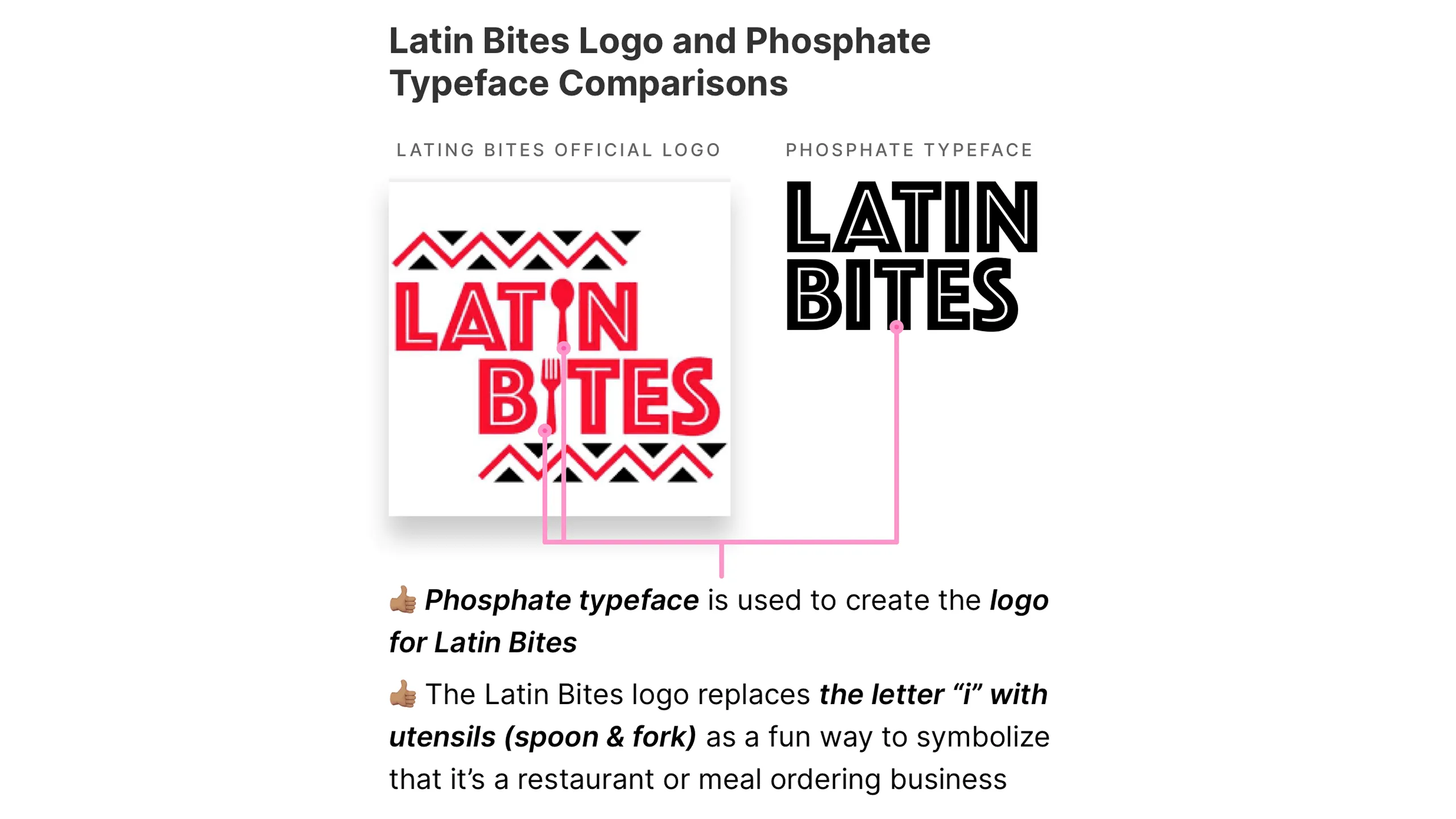
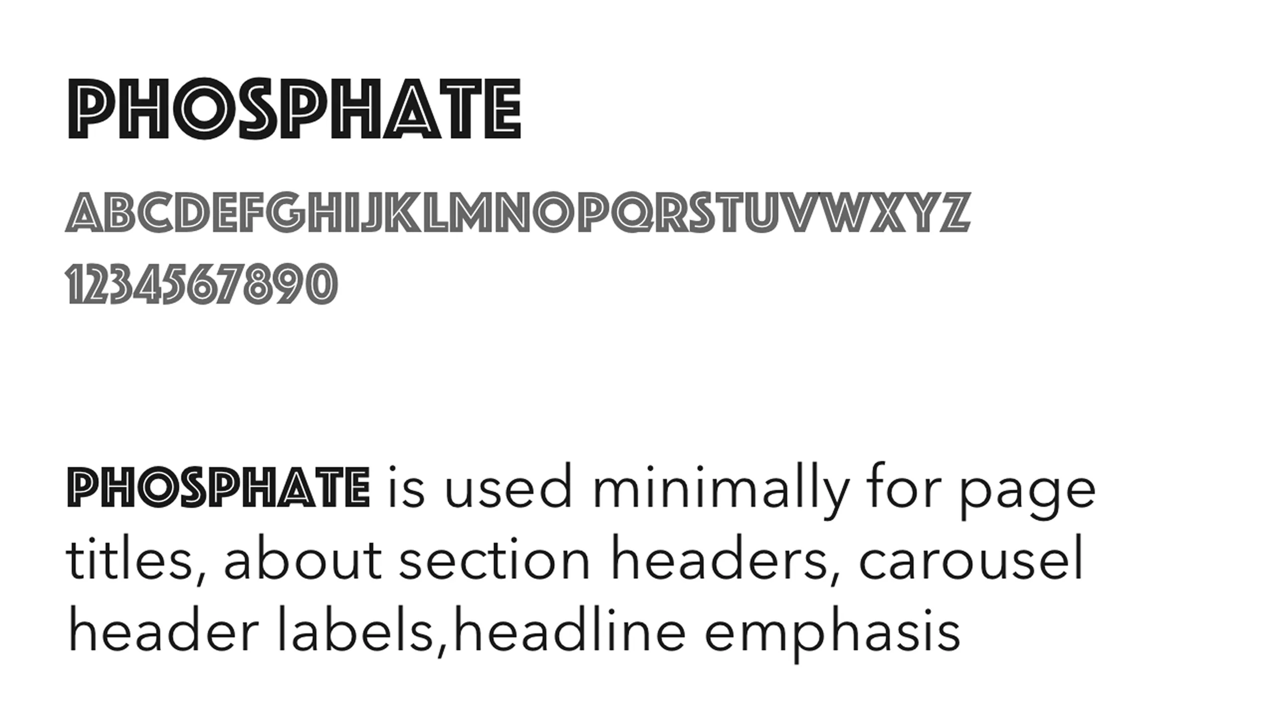
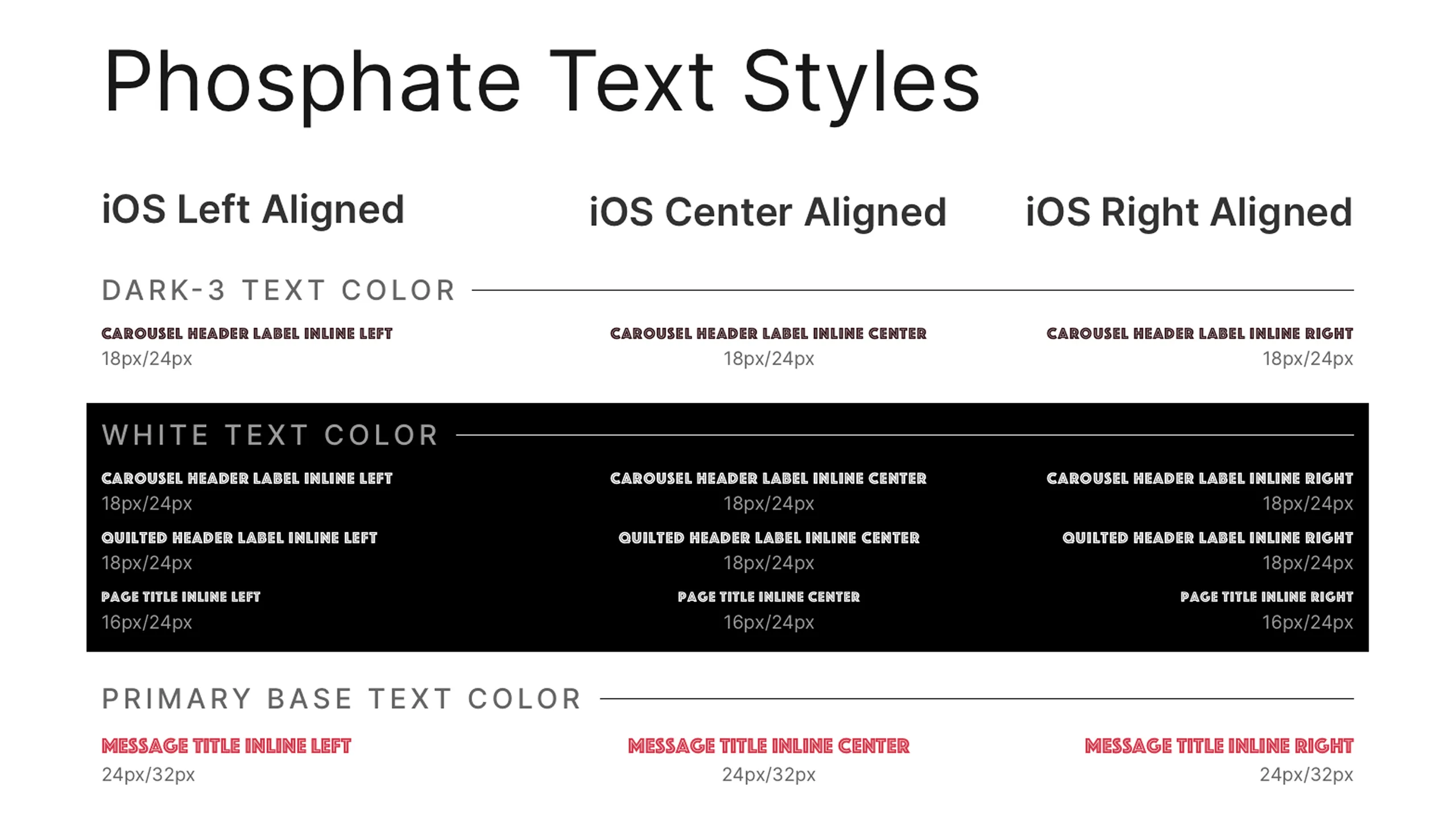
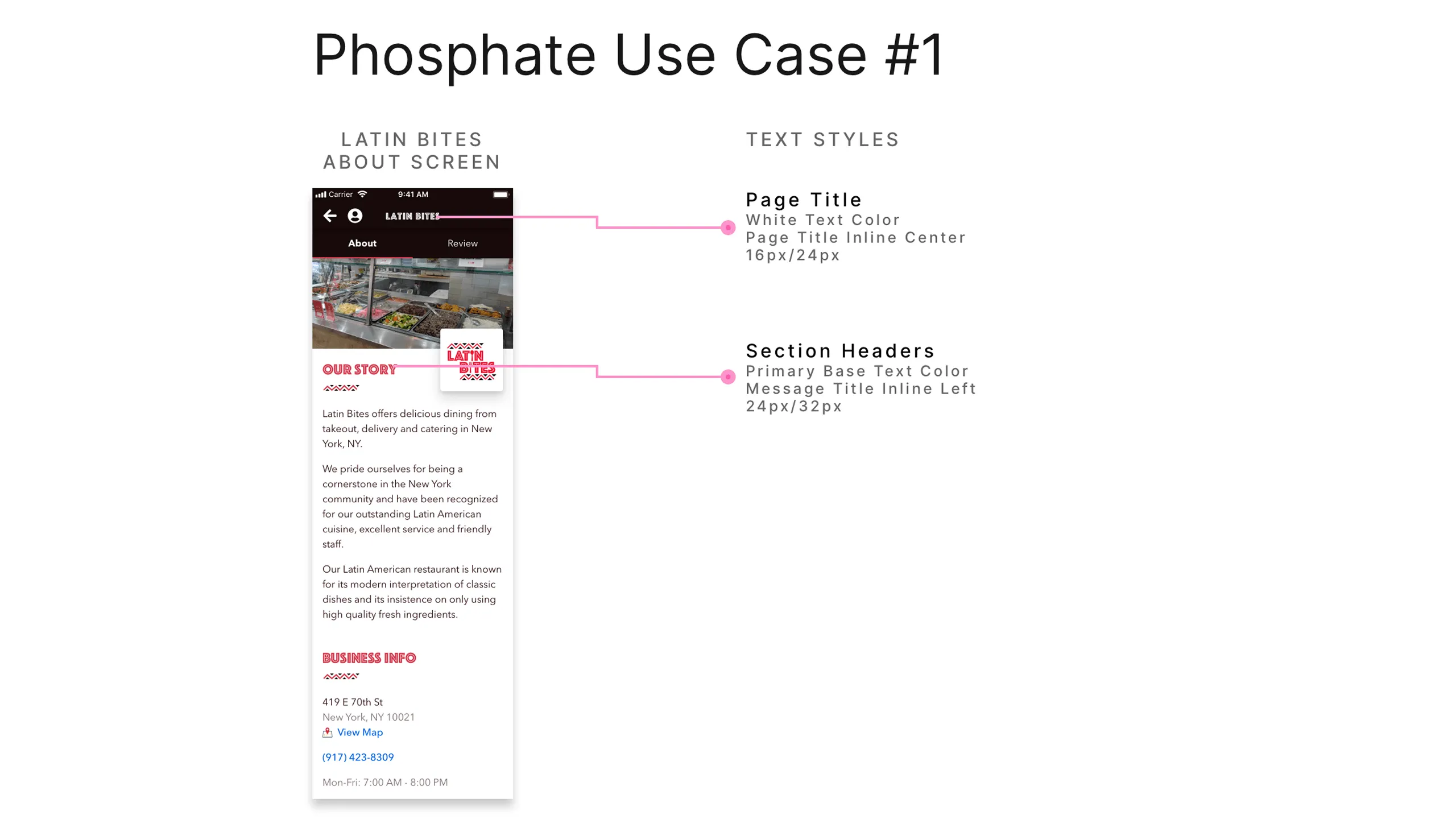
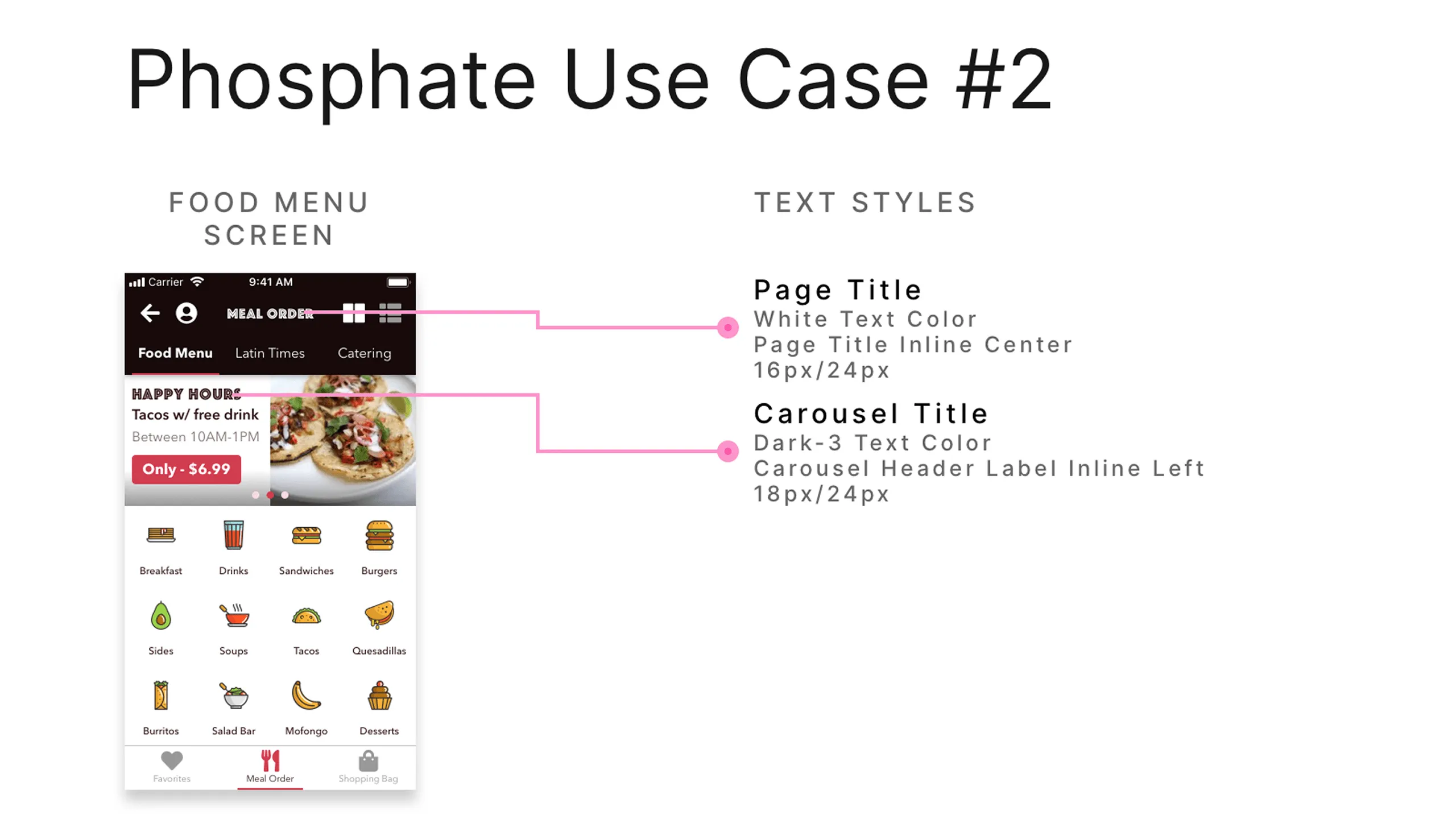
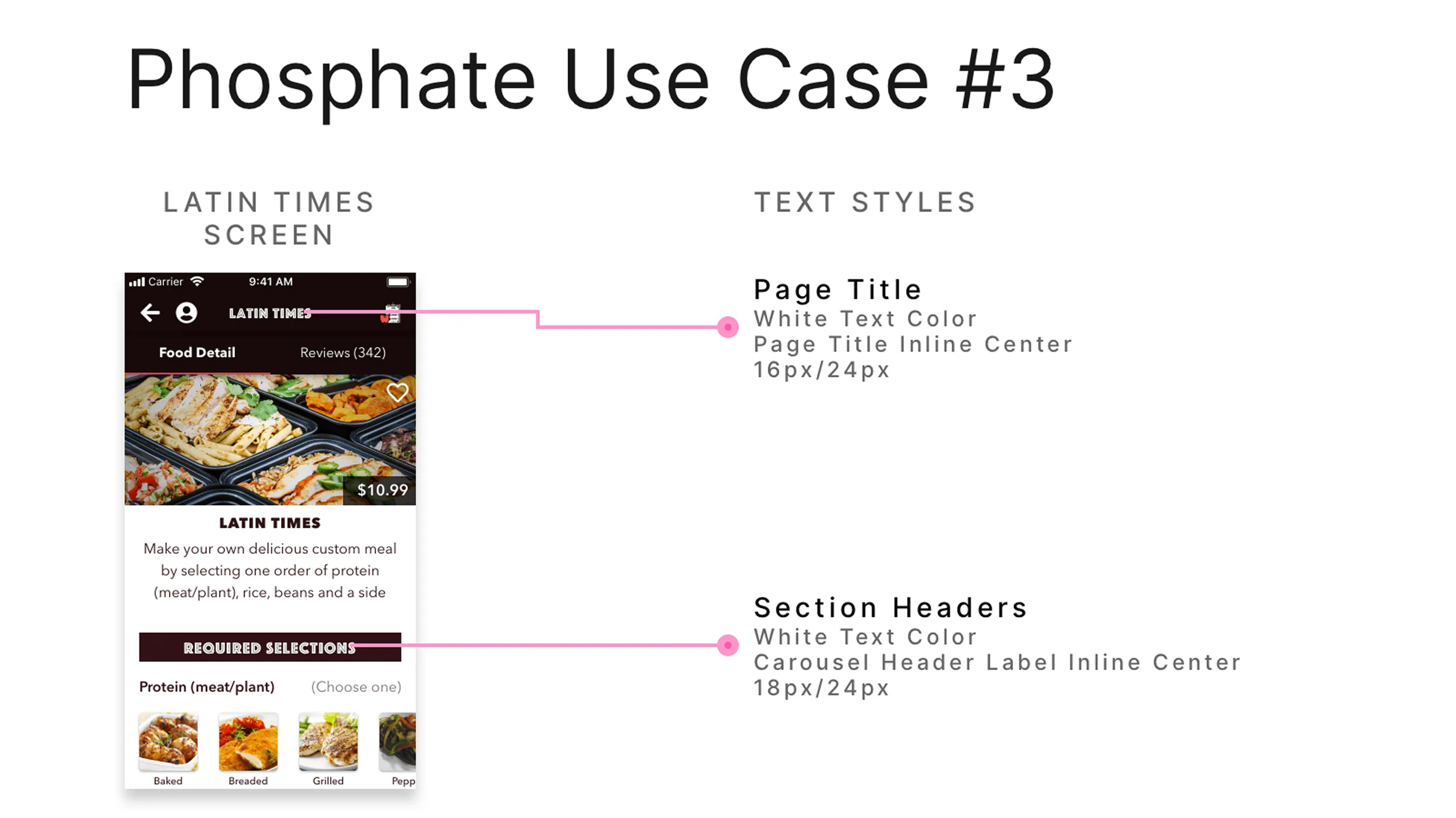
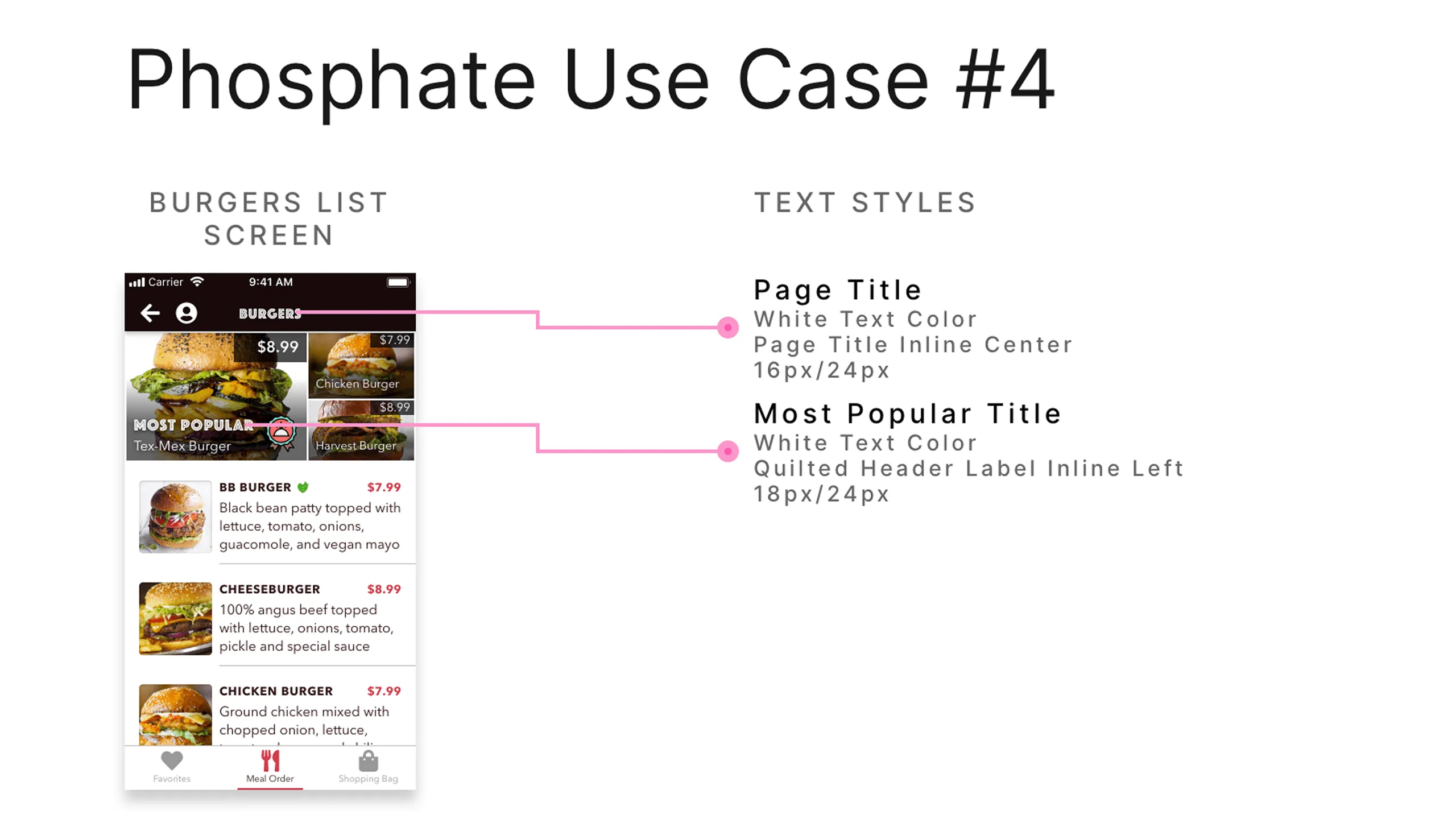
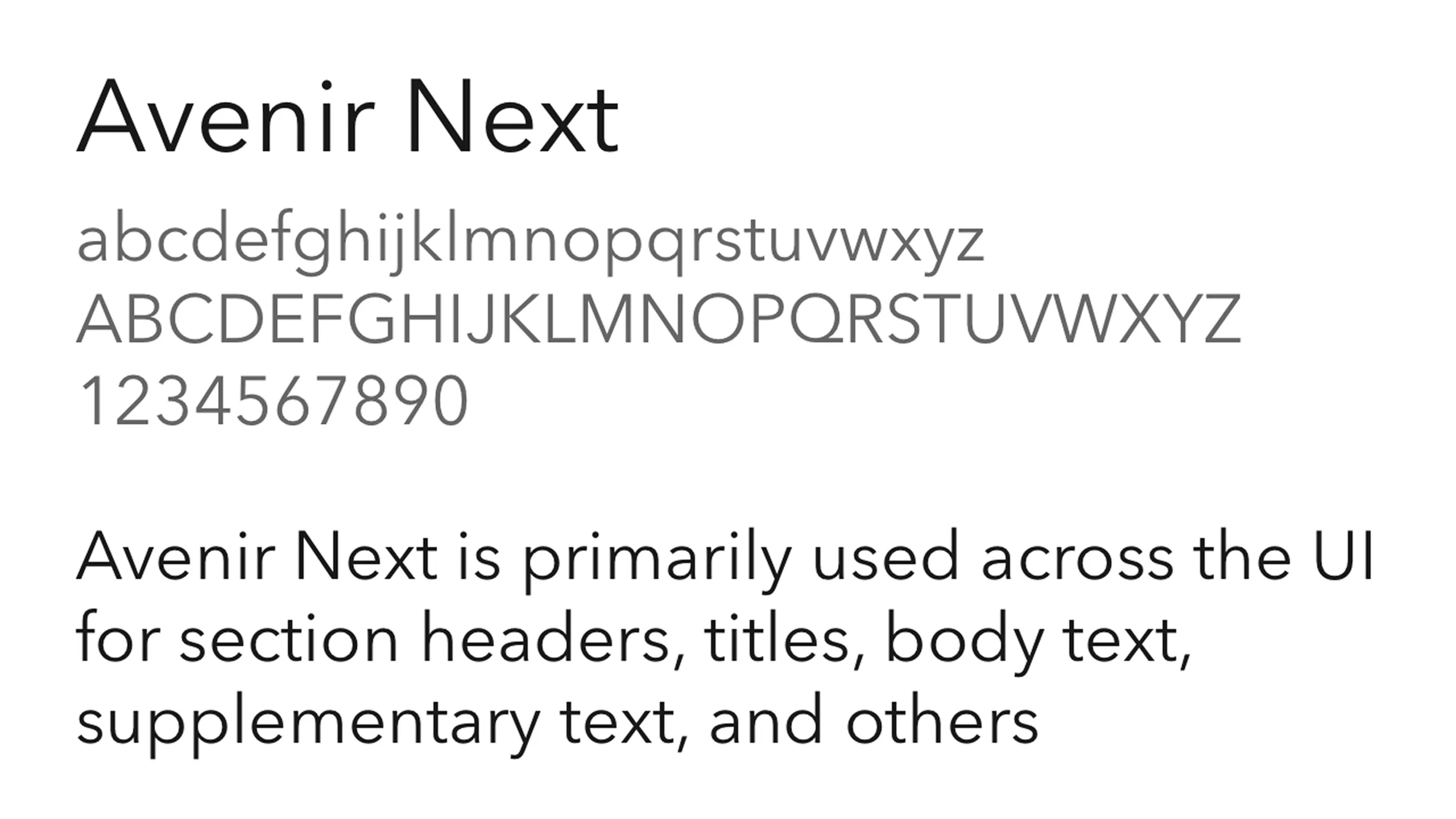
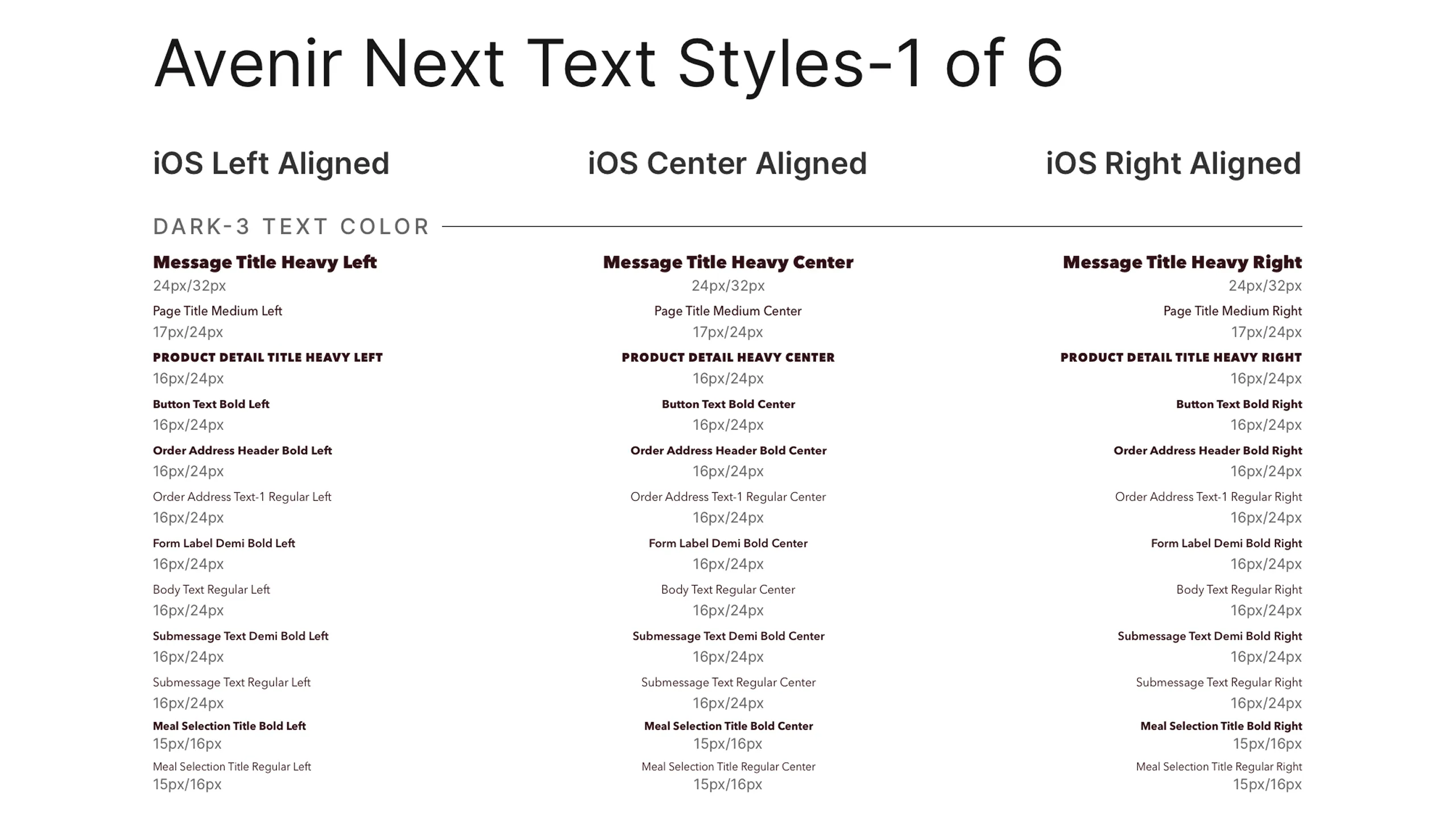
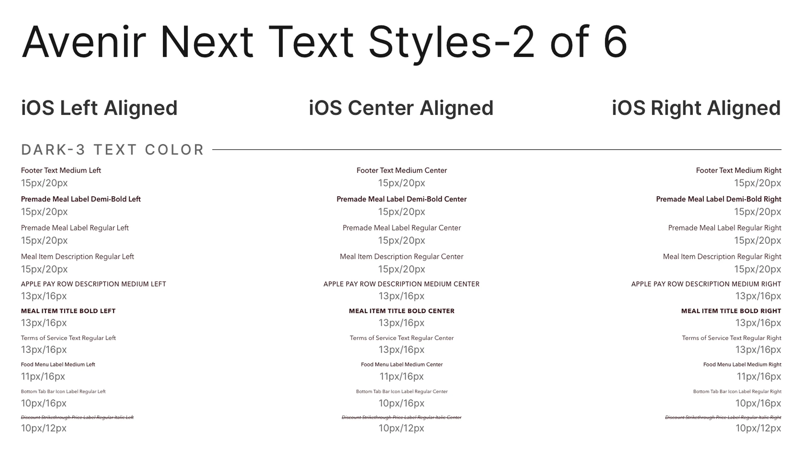
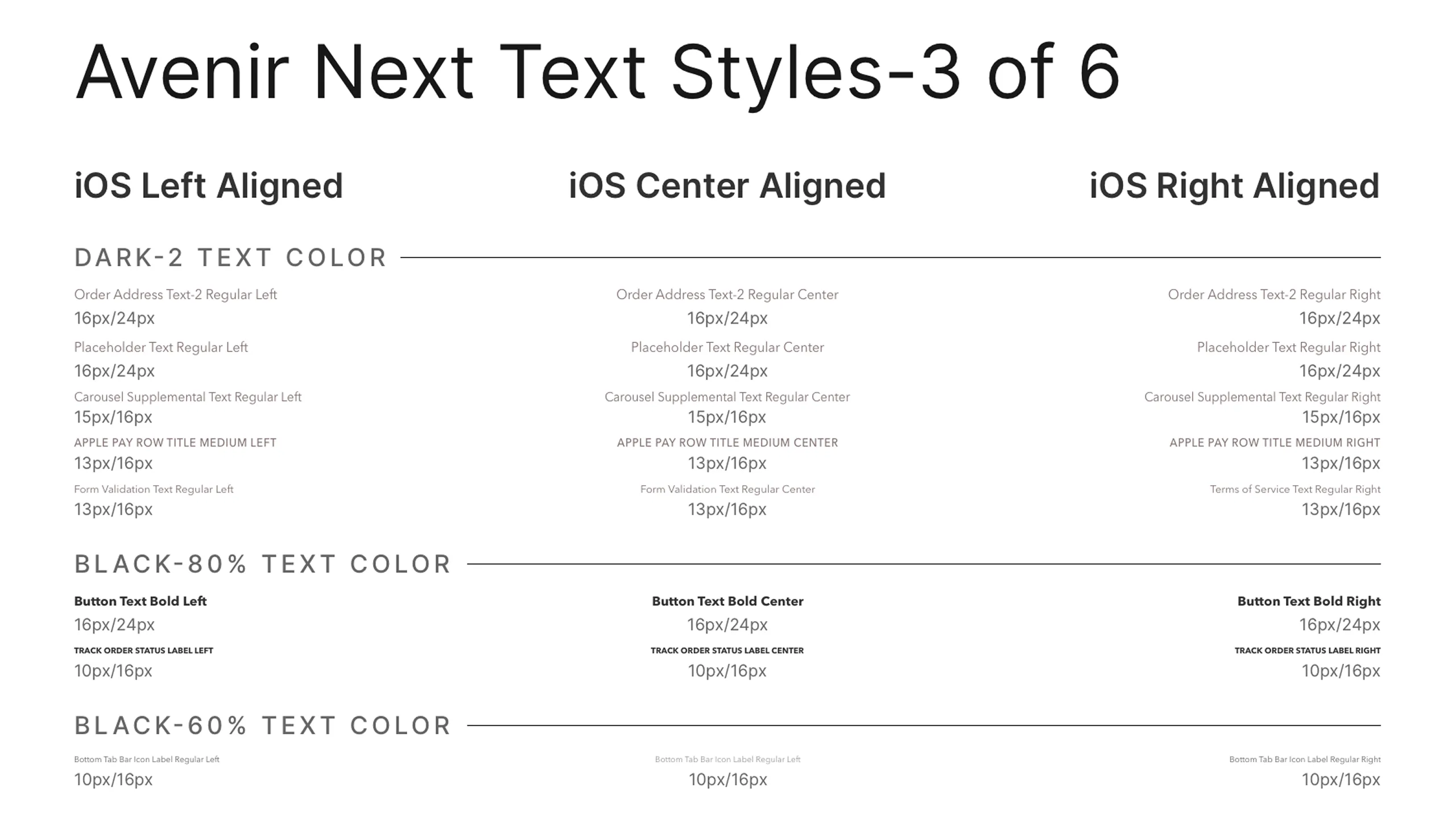
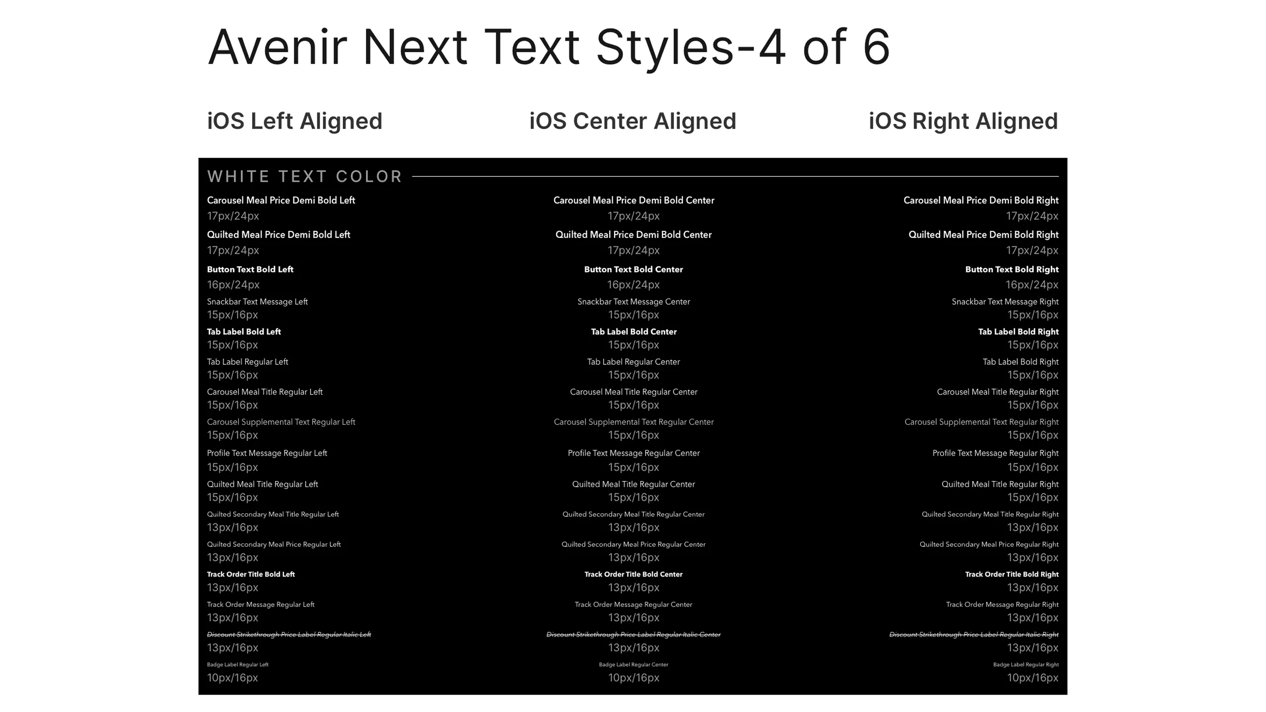
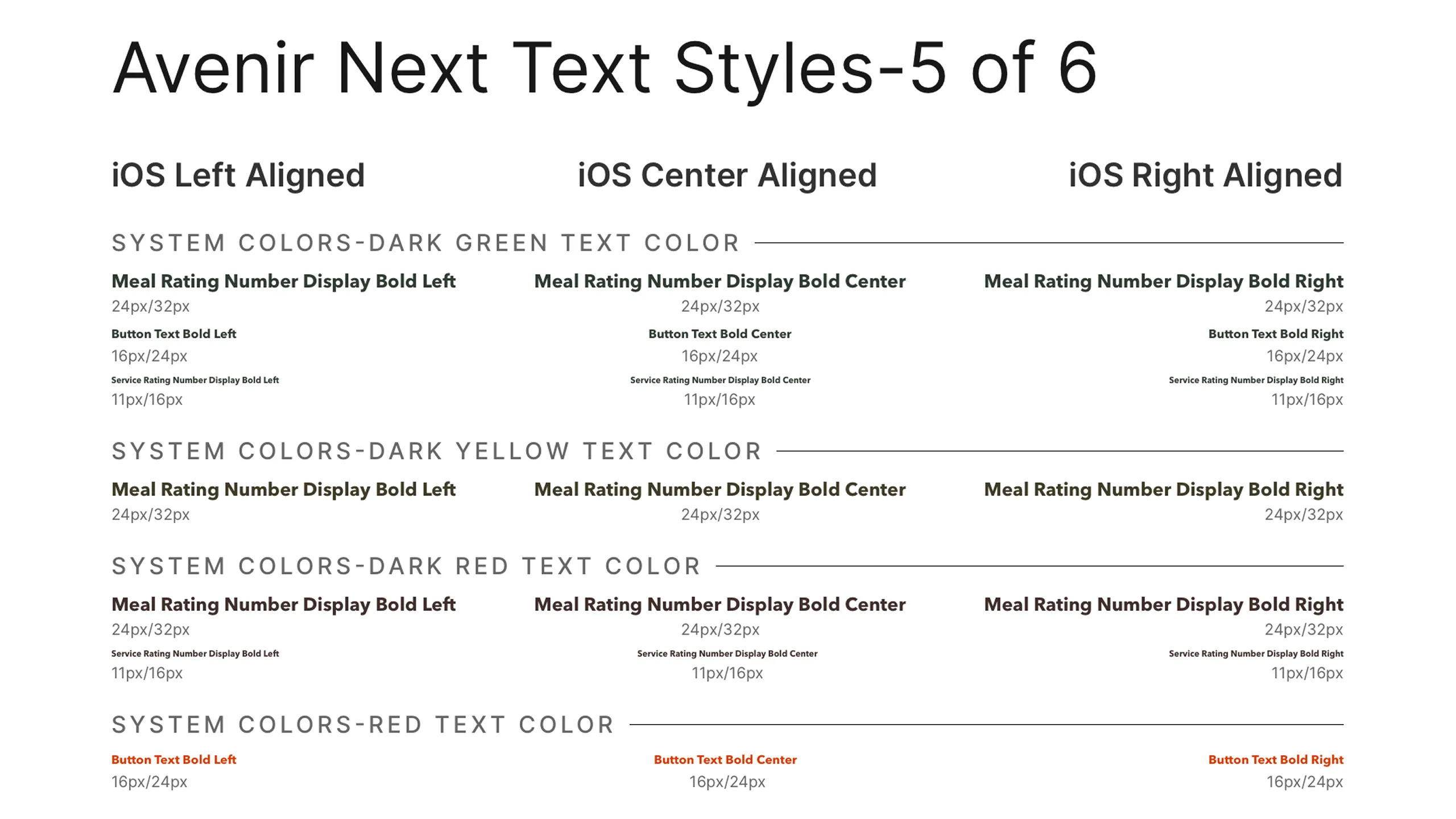
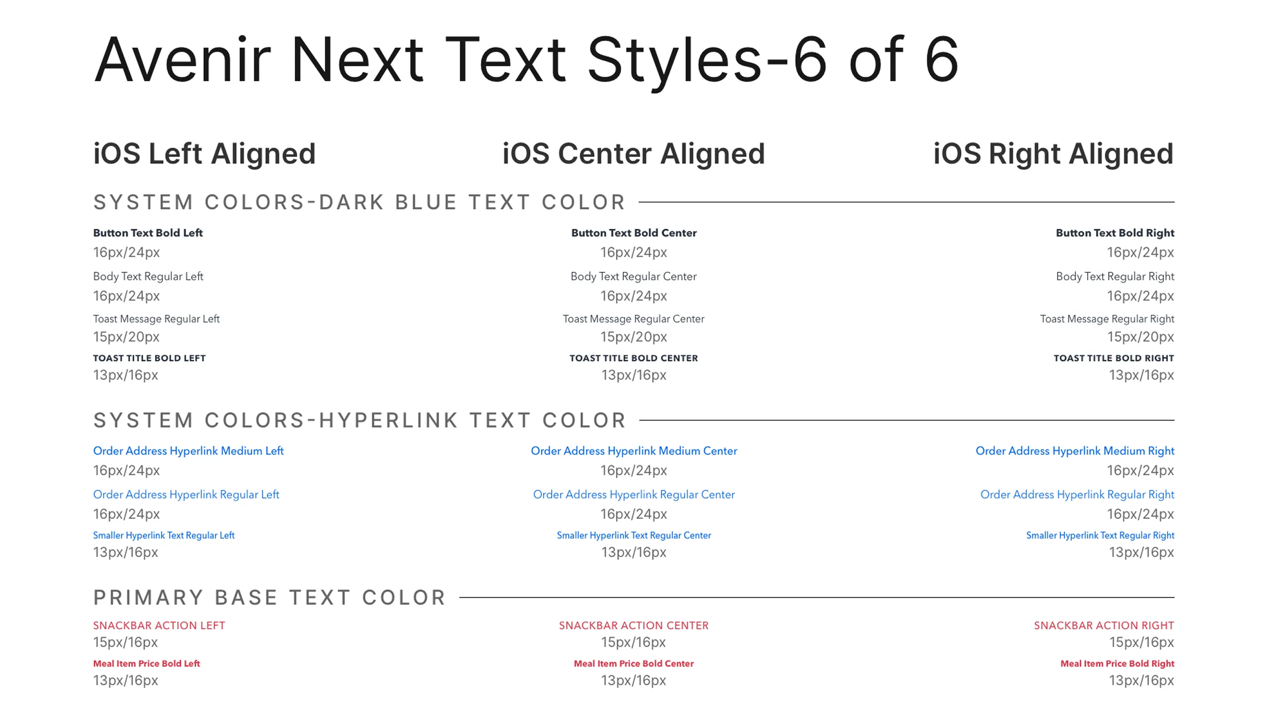
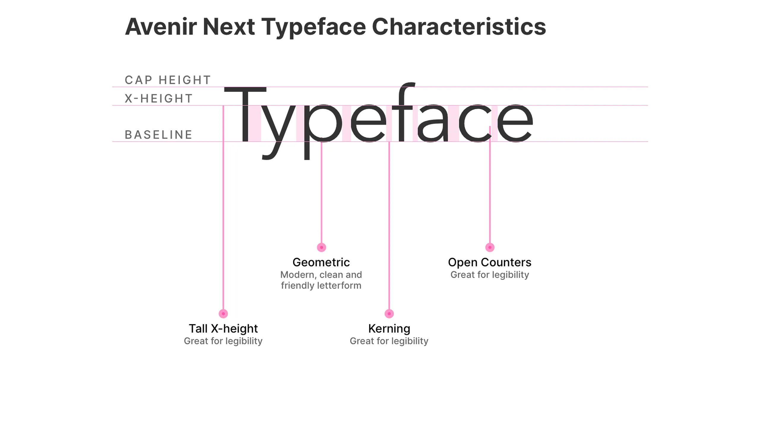
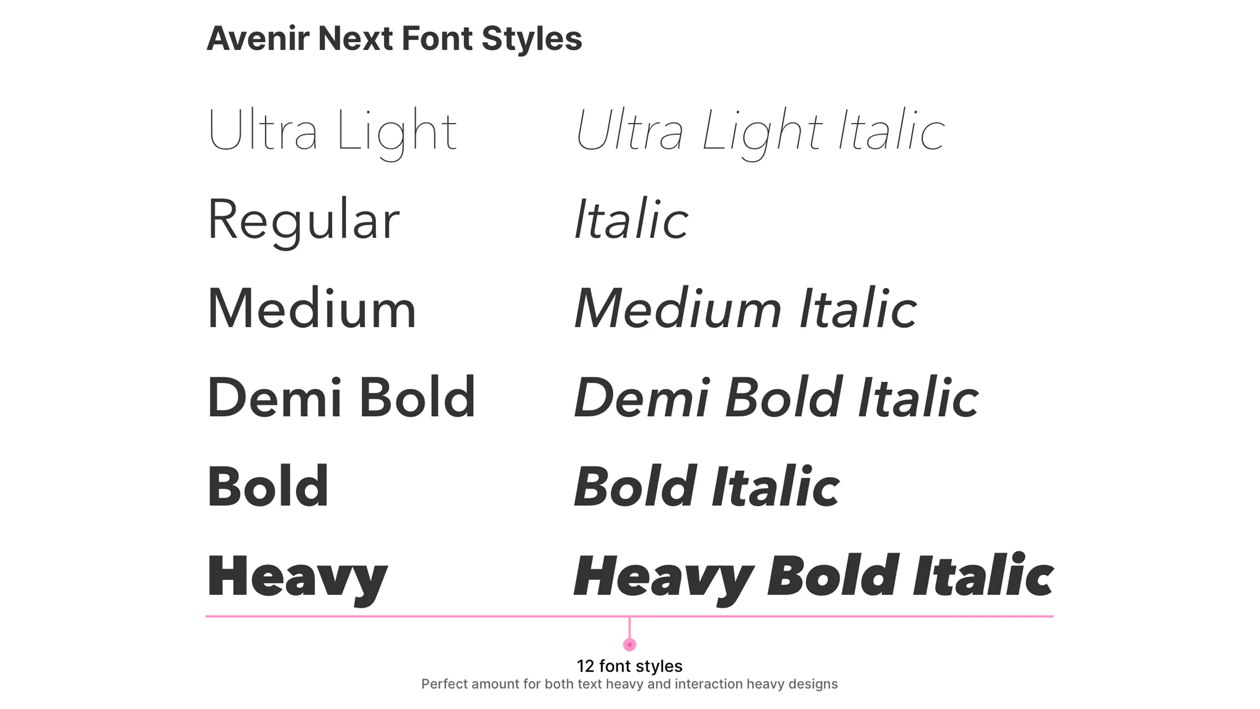
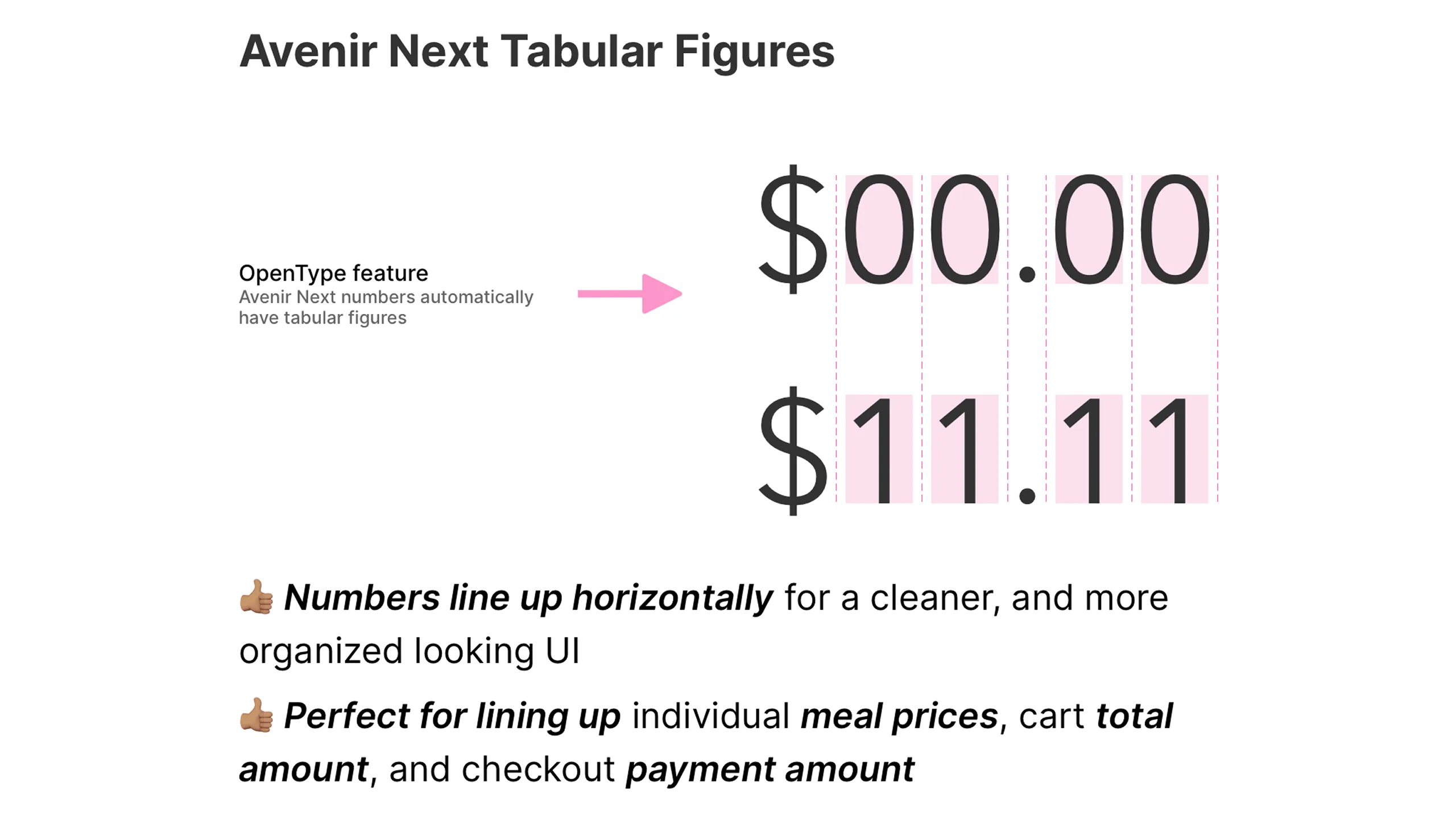
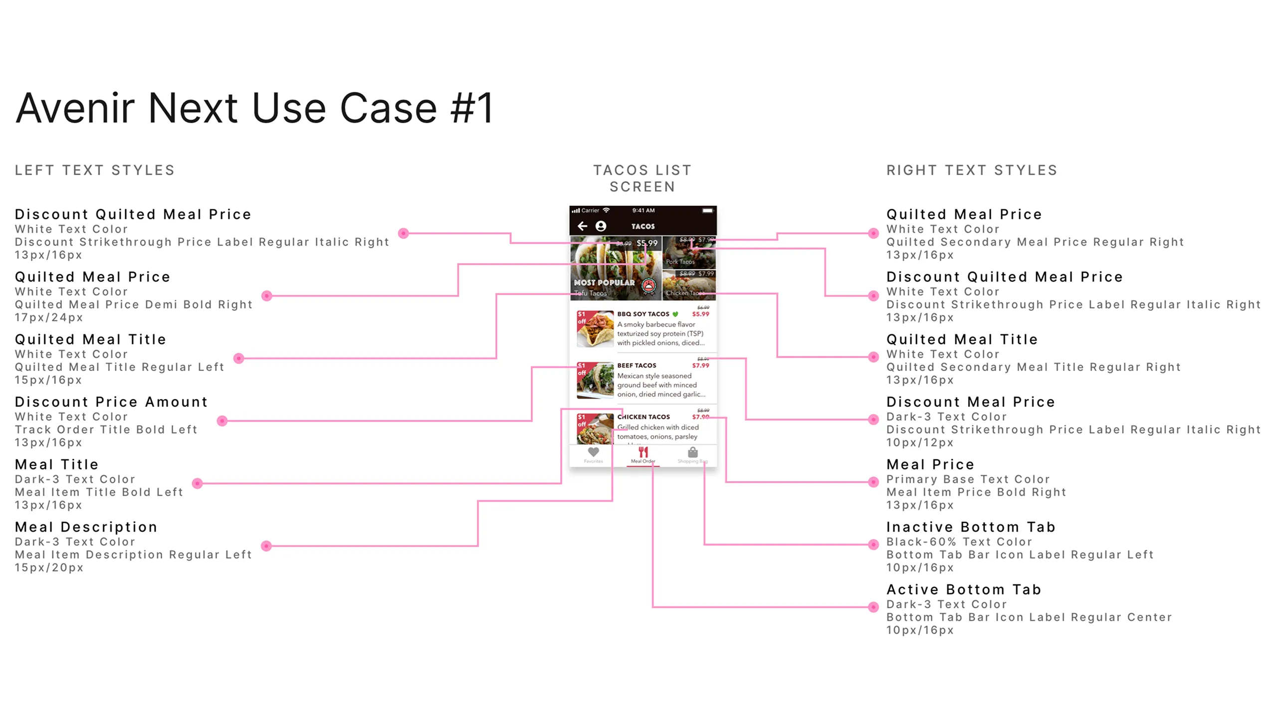
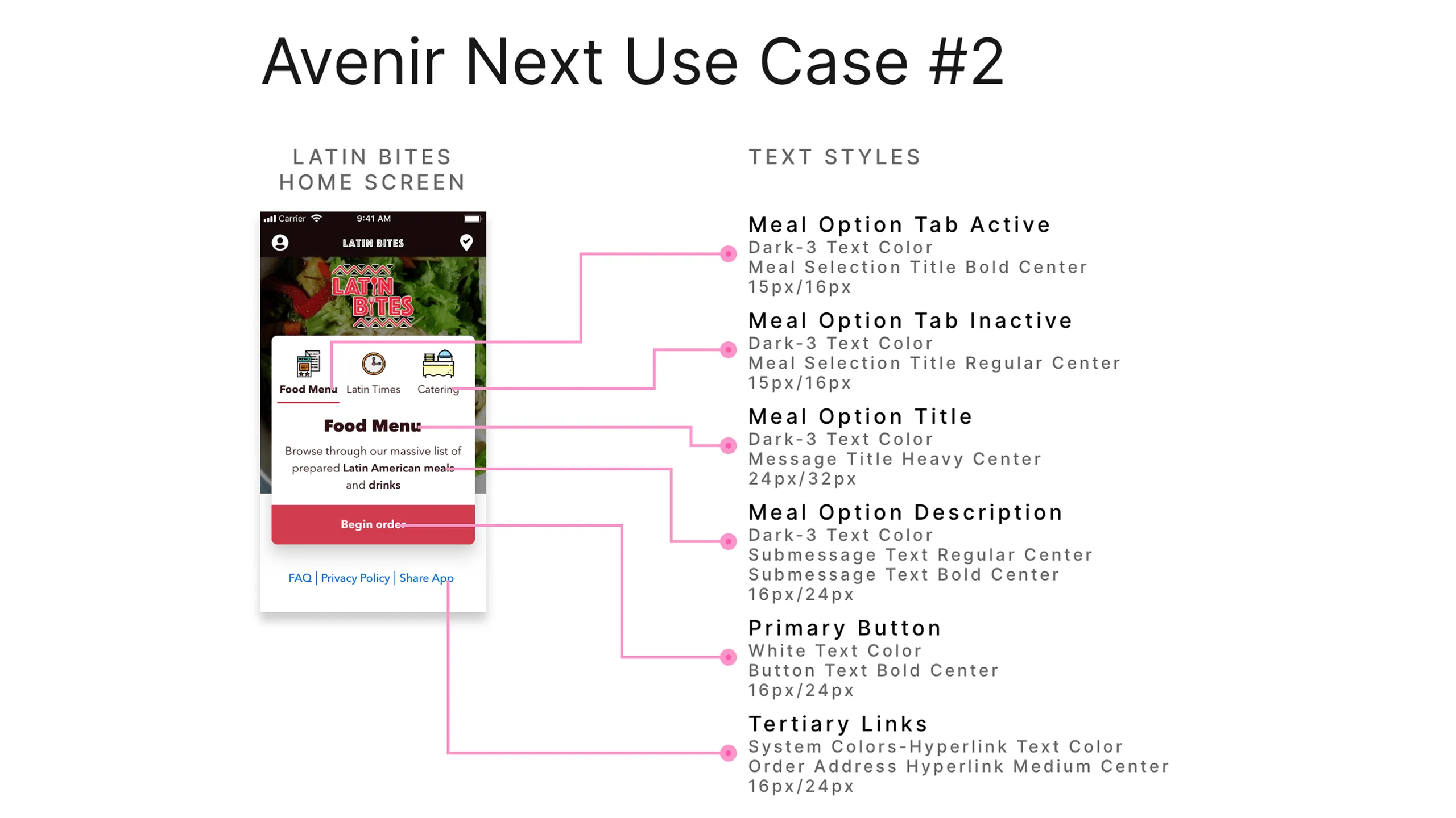
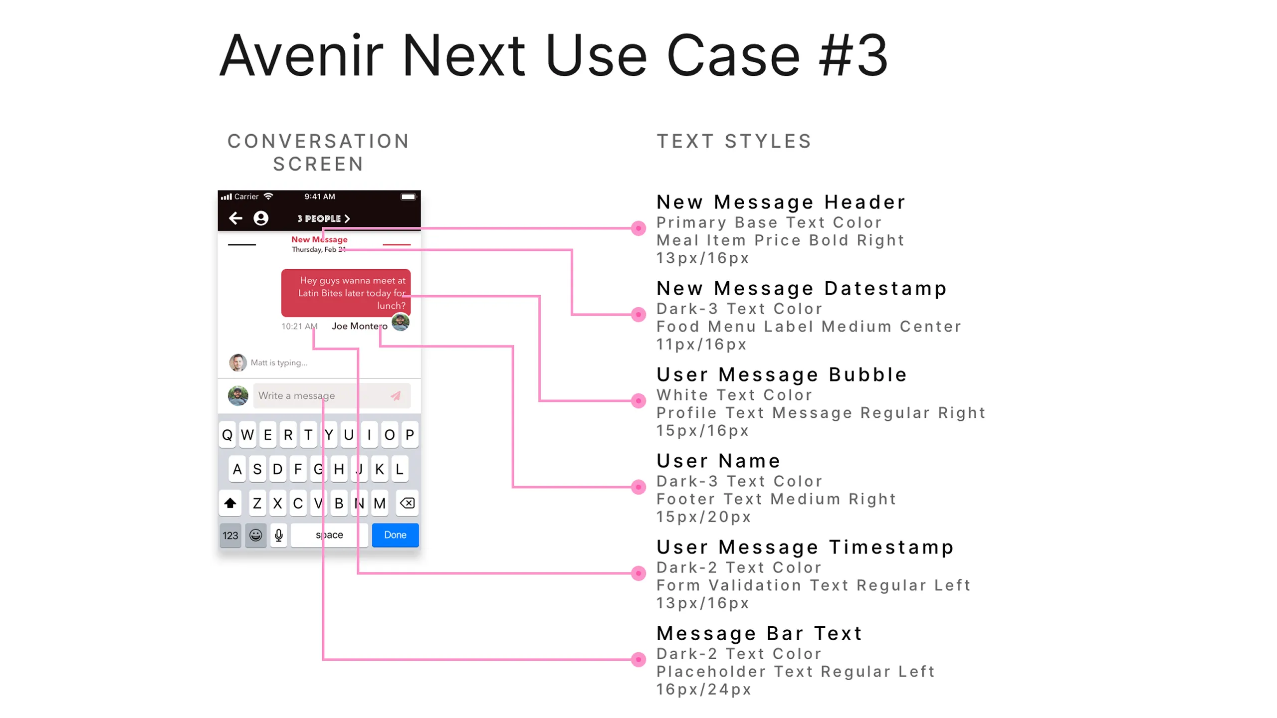
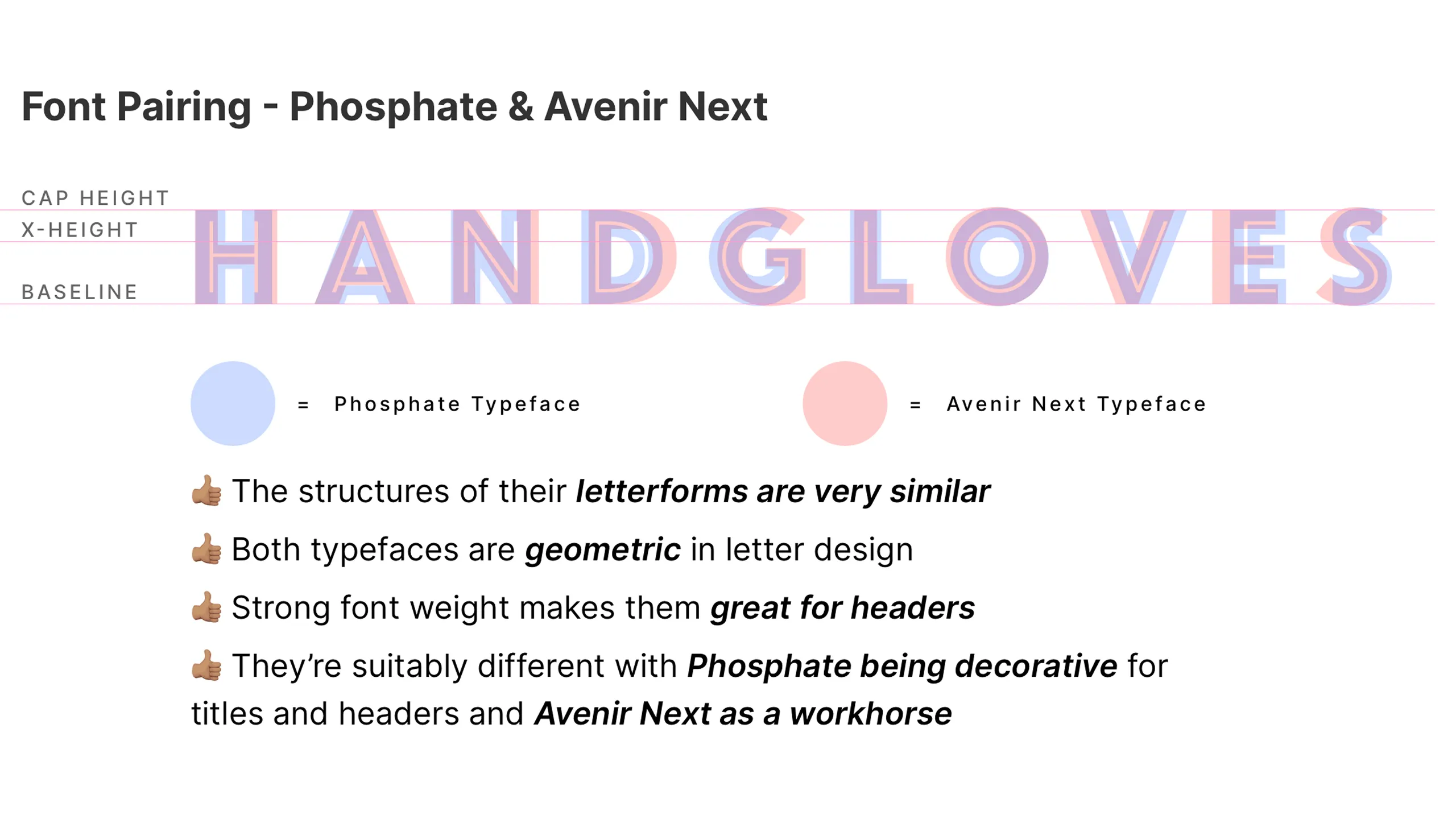
Given that I was designing for a small mobile screen, it was critical to select typefaces that not only looked well-rounded but also aligned with my design personality. I paired Phosphate (logo-based, bold, decorative) with Avenir Next (versatile, highly readable). This pairing ensured both strong branding and smooth readability.

Screenshot of Latin Bites logo next to Phosphate typeface comparisons.
Screenshot of Phosphate typeface with sample text and use case description.Screenshot of Phosphate text styles used across the Latin Bites app.Screenshot of Latin Bites About screen with Phosphate text annotations.Screenshot of Food Menu screen annotated with Phosphate font usage.Screenshot of Latin Times screen annotated with Phosphate text styles.Screenshot of Burger List screen with Phosphate typeface annotations.
Screenshot of Avenir Next typeface with sample text and its use in the Latin Bites app.
Screenshot of Avenir Next text styles used in Latin Bites app (part 1 of 6).Screenshot of Avenir Next text styles used in Latin Bites app (part 2 of 6).Screenshot of Avenir Next text styles used in Latin Bites app (part 3 of 6).Screenshot of Avenir Next text styles used in Latin Bites app (part 4 of 6).Screenshot of Avenir Next text styles used in Latin Bites app (part 5 of 6).Screenshot of Avenir Next text styles used in Latin Bites app (part 6 of 6).Screenshot of Avenir Next typeface characteristics, including cap height, x-height, and baseline.Screenshot showing different font weights of the Avenir Next typeface.Screenshot of Avenir Next tabular figures with numbers aligned horizontally.
Screenshot of the Tacos List screen with annotated Avenir Next text styles.

Icons that work

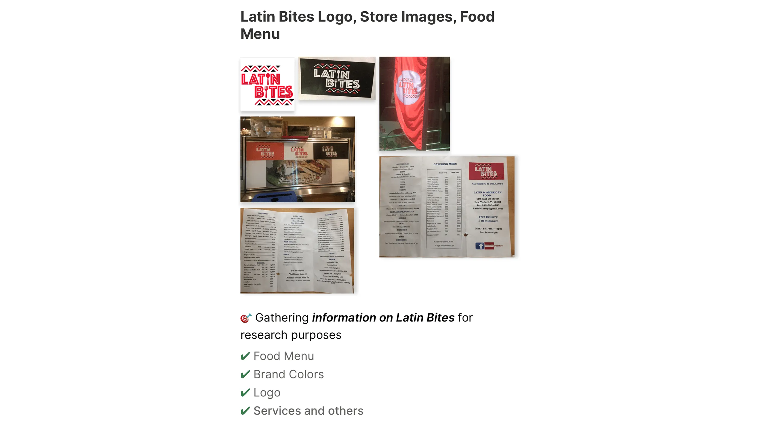
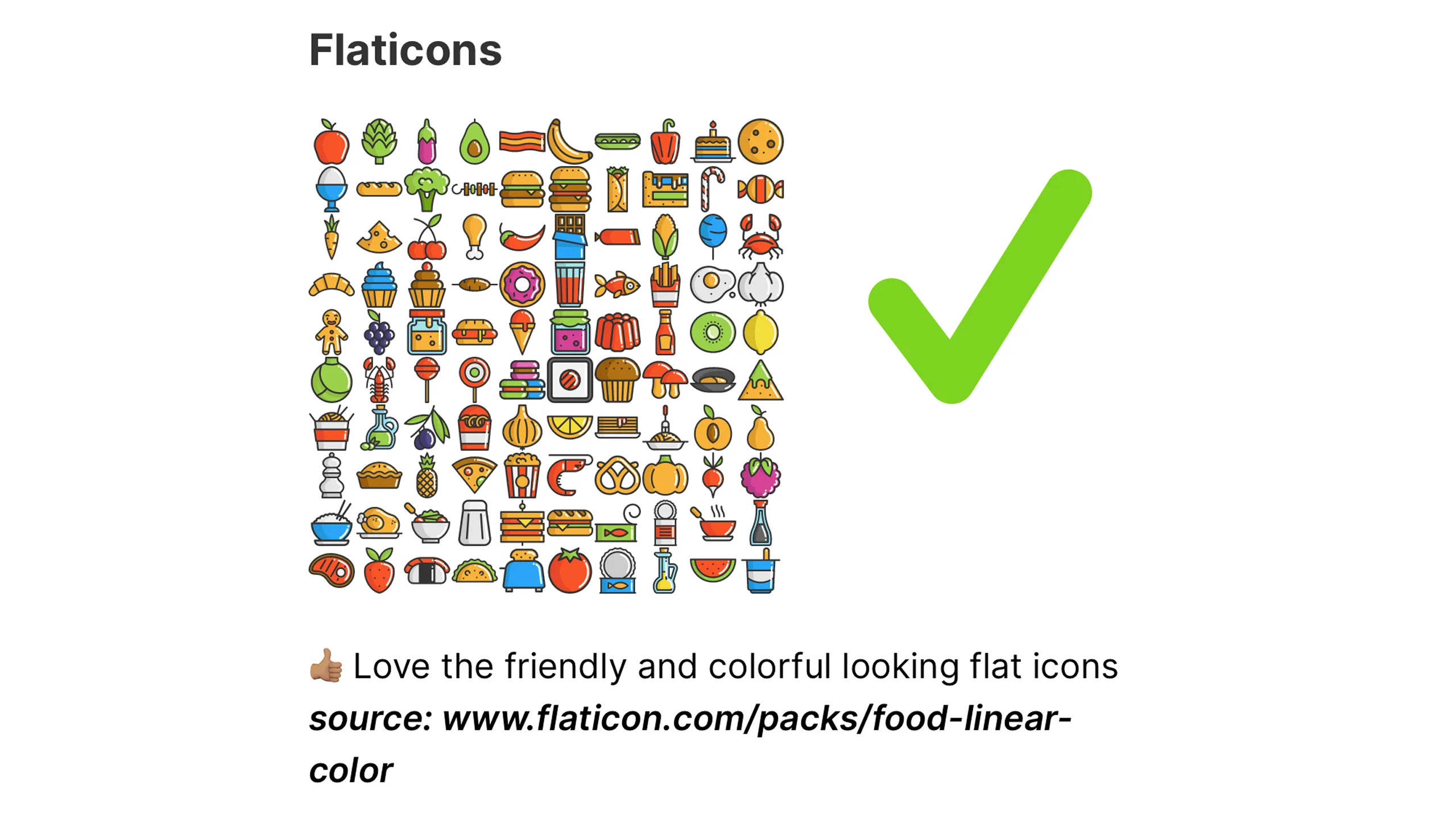
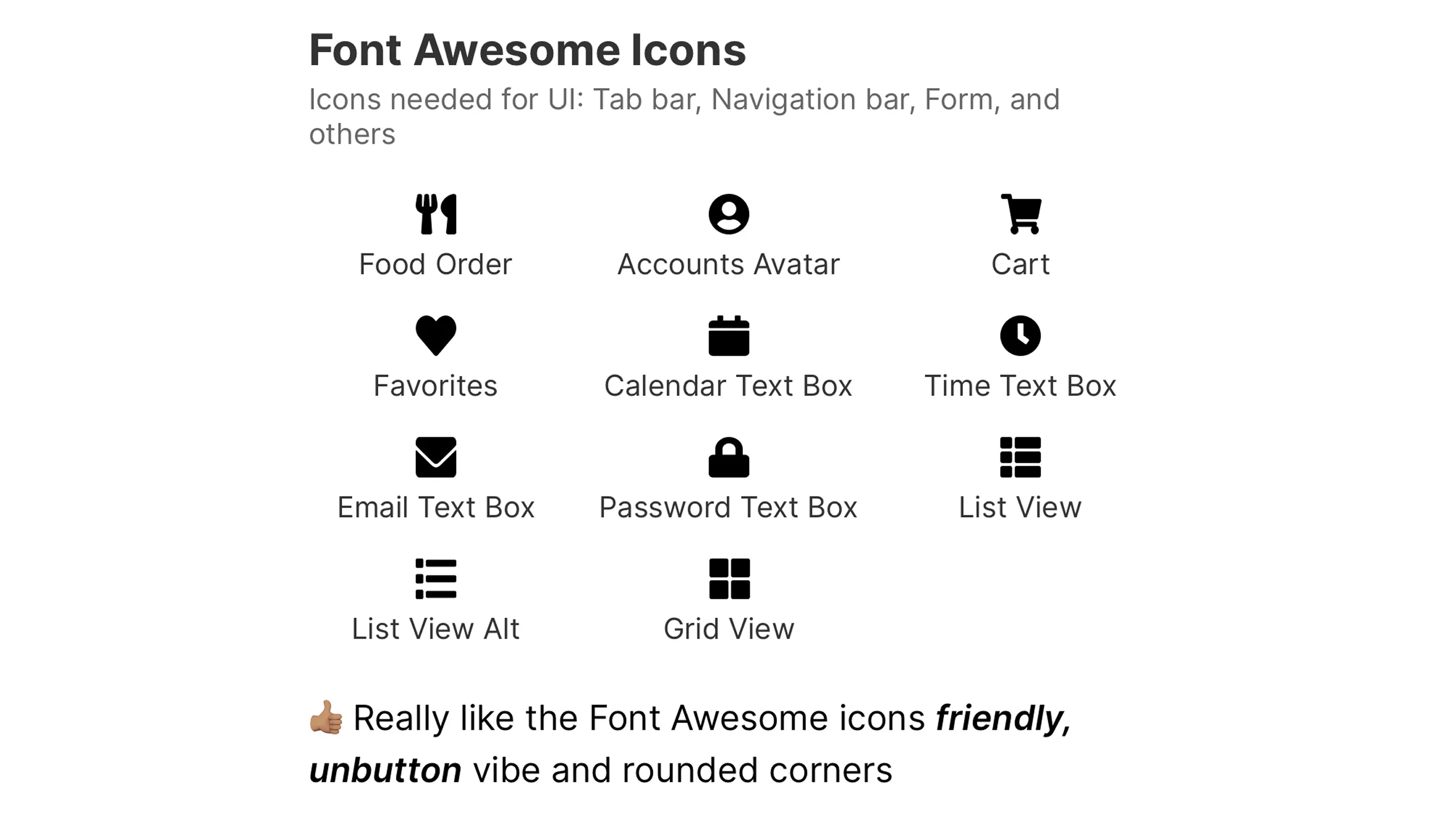
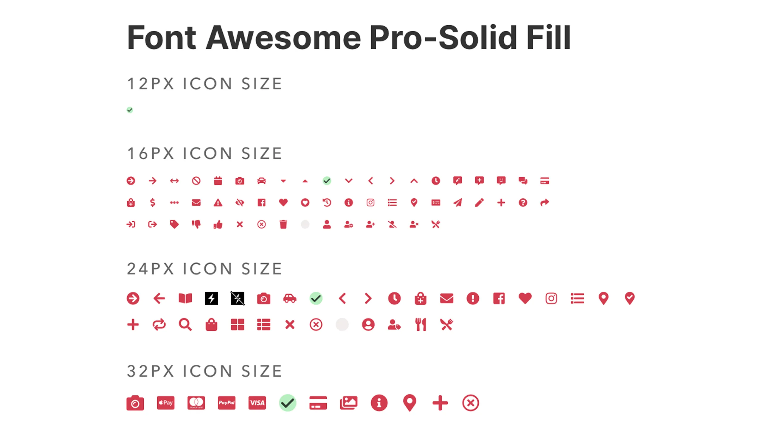
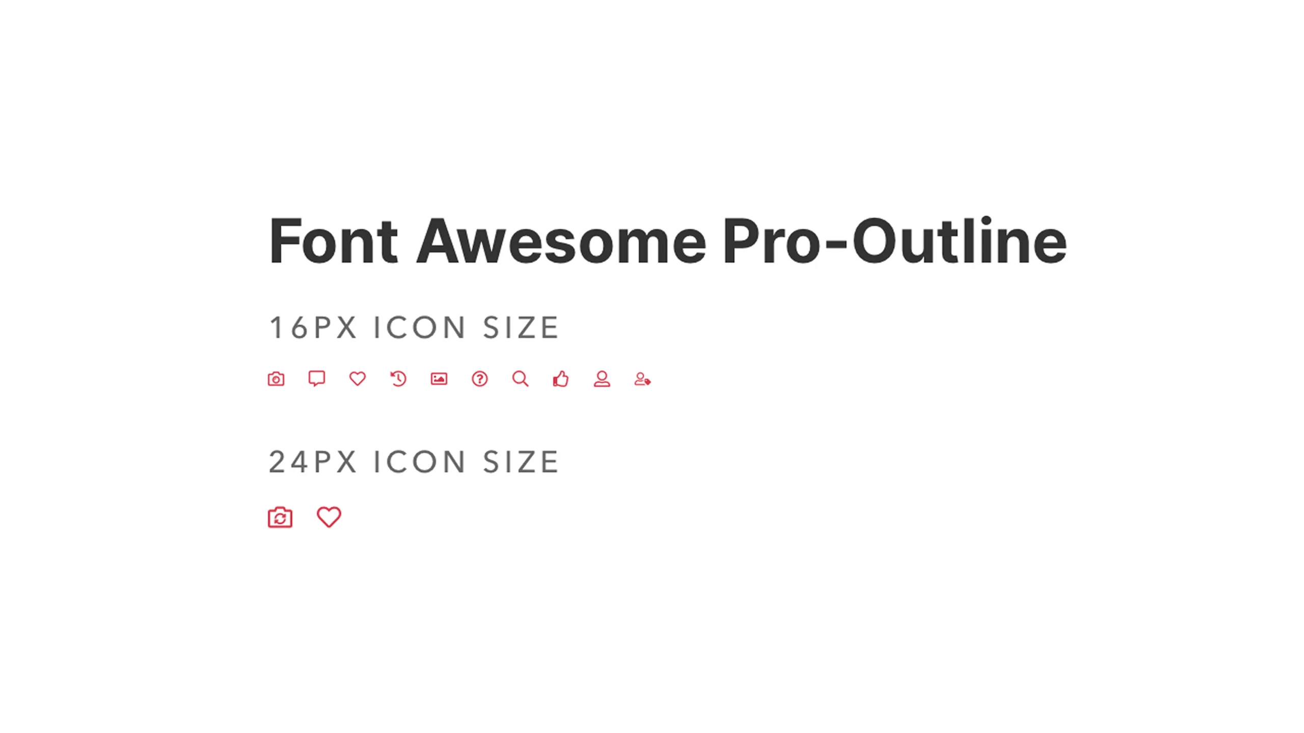
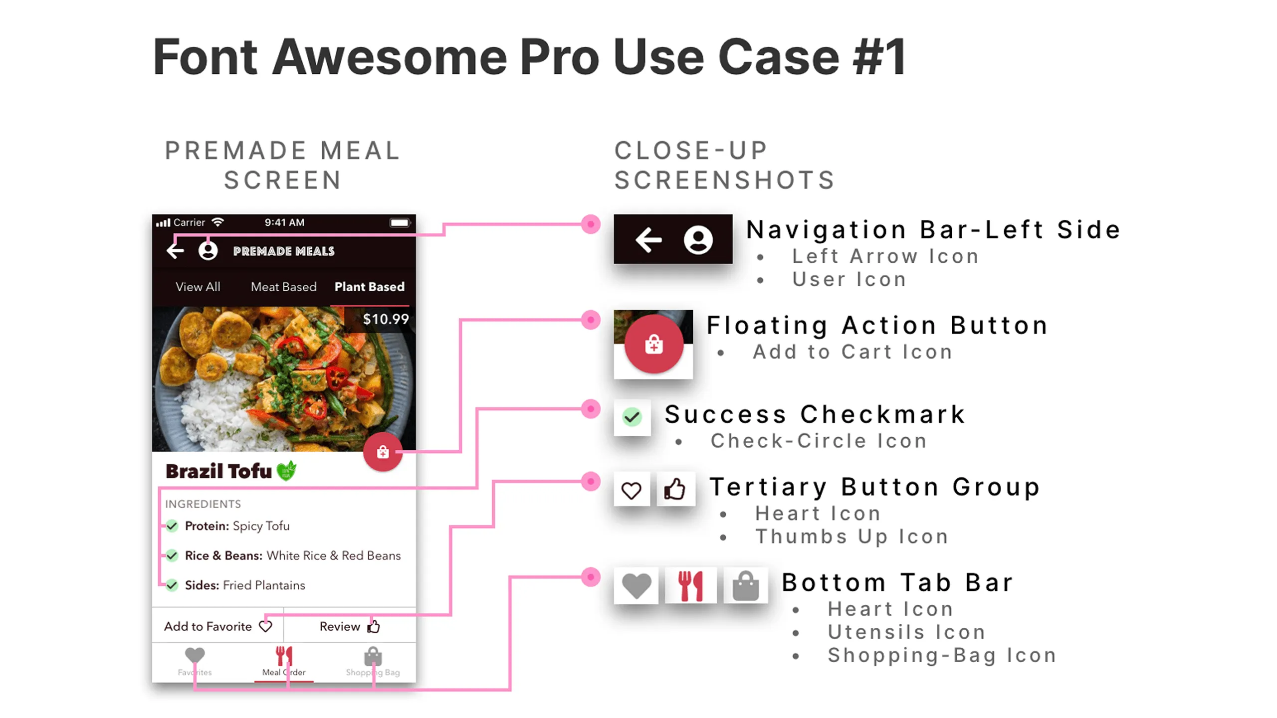
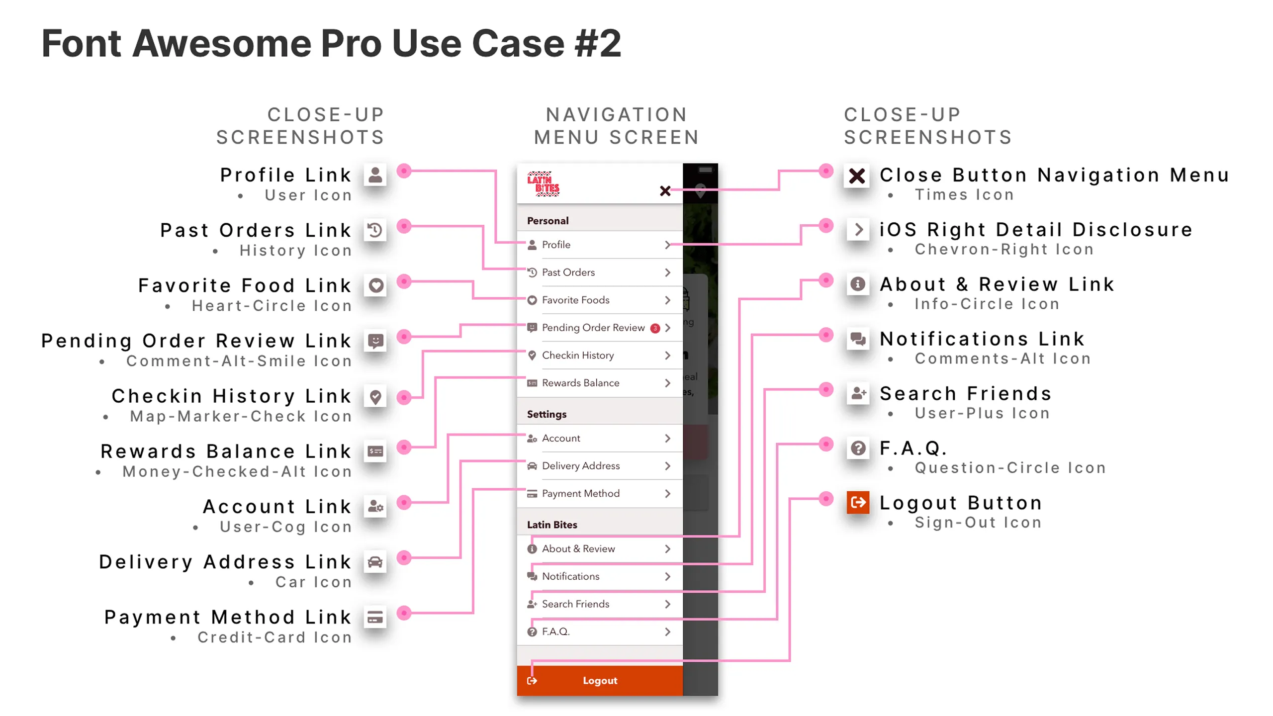
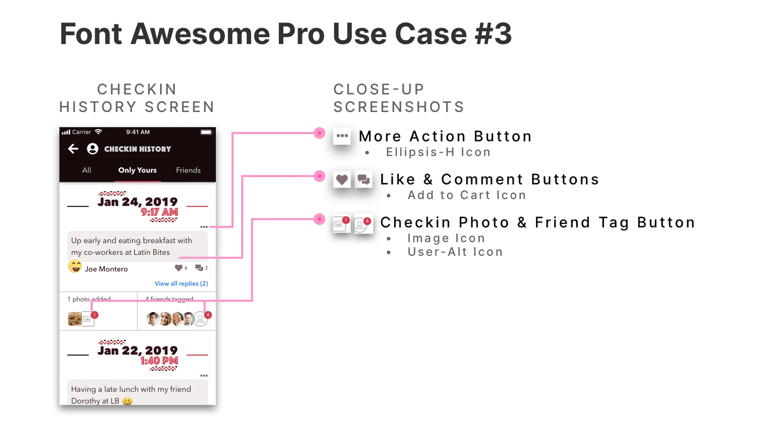
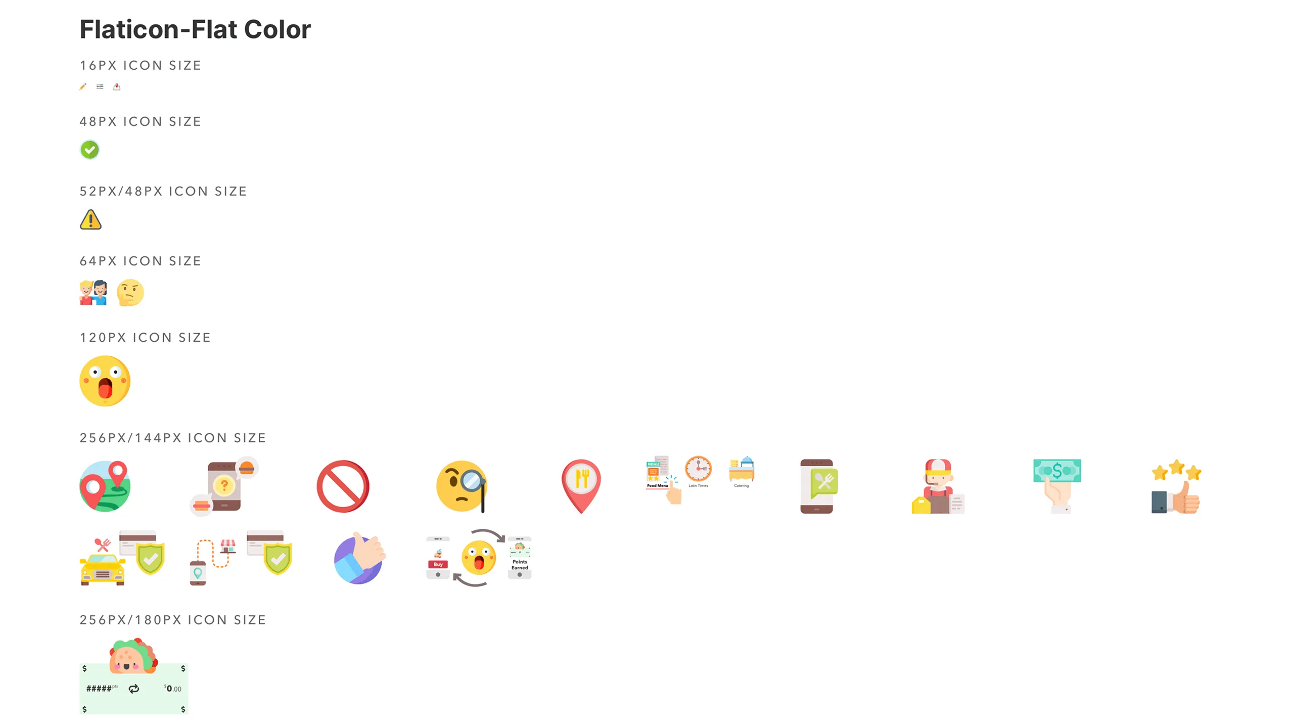
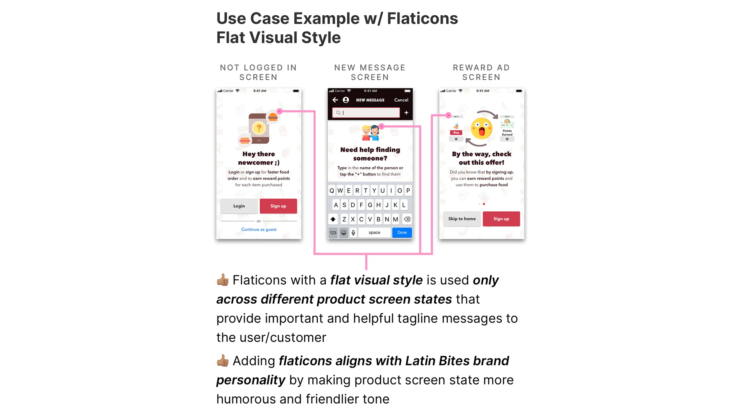
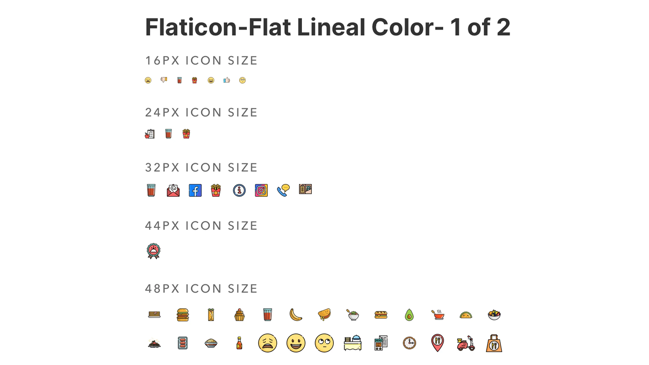
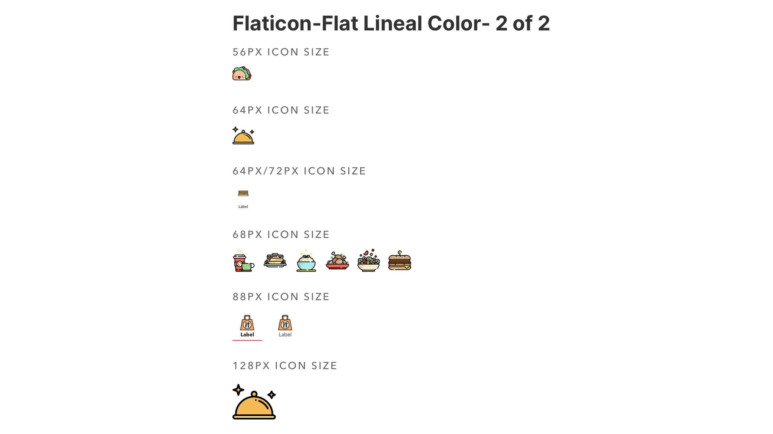
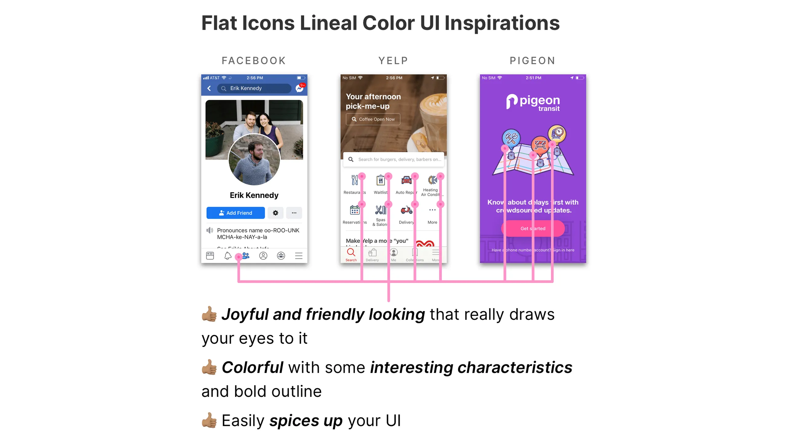
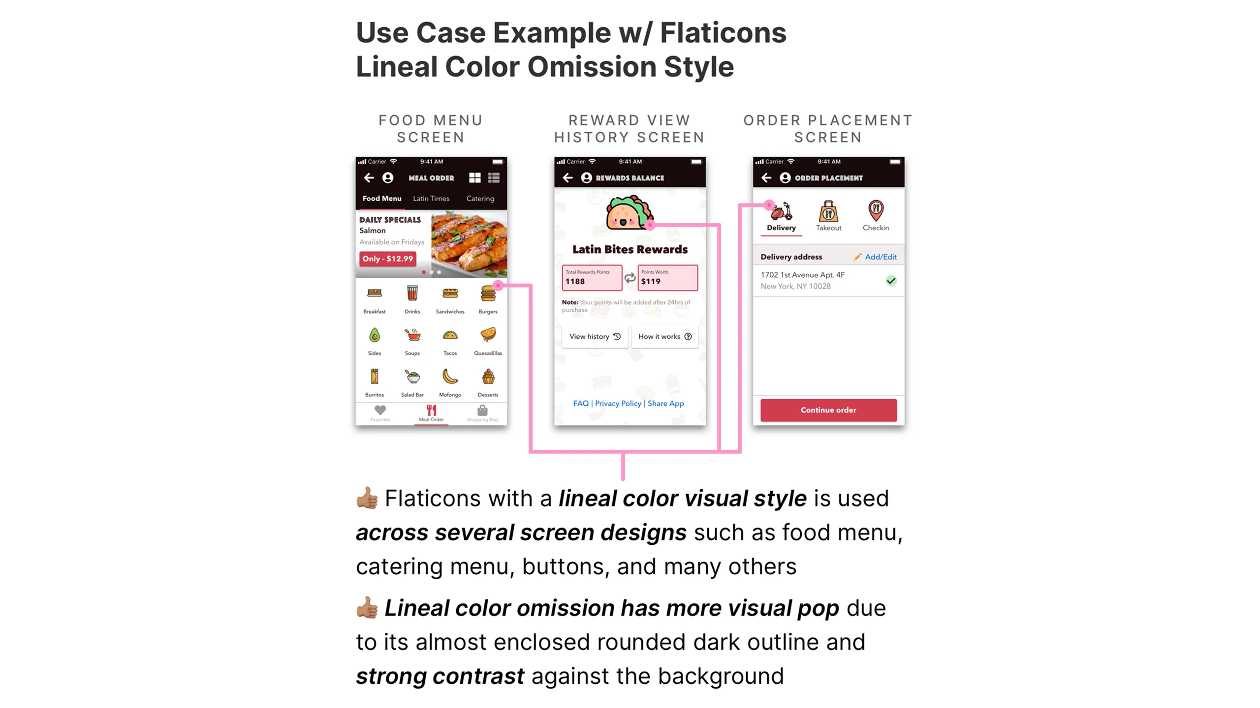
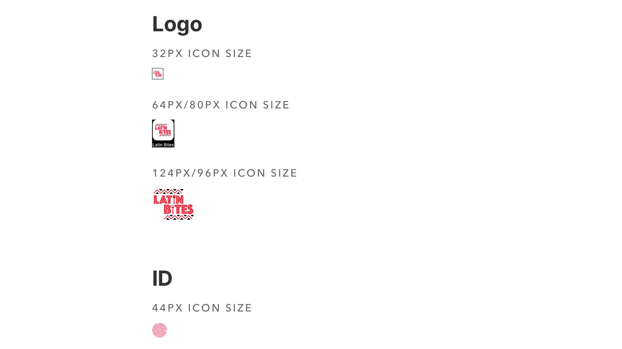
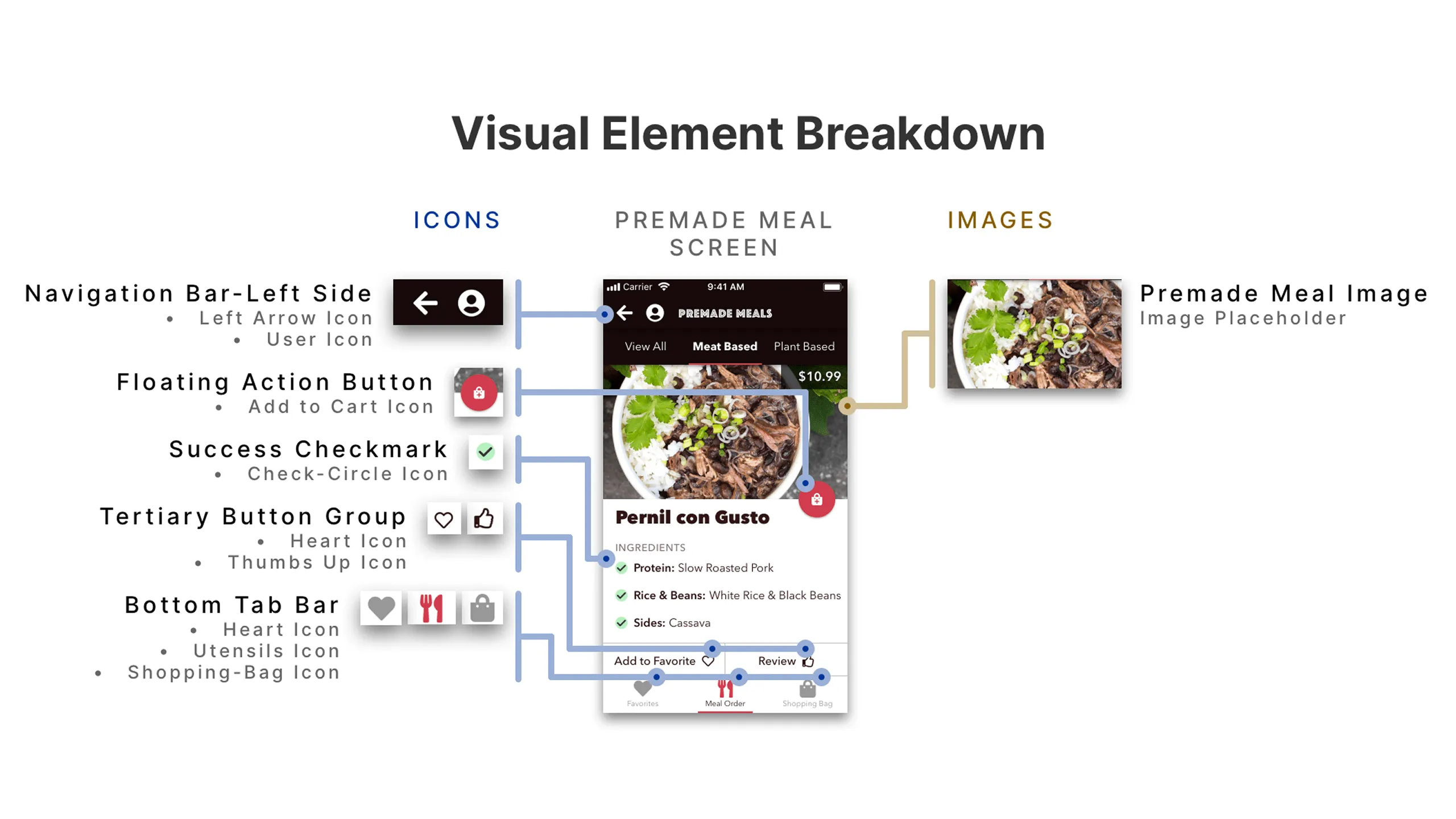
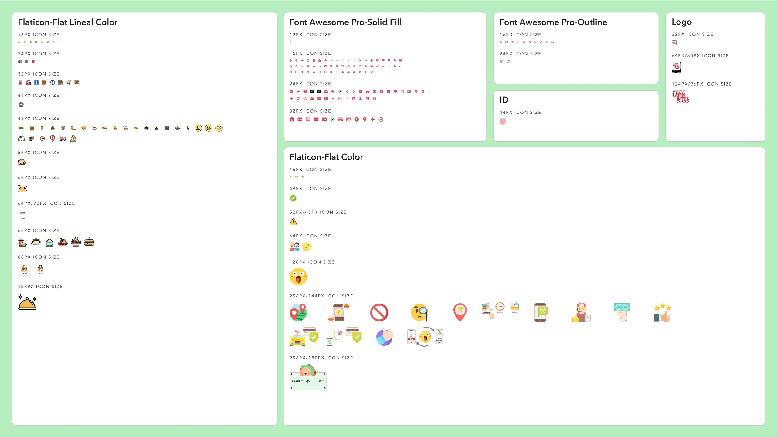
During my research phase, I collected various icon sets in a moodboard, analyzing their style and fit for the Latin Bites brand personality. After careful consideration, I selected a combination of the following:

  • Font Awesome Pro for UI actions
  • Flat Icons for flavor and fun in onboarding and rewards
  • Custom Latin Bites logo icons for branded moments
  • Apple ID thumbprint for a secure Apple Pay feel
Screenshot of Font Awesome Pro solid fill icons displayed in various standard sizes.
Screenshot of Font Awesome Pro outline icons in standard sizes used in Latin Bites.Screenshot of Premade Meal, Navigation Menu, and Check-in History screens using Font Awesome Pro icons.Screenshot of the Premade Meal screen with Font Awesome Pro icons annotated across the UI.Screenshot of the Navigation Menu screen annotated with Font Awesome Pro icon usage.Screenshot of Check-in History screen annotated with various Font Awesome Pro icons.
Screenshot of Flaticons Lineal Color style icons (part 1 of 2) in various standard sizes.
Screenshot of Flaticons Lineal Color style icons (part 2 of 2) in various standard sizes.Screenshot of Facebook, Yelp, and Pigeon UI designs using Lineal Color icons.Screenshot of Latin Bites Food Menu, Reward View History, and Order Placement screens using Lineal Color icons.

Sourcing the right images

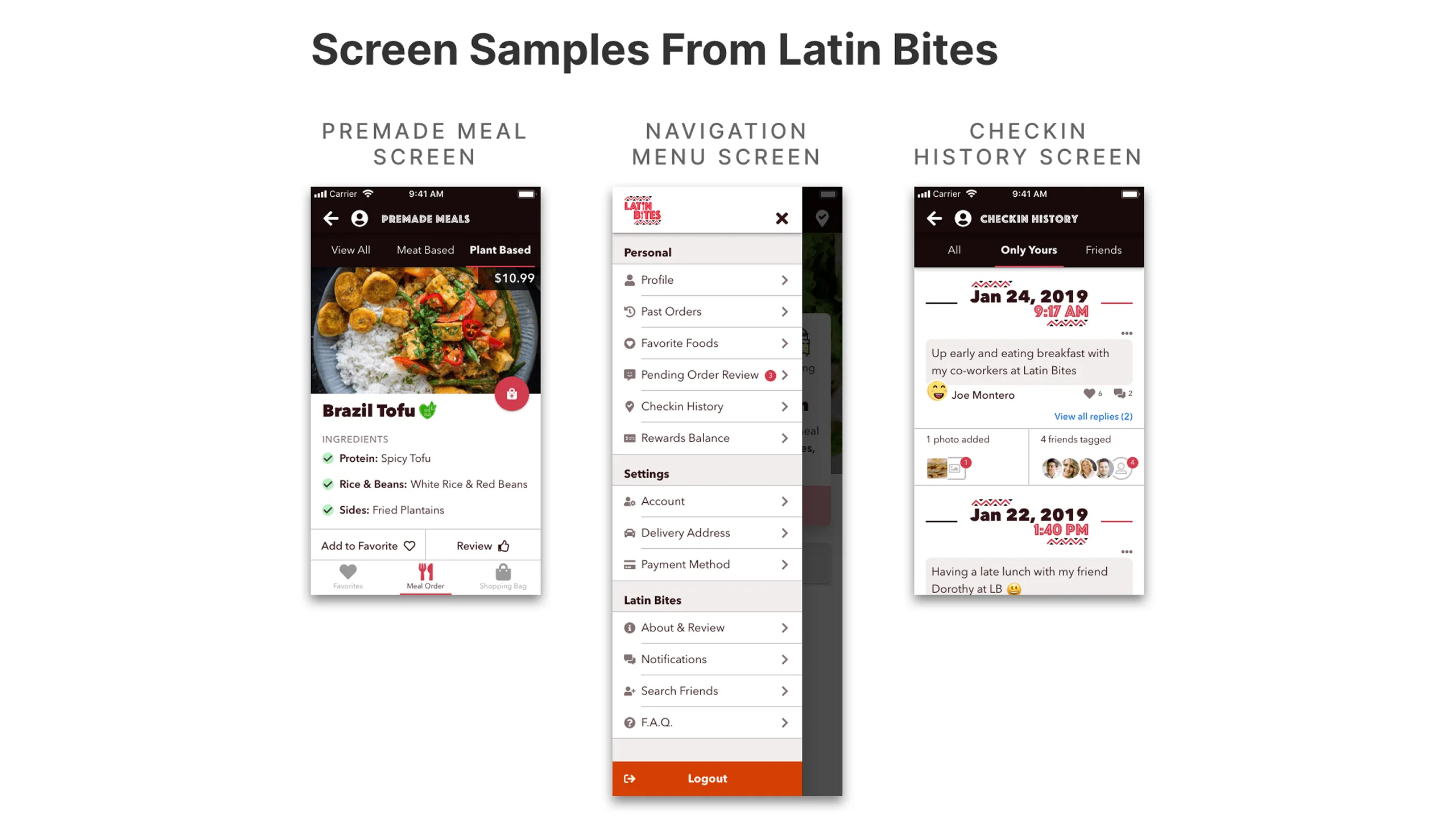
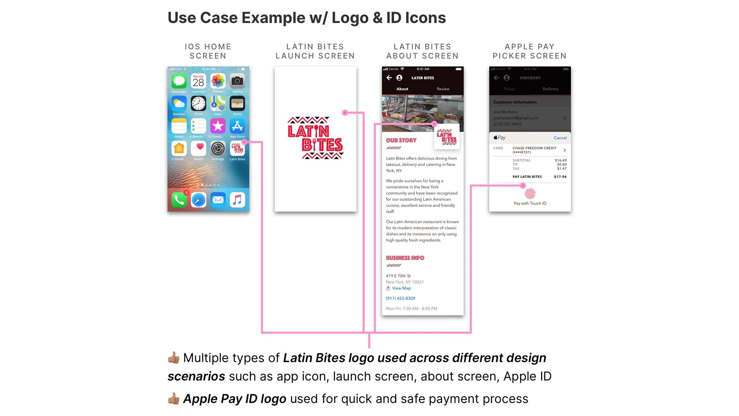
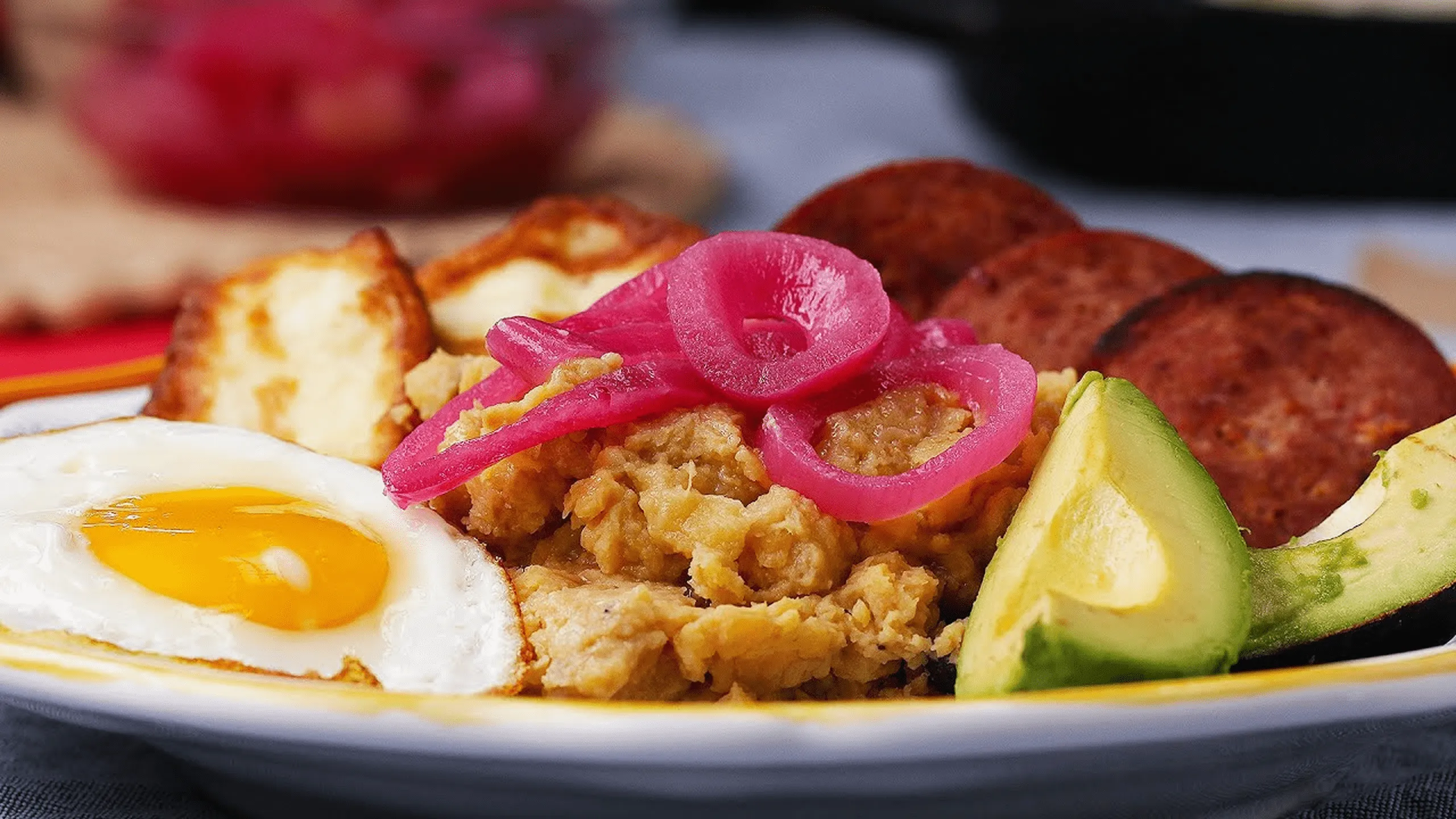
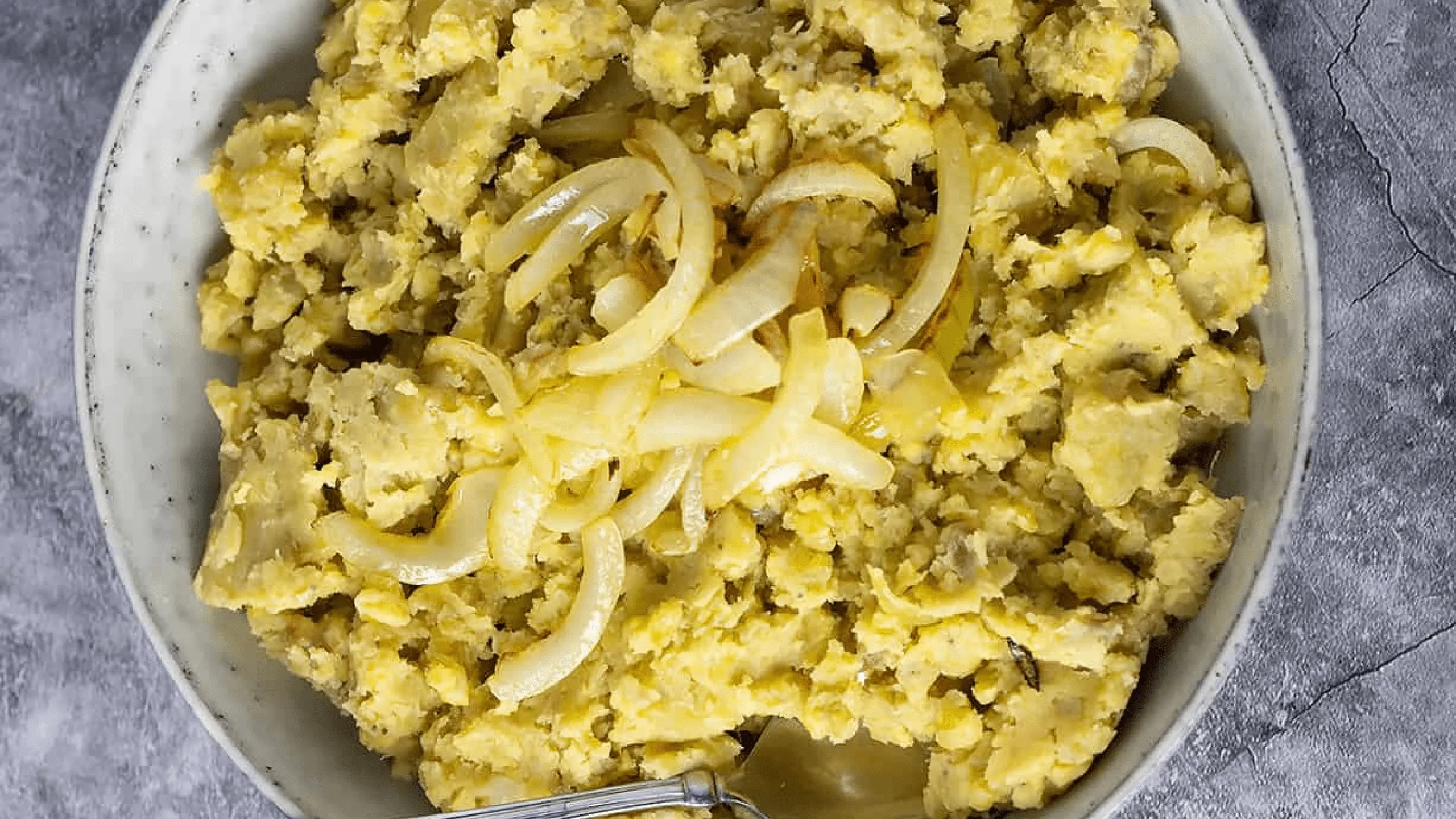
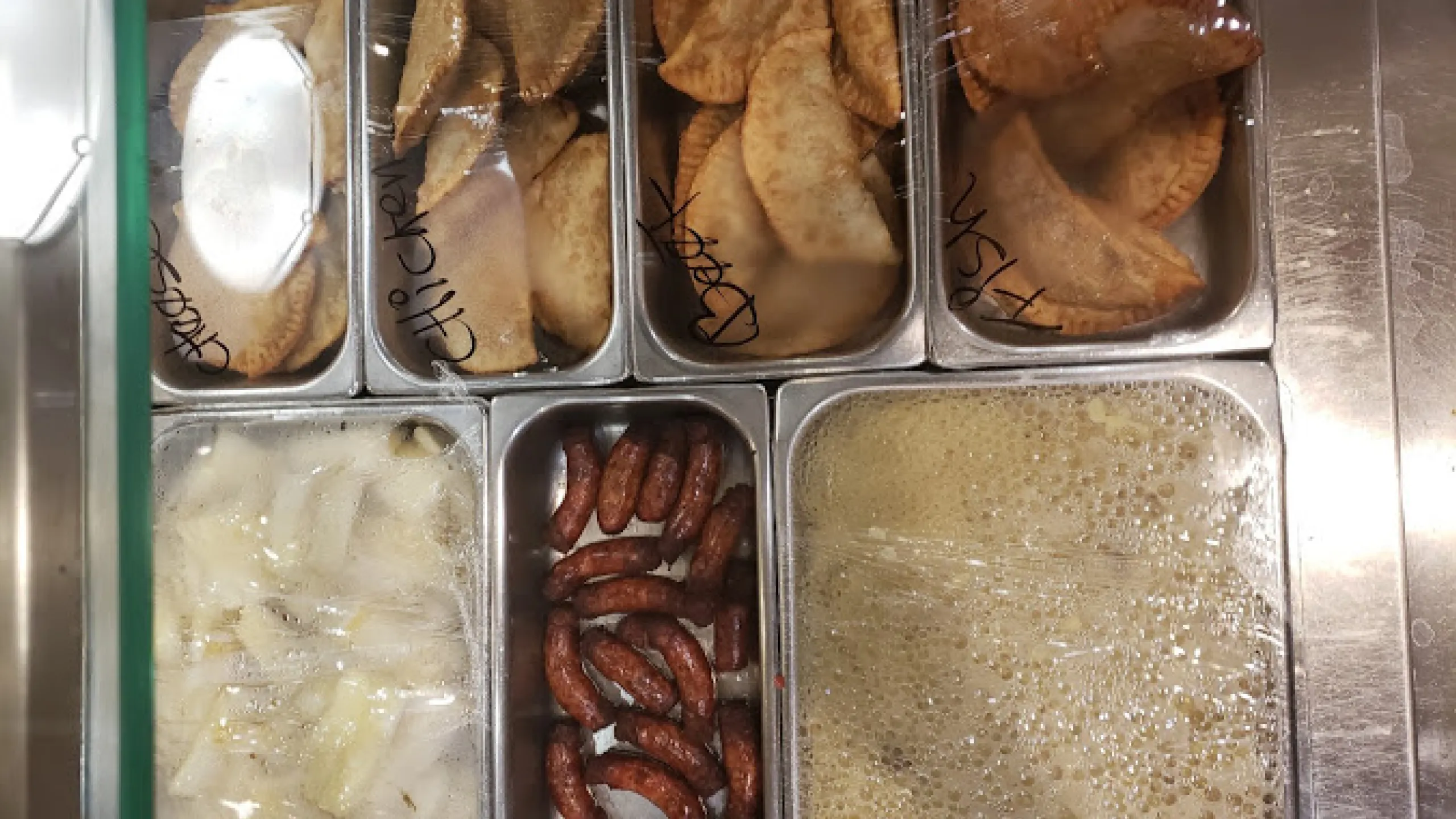
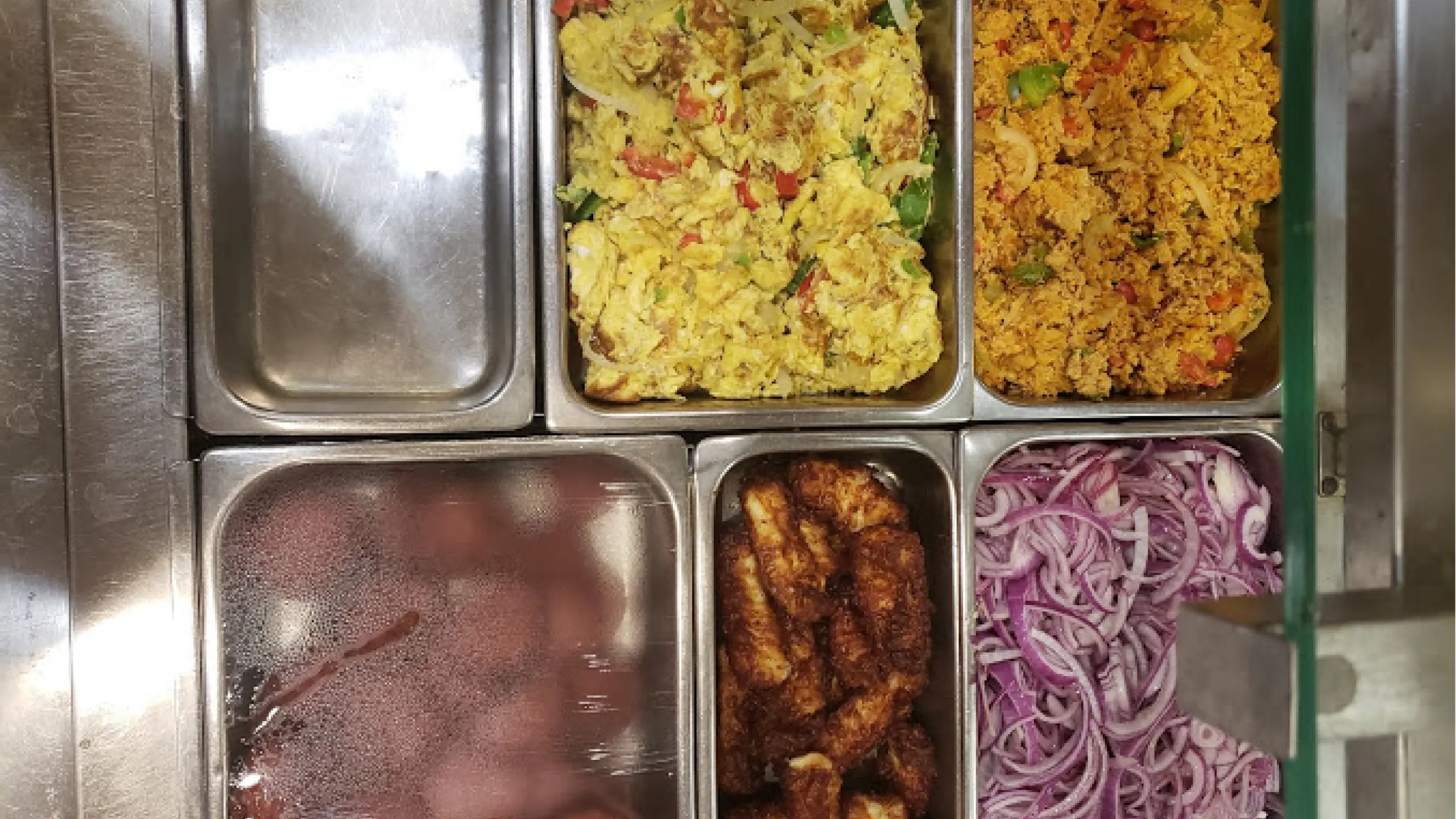
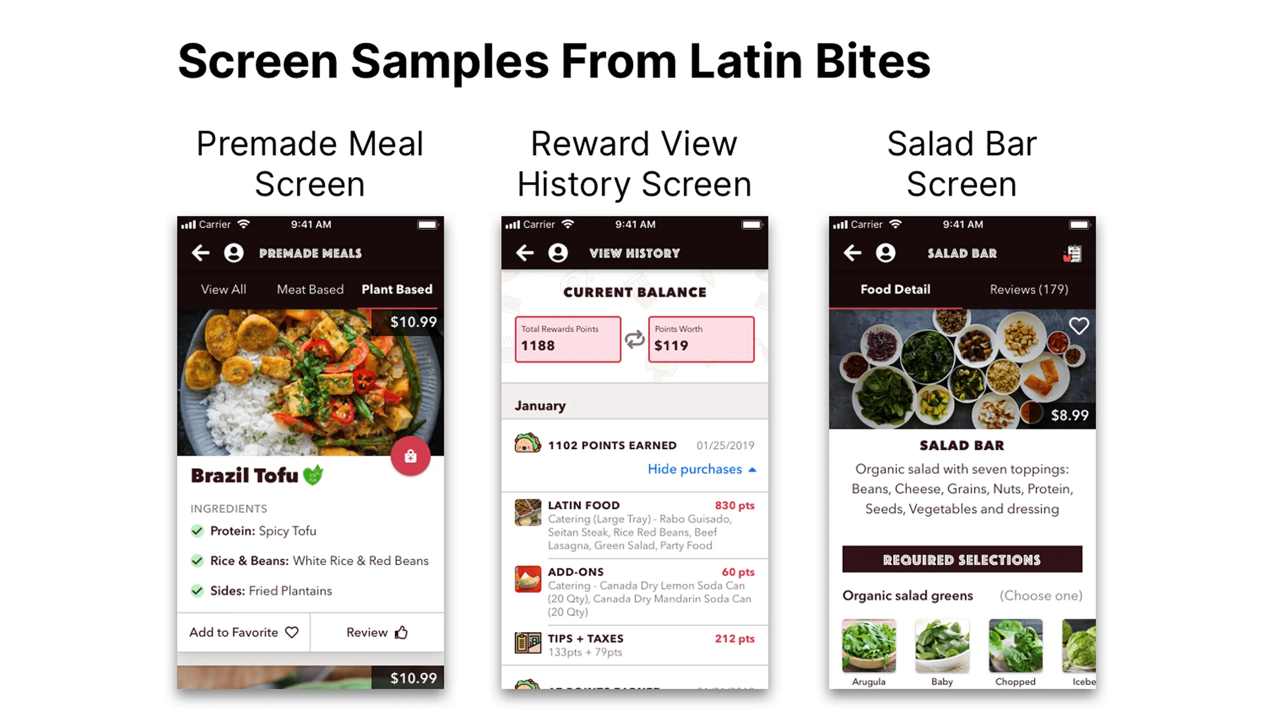
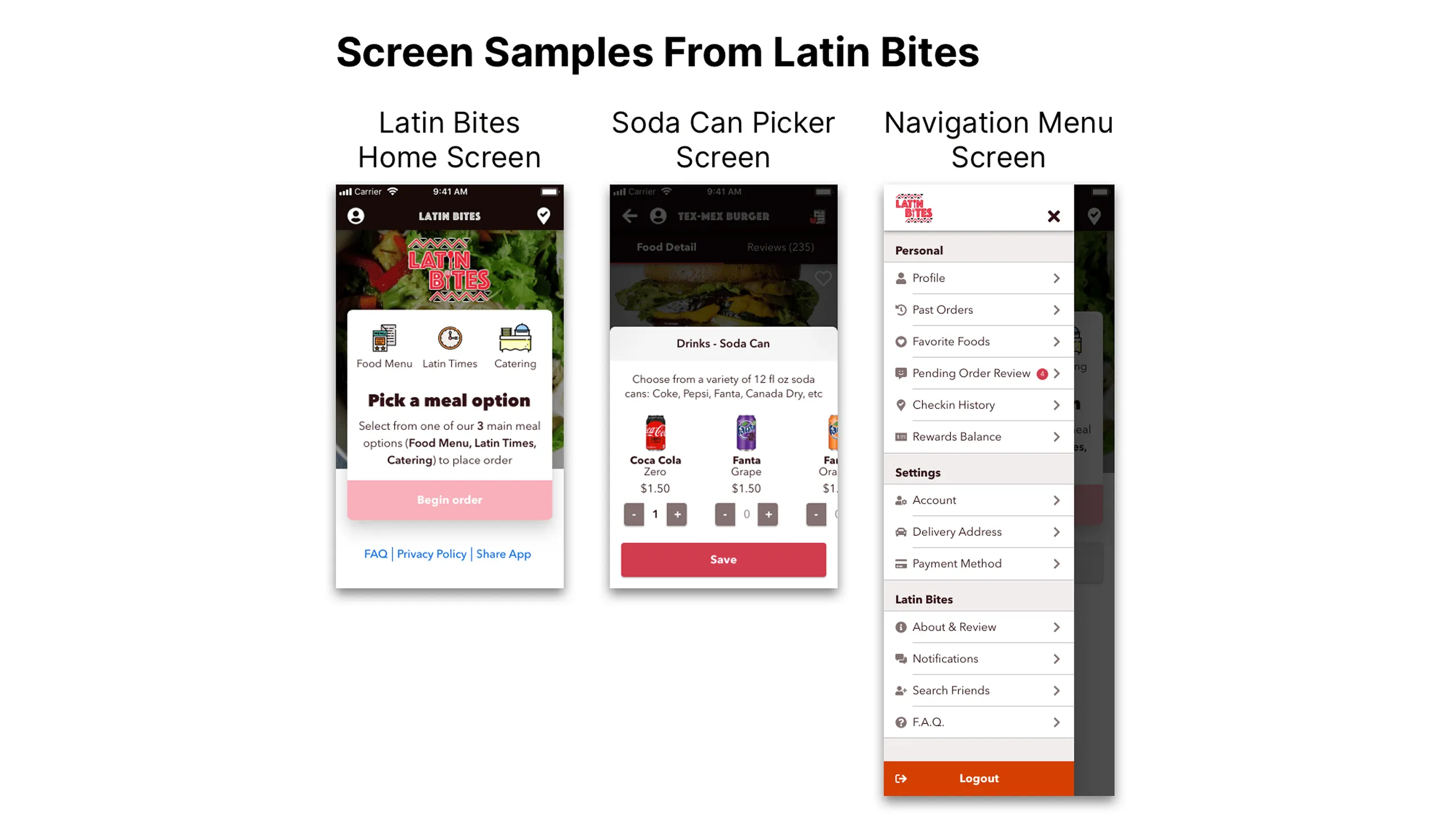
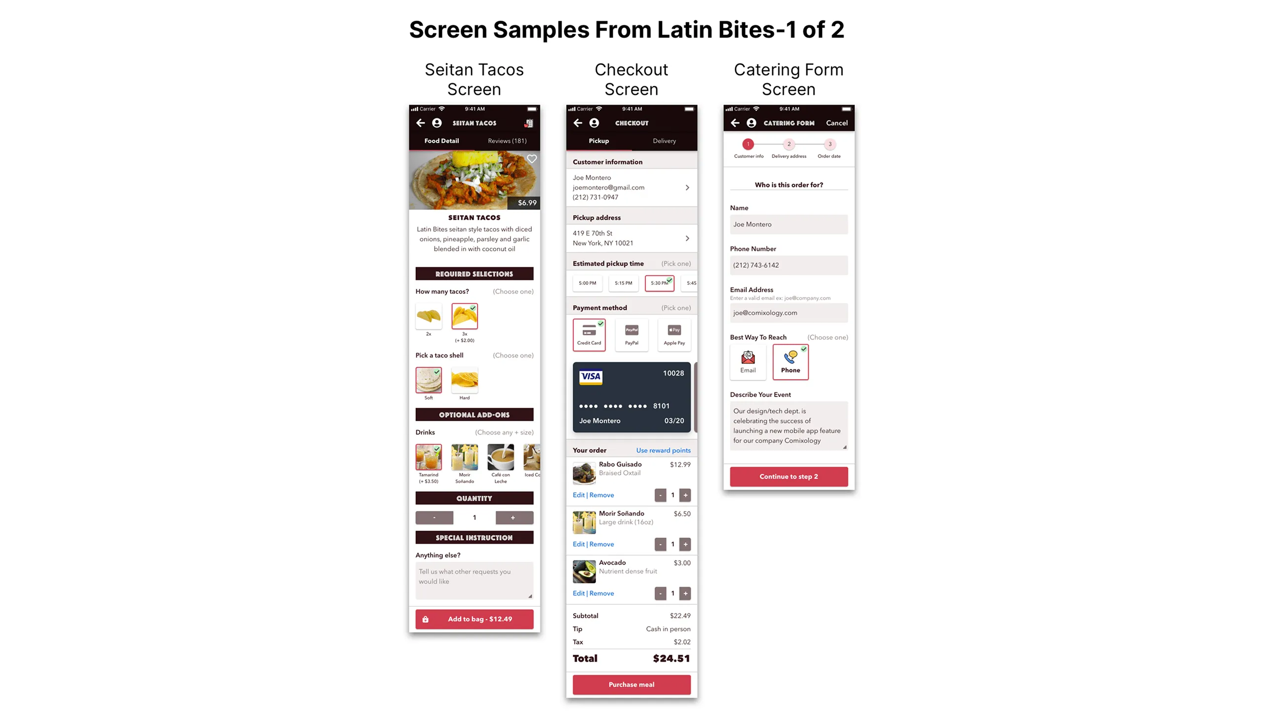
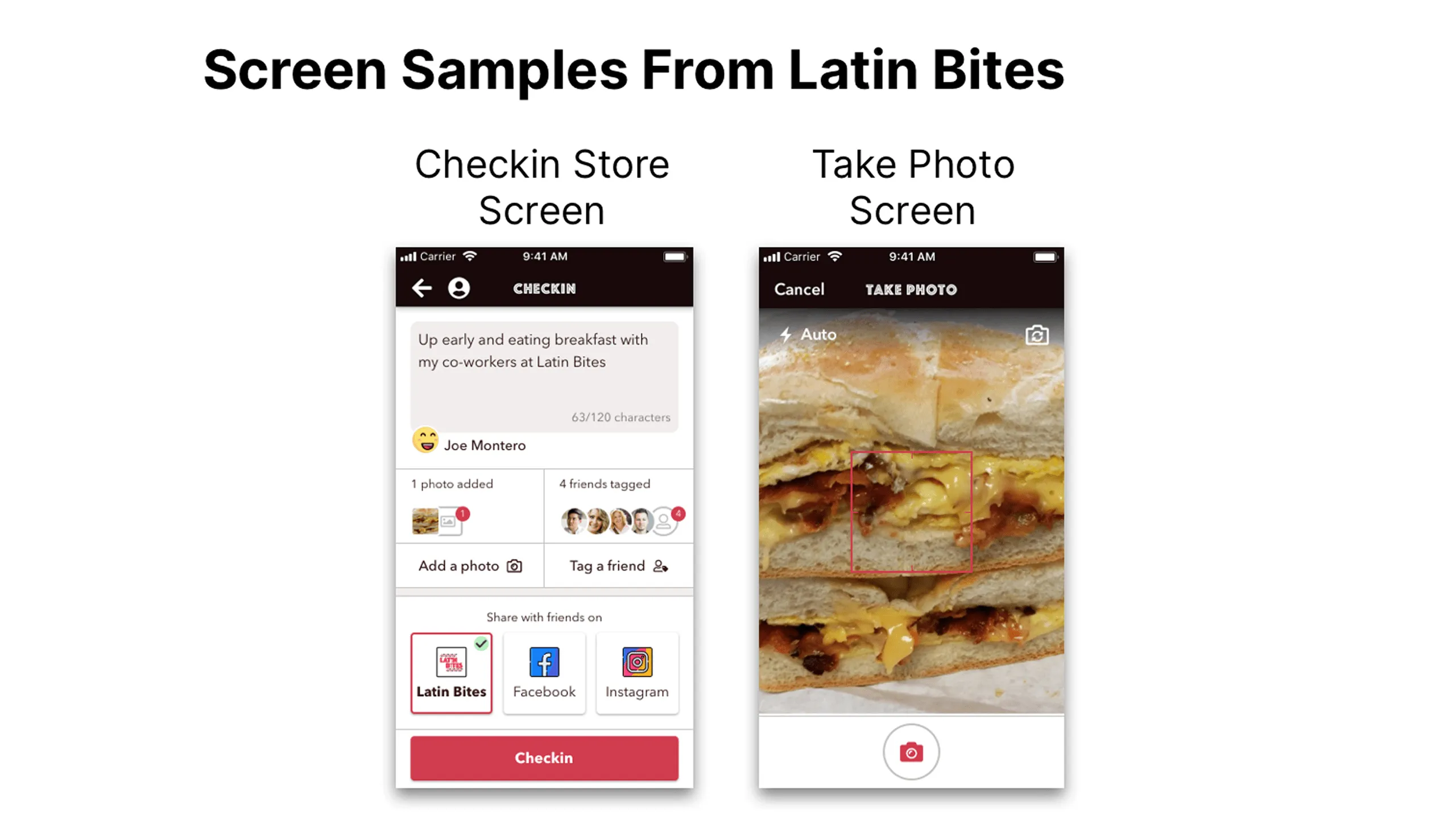
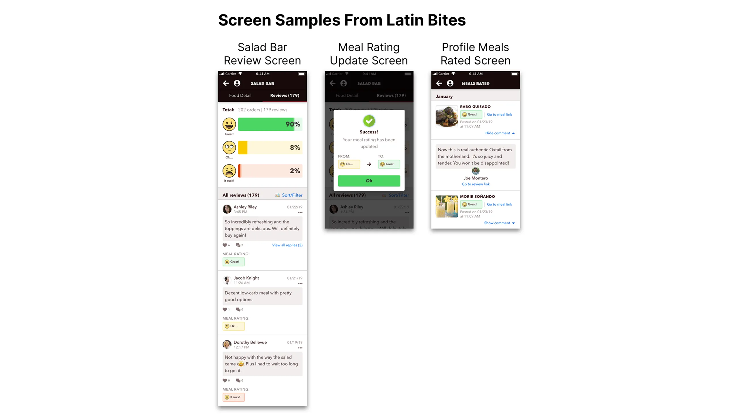
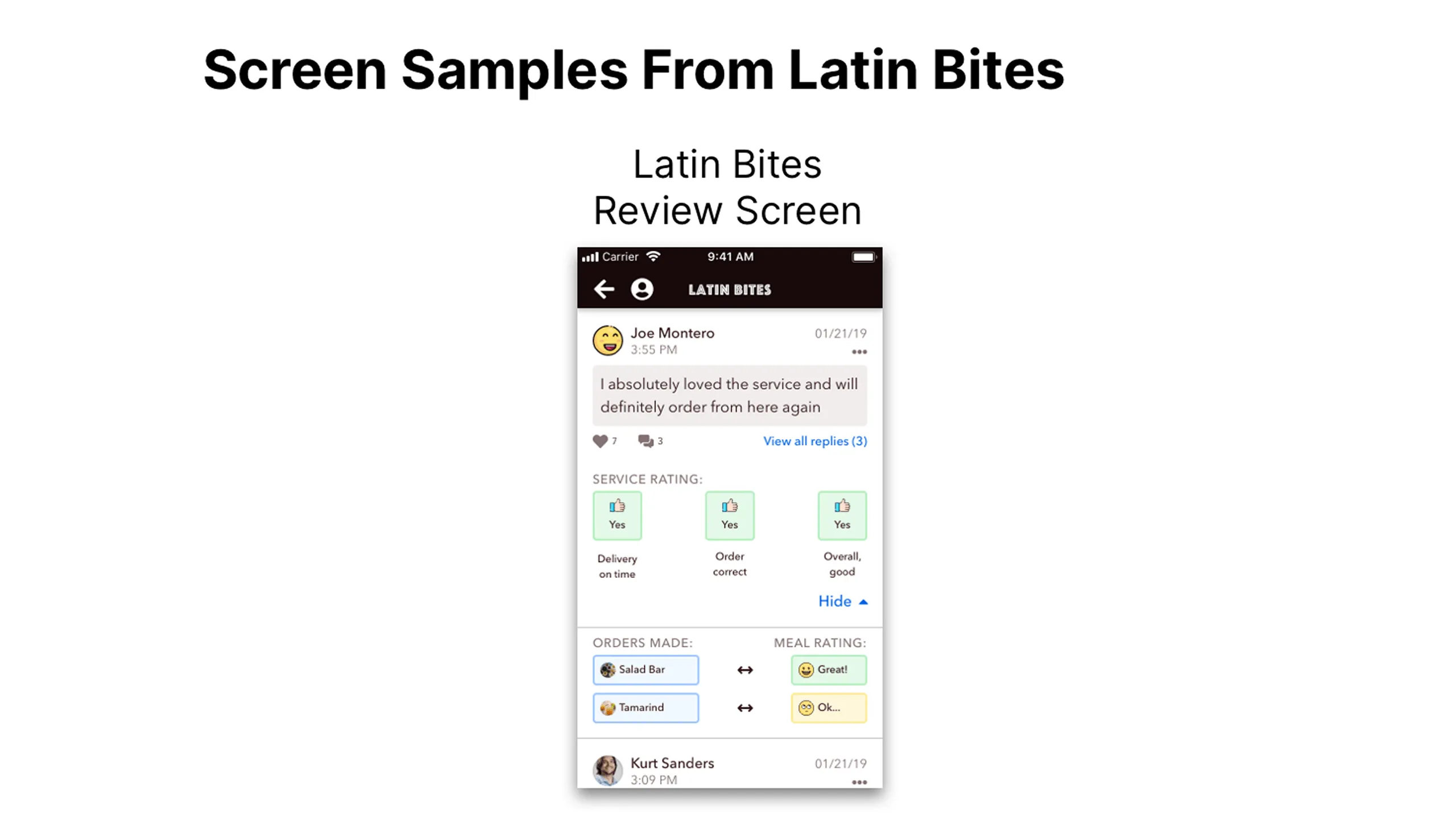
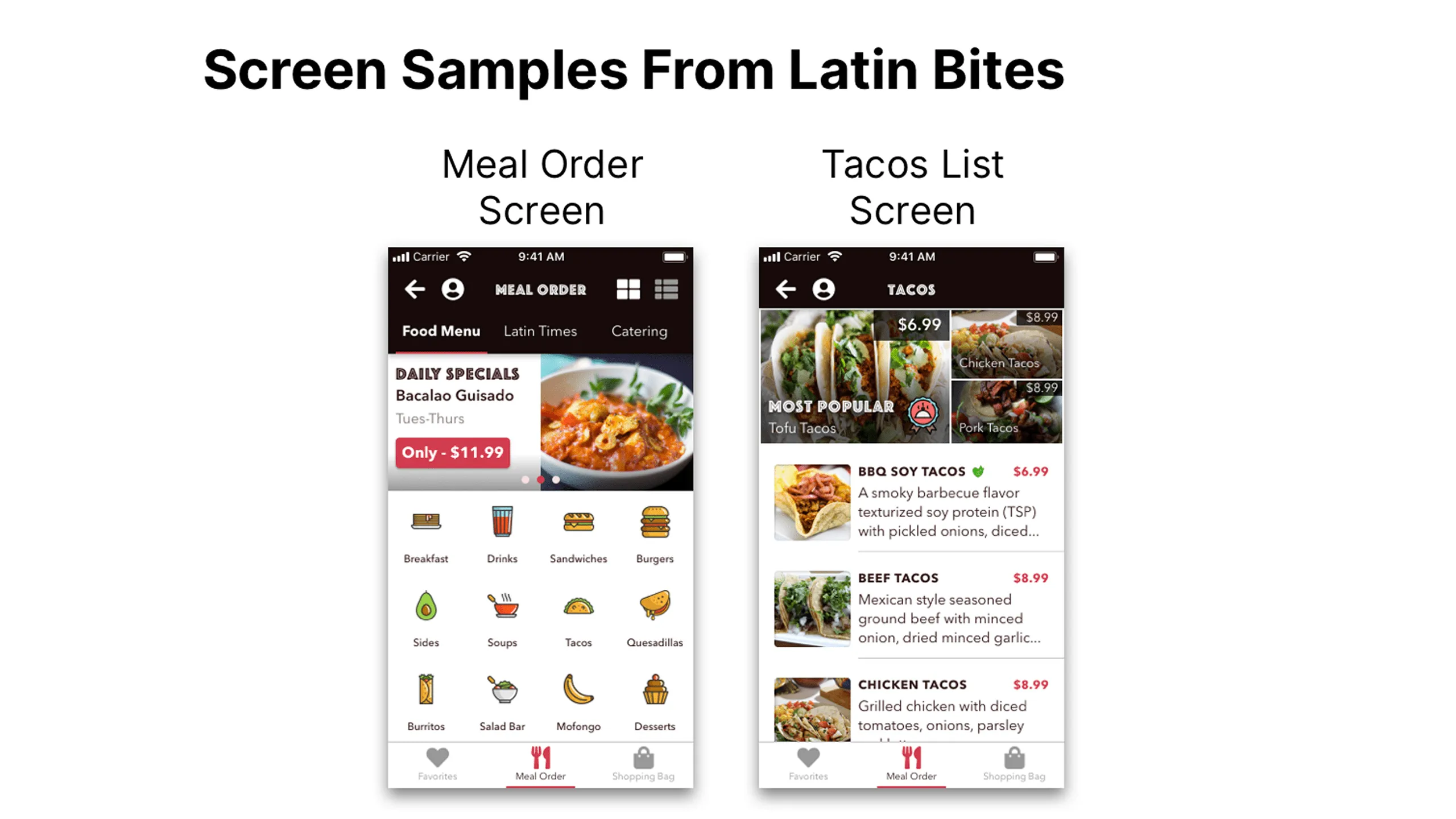
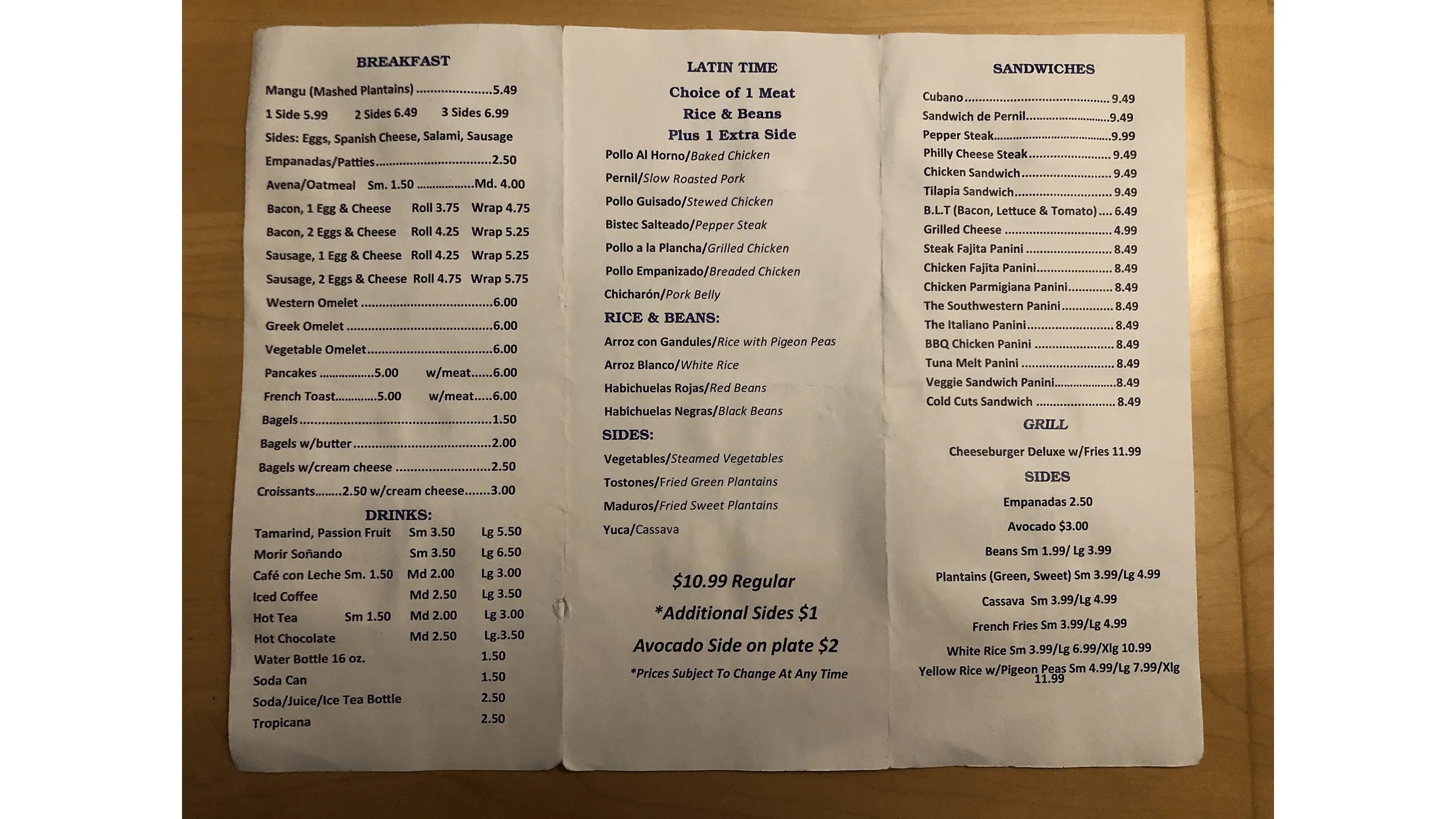
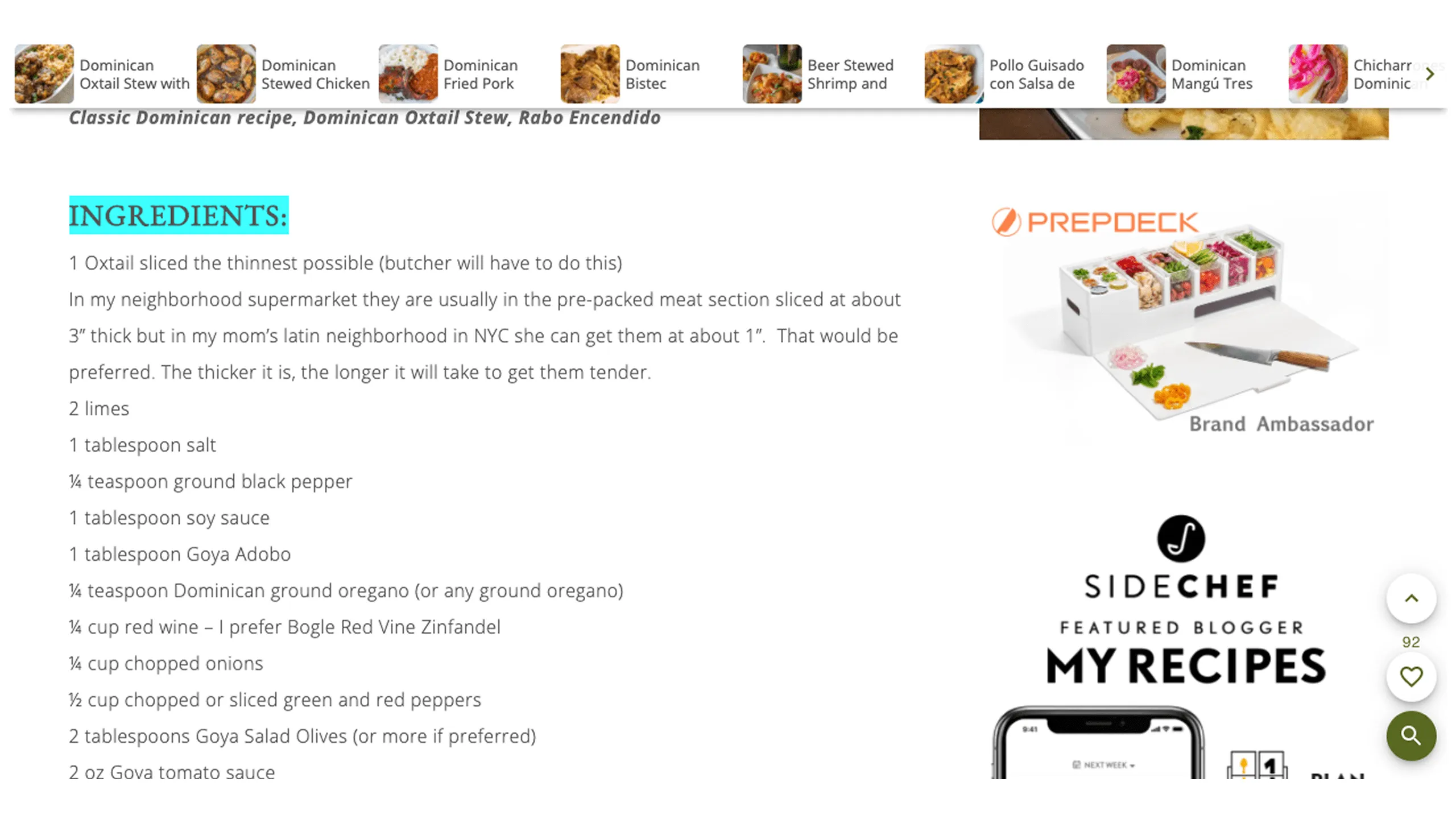
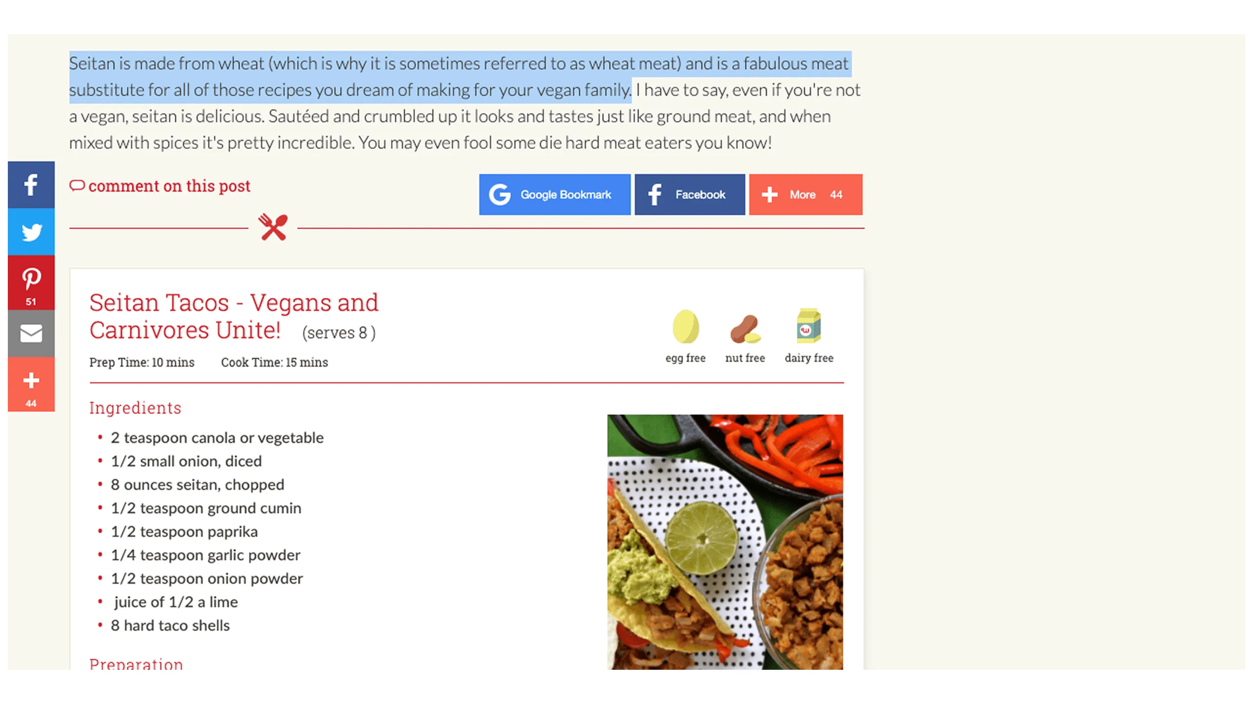
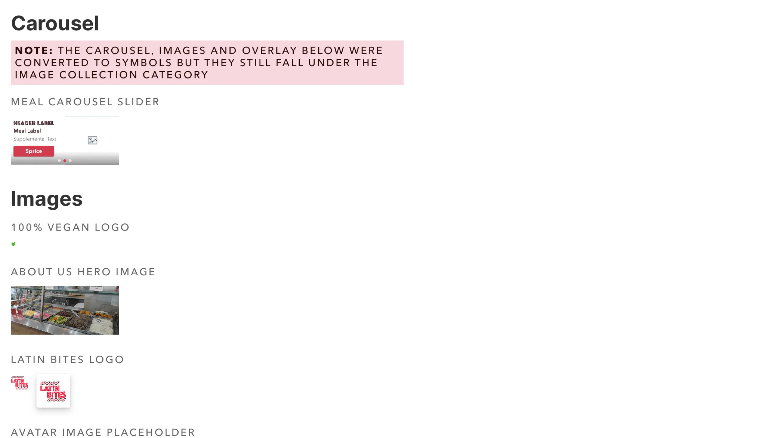
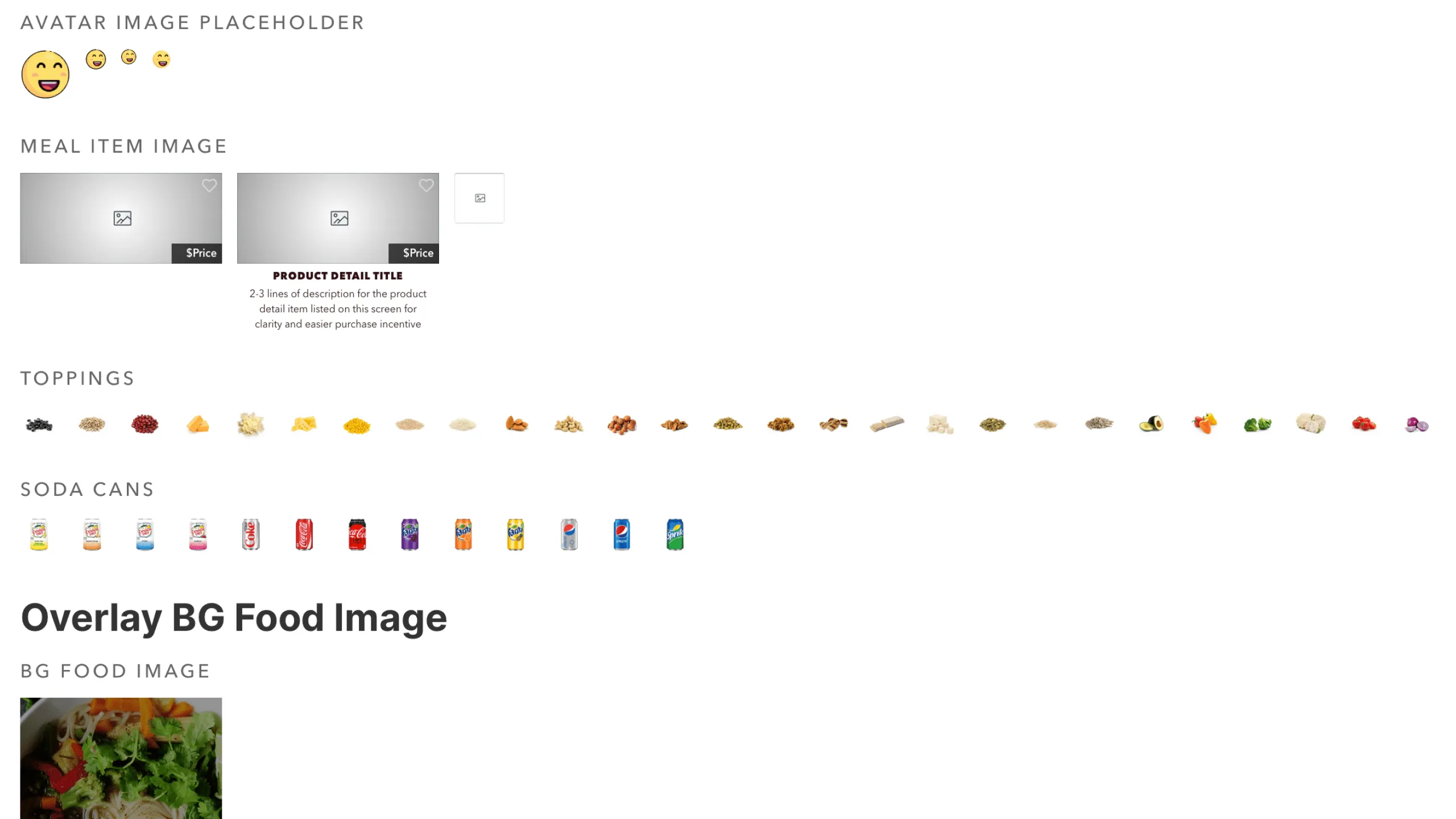
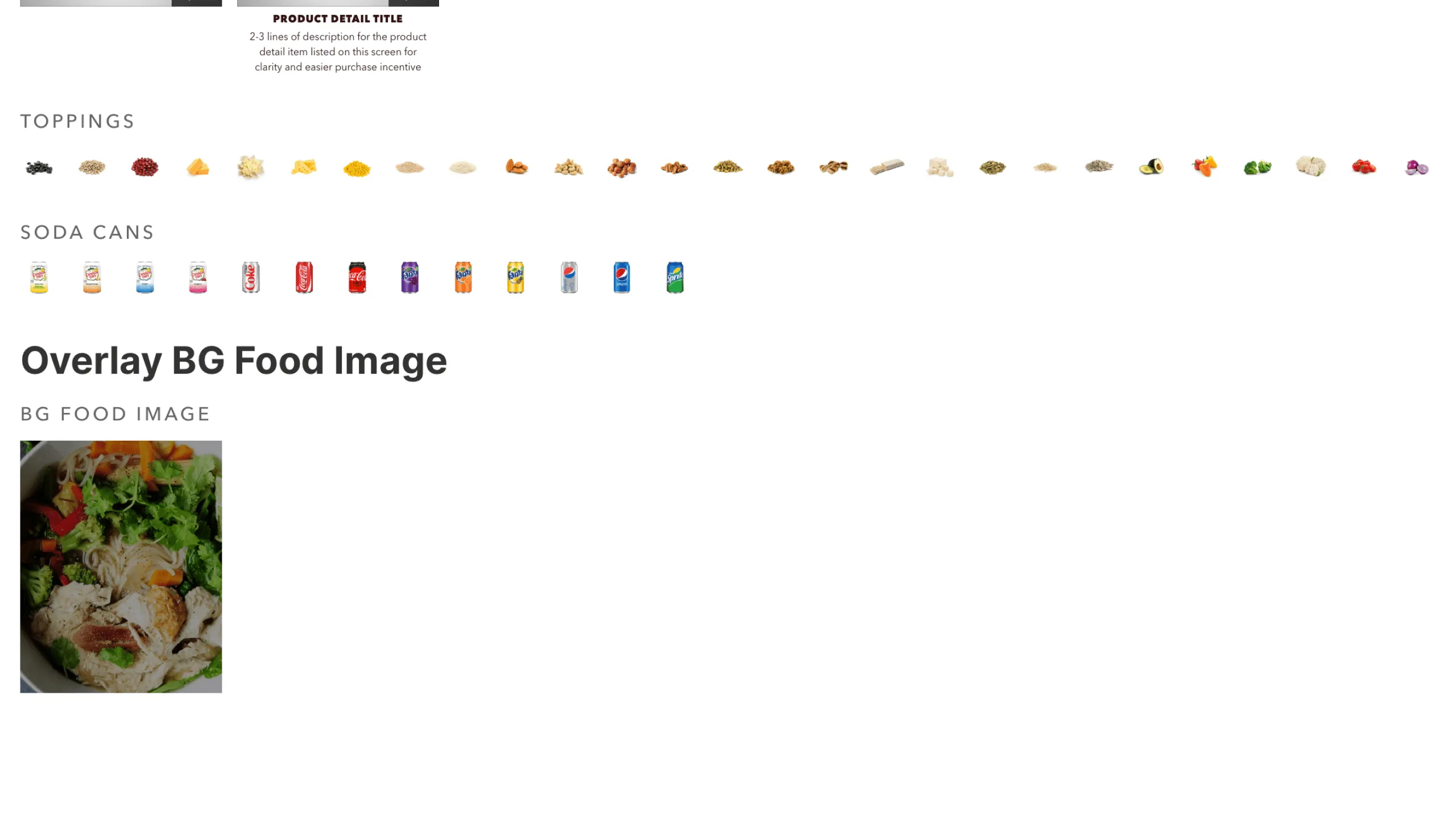
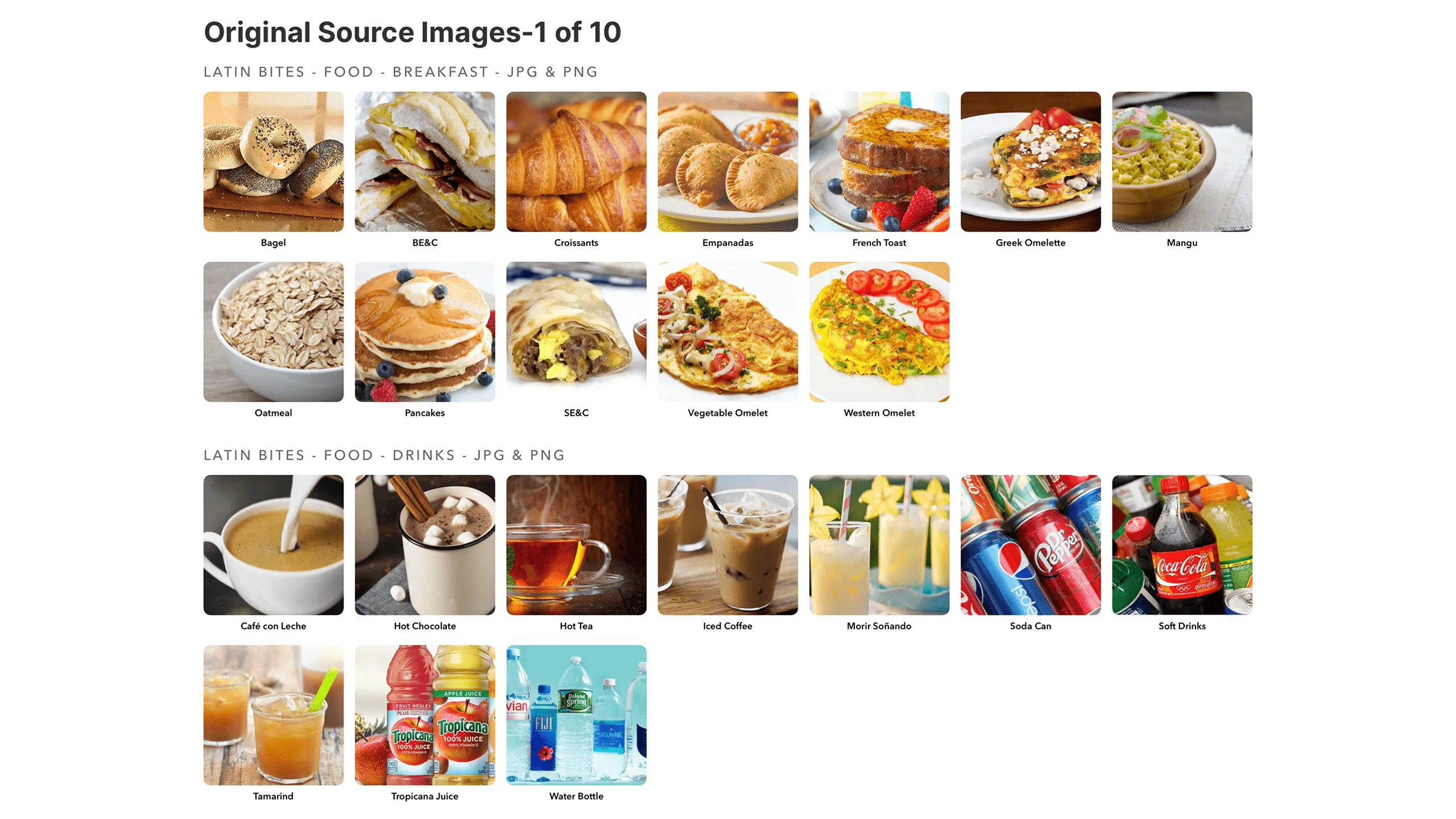
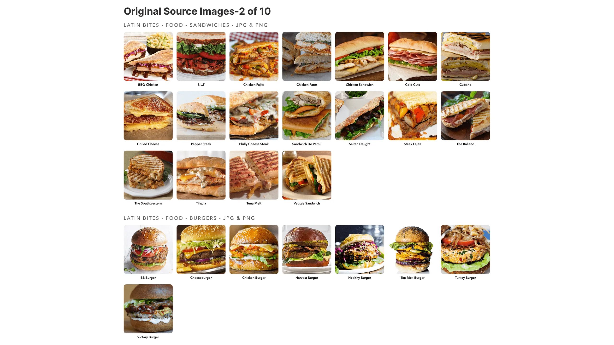
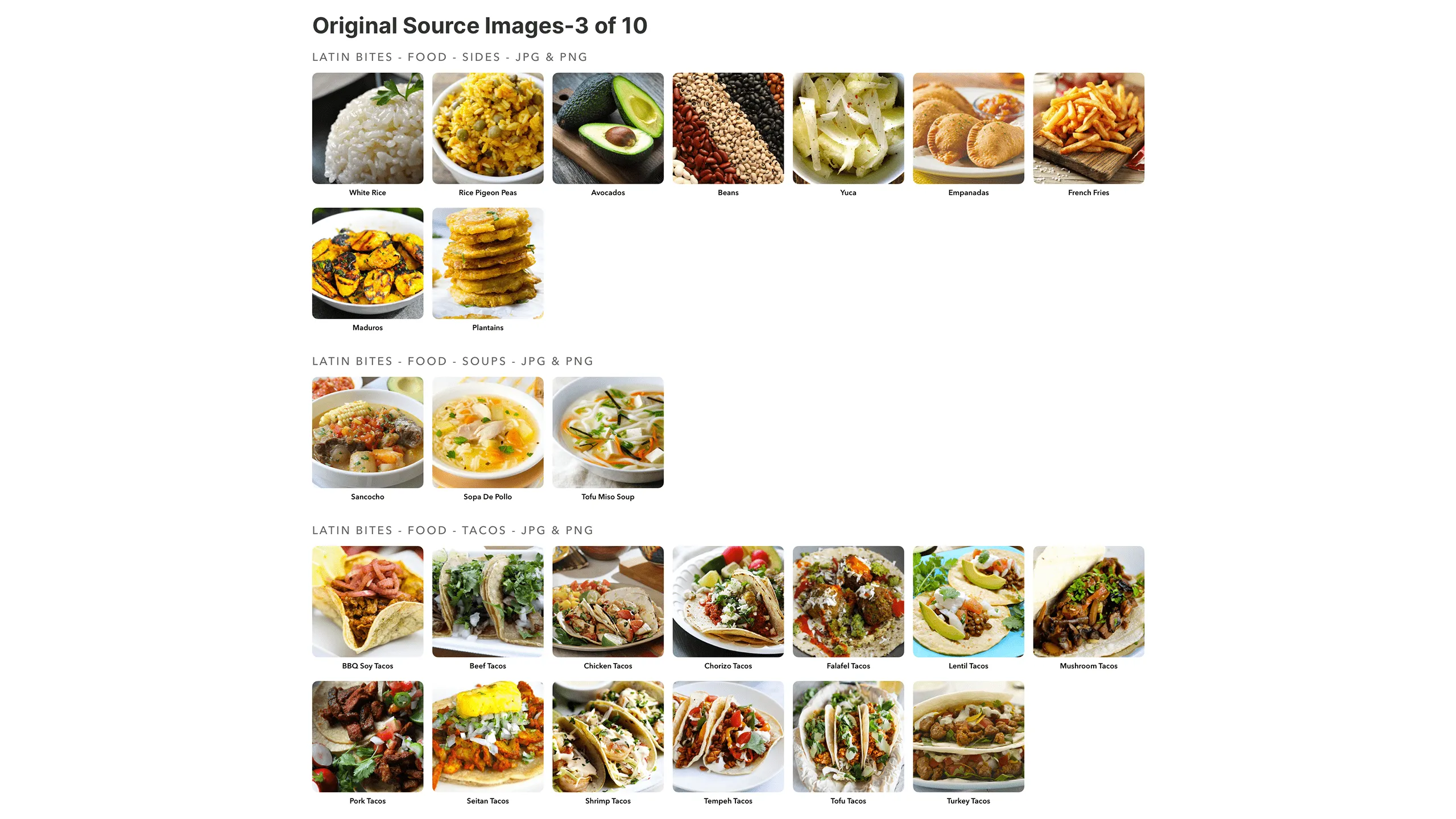
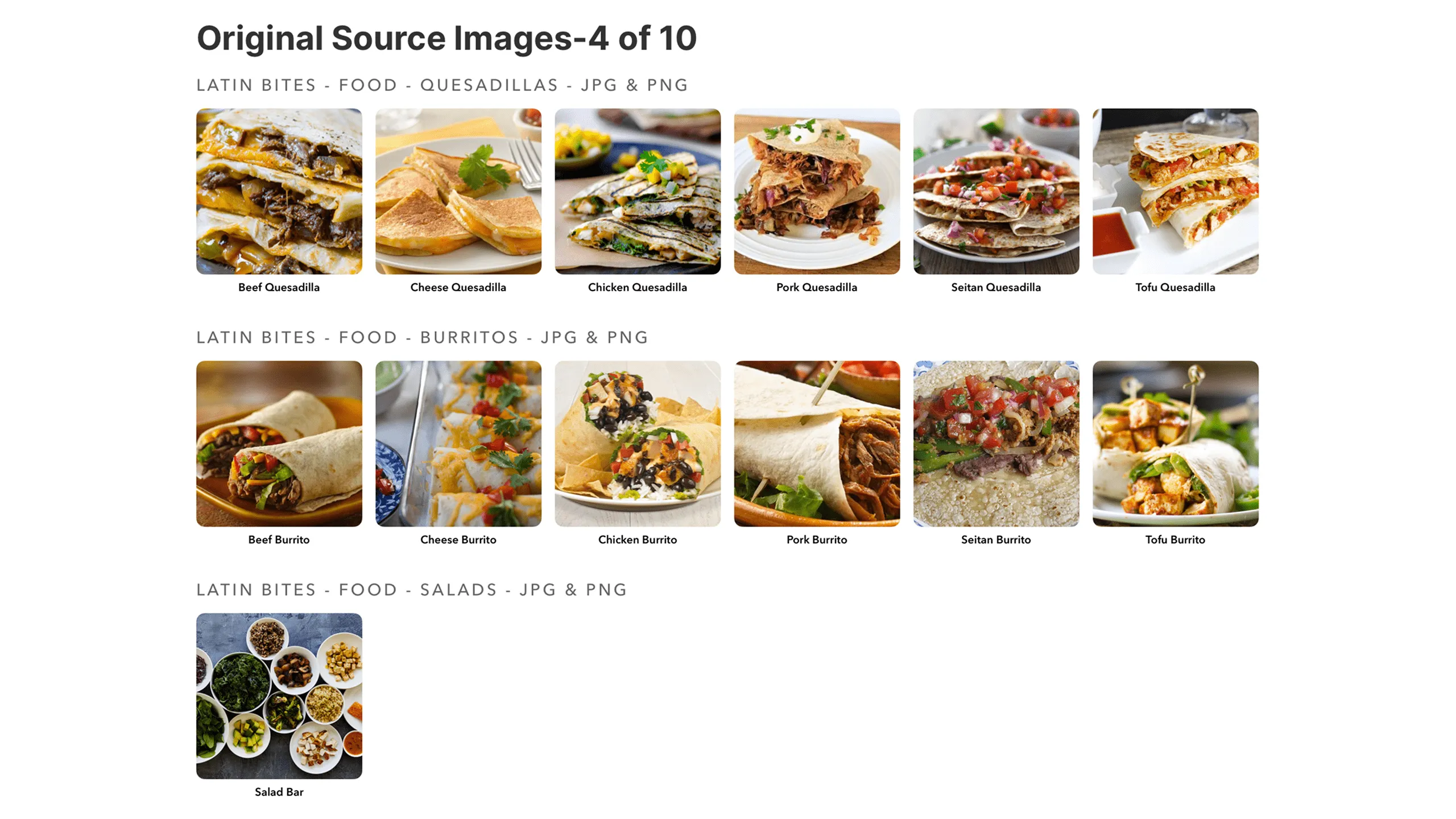
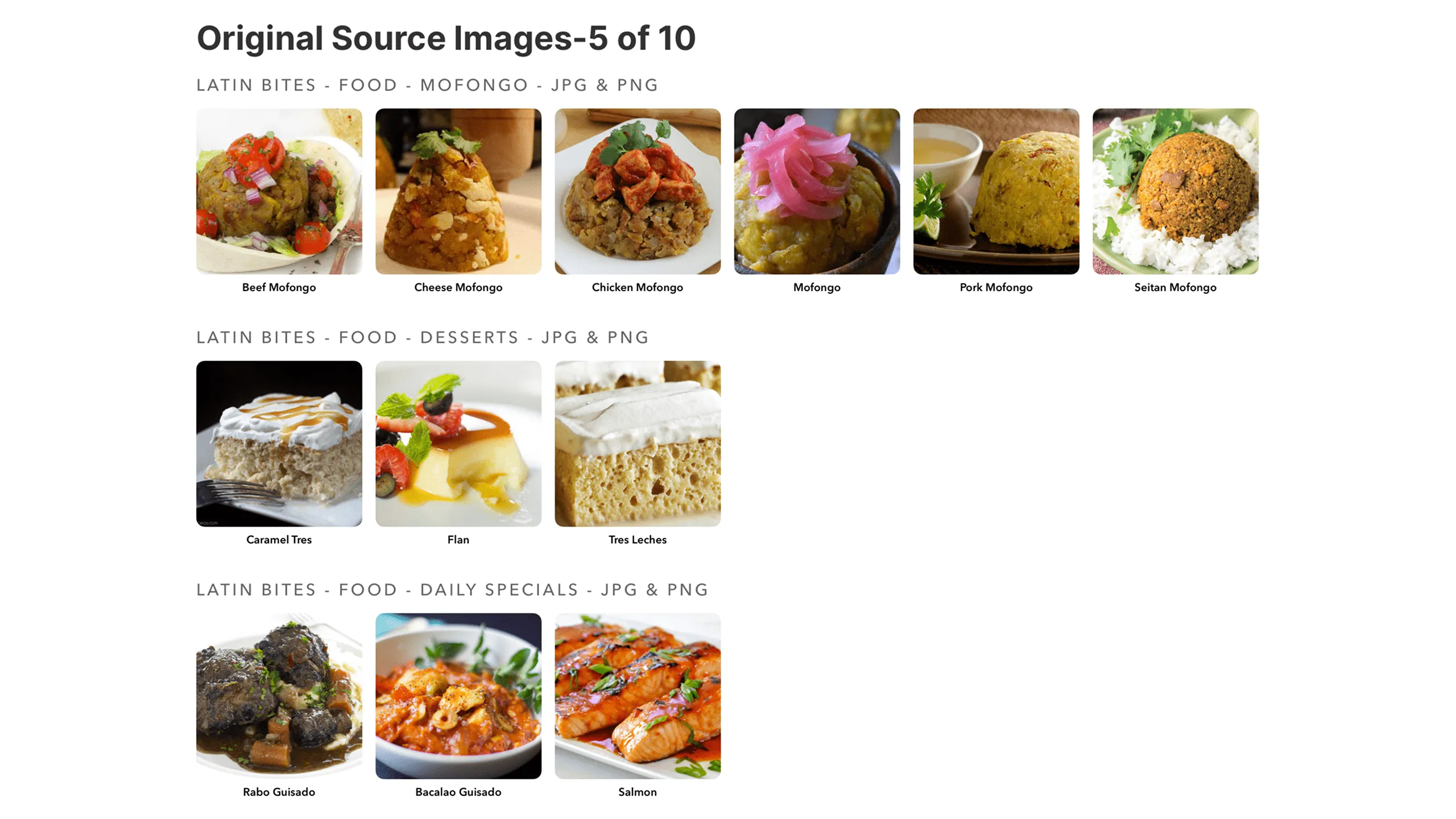
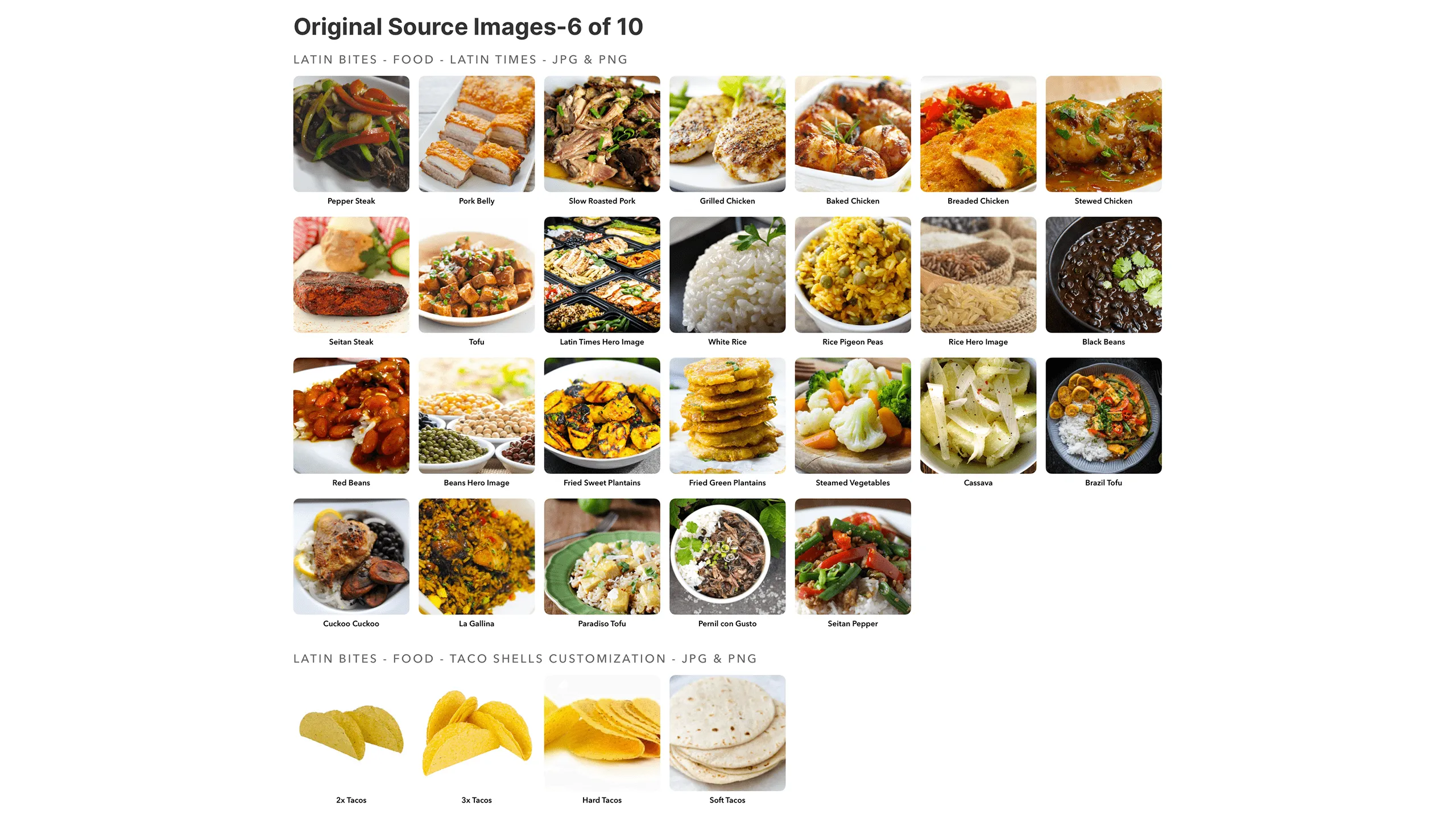
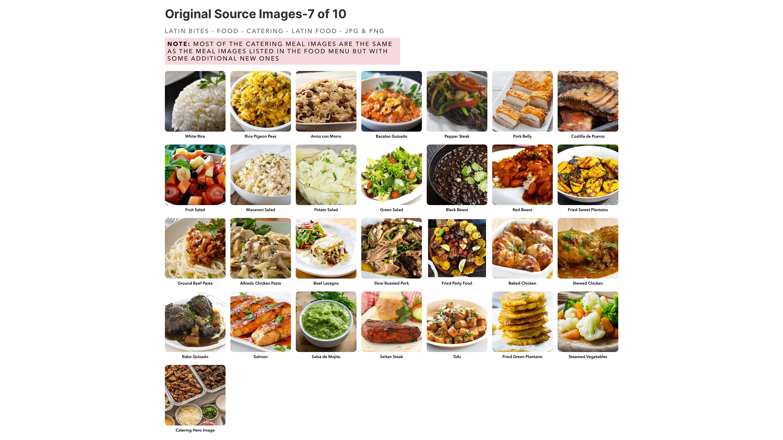
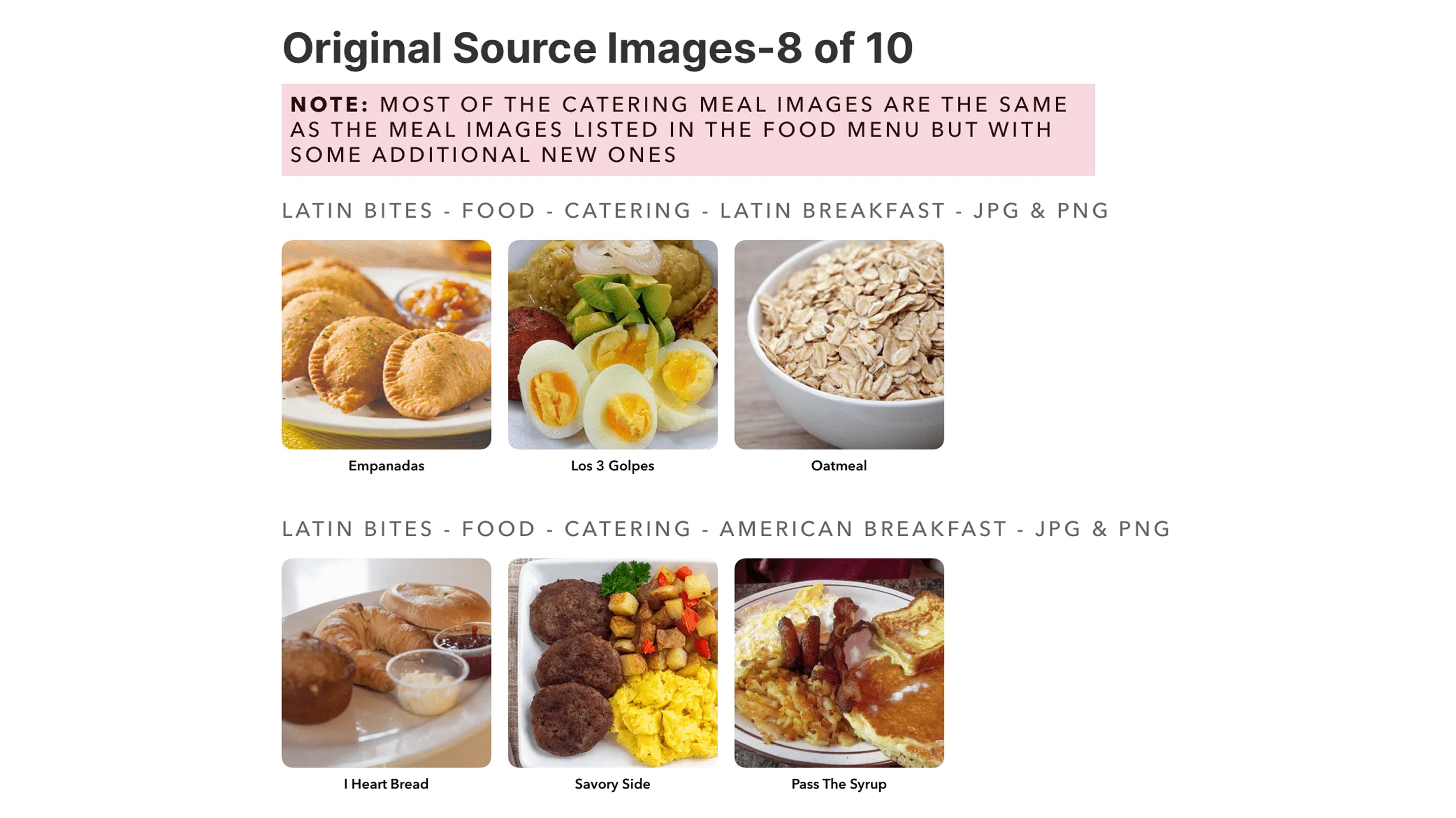
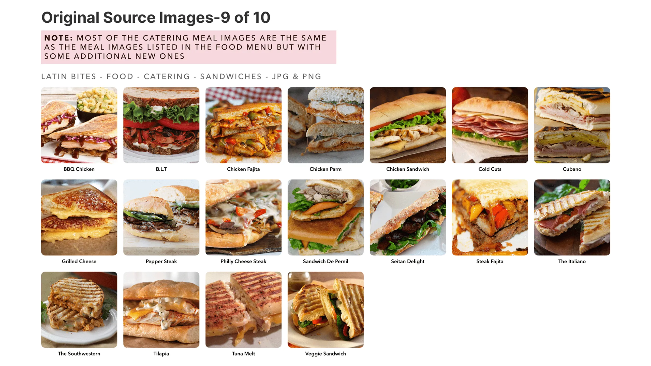
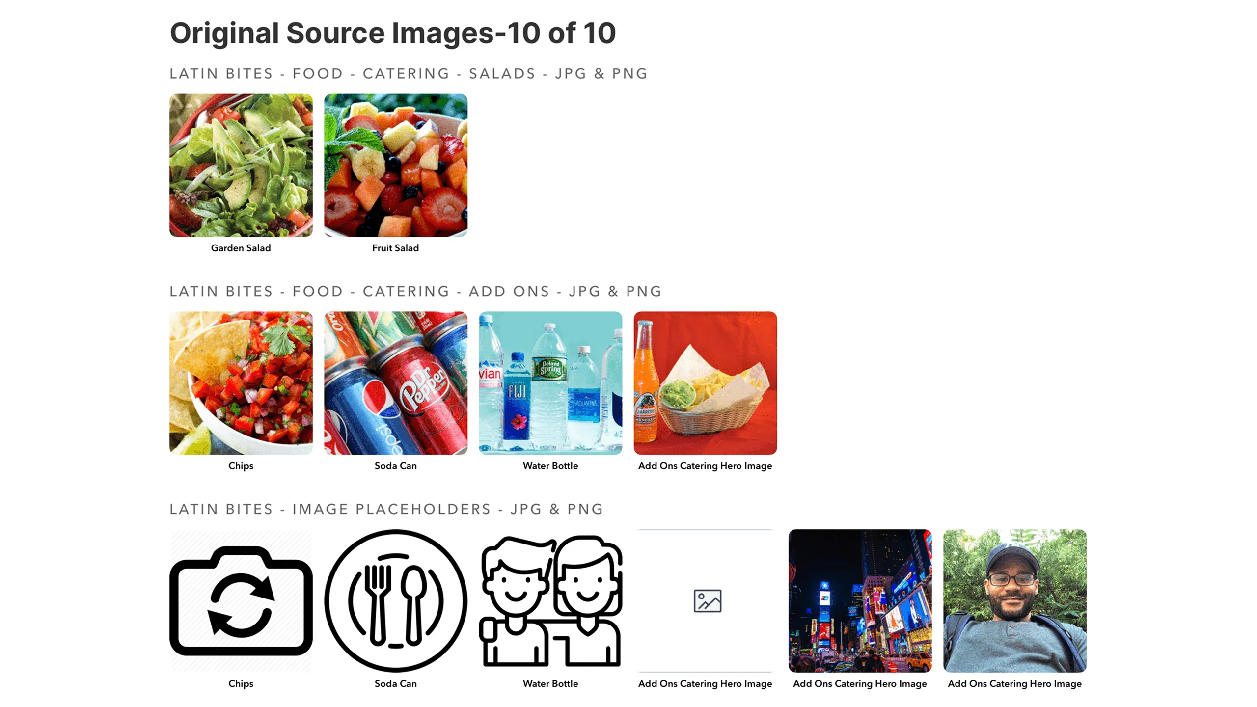
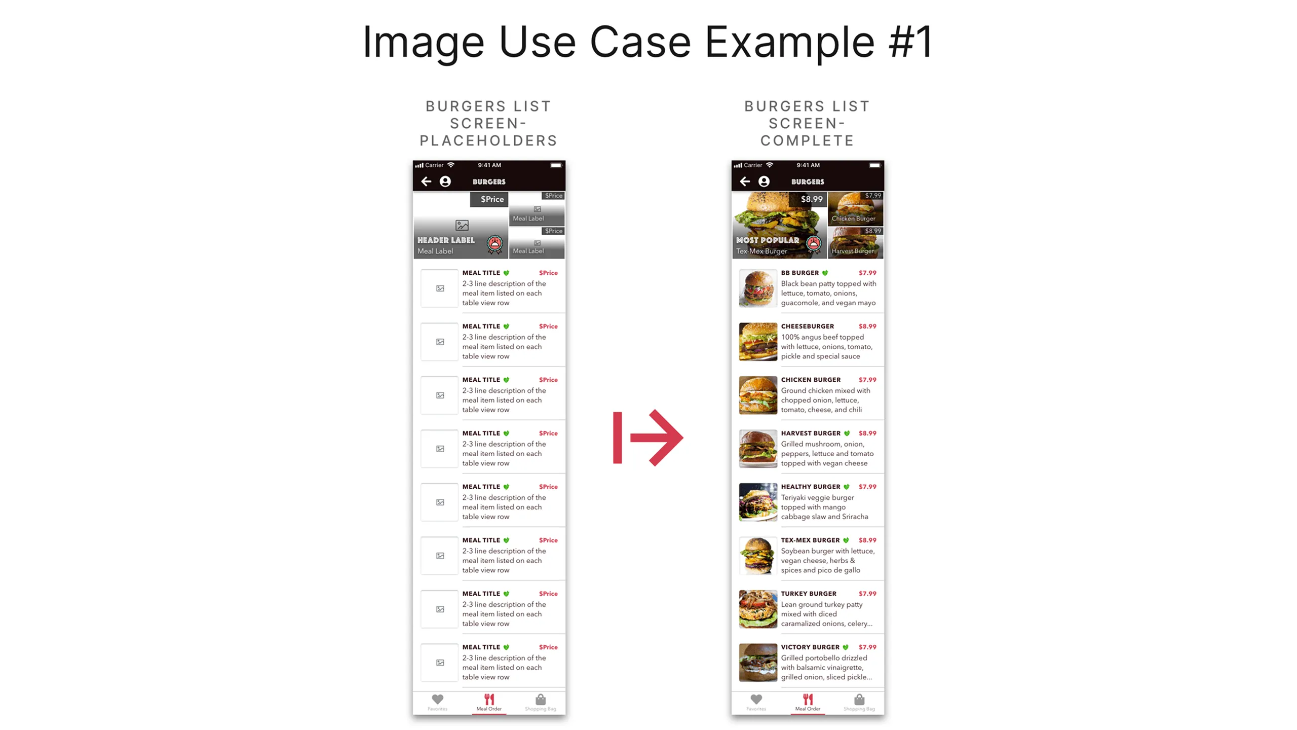
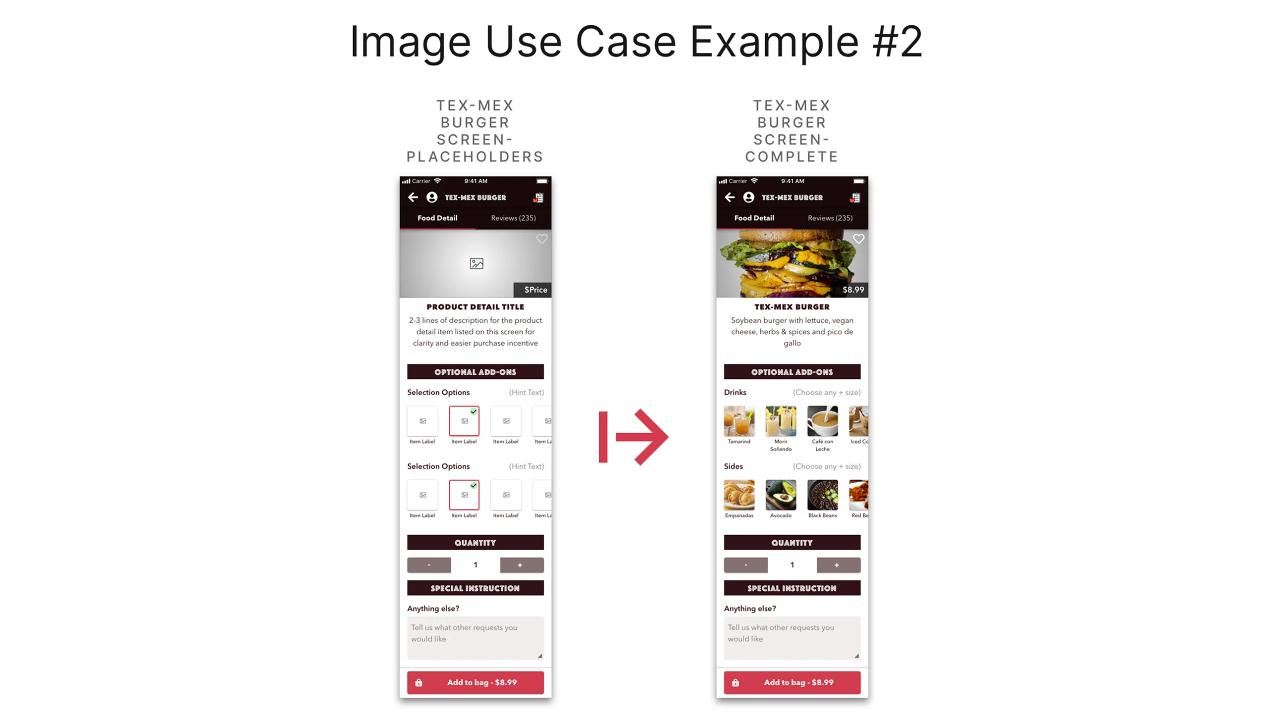
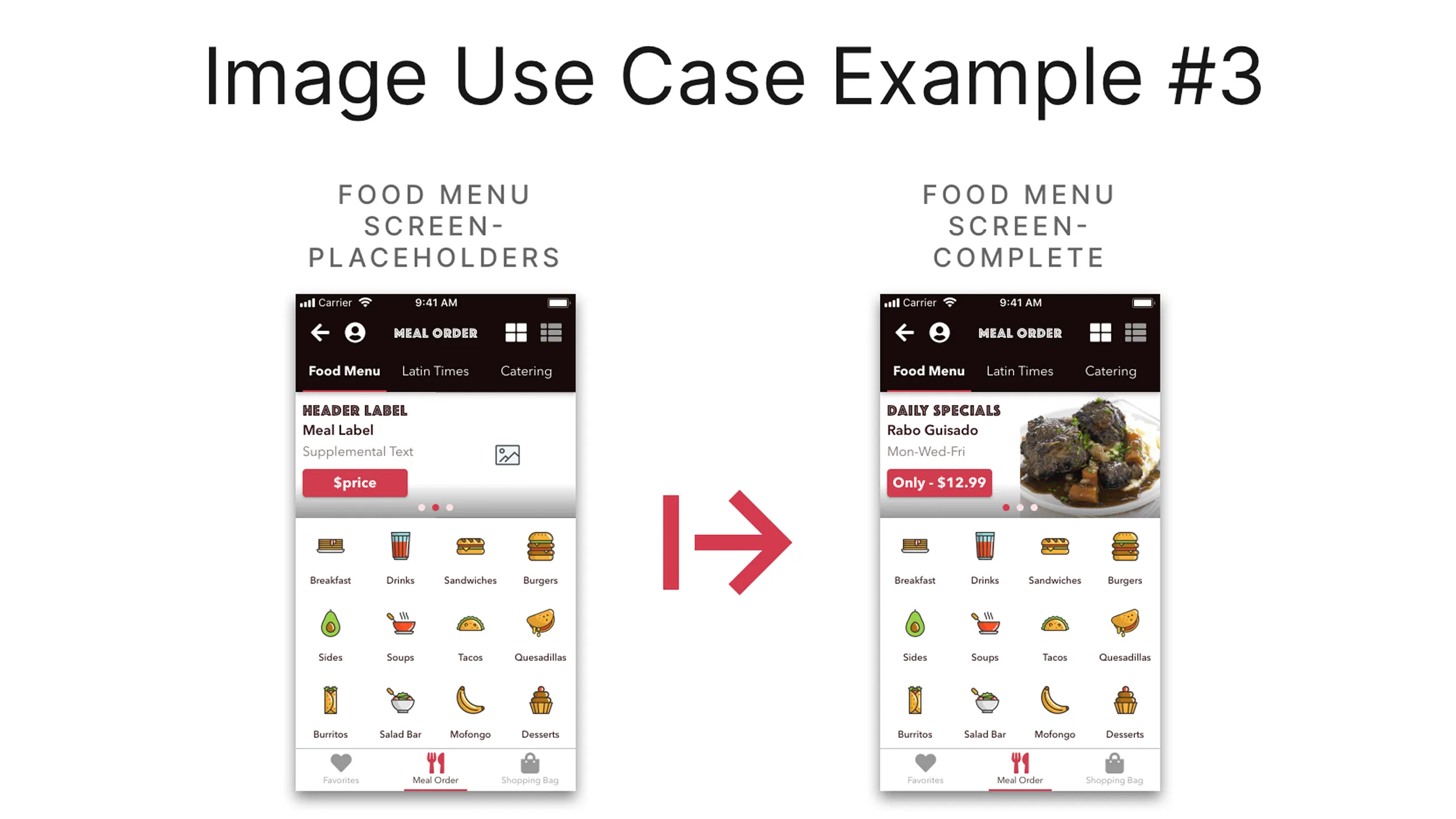
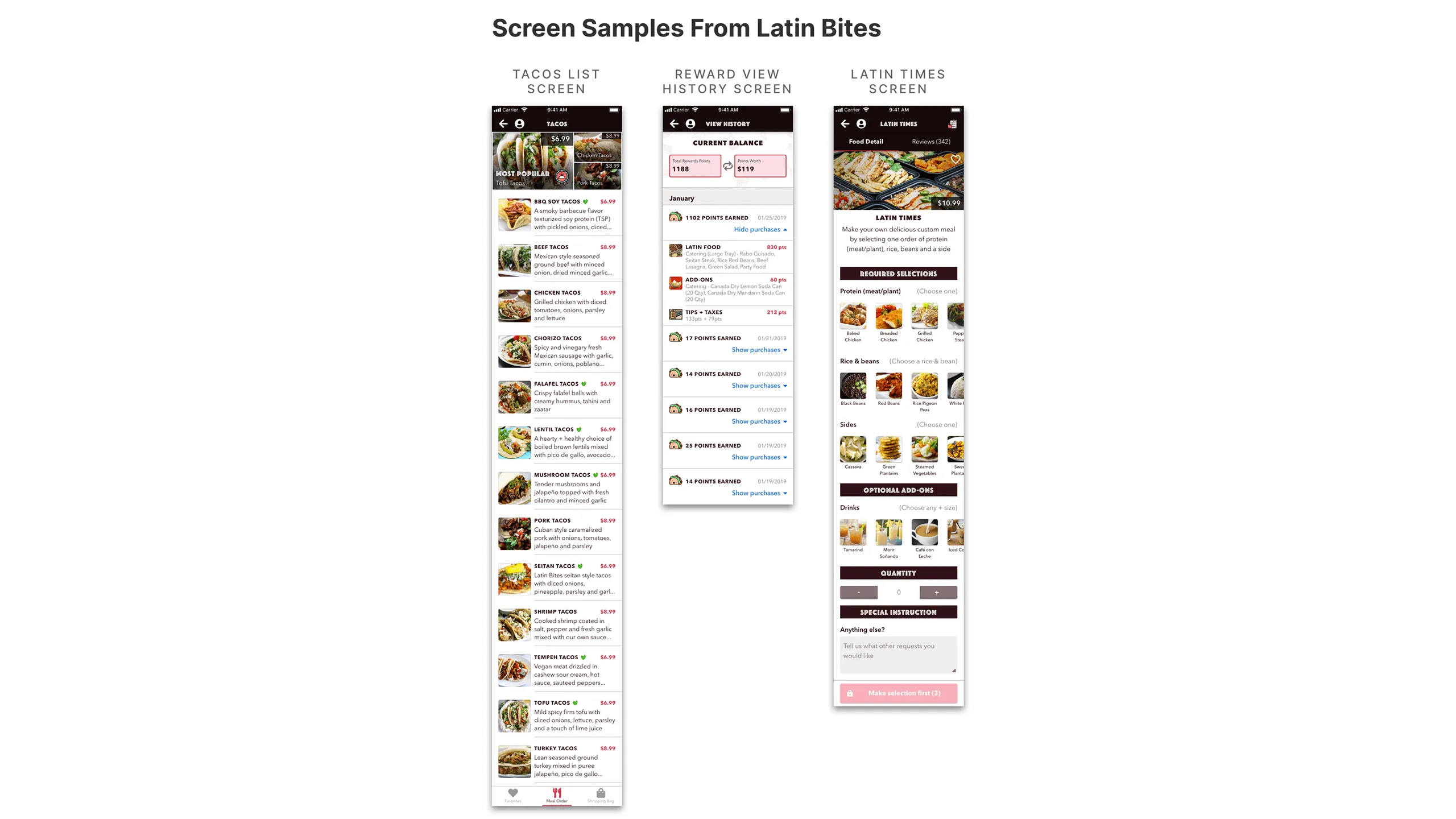
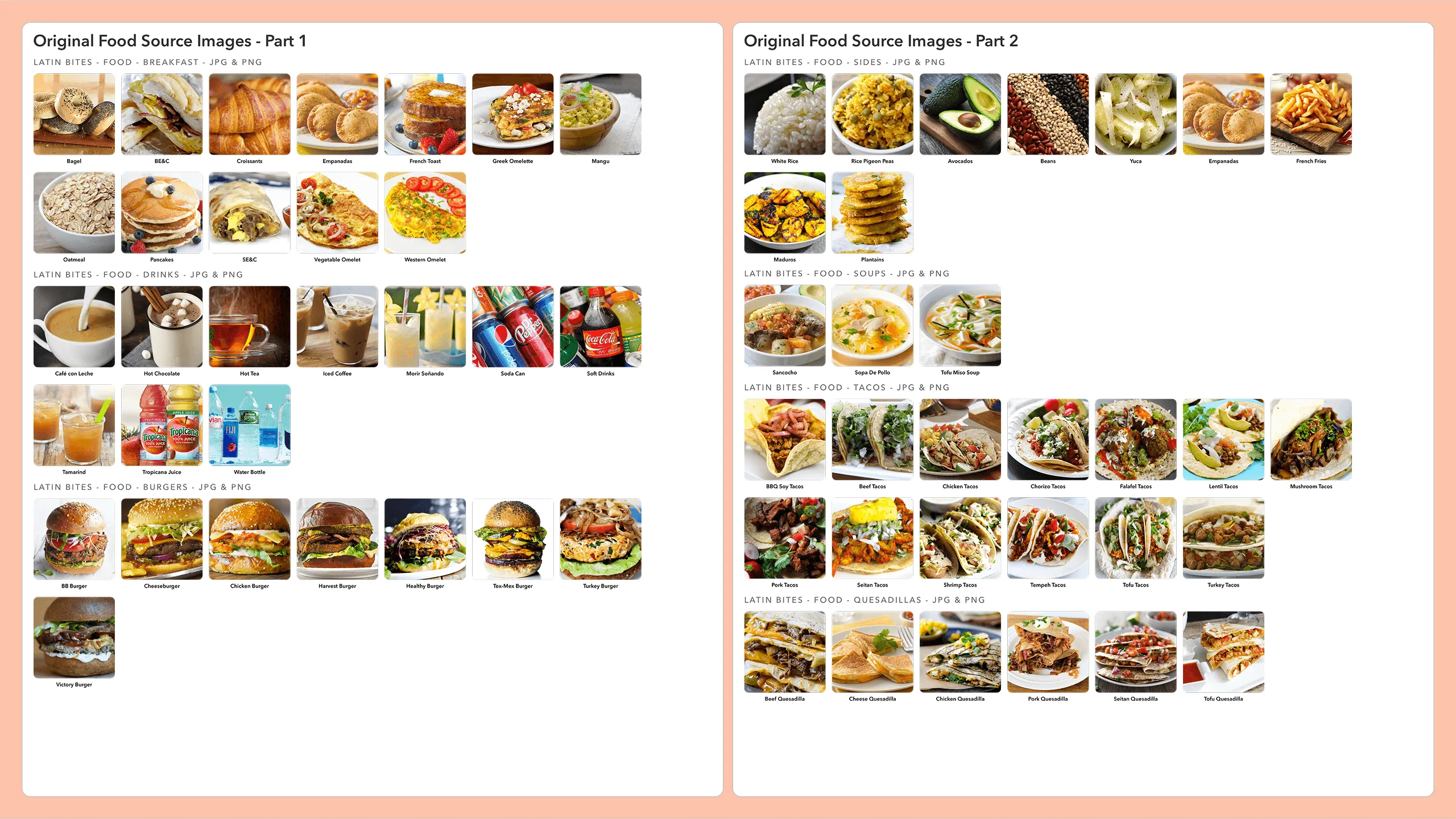
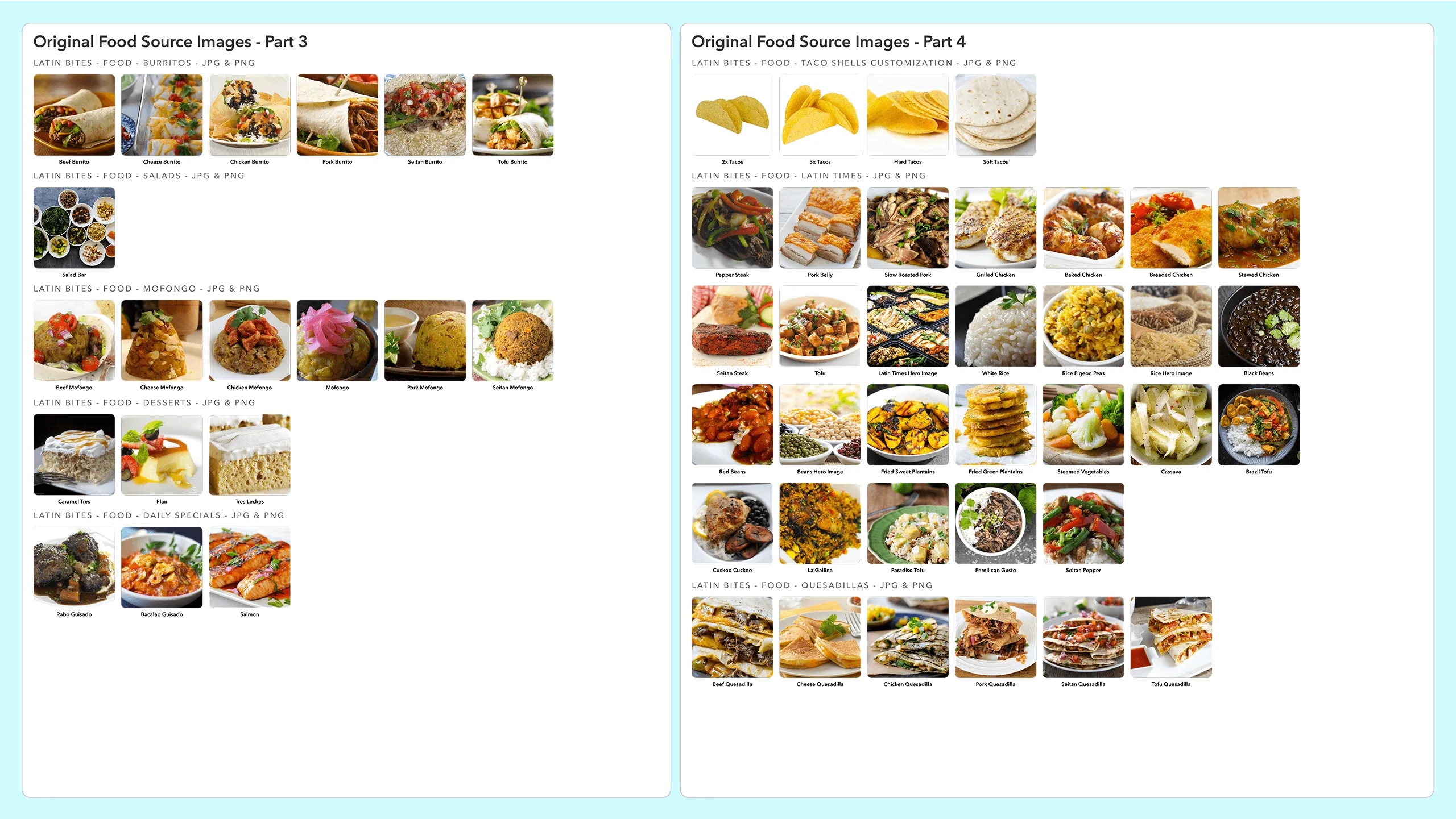
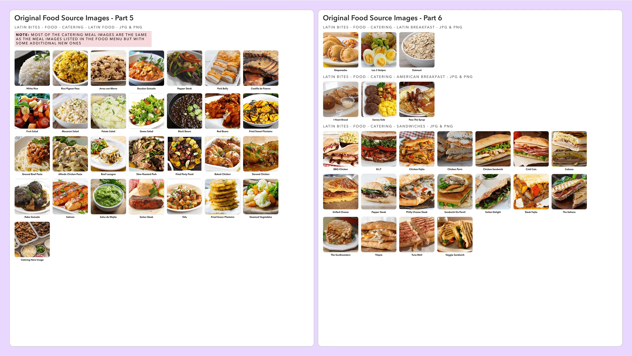
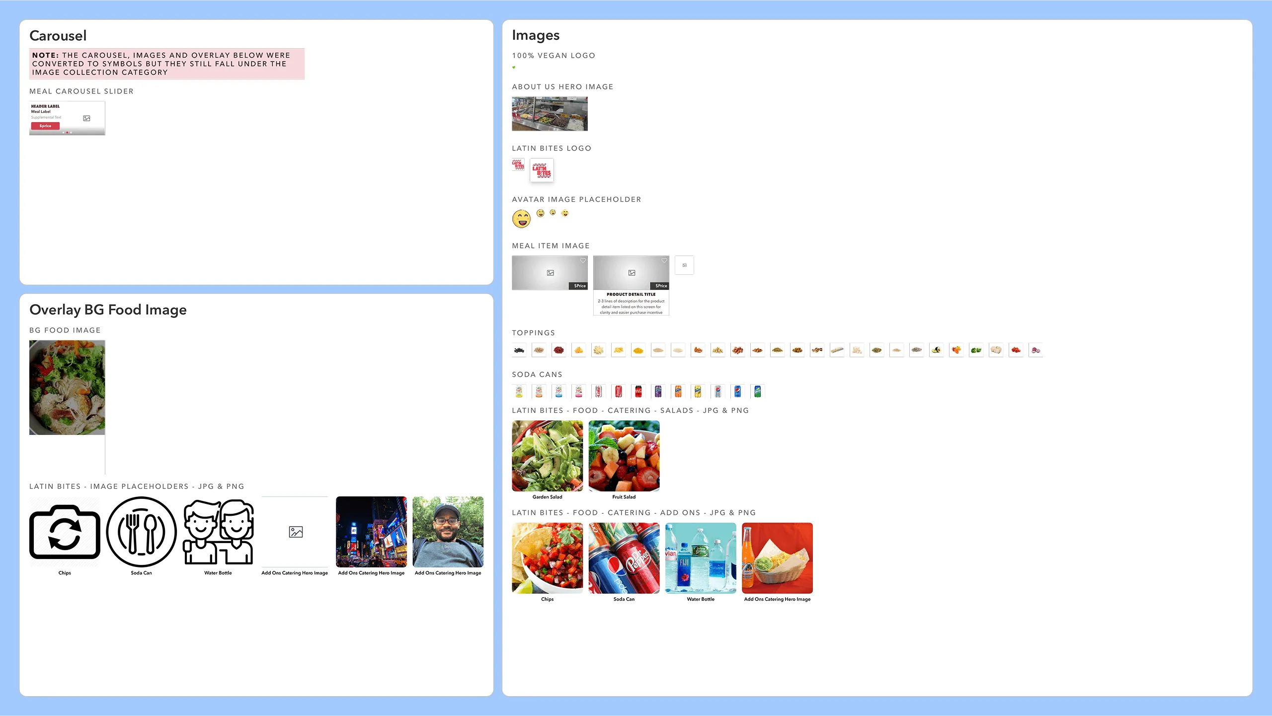
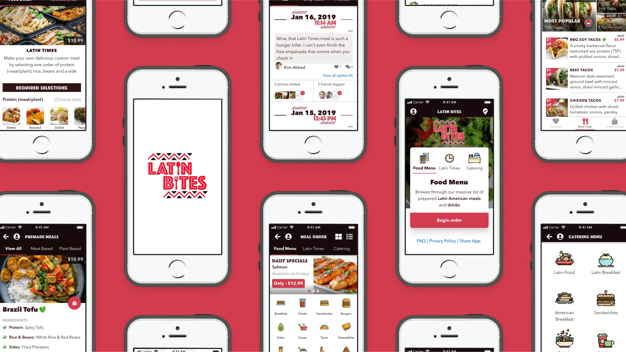
Sourcing food imagery was the most time-consuming task. I matched each meal from Latin Bites’ 50-item brochure with high-quality images, then enriched each with ingredient lists and descriptions. Additional visuals included logos, avatars, store photos, and topping bars.

Screenshot of Latin Bites closed front cover of the food menu brochure.
Screenshot of Latin Bites opened food menu brochure showing rear layout.Screenshot of Latin Bites opened food menu brochure showing front layout.Screenshot of Latin Bites closed catering menu brochure cover.Screenshot of Latin Bites opened catering menu brochure showing rear layout.Screenshot of Latin Bites opened catering brochure showing front layout.
Screenshot of Google image results for seitan tacos from various sources.
Screenshot of Google image results for beef stew from various sources.Screenshot of Google image results for mashed plantains from various sources.Screenshot of Google image results for morir soñando beverage from various sources.Screenshot of empanada food description from the web.Screenshot of potato salad meal description from the internet.Screenshot of mashed plantains meal description from the web.Screenshot of morir soñando drink background and history from the web.Screenshot of oxtail meal ingredients list from the internet.Screenshot of ingredients for Seitan Tacos (vegan and carnivore options) from the internet.
Screenshot of carousel meal components and food images used across Latin Bites design screens.
Screenshot of Latin Bites meal food images, including existing menu and new vegan options (Part 1 of 10).
Screenshot of Latin Bites meal food images, existing and vegan meals (Part 2 of 10).Screenshot of Latin Bites food menu images including vegan dishes (Part 3 of 10).Screenshot of Latin Bites food item visuals including traditional and vegan meals (Part 4 of 10).Screenshot of Latin Bites menu food photos featuring various meal types (Part 5 of 10).Screenshot of Latin Bites food image assets for menu items and vegan options (Part 6 of 10).Screenshot of catering meal images for Latin Bites menu, including vegan options (Part 7 of 10).Screenshot of catering food images from Latin Bites including vegan additions (Part 8 of 10).Screenshot of Latin Bites catering meal images with vegan selections (Part 9 of 10).Screenshot of Latin Bites food image placeholders and final meal image assets (Part 10 of 10).
Screenshot showing three Latin Bites screens: Burgers List, Tex-Mex Burger detail, and Food Menu.

#3. Applying visual style to the taskflow wireframes

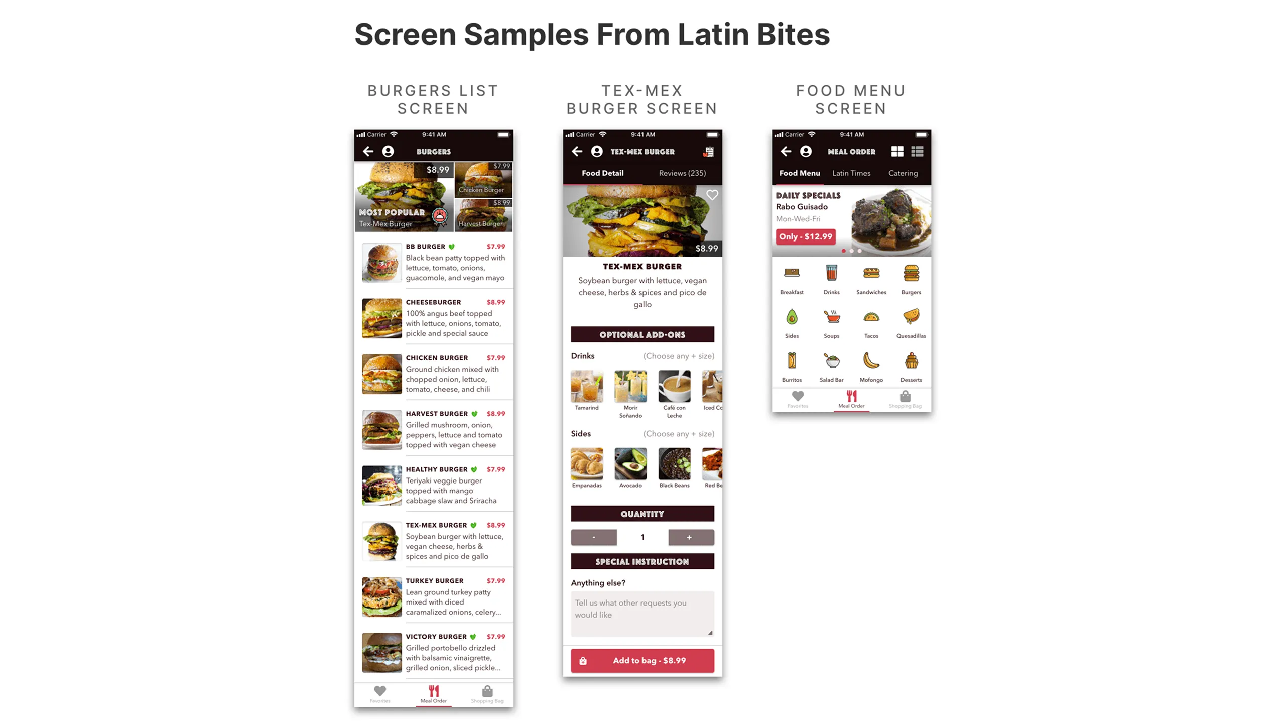
With the style guide and taskflows finalized, I applied the visual design to create high-fidelity mockups and interactive prototypes for key user journeys.

Screenshot of three Latin Bites screens: Premade Meal, Social Profile, and Meals Rated.
Screenshot of the Premade Meal screen with annotations highlighting layer styles and text styles.Screenshot of the Premade Meal screen with annotations highlighting icons and images.Screenshot of the Social Profile screen with annotations highlighting layer styles and text styles.Screenshot of the Social Profile screen with annotations highlighting icons and images.Screenshot of the Meals Rated screen with annotations highlighting layer styles and text styles.Screenshot of the Meals Rated screen with annotations highlighting icons and images.
Screenshot showing three Latin Bites design screens: Tacos List, Reward View History, and Latin Times.
Screenshot of the Tacos List screen with UI components annotated.Screenshot of the Reward View History screen with UI components annotated.Screenshot of the Latin Times screen with UI components annotated.

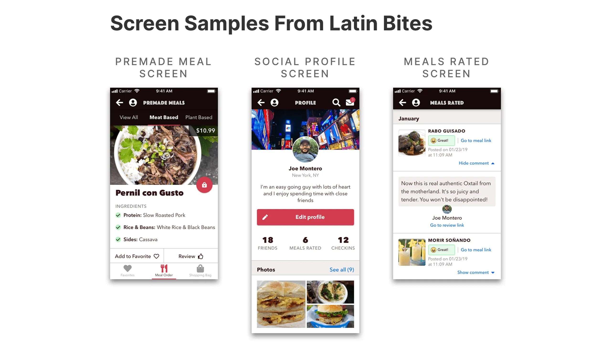
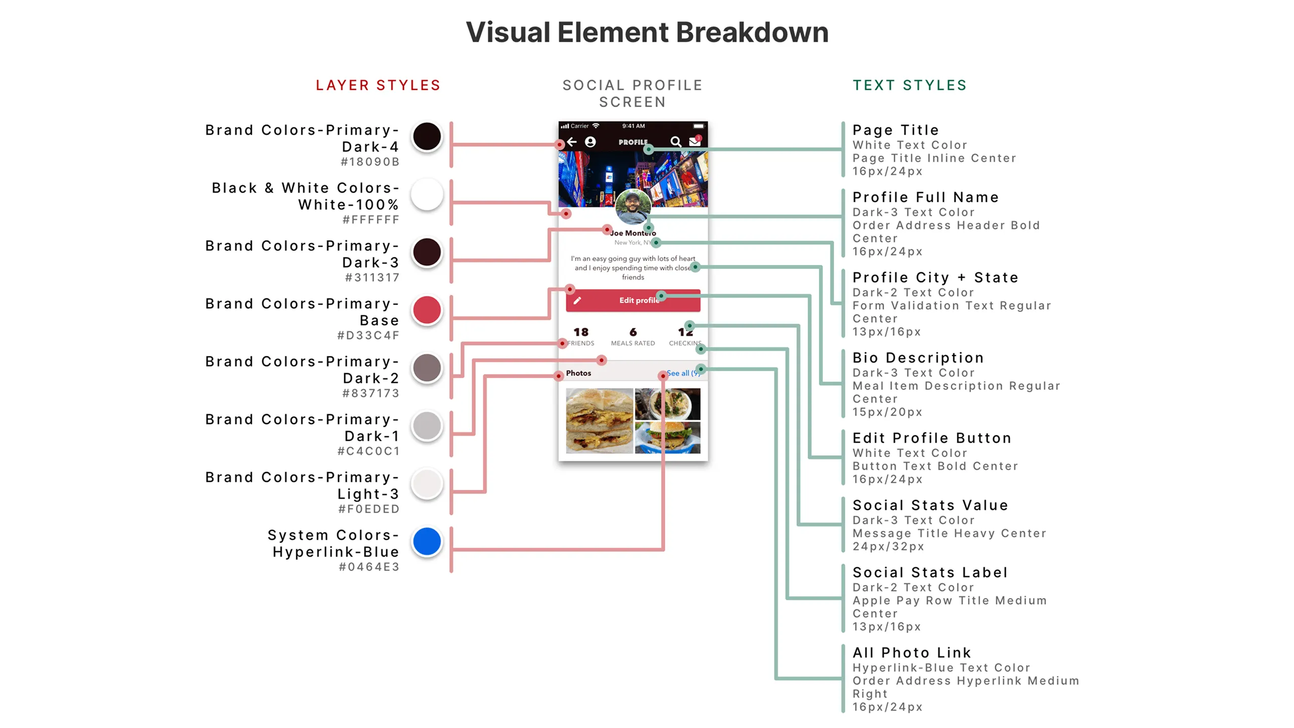
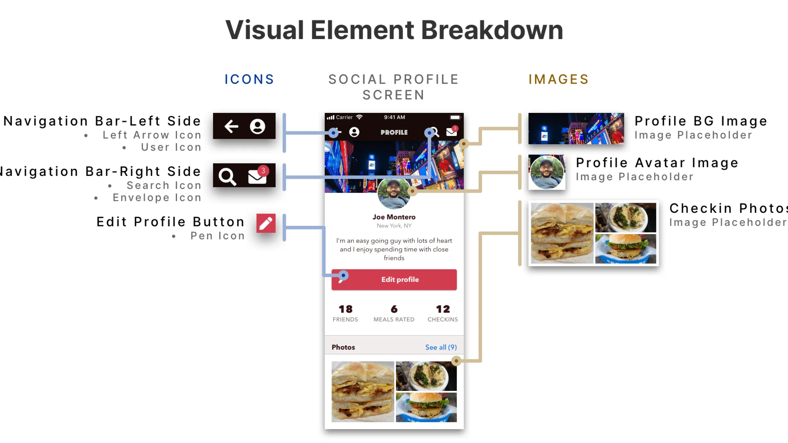
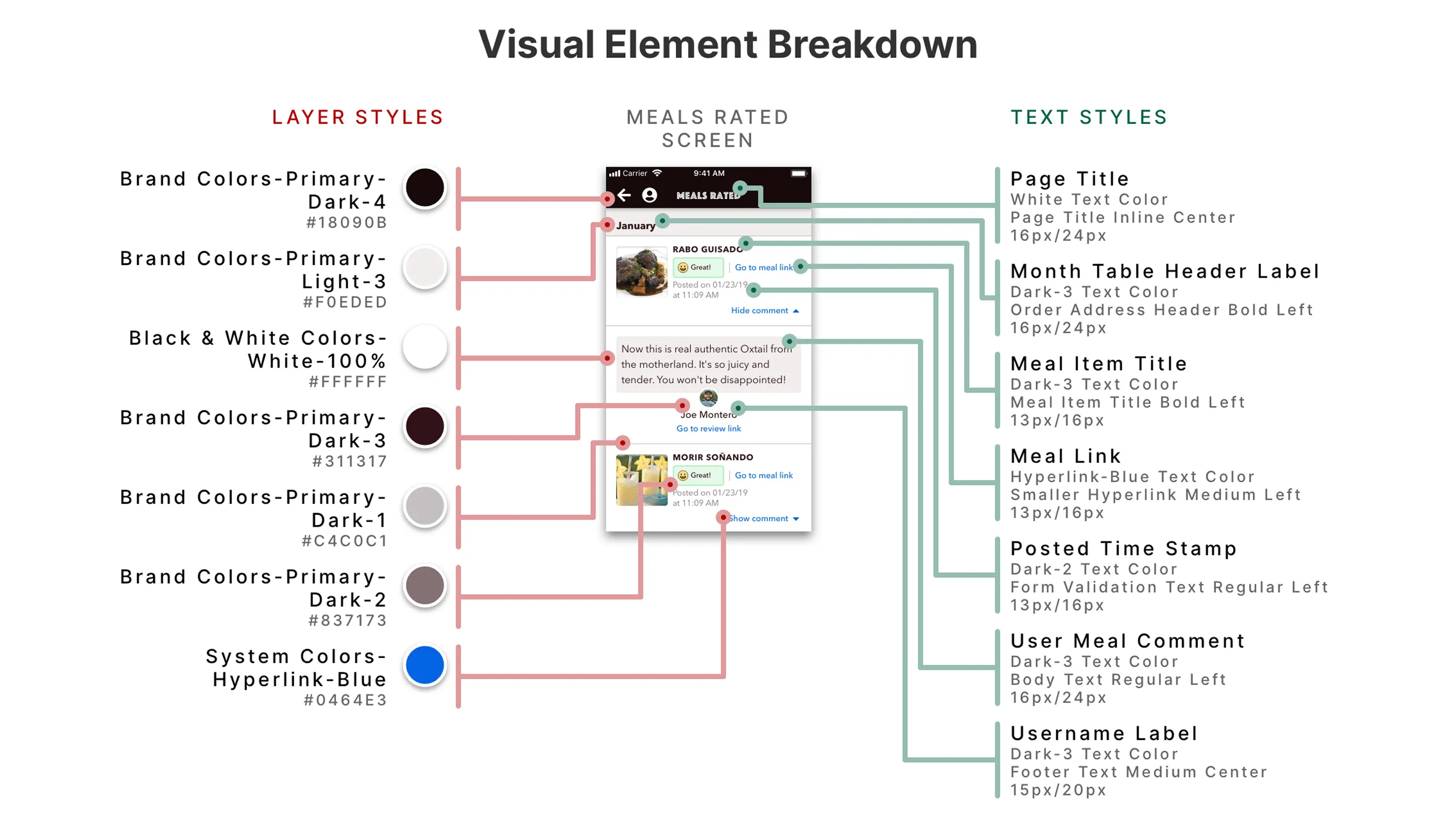
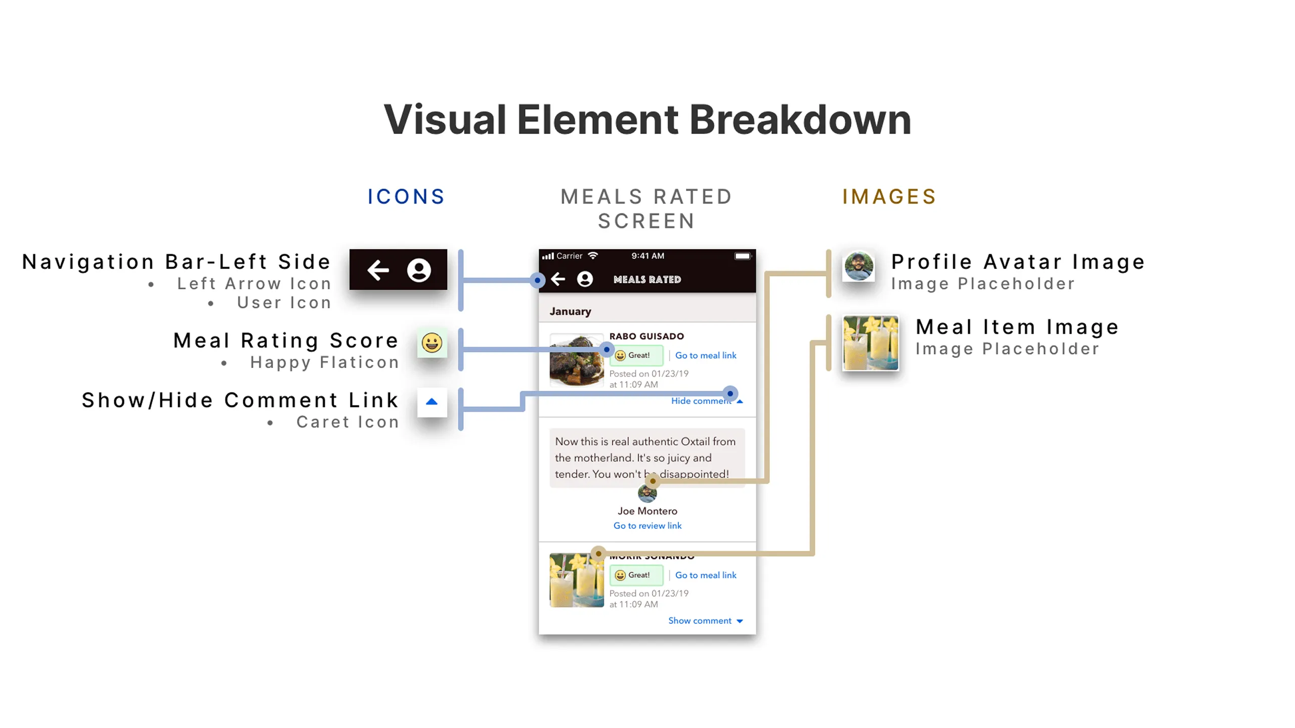
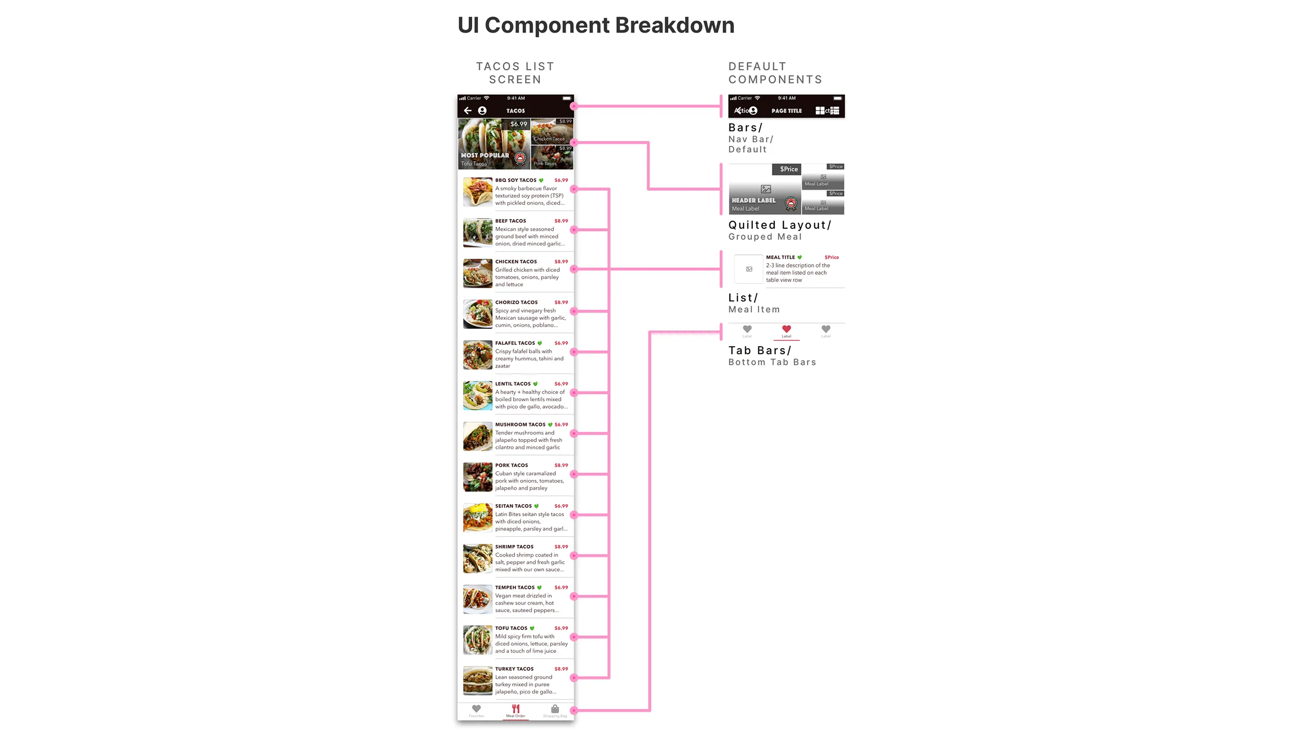
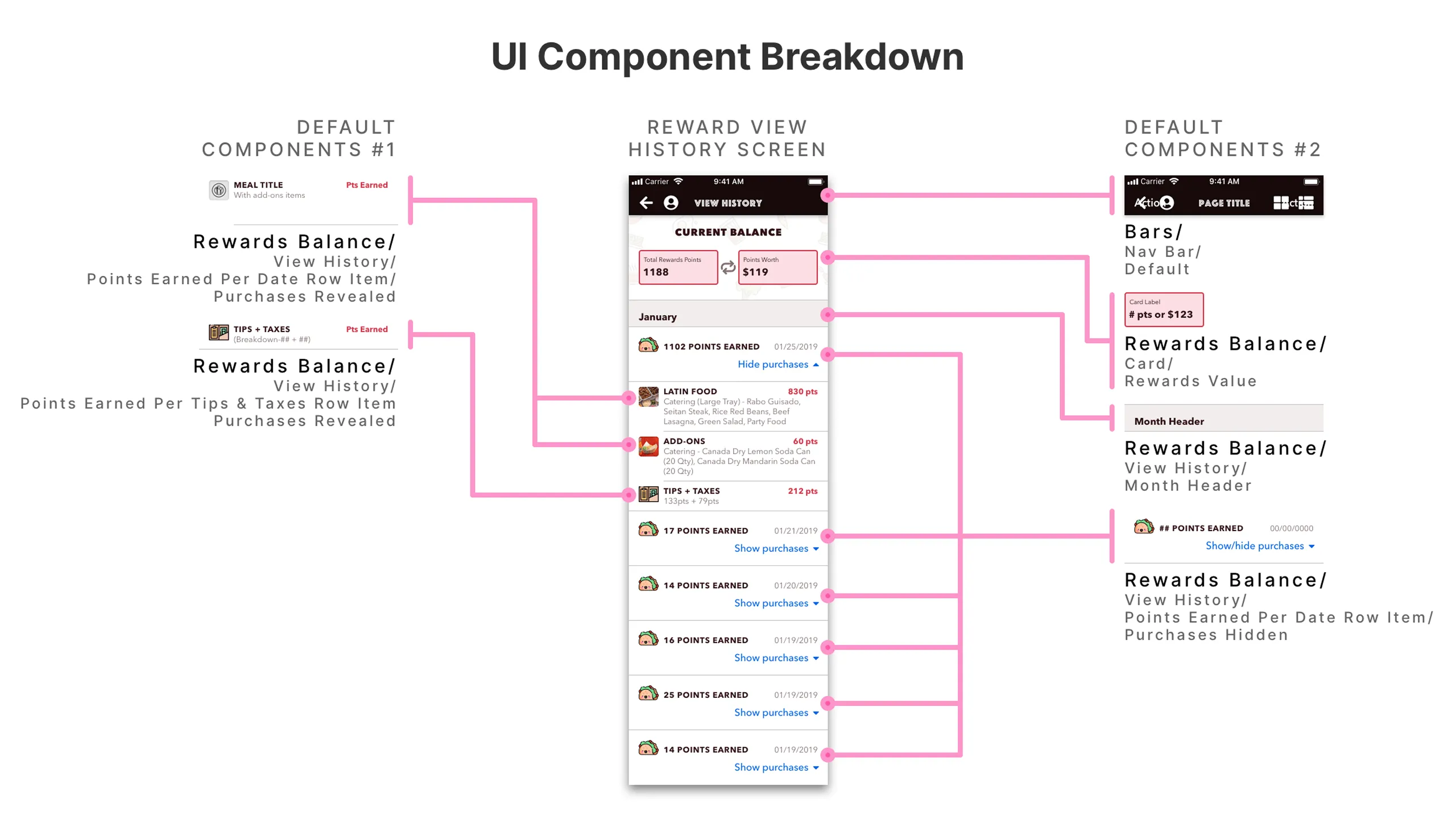
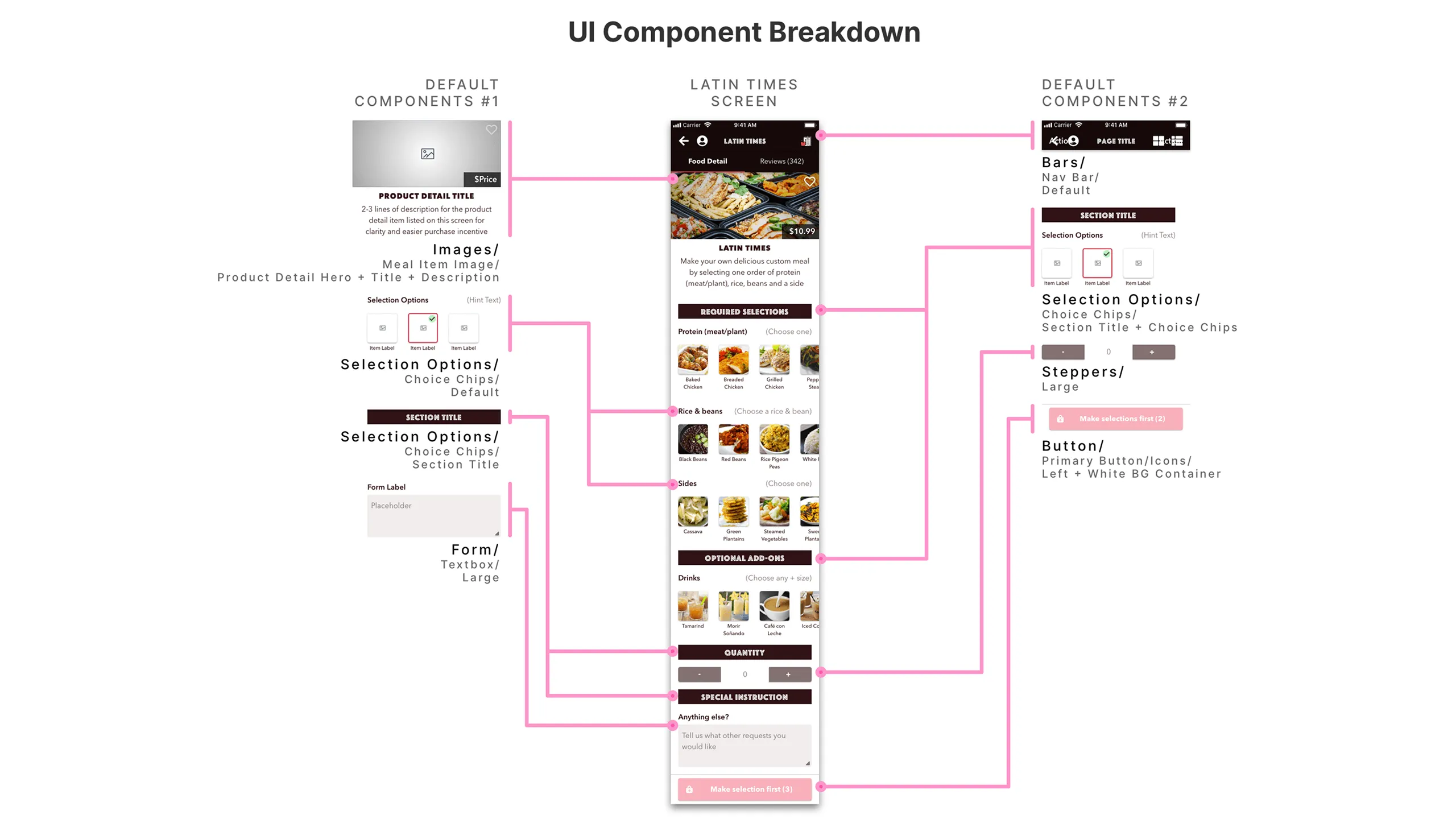
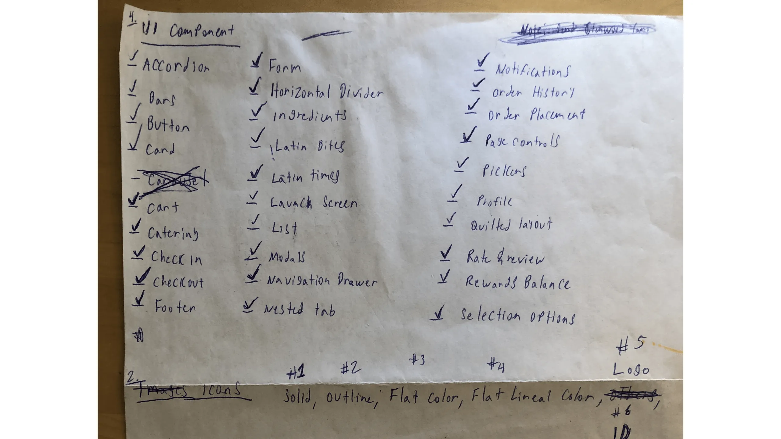
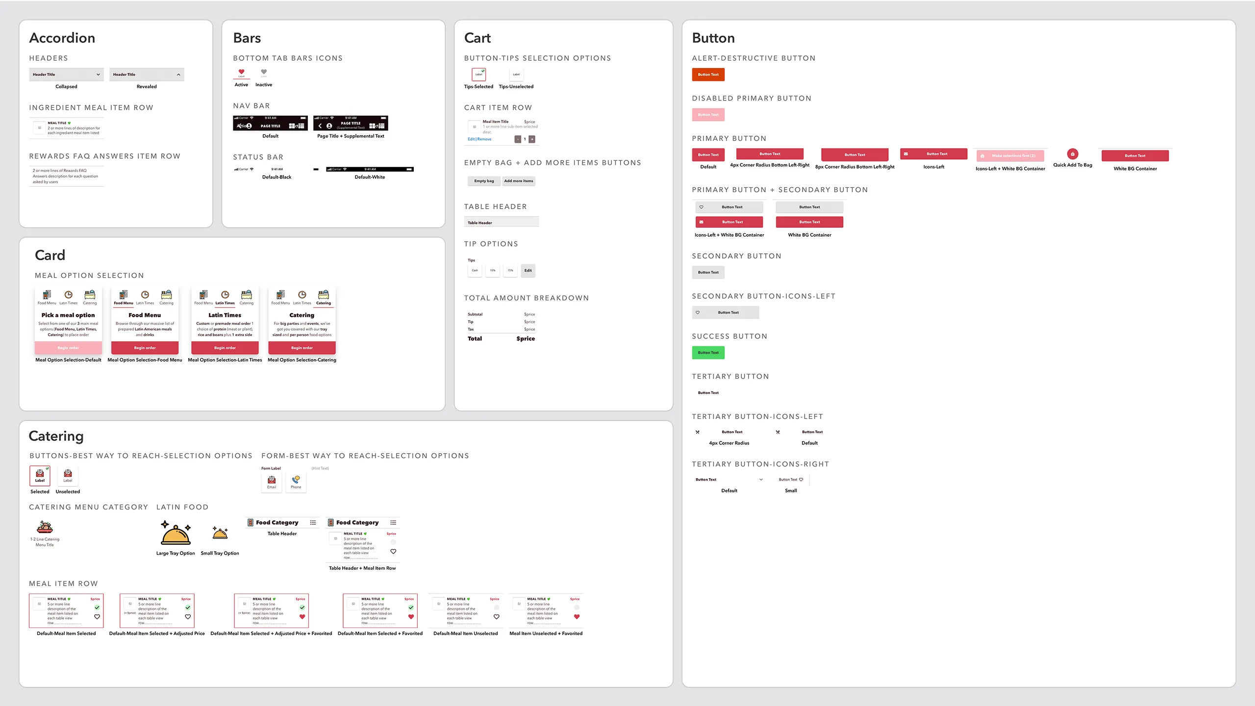
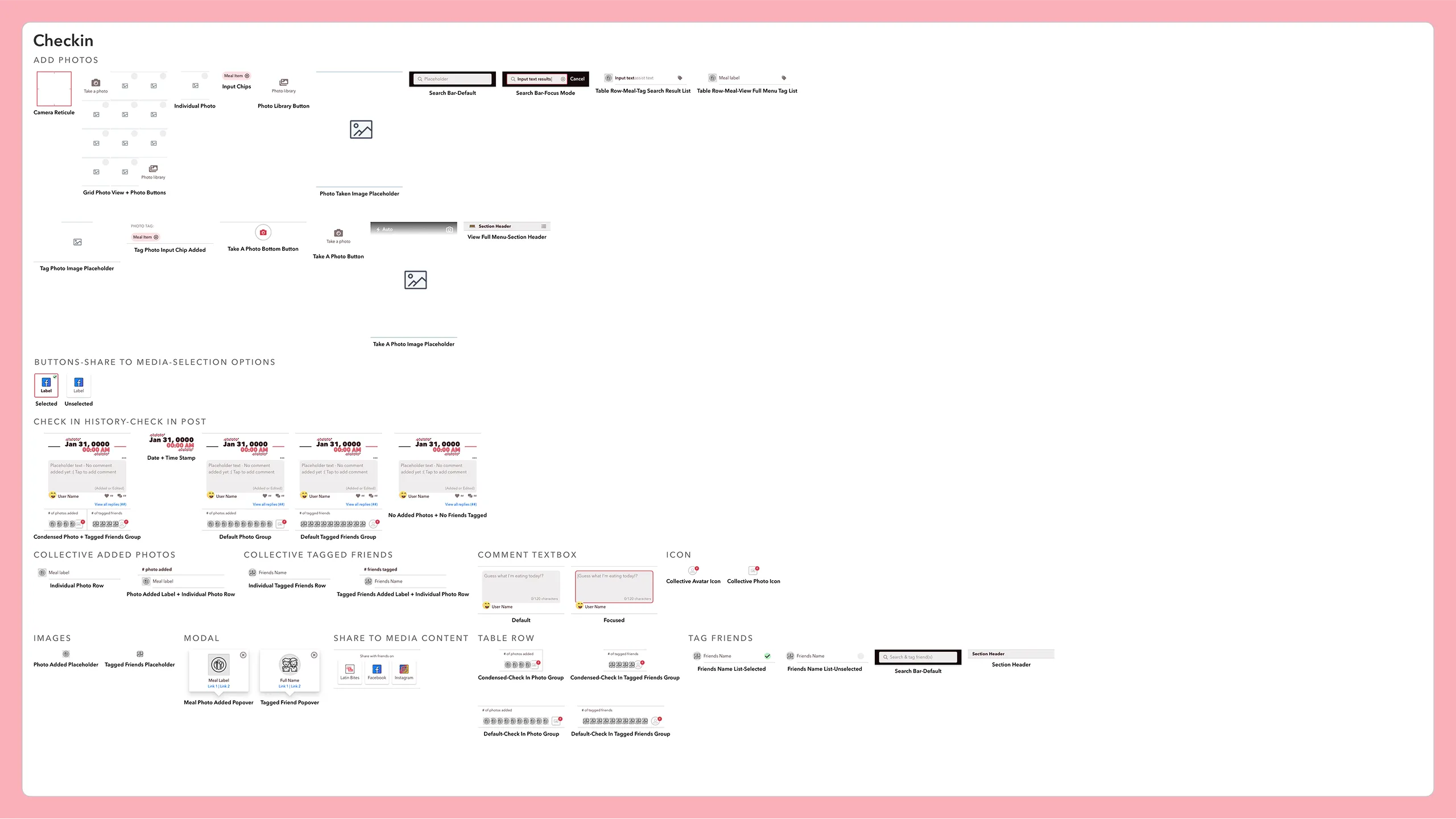
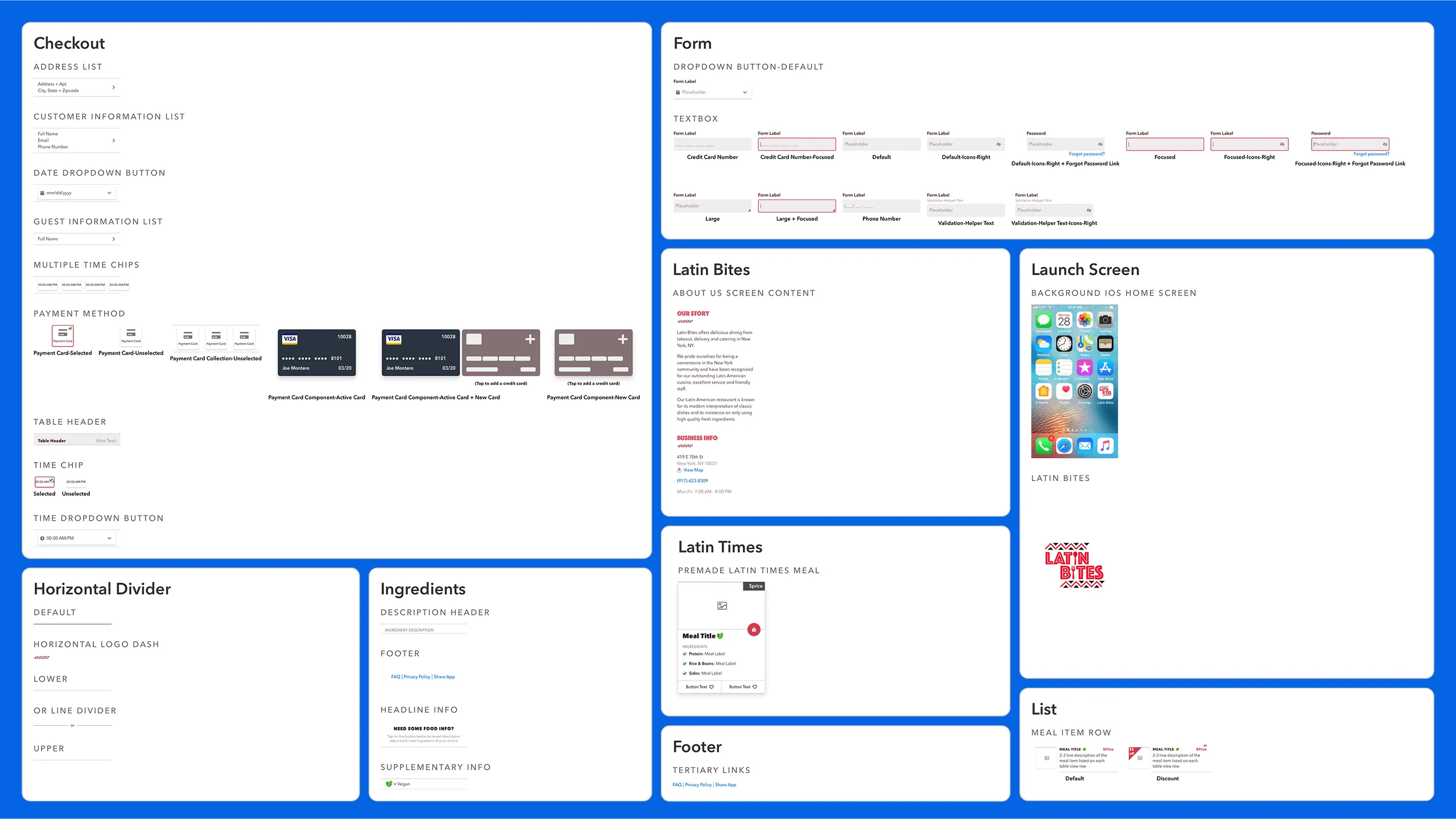
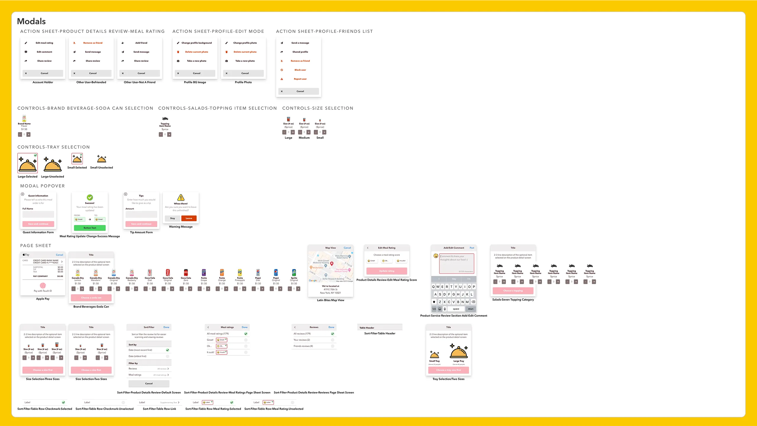
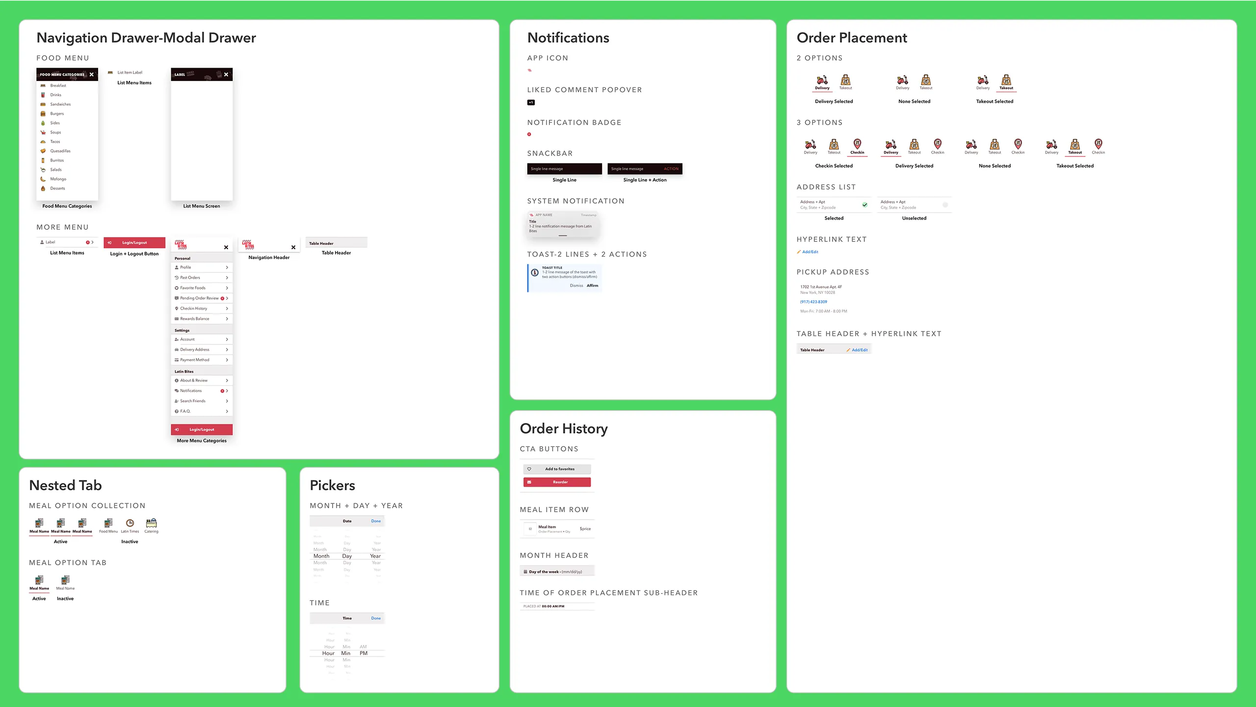
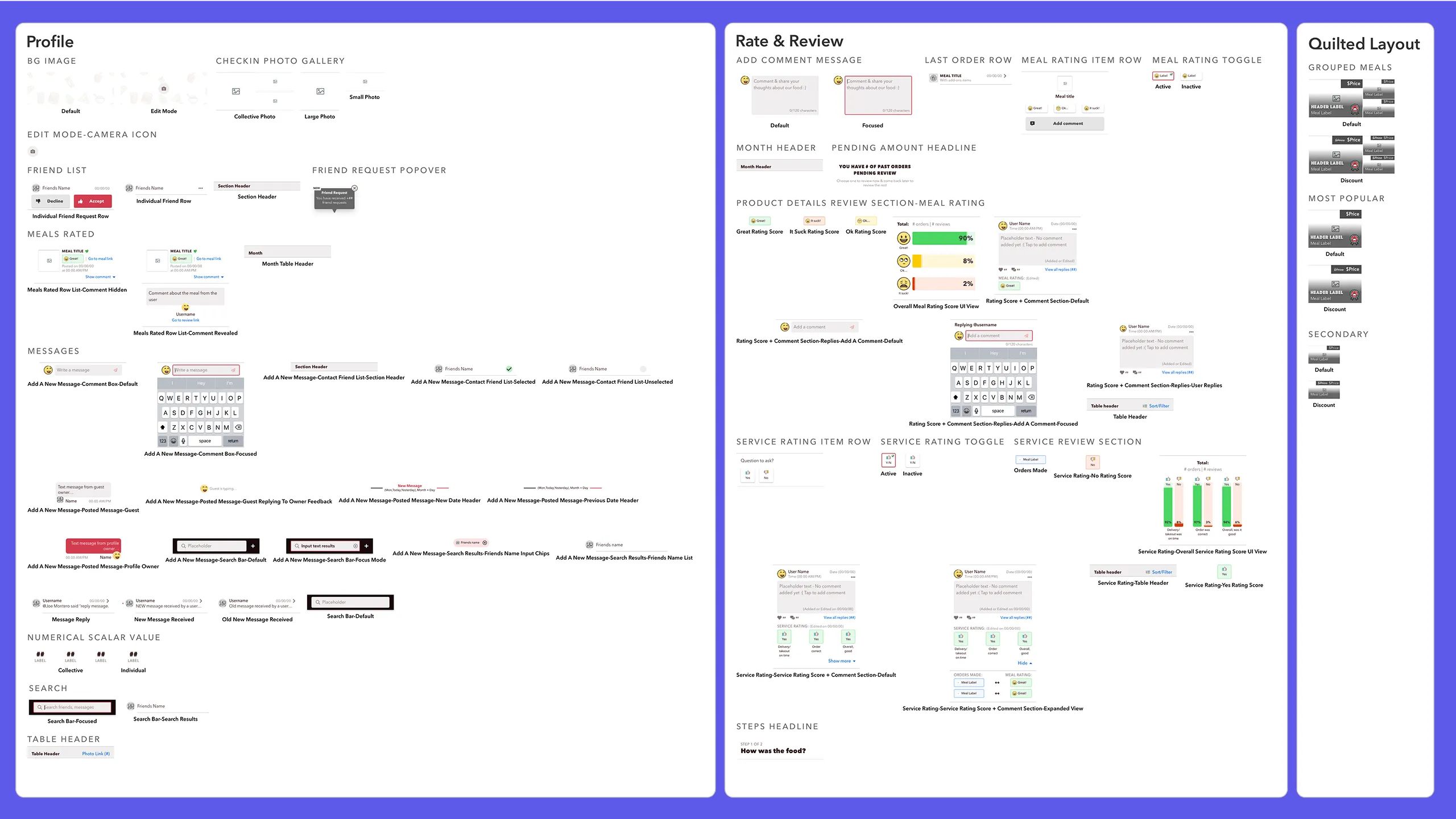
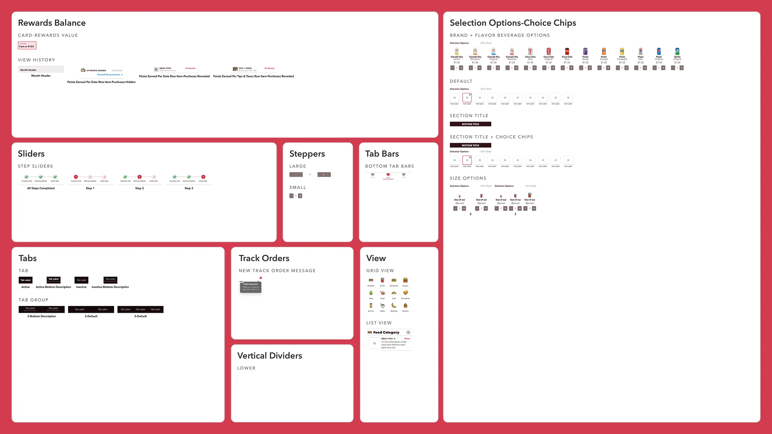
At the same time, I built a cohesive design system to document and organize UI elements.

Screenshot of Latin Bites brand design system assets including logo, color palettes, border styles, shadow styles, overlays, and typography styles for Phosphate and Avenir Next.
Screenshot of Latin Bites design system icons including Flaticon Flat & Lineal Color sets, Font Awesome Pro icons in solid and outline, Apple Pay thumbprint icon, and brand logo marks.Screenshot showing Latin Bites food images collection from the main food menu.Another screenshot of Latin Bites food images collection from the menu.Screenshot of Latin Bites food images from the catering menu.Screenshot showing Latin Bites carousel UI components, background overlay images, and avatar/meal placeholders.Screenshot showing Latin Bites component collection including accordions, status bars, cart UI, cards, catering module, and buttons.Screenshot of Latin Bites design system components focused on the check-in product experience.Screenshot of Latin Bites design system components including checkout flow, form controls, Latin Times module, footer, and product list items.Screenshot of Latin Bites modal component UI library.Screenshot of Latin Bites navigation drawer, notifications, nested tabs, picker controls, order history, and order placement UI modules.Screenshot showing Latin Bites design system components for profile screens, review modules, and quilted food layout.Screenshot of Latin Bites reward balance interface, sliders, steppers, tab bars, tracking modules, and toggle views.

User Testing

Real users, real feedback

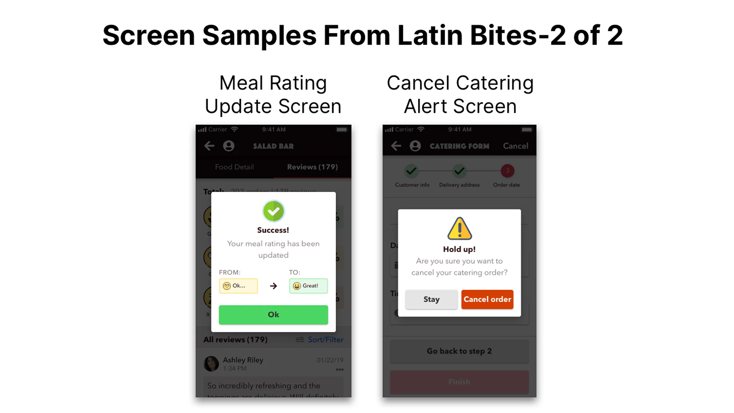
Once the high-fidelity mockups and prototypes were ready, I conducted usability testing with five participants who frequently use food ordering apps like Yelp or Grubhub. These users represented the target audience best suited to evaluate the core flows.

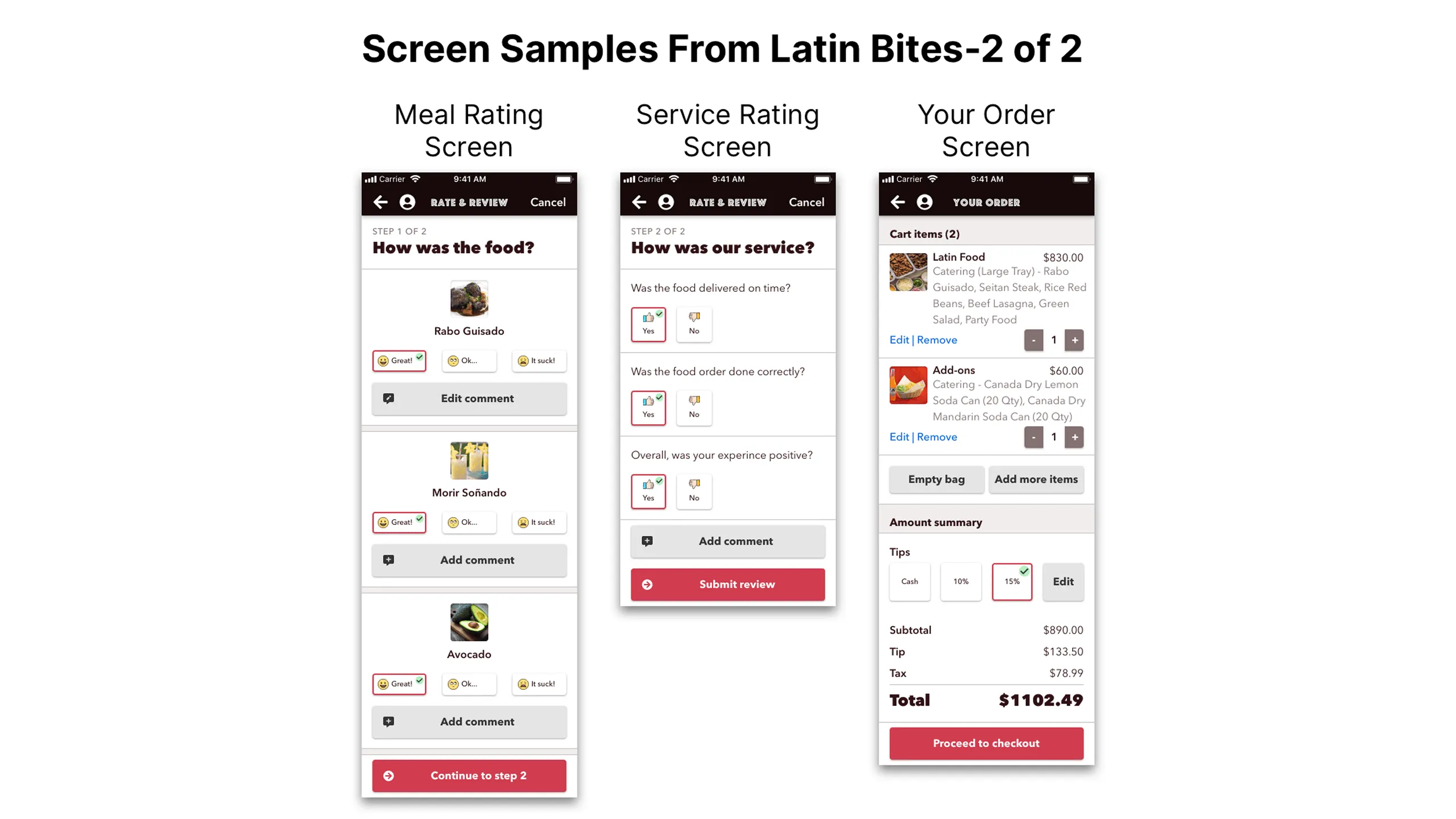
The four main task flows tested were:

These flows were critical to assess since they form the core of the app’s functionality and overall user experience.

Results & Impact

Successful metrics

The results were very encouraging. All participants successfully completed their assigned tasks with minimal to no issues.

  • 100% task completion rate for core flows: onboarding, ordering main meals, Latin Times, and catering
  • 100% of users loved the meal images and detailed descriptions, calling them engaging and appetizing
  • 100% positive feedback on the meal customization feature, highlighting it as a standout versus competitors
  • 4 out of 5 users said rewards points motivated them to create accounts and order more frequently

Users shared the following feedback:

  • Placing food orders was intuitive and visually straightforward
  • The food images were appetizing and well complemented by detailed descriptions
  • Users appreciated the inclusion of vegan meal options; one tester was vegan and particularly valued this feature
  • The ability to visually customize meals was preferred over competitors like Yelp and Grubhub
  • Reward points were seen as a strong incentive to create an account and encourage repeat orders
  • Daily happy hour specials were easy to find without needing to visit the restaurant’s physical location

These insights confirm a strong demand for a well-branded, user-friendly mobile app experience tailored to Latin Bites’ audience.

Next Steps

What happens now?

The positive outcomes have me excited about continuing this project. Since the initial tests covered only the four main user flows, the next phase will focus on testing the remaining 26 complex task flows. These include features like reordering, reviewing and commenting on food orders, performing check-ins, creating social profiles, and more.

My goal is to thoroughly test these flows, gather detailed feedback, and iterate to design the best possible food ordering experience. Ultimately, I aim to present the final concept to the Latin Bites owner with hopes of developing a full iOS mobile app. Only time will tell, but I’m eager for the opportunity.

Other Projects

See more of my work

Hero image for the Noonan case study, showing two device mockups featuring the app's golf course search screen and in-game play screenHero image for the Noonan case study, showing two device mockups featuring the app's golf course search screen and in-game play screen
Chip component tag labeled “UX Cabin Work” used to categorize case study projects.

Noonan

A redesigned AI-powered golf app with a fresh brand and a smoother, smarter playing experience
responsibilities
Check icon
UX Audit & Improvements
Check icon
Mobile App Redesign
Check icon
New Brand Guideline
Check icon
Design System
View Case Study
Hero image for the YellowHat case study, showcasing an AI-powered web app that helps construction subcontractors evaluate bid documentsHero image for the YellowHat case study, showcasing an AI-powered web app that helps construction subcontractors evaluate bid documents
Chip component tag labeled “UX Cabin Work” used to categorize case study projects.

YellowHat AI

A web app that uses AI to support subcontractors in analyzing and responding to bid opportunities
responsibilities
Check icon
UX/UI Design
Check icon
Design System
Check icon
Prototyping
Check icon
Design QA
View Case Study
Screenshot showing both desktop and mobile views of the Cellulacrum platform, which connects researchers, artists, and supporters to build a strength-based community against cancerScreenshot showing both desktop and mobile views of the Cellulacrum platform, which connects researchers, artists, and supporters to build a strength-based community against cancer
Chip component tag labeled “UX Cabin Work” used to categorize case study projects.

Cellulacrum

A hub connecting researchers, artists, and supporters in a strength-based cancer community
responsibilities
Check icon
Research
Check icon
UX/UI Design
Check icon
Low-Fi Wireframe
Check icon
Responsive Design
View Case Study
Screenshot of the Quadax desktop software, a complex payment remittance and medical billing platformScreenshot of the Quadax desktop software, a complex payment remittance and medical billing platform
Chip component tag labeled “UX Cabin Work” used to categorize case study projects.

Quadax

A platform for managing complex medical billing and payment remittance
responsibilities
Check icon
Research
Check icon
UX/UI Design
Check icon
Prototyping
Check icon
Design System
View Case Study
Hero image for the Moen case study card, featuring the app's home screen and sump pump monitor interface from the redesigned smart irrigation apHero image for the Moen case study card, featuring the app's home screen and sump pump monitor interface from the redesigned smart irrigation ap
Chip component tag labeled “UX Cabin Work” used to categorize case study projects.

Moen

A smart mobile irrigation app redesigned to unify features and support scalable design and testing
responsibilities
Check icon
UI Design
Check icon
Prototyping
Check icon
Component Redesign
Check icon
DS Documentation
View Case Study
Desktop view of the Qi Tissue platform, showing tools that help doctors analyze cancer images and create personalized treatmentsDesktop view of the Qi Tissue platform, showing tools that help doctors analyze cancer images and create personalized treatments
Chip component tag labeled “UX Cabin Work” used to categorize case study projects.

Qi Tissue

A tool that helps doctors analyze cancer images and create personalized treatments
responsibilities
Check icon
Research
Check icon
UX/UI Design
Check icon
Prototyping
Check icon
Design System
View Case Study
Two iPhone X mockups showing the Florecer app's splash screen and a plant trade marketplace listing.Two iPhone X mockups showing the Florecer app's splash screen and a plant trade marketplace listing.
Chip component tag labeled “Personal Work” used to categorize case study projects.

Florecer

A mobile app that lets plant lovers connect and swap plants anywhere in their local area
responsibilities
Check icon
Research
Check icon
UX/UI Design
Check icon
Prototyping
Check icon
Design System
View Case Study
Two iPhone X mockups showing the Open Peeps Stickers collection tab and a custom sticker creation screen.Two iPhone X mockups showing the Open Peeps Stickers collection tab and a custom sticker creation screen.
Chip component tag labeled “Personal Work” used to categorize case study projects.

Open Peeps Stickers

A fun concept iMessage stickers app inspired by Pablo Stanley - Open Peeps illustration
responsibilities
Check icon
Research
Check icon
UX/UI Design
Check icon
Prototyping
Check icon
Design System
View Case Study
Chevron up icon