Open Peeps Stickers

A fun concept iMessage stickers app inspired by Pablo Stanley - Open Peeps Illustration
Open Peeps Stickers - Hero Image - Mobile + Tablet
Open Peeps Stickers - Hero Image - Desktop
100%
4.6/5
25+
3

Info and Backstory

Starting with a spark

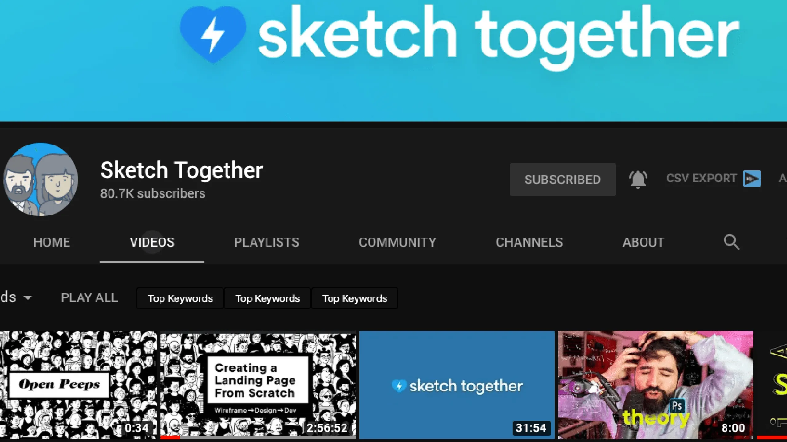
Pablo Stanley is a Product Designer known in the design community for his playful style and his work promoting open-source design. I first discovered him in 2016 through his YouTube channel Sketch Together, where he shared tons of helpful content: design tips, plugins, trends, podcasts, and more.

Screenshot of Pablo Stanley’s Sketch Together YouTube channel.
Screenshot of a section featuring Pablo Stanley’s Humaaans illustration library.Screenshot showcasing the Latinxs Who Design platform by Pablo Stanley.Screenshot of a section promoting Pablo Stanley’s Buttsss illustration library.Screenshot highlighting Pablo Stanley’s Dreamer Stories project.

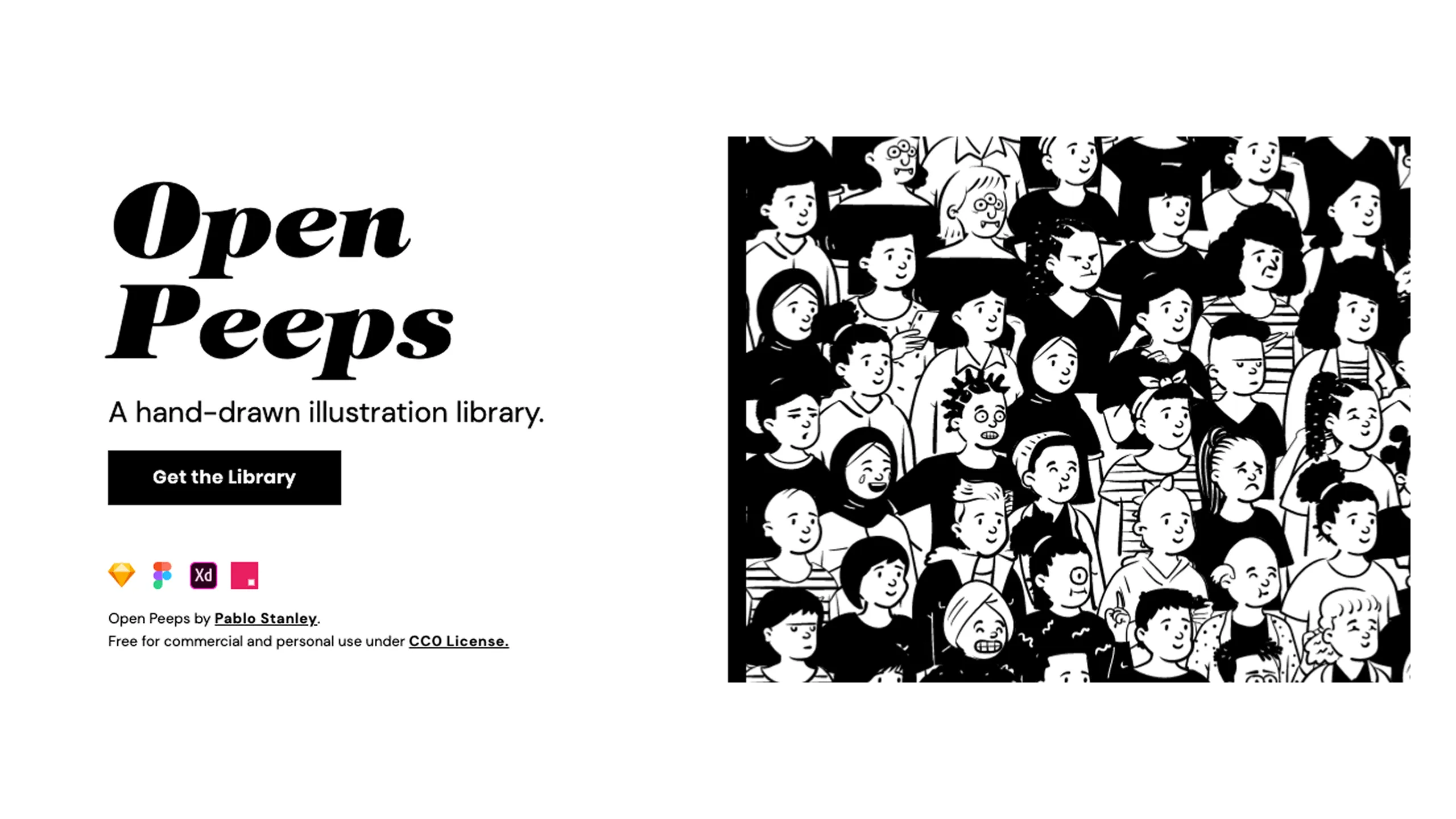
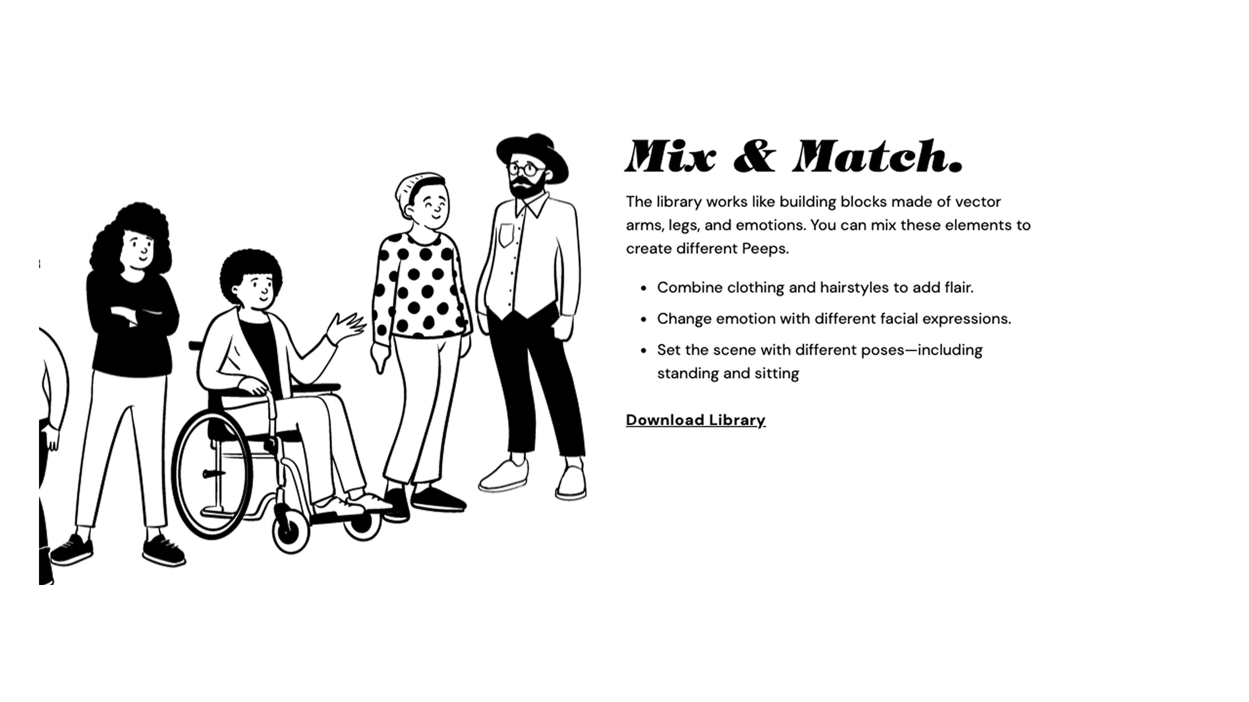
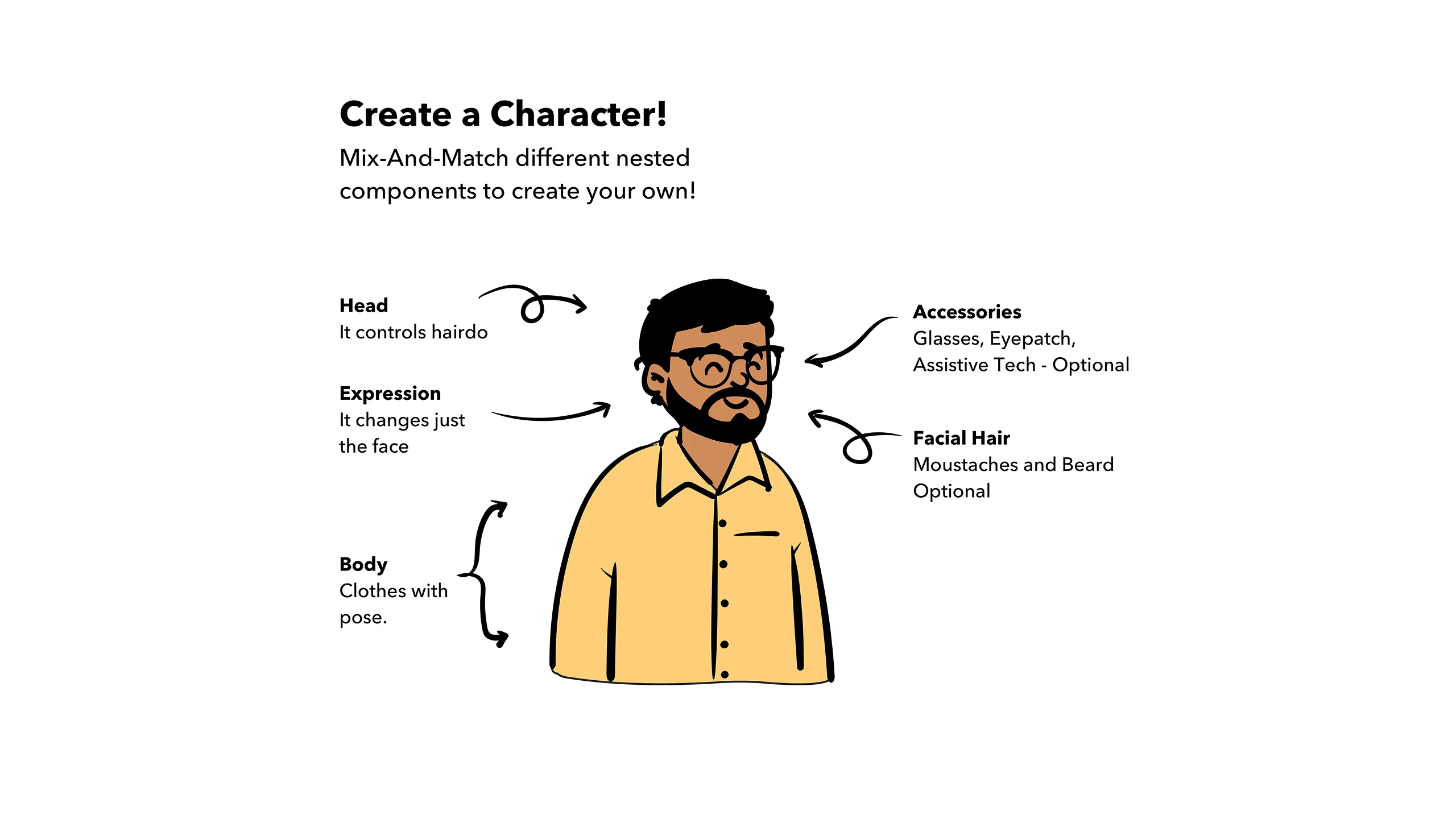
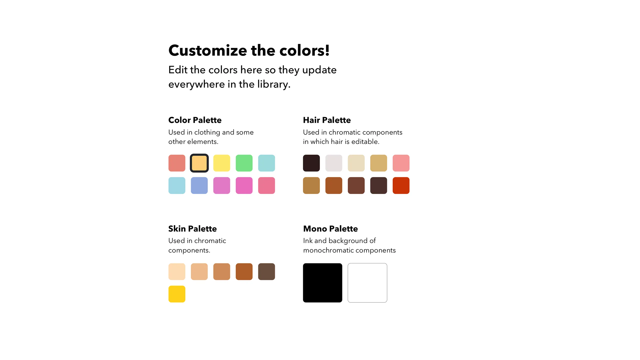
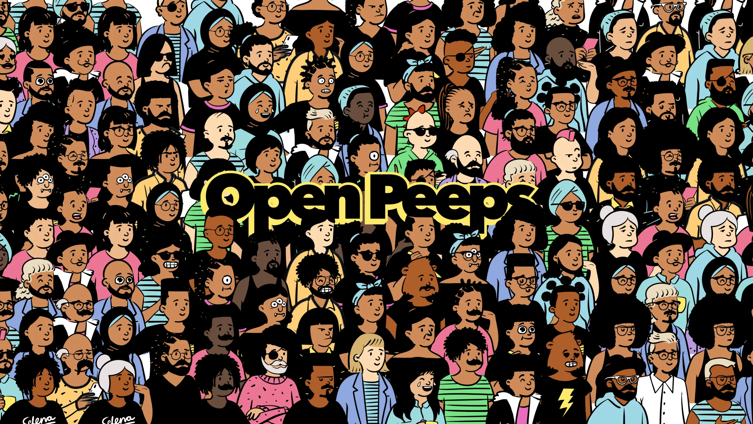
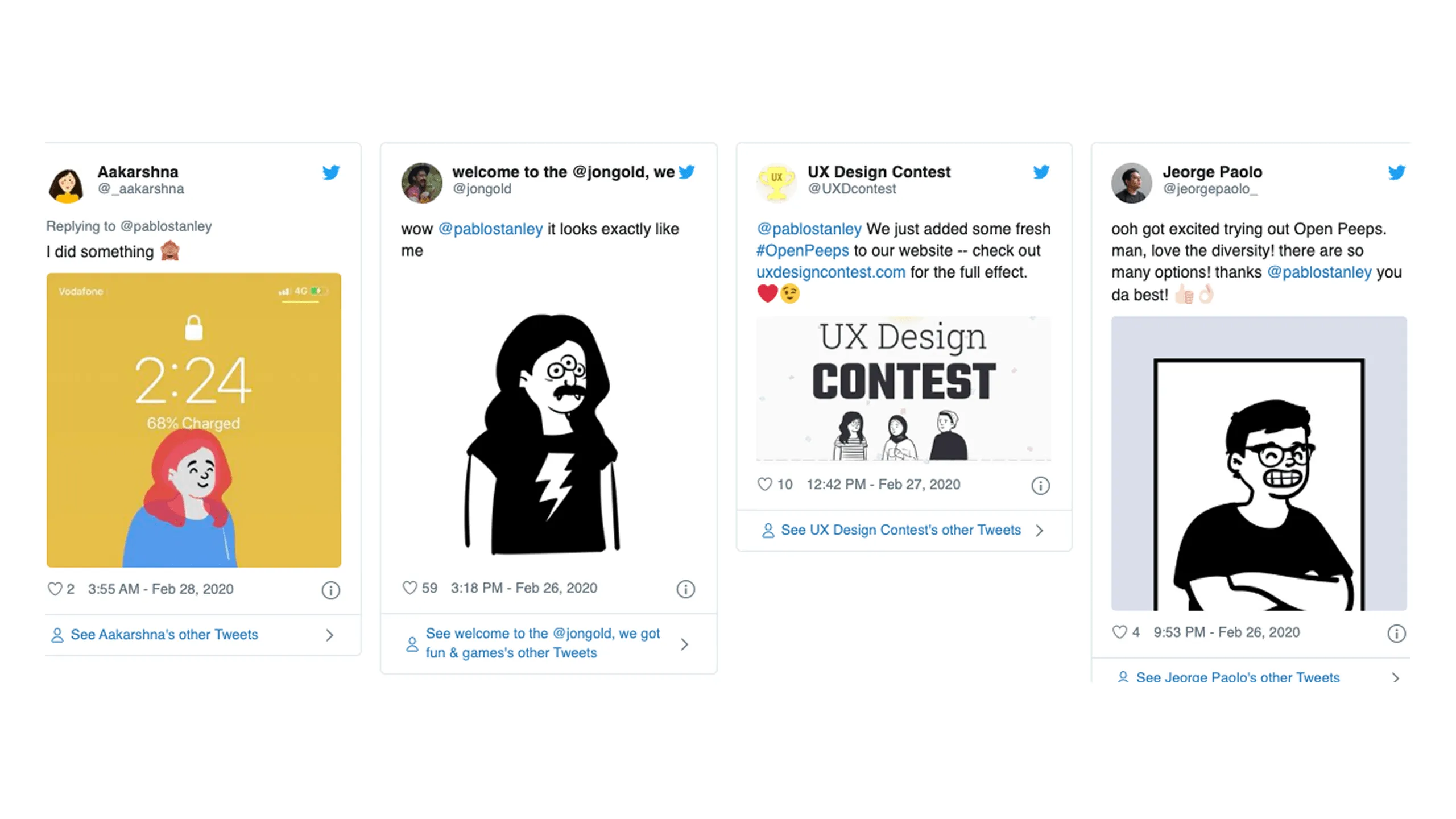
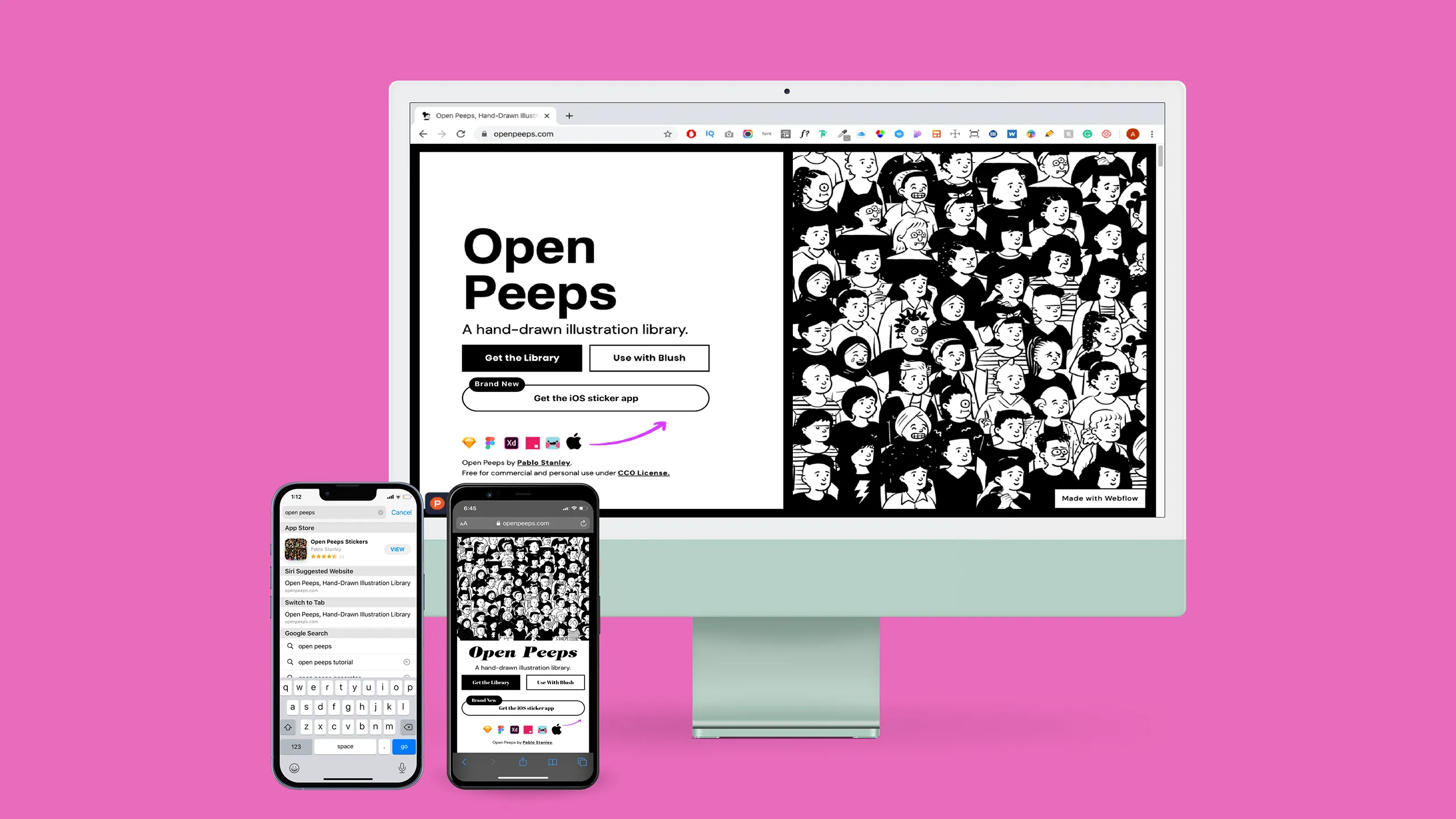
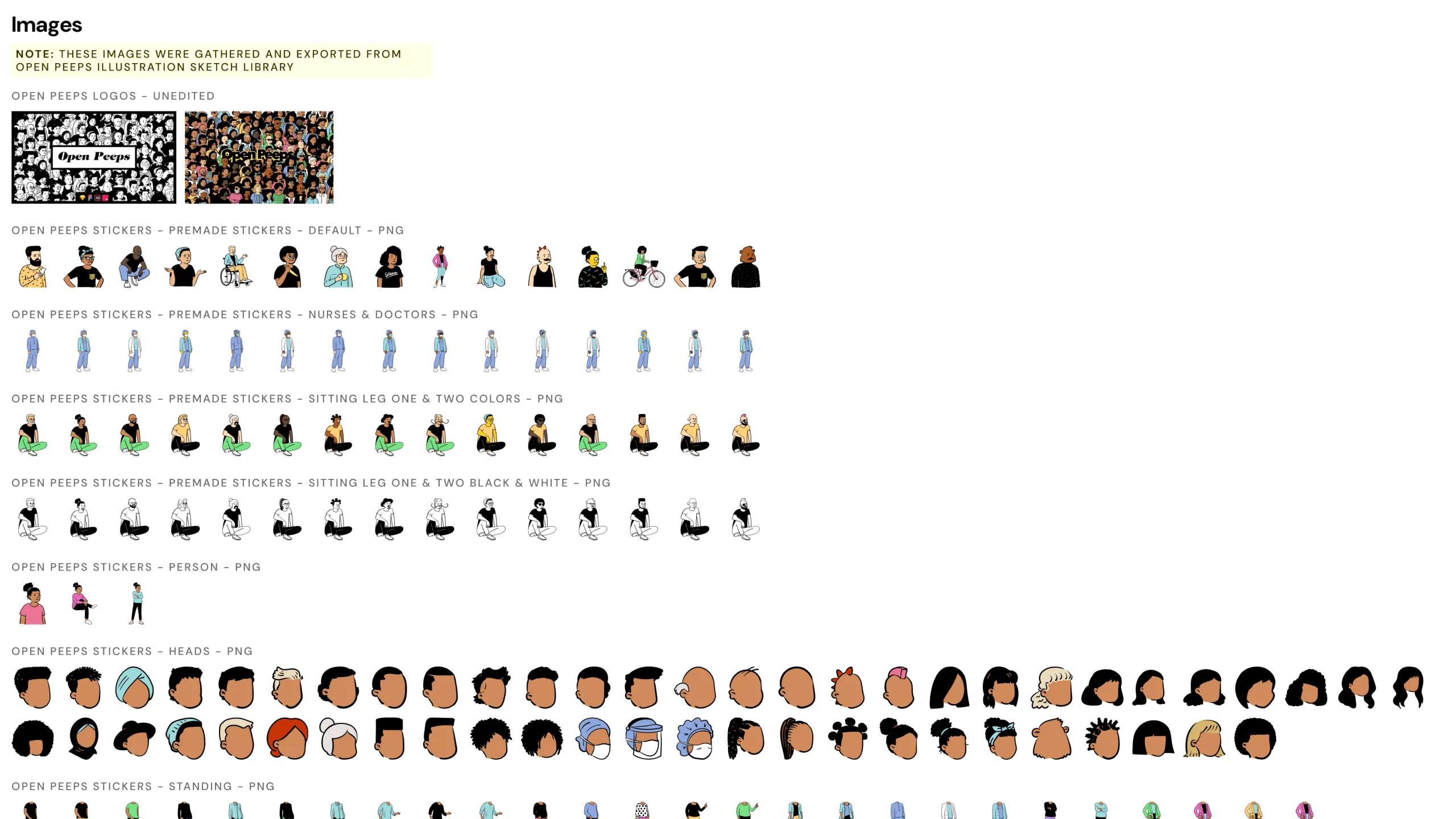
Since then, Pablo has continued to share amazing resources across the web. In 2018, he created Open Peeps, a hand-drawn illustration library. Originally made for tools like Figma and Sketch, it allows users to mix and match character parts to create fun, cartoon-style people. The illustrations are charming, flexible, and inclusive.

Screenshot of Open Peeps illustration homepage website.
Screenshot of Open Peeps illustration mix and match character parts description.Screenshot of Open Peeps illustration create a character example.Screenshot of Open Peeps illustration customize the colors example.Screenshot of an Open Peeps illustration thumbnail in color.

The Design Challenge

Turning a visual library into communication

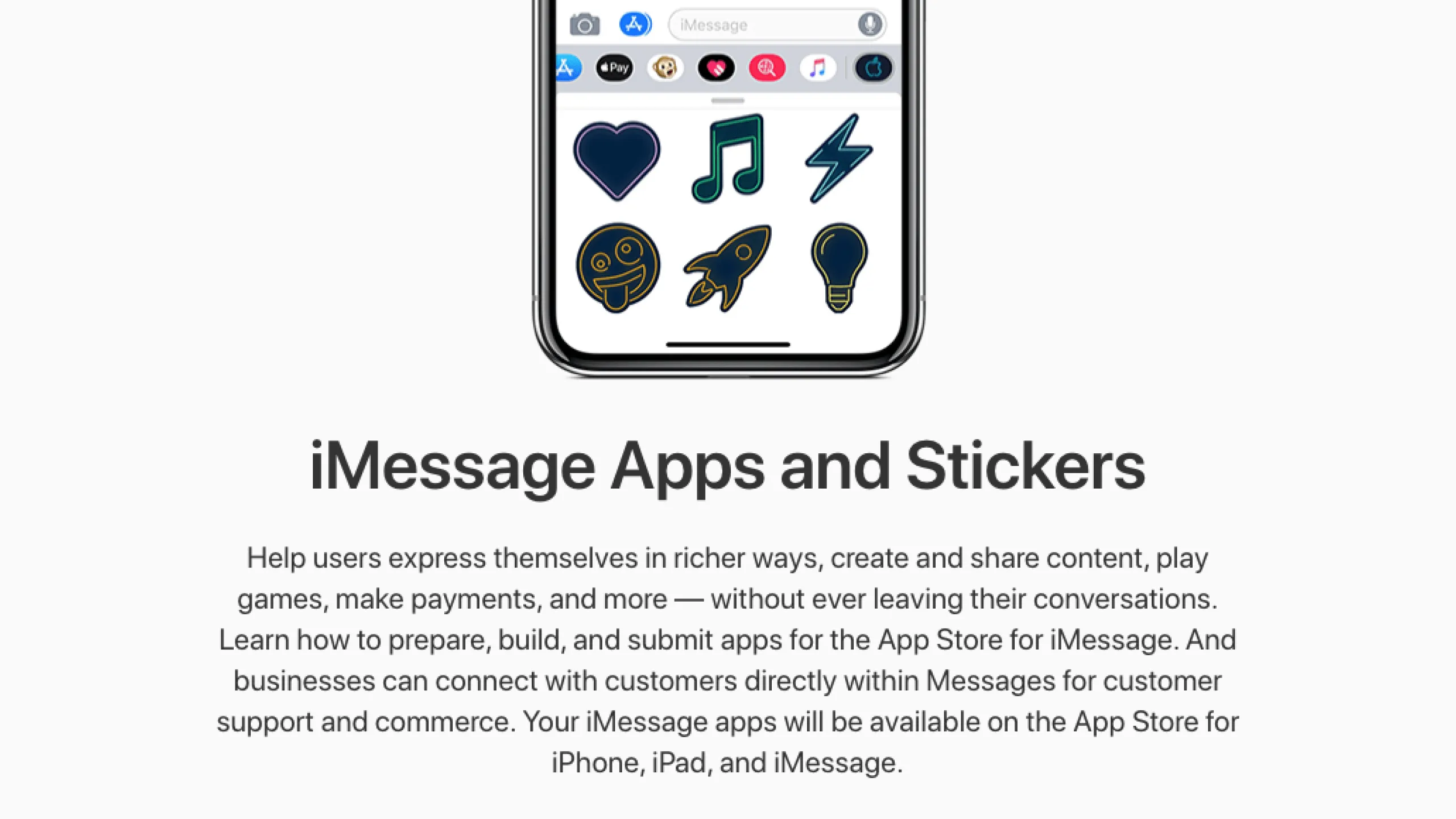
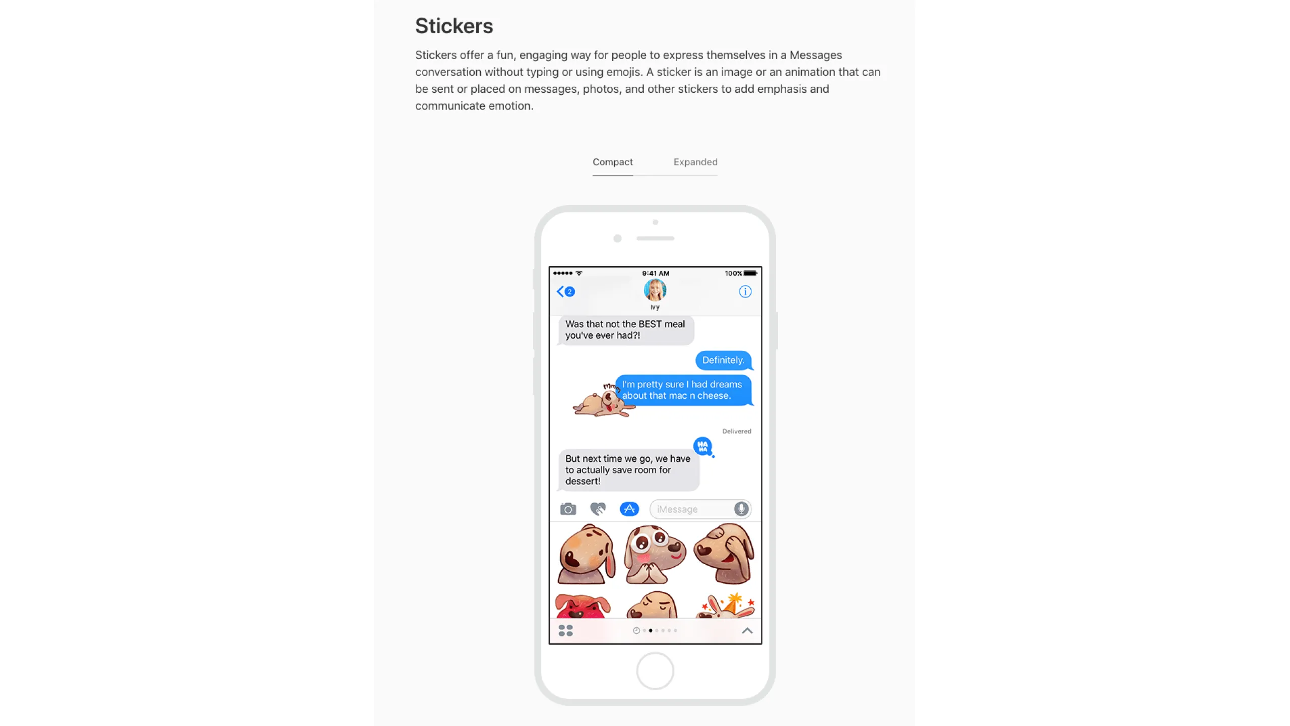
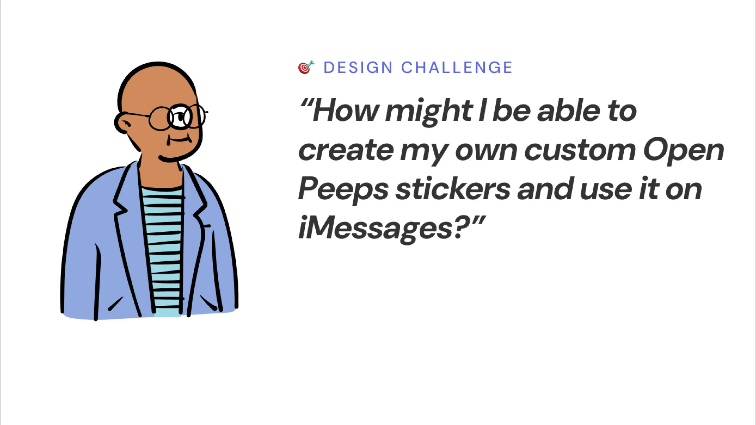
While Open Peeps worked great for websites, comics, and avatars, I started thinking. What if they could be even more accessible? What if these illustrations could be used in iMessage, as stickers or emojis that people could share in everyday chats?

Screenshot of various Open Peeps illustration characters being used in different creative design examples shared by designers on Twitter.
Screenshot of Open Peeps illustrations being used by a product designer in a UI screen with different UI states, and in a Kanban task board.Screenshot comparing two desktop views of my portfolio homepage: left side shows a realistic photo and clean aesthetic; right side shows a cartoonish visual with an Open Peeps character avatar.Screenshot of my desktop portfolio homepage design using a cartoon style, Open Peeps avatar, annotated with typography and color rationale.Screenshot of a digital advertisement using an Open Peeps character illustration from the Open Peeps Illustration library.

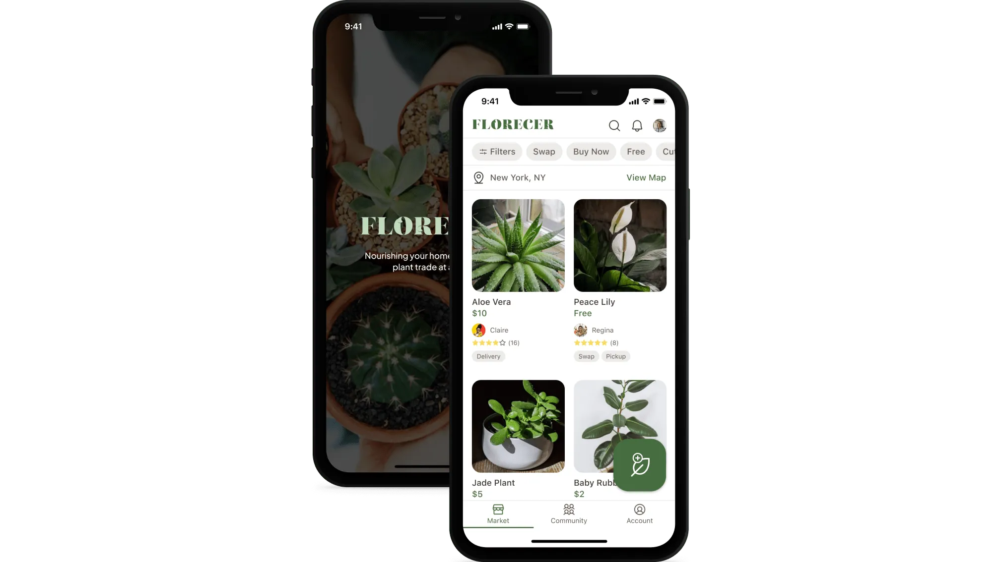
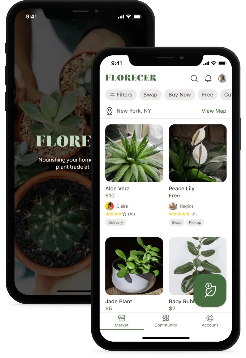
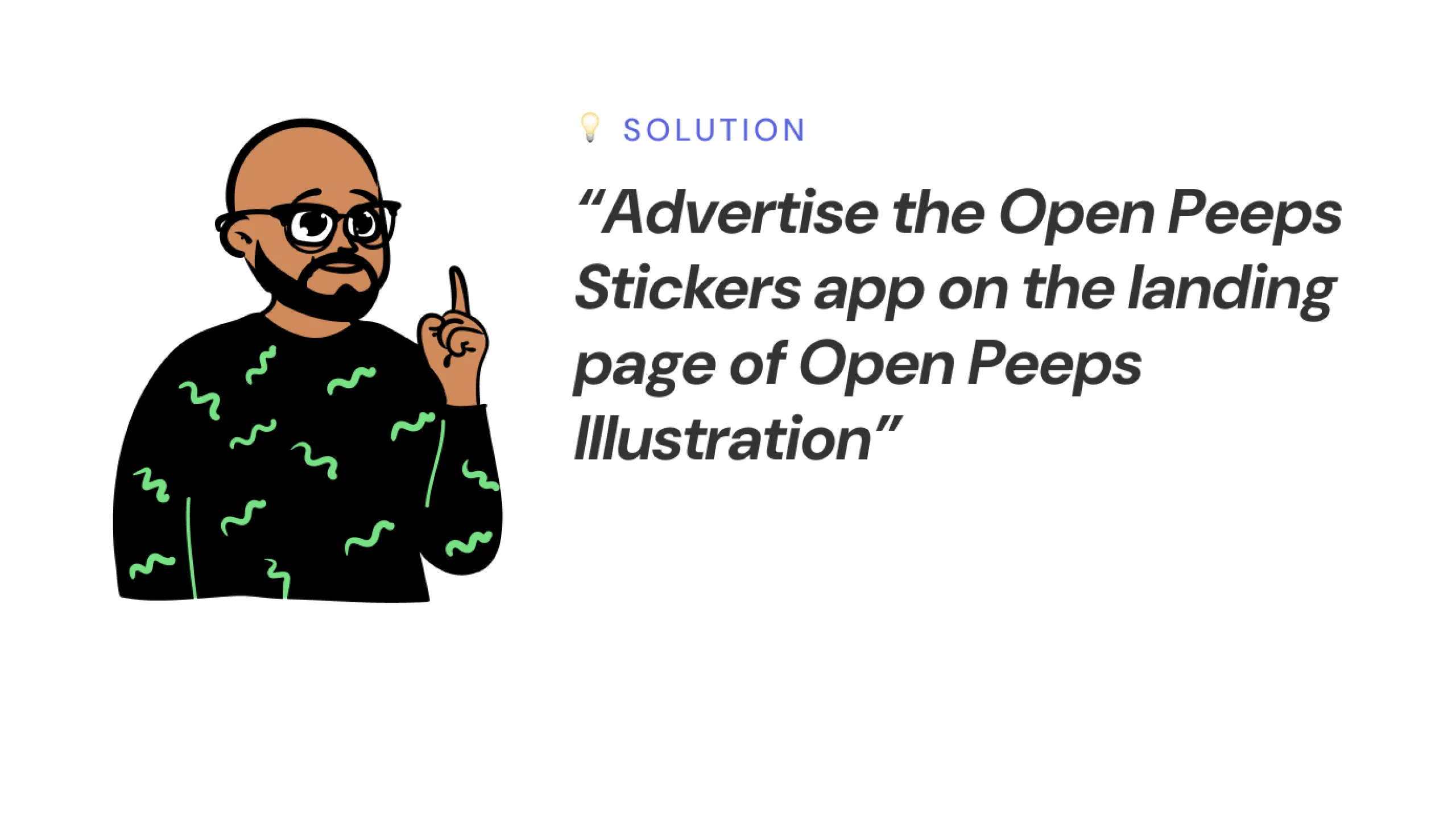
That’s when the idea came together: a simple, fun, and expressive sticker app using Open Peeps. The goal was to make something playful and shareable, all within the limits of a messaging app. The concept blends the fun of stickers and emojis with the unique personality of Open Peeps.

Screenshot of an iMessage conversation screen showing emoji being used, with annotated keypoints explaining their expressive value.
Screenshot of an iMessage conversation screen using stickers from a third-party app extension, with annotated keypoints on their expressive nature.Screenshot of an iMessage conversation screen with a GIF being shared, annotated to highlight its expressive impact.Screenshot of an Apple iMessage ad promoting apps and stickers, showing their role in expressive messaging.Screenshot of a sample iMessage conversation using a sticker, annotated to explain its expressive value.

User Goals & Task Requirements

What users should be able to do

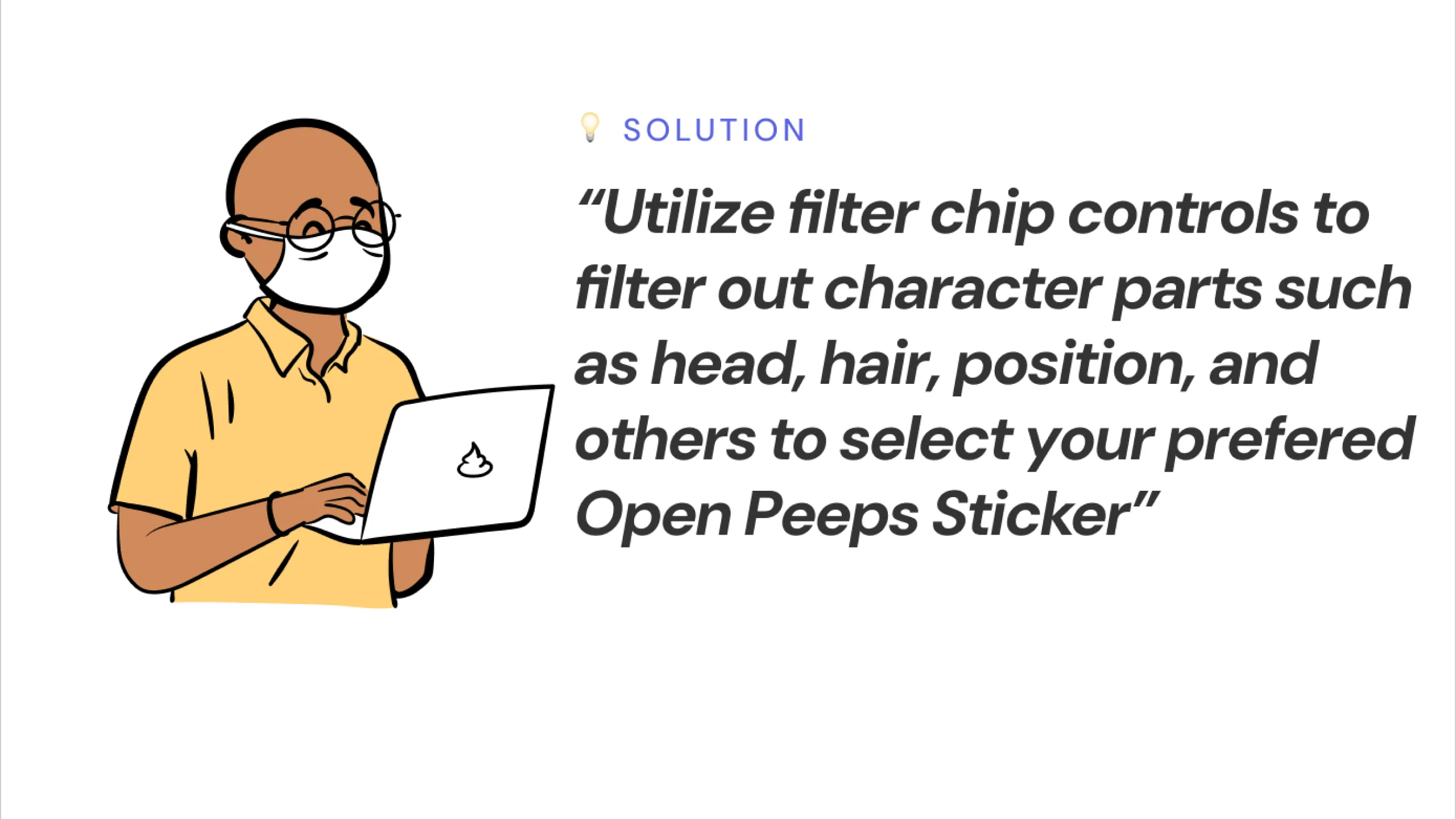
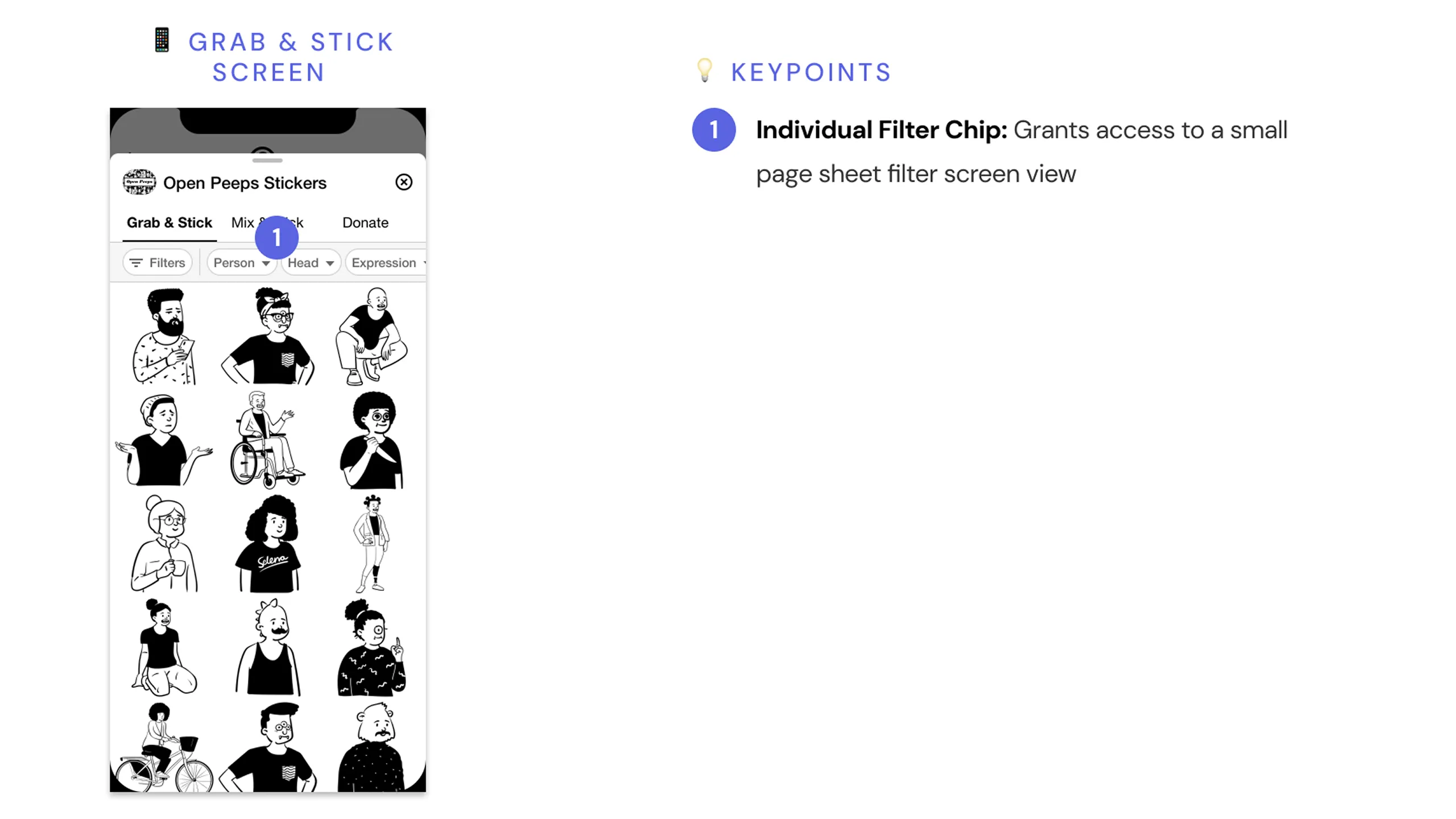
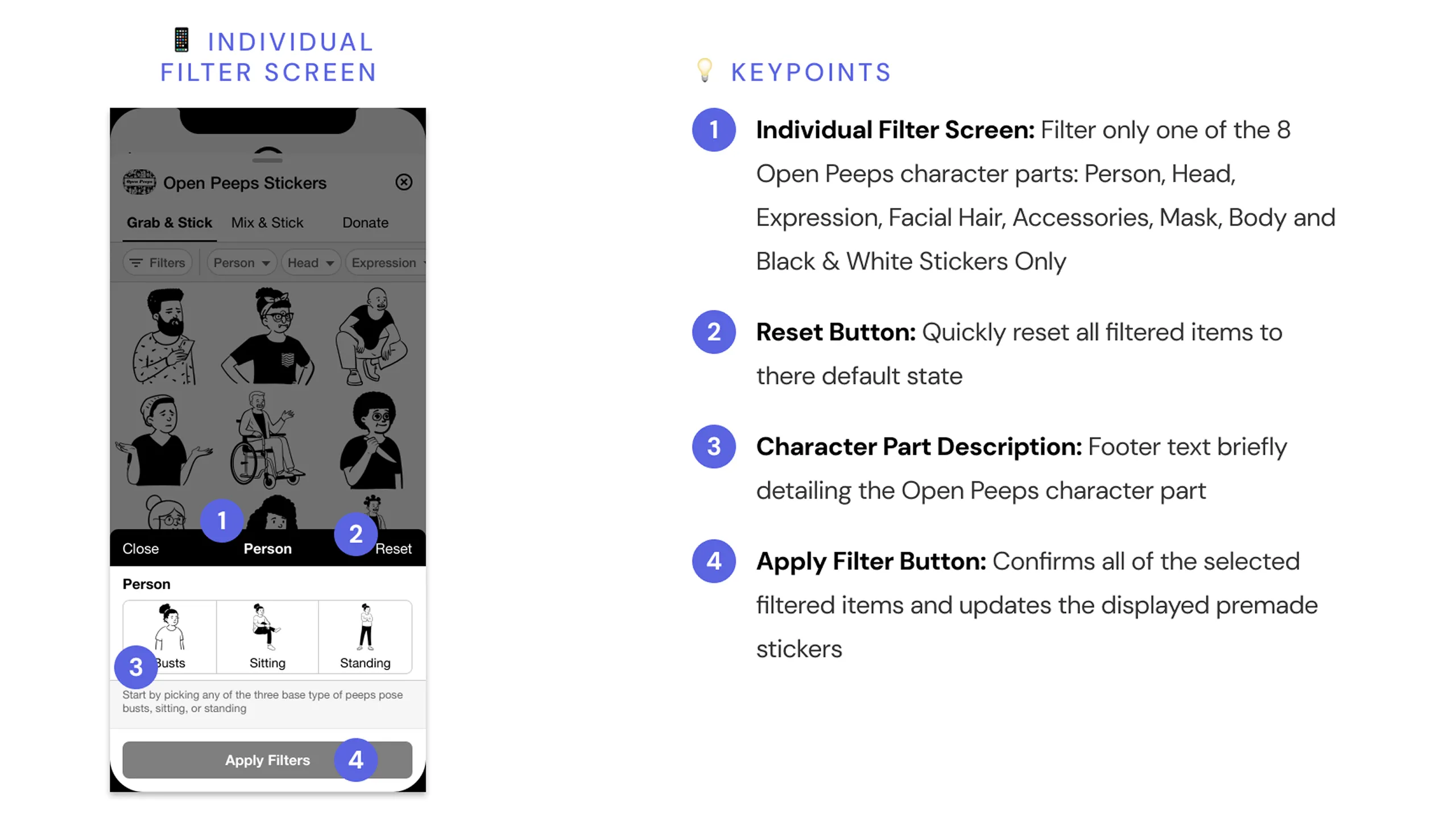
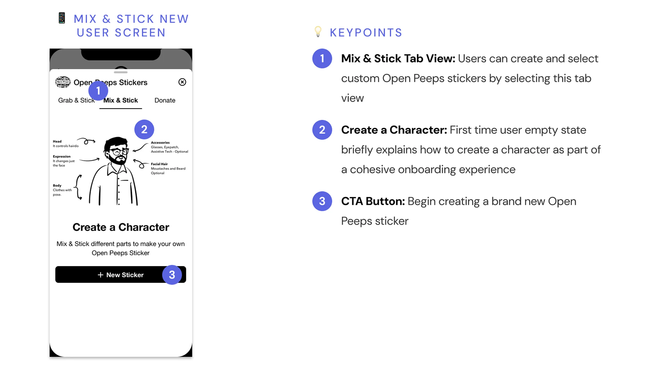
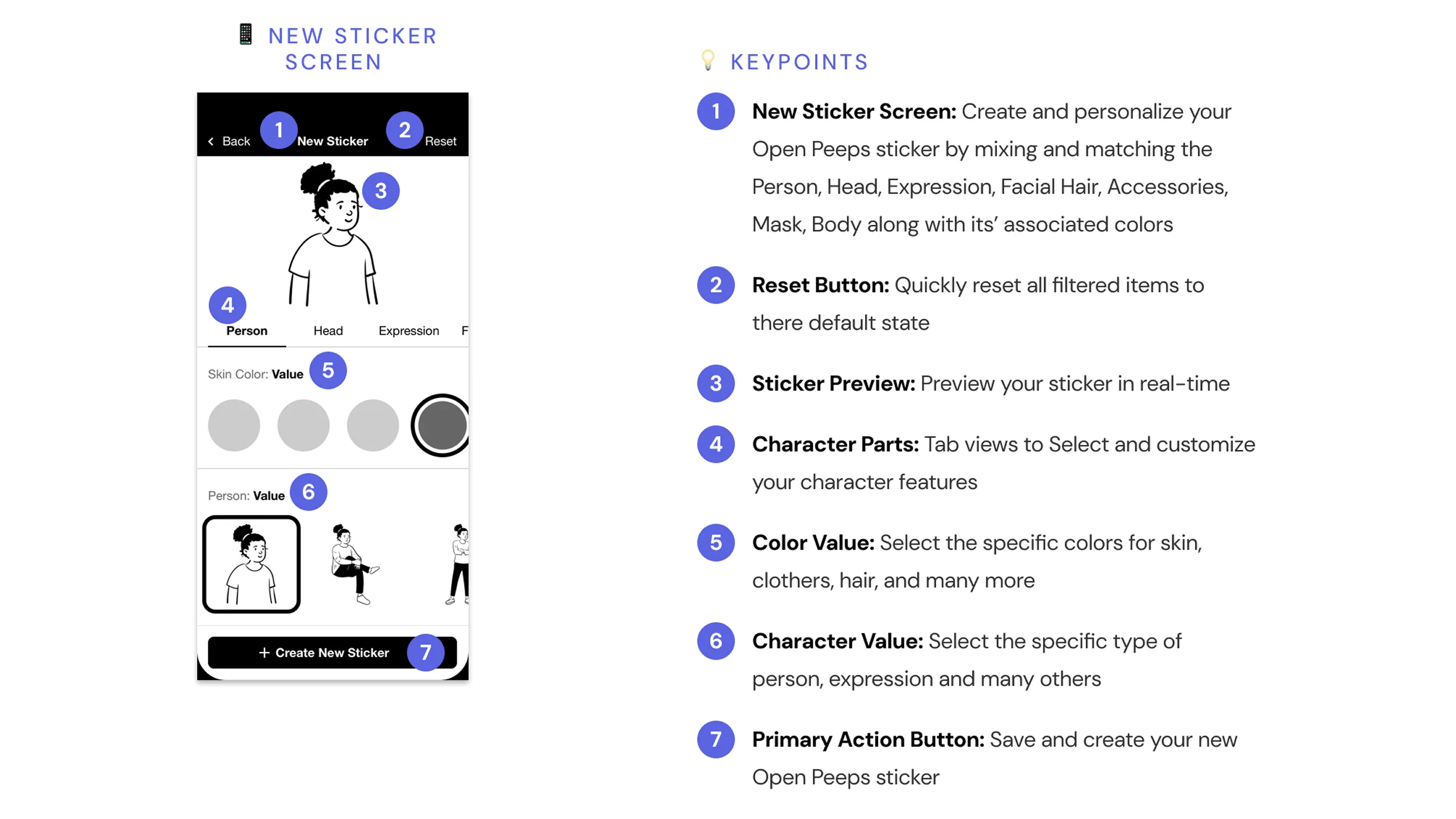
Before jumping into design, it was important to understand what the product needed to do. The sticker experience needed to be intuitive and enjoyable while also allowing the user to use premade or create their own Open Peeps character, similar to the illustration library. So I began outlining the primary tasks that would shape the app’s functionality.

  • Easy to download and install
  • Use premade stickers in iMessage
  • Build and share custom stickers
  • Offer a way to donate and support Open Peeps

Design Planning & Research

Setting the foundation

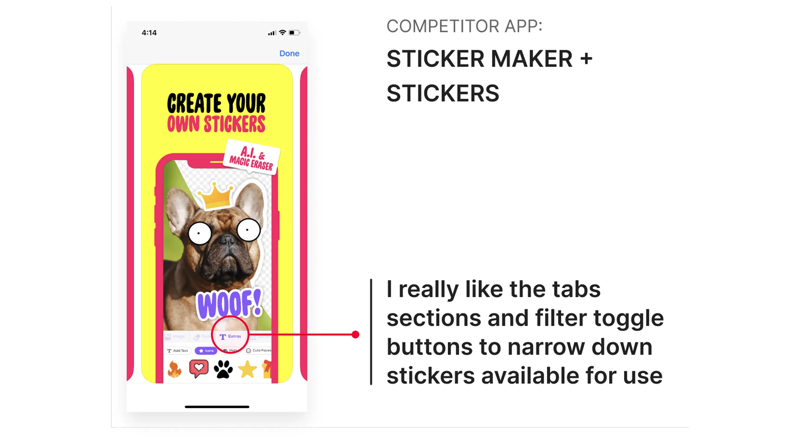
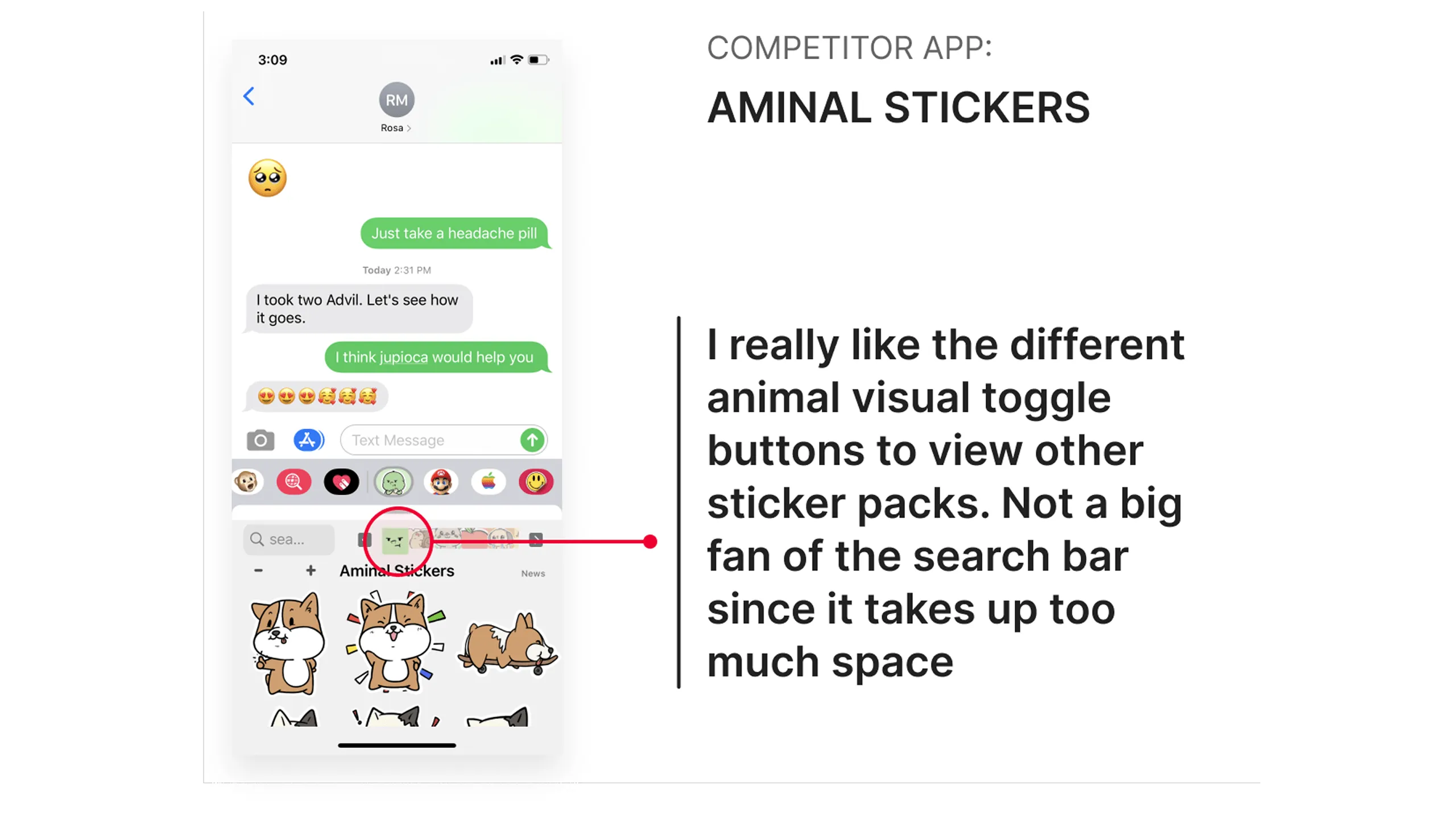
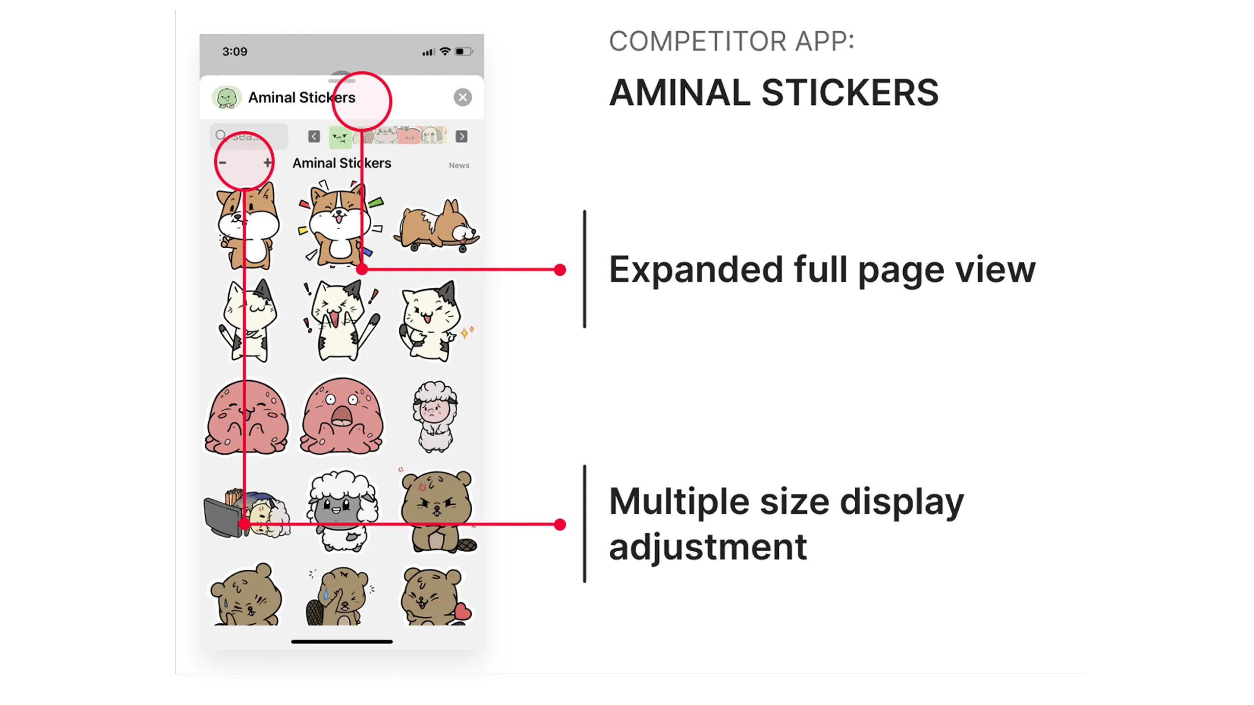
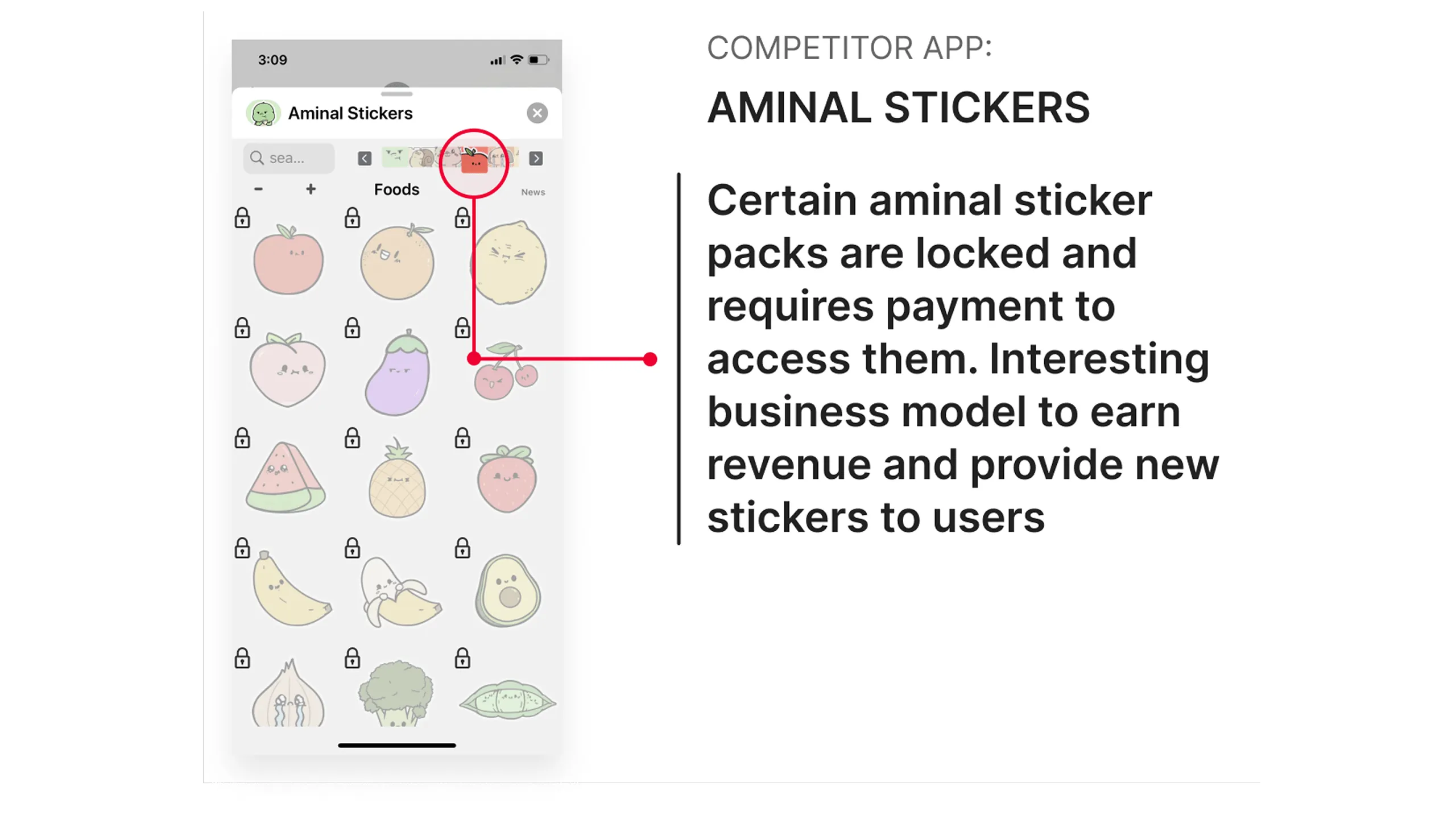
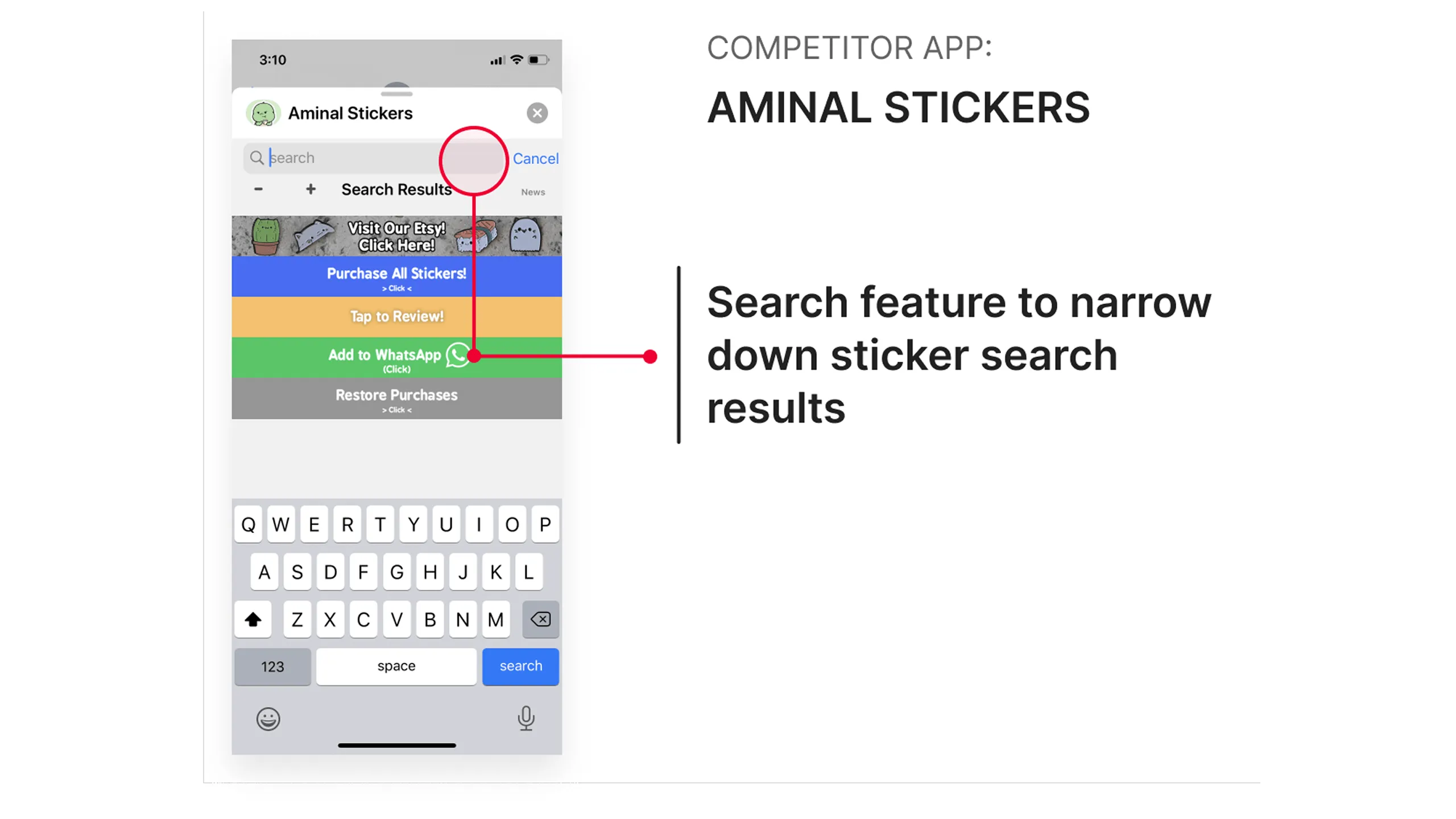
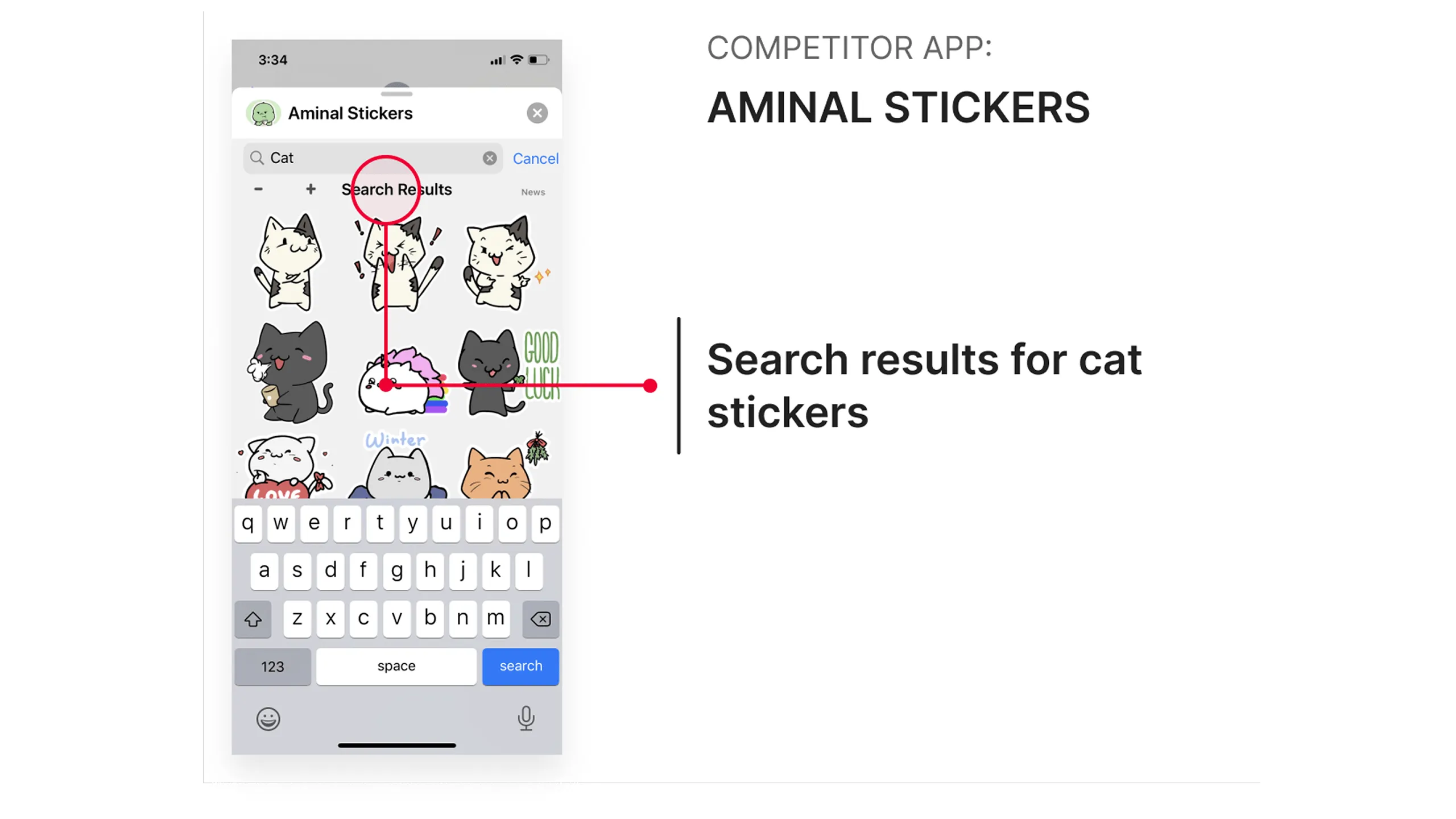
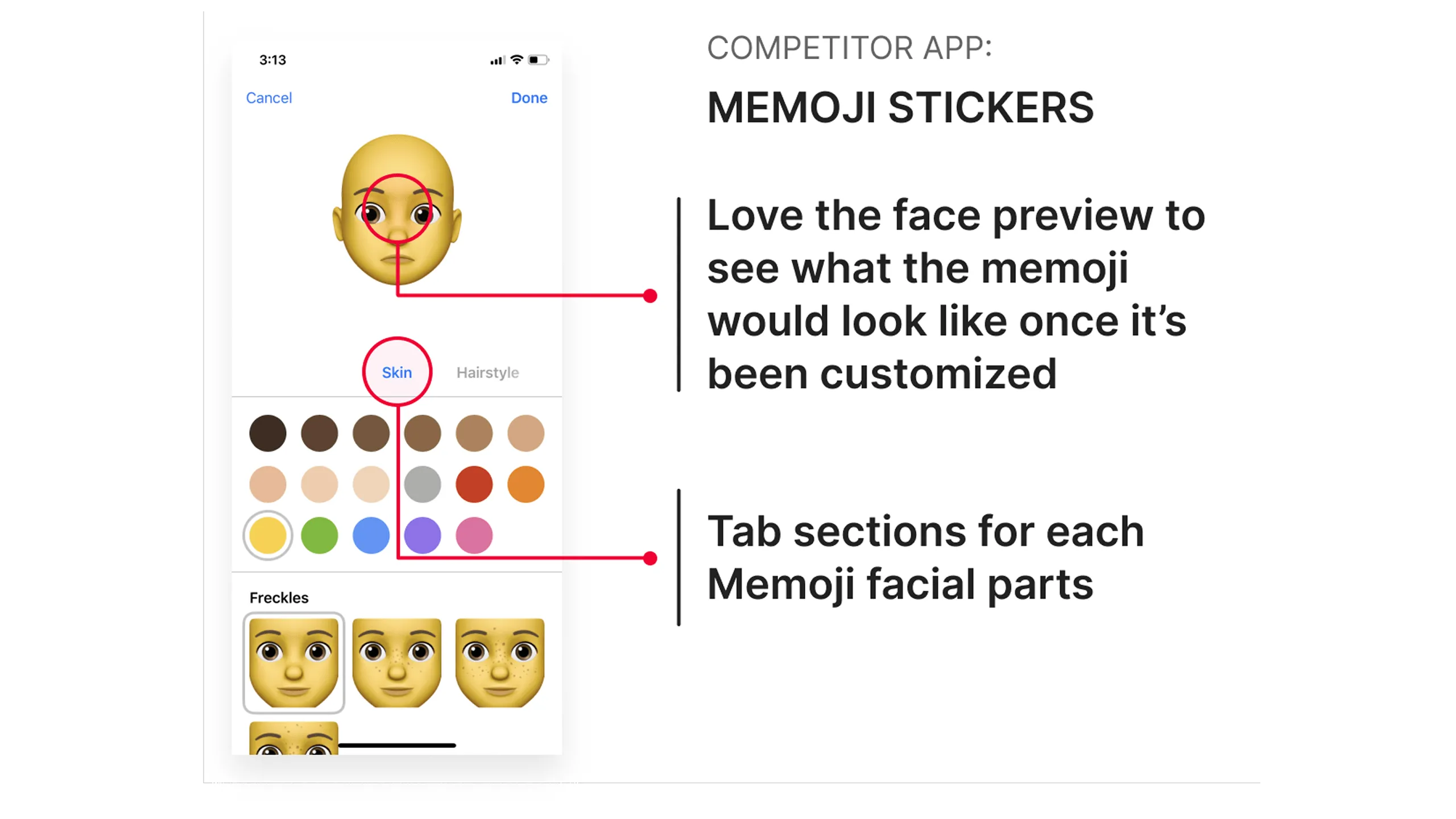
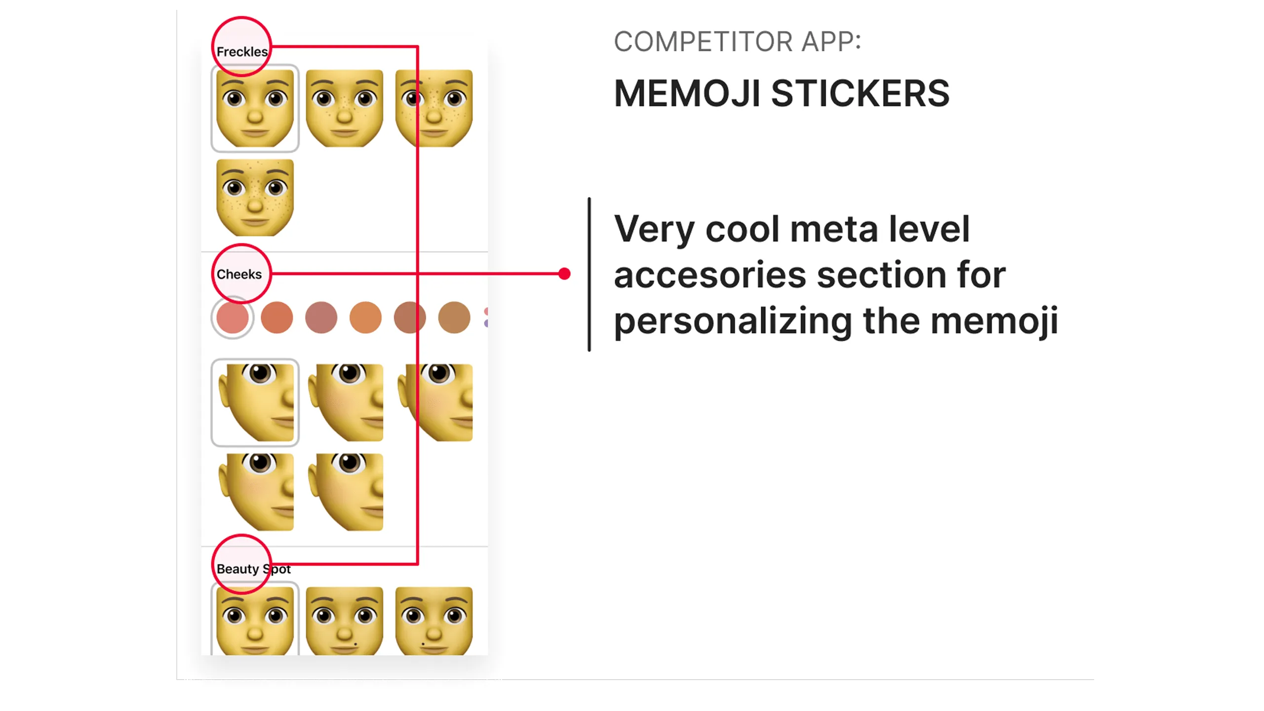
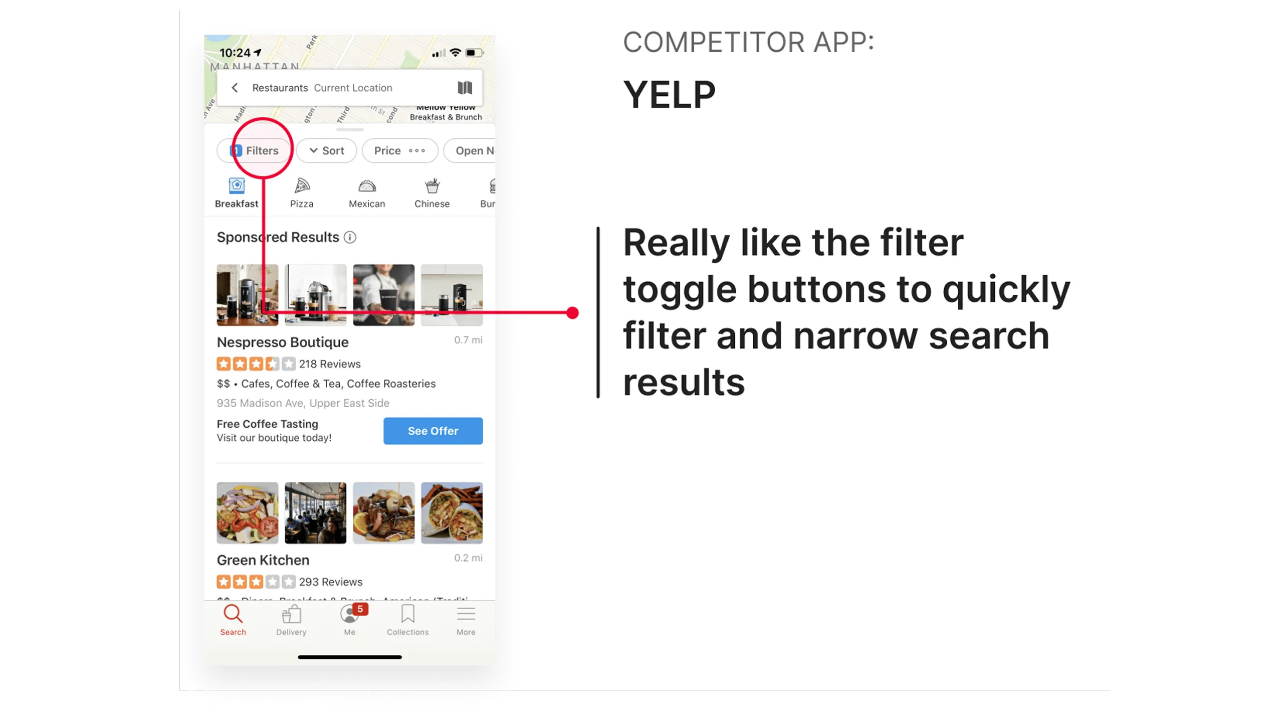
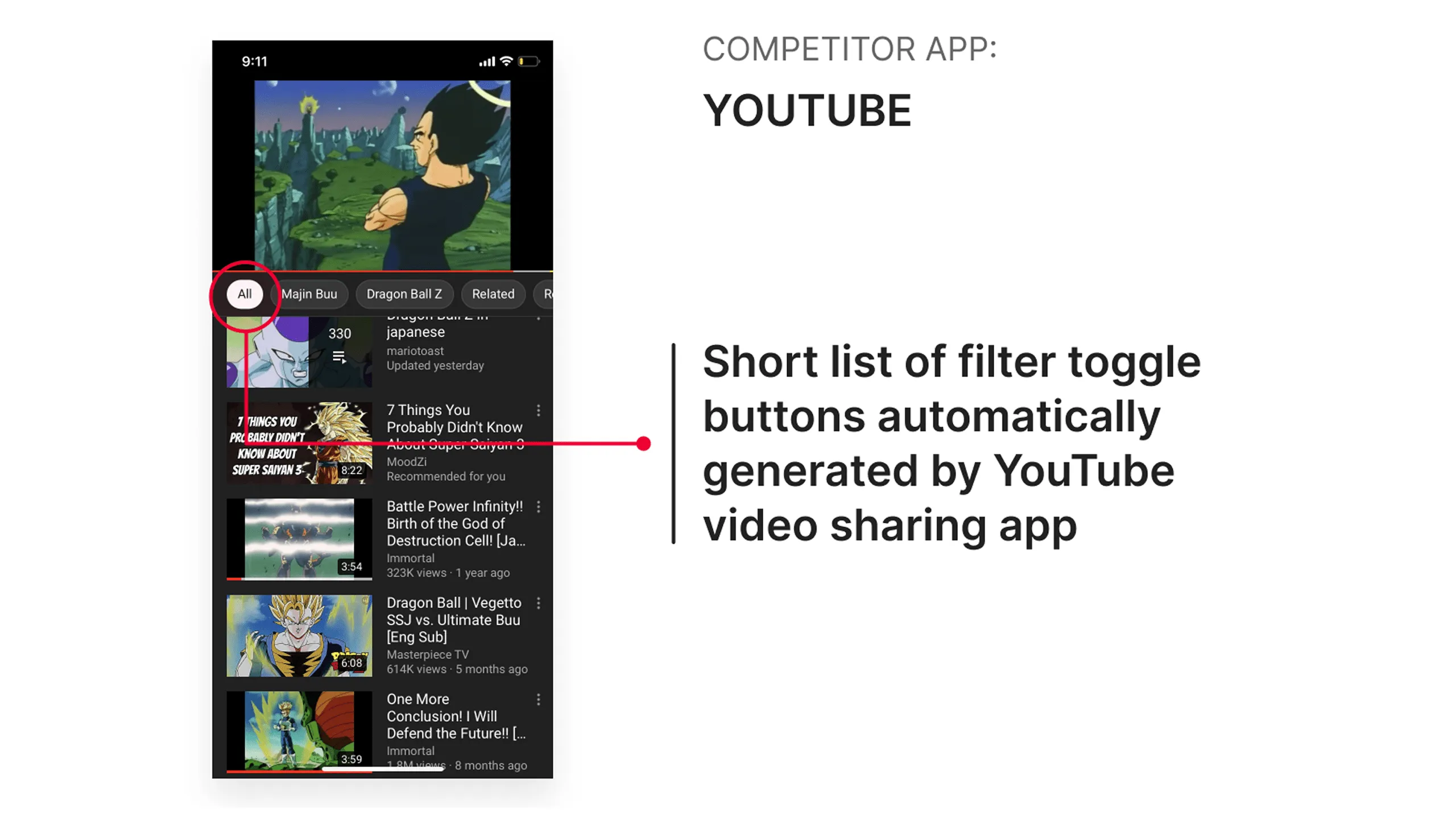
Once I laid out the requirements, I started doing some research by browsing the iOS App Store, reviewing iMessage sticker packs, and identifying best practices for customization flows. I created a visual moodboard to collect and gather several inspirations which helped define tone and direction. With Pablo Stanley’s visual language already clear: quirky, charming, playful, inclusive, and expressive, the groundwork for design decisions came together quickly

Screenshot of the Sticker Maker + Stickers app with annotations highlighting tabs and filter toggle buttons.
Screenshot of Aminal Stickers app showing different animal visual toggle buttons and a large search bar.Screenshot of Aminal Stickers app showing a full-page sticker display and multiple size options.Screenshot of Aminal Stickers app showing locked sticker packs with pay-to-unlock feature.Screenshot of Aminal Stickers app with a visible search bar and simple UI.Screenshot of search results for “cats” in the Aminal Stickers app with a simple grid layout.Screenshot of Twitch Stickers app showing sticky section headers dividing sticker categories.Screenshot of Aminal Stickers app showing an alert dialog prompting users to purchase sticker packs.Screenshot of Sonic the Hedgehog Stickers app with animated GIF stickers.Screenshot of Memoji Stickers app using visual icons instead of plain text for filters.Screenshot of Memoji Stickers app showing a live face preview while customizing.Screenshot of the Memoji Stickers app showing accessory options for memoji customization.Screenshot of Yelp app showing filter toggle buttons to refine results.Screenshot of YouTube app showing automatically generated short filter options.Screenshot of Foursquare app showing a pinned master filter toggle on the left side.Screenshot of Foursquare app with a modal filter sheet and reset button.Screenshot of Yelp app showing a full modal of filters, with applied state feedback and CTA.Screenshot of Ebay app showing sort and filter options in one interface.

Sketching & Wireframes

Putting ideas on paper

With goals and research in place, it was time to get scrappy and sketch. To explore different directions quickly, the Crazy 8s technique was used to generate eight layout ideas in eight minutes. This fast-paced process helped me visualize the user flows for browsing, creating, and sending stickers. Sketches covered everything from onboarding to donation screens, keeping usability and personality front and center.

Sketch showing taskflow and UI explorations for the Grab & Stick tab view, where users add premade stickers to iMessage, with various UI elements and states.
Sketch showing taskflow and UI explorations for the Mix & Stick tab view, enabling users to create custom stickers in iMessage, with all relevant UI controls.Sketch of taskflow showing how users create a custom sticker by selecting character parts, with detailed UI states and design components.Sketch showing the Donate tab flow where users make a one-time donation, with interface controls and payment method options.Sketch showing the Donate tab view with donation tracking and additional giving options, annotated with UI states and steps.Sketch showing chip component filters in the Grab & Stick tab for browsing specific Open Peeps character parts.Sketch showing first-time and returning user flows in the Donate tab, including confirmation and success states with UI annotations.Sketch showing user tapping the main filter chip to reveal detailed options for character part selection.Sketch showing how a user launches iMessage, opens the Open Peeps Stickers app, and sets up a recurring donation, with interactions and UI elements.Sketch showing taskflow for discovering and downloading the Open Peeps Stickers app from the Apple App Store, with UI steps and tap interactions.Sketch showing donation form interactions—entering name, email, amount—across multiple steps, with UI controls and button logic.Sketch showing users filtering character parts using a search input field on the main filter screen, with tap interactions and UI states.

Building a usable low-fi structure

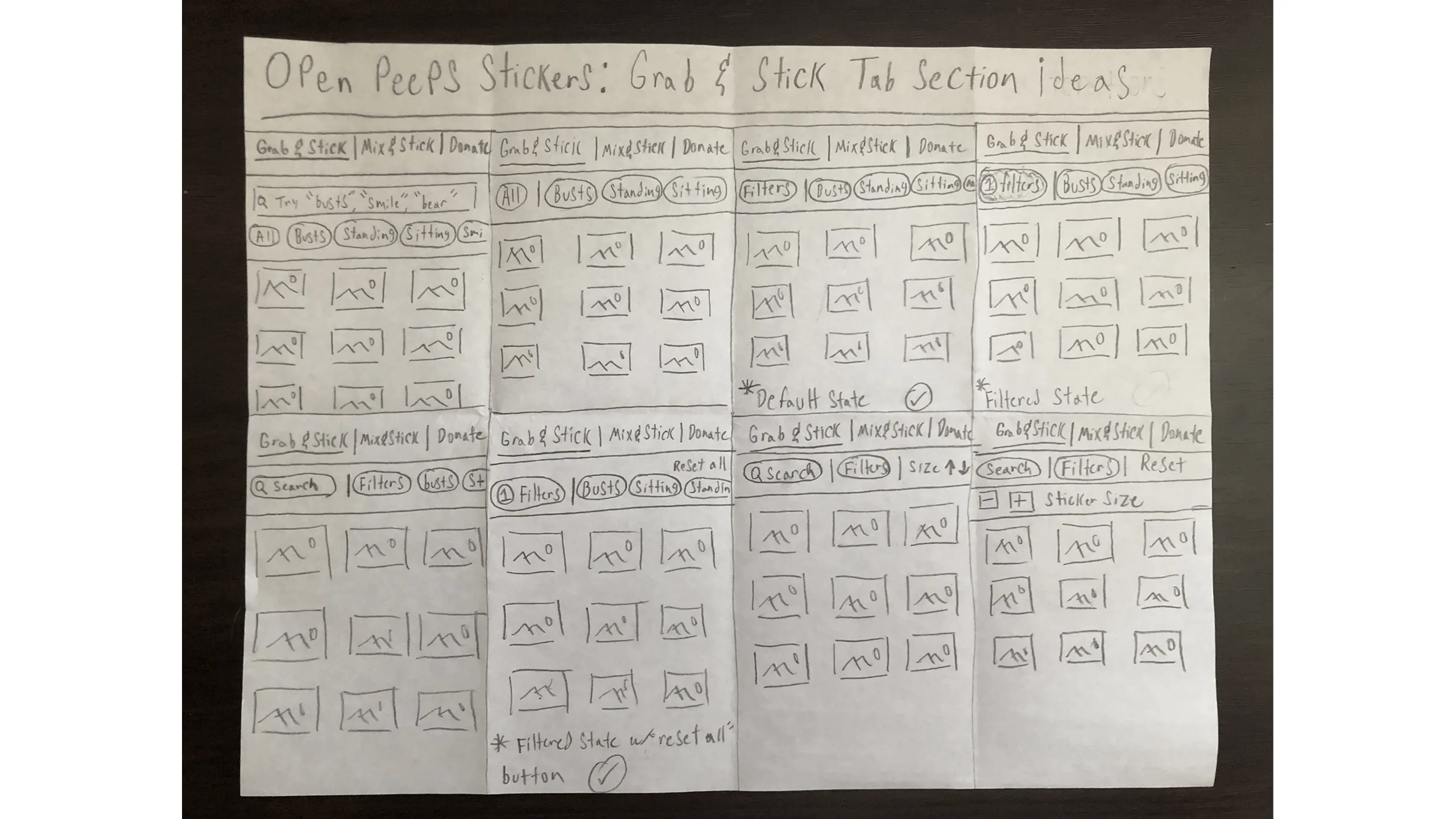
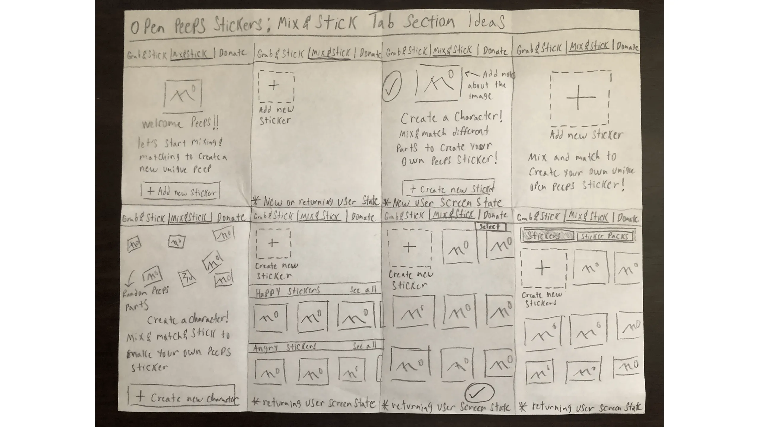
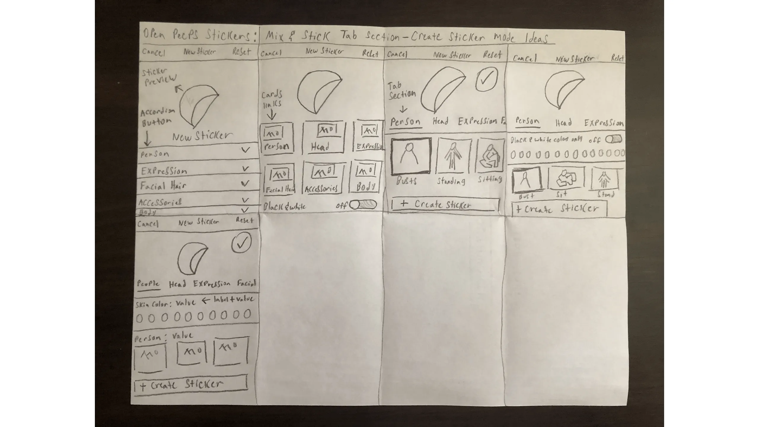
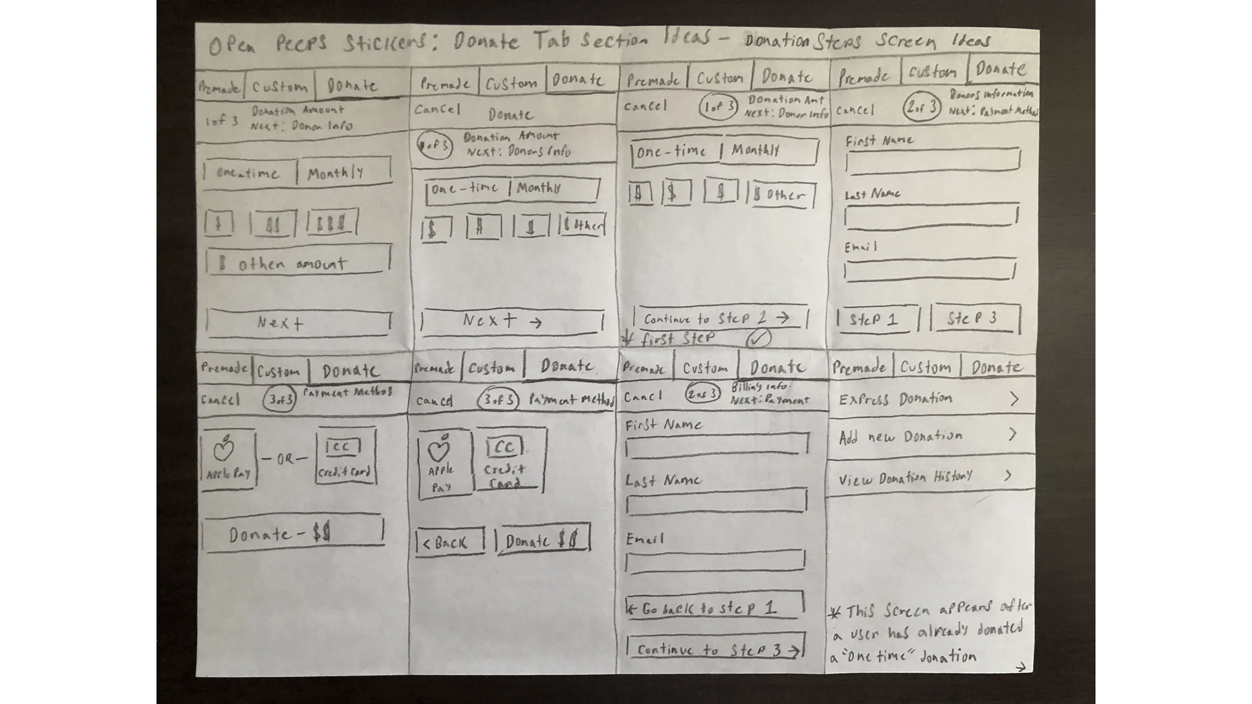
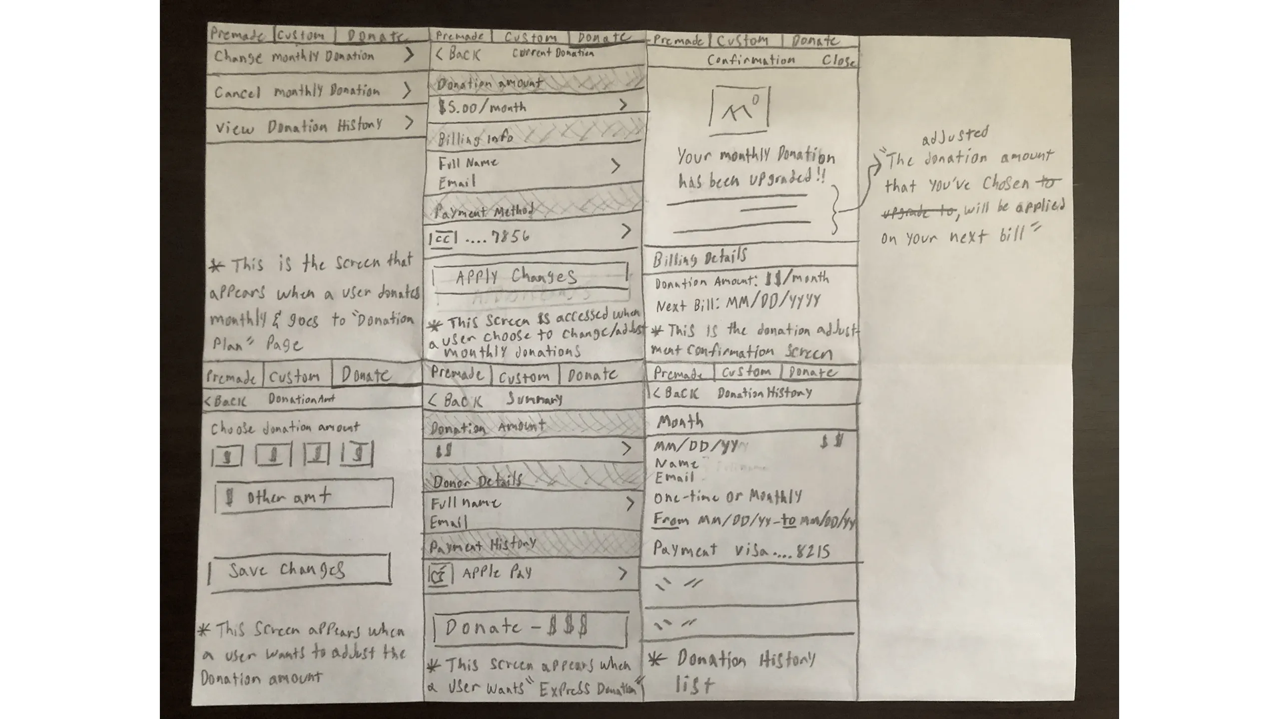
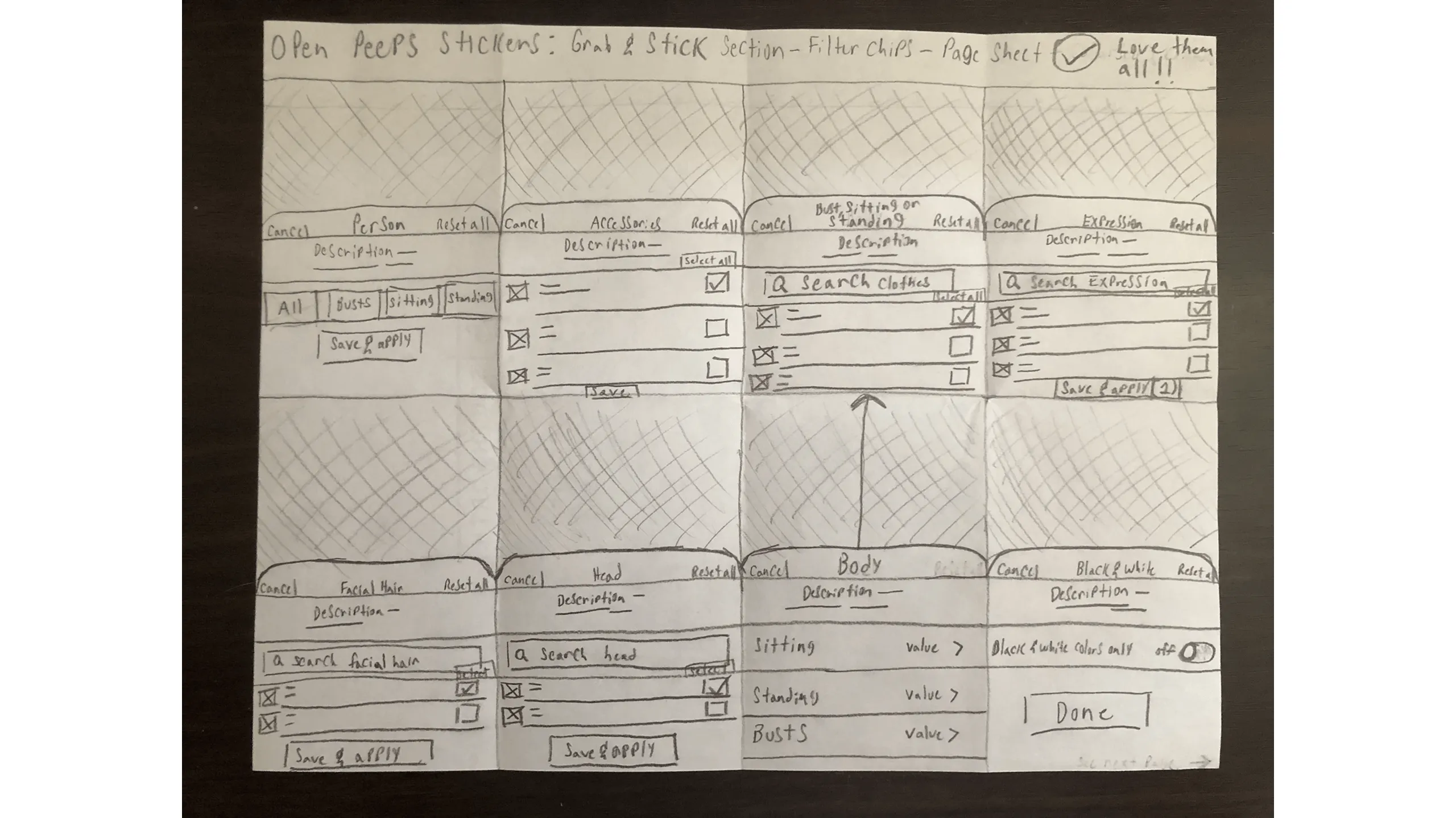
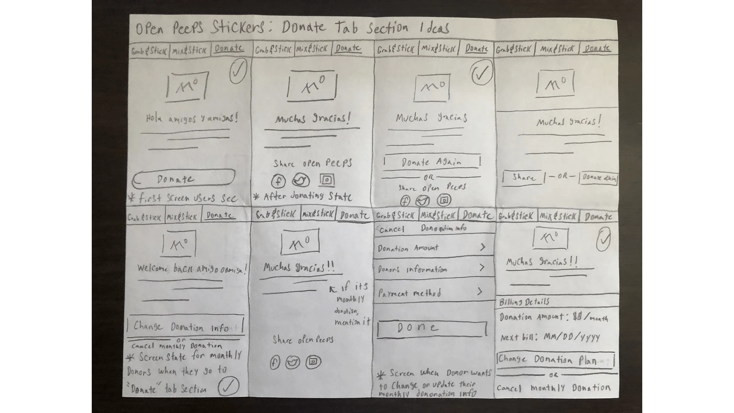
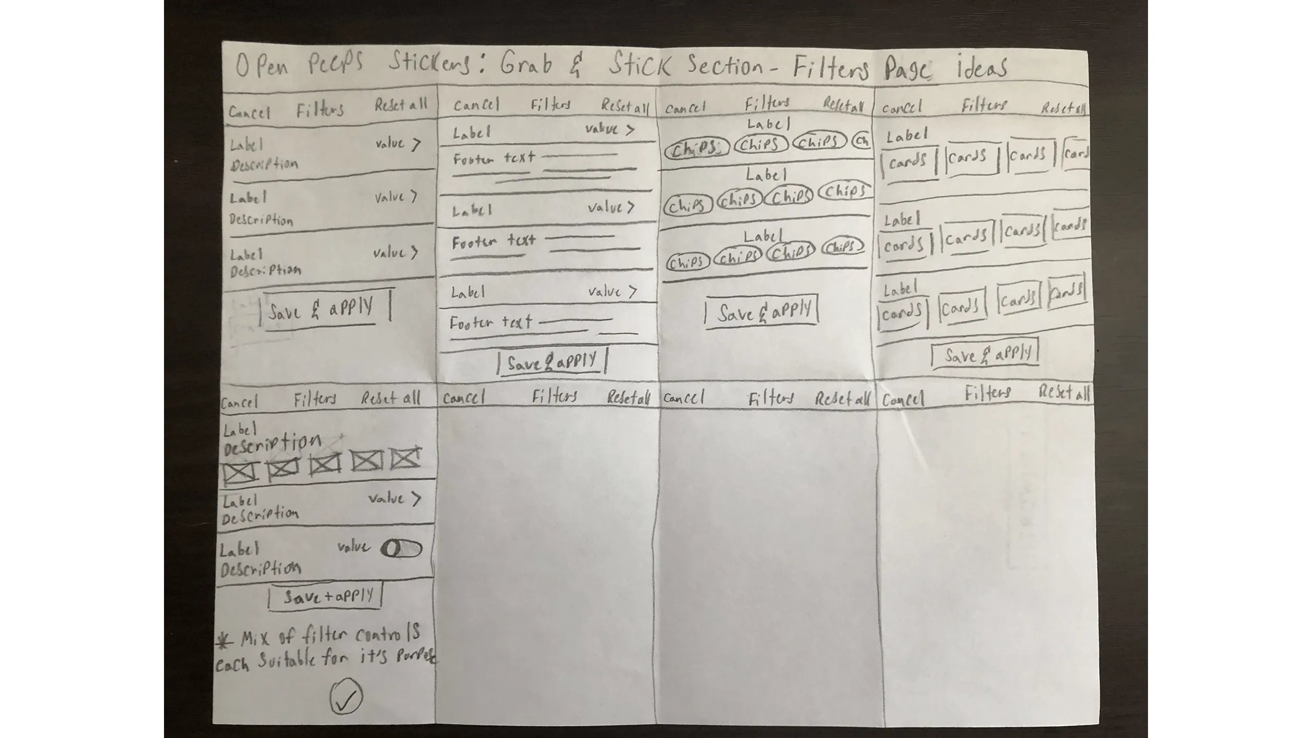
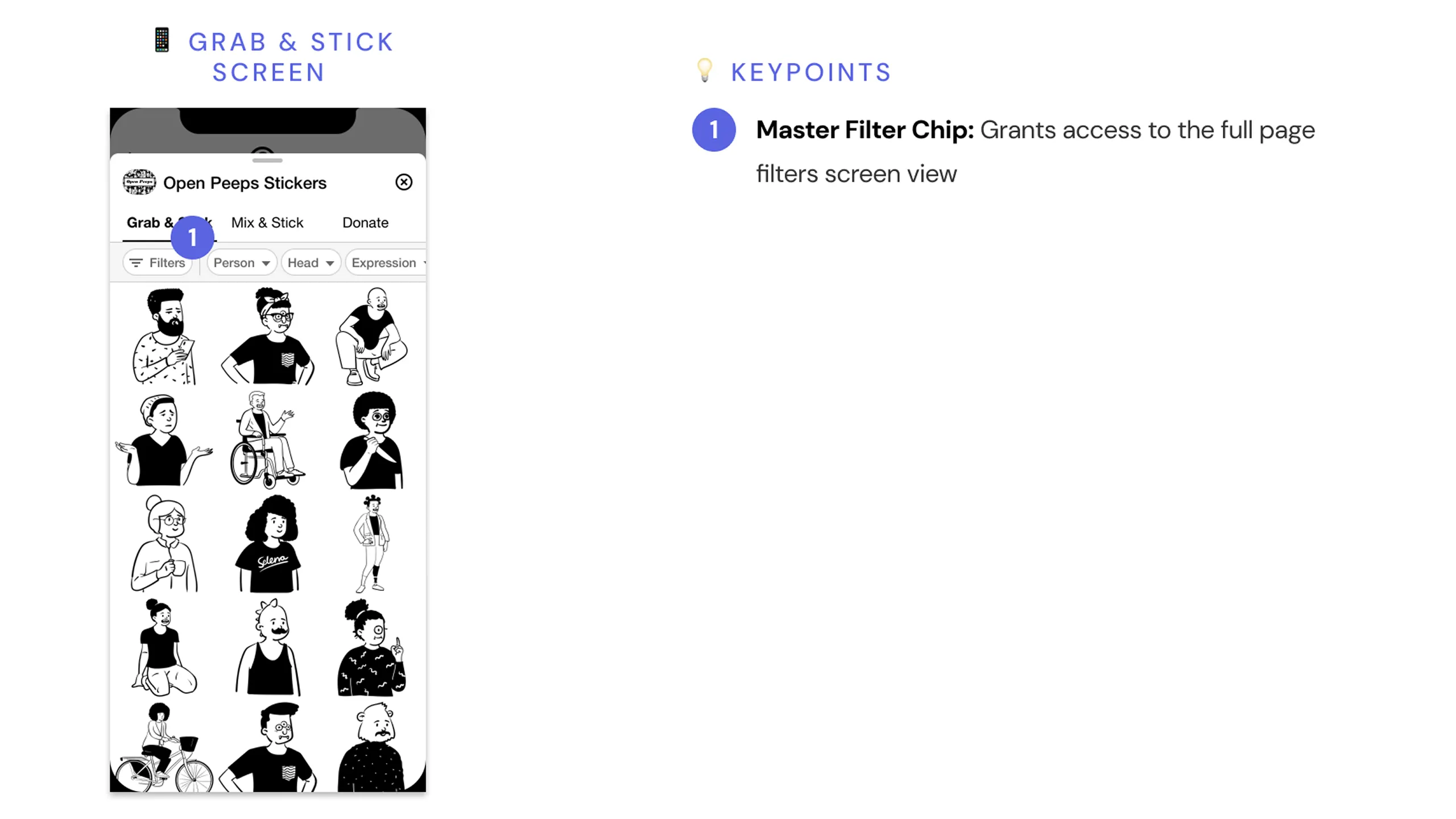
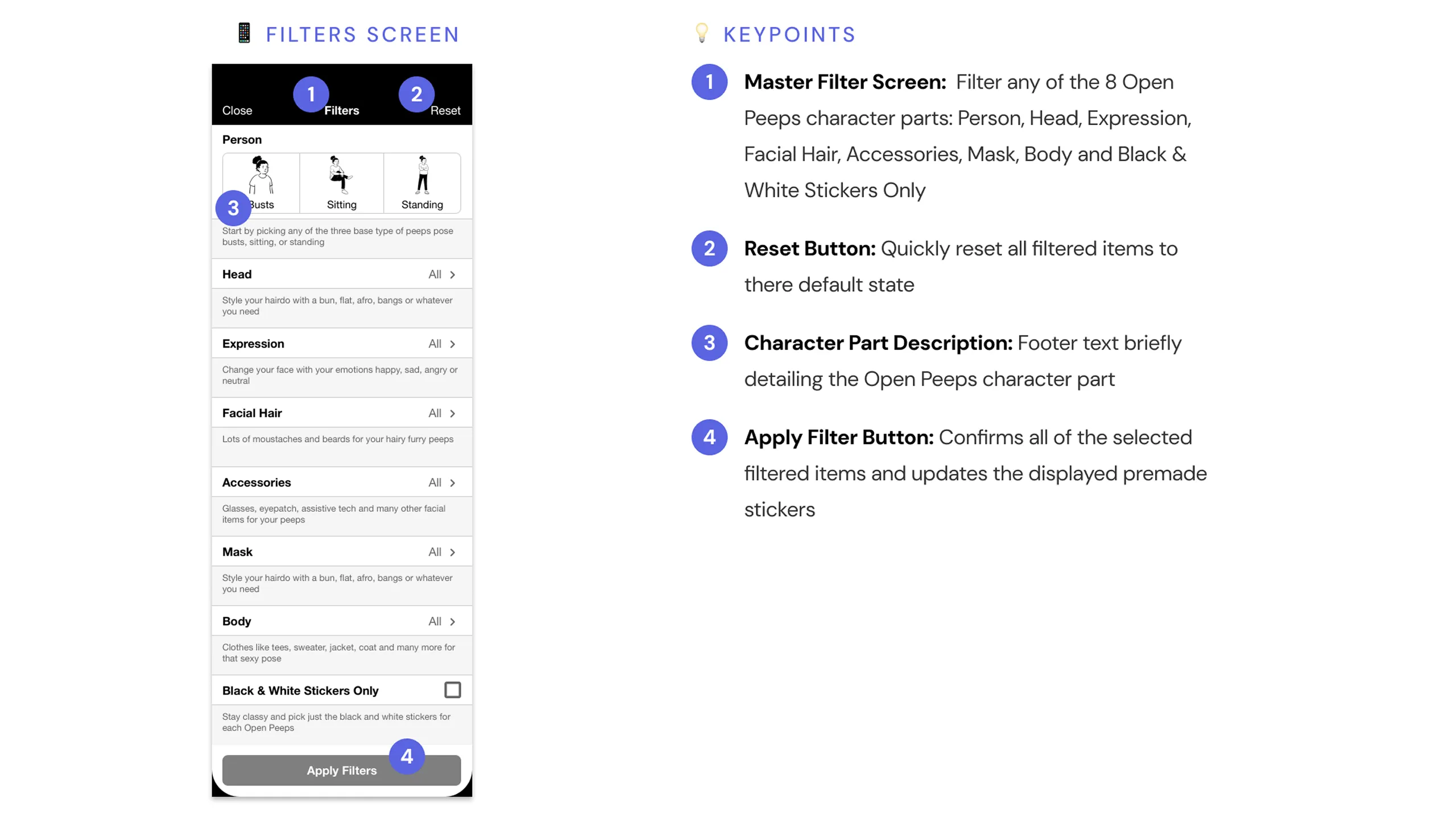
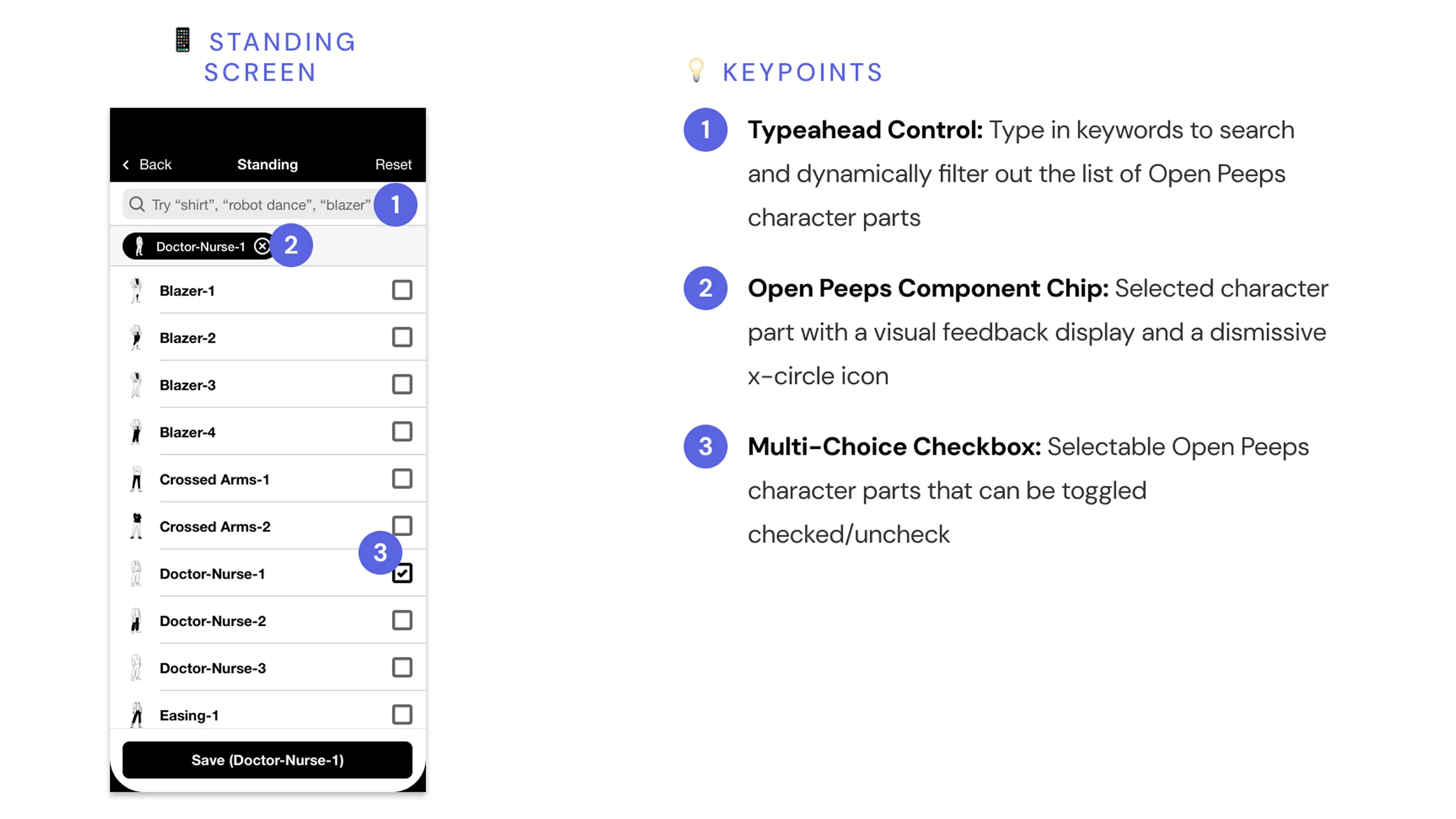
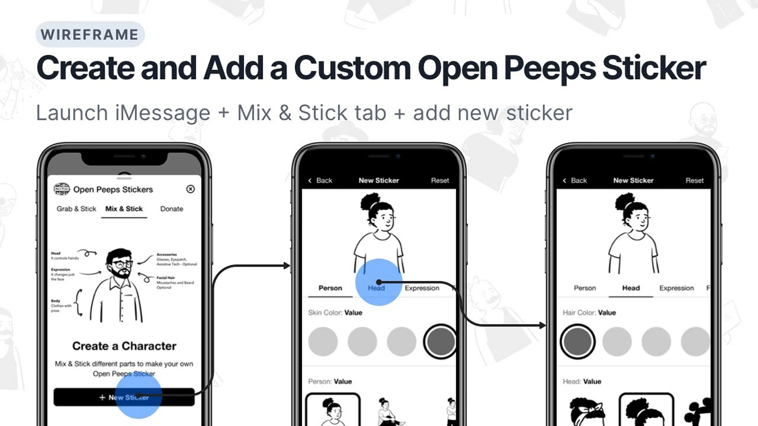
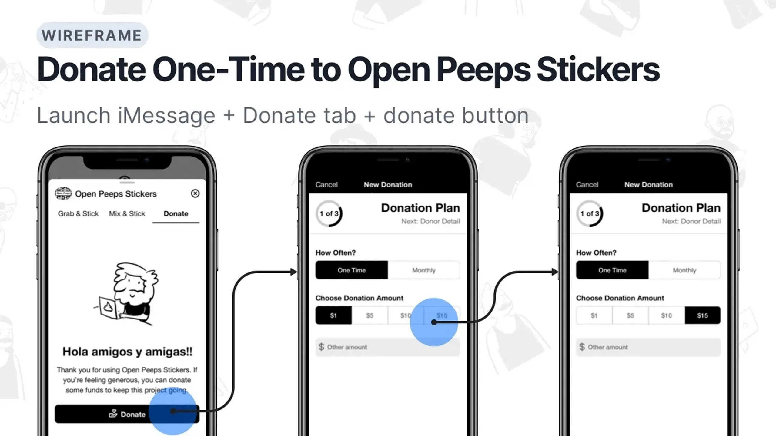
Once the sketches were done, I turned them into low-fidelity wireframes. Each screen focused on key UI elements designed to support and align with the key task requirements. The goal was to ensure that the experience was usable and intuitive.

Discovering Open Peeps via desktop browser

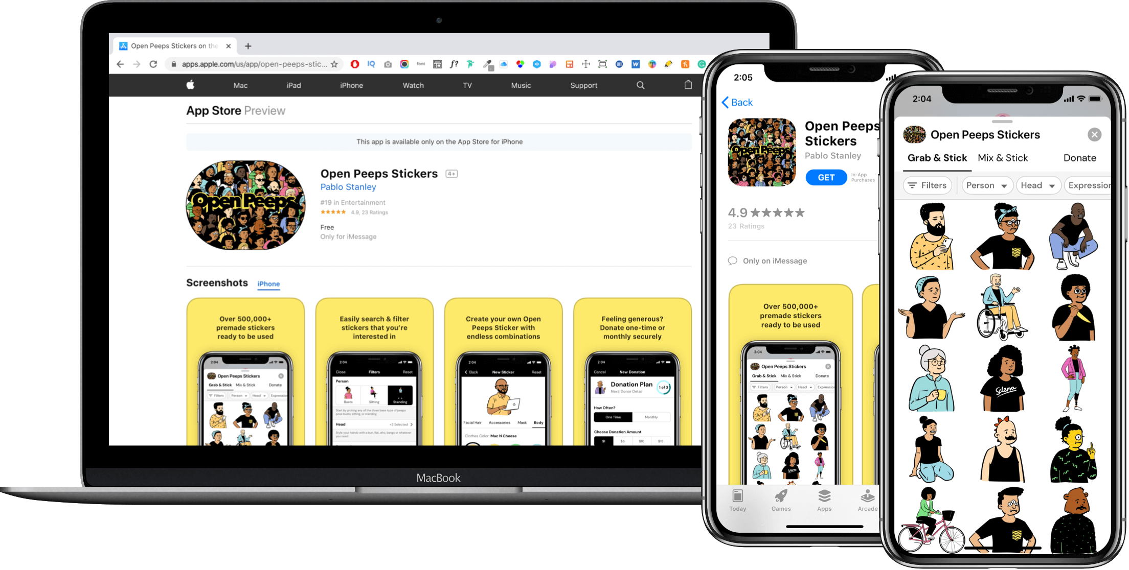
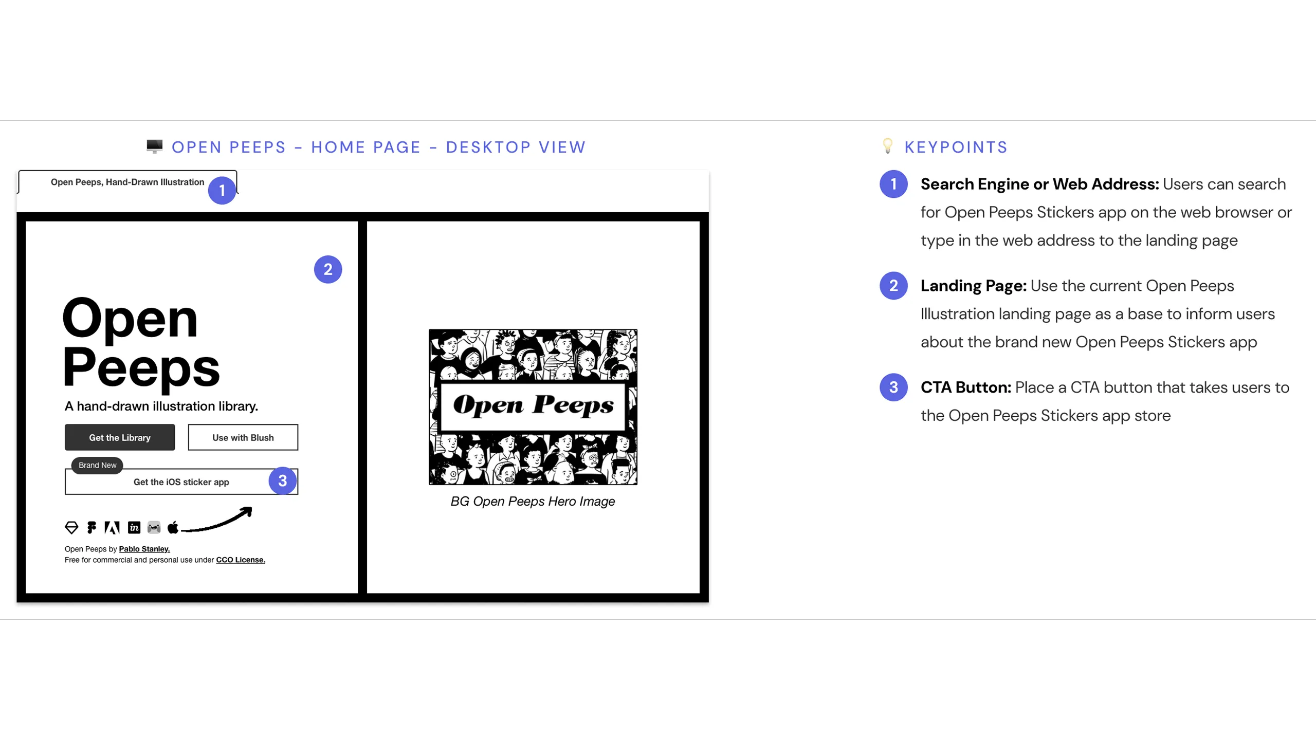
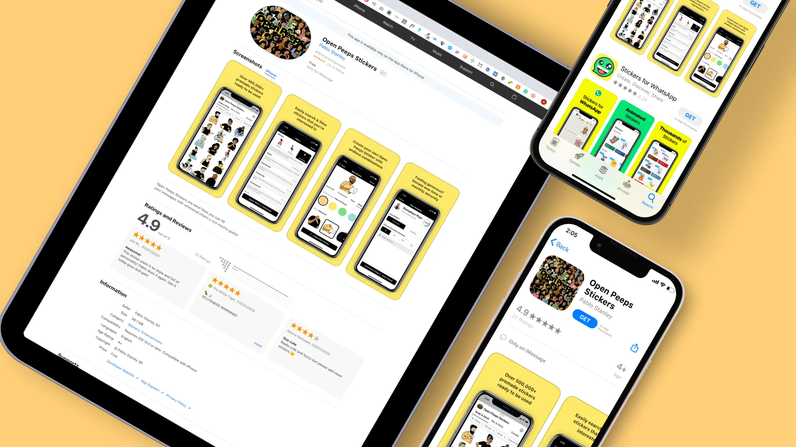
I wanted to see how someone might find the Open Peeps Stickers app if they're using a desktop or tablet. So I looked at what happens when you search for it online, like through Google or other design-related websites.

Screenshot of an Open Peeps character asking how to find the app using a desktop browser.

Discovering Open Peeps via mobile browser

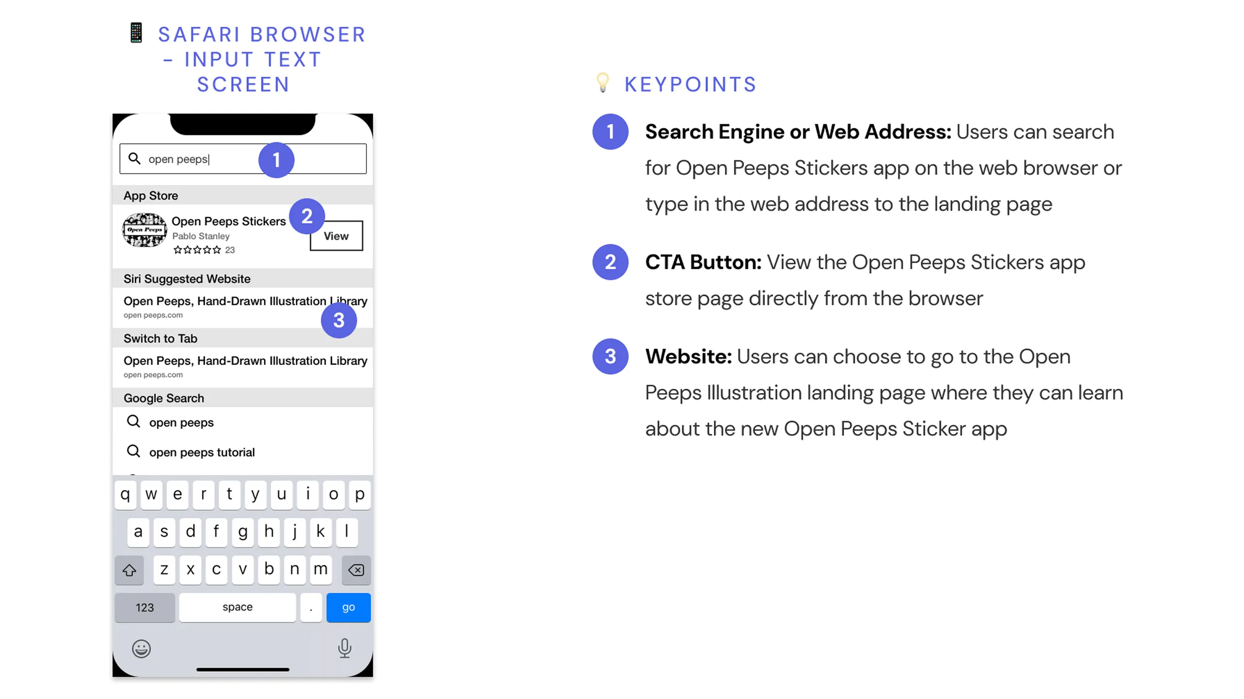
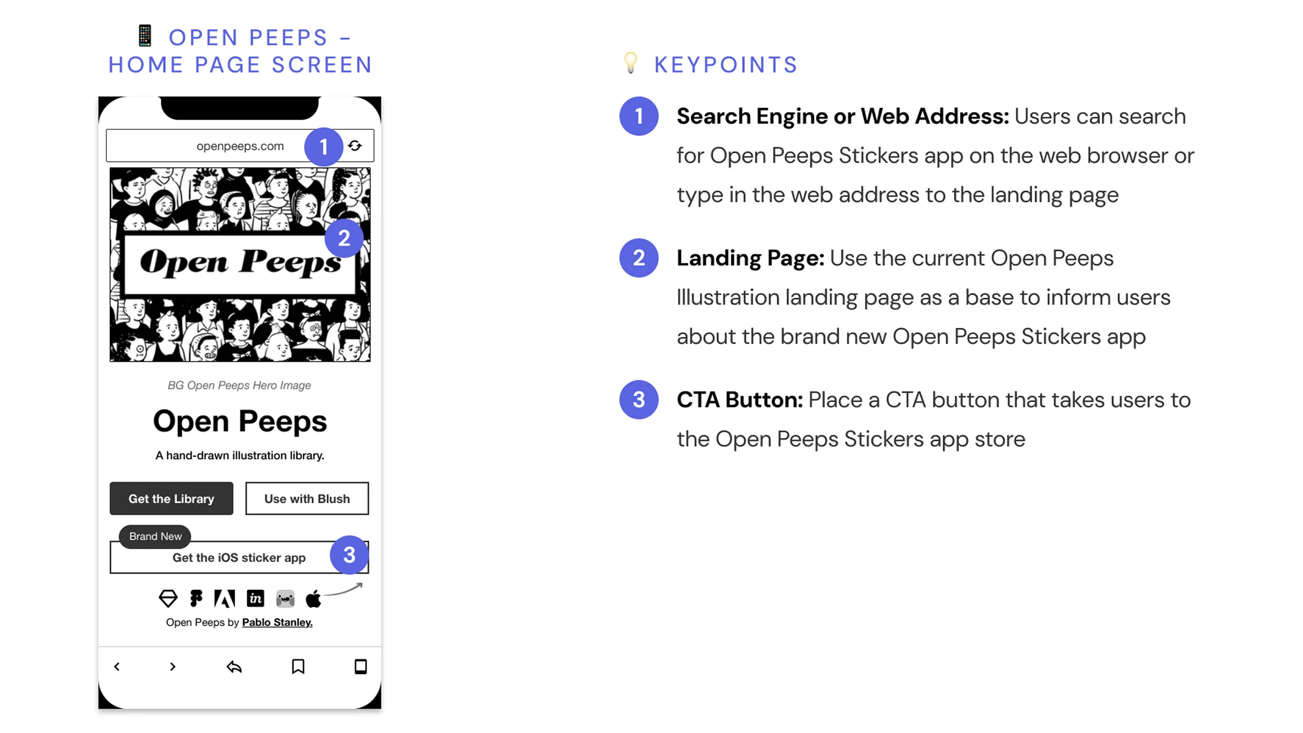
I also explored how people might come across the app using Safari on their phone. This helped me understand the mobile search experience, especially if someone’s clicking on links from social media or a blog.

Screenshot of an Open Peeps character asking how to discover the app using Safari on a smartphone.
Screenshot of an Open Peeps character proposing autocomplete categories for the search term “open peeps.”Screenshot of Safari mobile browser search input screen with Open Peeps Sticker query and design annotations.Screenshot of the Open Peeps Stickers mobile website with a CTA button and annotated design rationale.Screenshot of the Open Peeps Stickers App Store product page on iOS with annotated design elements.Screenshot of the App Store product screen with an install bottom sheet and annotations.

Discovering Open Peeps via app store

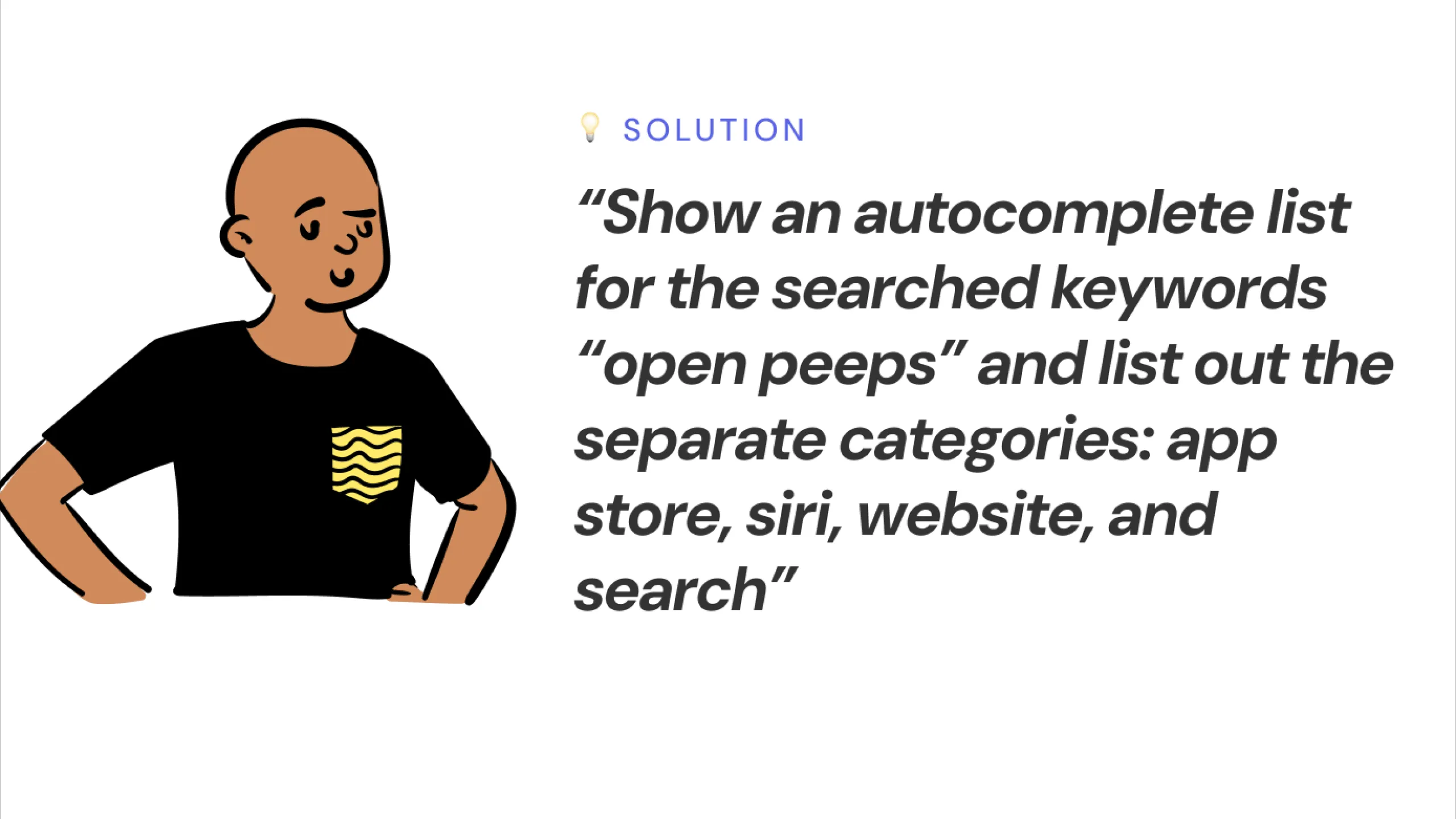
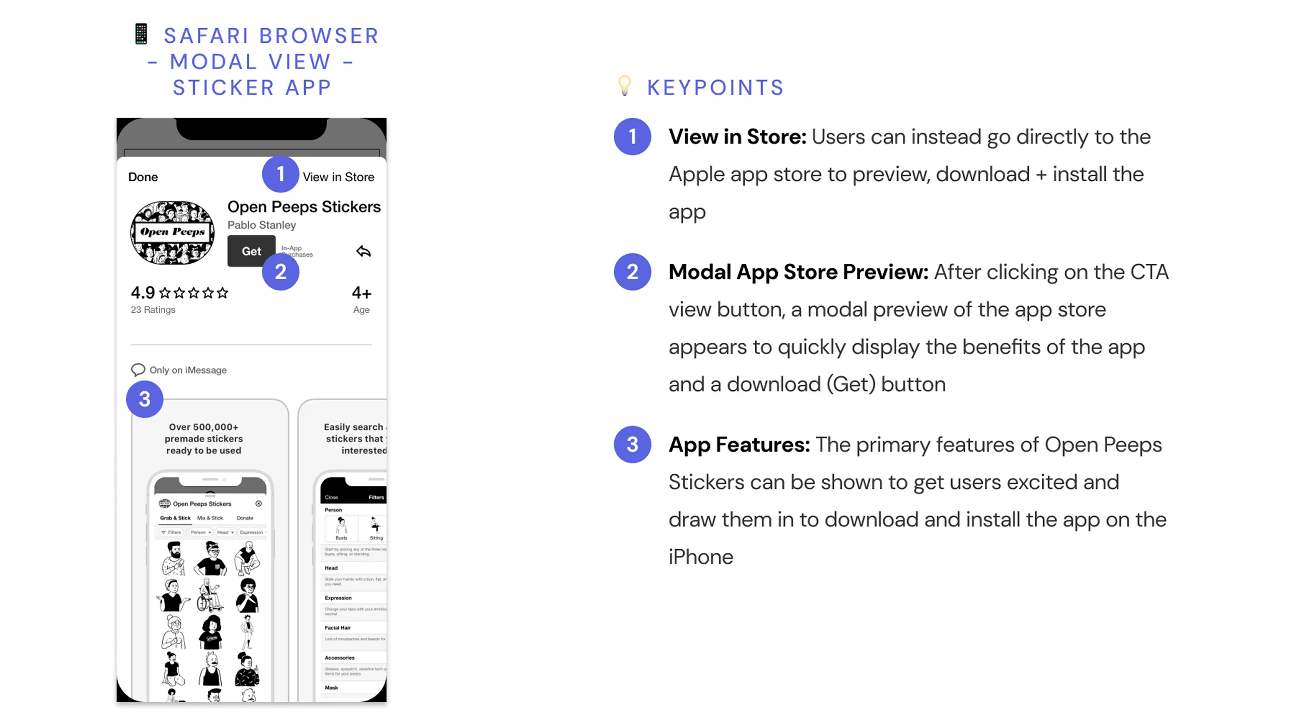
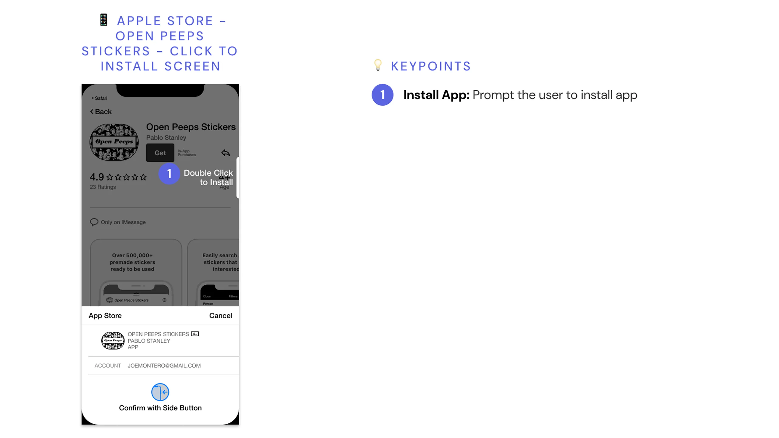
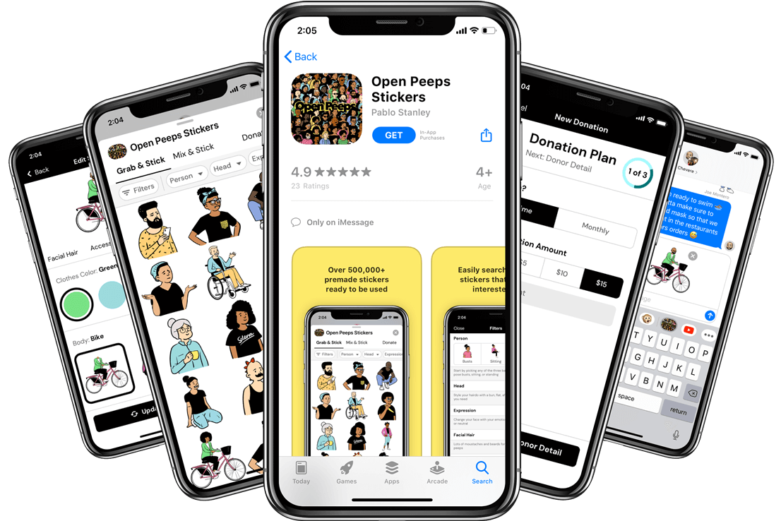
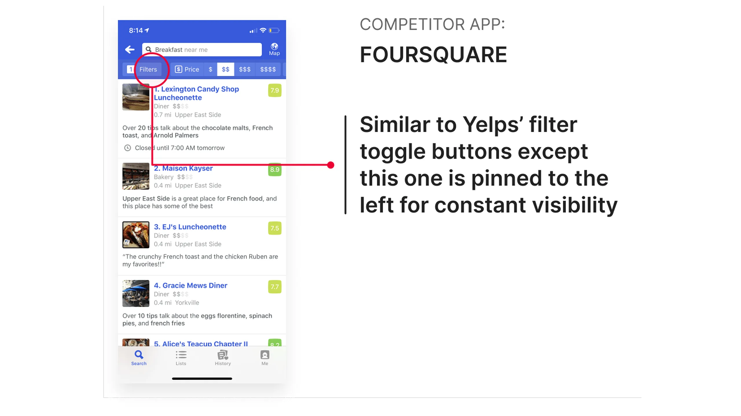
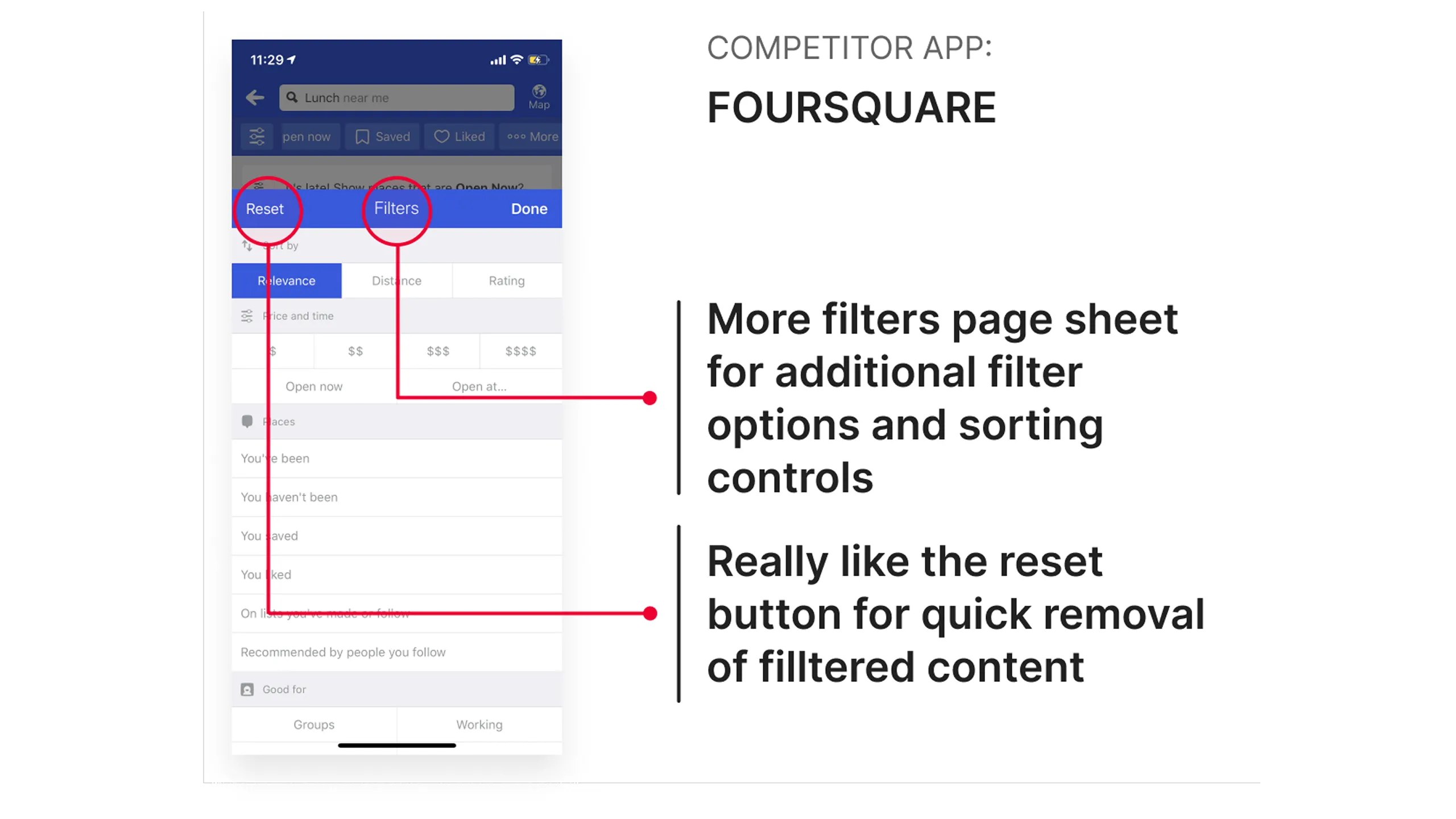
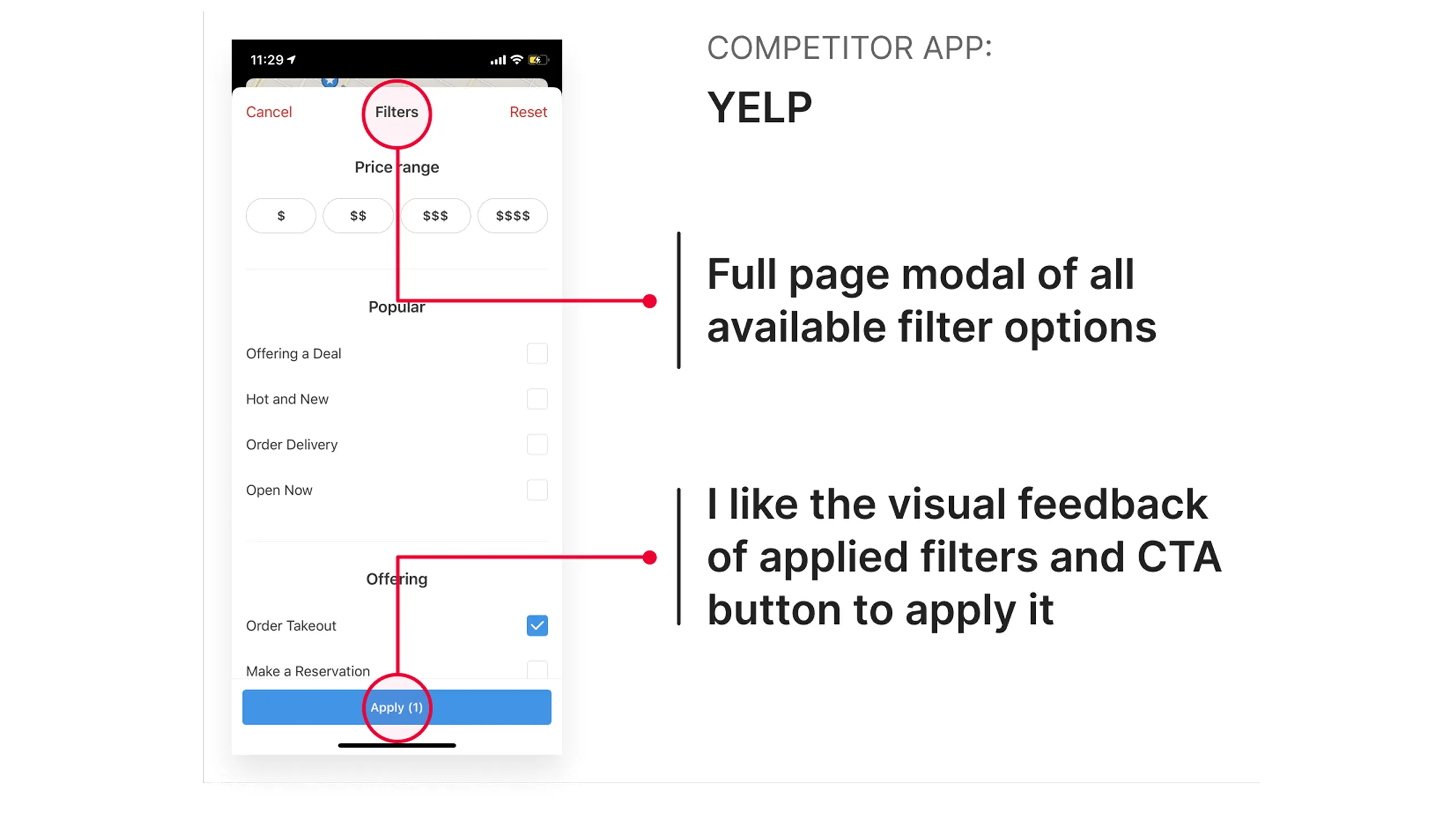
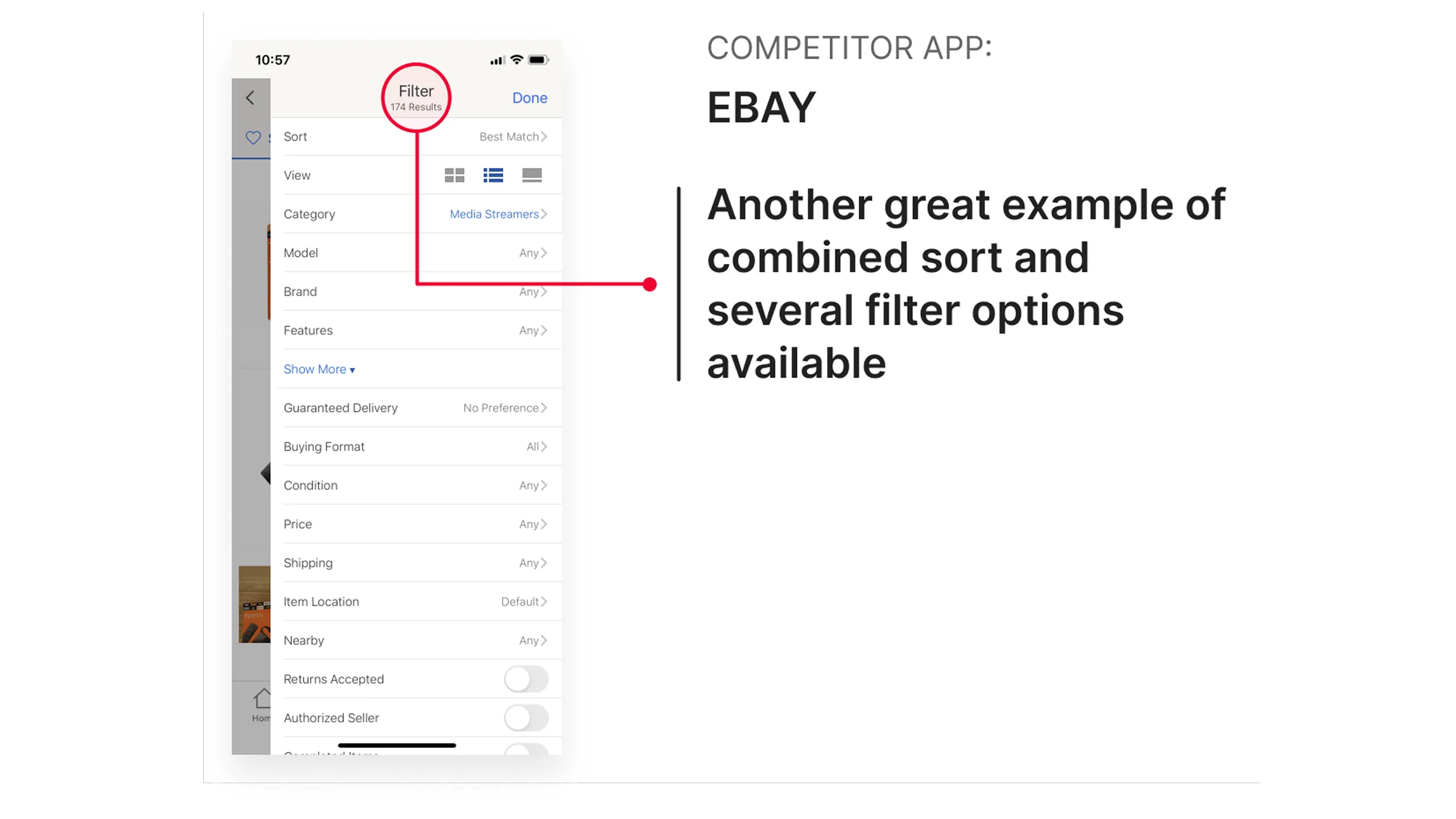
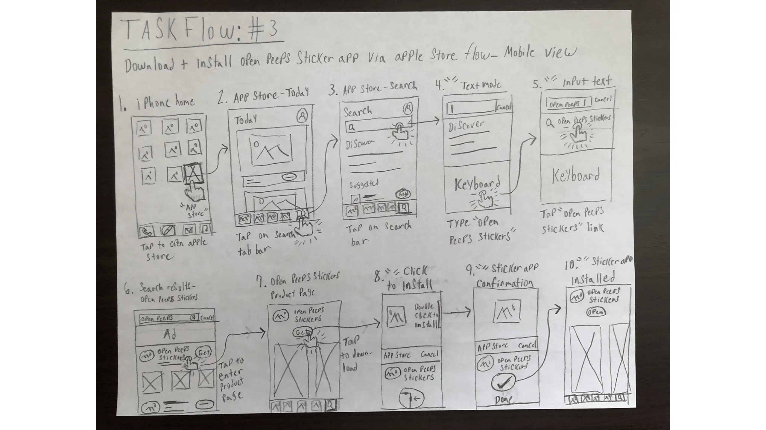
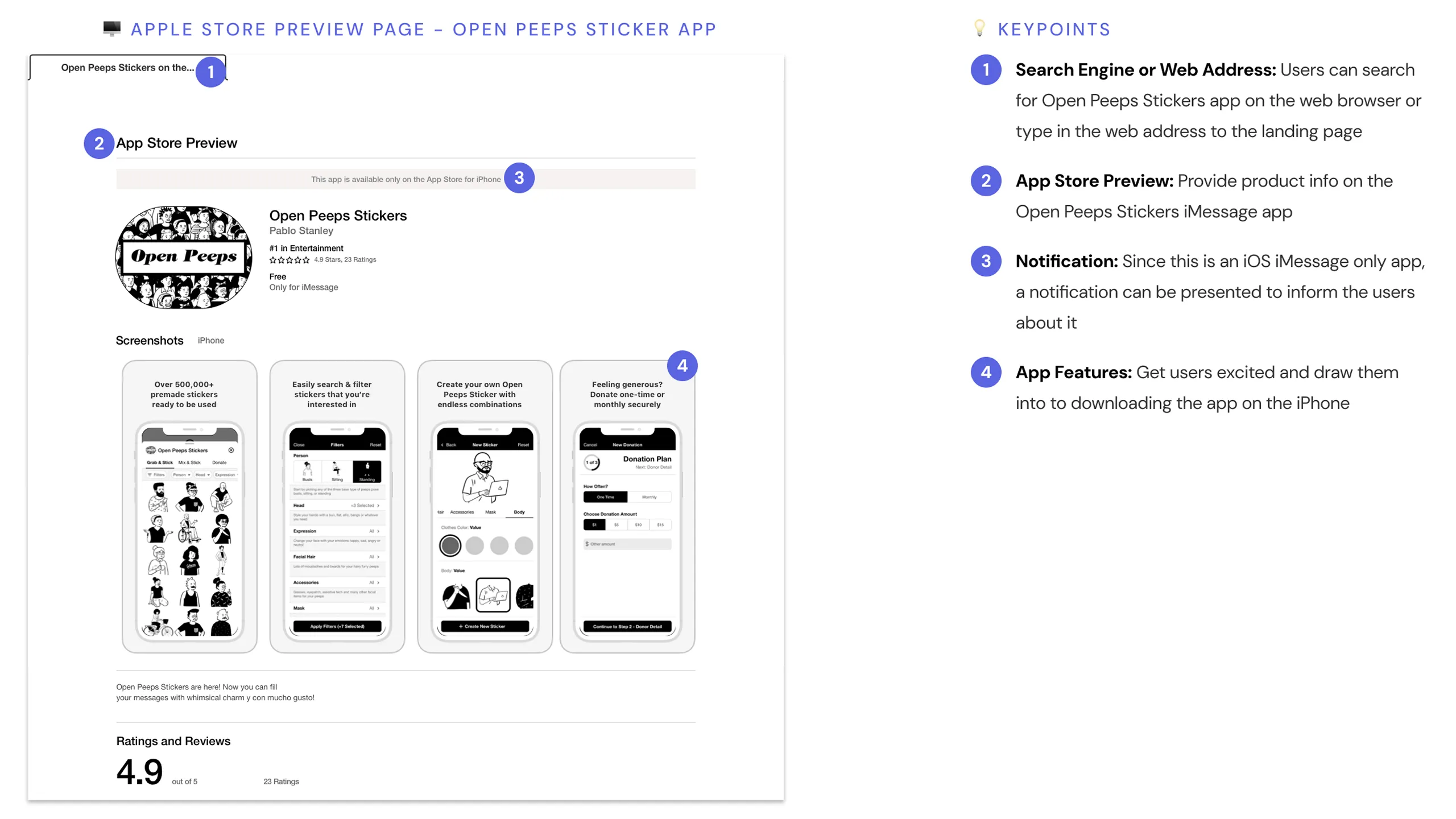
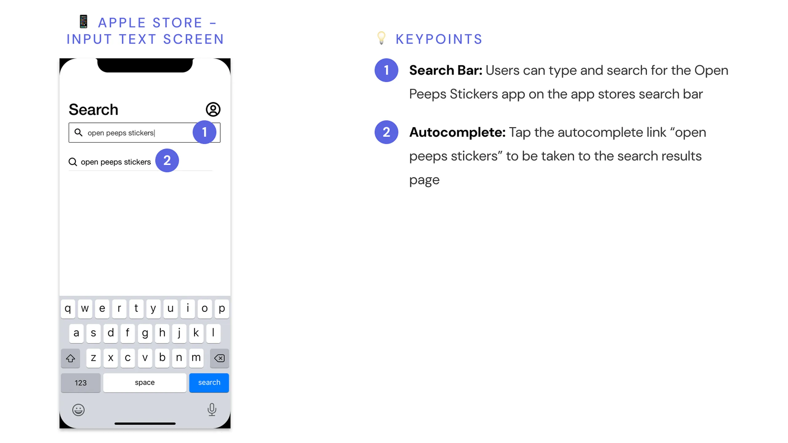
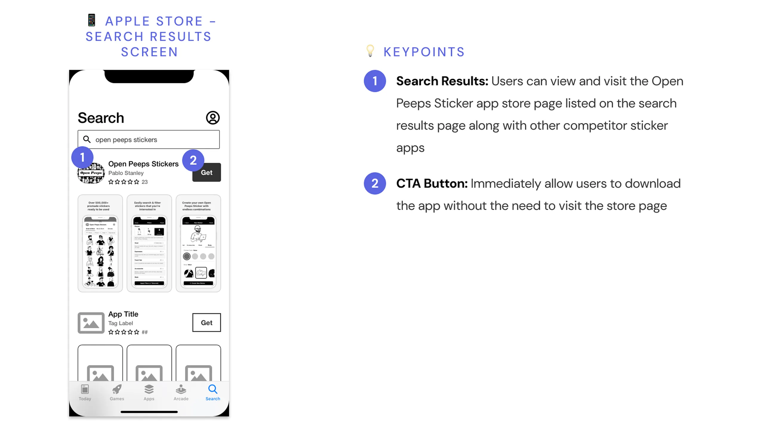
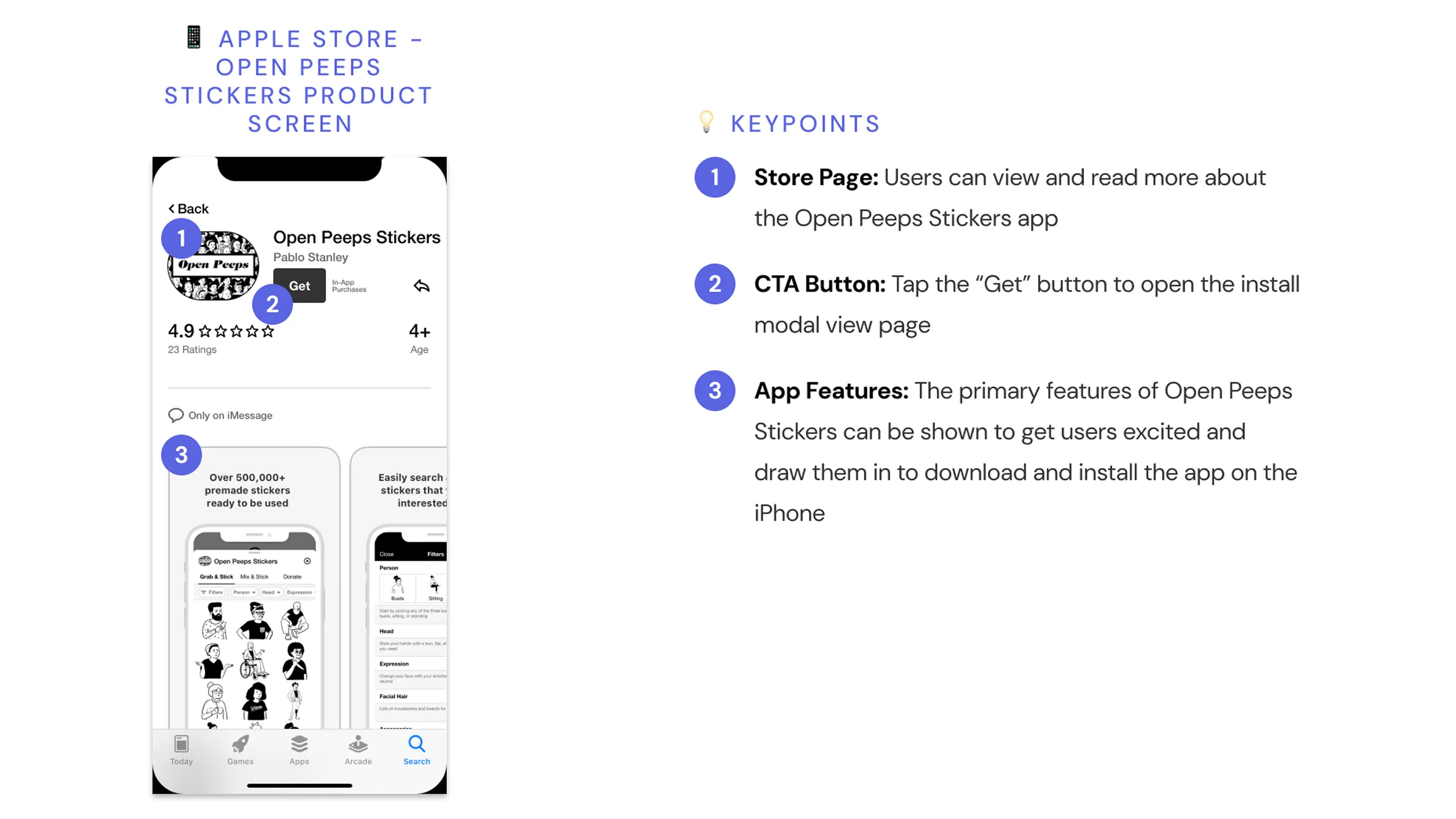
I checked what it’s like to search for Open Peeps directly in the Apple App Store. I looked at things like how easy it is to find, what keywords work best, and where it shows up in the results.

Screenshot of an Open Peeps character asking how to discover the app in the Apple App Store.
Screenshot of an Open Peeps character with a solution prompt about searching “open peeps stickers.”Screenshot of the App Store search bar with the query “open peeps stickers,” including design annotations.Screenshot of iOS App Store search results for Open Peeps Stickers, with design annotations.Screenshot of the Open Peeps Stickers app product page on iOS with annotations.Screenshot of the Open Peeps Stickers product page with install drawer open and annotations.

Using premade stickers in iMessage

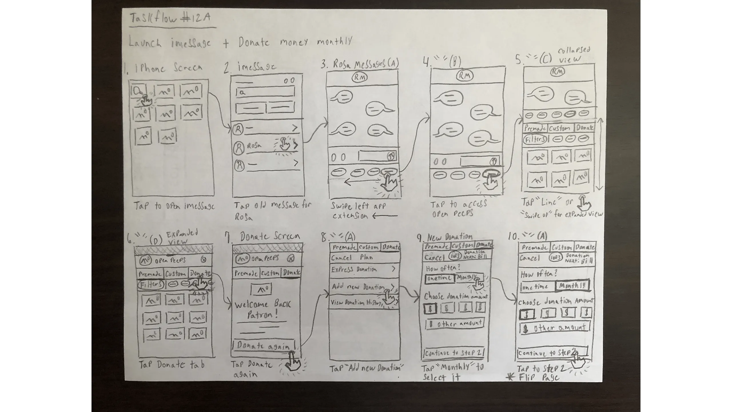
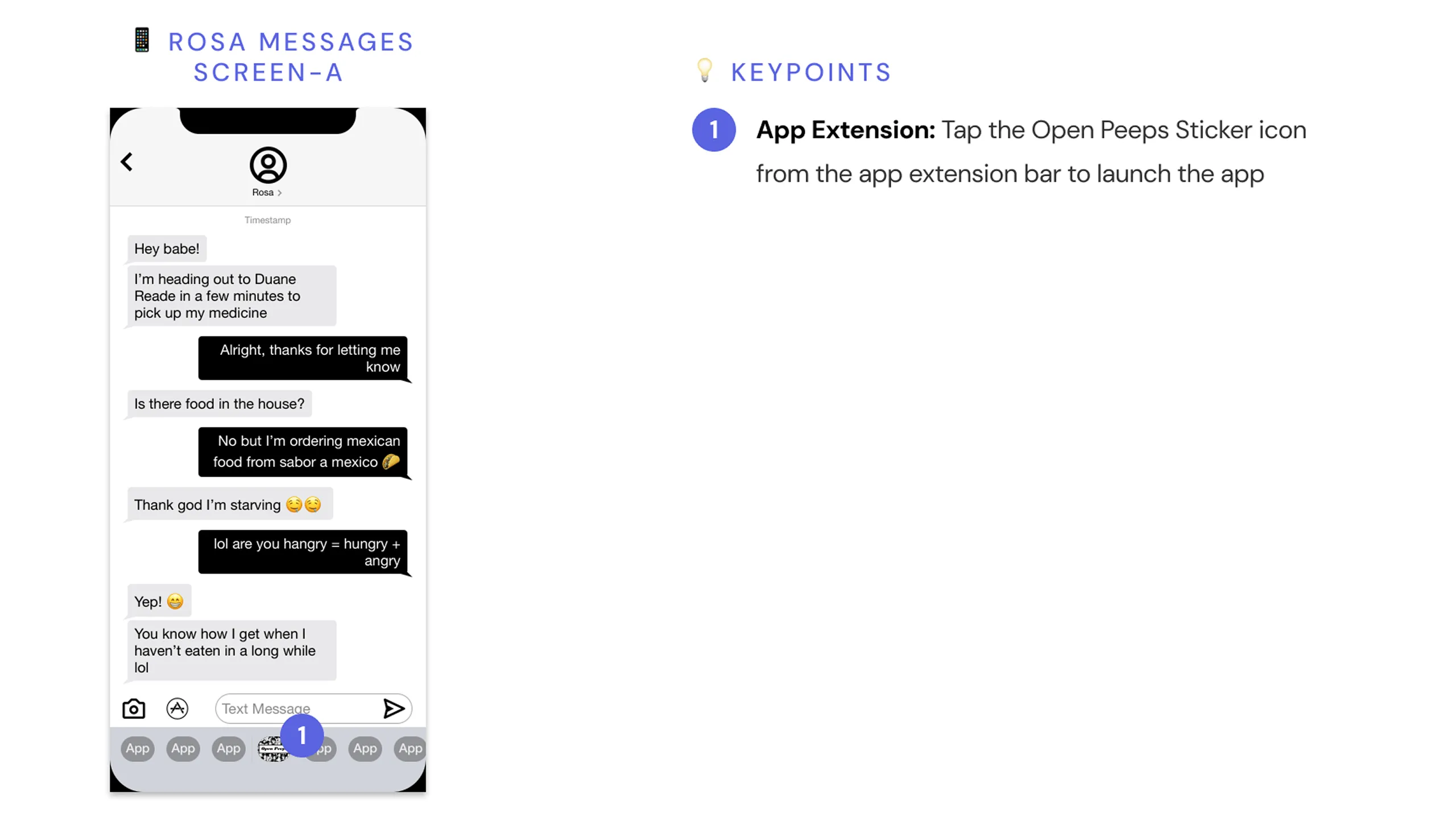
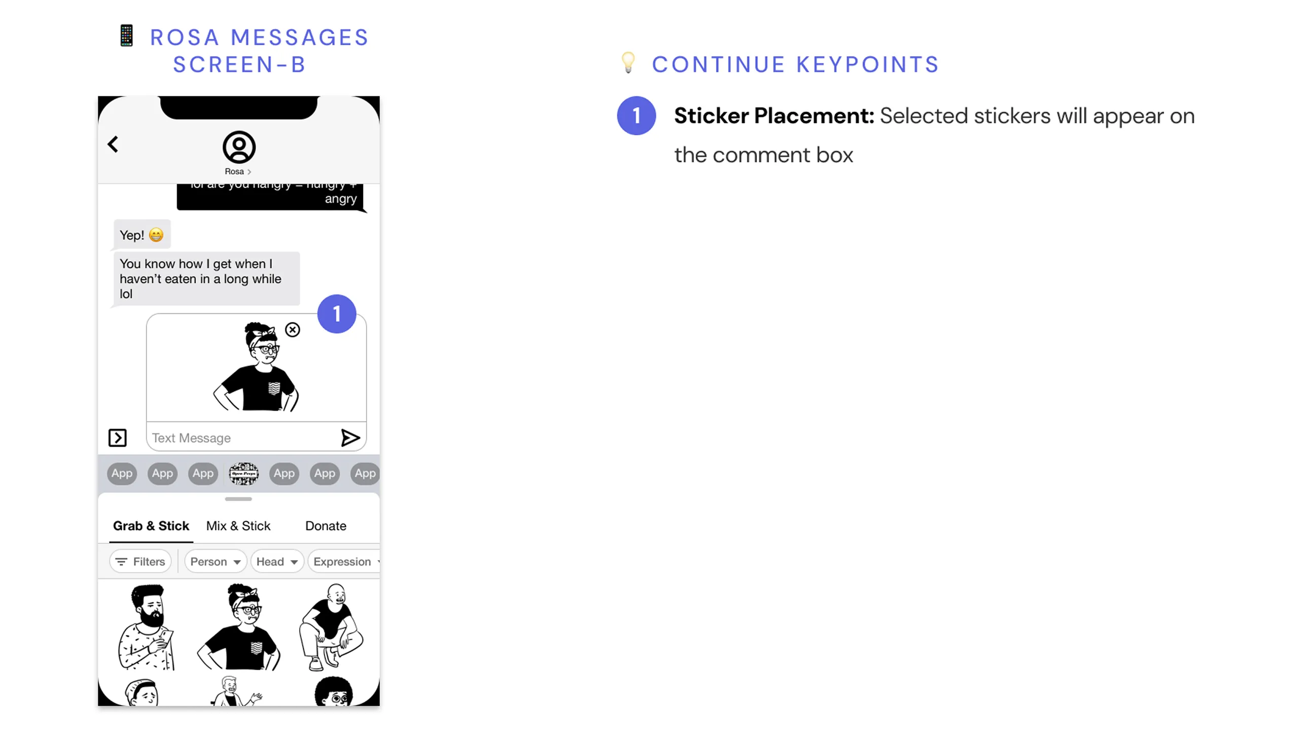
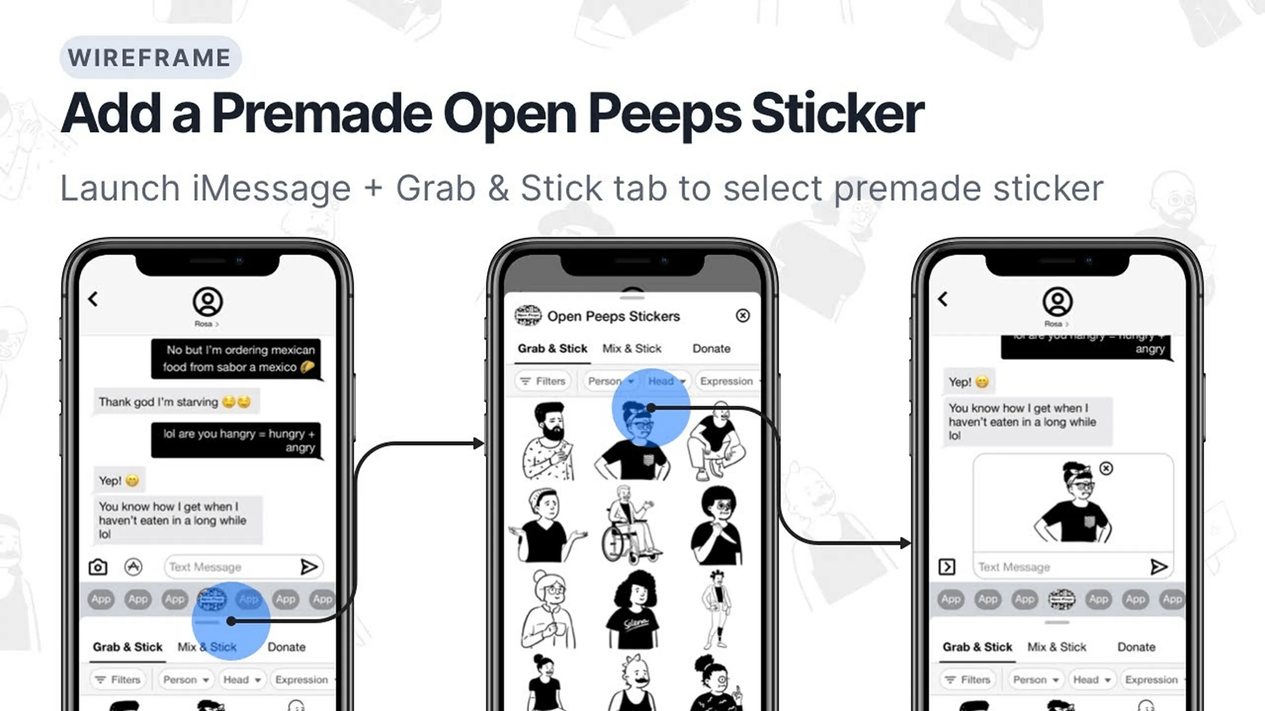
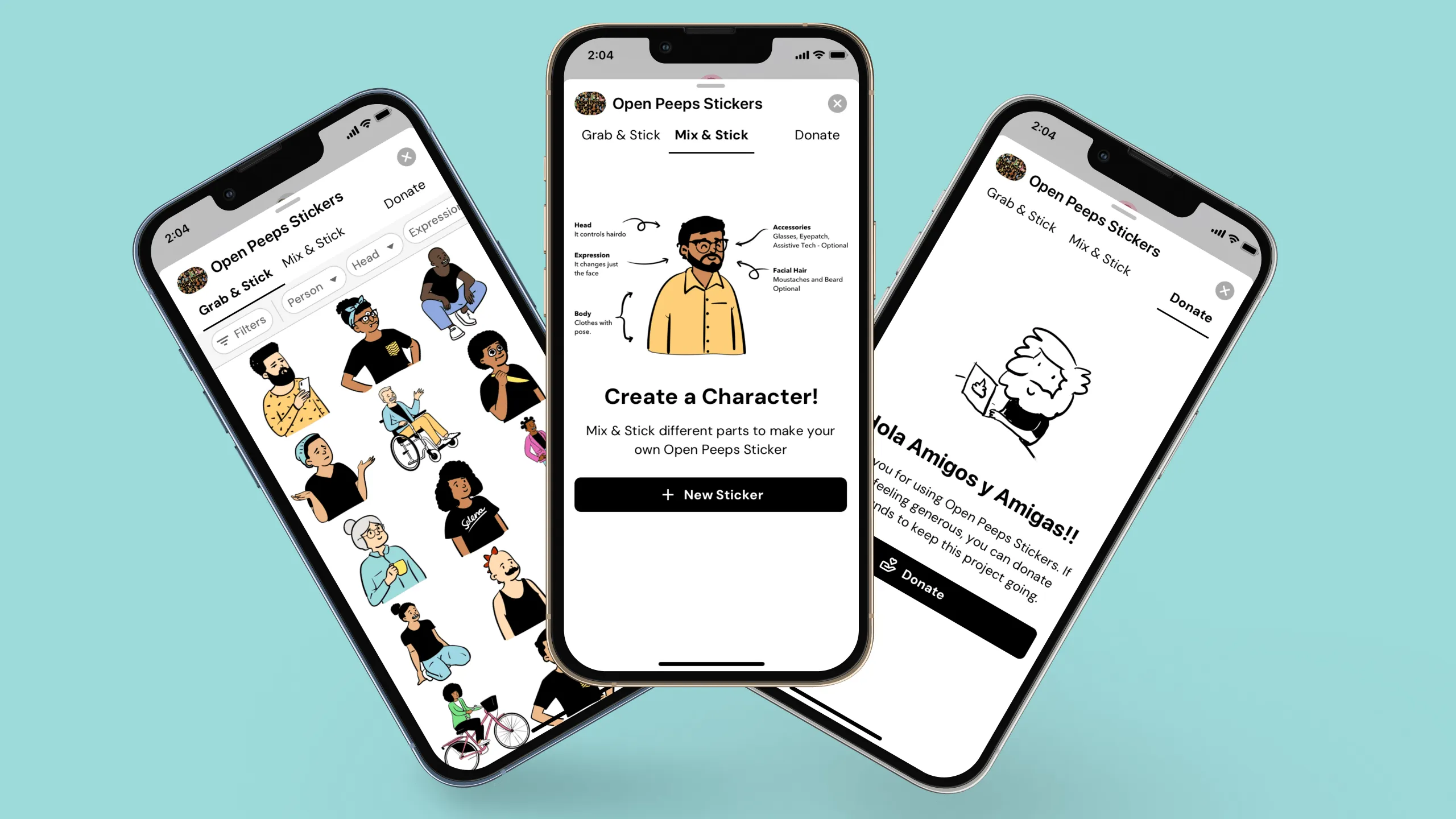
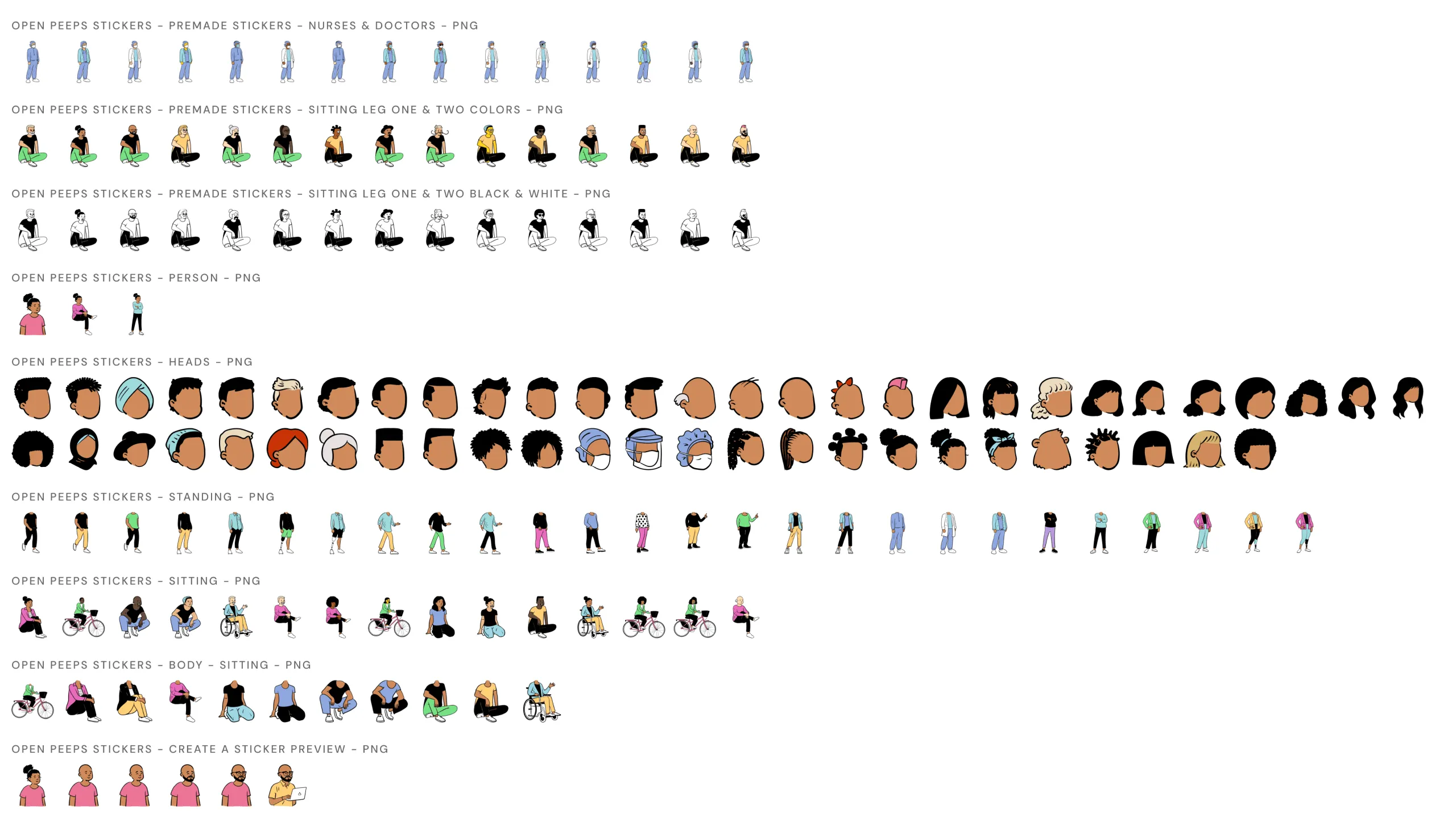
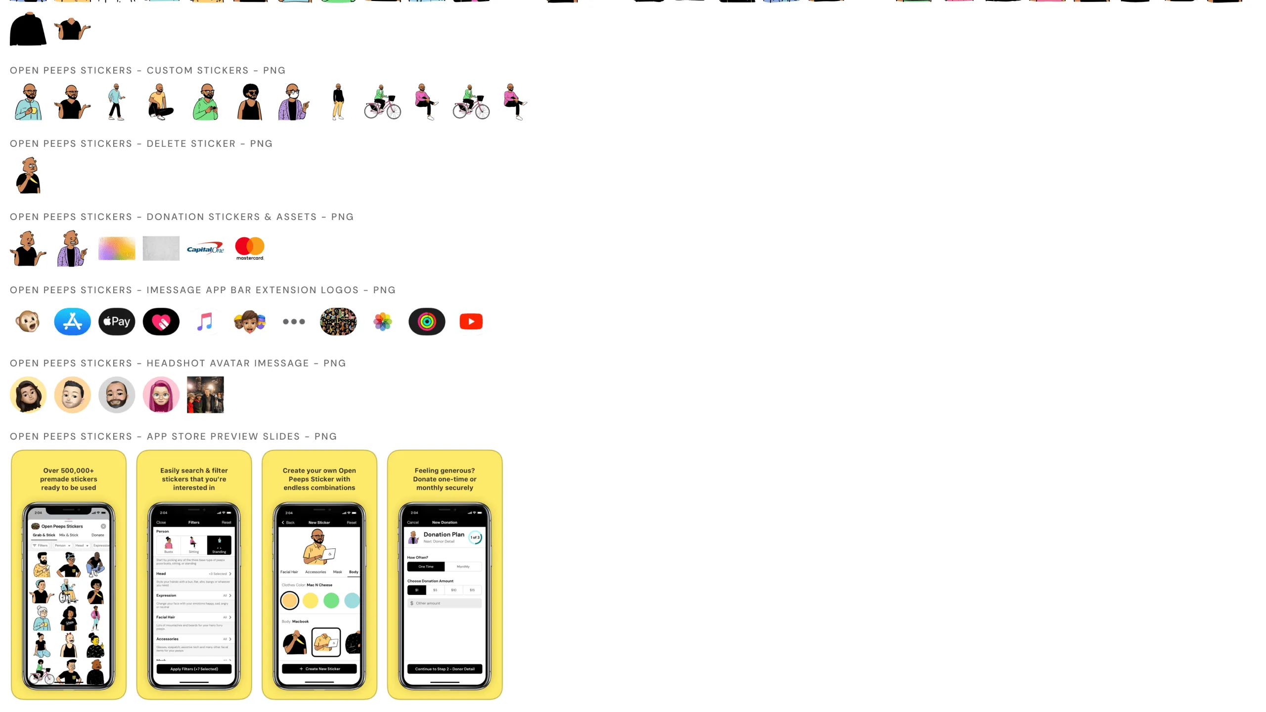
I walked through how to use the premade Open Peeps stickers in iMessage. It’s pretty straightforward you just install the app, and the stickers show up in your sticker drawer.

Screenshot of an Open Peeps character asking how to use premade stickers in iMessage.
Screenshot of an Open Peeps character suggesting a Grab & Stick tab for browsing and sending stickers.Screenshot of an iMessage conversation with the Open Peeps Stickers app extension toolbar, with annotations.Screenshot of the Grab & Stick screen displaying premade stickers, with annotated design rationale.Screenshot showing a sticker placed inside an iMessage text bubble from the Open Peeps Stickers app.

Customizing premade stickers

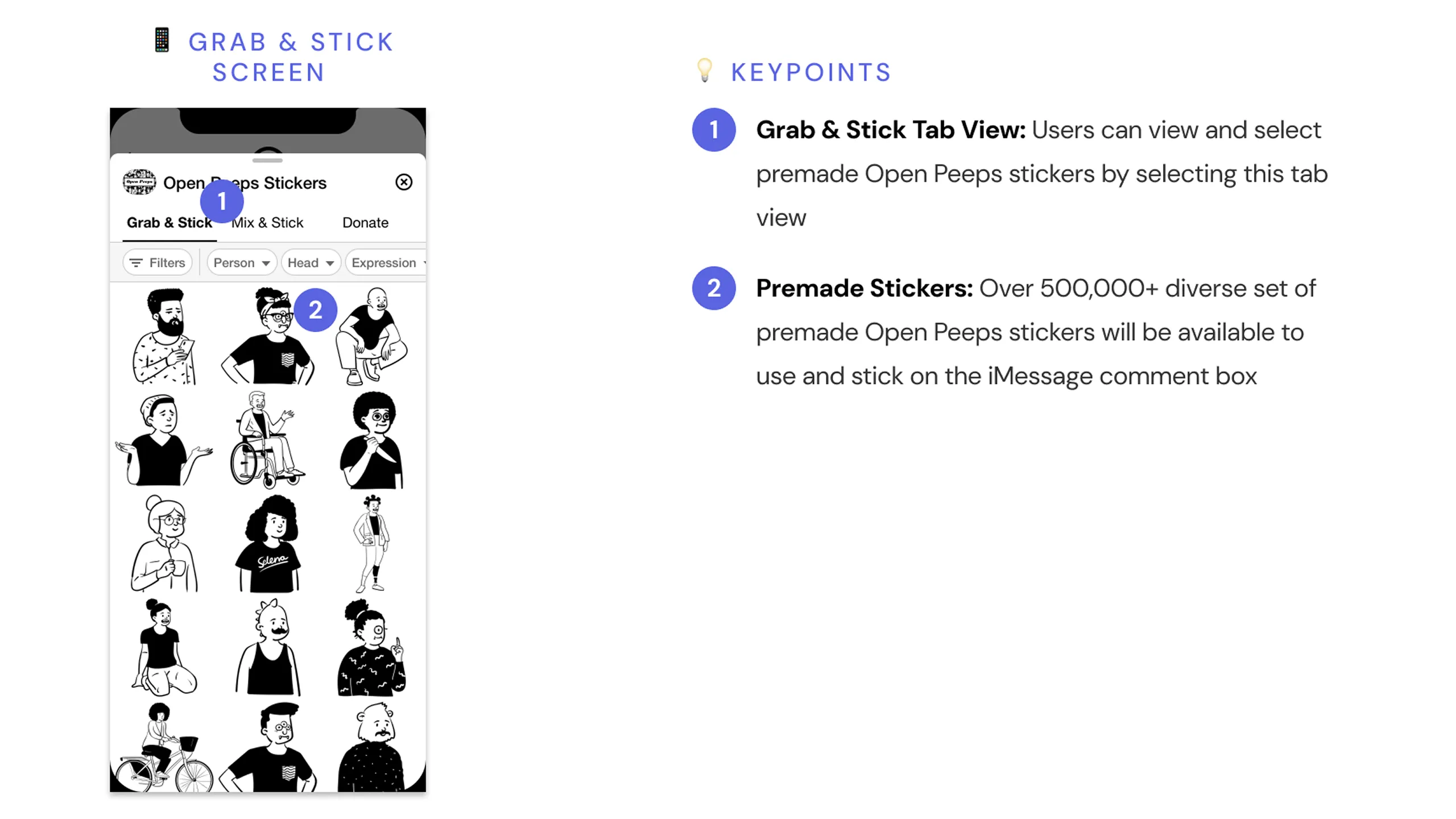
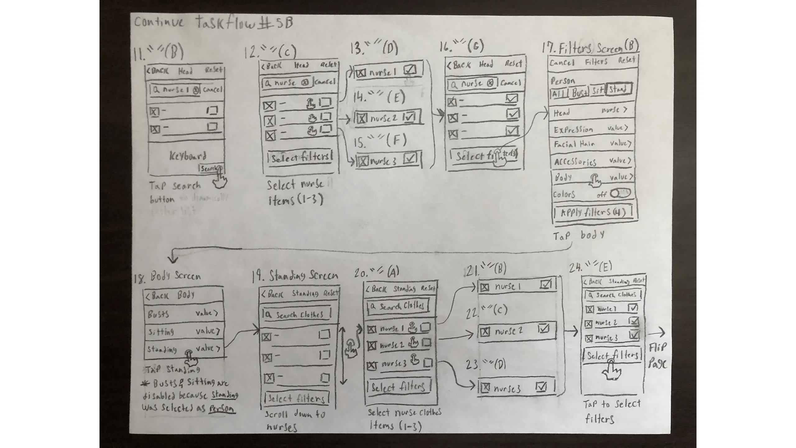
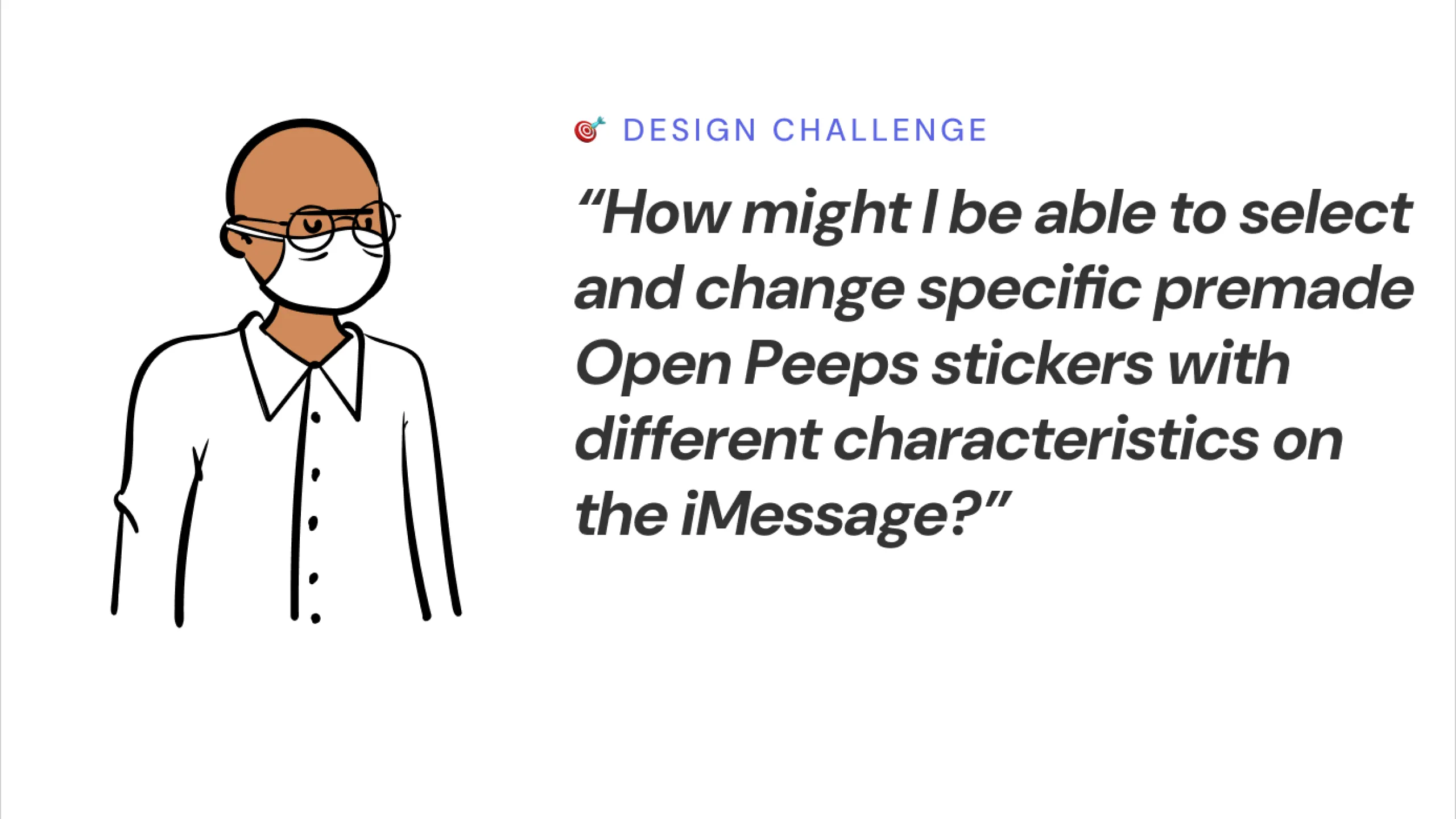
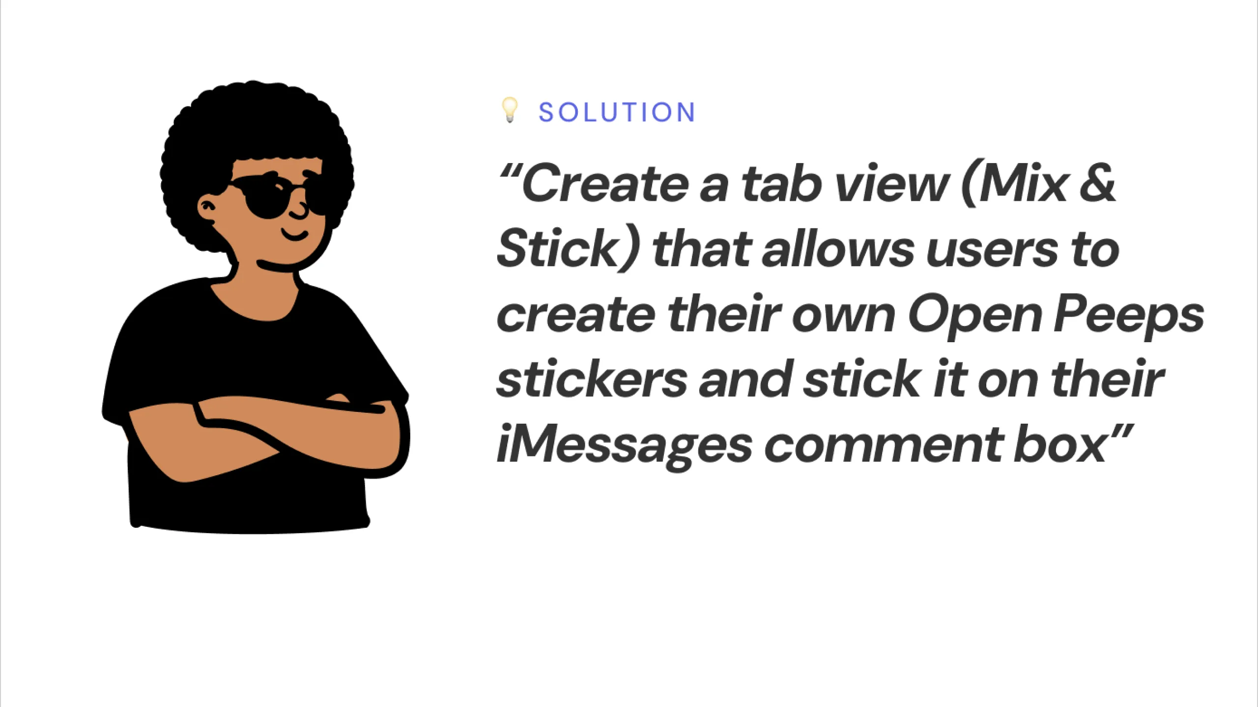
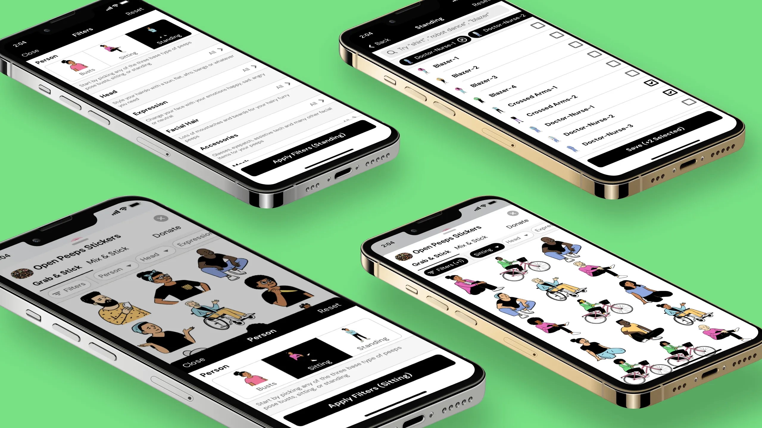
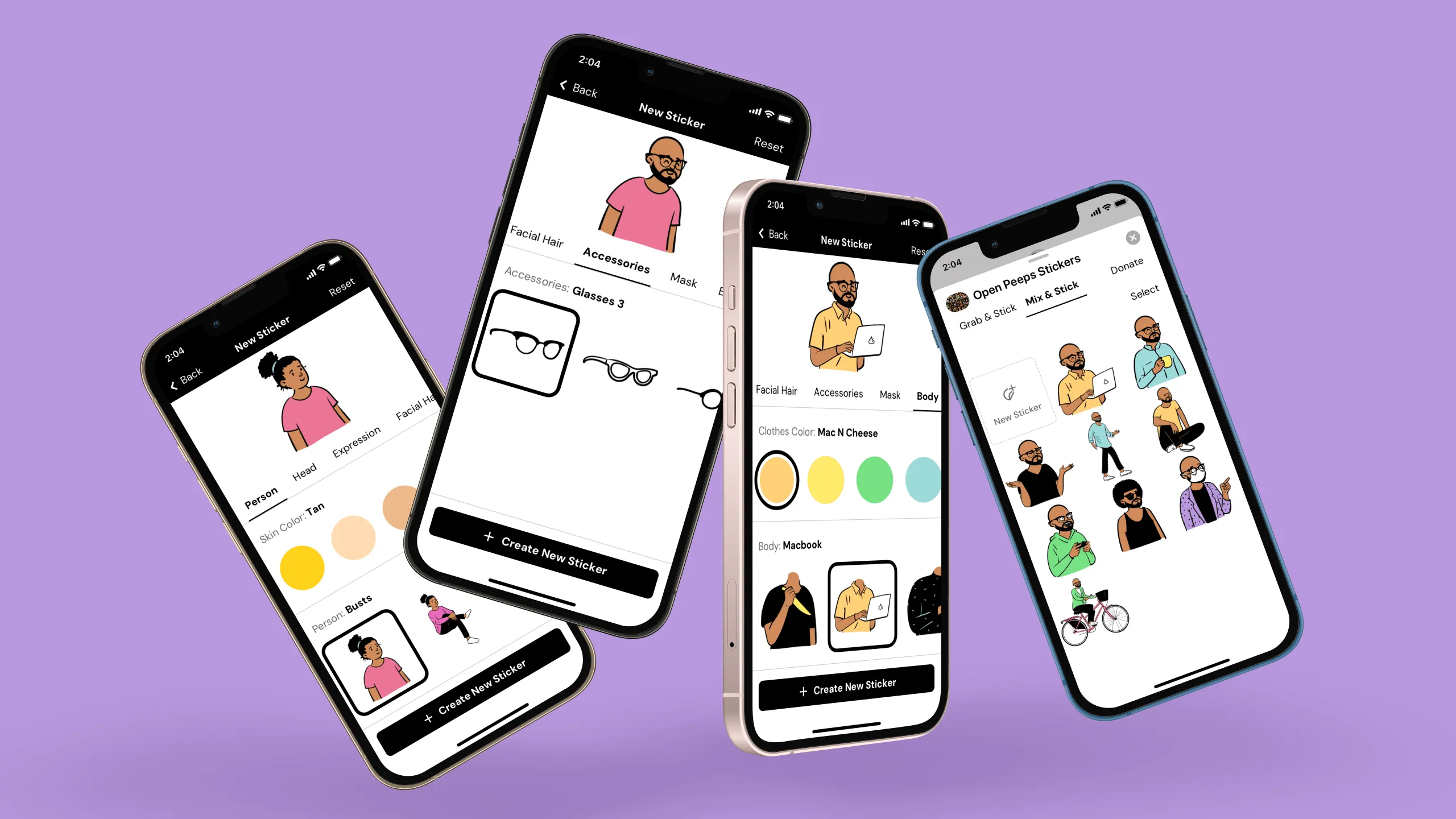
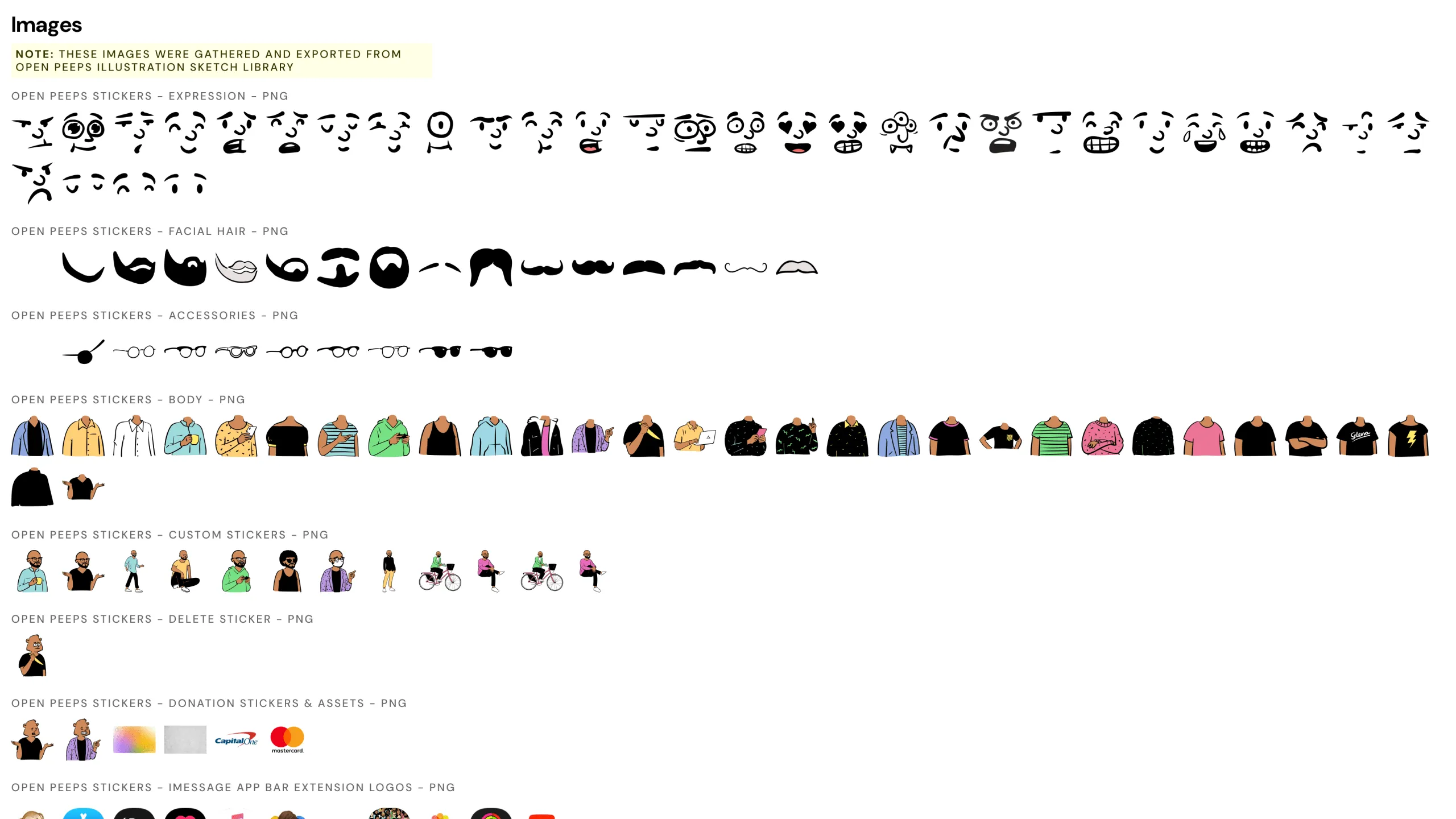
I wanted to understand how flexible the premade stickers are, so I tested how you can change things like facial expressions, outfits, and other traits before sending them in iMessage.

Screenshot of an Open Peeps character with a challenge prompt about changing premade sticker traits.
Screenshot of an Open Peeps character with a solution prompt about using filter chips for character traits.Screenshot of the Grab & Stick screen with filter chips and design annotations.Screenshot of the Master Filter screen mockup with annotated design rationale.Screenshot of the Standing screen mockup with dynamic filtering and annotations.Screenshot of Grab & Stick screen with individual character part filters and annotations.Screenshot of Grab & Stick screen with a bottom sheet filter drawer and annotations.

Creating custom stickers

I tried making my own stickers from scratch using the customization tools. It was fun to play around with the different parts and see how easily I could create a totally new character.

Screenshot of an Open Peeps character with a design challenge prompt about creating custom stickers for iMessage.
Screenshot of an Open Peeps character with a solution prompt about the Mix & Stick tab concept.Screenshot of an empty state UI mockup for new users in the Mix & Stick tab, with design annotations.Screenshot of the New Stickers creation screen with design annotations.Screenshot of the Mix & Stick tab for returning users, displaying saved stickers with design annotations.

Editing custom stickers

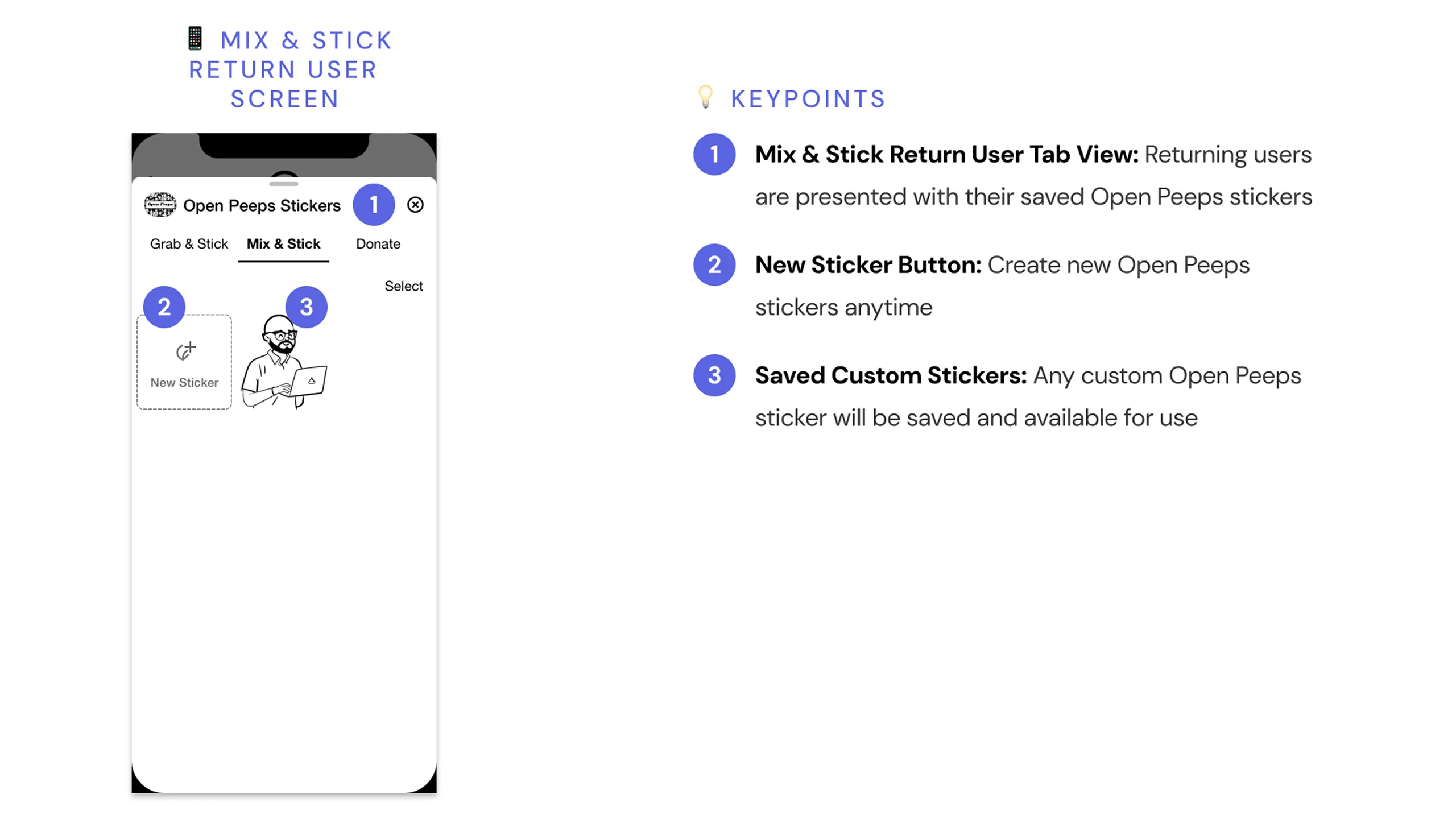
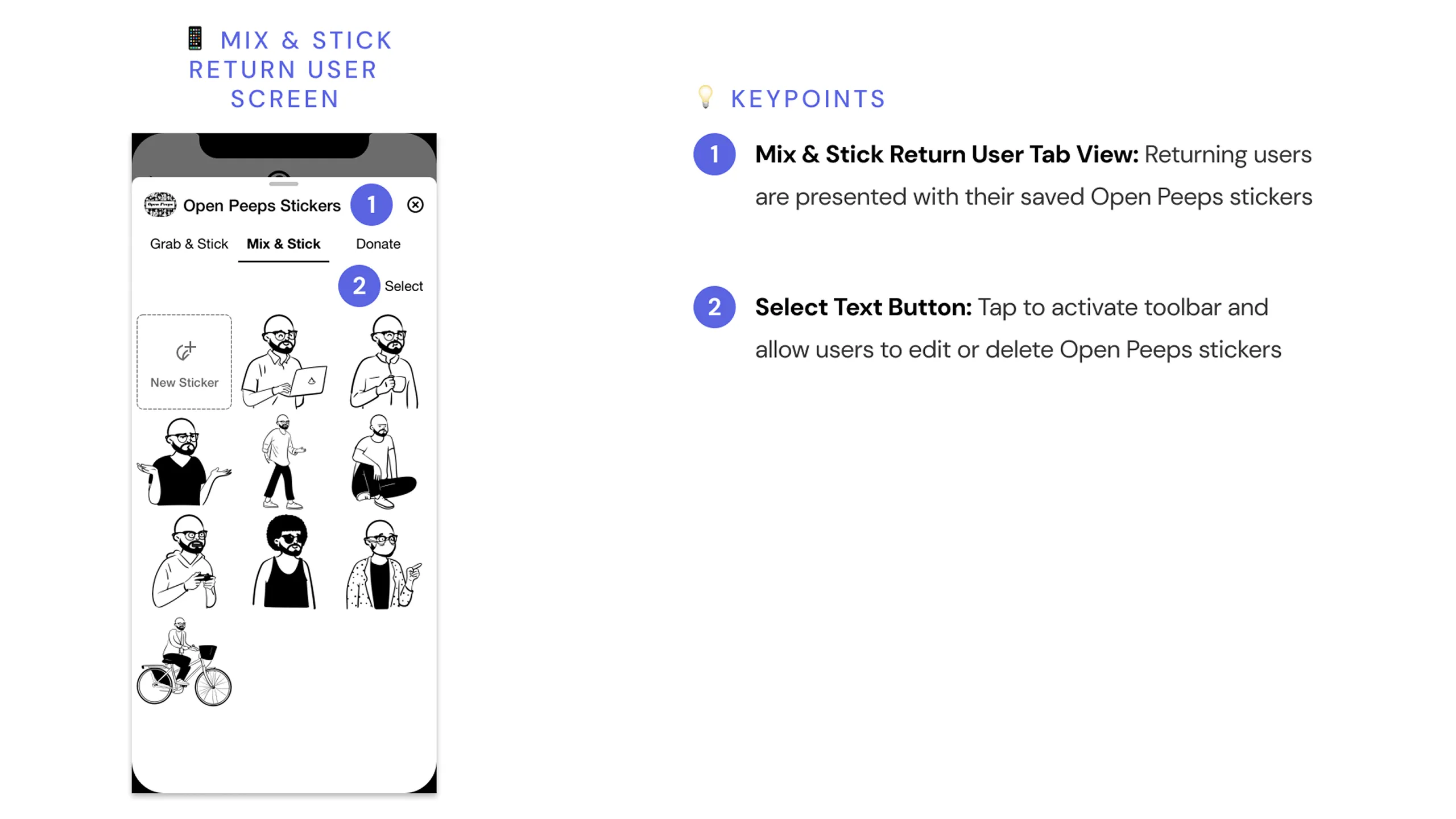
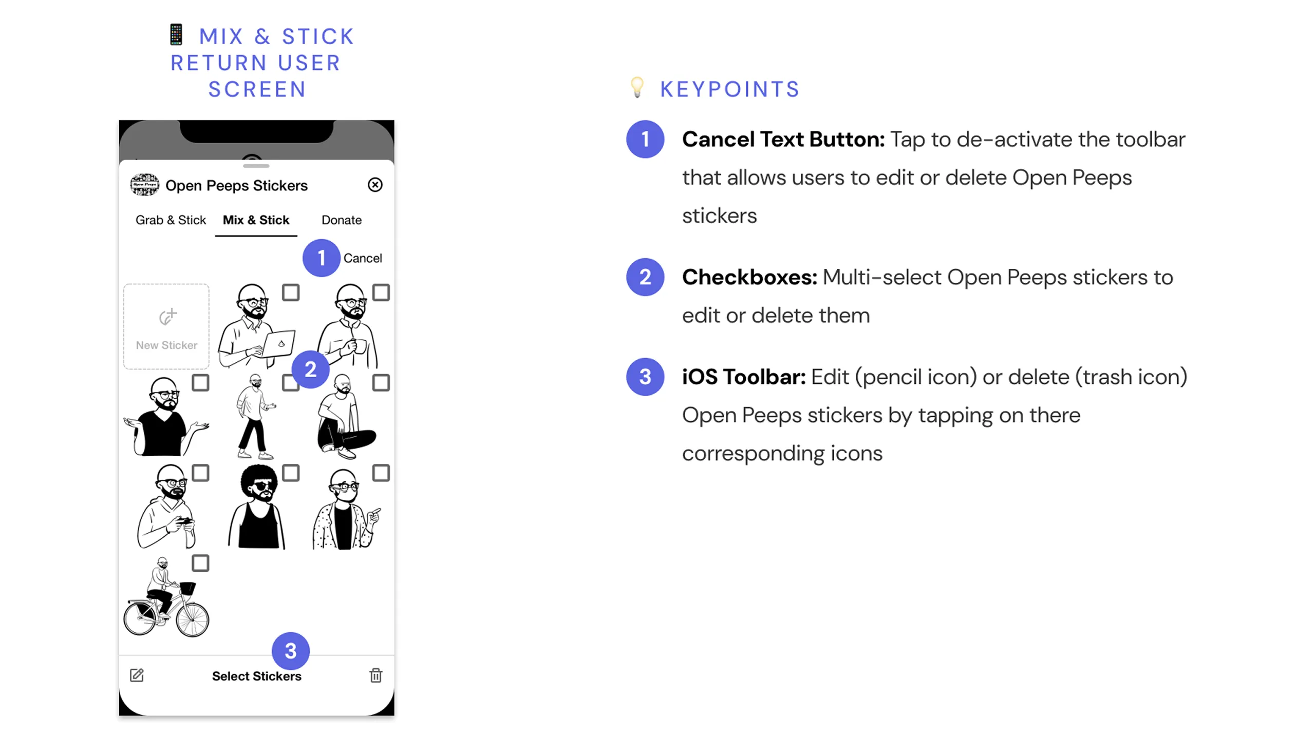
I also looked into how easy it is to go back and tweak a custom sticker I’d already made. I tested editing features to see if I could change details without starting over.

Screenshot of an Open Peeps character asking how to edit custom stickers for iMessage.
Screenshot of an Open Peeps character proposing a toolbar for selecting, editing, or deleting stickers.Screenshot of the Mix & Stick tab for returning users showing a list of their custom stickers with design annotations.Screenshot of the Mix & Stick tab in edit mode with checkboxes, toolbar actions, and annotations.

Supporting Open Peeps stickers

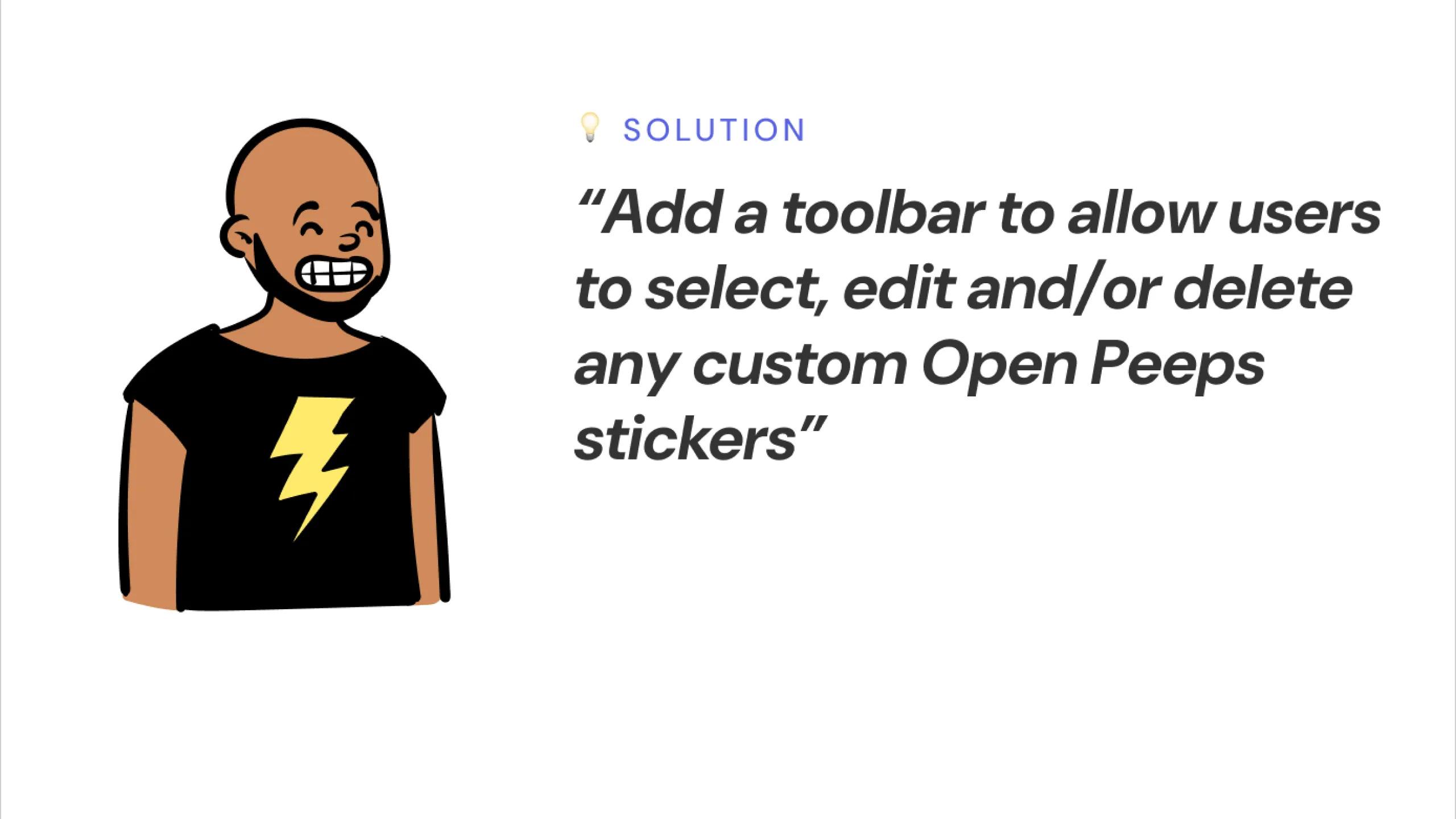
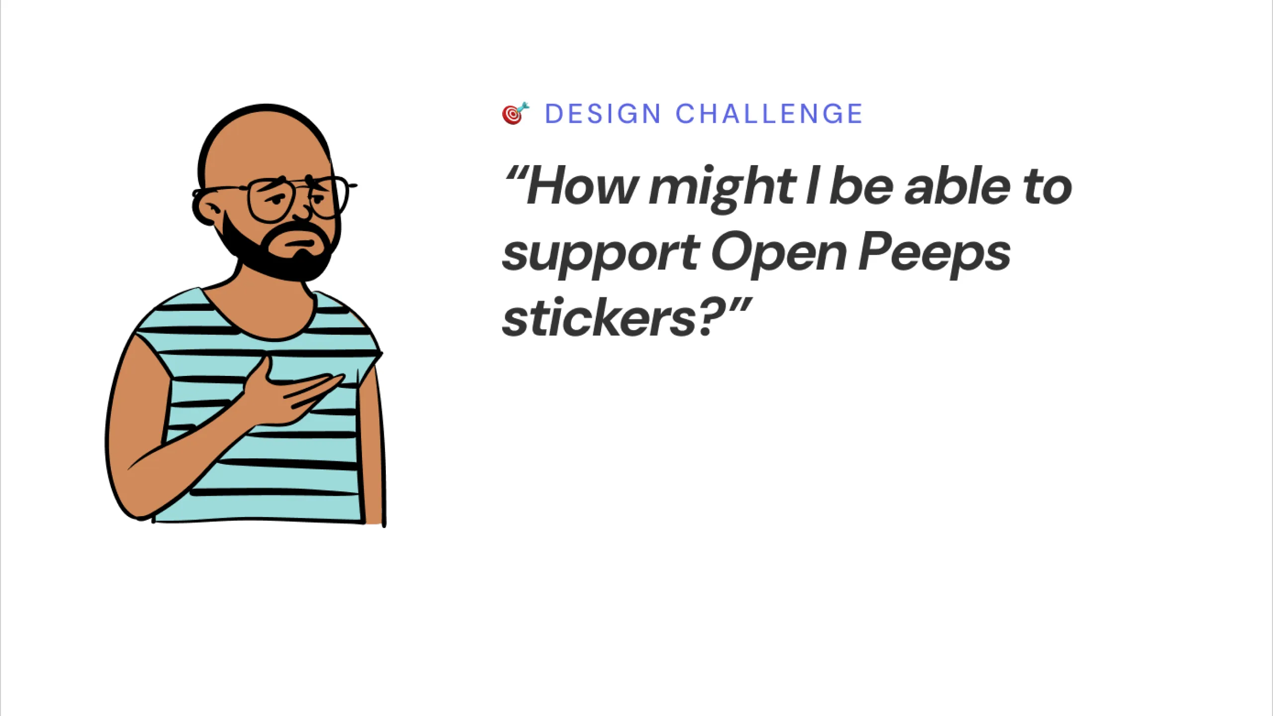
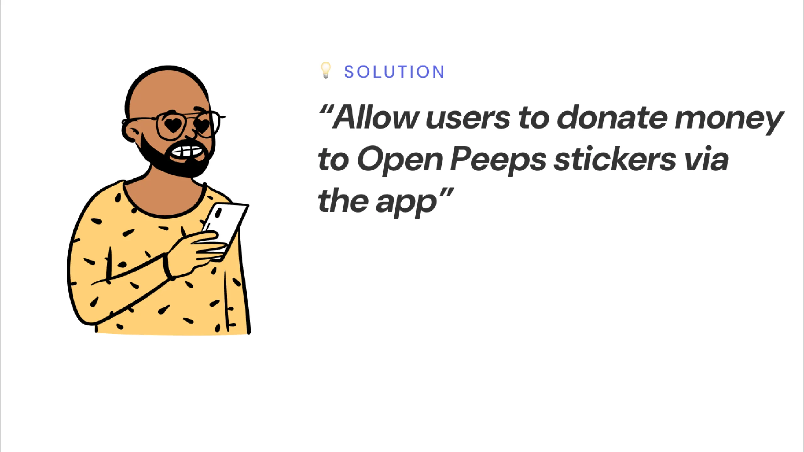
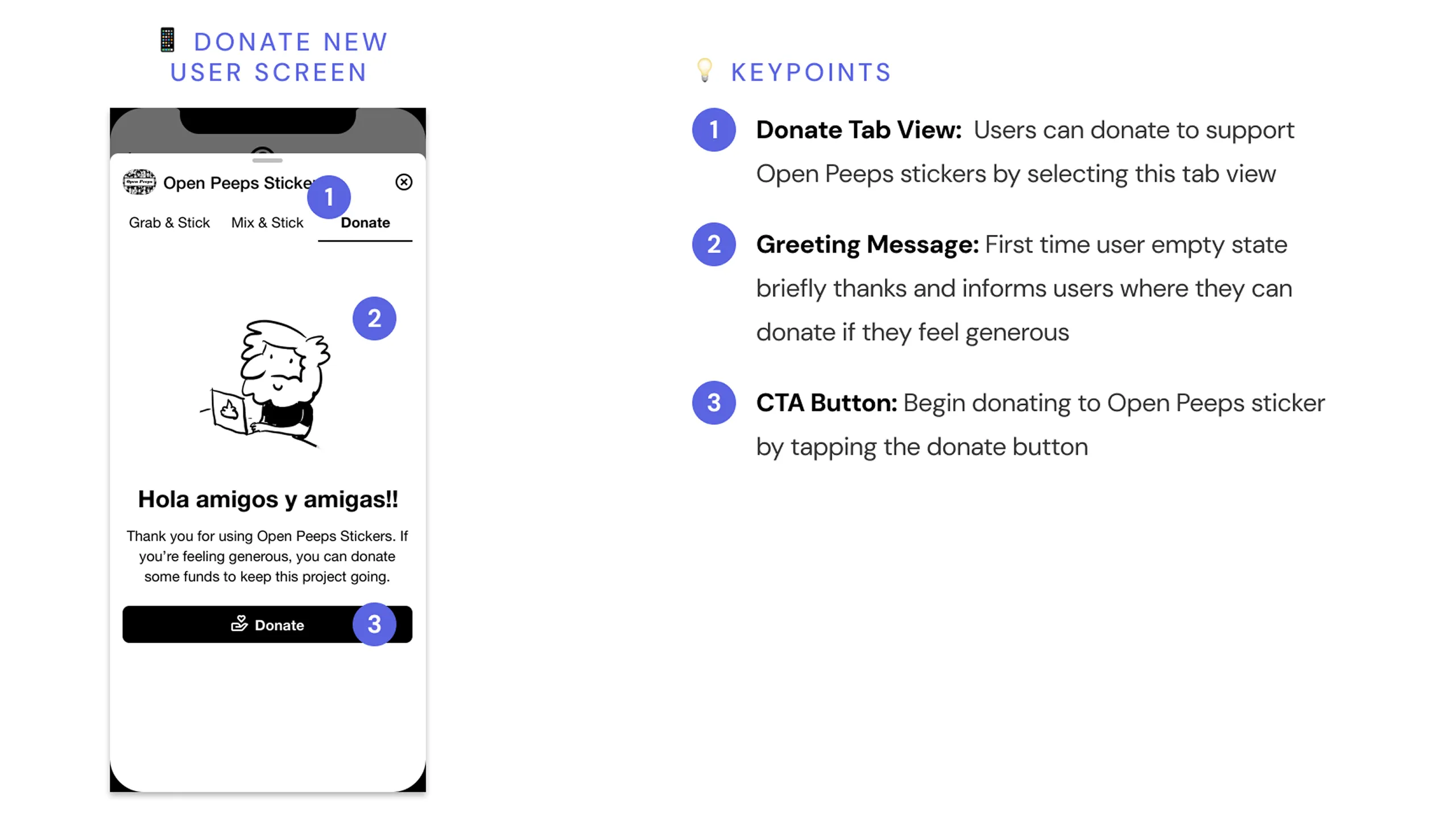
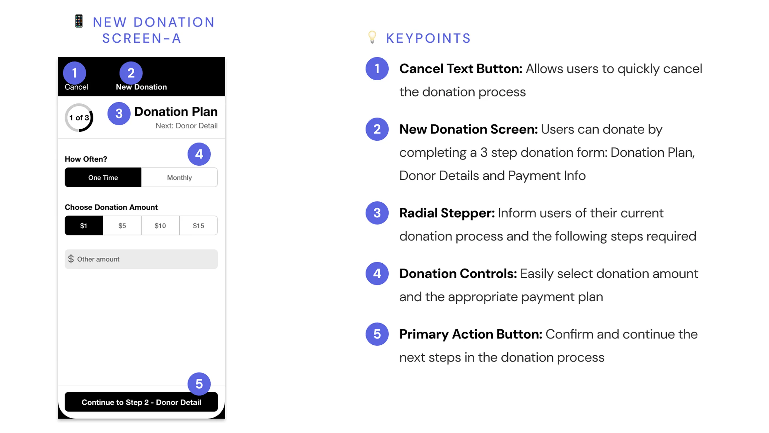
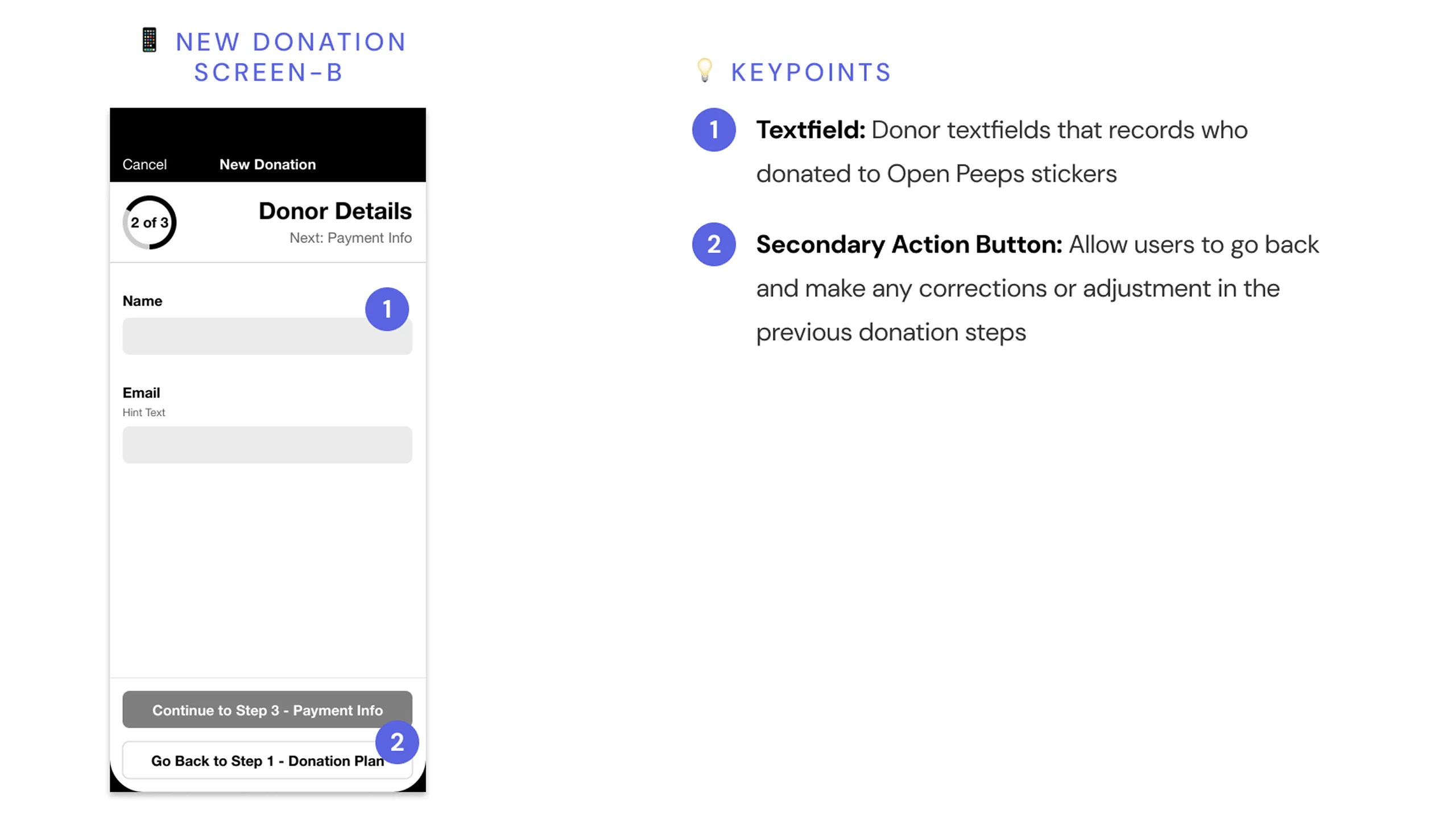
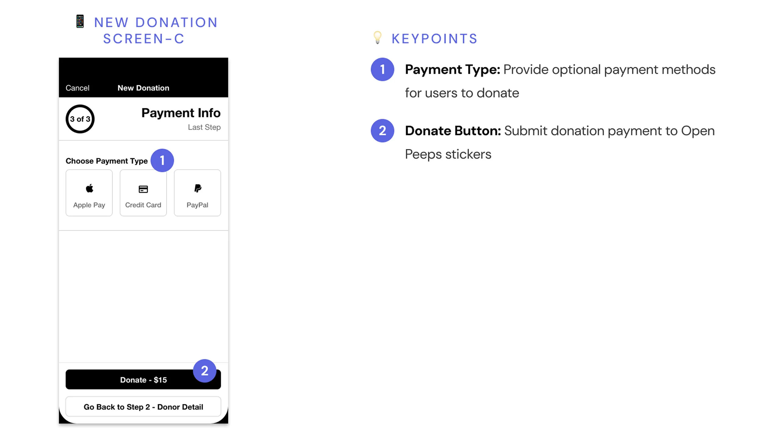
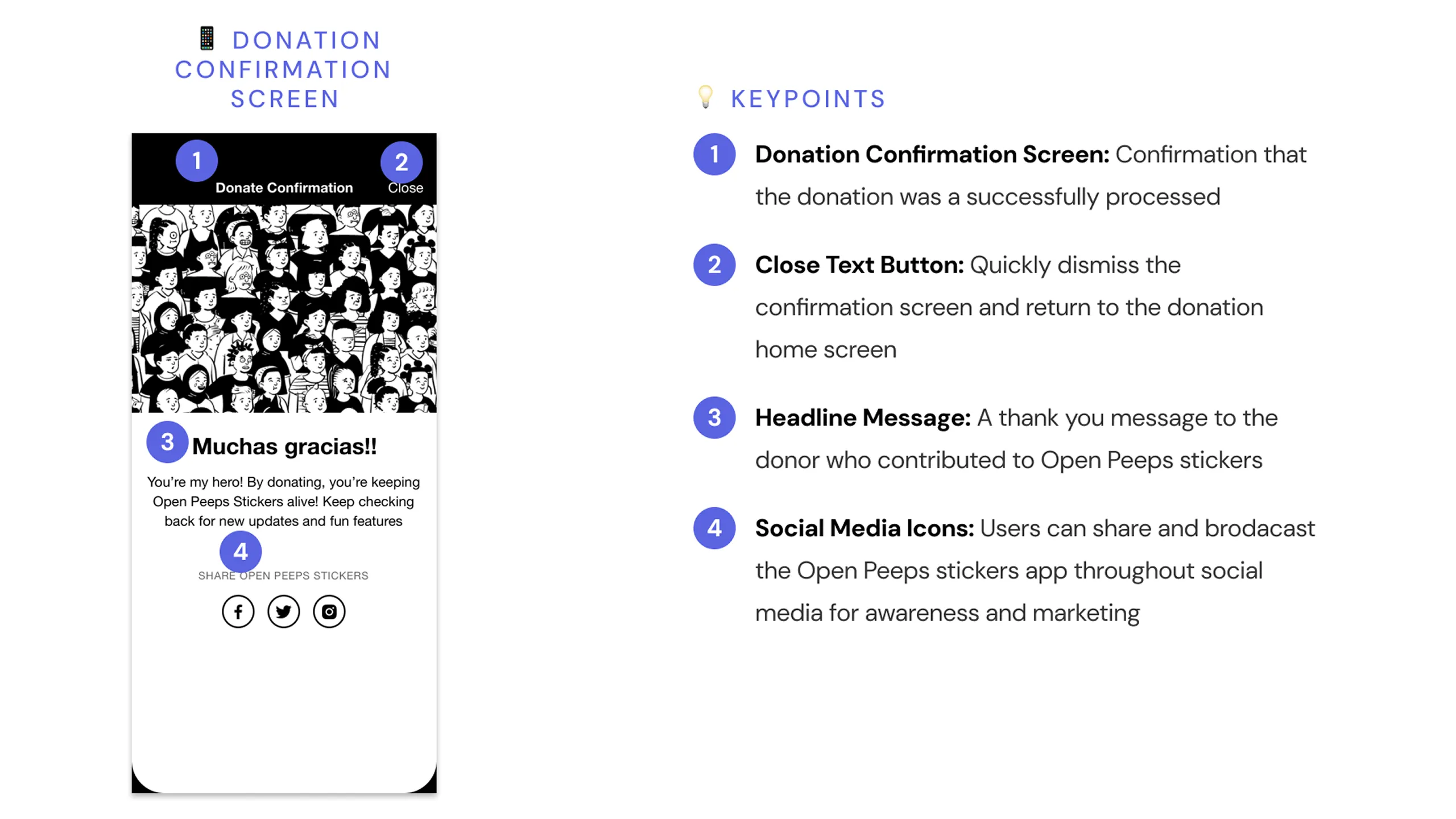
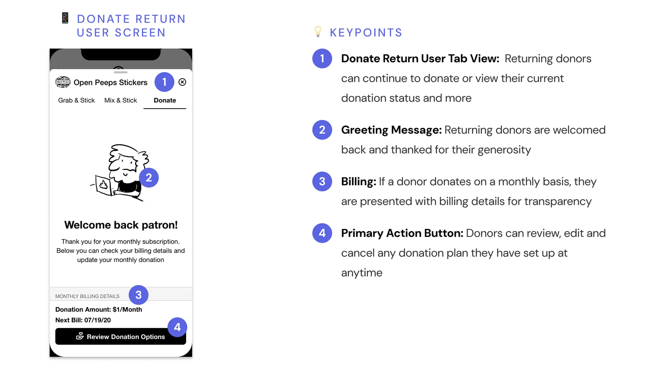
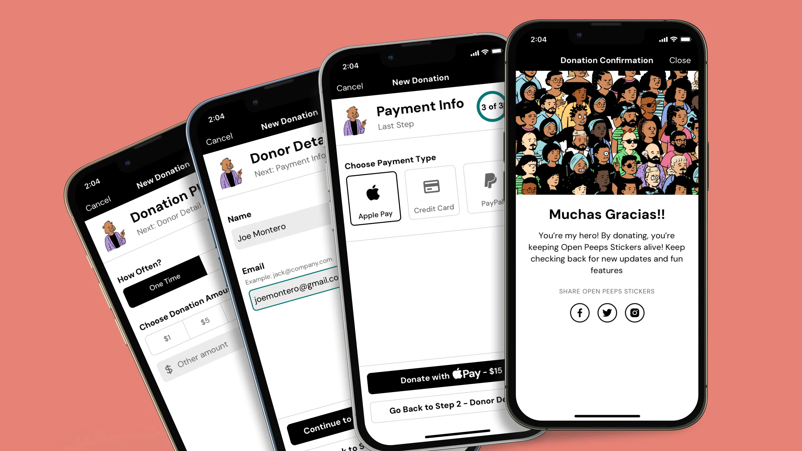
Lastly, I explored how people can support the project whether that’s by donating, sharing it with friends, leaving a review, or even contributing to the Open Peeps community online.

Screenshot of an Open Peeps character asking how to support Open Peeps Stickers.
Screenshot of an Open Peeps character suggesting users donate through the app.Screenshot of the Donate tab for new users prompting them to contribute, with annotated design rationale.Screenshot of the Donation Plan step prompting users to select frequency and amount, with annotations.Screenshot of the Donation Details step prompting users to enter name and email, with annotations.Screenshot of the Payment Info step prompting users to select a payment method, with annotations.Screenshot of the donation confirmation screen with thank-you message and social media share icons.Screenshot of the Donate tab for returning users showing donation status and CTA to give more.

Usability Testing (Lo-Fi)

Validating the core experience

After designing the wireframes, I created interactive prototypes using Sketch’s built-in tools and tested them on an actual iPhone X using Sketch Mirror to simulate a real user experience. I reached out to five frequent emoji and sticker users to try out the main flows: using pre-made stickers, customizing characters, and donating.

All users completed each task with some minor confusion that came from the low-fidelity visuals (which was expected). In the end, the concept tested well, and the core flows felt intuitive and fun to use.

Screenshot of a YouTube thumbnail showing the wireframe taskflow for adding a premade Open Peeps Sticker in iMessage.

High-Fidelity Design

Bringing the product to life

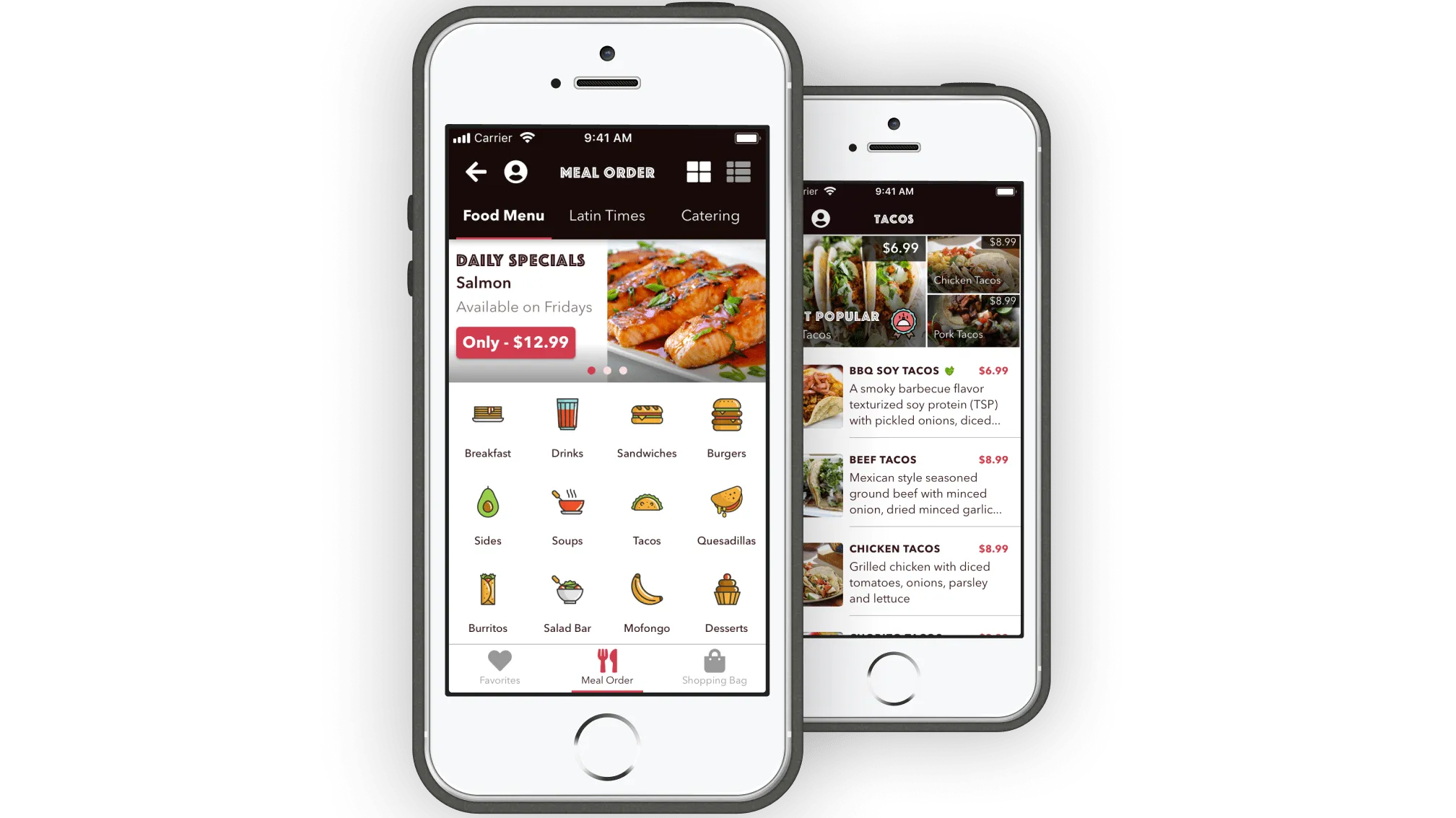
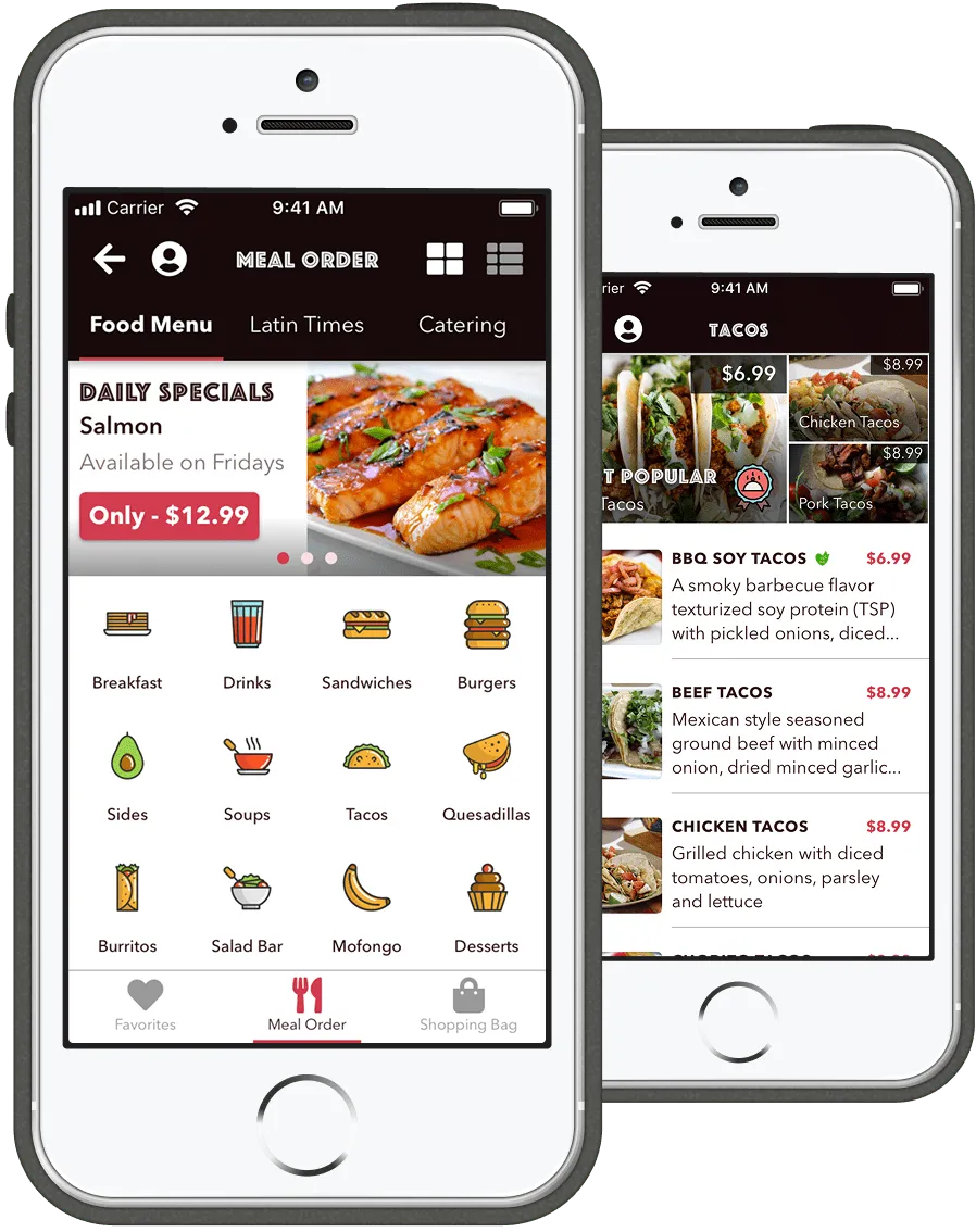
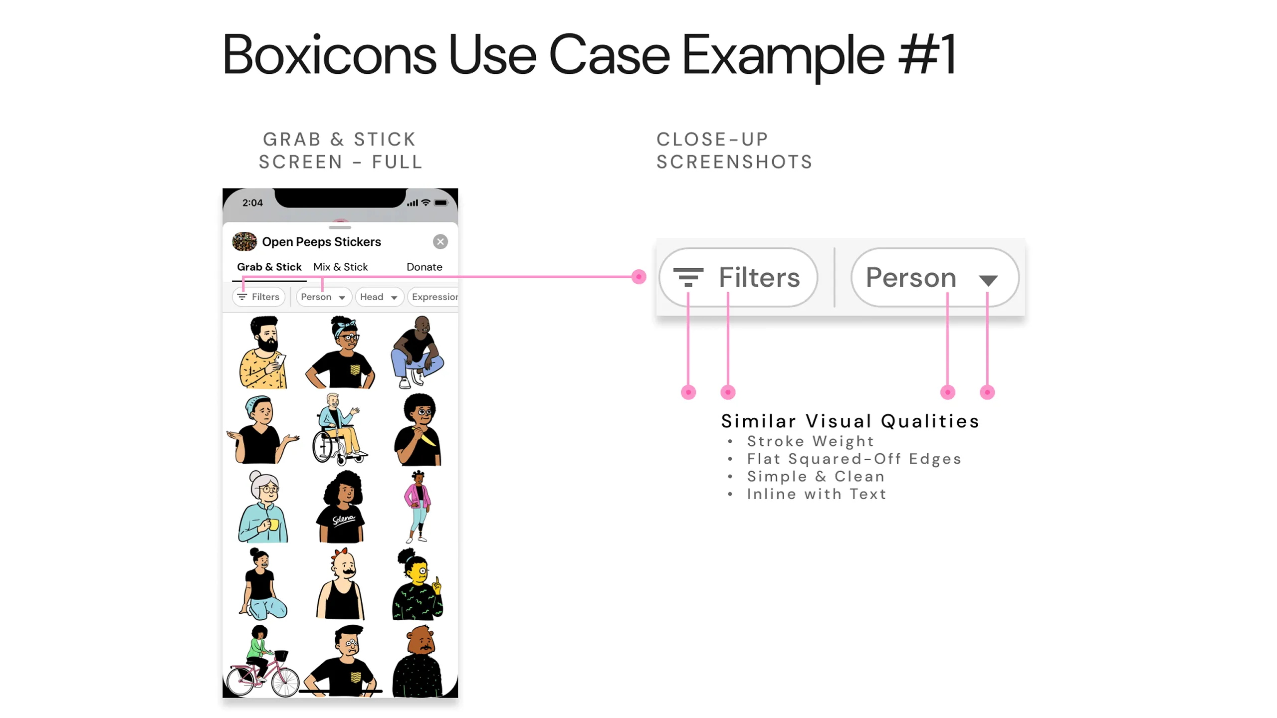
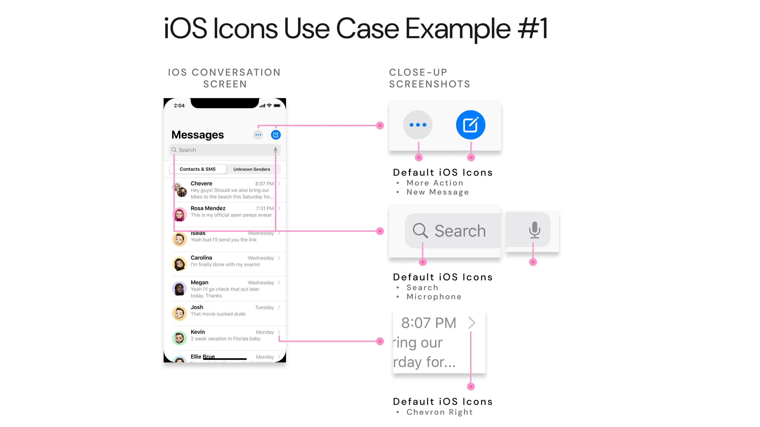
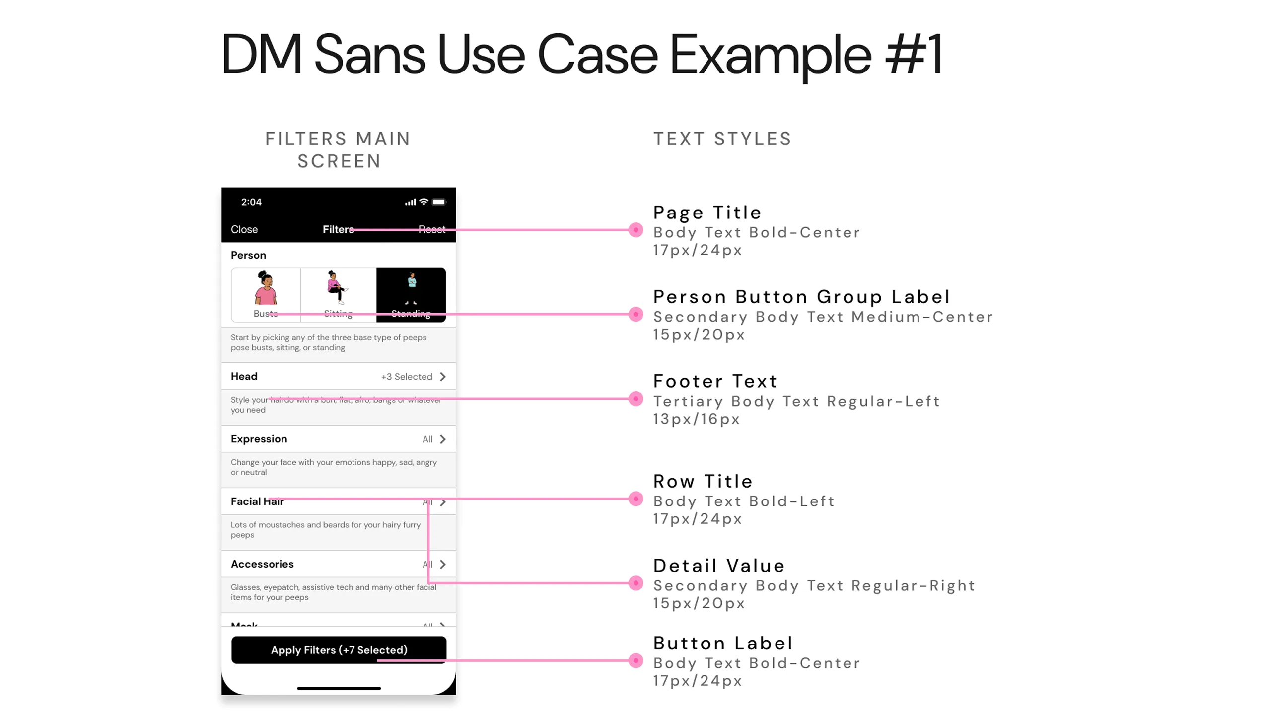
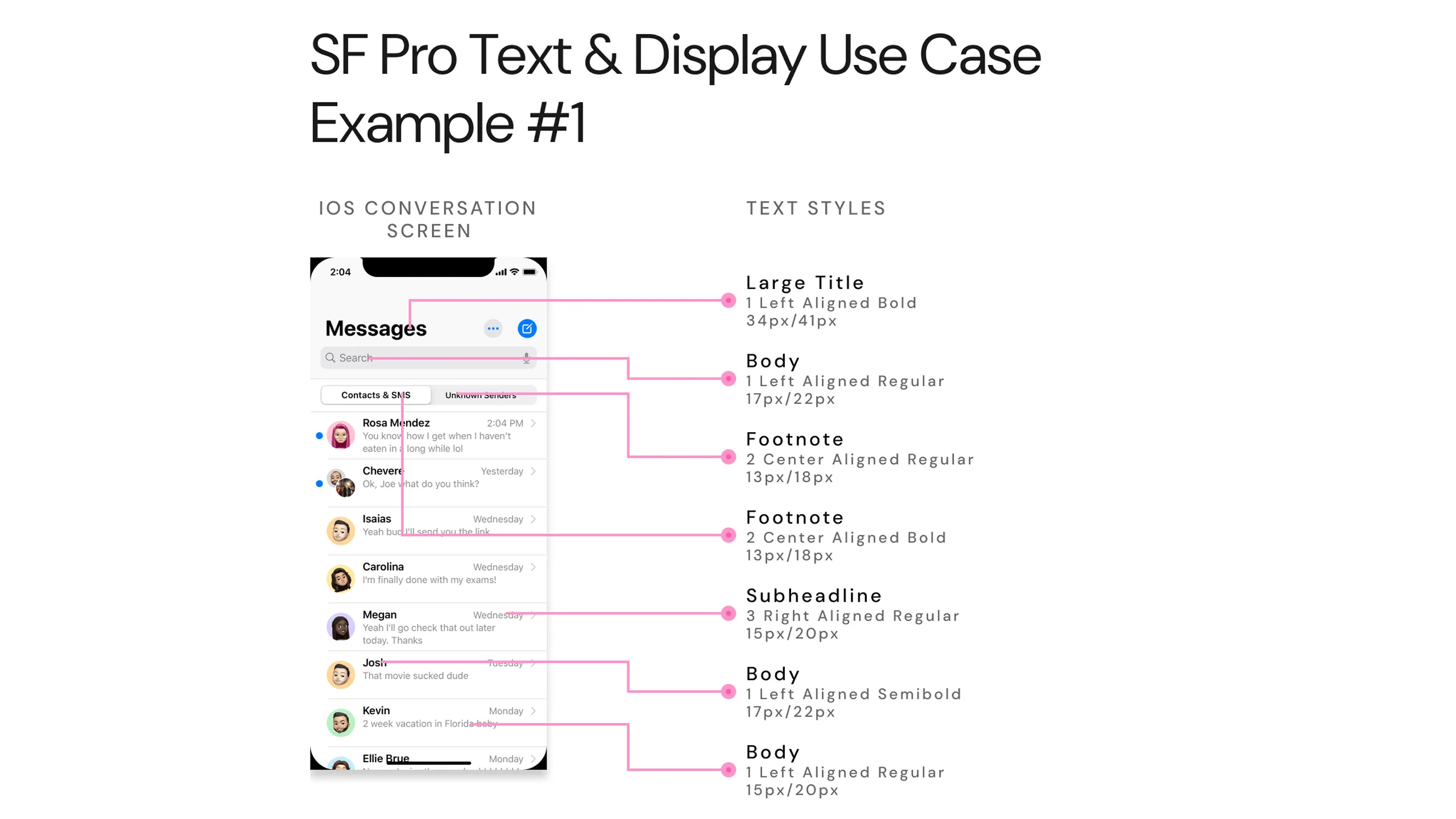
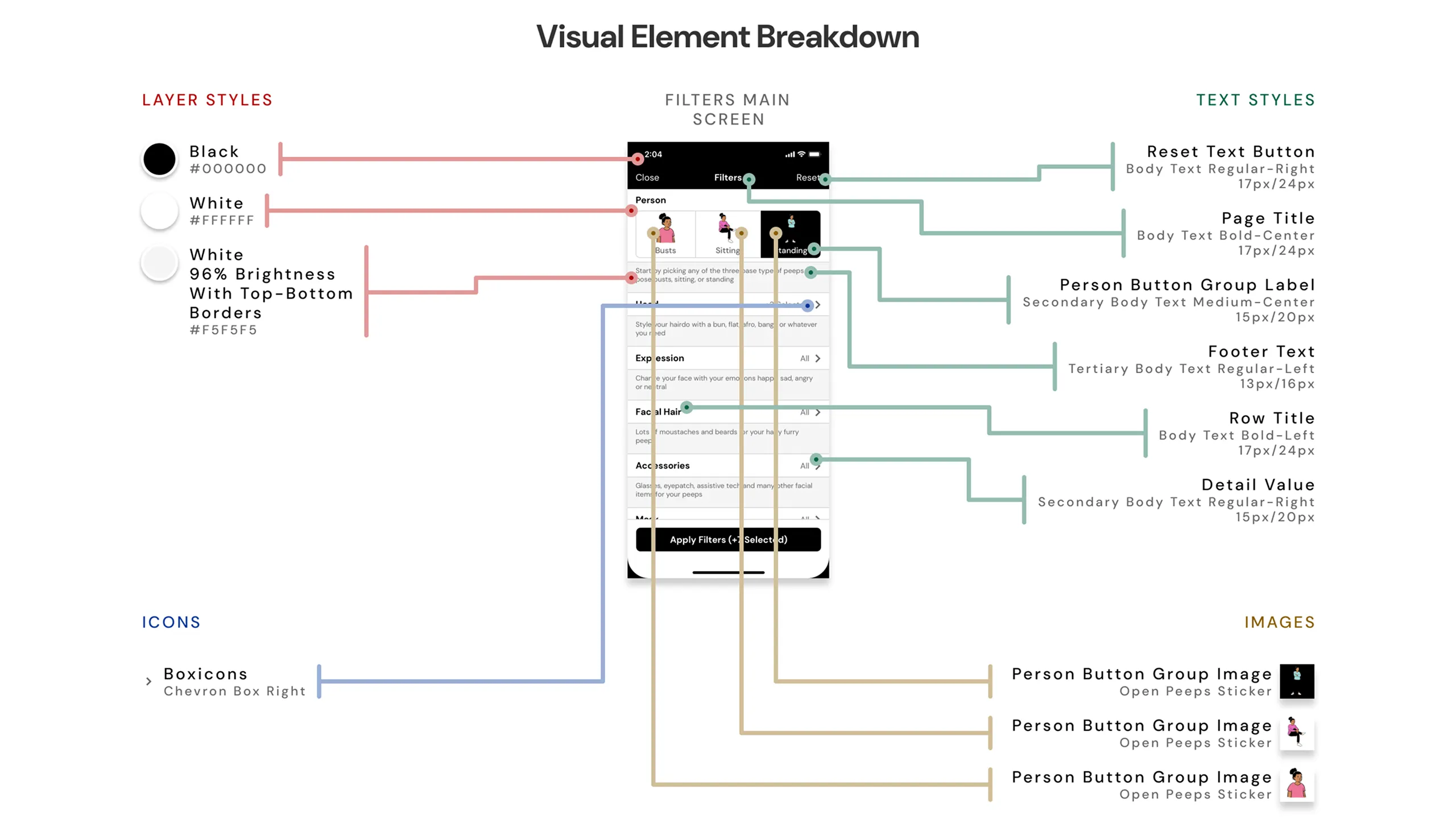
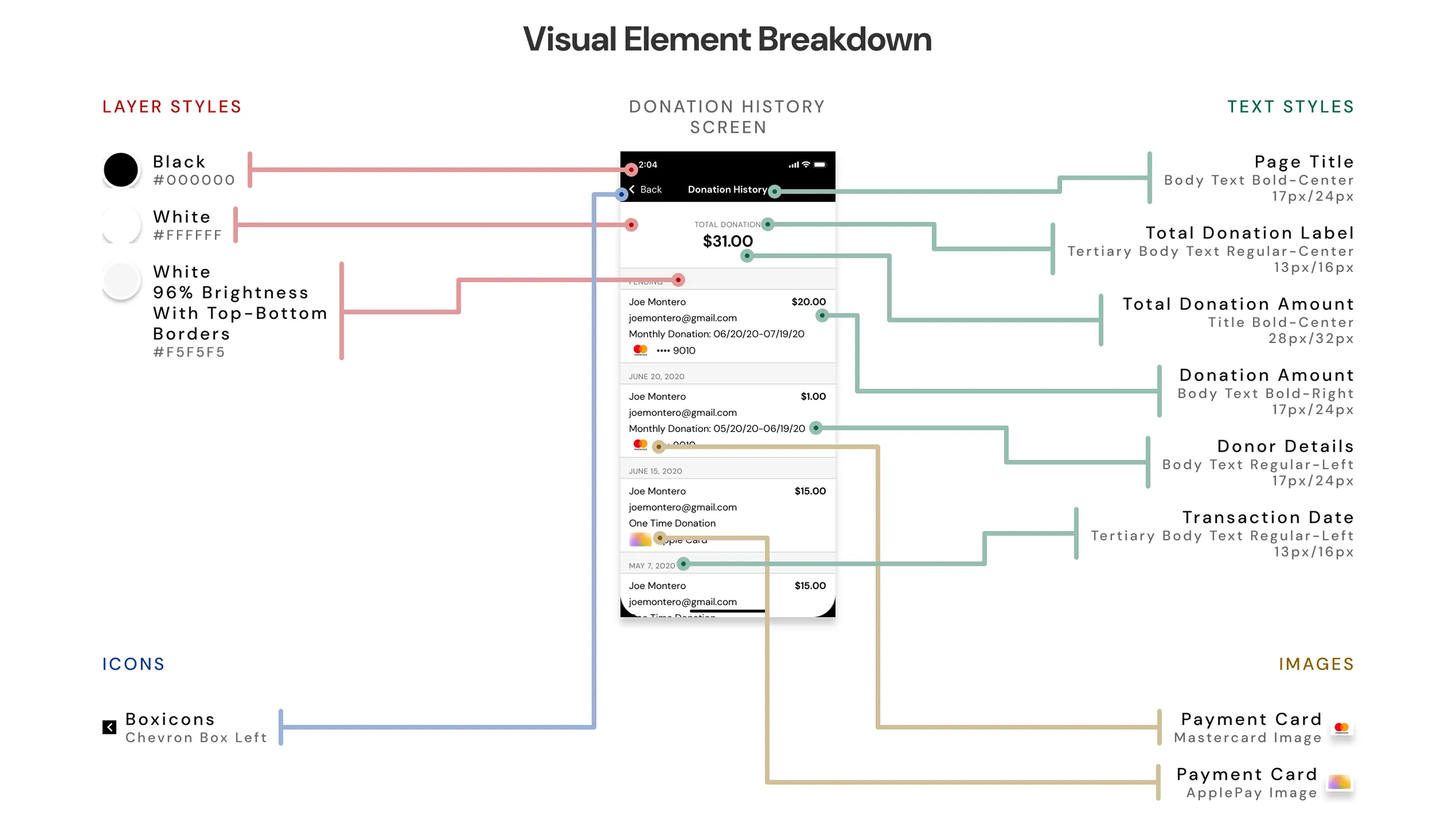
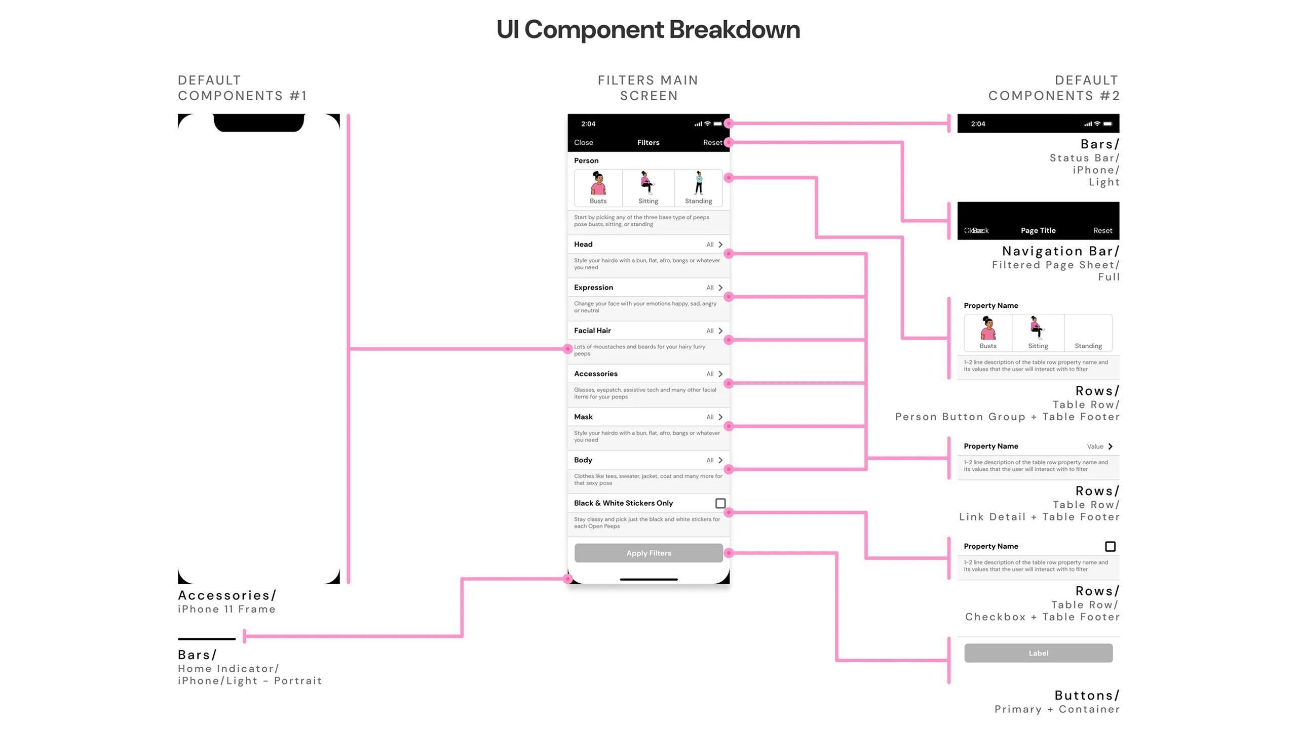
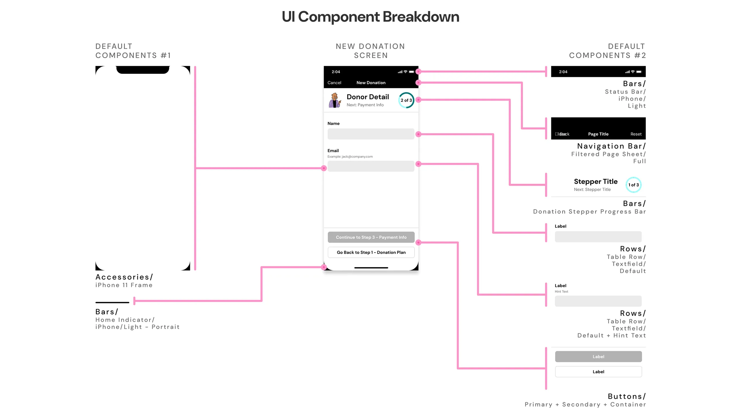
With the foundation in place, I moved on to designing high-fidelity mockups. The final UI featured a clean layout, easy-to-read typography, and the vibrant, playful illustrations from Open Peeps.

Screenshot of a visually striking collage of Open Peeps Stickers app design mockups shown in an angled layout, arranged in a hero-style presentation.
Screenshot of desktop and two mobile mockups of the Open Peeps Illustration website, modified to include a prominent CTA to download Open Peeps Stickers.Screenshot of tablet and two mobile design mockups advertising Open Peeps Stickers on the Apple App Store product page.Screenshot of three mobile mockups showing Open Peeps Stickers app’s tab views: Grab & Stick (premade stickers), Mix & Stick (custom sticker creation), and Donate.Screenshot of four mobile design mockups from Open Peeps Stickers app, showcasing different screens and controls for filtering character parts.Screenshot of four mobile mockups showing the taskflow for creating a custom Open Peeps Sticker, including selecting character parts and viewing the final sticker list.Screenshot of four mobile design mockups for the Open Peeps Stickers app showing the user flow for completing a one-time donation payment.

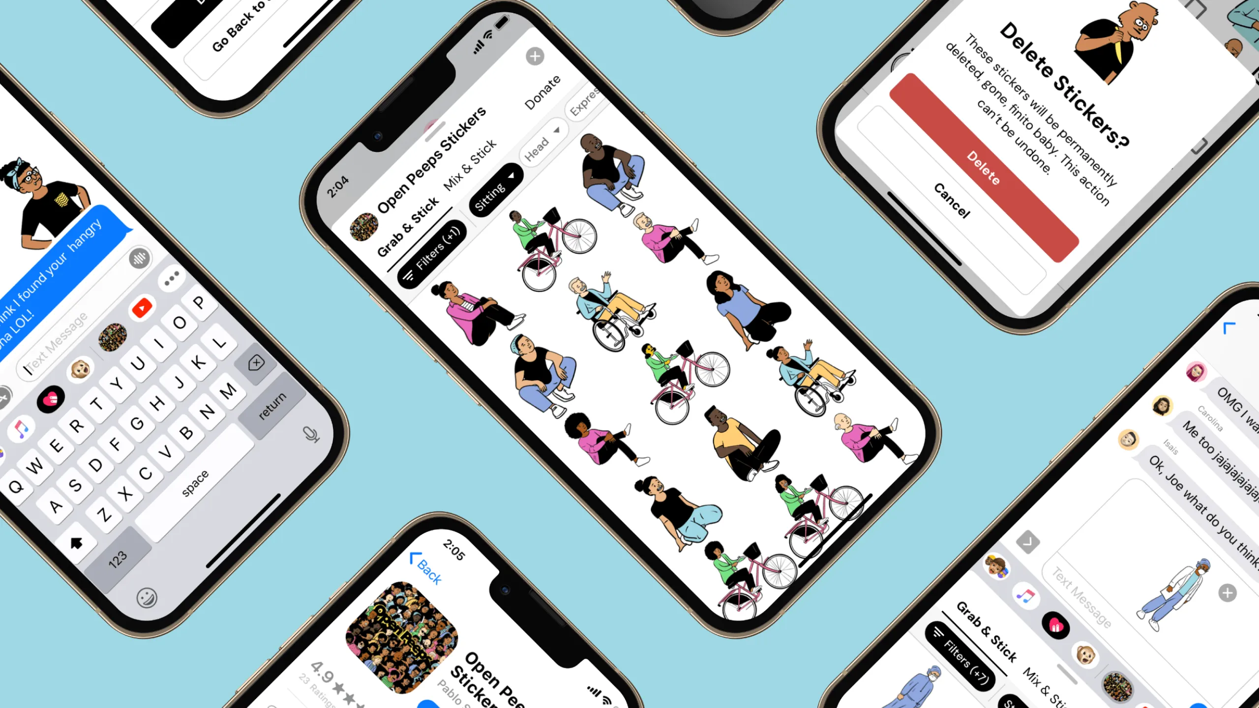
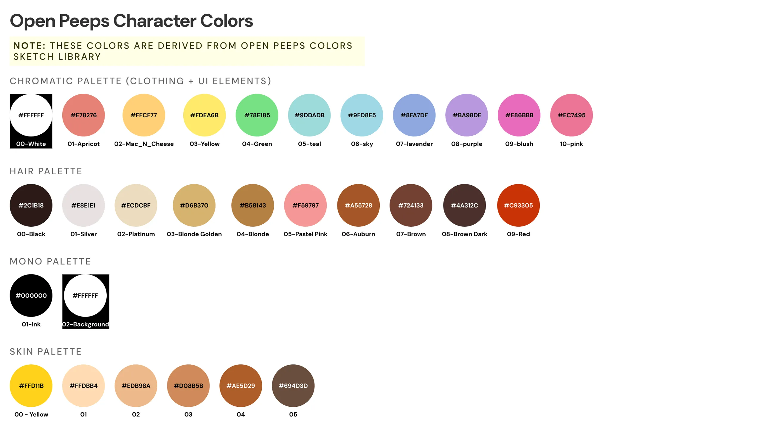
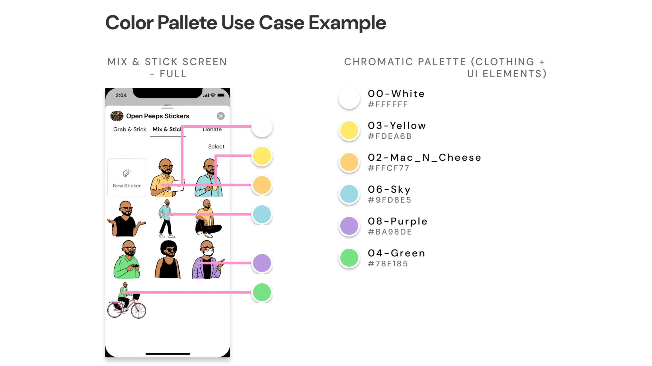
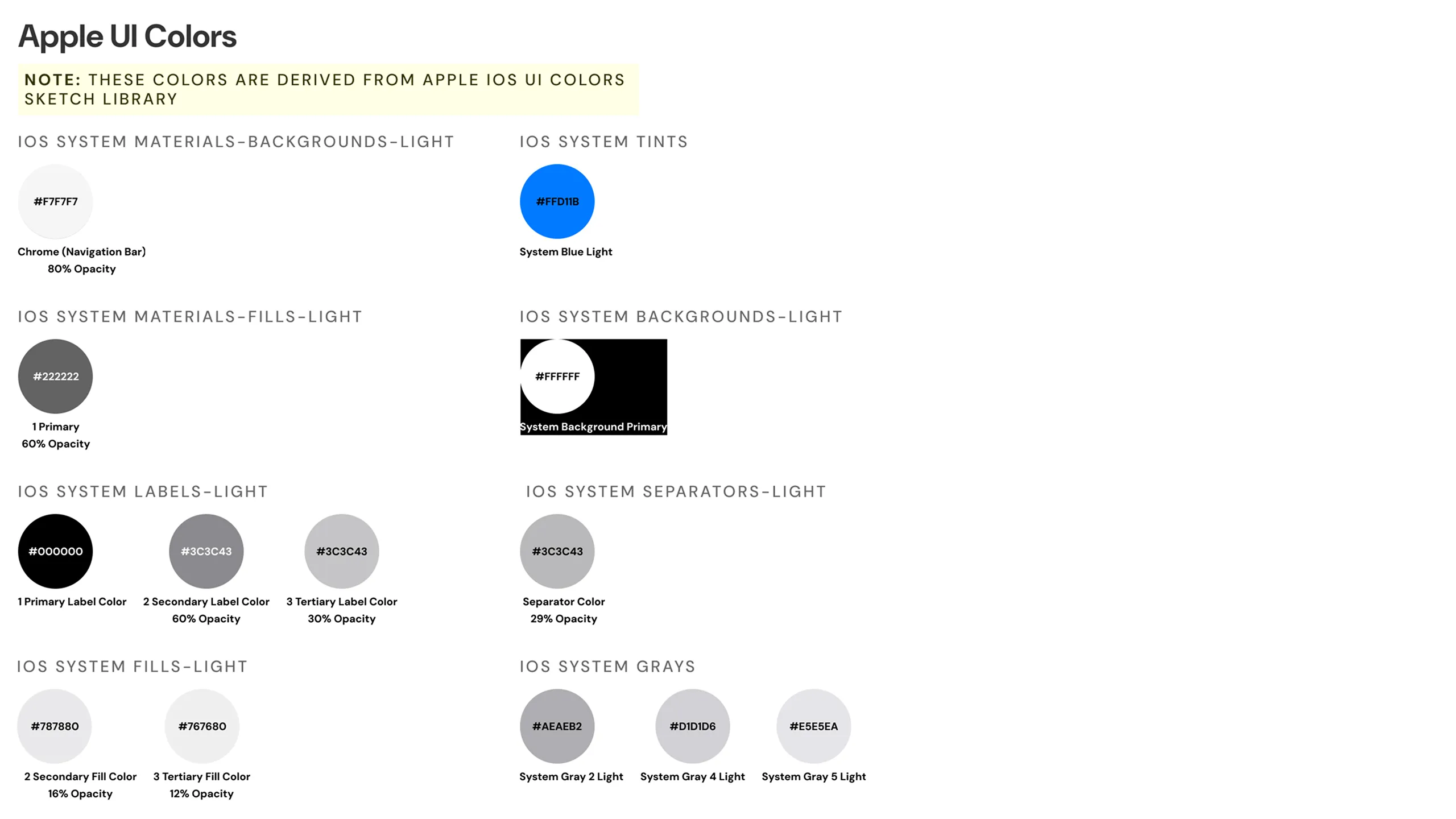
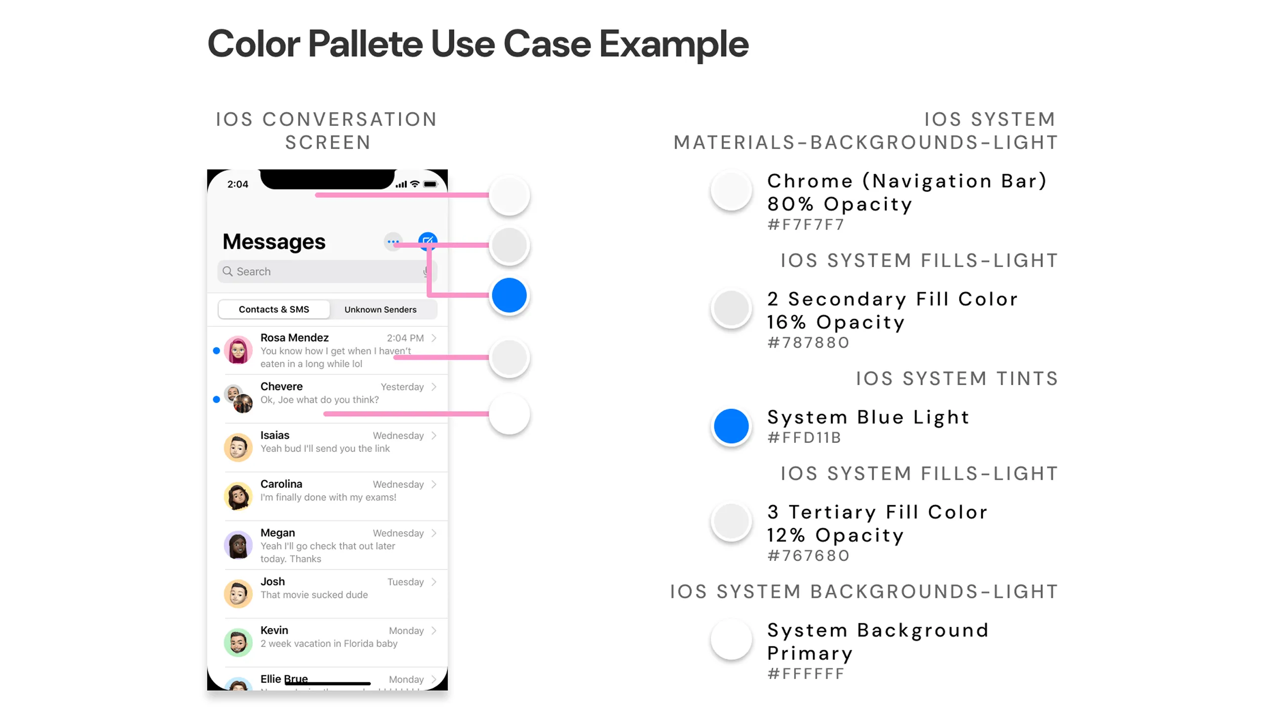
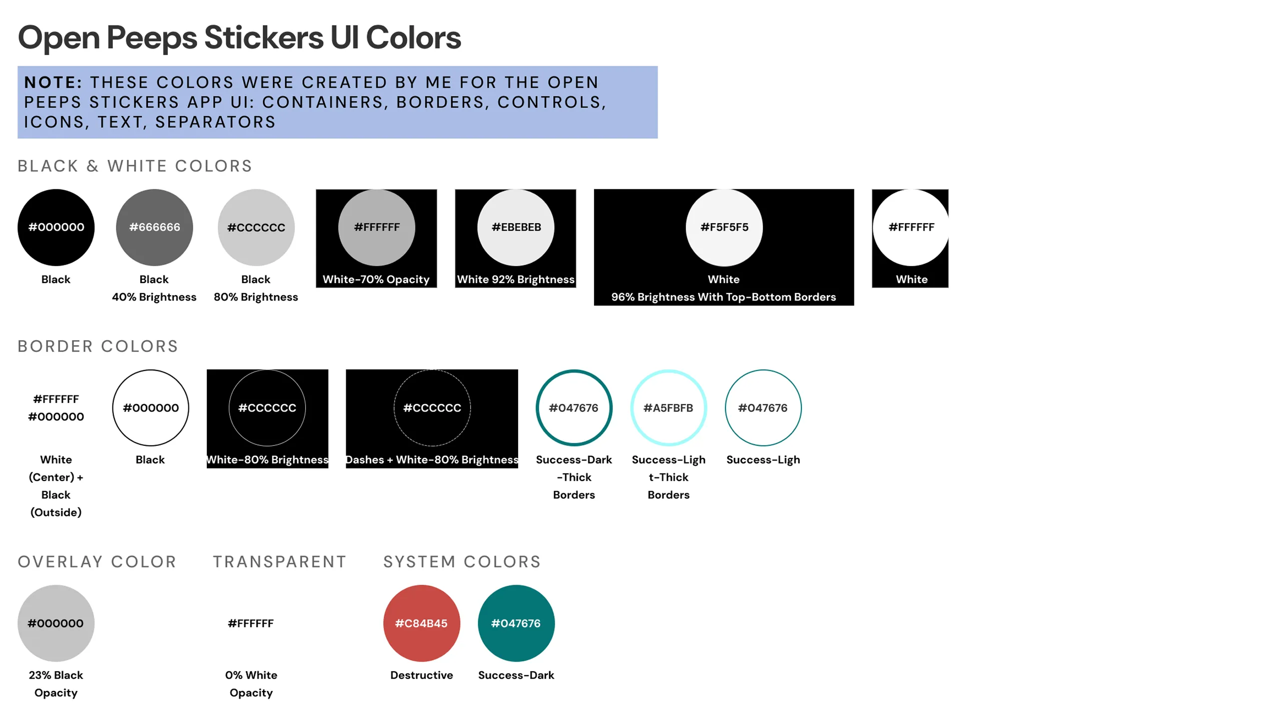
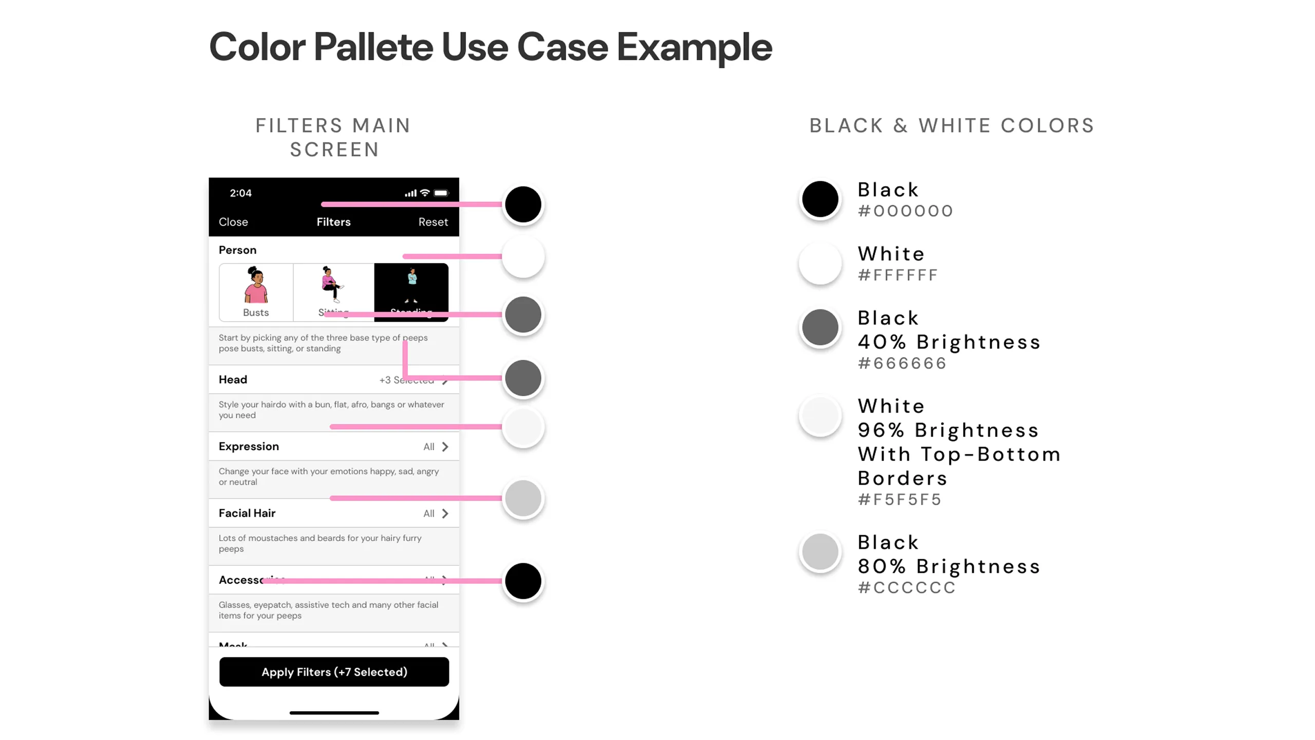
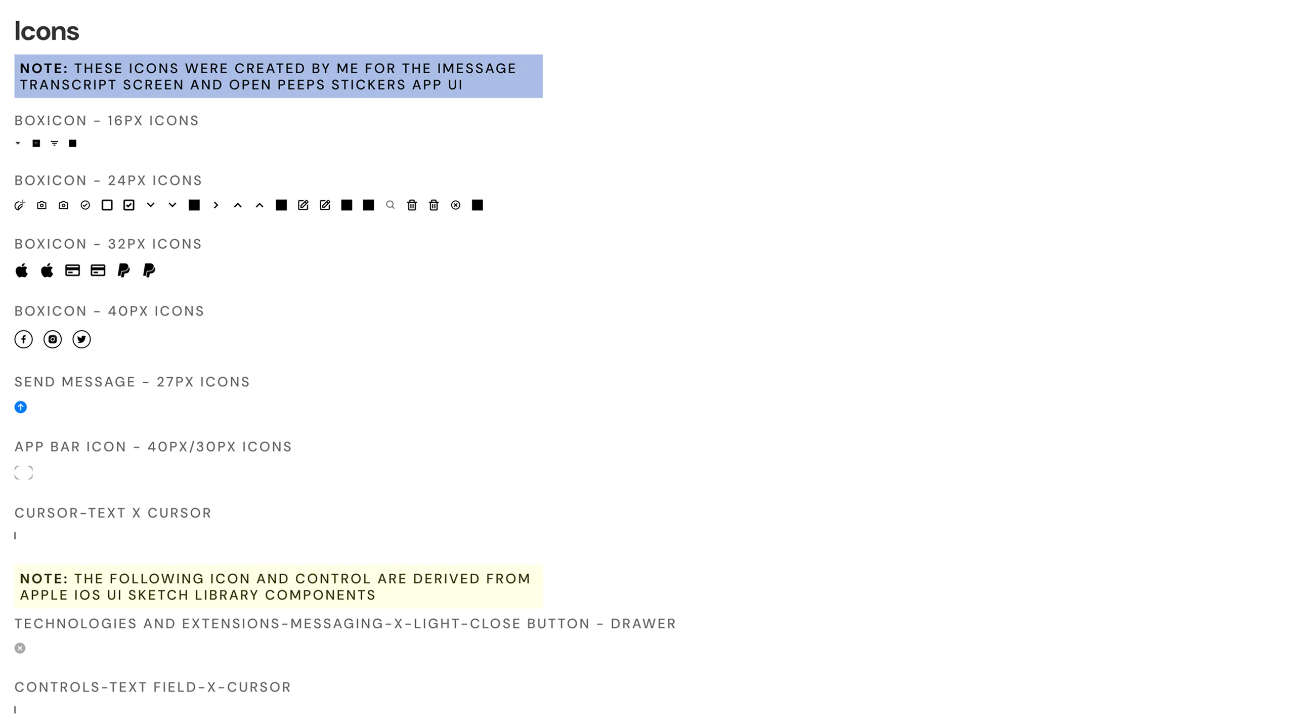
At the same time, I created a mini design system in Sketch using reusable symbols and styles to keep everything consistent and scalable. The overall goal was to make the interface feel cheerful, expressive, and a little bit silly.

Screenshot of Open Peeps character color guide for clothing, hair, skin, and UI.
Screenshot of Mix & Stick screen mockup using Open Peeps colors, with annotations.Screenshot of Apple UI color palette for backgrounds, labels, and UI elements.Screenshot of iOS message screen mockup using Apple UI colors, with annotations.Screenshot of a custom Open Peeps Stickers UI color guide for elements like borders, overlays, and icons.Screenshot of filter screen mockup using custom UI color palette with annotations.Screenshot of boxicons component set used in app UI and message screen.Screenshot of Grab & Stick mockup with boxicons applied and annotated.Screenshot of iOS message screen with default Apple UI icons in use.Screenshots of image sets exported and modified from Open Peeps Sketch Library.Screenshots of additional image sets exported and modified from Open Peeps Sketch Library.Screenshots of additional image sets exported and modified from Open Peeps Sketch Library.Screenshots of additional image sets exported and modified from Open Peeps Sketch Library.Screenshot showing DM Sans used across various UI text elements, with annotations.Screenshot showing SF Pro Display and Text used in an iOS message mockup.Screenshot of visual breakdown of styles, icons, text, and images for the filters screen.Screenshot of donation history screen with annotated visual style breakdown.Screenshot of main filters screen showing component breakdown with annotations.Screenshot of donation screen mockup showing component use and annotations.

Usability Testing (Hi-Fi)

Testing the final look & feel

Once the high-fidelity mockup and prototype were ready, I ran another round of user testing this time covering the full app experience from start to finish. Each user went through all 15 task flows, from installing the Open Peeps sticker app to sending stickers in iMessage and even donating to Open Peeps. Each flow included different UI states and variations for a more realistic experience.

Results & Next Steps

Where things stand & what’s ahead

The Open Peeps Stickers concept proved both intuitive and engaging:

  • 100% of users completed all key flows (installing, customizing, sharing, and donating) without major friction.
  • The score rating was a 4.6/5, with users calling it fun, personal, and easy to use.
  • A reusable design system with 25+ components was created to support future scalability.
  • User feedback surfaced 3 strong feature ideas, including selfie-based avatar creation and smarter sticker search.

This project reminded me how powerful illustration and play can be in product design. Turning a beloved design asset like Open Peeps into a fun messaging experience combined everything I enjoy about design, UX, and creativity. Next steps include refining the prototype, exploring advanced features, and potentially launching a public beta to gather wider feedback.

Other Projects

See more of my work

Hero image for the Noonan case study, showing two device mockups featuring the app's golf course search screen and in-game play screenHero image for the Noonan case study, showing two device mockups featuring the app's golf course search screen and in-game play screen
Chip component tag labeled “UX Cabin Work” used to categorize case study projects.

Noonan

A redesigned AI-powered golf app with a fresh brand and a smoother, smarter playing experience
responsibilities
Check icon
UX Audit & Improvements
Check icon
Mobile App Redesign
Check icon
New Brand Guideline
Check icon
Design System
View Case Study
Hero image for the YellowHat case study, showcasing an AI-powered web app that helps construction subcontractors evaluate bid documentsHero image for the YellowHat case study, showcasing an AI-powered web app that helps construction subcontractors evaluate bid documents
Chip component tag labeled “UX Cabin Work” used to categorize case study projects.

YellowHat AI

A web app that uses AI to support subcontractors in analyzing and responding to bid opportunities
responsibilities
Check icon
UX/UI Design
Check icon
Design System
Check icon
Prototyping
Check icon
Design QA
View Case Study
Screenshot showing both desktop and mobile views of the Cellulacrum platform, which connects researchers, artists, and supporters to build a strength-based community against cancerScreenshot showing both desktop and mobile views of the Cellulacrum platform, which connects researchers, artists, and supporters to build a strength-based community against cancer
Chip component tag labeled “UX Cabin Work” used to categorize case study projects.

Cellulacrum

A hub connecting researchers, artists, and supporters in a strength-based cancer community
responsibilities
Check icon
Research
Check icon
UX/UI Design
Check icon
Low-Fi Wireframe
Check icon
Responsive Design
View Case Study
Screenshot of the Quadax desktop software, a complex payment remittance and medical billing platformScreenshot of the Quadax desktop software, a complex payment remittance and medical billing platform
Chip component tag labeled “UX Cabin Work” used to categorize case study projects.

Quadax

A platform for managing complex medical billing and payment remittance
responsibilities
Check icon
Research
Check icon
UX/UI Design
Check icon
Prototyping
Check icon
Design System
View Case Study
Hero image for the Moen case study card, featuring the app's home screen and sump pump monitor interface from the redesigned smart irrigation apHero image for the Moen case study card, featuring the app's home screen and sump pump monitor interface from the redesigned smart irrigation ap
Chip component tag labeled “UX Cabin Work” used to categorize case study projects.

Moen

A smart mobile irrigation app redesigned to unify features and support scalable design and testing
responsibilities
Check icon
UI Design
Check icon
Prototyping
Check icon
Component Redesign
Check icon
DS Documentation
View Case Study
Desktop view of the Qi Tissue platform, showing tools that help doctors analyze cancer images and create personalized treatmentsDesktop view of the Qi Tissue platform, showing tools that help doctors analyze cancer images and create personalized treatments
Chip component tag labeled “UX Cabin Work” used to categorize case study projects.

Qi Tissue

A tool that helps doctors analyze cancer images and create personalized treatments
responsibilities
Check icon
Research
Check icon
UX/UI Design
Check icon
Prototyping
Check icon
Design System
View Case Study
Two iPhone X mockups showing the Florecer app's splash screen and a plant trade marketplace listing.Two iPhone X mockups showing the Florecer app's splash screen and a plant trade marketplace listing.
Chip component tag labeled “Personal Work” used to categorize case study projects.

Florecer

A mobile app that lets plant lovers connect and swap plants anywhere in their local area
responsibilities
Check icon
Research
Check icon
UX/UI Design
Check icon
Prototyping
Check icon
Design System
View Case Study
Two iPhone 5s mockups showing the Latin Bites food menu tab and a tacos product listing page.Two iPhone 5s mockups showing the Latin Bites food menu tab and a tacos product listing page.
Chip component tag labeled “Personal Work” used to categorize case study projects.

Latin Bites

An iOS concept app born out of the need for a better food ordering experience
responsibilities
Check icon
Research
Check icon
UX/UI Design
Check icon
Prototyping
Check icon
Design System
View Case Study
Chevron up icon